Welcome to the world of visual analysis. You can explore artwork with fresh eyes and gain new insights. Visual analysis helps you understand how artists create meaning in artwork. You do not need experience to start writing a visual analysis essay. You can look at any artwork and begin your visual analysis essay with simple observations. FanRuan’s FineBI and FineReport make visual analysis essay writing easier. You can organize your thoughts and see patterns in artwork. Many students use these tools when starting a visual analysis essay. You can learn to see every detail in artwork and express your ideas in your visual analysis essay.
What is visual analysis?
Defining visual analysis for beginners
Visual analysis helps you look closely at artwork and understand how artists create meaning. You start by observing the formal elements, such as color, line, shape, and texture. These elements form the foundation of every artwork. When you study them, you see how artists use techniques to express ideas and emotions. You can apply visual analysis to paintings, sculptures, photographs, and even advertisements. For example, when you do a visual analysis of an advertisement, you notice the colors, shapes, and layout that attract your attention.
Visual analysis in art means examining visual elements, decoding symbols, and considering the historical context. You learn to see how artists use composition and design to send messages. This process is not just about looking; it is about thinking and understanding. You can use visual analysis of an advertisement to explore how companies communicate with viewers. By breaking down each part, you discover the choices behind every detail.
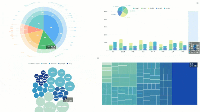
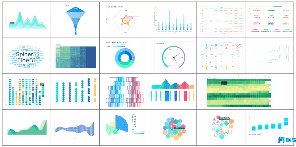
FanRuan leads the way in data visualization and analysis. With tools like FineBI and FineReport, you can organize your observations and create clear visual reports. These tools help you see patterns in artwork and advertisements, making your analysis more effective.
Visual analysis gives you the skills to appreciate artwork on a deeper level. You learn to identify the artist’s intentions and the cultural meaning behind each piece. When you analyze artwork, you connect with history, society, and personal stories. You see how formal elements like shape and texture reveal the artist’s message.
Tip: Use visual analysis of an advertisement to understand how images influence your choices and feelings.
Visual analysis is important because it transforms your experience with artwork. You move from simply looking to truly understanding. In business intelligence, visual analysis helps you turn complex data into clear stories. You can use these skills to interpret charts, dashboards, and even marketing materials. The importance of visual analysis lies in its power to make information accessible and engaging.
A step-by-step guide to analyzing visual art helps you break down any artwork into manageable parts. You can use this process to build a strong visual analysis and gain deeper insights. Experts recommend covering a range of visual elements and design principles, writing alongside the artwork, and supporting your writing with visual analysis. FineBI and FineReport can help you organize your findings and visualize your analysis at every stage.
Observation—overview of the artwork
Start by observing the artwork closely. Look at the entire piece before focusing on details. Use these techniques to improve your observation:
Start with grayscale or pencil sketches to see highlights, midtones, and darks.
Stay still to keep your perspective accurate.
Spend at least half your time looking at the subject, not just your paper.
Focus on large shapes and proportions before adding details.
Add texture to bring the artwork to life.
Use references or draw from direct observation to build your skills.
Observe before you begin drawing or painting.
Get to know your subject well.
Cut out distractions to focus deeply.
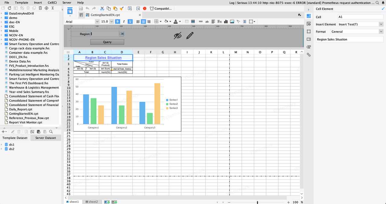
You can use FineBI to create a table of your initial observations. This helps you track what you notice and compare different artworks. FineReport allows you to organize your notes and create visual summaries for classroom discussions.
Description—identifying visual elements
Next, describe what you see in the artwork. Focus on the visual elements that stand out. These include:
Colors and contrast
Size of elements
Content alignment
Shapes
Motion design
Perspectives
Typography
White spaces
Proximity
Texture
List these elements as you see them. Avoid interpreting or judging at this stage. FineReport supports a variety of visualization types, so you can create charts or diagrams to display these elements. FineBI lets you build dashboards that show how these features appear across multiple artworks.
Analysis—examining formal elements
Now, analyze the formal elements of the artwork. Ask yourself how the artist uses color, line, shape, and texture. Think about how these choices affect your response.
The formal elements of art constitute the essential components that artists use to construct a visual language. They serve as the vocabulary for both art analysis and creation.
Together, these formal elements serve as the 'building blocks of art analysis,' enabling us to dissect and appreciate how artists use them to create meaning and emotion.
In every visual image, multiple things affect our response: the visual elements (also called formal elements), the way these elements relate to one another (composition), and the cultural context in which the image is made and viewed.
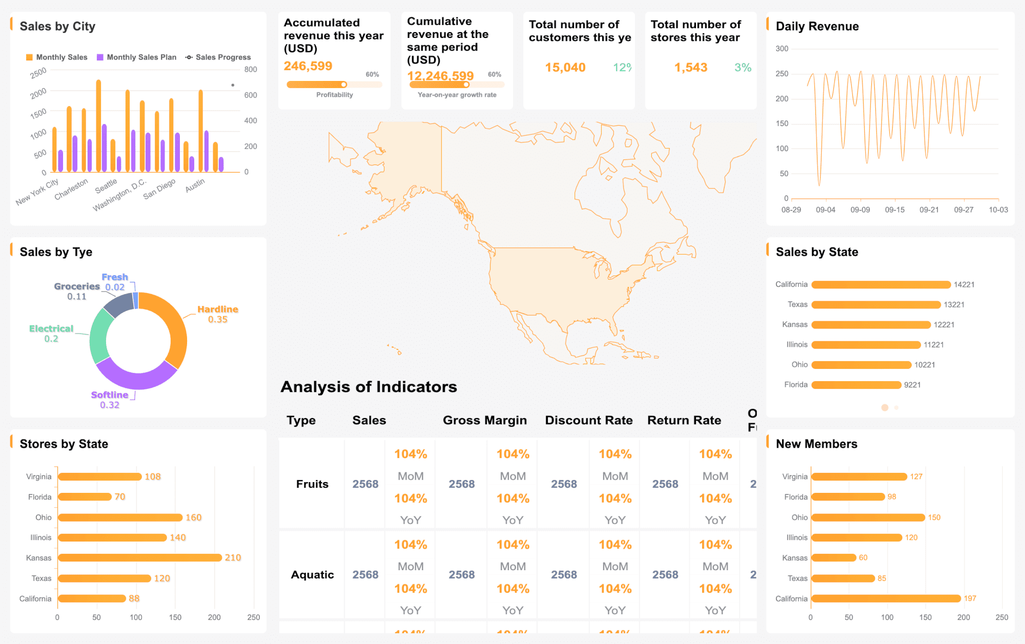
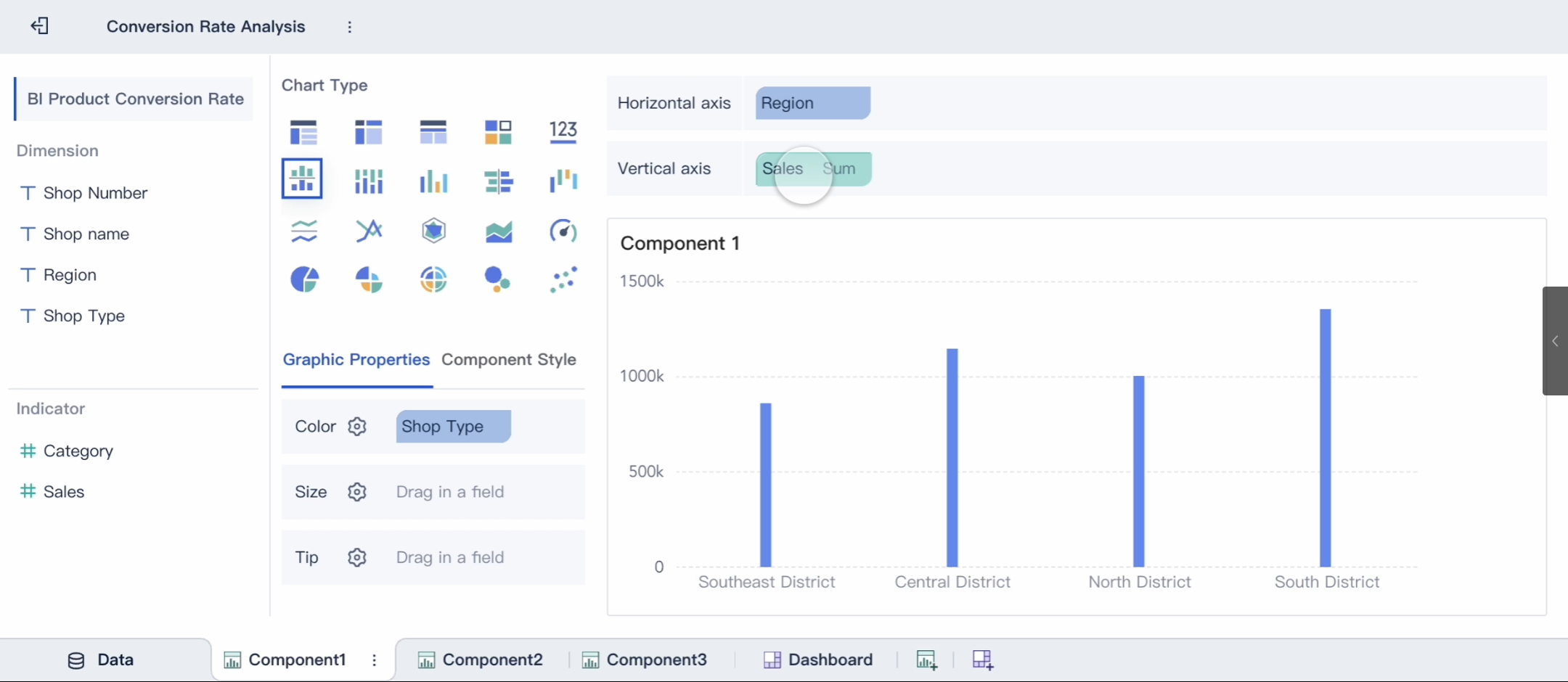
FineBI and FineReport help you organize your analysis. You can prepare your data in tables, choose from a variety of charts, and create dashboards that make your findings clear. Here is how these tools support your visual art analysis:
Functionality
Description
Data Preparation
Prepare data with tables before creating charts to minimize errors.
Chart Variety
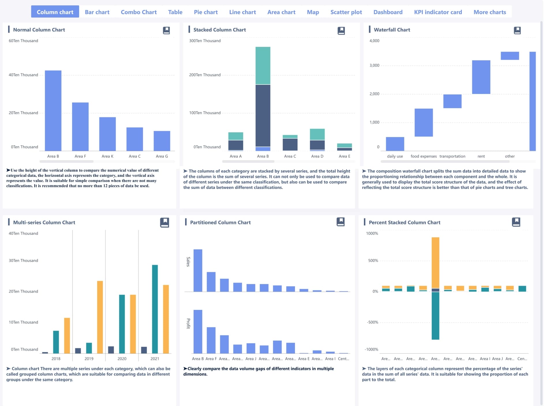
Use different chart types to meet visualization needs and make data display intuitive.
Dashboard Creation
Create dashboards that organize and present data clearly, aiding in analysis.
Interpretation—understanding meaning
Interpretation is where you explain what the artwork means. Use these steps to interpret visual art:
Start with visual analysis. Examine the formal elements, such as color, composition, texture, and line. Notice the artist’s choices and their emotional impact.
Consider the context. Think about the historical and cultural background of the artwork. This often reflects the time it was created and gives important clues about its meaning.
Try to understand the artist’s intentions. Every artwork comes from the artist’s thoughts and emotions. Grasping their intentions helps you interpret visual art more deeply.
The Ways of Looking method provides a basis for creating interpretations of artworks through four distinct frameworks: A Personal Response, Looking at the Subject, Looking at the Object, and Looking at the Context. Each framework sets out a series of questions that enhance the act of looking, leading to multiple interpretations.
FineBI can help you visualize your interpretations by creating charts that show different viewpoints or emotional responses. FineReport allows you to document your interpretations and share them with others.
Context—situating the artwork
Finally, place the artwork in its context. Understanding the background of the piece gives you a complete visual analysis. Consider these aspects:
Aspect of Context
Description
Artist's Background
Research the artist’s influences and experiences to reveal their intentions.
Historical Factors
Learn about the time period to understand societal influences.
Artistic Movement
Identify the movement to place the artwork within broader trends.
Audience Reception
Examine how the artwork was received to inform its significance over time.
Political Climate
Recognize the political context to enhance understanding of the themes addressed in the artwork.
Cultural factors shape both the creation and interpretation of artworks.
Understanding the circumstances surrounding the artwork is crucial for grasping its meaning and the artist's intentions.
You can use FineBI and FineReport to create timelines, compare artworks from different periods, and visualize how context influences meaning. These tools help you build a strong visual analysis by connecting every step, from observation to context.
By following this step-by-step guide to analyzing visual art, you can analyze an artwork with confidence. You will develop strong visual analysis skills and learn to interpret visual art in a meaningful way. FineBI and FineReport support you at every stage, making your visual art analysis organized, clear, and effective.
Key elements in visual art analysis
When you analyze the elements of design in artwork, you build a strong foundation for art analysis techniques. Each element plays a unique role in shaping the overall composition and meaning. Let’s break down these elements with clear examples and see how FineReport helps you visualize them.
Color, line, and shape
Color, line, and shape are the building blocks of any artwork. Color sets the mood and draws your attention. Line guides your eye and creates movement. Shape forms the structure and helps you recognize objects. You can see these elements in paintings, sculptures, and even advertisements.
Element
Description
Line
The most basic building block, used to create shapes and guide the viewer's eye.
Color
Differentiates and defines other elements; includes various shades.
Shapes
Formed by combining lines; can be organic or geometric.
When you use FineReport, you can create line charts to show trends and data points. You can customize colors, lines, and shapes to match the style of the artwork. You can set the series color, line style, and mark point styles for tailored visualizations. This makes examining color and contrast and assessing line and shape much easier.
Texture and space add depth and emotion to artwork. Texture can be real, like the roughness of a sculpture, or visual, like the brushstrokes in a painting. Space is the area around and between objects. It affects how you see the overall composition and creates perspective.
Texture enhances the sensory experience and adds complexity.
It can create contrast and focal points.
Texture helps convey emotions, mood, and atmosphere.
Space uses positive and negative areas to create depth.
When you evaluate texture and pattern, you notice how artists use these features to evoke feelings. FineReport lets you visualize texture and space by using different chart types and layouts. You can compare artworks and see how artists use space to guide your eye.
Composition and scale
Composition refers to how all elements fit together in artwork. Scale is about the size of objects and how they relate to each other. Larger elements attract more attention and seem closer. Smaller elements fade into the background. Playing with size and scale creates visual tension and interest in the overall composition.
Mount Rushmore is a great example. The massive scale of the sculpture emphasizes the importance of the figures in American history.
When you analyze the elements and focus on analyzing composition and design, you see how artists organize their work. FineReport supports diverse visualization types, so you can explore composition and scale by adjusting chart sizes and comparing different layouts.
Art analysis techniques help you interpret artwork by examining color and contrast, assessing line and shape, evaluating texture and pattern, and interpreting symbolism and iconography. When you use FineReport, you can visualize these elements and gain deeper insights into the overall composition of any artwork.
Design principles help you understand how artists organize and create meaning in artwork. When you use visual analysis, you look for these principles to see how each part works together. You can find balance, contrast, emphasis, unity, movement, and rhythm in almost every artwork.
Balance and contrast
Balance means that the elements in artwork feel stable and harmonious. You see balance when shapes, colors, and lines are arranged evenly. Sometimes artists use symmetrical balance, where both sides look the same. Other times, they use asymmetrical balance, where different elements still create a sense of stability.
Contrast happens when artists place different elements next to each other. You notice contrast in artwork when light meets dark, or when smooth textures meet rough ones. Contrast makes certain parts stand out and grabs your attention.
Balance and contrast help guide your eyes across the artwork.
You can spot these principles in paintings, sculptures, and digital designs.
Emphasis and unity
Emphasis draws your attention to the most important part of the artwork. Artists use placement, isolation, scale, and color to make one area stand out. Unity brings all the elements together, creating a sense of harmony.
Technique
Description
Placement
Positioning elements to focus attention.
Isolation
Separating an element to make it stand out.
Scale
Making key parts larger or smaller.
Repetition
Using repeated shapes or colors for unity.
Proximity
Grouping related elements.
Balance
Distributing visual weight for harmony.
Color Harmony
Keeping a consistent color palette.
You see unity when colors, shapes, and lines work together. This helps you focus on the message of the artwork.These features help you create reports that feel organized and easy to understand.
Tip: When you analyze emphasis and unity, look for repeated patterns and grouped elements in the artwork.
Movement and rhythm
Movement shows how your eyes travel across the artwork. Rhythm creates a visual beat by repeating elements like lines and colors. Artists use these principles to make artwork feel alive and energetic.
You notice movement in artwork when lines lead your eyes from one part to another. Rhythm appears when shapes or colors repeat, creating a sense of flow. Famous examples include the rapid motion in Dürer’s woodcut and the dynamic lines in Manohar’s painting. Jackson Pollock’s Autumn Rhythm uses loose patterns to capture the feeling of jazz music.
FanRuan tools help you analyze movement and rhythm by letting you track patterns and changes in your data. You can use charts to show how elements repeat or vary, making your visual analysis more powerful.
Remember, design principles help you understand how artwork communicates ideas and emotions. Use these principles to guide your analysis and make your reports more effective.
How to write a visual analysis essay
Writing a visual analysis essay helps you explore artwork in depth and communicate your insights clearly. You can follow a simple structure to organize your ideas and present your findings. This section guides you through organizing your analysis, crafting a thesis statement, and describing visual elements. You will also learn how FineBI supports your writing by creating visual reports and dashboards.
Organizing your analysis
Start by selecting a compelling artwork or image. Choose one with strong contrast, clear meaning, or interesting symbolism. Structure your essay with a clear introduction, body, and conclusion. Begin with an engaging hook and a brief description of the artwork. Use a visual analysis essay outline to keep your writing focused.
Here is a recommended visual analysis essay format:
Section
Description
Introduction
Mention the artwork and state your thesis.
Description
Give a brief description of what’s in the image.
Analysis
Discuss the visual elements.
Interpretation
Explore what the piece might mean.
Conclusion
Tie everything back to your thesis.
FineBI helps you organize your analysis by allowing you to create dashboards and visual reports. You can use data visualization to support your arguments and export your findings as PDF files for easy inclusion in your visual analysis paper.
A strong thesis statement guides your visual analysis essay. Clearly state your main argument or interpretation of the artwork. Synthesize your findings and connect them to the overall themes. Identify strong emotional impacts and connect your analysis to the context of the piece. Your thesis should reflect your understanding and set the direction for your essay.
Tip: Crafting a clear visual analysis starts with a focused thesis. Make sure your thesis connects your observations and interpretations.
Describing and analyzing visual elements
When writing a visual analysis essay, focus on how the artist arranges elements like color, line, shape, and composition. Identify focal points that draw attention. Analyze symbolic elements and their meanings. Examine design features such as size, color, and shape. Conduct contextual analysis to understand broader implications.
Focus on composition and arrangement.
Identify focal points and symbolism.
Examine design elements and context.
Incorporating visual analysis into your writing strengthens your arguments and deepens your interpretation. FineBI allows you to filter data, highlight key points, and create visual components that support your essay. You can use these tools to make your writing a visual analysis essay more engaging and insightful.
If you need inspiration, explore visual analysis essay topics such as famous paintings, advertisements, or sculptures. Use the recommended visual analysis essay outline to structure your work. Writing a visual analysis essay becomes easier when you organize your thoughts and use visual reports to support your ideas.
Practical walkthrough with FineBI and FineReport
Selecting an artwork for analysis
You begin your journey by choosing an artwork that interests you. Pick a painting, sculpture, or photograph that has clear colors, shapes, and textures. For example, you might select a famous painting like Van Gogh’s "Starry Night" or a modern advertisement. Look for an artwork with strong visual elements. This makes your visual analysis easier and more meaningful.
Tip: Choose an artwork that inspires you or makes you curious. The more you connect with the piece, the deeper your analysis will be.
Applying each step using FanRuan tools
You can use FineBI and FineReport to organize your visual analysis of the artwork. Start by creating a table in FineBI to record your observations. List the colors, lines, shapes, and textures you see in the artwork. Next, use FineReport to build charts that show how these elements appear. For example, you can create a pie chart to display the color distribution or a bar chart to compare the size of different shapes.
FineBI helps you create dashboards that combine your findings. You can add filters to focus on specific parts of the artwork. Use interactive features to highlight important details. FineReport lets you customize your charts and layouts. You can adjust colors and styles to match the artwork. This makes your analysis clear and visually appealing.
Note: Many students and professionals use these tools to present their visual analysis in classrooms and meetings.
Using templates for visual art analysis
Templates save you time and help you stay organized. FineBI and FineReport offer templates for visual analysis of artwork. You can use a template to structure your observations, descriptions, and interpretations. For example, a dashboard template might include sections for color analysis, composition, and context. You fill in each part as you study the artwork.
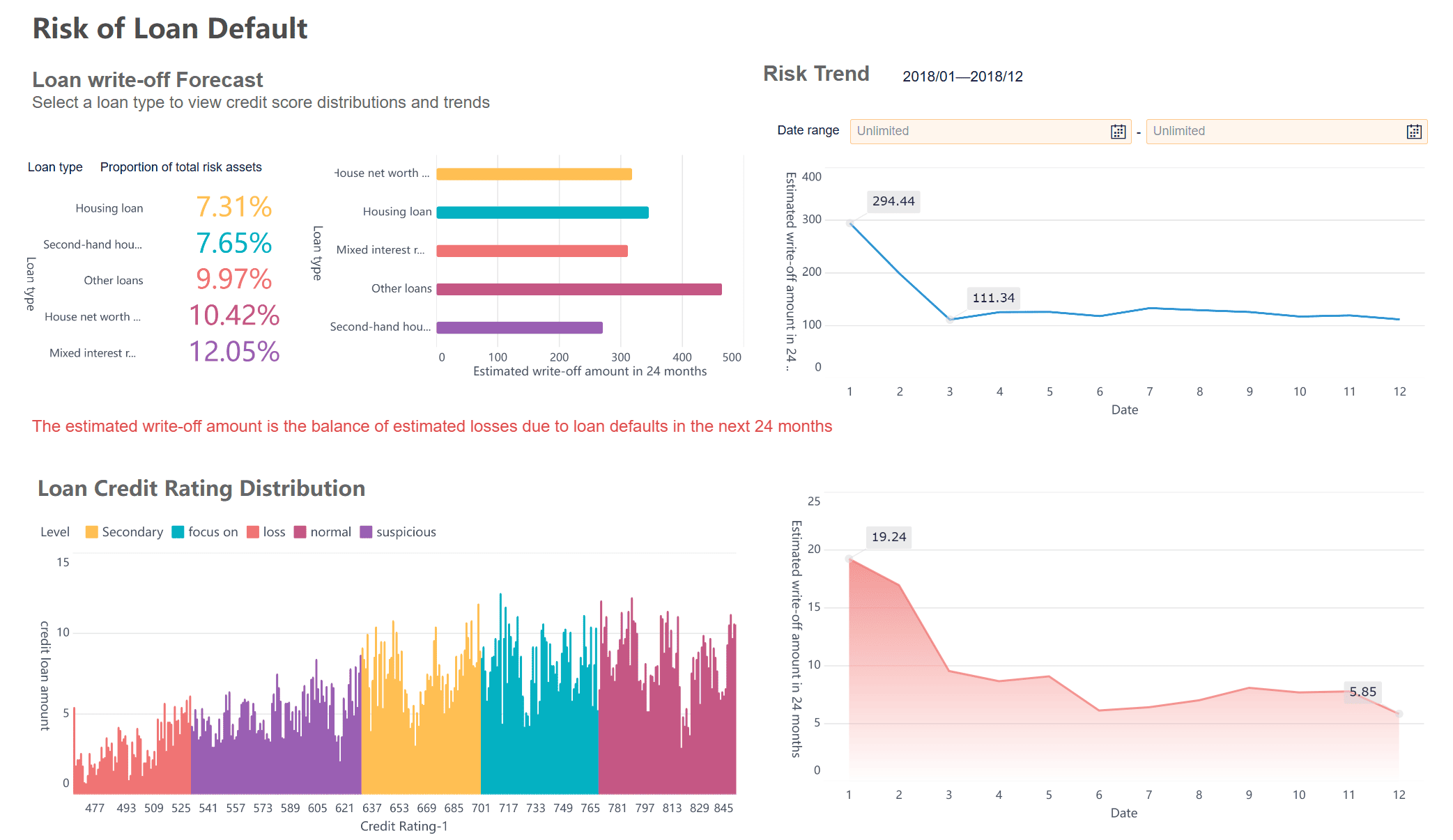
Let’s look at a real-world example. UnionPay Data Services used FineBI to analyze credit card artwork and improve customer engagement. By visualizing data from different artworks, they identified patterns and made better decisions. In manufacturing, FineReport helps companies monitor product artwork for quality control. Dashboards show defect rates and highlight areas for improvement.
Using templates and dashboards, you can turn your visual analysis of artwork into actionable insights.
Tips and common mistakes in visual analysis
Actionable tips for beginners
You can improve your skills in analyzing artwork by following a few practical steps. These art analysis tips help you see details and understand meaning more clearly.
Consider opposing viewpoints. When you look at artwork, try to imagine how others might interpret it. This helps you see new perspectives and strengthens your analysis.
Play games or brain teasers. Activities that challenge your mind, like puzzles, help you visualize relationships and draw conclusions. These skills transfer directly to analyzing artwork.
Take an online analytics course. Structured learning gives you a foundation in visual analysis. You interact with professionals and learn new techniques.
Use templates and dashboards in FineBI and FineReport. These tools help you organize your observations and compare different artworks. You can visualize patterns and track your progress over time.
Practice regularly. The more you analyze artwork, the better you become. Set aside time each week to study new pieces and apply what you learn.
Tip: Try using FineBI to create a dashboard of your favorite artworks. You can compare colors, shapes, and styles to see how artists use different techniques.
Mistakes to avoid in visual art analysis
Many beginners make common mistakes when analyzing artwork. You can avoid these pitfalls by staying aware and adjusting your approach.
Choosing the wrong paper or surface. The materials you use affect your results. Experiment with different types to find what works best for your artwork.
Setting unrealistic expectations. Improvement takes time. Focus on learning and enjoy the process rather than aiming for perfection.
Failing to develop a full range of value. Value shows light, volume, and texture in artwork. Practice shading and use a variety of tones to make your drawings more dynamic.
Poor shading and lighting. Flat shading makes artwork look lifeless. Learn proper techniques to create depth and realism.
Skipping on foundations. Rushing to details can weaken your composition. Start with a strong structure before adding intricate elements.
Producing weak or uninspiring compositions. Try to create balanced and innovative arrangements. Use FineReport to experiment with layout and design before finalizing your artwork.
Note: FanRuan products simplify visual analysis by helping you organize, visualize, and refine your approach. You can avoid mistakes and improve your skills with regular use.
You have learned the main steps for visual analysis. Start by observing artwork, then describe, analyze, interpret, and consider context. Practice these steps with different artwork to improve your skills. Use FineBI and FineReport to organize your visual analysis essay and create clear reports. Regular practice with artwork leads to mastery of visual analysis essay writing. Studies show that consistent practice helps you retain skills and reach higher accuracy.
Regular practice with artwork increases skill retention.
Structured practice with artwork leads to mastery of visual analysis essay techniques.
Frequent practice with artwork supports long-term improvement.
You can master visual analysis essay writing. Improvement comes with practice. Every artwork you study brings you closer to mastery.
Product Trial
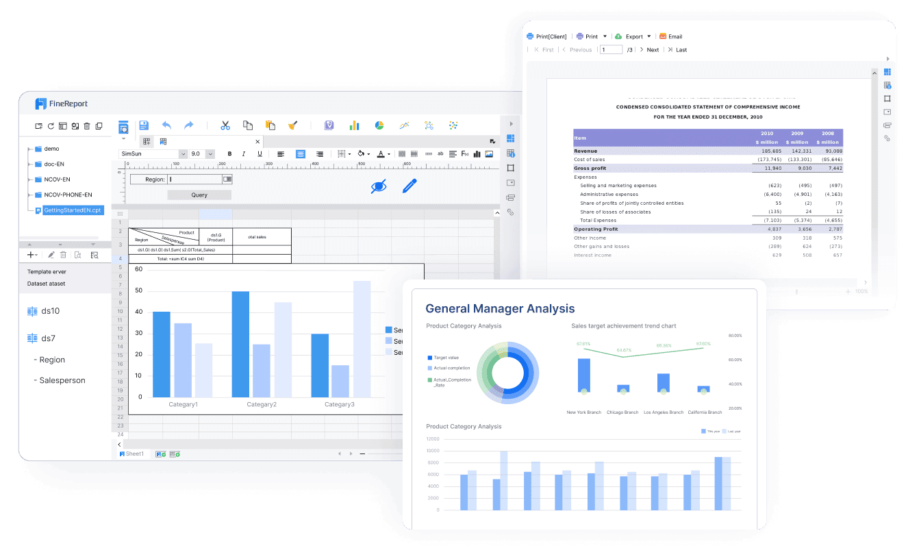
FineReport
Pixel-perfect reports · Interactive dashboards · Easy data entry · Digital twins
Access a wealth of case studies, industry insights, and solution guides to accelerate digital transformation.
FAQ
What is visual analysis in art?
Visual analysis helps you look closely at artwork. You study elements like color, line, and shape. You learn how artists use these features to create meaning and emotion.
How can FineBI and FineReport help with visual analysis?
You use FineBI and FineReport to organize your observations. These tools let you create charts, dashboards, and reports. You see patterns and share your findings easily.
Do I need art experience to start visual analysis?
You do not need any art experience. You can begin by observing and describing what you see. Practice helps you improve your skills over time.
What are common mistakes in visual analysis?
Many beginners rush to details or skip basic structure. You should start with observation and build your analysis step by step. Use templates and dashboards to stay organized.