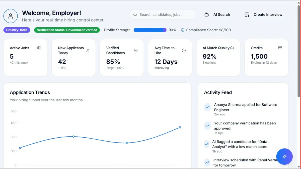
A data analytics report is not just a document full of charts. It is a decision tool. For operations directors, analysts, finance leads, and department managers, the real value of a report is simple: it helps answer a business question, explain what the data means, and recommend what to do next. If your current reports are hard to read, overloaded with metrics, or disconnected from actual decisions, you are not dealing with a data problem. You are dealing with a reporting problem.
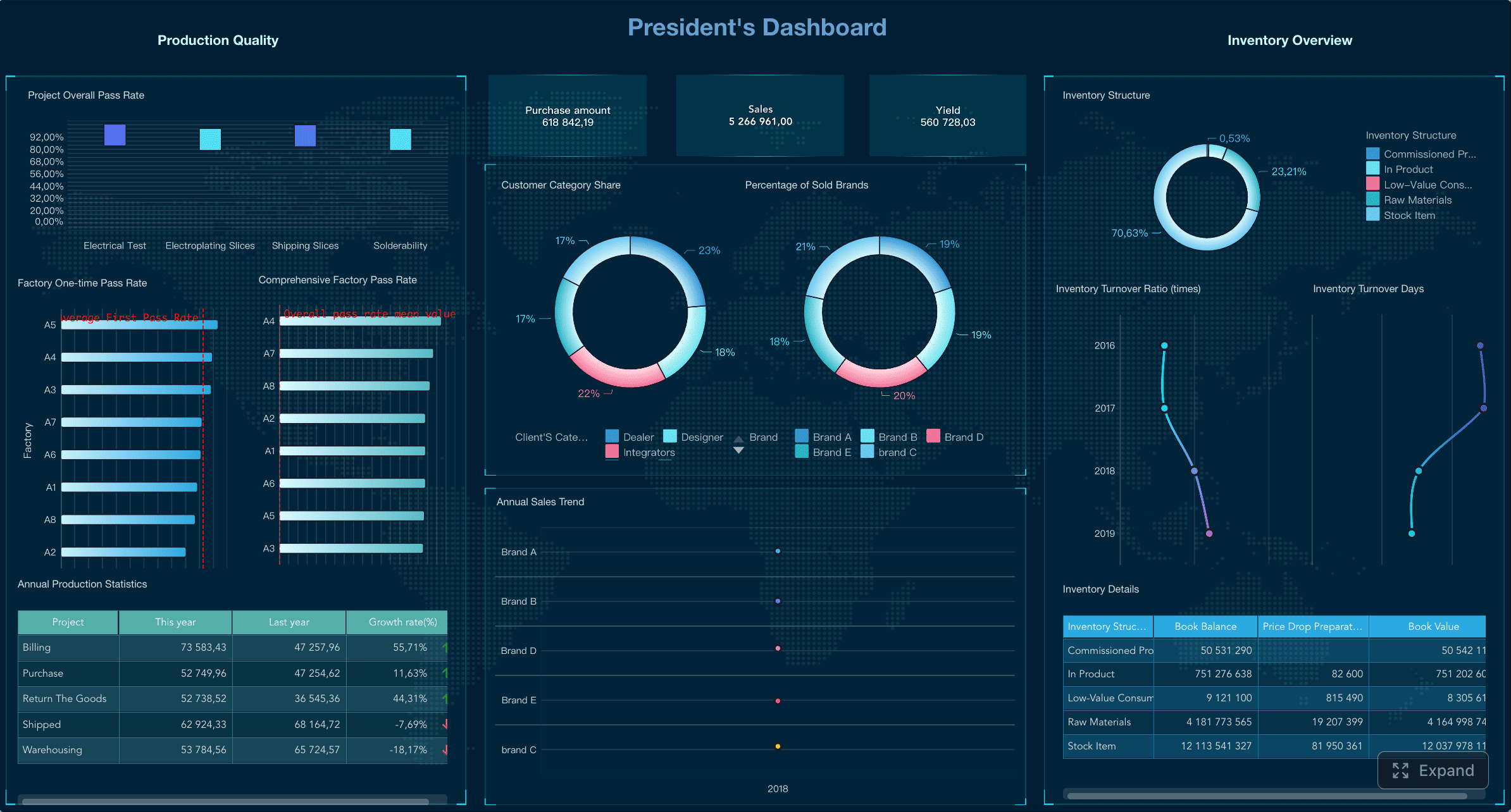
All reports in this article are built with FineReport.
What a data analytics report is and why it matters
A data analytics report is a structured report that turns raw data into findings, business context, and recommended actions. In plain language, it tells stakeholders what happened, why it happened, and what should happen next.
That matters because most teams do not struggle to collect data. They struggle to communicate it in a way that supports action. Marketing teams need to know where spend is working. Sales leaders need forecast confidence. Product teams need retention signals. Finance needs variance explanations. A strong report gives each of those teams a clear basis for decision-making.
Data collection, analysis, and reporting are not the same thing
These terms are often used interchangeably, but they serve different purposes:
- Data collection gathers raw inputs from systems like CRM, ERP, web analytics, surveys, and transactional databases.
- Data analysis examines patterns, trends, anomalies, relationships, and causes within that data.
- Data reporting packages the results into a format stakeholders can consume and act on.
Think of it this way: data collection gives you the ingredients, analysis cooks the meal, and reporting serves it in a way people can actually use.
When to use a report instead of a dashboard, slide deck, or ad hoc summary
A dashboard is great for monitoring live performance. A slide deck is useful for presentations. An ad hoc summary can solve a quick one-off need. But a data analytics report is the better choice when you need:
- A documented explanation of results
- Business context behind performance shifts
- A formal recommendation trail
- A repeatable reporting structure
- Cross-functional alignment on next steps
Use a report when the audience needs more than numbers on a screen. Use it when they need interpretation, accountability, and action.
Key Metrics (KPIs) every strong data analytics report should define
Before you write the report, define the KPIs that matter most to the decision at hand. At minimum, most reports should clarify:
- Primary outcome metric: The main business result being measured, such as revenue, churn, conversion rate, or cycle time.
- Supporting metrics: Metrics that help explain movement in the primary result, such as traffic, pipeline volume, feature adoption, or cost per order.
- Dimensions: The lenses used to segment performance, such as region, channel, product line, customer segment, or time period.
- Comparison period: The benchmark used for context, such as month over month, quarter over quarter, year over year, or target versus actual.
- Variance: The difference between actual performance and the baseline, target, or forecast.
- Confidence or data quality note: Any caveat related to missing data, model assumptions, or source limitations.
- Action threshold: The point at which a result requires escalation, intervention, or investment.
The structure of a data analytics report that readers can actually follow
The best reports are easy to scan but rigorous underneath. They do not bury the answer. They lead with the decision context, then support it with evidence.
A practical structure usually includes the following components.
Start with the business question, scope, and audience
Your report should begin by answering three questions:
- What business question is this report solving?
- What scope does it cover?
- Who is the intended audience?
For example:
- Business question: Why did conversion rates decline in the last quarter?
- Scope: Website traffic, lead quality, and funnel performance across three regions
- Audience: VP of Marketing, Growth Manager, and Regional Team Leads
This framing prevents the report from becoming a generic data dump.
Present the data sources, timeframe, assumptions, and methodology
Stakeholders trust reports that are transparent. Include:
- Data sources used
- Reporting period
- Definitions of major metrics
- Any exclusions or assumptions
- Basic analytical approach
This does not need to be overly technical. It just needs to make the report defensible.
Organize findings by key trends, supporting evidence, and visualizations
The body of the report should be structured around the most important findings, not around random charts. A strong pattern is:
- Finding
- Evidence
- Interpretation
- Business implication
For example:
- Finding: Paid search conversions fell 18%
- Evidence: CPC rose 22% while landing page conversion dropped from 4.1% to 2.9%
- Interpretation: Traffic became more expensive and lower converting
- Business implication: Current budget allocation is reducing efficiency
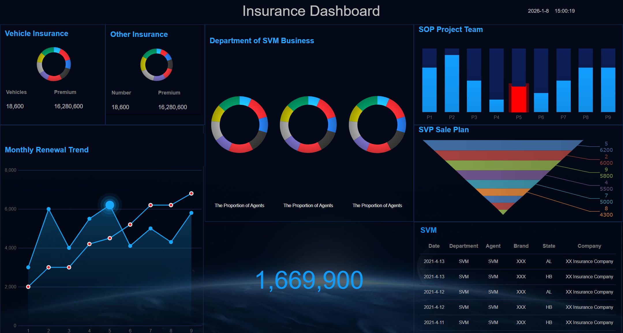
End with conclusions, recommendations, limitations, and next steps
This is where many reports fail. They describe the data but do not close the loop. Every report should end with:
- Conclusions: What the data clearly shows
- Recommendations: What should be done next
- Limitations: What the data cannot fully explain
- Next steps: Who owns the action and by when
A simple data analysis report template
Here is a practical section order you can reuse for weekly, monthly, quarterly, or project-based reporting:
- Executive summary
- Business question and objectives
- Scope and audience
- Data sources and methodology
- KPI definitions
- Key findings
- Supporting visuals and tables
- Analysis of drivers and root causes
- Recommendations
- Risks and limitations
- Next steps and owners
- Appendix
This structure works well because it puts business relevance first and technical detail later.
| Section | Purpose | Best For |
|---|---|---|
| Executive summary | Gives the main takeaway fast | Executives |
| Objectives and scope | Defines what the report covers | All audiences |
| Data sources and methodology | Builds trust and transparency | Analysts and managers |
| Key findings | Highlights major trends and issues | All audiences |
| Supporting visuals | Makes evidence easy to interpret | All audiences |
| Recommendations | Turns insight into action | Decision-makers |
| Appendix | Stores detailed backup analysis | Analysts |
Analytics vs. reporting: the key difference in structure and purpose
Analytics and reporting are related, but they are not the same.
- Analytics is about discovering meaning, testing hypotheses, and explaining why something happened.
- Reporting is about communicating results clearly so stakeholders can make decisions.
That difference affects structure. Analytics often starts broad, explores patterns, and may branch into multiple questions. Reporting should be tighter. It should lead readers toward a conclusion and action.
A useful rule: analysis is the engine, reporting is the delivery system.
How to write a data analytics report step by step
If you want a repeatable process, use this sequence.
1. Identify the decision the report needs to support
Start with the decision, not the data.
Ask:
- What choice will this report influence?
- Who will make that choice?
- What level of certainty do they need?
Examples include:
- Should we increase spend on a campaign?
- Which region needs intervention?
- Which product feature should we prioritize?
- Are we on track against budget?
A report with no decision behind it usually becomes an archive, not a business tool.
2. Choose the right metrics, dimensions, and comparison periods
Pick metrics that directly connect to the decision. Avoid vanity metrics that look busy but do not help anyone act.
Choose:
- One or two headline KPIs
- A few explanatory supporting metrics
- Relevant dimensions like region, product, customer segment, or channel
- Comparison periods that make trends meaningful
For instance, a retention report without cohorts is weak. A sales report without stage conversion rates is incomplete. A finance report without budget versus actuals lacks control value.
3. Clean and validate the data before drawing conclusions
Never build recommendations on unchecked data.
Validation should include:
- Deduplicating records
- Checking missing values
- Confirming time ranges
- Verifying metric definitions
- Reconciling totals against source systems
- Reviewing outliers and anomalies
This step is often invisible to readers, but it is what separates trusted reports from misleading ones.
4. Turn insights into a clear narrative supported by charts, tables, and concise commentary
Good reporting is structured storytelling. The narrative should move logically:
- What happened
- Why it happened
- Why it matters
- What to do next
Each chart should support a takeaway. Each table should simplify comparison. Each paragraph should add interpretation, not repeat what the visual already shows.
How exactly to structure a report from introduction to recommendations
An ideal flow looks like this:
Executive summary
Summarize the core outcome in a few lines:
- Main result
- Major driver
- Recommended action
Introduction
State the business question, scope, and reporting period.
Data and methodology
Explain sources, filters, assumptions, and analytical approach.
Findings
Present the most important trends first. Group them into themes, not isolated metrics.
Interpretation
Explain likely causes, dependencies, and business implications.
Recommendations
Provide specific actions, prioritized by impact and feasibility.
Appendix
Store definitions, supporting tables, detailed calculations, or extra breakdowns.
This structure works especially well in enterprise reporting because it supports both quick executive review and deeper analyst validation.
Common mistakes that weaken a report
Even experienced teams make the same reporting mistakes. The most common are:
- Unclear objectives: The report does not answer a defined business question.
- Vanity metrics: It includes easy-to-measure numbers with no decision value.
- Missing context: It shows performance without benchmarks, targets, or history.
- Overloaded visuals: Too many charts compete for attention.
- Weak recommendations: Findings are presented without practical next steps.
- No audience fit: The report is too technical for executives or too shallow for analysts.
- Hidden limitations: Data issues are ignored instead of disclosed.
Best practices from a consultant’s playbook
Here are four field-tested ways to improve implementation quality.
Build the report backward from the final decision
Write the recommendation section first. Then identify the evidence required to justify it. This prevents bloated reporting.
Limit headline KPIs
Most business readers can absorb only a few top-level metrics quickly. Make the primary KPI obvious, then use supporting metrics to explain movement.
Standardize commentary blocks
For recurring reports, use a fixed logic:
- Result
- Driver
- Risk
- Action
This increases consistency and speeds review.
Automate recurring sections, not judgment
Automate data collection, refreshes, alerts, and standard chart production. Keep human interpretation for the parts that explain cause, risk, and action.
7 real-world data analytics report examples across teams
The best way to understand a data analytics report is to see how it works in real business contexts.
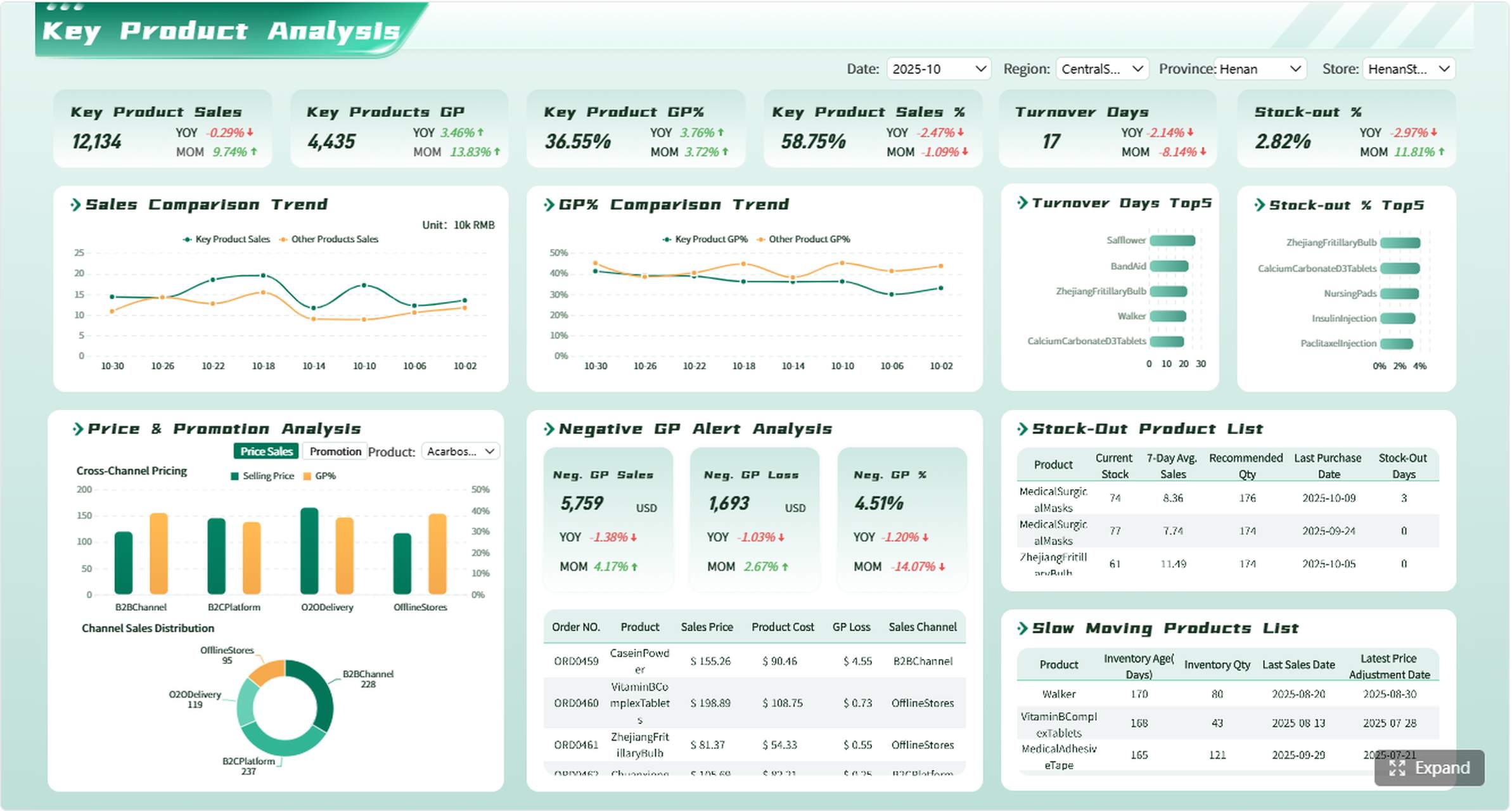
Marketing performance report
A marketing performance report should show whether spend is producing results, which channels are efficient, and where optimization is needed.
Core sections often include:
- Traffic and lead volume by channel
- Conversion rates by campaign
- Cost per acquisition
- Return on ad spend
- Funnel drop-off by source
- Attribution notes and caveats
A useful insight might be: paid social generated high traffic but low conversion quality, while email delivered lower volume but better revenue efficiency.
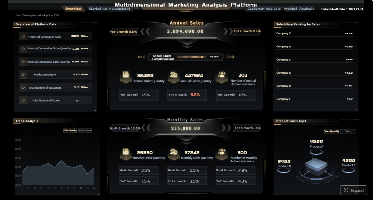
Sales pipeline and revenue report
This report helps revenue leaders assess whether pipeline coverage supports target attainment.
Typical elements include:
- Pipeline value by stage
- Win rate by segment or region
- Average sales cycle length
- Forecast versus actual revenue
- Rep or team performance
- Pipeline aging and slippage risks
What matters is not just top-line revenue, but the health of the pipeline that produces future revenue.
Product usage and retention report
For product and growth teams, the report should connect feature behavior to retention and churn.
Important sections may include:
- Active users over time
- Feature adoption rates
- Cohort retention
- Churn signals
- Experiment or A/B test results
- Customer segmentation by usage depth
A strong report might reveal that users who adopt a key feature in the first seven days retain at twice the rate of those who do not.
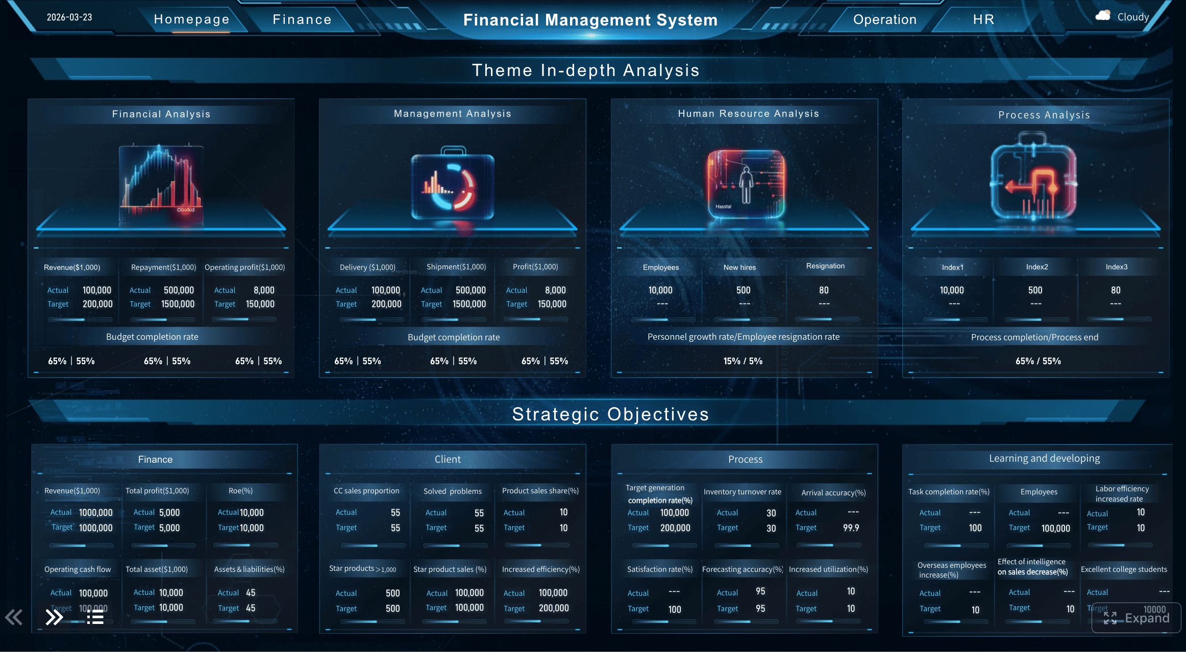
Finance and operations report
This report is critical for control, efficiency, and risk management. It should compare plan to performance and explain operational drivers.
Common sections include:
- Budget versus actuals
- Revenue and cost variance
- Margin trends
- Working capital indicators
- Operational throughput or utilization
- Risk flags such as delays, defects, or cost overruns
For operations leaders, the value lies in understanding where performance is off plan and where intervention is required.
Customer support performance report
A customer support report tracks service quality, workload, and resolution efficiency.
Useful metrics include:
- Ticket volume by channel
- First response time
- Resolution time
- SLA compliance
- Reopen rate
- Customer satisfaction score
This kind of report often identifies staffing gaps, process bottlenecks, or issue categories that require product fixes.
HR and workforce analytics report
People analytics reports help leaders monitor workforce stability and planning.
Include metrics such as:
- Headcount changes
- Attrition rate
- Time to hire
- Offer acceptance rate
- Training completion
- Productivity or utilization indicators
This report is especially useful when leadership needs to align hiring plans with business growth and retention risk.
Executive cross-functional performance report
For senior leadership, a cross-functional report combines major KPIs across departments into one concise view.
It may cover:
- Revenue growth
- Margin performance
- Customer retention
- Operational efficiency
- Strategic initiative progress
- Top enterprise risks
The goal is not depth in every area. It is alignment across the business.
Tools, techniques, and presentation tips for a stronger data analytics report
The quality of a report depends on more than analysis. It also depends on workflow, presentation, and delivery.
Which tools help with data collection, cleaning, visualization, and automation
Most reporting stacks need support across four layers:
- Data collection: CRM, ERP, web analytics, customer support, and database connectors
- Data cleaning: SQL, ETL tools, spreadsheets, Python, or data prep workflows
- Visualization: BI and reporting platforms that support charts, tables, and drill-down analysis
- Automation: Scheduled refreshes, access control, template reuse, and distribution workflows
For enterprise teams, FineReport is a practical option because it supports highly formatted reports, dashboards, parameter queries, pixel-level layout control, and scheduled distribution. That makes it especially useful when teams need both operational dashboards and formal reporting outputs in the same environment.
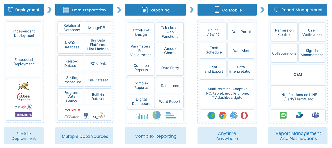 FineReport Workflow
Techniques for choosing charts, writing captions, and adding context
A few presentation rules improve readability fast:
- Use line charts for trends over time
- Use bar charts for comparisons across categories
- Use tables when exact values matter
- Use waterfall charts for variance explanation
- Use heatmaps for dense comparisons or intensity patterns

Captions should not describe the chart mechanically. They should explain the takeaway.
Bad caption:
- Revenue by region
Better caption:
- North America drove 62% of revenue growth, while EMEA missed forecast due to lower enterprise deal conversion
This is what makes a data analytics report useful rather than decorative.
How recurring reports can align with broader data and analytics reviews across the business
Recurring reports should not exist in isolation. They should feed monthly business reviews, quarterly planning, and strategic operating rhythms.
To do that, standardize:
- KPI definitions
- Reporting cadences
- Commentary format
- Escalation thresholds
- Ownership for follow-up actions
This creates consistency between team-level reporting and executive decision-making.
A guide to data analytics and reporting workflows
A reliable reporting workflow usually follows this path:
- Define the business question
- Identify stakeholders and audience needs
- Gather data from source systems
- Clean, transform, and validate data
- Select KPIs and dimensions
- Analyze trends and drivers
- Build visuals and narrative
- Review for accuracy and clarity
- Publish and distribute the report
- Track actions and feedback for the next cycle
This process sounds simple, but execution discipline is what makes reports trusted.
What to include in a recurring state-of-data style report
Some organizations also create a broader internal report on analytics maturity, data quality, and business opportunities. A recurring state-of-data report can include:
- Key enterprise trends
- Data quality issues and progress
- Analytics adoption across teams
- Reporting gaps and risks
- Automation opportunities
- Strategic priorities for the next quarter or year
This type of report helps leadership understand not only business performance, but also the health of the analytics function itself.
Final checklist for creating a useful data analytics report
Before you send or publish your report, use this checklist.
- Does the report answer a real business question?
- Is the intended decision clearly stated?
- Are the primary KPIs directly tied to that decision?
- Does every chart support a takeaway?
- Are comparison periods and benchmarks included?
- Have the data sources and assumptions been explained?
- Are recommendations specific, prioritized, and realistic?
- Are risks and limitations disclosed?
- Does the format match the audience?
- Is there a clear next step with ownership?
A strong data analytics report should leave the reader with clarity, not work. They should know what changed, why it matters, and what should happen next.
If you want to build structured, enterprise-ready data analytics reports with flexible layouts, automated workflows, and dashboard-style interactivity, FineReport is built for exactly that use case.
 Get Ready-to-Use Dashboard Templates in Fine Gallery
FAQs
A strong data analytics report should include the business question, scope, audience, key KPIs, data sources, timeframe, findings, and recommended actions. It should also explain assumptions, limitations, and what stakeholders should do next.