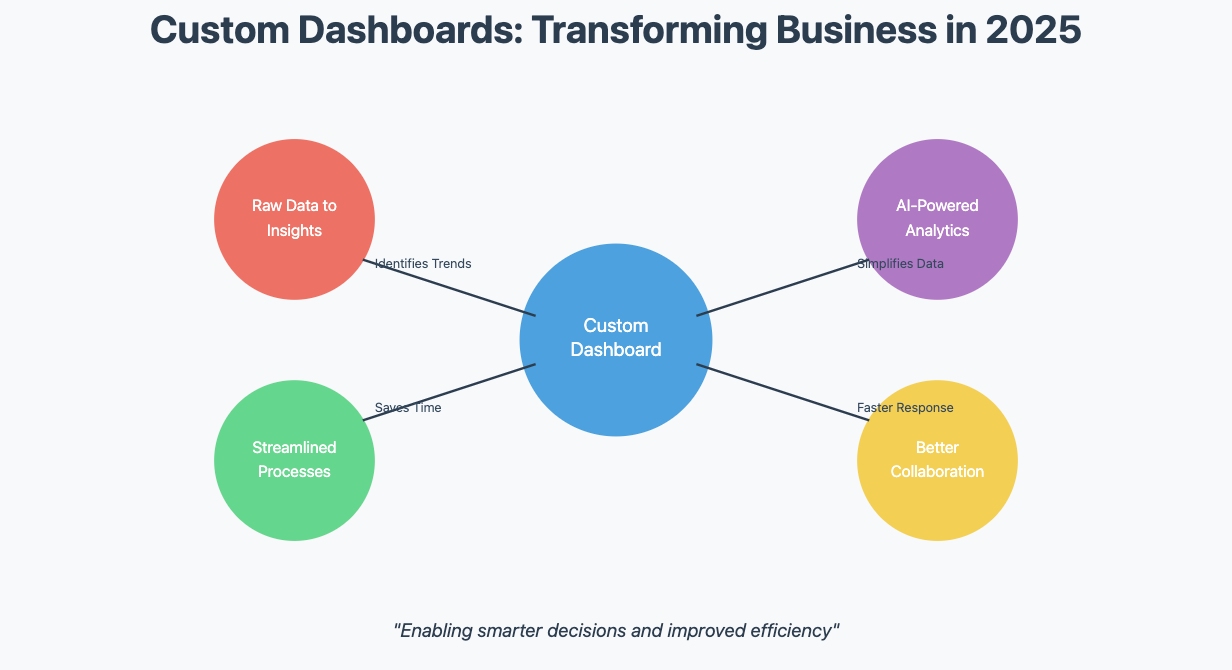
In 2026, businesses rely on custom dashboards to make smarter decisions and improve efficiency. Understanding how to create a custom dashboard for business analytics can streamline this process, offering actionable insights tailored to specific business needsThese dashboards transform raw data into actionable insights, helping you identify trends and opportunities. They also streamline processes, saving time and boosting productivity. Recent advancements, like AI-powered dashboards and augmented analytics, make creating tailored dashboards easier than ever. These tools simplify complex data, ensuring accessibility for all users. By leveraging a custom dashboard, you gain a comprehensive view of your operations, enabling better collaboration and faster responses to market changes.
When creating a custom dashboard for your business, it’s important to choose the right tool. Tools like FineBI, Tableau, Power BI, and Google Data Studio are popular options, each offering unique features for creating interactive, data-driven dashboards.
Defining Purpose and Audience for Custom Dashboards
Clarify the Dashboard’s Objective
Before building a custom dashboard, you need to define its purpose. Knowing how to create a custom dashboard for business analytics ensures that each objective is clearly addressed, from tracking performance to monitoring key metrics. A clear objective ensures the dashboard delivers meaningful insights. Start by identifying the specific goals you want to achieve. For example, do you need to monitor daily operations, track supply chain performance, or analyze sales pipelines? Each objective requires a unique approach to data visualization.
Here are some common objectives businesses set for dashboards:
Objective Type
Description
Operational Tracking
Dashboards are used to track day-to-day software deliveries and operational activities.
Supply Chain Analysis
Dashboards track supply chain KPIs around stock, inventory, and delivery to visualize data for executives.
Departmental Performance Monitoring
Dashboards provide granular data on departmental performance, such as social media metrics for marketers.
Operations and safety dashboards help manage and prevent risks proactively.
HR Metrics Reporting
HR dashboards report on employee satisfaction and recruiting success rates.
To define your dashboard’s purpose, follow these steps:
Identify stakeholders, such as executives or department heads.
Discuss their daily challenges and data needs.
Understand their objectives for the dashboard.
By aligning the dashboard’s purpose with business goals, you ensure it provides actionable insights.
Identify the Target Audience
Understanding your audience is crucial when designing a custom dashboard. Different users have different needs. Executives may prefer high-level summaries, while analysts require detailed data. Tailoring the dashboard to its audience improves usability and ensures the right information reaches the right people.
Consider these factors when identifying your audience:
What decisions will they make using the dashboard?
How familiar are they with data analysis?
What level of detail do they need?
For example, a marketing team might need a dashboard that highlights social media engagement metrics. Meanwhile, an operations team may focus on safety and risk management data. By addressing these unique needs, you create a dashboard that empowers users to make informed decisions.
Tip: Keep the design simple and intuitive. A cluttered dashboard can overwhelm users and reduce its effectiveness.
Connecting Data Sources for Custom Dashboards
Choose the Right Data Sources
The foundation of any effective custom dashboard lies in selecting the right data sources. Knowing how to create a custom dashboard for business analytics allows you to connect relevant data sources, ensuring the dashboard provides valuable insights for decision-makers. Reliable and accurate data ensures your dashboard delivers meaningful insights. Start by identifying the metrics that align with your dashboard’s goals. For example, if your goal is to track sales performance, focus on data sources like CRM systems or sales reports.
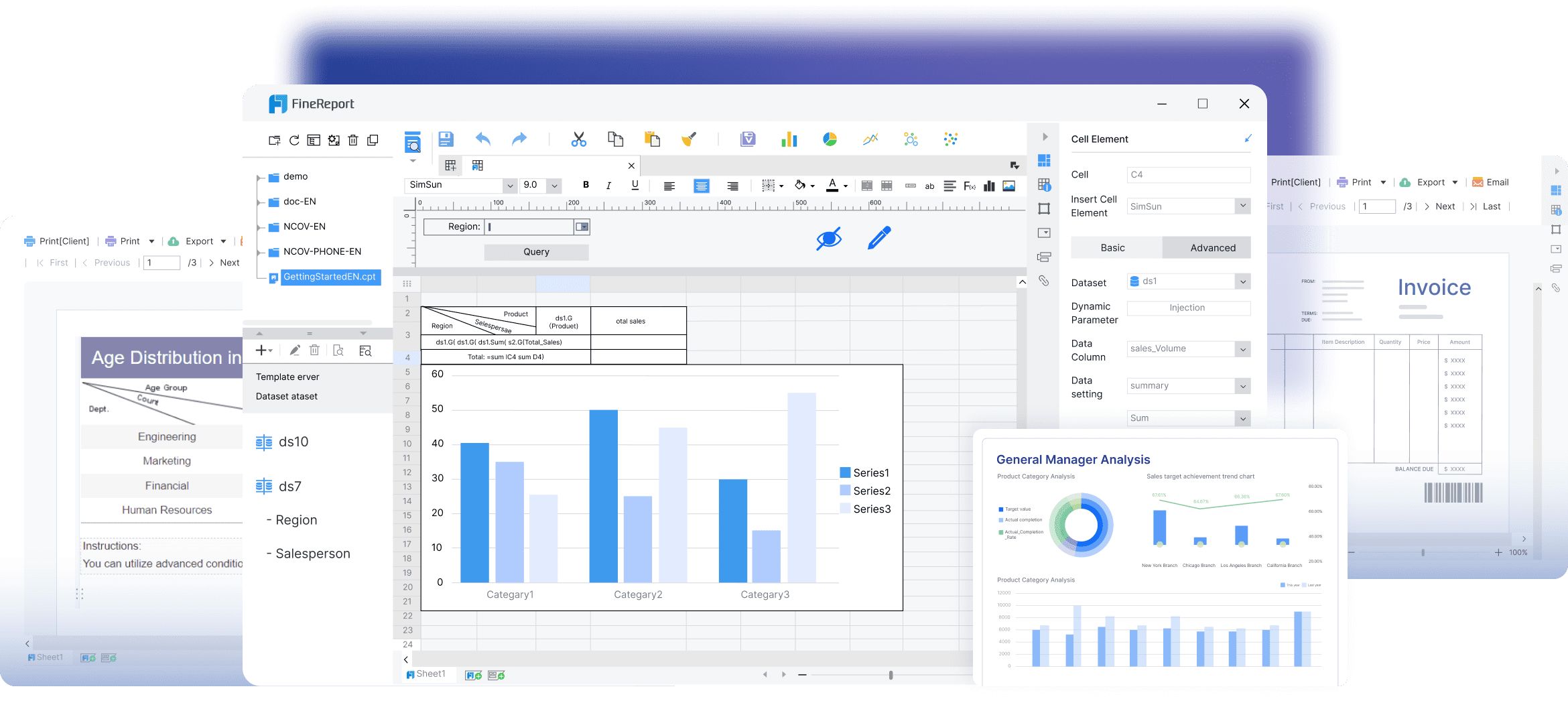
For companies seeking robust BI solutions, FineBI by FanRuan is a powerful tool that allows seamless integration with various data sources. With FineBI, businesses can consolidate their data in a central place, creating interactive and customizable dashboards that help decision-makers make informed choices quickly. Always consider what the dashboard is trying to accomplish and the main insights it should provide.
Key performance indicators (KPIs) play a crucial role in this process. Choose KPIs that reflect your business needs and resonate with your target audience. For instance, a marketing team might prioritize metrics like website traffic or conversion rates, while an operations team may focus on inventory levels or delivery times. Selecting the right KPIs ensures your dashboard remains relevant and actionable.
Additionally, prioritize data sources that are regularly updated. Outdated or inaccurate data can lead to poor decision-making. Whether you’re pulling data from cloud-based platforms, internal databases, or third-party tools, ensure the sources are trustworthy and capable of providing real-time updates.
Prepare the Data for Analysis
Once you’ve chosen your data sources, the next step is preparing the data for analysis. Raw data often contains inconsistencies, errors, or irrelevant details. Cleaning and transforming the data ensures it’s accurate and ready for visualization. Start by removing duplicates, correcting errors, and standardizing formats. Aggregating data from multiple sources can also help create a unified view.
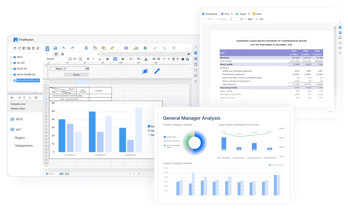
Once your data is clean and unified, FineReport can further streamline the analysis process. It provides advanced reporting tools that help visualize the cleaned data, making it easier for users to generate accurate, real-time reports.
To enhance usability, follow these best practices:
Round numbers to avoid overwhelming users with excessive decimal places.
Use appropriate visualizations that match the type of data being presented.
Maintain a consistent color palette to reduce confusion.
Ensure contrast and readability in design elements for better comprehension.
Incorporate accessibility standards, such as keyboard navigation and clear labels, to make the dashboard usable for everyone.
Avoid overly complex visualizations that distort the data. Instead, focus on simplicity and clarity. For example, use bar charts for comparisons or line graphs for trends. By preparing your data thoughtfully, you’ll create a custom dashboard that is both accurate and user-friendly.
Step-by-Step Guide to Custom Dashboards
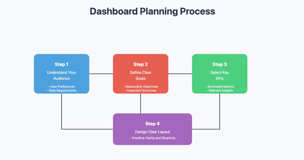
Plan the Layout and Structure
A well-planned layout is the backbone of an effective custom dashboard. Start by understanding your audience and their needs. Define your goals and choose relevant KPIs that align with those objectives. Once you have this foundation, focus on designing a layout that is both functional and visually appealing.
Follow these steps to plan your dashboard layout:
Understand your audience’s preferences and data requirements.
Define clear goals for the dashboard.
Select KPIs that provide actionable insights.
Design a layout that prioritizes clarity and simplicity.
When designing, consider these essential elements:
Clarity and Simplicity: Avoid clutter by focusing on the most important data.
Customizable Layouts: Allow users to adjust the dashboard to fit their needs.
Mobile Responsiveness: Ensure the dashboard works seamlessly on all devices.
Real-Time Data Updates: Provide users with the latest information.
A clear and structured layout ensures your custom dashboard delivers value to its users.
Add Visualizations and Interactivity
Visualizations transform raw data into meaningful insights. Choose the right type of visualization based on the data you want to present. For example, line charts are ideal for showing trends over time, while bar charts work well for comparing categories. Use interactivity to make the dashboard more engaging and user-friendly.
Here’s a guide to selecting visualizations:
Indicators: Show one KPI clearly, useful for instant insights on business performance.
Line charts: Display trends over time, effective for comparing categories.
Bar charts: Compare different values, especially with color-coded categories.
Pie charts: Show proportions of a whole, intuitive for limited categories.
Funnel charts: Depict sales pipeline, illustrating conversion rates at each step.
To enhance the visual appeal and interactivity of dashboards, FineVis, another tool from FanRuan, provides rich graphical elements and dynamic data visualizations. It enables businesses to create visually striking dashboards that are easy to interpret and analyze.
This placement ensures that FineVis is introduced right after discussing different visualization methods, making it a natural flow for readers to understand how this tool contributes to improving the visual aspects of dashboards.
Test and Refine the Dashboard
Testing ensures your custom dashboard performs optimally. Begin by reviewing data sources and visualizations for accuracy. Test the dashboard on different devices and browsers to ensure compatibility. Collect feedback from stakeholders to identify areas for improvement.
Use these methods to refine your dashboard:
Leverage Asynchronous Data Loading: Let users interact with parts of the dashboard while other elements load.
Optimize Image and Asset Sizes: Reduce loading times by using compressed formats.
Conduct Usability Testing: Observe real users to identify usability issues.
Collect User Feedback: Use surveys or interviews to gather insights.
Testing and refining your dashboard ensures it meets user expectations and delivers a seamless experience.
Customizing Your Dashboard
Branding and Personalization
Customizing your dashboard with branding elements creates a professional and cohesive experience for users. By aligning the dashboard with your organization’s brand guidelines, you ensure consistency across reports and visualizations. This fosters trust and familiarity among users while reinforcing your brand identity.
Key branding elements you can incorporate include:
Setting
Corresponding Branding Element
logo
Header logo
mark
OpenSearch Dashboards mark
loadingLogo
Loading logo displayed during startup
faviconUrl
Website icon
applicationTitle
The application’s title
In addition to these elements, you can customize color schemes, fonts, and design layouts to match your organization’s style. This creates a uniform visual identity that enhances user engagement. Personalization also allows you to tailor the dashboard to specific user needs, ensuring it delivers relevant insights effectively.
Tip: Use consistent branding across all dashboards to create a seamless experience for users.
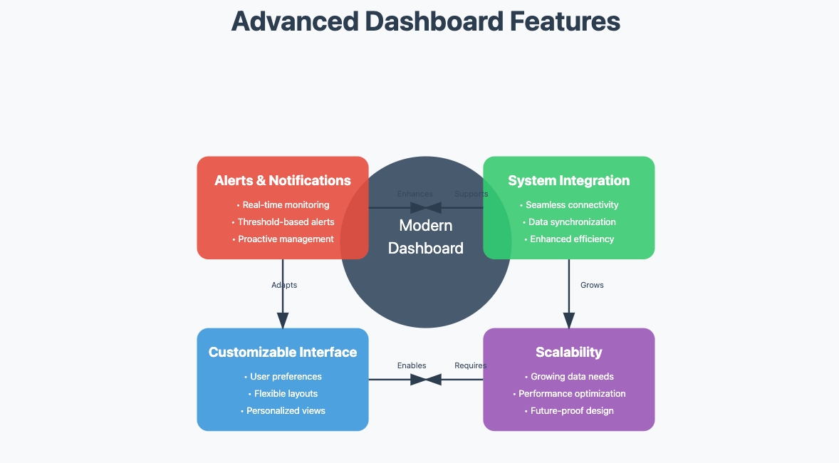
Advanced Features
Adding advanced features to your custom dashboard enhances its functionality and usability. Knowing how to create a custom dashboard for business analytics with real-time data updates and interactive features can significantly improve business decision-making. Interactive visualizations allow users to explore data dynamically, helping them identify trends and patterns. Real-time updates ensure users always have access to the latest information, enabling faster decision-making.
Consider incorporating these advanced features:
Alerts and notifications for proactive management.
Customizable interfaces to adapt to user preferences.
Interactive data exploration tools, such as drill-downs and filters, empower users to analyze data in real time. These features reduce reliance on static reports and provide immediate insights. By integrating these capabilities, you create a dashboard that evolves with your business needs.
Note: Advanced features not only improve functionality but also reduce human error, ensuring more accurate decision-making.
Sharing and Collaborating on Dashboards
Methods for Sharing Dashboards
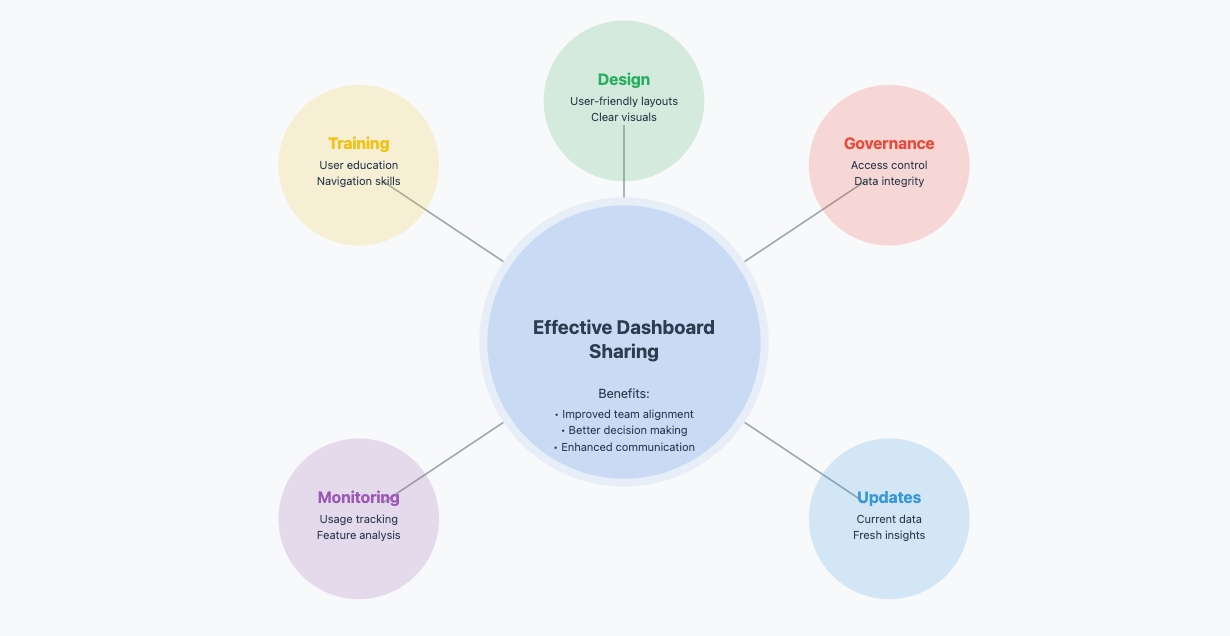
Sharing dashboards effectively ensures that your team and stakeholders stay aligned. A well-designed dashboard improves communication by providing consistent reporting and actionable insights. To share dashboards successfully, focus on these methods:
Design user-friendly dashboards: Use clear layouts, readable fonts, and accessible color schemes. This ensures everyone can interpret the data easily.
Establish governance rules: Define who can access, edit, or view the dashboard. This prevents unauthorized changes and maintains data integrity.
Provide training: Teach users how to navigate and interpret the dashboard. This step ensures they can use it confidently and make informed decisions.
Monitor usage: Track how often the dashboard is accessed and which features are used. This helps you identify areas for improvement.
Keep dashboards updated: Regularly refresh the data to reflect current trends and metrics. Outdated dashboards can lead to poor decision-making.
Shared dashboards also enable real-time collaboration. Features like in-dashboard comments allow team members to discuss insights directly within the platform. This reduces the need for external communication tools and keeps discussions focused on the data.
Collaboration Best Practices
Collaboration on dashboards requires clear strategies to maximize efficiency. Start by defining roles and responsibilities for each team member. For example, assign someone to manage data updates while another oversees dashboard design. This division of tasks ensures accountability and prevents confusion.
Encourage open communication by using dashboards as a central hub for discussions. Interactive features, such as filters and drill-downs, allow users to explore data together during meetings. This fosters a shared understanding of the insights and promotes data-driven decision-making.
To maintain collaboration, schedule regular reviews of the dashboard. Use these sessions to gather feedback, identify gaps, and refine the design. Always prioritize simplicity to avoid overwhelming users with excessive information. A streamlined custom dashboard keeps everyone focused on the most critical metrics.
Tip: Use cloud-based platforms for dashboards. These platforms enable seamless sharing and real-time updates, ensuring all team members access the latest data.
Overcoming Custom Dashboard Challenges
Ensuring Data Security and Privacy
Protecting sensitive data is one of the most critical challenges when building a custom dashboard. Data breaches, compliance failures, and the need for advanced security measures are common issues businesses face. These risks can lead to financial losses, reputational damage, and legal consequences. To safeguard your data, you must implement robust security practices.
Start by addressing the risk of data leakage. Use effective security layers, such as encryption and multi-factor authentication, to protect sensitive information. Reliable on-premise solutions can also provide additional control over your data. Advanced security measures, like real-time threat detection, help defend against cyberattacks. These steps ensure your dashboard remains secure and trustworthy.
Tip: Regularly audit your dashboard’s security protocols to identify vulnerabilities and stay compliant with data protection regulations.
Avoiding Information Overload
A custom dashboard should deliver insights without overwhelming users. Overloading your dashboard with excessive data can reduce its effectiveness. Focus on simplicity and clarity to enhance usability.
To avoid information overload, prioritize key metrics that align with your goals. Remove unnecessary data that doesn’t directly support decision-making. A clean and simple design improves readability and helps users focus on what matters most. Customizable layouts allow users to personalize their interface, making the dashboard more intuitive.
Incorporate data visualization techniques to simplify complex information. Charts, graphs, and visual hierarchies make it easier to interpret data at a glance. Progressive disclosure, which reveals details gradually, prevents users from feeling overwhelmed.
Strategy
Description
Prioritize Key Metrics
Focus on the most critical metrics that align with the dashboard’s goals. Remove any data that doesn’t directly support decision-making.
Use Visual Hierarchy
Organize data logically and use visual cues to differentiate between primary and secondary information.
Implement Progressive Disclosure
Reveal information gradually, showing only the most relevant details first to prevent overload.
By following these strategies, you can create a dashboard that delivers actionable insights without overwhelming users.
Custom dashboards are essential for business analytics in 2026. They provide actionable insights that drive better decisions and improve efficiency. Start small by building one or two simple dashboards. Use a cloud-native platform and prebuilt connectors to streamline the process. Gather feedback from users and refine the design based on their input. Experiment with visualizations to find what works best.
Investing in a well-designed custom dashboard offers long-term benefits. It simplifies complex data, making it accessible to everyone. Personalized insights enhance user engagement and productivity. Dashboards also integrate data from multiple sources, providing a comprehensive view for strategic planning.
Tip: Focus on clarity and usability to ensure your dashboard remains effective as your business grows.
Key Takeaways
Set Clear Goals: Define the purpose of your dashboard to align with business needs. This ensures the dashboard provides valuable insights.
Understand Your Audience: Design the dashboard to present data in a way that’s easy for your audience to interpret. Focus on what’s relevant for decision-making.
Use Relevant Data and Features: Choose the right data sources and KPIs. Add interactive elements and live updates to enhance usability and speed up decisions.
Click the banner below to experience FineBI for free and empower your enterprise to convert data into productivity!
Access a wealth of case studies, industry insights, and solution guides to accelerate digital transformation.
FAQ
What tools can you use to create a custom dashboard?
You can use tools like Tableau, Power BI, or Google Data Studio. These platforms offer user-friendly interfaces and advanced features for data visualization. Many tools also integrate with cloud services, making it easier to connect data sources and update dashboards in real time.
How do you ensure your dashboard stays relevant?
Regularly review your dashboard’s KPIs and design. Update data sources to reflect current trends. Gather feedback from users to identify gaps or outdated metrics. By refining the dashboard periodically, you ensure it continues to meet your business needs effectively.
Can you create a dashboard without coding skills?
Yes, many modern tools allow you to build dashboards without coding. Drag-and-drop interfaces and prebuilt templates simplify the process. However, basic knowledge of data structures and visualization principles can help you create more effective dashboards.
How do you choose the right visualizations?
Match the visualization type to your data. Use line charts for trends, bar charts for comparisons, and pie charts for proportions. Avoid clutter by focusing on clarity. Test different options to find the most intuitive way to present your insights.
What are the best practices for dashboard security?
Use encryption and multi-factor authentication to protect sensitive data. Limit access to authorized users only. Regularly audit your dashboard for vulnerabilities. Following these practices ensures your data remains secure and compliant with regulations.