A program dashboard shows your organization’s data right away. You can see patterns, watch important numbers, and respond fast to changes. For example, leaders like Frank Fieseler and Tom Bland use dashboards to check attendance, find problems early, and make better choices. When you use an executive dashboard, you help people take responsibility and keep everyone working toward goals. Solutions like FineReport help you use data to act and make your work more efficient.
Program Dashboard Overview
What Is a Program Dashboard
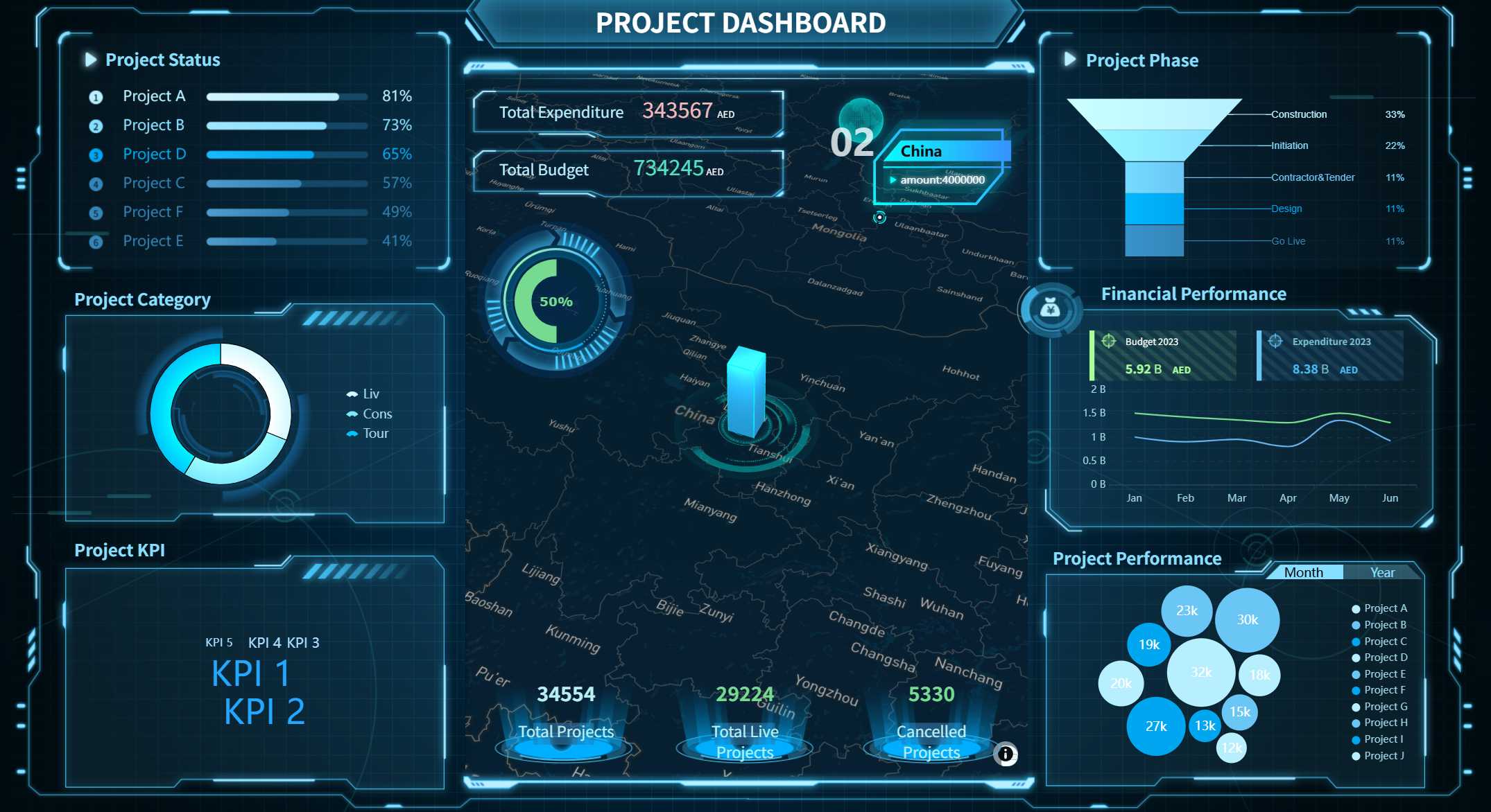
A program dashboard is a tool that shows important information in one spot. You can use it to check progress, find problems, and make better choices. It puts data from different places together and shows it in a simple way. With a data dashboard, you do not need to look through lots of reports or spreadsheets. You get a clear picture of what is happening right now.
A program dashboard is different from other business intelligence tools because of its main parts:
Data visualization helps you see trends and how things are going.
Dashboard layout puts information in order so you find things fast.
Global filters let you look at the data that matters most to you.
FineReport is a top solution for dashboards. You can use FineReport to make a business dashboard that works for you. It connects to many data sources and gives you updates right away, so you always know the latest information.
Purpose of a Dashboard
A dashboard helps you understand hard data. You can use it to watch key numbers and see what needs your attention. This means you can act fast when things change. Dashboards are important because they show you what matters most, so you do not miss anything important.
Here are some reasons why organizations use dashboards:
Dashboards show what needs attention, so you can act quickly.
You get a simple view of hard data, which helps you decide.
Dashboards let you watch key numbers in real time, so you can respond fast.
They help people talk to each other and work toward the same goals.
When you use a dashboard like FineReport, your team can stay focused and work together. It also makes it easier to reach your goals and improve how your organization works.
How Program Dashboards Work
Connecting Data and Showing It Clearly
You can link your dashboard to many kinds of data sources. This means all your important numbers are in one place. Some dashboards connect directly to apps like Salesforce using APIs. Others use ETL or ELT pipelines to move data into a storage area before showing it on the dashboard. You can also use a semantic layer to make sure your numbers are always right.
Here is a table that shows common ways dashboards get data:
Integration Method
Description
Direct API Connections
Connects dashboards to cloud apps, but may limit data history.
ETL/ELT Pipelines
Moves data into storage for detailed analysis and past data.
Reverse ETL
Sends data from storage back to business tools for better view.
Semantic Layer Abstraction
Sets rules so all dashboards use the same calculations for metrics.
FineReport makes connecting data simple. You can drag and drop to build your dashboard. This saves time because you don’t need to write code. You can move charts, tables, and filters easily. The layout looks good on any screen. You can arrange parts to fit your needs. FineReport also helps you make clear visualizations. This helps you see trends and patterns quickly.
Watching Data Live and Making Reports
A data dashboard shows live updates. You see changes as soon as they happen. This helps you act fast if something changes. Dashboards can refresh data in different ways. Some update every few minutes. Others show new data in less than a second.
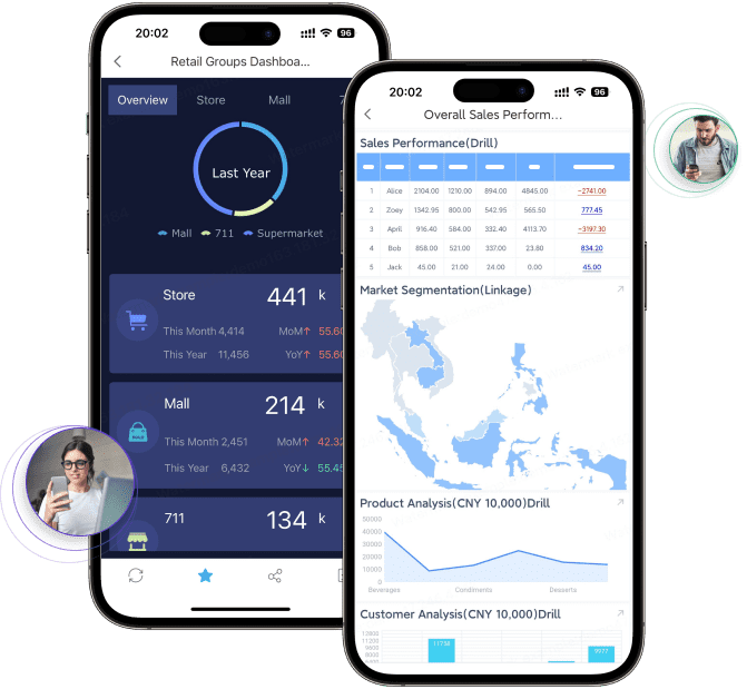
With FineReport, you can interact with your dashboard in many ways. On a computer, you can use tabs or grids to change views. On a phone, you can swipe or tap to see different parts. For example, you can add a dropdown box, choose what it controls, and connect it to live data. This makes your dashboard easy to use and keeps your team updated all the time.
Key Features of Program Dashboards with FineReport
Custom Metrics and KPIs
You can change your dashboard to follow the numbers that matter most. FineReport lets you pick from many key performance indicators. You might want to watch website traffic or sales pipeline activity. You can also check inventory levels. In manufacturing, you can track throughput and system uptime. For planning, you can focus on revenue growth or employee engagement. The dashboard shows these numbers live, so you always know how your business is doing.
Dashboard Type
Typical Metrics
Operational
Website traffic, sales pipeline activity, customer service ticket volume, inventory levels, system uptime, manufacturing throughput
Revenue growth, market share, customer lifetime value, employee engagement, overall business health indicators
You can set up your dashboard to show these key performance indicators in a simple way. This helps you see patterns and make smart choices fast.
User Access and Security
FineReport lets you control who can see and change your dashboard. You can set permissions for each person. This makes sure only the right people see important data. FineReport uses strong security features to keep your information safe.
Security Measure
Description
Enhanced Encryption
Protects sensitive data with strong encryption methods
Token-based Authentication
Uses tokens instead of cookies for better account security
Access Control
Lets you set detailed permissions for each user
Detailed Audit Logs
Tracks all access and changes for accountability
File Upload Verification
Checks uploaded files for security risks
Security Headers
Guards against common web threats
Regular System Backups
Keeps your data safe in case of problems
You can trust that your dashboard and key performance indicators stay safe and private.
Mobile and 3D Dashboards
You can use your dashboard on any device. FineReport’s mobile dashboard lets you check key performance indicators on your phone or tablet. This keeps you updated wherever you are. The dashboard fits different screen sizes, so it is easy to read and use.
FineReport also has 3D dashboards. These dashboards let you explore your data in a fun way. You can rotate, zoom, and interact with graphs to find hidden patterns. This makes it easier to understand hard information and share ideas with your team.
Aspect
3D Dashboards
2D Dashboards
Data Comprehension
Dynamic, immersive, actionable
Limited visual representation
Stakeholder Communication
Manages complex data from multiple sources
Less depth in presentation
Data Exploration
Multi-variable, real-time analysis
More static, less interactive
You can move 3D graphs to find trends and outliers.
3D dashboards help you make better choices by showing relationships you might miss in 2D.
FineReport works with the FanRuan ecosystem. This lets you connect your dashboard to many data sources and tools. Your dashboard becomes even more useful and flexible.
Benefits of Program Dashboards for Organizations
Using a program dashboard gives your organization many good things. These dashboards put all your data in one place. This helps you make better choices, work faster, and reach your goals.
Improved Decision-Making
One big benefit of dashboard reporting is making decisions with data. When you see important numbers right away, you can act fast. Teams say dashboards help them get answers quicker. This means they spend less time waiting for reports. Fast answers help your organization react to changes or problems.
For example, a KPI dashboard can show sales in different places. Managers can spot slow areas right away. This helps them use resources better and change plans if needed. Over time, teams can guess future results more accurately. This helps with planning for the future. Because of this, costs go down and money goes up. This happens because choices are made with good, up-to-date data.
Efficiency and Goal Tracking
Dashboards also help teams work better and know their goals. Automatic reports save time because people do not need to gather data by hand. Teams can spend more time looking at data instead of collecting it. This saves money and makes work easier.
Dashboards also show how close you are to reaching your goals. For example, a business dashboard can show live KPIs like revenue or customer happiness. When everyone sees these numbers, teams work together to meet targets. Seeing the numbers helps people know how their work matters.
In big companies, dashboards help teams work together. When everyone sees the same data, they can find problems and share ideas. This teamwork helps the whole company do better and reach long-term goals.
Real-World Use Cases
Many groups have seen real results after using program dashboards. For example, BOE Technology used a KPI dashboard to use the same numbers in all factories. This helped them lower inventory costs by 5%. It also made their work 50% more efficient. These results show dashboards help teams keep getting better and working toward the same goals.
In factories, dashboards help watch quality by showing defect rates and scrap levels live. This lets teams find problems early and fix them. This means less waste and less rework. Stores use dashboards to watch sales and customer interest. This helps them change marketing plans quickly.
In many jobs, dashboards help with rules by watching important numbers all the time. They also help with planning by showing patterns in data. This helps organizations stay ahead of others.
You need a dashboard to keep your organization focused and ready for change. FineReport helps you connect to many databases and create reports that fit your needs. In the future, dashboards will use AI and machine learning to show you the most important data. To get started, follow these steps:
Plan your goals and team.
Design your dashboard.
Build and test it.
Launch and keep it updated.
Stay ahead by making data-driven choices every day.
Product Trial
FineReport
Pixel-perfect reports · Interactive dashboards · Easy data entry · Digital twins
Access a wealth of case studies, industry insights, and solution guides to accelerate digital transformation.
FAQ
What is the main purpose of a program dashboard?
You use a program dashboard to see important data in one place. It helps you track progress, spot problems, and make smart decisions quickly.
Can I use FineReport dashboards on my phone?
Yes, you can. FineReport dashboards work on phones and tablets. You can check your data anywhere and anytime.
What types of data can I connect to FineReport?
You can connect FineReport to many data sources. These include databases, Excel files, cloud apps, and more. This lets you see all your key numbers together.
How do dashboards keep my data safe?
Dashboards like FineReport use strong security. You set who can see or change data. The system uses encryption and keeps logs of all actions.