Creating an Excel dashboard can transform how you view and analyze data. An Excel dashboard is a high-level summary of key metrics, offering real-time updates and interactive features. It helps you visualize data through charts, graphs, and PivotTables, making complex information easy to digest. The benefits are numerous: you gain insights at a glance, enhance decision-making, and foster accountability across teams. For beginners, Excel dashboard templates provide a user-friendly starting point. Tools like FineReport, FineBI, and FineVis further enhance your ability to create dynamic and insightful dashboards, making data analysis accessible and efficient.
Excel Dashboard Templates: Start with a Clean Dataset
Creating an effective Excel dashboard begins with a clean dataset. You might wonder why this step is so crucial. Well, the quality of your data directly impacts the insights you can draw from it. Let's dive into how you can prepare your data for an Excel dashboard.
Importance of Data Preparation
Data preparation is the foundation of any successful dashboard. It involves cleaning and organizing your data to ensure data accuracy and data consistency. This step is essential because it sets the stage for meaningful analysis.
Cleaning and Organizing Data
First, you need to clean your data. Remove any duplicates or irrelevant information. This process helps you focus on the data that truly matters. Next, organize your data logically. Group similar data points together. This organization makes it easier to analyze and visualize later.
Ensuring Data Accuracy and Consistency
Accuracy and consistency are key. Double-check your data for errors. Ensure that all entries follow the same data format. Consistent data allows for smoother analysis and more reliable results. You don't want to base decisions on faulty data, right?
Formatting Data as a Table
Once your data is clean and organized, it's time to format it as a table. Excel tables offer several advantages that enhance your dashboard's functionality.
Benefits of Using Excel Tables
Excel tables make your data more manageable. They automatically expand as you add new data, keeping everything organized. Tables also come with built-in filtering and sorting options. These features help you quickly find the information you need.
Steps to Format Data as a Table
To format your data as a table, follow these simple steps:
- Select your data range.
- Go to the "Insert" tab.
- Click on "Table."
- Confirm the range and check the "My table has headers" box if applicable.
Voilà! Your data is now in a table format, ready for further analysis.
By starting with a clean dataset and using Excel dashboard templates, you set yourself up for success. These templates guide you through the process, making it easier to create insightful dashboards. Remember, a well-prepared dataset is the backbone of any effective Excel dashboard.
Excel Dashboard Templates: Create Pivot Tables and Charts
Creating an Excel dashboard involves using powerful tools like Pivot Tables and Charts. These tools help you summarize, analyze, and visualize your data effectively. Let's explore how to use them in your dashboard.
Introduction to Pivot Tables
Pivot Tables are essential for any Excel dashboard. They allow you to group, filter, and perform calculations on your data. This makes it easier to spot patterns and trends.
How to Create a Pivot Table
Creating a Pivot Table is straightforward. Follow these steps:
- Select any cell within your data range.
- Go to the "Insert" tab.
- Click on "PivotTable."
- Choose "New Worksheet" to place your Pivot Table.
Expert Insight: "Pivot tables are the most useful method for the purposes of a dashboard, as they let you sort, group, count, and add up data in a table."
Customizing Pivot Table Fields
Once you've created a Pivot Table, customize it to suit your needs. Drag and drop fields into the Rows, Columns, and Values areas. This lets you organize your data in a way that highlights key insights.
Tip: Experiment with different field arrangements to find the most informative view of your data.
Visualizing Data with Charts
Charts are a vital part of any Excel dashboard. They transform raw data into visual stories, making it easier to understand complex information.
Choosing the Right Chart Type
Selecting the right chart type is crucial. Consider what you want to convey. For trends over time, use a line chart. For comparisons, a bar chart works well.
Expert Advice: "Use PivotTables and PivotCharts to summarize key information. These tools allow you to interact with your data dynamically."
Creating and Formatting Charts
To create a chart, follow these steps:
- Select your Pivot Table data.
- Go to the "Insert" tab.
- Choose the chart type that best fits your data.
- Customize the chart's appearance using the "Chart Tools" options.
Pro Tip: Use colors and labels to make your charts more readable and engaging.
By mastering Pivot Tables and Charts, you can create dynamic and insightful Excel dashboard templates. These tools help you present data in a way that's easy to understand and act upon. Remember, the right visualization can make all the difference in how your data is perceived.
Assemble the Excel Dashboard Templates
Creating an Excel dashboard is like assembling a puzzle. You need to arrange all the pieces in a way that makes sense and looks good. Let's dive into how you can lay out your dashboard effectively.
Laying Out the Dashboard
A well-organized layout is crucial for a functional dashboard. It helps you and others quickly find the information you need.
Arranging Pivot Tables and Charts
Start by arranging your Pivot Tables and charts logically. Place related data close together. This makes it easier to compare and analyze. For example, if you're tracking sales and expenses, keep those charts side by side. This arrangement helps you spot trends and make informed decisions.
Tip: Group similar data points together to create a cohesive story. This approach enhances the readability of your dashboard.
Using Excel's Grid System for Alignment
Excel's grid system is your best friend when it comes to alignment. Use it to ensure everything lines up neatly. This not only looks professional but also makes your dashboard easier to navigate. Aligning elements helps maintain a clean and organized appearance.
Expert Insight: "A structured layout enhances the logical flow of information, making it easier for users to interpret data."
Adding Titles and Labels
Titles and labels are like signposts on your dashboard. They guide users and provide context for the data.
Importance of Clear Labeling
Clear labeling is essential. It tells users what they're looking at and why it matters. Without clear labels, users might misinterpret the data. Make sure every chart and table has a descriptive title.
Pro Tip: Use concise and straightforward language for labels. Avoid jargon that might confuse users.
Tips for Effective Titles and Labels
Here are some tips for creating effective titles and labels:
- Be Specific: Use titles that clearly describe the data. Instead of "Sales," use "Quarterly Sales by Region."
- Keep It Short: Long titles can be overwhelming. Aim for brevity while maintaining clarity.
- Use Consistent Formatting: Stick to a consistent font and size for all titles and labels. This creates a cohesive look.
By carefully laying out your Excel dashboard templates and using clear titles and labels, you create a user-friendly experience. This approach ensures that your dashboard communicates information effectively and efficiently. Remember, a well-assembled dashboard is a powerful tool for data analysis.
Add Interactivity with Slicers and Timelines
Adding interactivity to your Excel dashboard templates can transform them from static displays into dynamic tools. Slicers and timelines are two powerful features that allow you to interact with your data, making it easier to focus on specific information and derive meaningful insights.
Using Slicers for Filtering
Slicers provide a user-friendly way to filter data in your Excel dashboard templates. They act like buttons that let you choose what data to display, making your dashboard more flexible and adaptable.
How to Add and Customize Slicers
Adding slicers to your dashboard is straightforward. Follow these steps:
- Select your Pivot Table.
- Go to the "Insert" tab.
- Click on "Slicer."
- Choose the fields you want to filter by and click "OK."
Once added, you can customize slicers to match your dashboard's style. Adjust their size, color, and layout to ensure they blend seamlessly with your design.
Tip: Use slicers to highlight key data points. This makes it easier for users to interact with the dashboard and focus on what's important.
Enhancing User Interaction with Slicers
Slicers enhance user interaction by allowing real-time data filtering. Users can click on slicer buttons to instantly update the data displayed. This interactivity supports informed decision-making by letting users drill down into specific data sets.
Expert Insight: "Slicers make dashboards more interactive, enabling users to explore data easily and derive important insights."
Implementing Timelines
Timelines are another feature that adds interactivity to your Excel dashboard templates. They allow you to filter data based on time, providing a clear view of trends and patterns over specific periods.
Benefits of Timelines for Date Filtering
Timelines offer several benefits for date filtering. They provide a visual representation of time periods, making it easy to select and analyze data from specific dates or ranges. This feature is particularly useful for tracking changes over time and identifying trends.
Pro Tip: Use timelines to compare data across different time frames. This helps you spot seasonal trends and make data-driven decisions.
Steps to Add and Use Timelines
To add a timeline to your dashboard, follow these steps:
- Select your Pivot Table.
- Go to the "Insert" tab.
- Click on "Timeline."
- Choose the date field you want to filter by and click "OK."
Once added, you can use the timeline slider to select different time periods. This allows you to quickly adjust the data displayed and focus on specific time frames.
Expert Advice: "Timelines enhance dashboard interactivity by allowing users to filter data based on specific criteria, such as dates."
By incorporating slicers and timelines into your Excel dashboard templates, you create a more engaging and interactive experience. These features empower users to explore data in real time, supporting better analysis and decision-making. Remember, the more interactive your dashboard, the more valuable it becomes as a tool for data analysis.
Customize the Excel Dashboard Templates
Customizing your Excel dashboard templates can make a world of difference. You can transform a basic dashboard into a visually appealing and user-friendly tool. Let's explore how you can apply themes and styles to enhance your dashboard's appearance.
Applying Themes and Styles
A consistent theme ties your dashboard together, making it look professional and cohesive.
Choosing a Consistent Color Scheme
Start by selecting a color scheme that aligns with your brand or the message you want to convey. A consistent color palette helps users quickly understand and interpret the data. Choose colors that complement each other and ensure text remains readable. For instance, use contrasting colors for text and background to enhance visibility.
Tip: Stick to a maximum of three to four colors to avoid overwhelming your audience.
Using Excel's Built-in Themes
Excel offers built-in themes that simplify the styling process. These themes provide a coordinated set of colors, fonts, and effects. To apply a theme, go to the "Page Layout" tab and select "Themes." Choose a theme that suits your needs. This feature ensures your dashboard maintains a uniform look and feel.
Pro Tip: Experiment with different themes to find one that best highlights your data.
Enhancing Visual Appeal
Visual elements can significantly enhance the appeal of your Excel dashboard templates. They make your data more engaging and easier to understand.
Adding Icons and Images
Incorporate icons and images to break up text and add visual interest. Icons can represent data categories or highlight important information. Images can provide context or illustrate a point. To add an icon or image, go to the "Insert" tab and choose "Pictures" or "Icons."
Expert Insight: "Icons and images can guide users' attention and make complex data more relatable."
Using Conditional Formatting for Emphasis
Conditional formatting is a powerful tool for emphasizing key data points. It allows you to automatically change the appearance of cells based on their values. For example, you can highlight cells with high sales figures in green and low figures in red. This visual cue helps users quickly identify trends and outliers.
To apply conditional formatting, select your data range, go to the "Home" tab, and click "Conditional Formatting." Choose a rule that fits your needs.
Tip: Use conditional formatting sparingly to avoid cluttering your dashboard.
By customizing your Excel dashboard templates with themes, styles, icons, and conditional formatting, you create a more engaging and informative experience. These enhancements not only improve the visual appeal but also make your dashboard more functional and user-friendly. Remember, a well-designed dashboard can transform how you and others interact with data.
Update the Excel Dashboard Templates
Keeping your Excel dashboard templates up-to-date ensures they remain valuable tools for data analysis and decision-making. Regular updates help reflect the latest data and maintain optimal performance. Let's explore how you can refresh your data and keep your dashboard running smoothly.
Refreshing Data
Data changes frequently, and your dashboard should reflect these updates. Ensuring your dashboard displays the most current information is crucial for accurate analysis.
How to Update Data Sources
Updating data sources in your Excel dashboard templates is straightforward. Follow these steps:
- Open your Excel file: Start by opening the workbook containing your dashboard.
- Navigate to the Data tab: Click on the "Data" tab in the Excel ribbon.
- Refresh All: Select "Refresh All" to update all data connections and PivotTables in your workbook.
Tip: Set up automatic refresh options if your data source supports it. This ensures your dashboard always reflects the latest data without manual intervention.
Ensuring Dashboard Reflects Latest Data
After refreshing your data sources, verify that your dashboard accurately reflects the updated information. Check key metrics and charts to ensure they align with the latest data. This step is essential for maintaining the reliability of your insights.
Expert Insight: "An Excel dashboard is a powerful way to turn raw data into insights. Keeping it updated ensures you make smarter decisions based on the most current information."
Maintaining Dashboard Performance
A well-performing dashboard enhances user experience and ensures efficient data analysis. Regular maintenance helps keep your dashboard running smoothly.
Tips for Optimizing Performance
Optimizing your Excel dashboard templates involves several strategies:
- Limit data range: Use only the necessary data range for your analysis. This reduces processing time and improves performance.
- Simplify formulas: Use simple formulas where possible. Complex calculations can slow down your dashboard.
- Minimize conditional formatting: Excessive use of conditional formatting can impact performance. Apply it sparingly to highlight key data points.
Pro Tip: Regularly review your dashboard's performance. Identify and address any elements that may slow it down.
Regularly Reviewing and Refining the Dashboard
Regular reviews help you identify areas for improvement in your dashboard. Consider user feedback and make necessary adjustments to enhance functionality and usability. Refining your dashboard ensures it continues to meet your needs effectively.
Expert Advice: "Working with a dashboard in Excel is an intermediate-level topic. Regular refinement helps you leverage Excel to visualize and use your data effectively."
By keeping your Excel dashboard templates updated and optimized, you ensure they remain powerful tools for data analysis. Regular updates and performance checks help you maintain a reliable and efficient dashboard, supporting better decision-making and strategic actions.
Practical Tips for Effective Dashboard Creation
Creating an Excel dashboard can be a rewarding experience, but it's easy to fall into some common traps. Let's explore some practical tips to help you avoid these pitfalls and create effective dashboards using Excel dashboard templates.
Common Mistakes to Avoid
Overloading with Information
When building your dashboard, you might feel tempted to include every piece of data you have. However, this can lead to information overload, making it difficult for users to find the insights they need. Imagine trying to find a needle in a haystack. Instead, focus on the most critical metrics that align with your goals. Prioritize clarity over quantity to ensure your dashboard remains user-friendly.
Key Takeaway: Less is more. Keep your dashboard focused on essential data to enhance readability and usability.
Ignoring User Experience
User experience plays a crucial role in the effectiveness of your dashboard. If users struggle to navigate or interpret the data, the dashboard loses its value. Consider the layout, color scheme, and labeling. Ensure that your Excel dashboard templates are intuitive and easy to use. Remember, a well-designed dashboard guides users effortlessly to the insights they seek.
Pro Tip: Test your dashboard with a few users to gather feedback on its usability. This can help you identify areas for improvement.
Best Practices for Beginners
Keeping it Simple and Focused
As a beginner, simplicity should be your guiding principle. Start with a clean dataset and use Excel dashboard templates to streamline the process. Focus on a few key metrics that provide the most value. This approach not only makes your dashboard easier to manage but also ensures that users can quickly grasp the information presented.
Expert Insight: "Proper data preparation is crucial for the success of your dashboard project. It sets the foundation for accurate analysis and visualization."
Testing the Dashboard with Real Users
Before finalizing your dashboard, test it with real users. This step helps you understand how others interact with your dashboard and whether it meets their needs. Gather feedback on the layout, functionality, and overall experience. Use this input to make necessary adjustments, ensuring your dashboard is both effective and user-friendly.
Tip: Encourage users to share their thoughts on what works well and what could be improved. This feedback is invaluable for refining your dashboard.
By following these practical tips, you can create Excel dashboard templates that are not only visually appealing but also highly functional. Avoid common mistakes, focus on simplicity, and always consider the user experience. With these strategies, you'll be well on your way to crafting dashboards that deliver meaningful insights and support informed decision-making.
Excel Dashboard Templates
Excel dashboard templates serve as a fantastic starting point for anyone looking to create dynamic and visually appealing dashboards. They allow you to consolidate and visualize large amounts of data in a single view, making it easier to identify trends, patterns, and outliers. Let's dive into how you can utilize these templates effectively.
Utilizing Excel Dashboard Templates
Excel dashboard templates offer several benefits that make them an excellent choice for beginners and seasoned users alike.
Benefits of Using Templates
- Time-Saving: Templates provide a pre-designed structure, saving you the time and effort of starting from scratch. You can focus on customizing the content rather than worrying about layout and design.
- Consistency: Using templates ensures a consistent look and feel across your dashboards. This consistency helps in maintaining a professional appearance and makes it easier for users to navigate and understand the data.
- Ease of Use: Templates often come with built-in functionalities like charts and tables, which simplify the process of data visualization. You can easily plug in your data and watch it transform into insightful visuals.
- Interactivity: Many templates include interactive elements such as slicers and timelines, allowing users to filter and drill down into specific data points for deeper analysis.
Pro Tip: Choose a template that aligns with your specific needs and goals. This alignment will ensure that your dashboard effectively communicates the insights you want to convey.
Customizing Templates for Specific Needs
While templates provide a great starting point, customization is key to making them truly effective for your specific requirements.
- Modify Layouts: Adjust the layout to highlight the most critical data. Move elements around to create a logical flow that guides users through the information.
- Personalize Colors and Fonts: Tailor the color scheme and fonts to match your brand or personal preferences. This personalization enhances the visual appeal and ensures that the dashboard resonates with your audience.
- Add Custom Calculations: Incorporate custom calculations or metrics that are relevant to your analysis. This addition can provide deeper insights and make your dashboard more valuable.
Expert Insight: "Customizing templates allows you to tailor the dashboard to your unique needs, ensuring it delivers the insights you require."
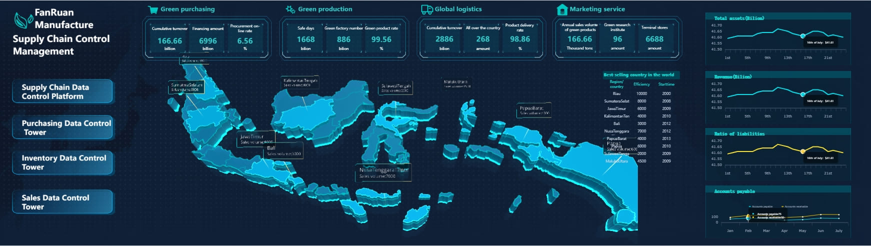
FanRuan's FineReport and FineBI for Enhanced Dashboards
FanRuan offers powerful tools like FineReport and FineBI that take your Excel dashboards to the next level. These tools provide advanced features that enhance your ability to create dynamic and insightful dashboards.
How FineReport Enhances Excel Dashboards
FineReport allows you to create highly formatted, pixel-perfect reports and dashboards. It offers a flexible report designer with a drag-and-drop interface, making it easy to generate detailed reports. With FineReport, you can connect to various data sources, ensuring that your dashboards are always up-to-date with the latest information.
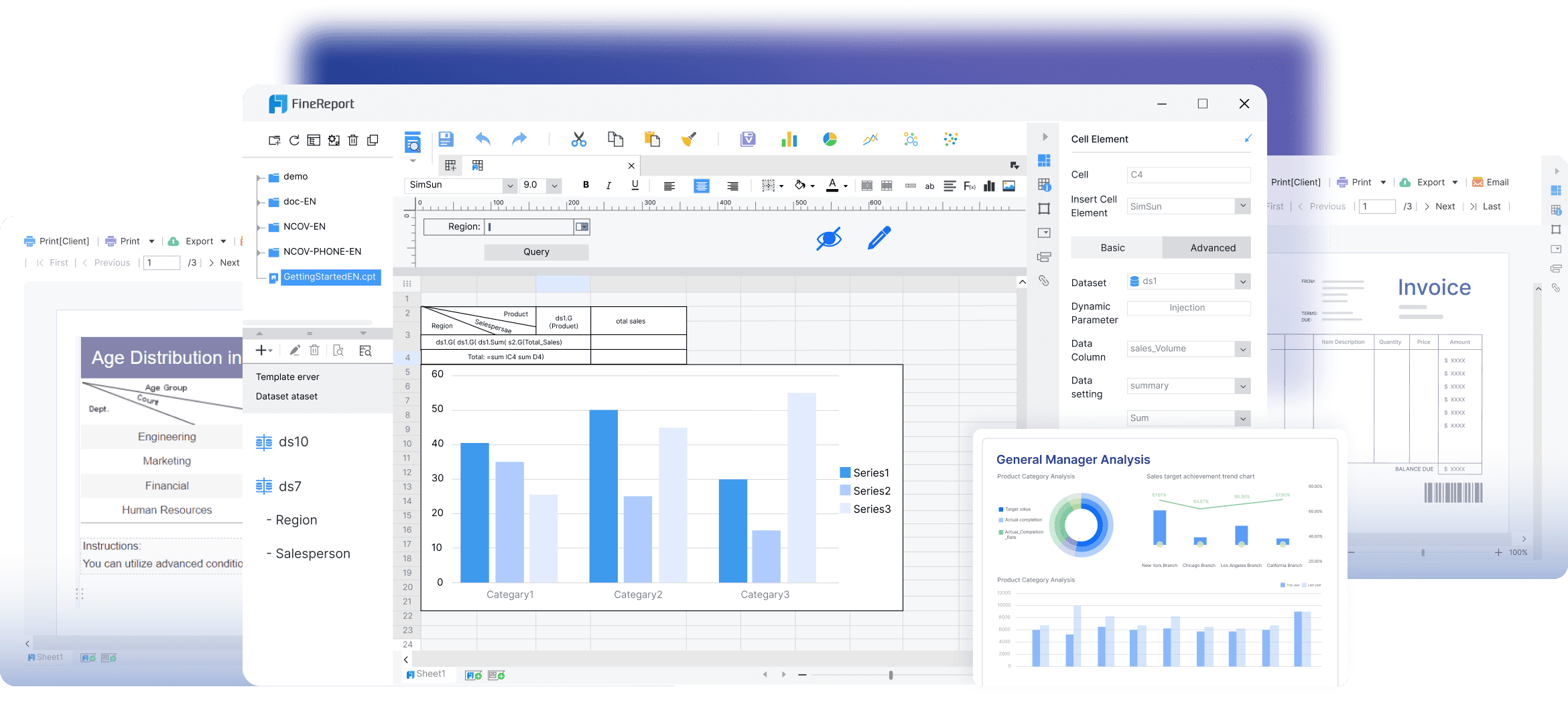
- Dynamic Data Integration: FineReport supports dynamic data updates, allowing your dashboards to reflect real-time changes. This feature ensures that you always have the most current data at your fingertips.
- Interactive Analysis: The tool provides interactive analysis capabilities, enabling users to explore data in-depth and uncover valuable insights.
Pro Tip: Use FineReport to automate report generation and distribution, saving time and reducing errors.

Key Features of FineBI for Dashboard Creation
FineBI is designed to empower business users and data analysts with self-service analytics. It transforms raw data into insightful visualizations, making it easier to track KPIs and identify trends.
- Self-Service Analytics: FineBI allows users to independently explore and analyze data, facilitating informed decision-making without relying on IT support.

- Real-Time Analysis: The tool supports real-time data analysis, ensuring that your dashboards provide timely insights for strategic actions.
- Augmented Analytics: FineBI offers augmented analytics features that automatically generate analysis based on selected data, simplifying the process of deriving insights.
Expert Advice: "FineBI's self-service capabilities empower users to take control of their data analysis, enhancing productivity and efficiency."

By leveraging Excel dashboard templates and integrating tools like FineReport and FineBI, you can create powerful dashboards that drive strategic actions and support informed decision-making. These tools enhance your ability to visualize and interpret data, making complex information accessible and actionable.
Creating an Excel dashboard can transform how you analyze and visualize data. Start by preparing your dataset, then use Pivot Tables and Charts to bring your data to life. Customize your dashboard with slicers and timelines for interactivity. Practice and experimentation are key. Address common FAQs to ease your journey. Remember, the more you explore, the more confident you'll become. So, why wait? Dive into the world of Excel dashboards and unlock the full potential of your data.
Continue Reading About Dashboard
How to Quickly Build a Core App Dashboard
Store Performance Dashboard: Your Retail Command Center
Dynamic Dashboard: A Game Changer for Data Analysis
Master the Square Dashboard in Easy Steps
How to Design a Client Dashboard That Delivers Results
Draft Dashboard Review - Is It the Ultimate DFS Tool?
Mastering the Twitch Dashboard for Streamer Success
Using the Blooket Dashboard to Boost Student Engagement
Mastering the Unity Cloud Dashboard for Effective Use
How to Access the Clover Dashboard Easily
How to Access the Chrysler Employee Portal Easily
Covers Dashboard: Find Your Perfect Match
What Does the Motive Dashboard Do?


