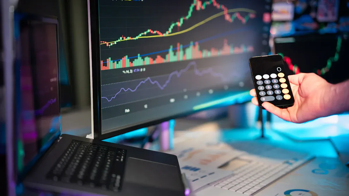
You want your investment dashboard to give you clear answers fast. Many investors struggle with dashboards that cause more confusion than clarity. In a recent survey, only 12% of users said their dashboards made things clearer. Most people felt frustrated and sometimes even went back to using spreadsheets. Common problems include:
- Charts that hide important details
- Too much information on one page
- Hard-to-read layouts
FineBI by FanRuan can help you design your dashboard for better results. Think about your current setup. What would you change to make your insights easier to find?
Optimize Your Investment Dashboard Visuals with FineBI
Choose the Right Visualizations for Investment Data
You want your dashboard to show important information fast. FineBI lets you pick from over 60 chart types. You can use line graphs to see how stock prices change. Area charts help you spot revenue growth. Bar charts let you compare expenses in different groups. Pie charts show how your portfolio is split by region. The drag-and-drop tool makes building dashboards easy for any investment need.
| Visualization Type | Best For |
|---|---|
| Line Graph | Financial trends and time-series data |
| Bar Chart | Comparing expenses or allocations |
| Pie Chart | Revenue breakdown by region |
| Heat Map | Correlations in large datasets |
| Bubble Chart | Market size and investment amount |
Use Color and Labels for Clarity
Think about colors when you make your dashboard. Colors help you highlight important numbers and separate groups. Use bright colors for key numbers. Use soft colors for backgrounds. Keep a contrast ratio of at least 4.5:1 so things are easy to read. Grayscale colors can help remove distractions and make your dashboard look neat. Labels should be simple and clear so everyone knows what each chart shows.
Minimize Visual Clutter
A simple layout makes your dashboard easier to use. Put information under clear headers and group things logically. Show summaries first, then details if needed. Remove extra charts and focus on the most important numbers. This helps you see useful insights faster.
| Principle | Benefit |
|---|---|
| Minimize Mental Effort | Focus on key metrics and insights |
| Organize Information | Clear headers aid understanding |
| Progressive Disclosure | Summaries reduce overwhelm |
You can make your dashboard easy to use by picking the right charts, using colors well, and keeping the layout simple. FineBI’s tools help you build a dashboard that supports smart investment choices.
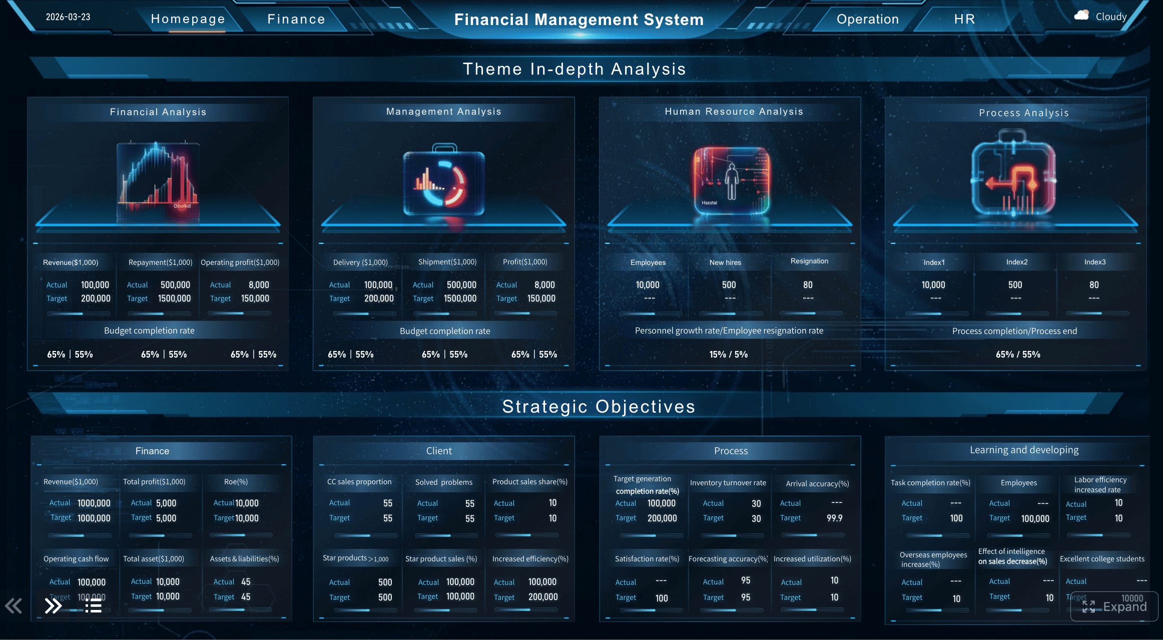
Design Your Investment Dashboard Layout for Actionable Insights
Prioritize Key Investment Metrics
You should see the most important numbers first. FineBI lets you move key metrics where you want. Put revenue, net profit margin, and LTV:CAC ratio in the top left. This spot is easy to notice and helps you decide quickly. Make sure budget to actual variance analysis is simple to find. Use clear visuals and labels so these numbers stand out. When you focus on the most important data, you manage investments better and make faster choices.
Group and Arrange Components Effectively
A good layout puts related information together. You can organize your portfolio by asset class, performance, and risk. Use tables to show how each part helps you manage investments:
| Component Type | Description |
|---|---|
| Total Invested Amount | Quick look at funds invested for fast checking. |
| Stocks, Bonds, Crypto | Asset classes for easy sorting and review. |
| Top Funds | Shows best performers for future investment choices. |
| Diversification | Shows how investments are spread for risk control. |
| Dividend | Shows possible income for cash flow checks. |
Grouping things logically makes your layout easier to read. Putting things in order helps people follow along. Bigger size and brighter color make important numbers stand out. Using the same design and clear labels stops confusion. Filters and other tools let you explore data and find useful insights.
Ensure Responsive Design Across Devices
You want your dashboard to work on any device. FineBI supports layouts that fit desktops, tablets, and phones. Grids and spacing change so charts stay easy to read. Font sizes and chart spaces adjust by themselves. This makes tracking your portfolio easy anywhere. Responsive design makes your dashboard clear and simple to use. You get good investment tools no matter where you are.
Customize Data Views to Match Your Goals in Investment Dashboard
Apply Filters and Alerts in FineBI
You want your dashboard to show the right information. FineBI lets you use filters and alerts that fit your needs. You can filter by stock symbol, keyword, or alert type. This helps you focus on what matters most. Real-time alerts tell you about market changes fast. You get notifications when something important happens. These alerts help you act quickly and manage your investments with confidence.
- Real-time alerts tell you about market changes fast.
- Filters let you see only the data you need.
- Notifications help you react quickly to new risks or chances.
- Categorized alerts make it easy to know what is happening.
These tools help you stay ahead in the market. You can make smart choices for maximum impact.
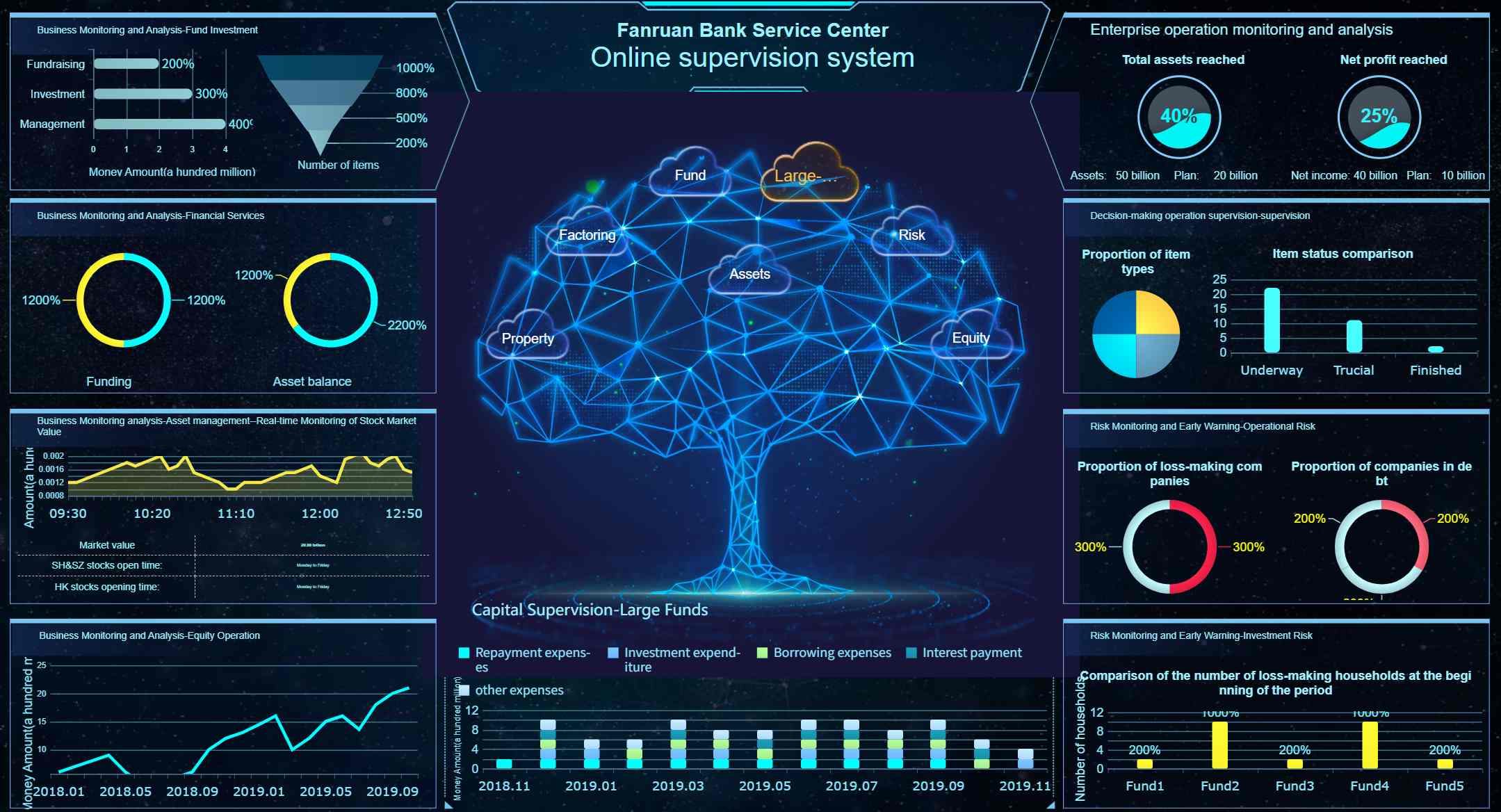
Create Personalized Investment Watchlists
FineBI lets you build dashboards with watchlists just for you. You can track your favorite stocks and see market moves in real time. Watchlists save you time because you do not have to check everything. You get alerts about key events for the stocks you care about. This makes it easier to plan when to buy or sell. Watchlists help you spot new chances and see how trends affect your choices.
Watchlists help you monitor your portfolio better. You can focus on stocks that match your goals. This view helps you make quick decisions and manage risks. You can use your watchlists on any device, so you always stay informed.
Adjust Timeframes and Benchmarks
You can change timeframes and benchmarks in FineBI to fit your strategy. You can look at daily, weekly, or monthly trends. You can compare your results to benchmarks like the S&P 500 or a custom index. This helps you see how your investments do over time.
Customizing data views lets you see the metrics that matter to you. Wealth advisors use this to spot compliance issues and find new chances. You can use self-service analytics, interactive dashboards, and many ways to show your data in FineBI. These features help you explore your dashboard and make better decisions.
| Feature | Description |
|---|---|
| Self-Service Analytics | Lets you do your own data analysis without needing technical skills. |
| Interactive Dashboards | Lets you explore data and dig deeper for more insights. |
| Data Visualization Options | Gives you many ways to show your data for clear communication. |
FineBI gives you tools to make your dashboard fit any investment strategy or role. You can focus on the data that matters most and get the most out of your analysis for maximum impact.
You can make your investment dashboard better by using clear visuals. Smart layouts help you see important information fast. Custom data views let you focus on what matters most. FineBI by FanRuan gives you tools to check your portfolio yourself. You get real-time insights that help you act quickly. You can make decisions faster and use your data to do useful things.
- FineBI lets you look at your portfolio and spot trends fast.
- You manage your portfolio better with simple filters and alerts.
- You make smarter choices for your investments.
| Feature | Description |
|---|---|
| Q&A Data Retrieval | You ask questions and get answers about your portfolio fast. |
| Intelligent Reporting | You see your portfolio data in clear charts and reports. |
| AI Agent Decision Support | You get early warnings and advice for your portfolio. |
Go to FanRuan for more help and a free trial. Start making your portfolio work better right now.


FAQ

The Author
Lewis Chou
Senior Data Analyst at FanRuan
Related Articles

Portfolio Reporting for PMOs: 9 Executive Metrics Every Weekly Portfolio Dashboard Should Include
Weekly portfolio reporting should help executives answer three questions fast: Are we delivering the right initiatives, are we putting outcomes at risk, and what decisions need leadership this week? For PMOs, that means
Yida Yin
Jul 01, 2026

How to Build an Investment Portfolio Reporting Dashboard for Executives: KPIs, Benchmarks, and Drill-Down Views
Investment portfolio reporting for executives is not about showing every holding, transaction, and chart your investment team can produce. It is about giving CEOs, CFOs, CIOs, boards, and investment committees a fast, re
Yida YIn
Jun 25, 2026

12 KPI Reporting Examples for Executive Dashboards: What to Show in Weekly, Monthly, and Quarterly Reviews
Executive leaders do not need more data. They need decision ready $1 examples that match how often they review the business and what actions they are expected to take. A weekly $1 should surface fast moving risks and per
Yida YIn
Jun 25, 2026