Dashboards have become essential tools for modern businesses in Malaysia. They provide a high-level view of organizational activities and enhance your ability to make informed decisions. With real-timedata access, you can spot trends that might not be immediately obvious, allowing for strategic planning. Effective dashboard design simplifies complex data into clear, actionable insights. By combining functionality with engaging data visualization, you can create a dashboard that not only informs but also empowers decision-making at every level in Malaysia.
Understanding the Audience and Purpose for Dashboard Design
Identifying the Target Audience
Before you start creating a dashboard, you need to know who will use it. Different users in Malaysia have different needs. For instance, if your audience includes non-technical users, focus on simplicity and clarity. Use visuals like chartsand graphs to make the data easy to understand. On the other hand, for technical users in Malaysia, you can include more complex data points and interactive features. Understanding your audience helps you decide what information to include and how to present it.
Defining the Dashboard's Primary Goal
Every dashboard should havea clear purpose. Without one, it becomes cluttered and confusing. Start by identifying the main question your dashboard needs to answer. For example, is it tracking sales performance? Monitoring website traffic? Or analyzing customer behavior? A focused goal ensures that every element in the dashboard serves a purpose.
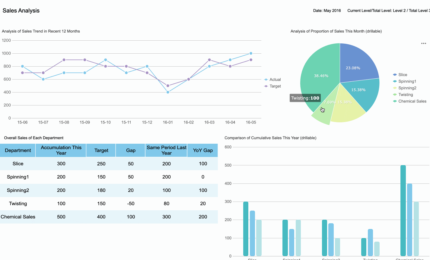
For instance, a sales dashboard is designed specifically to provide an overview of sales performance, helping you track revenue, monitor targets, and identify key trends, just like the dashboard below.
Selecting the right KPIsensures your dashboard delivers actionable insights. Start by understanding your audience and their specific needs. Executives may focus on strategic KPIs like revenue growth, while managers might prioritize operational metrics such as team performance. Analysts often require detailed, analytical KPIs for in-depth evaluations. Tailoring KPIs to these roles enhances the relevance of your dashboard.
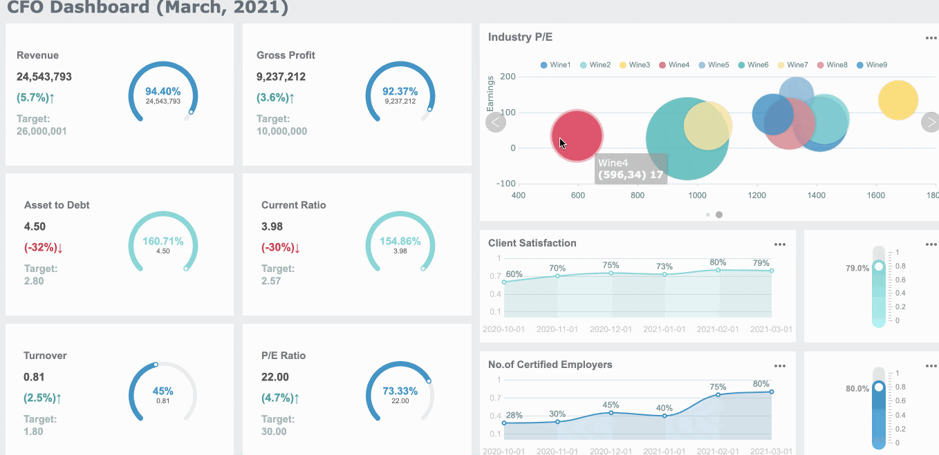
Consider the type of dashboard you are designing. Strategic dashboards highlight high-level goals, while operational dashboards track daily activities. For example, Starbucks successfully integrated customer feedback into their KPI dashboard. This approach improved customer satisfaction and demonstrated the value of aligning KPIs with business needs in Malaysia. For financial leaders, a CFO dashboard provides an essential view of the company's financial health, prioritizing KPIs like cash flow, profitability, and cost management, which are key to making informed decisions on resource allocation and long-term financial strategy.
Tip: Always ask, "Does this KPI help the user make better decisions?" If not, it may not belong on the dashboard.
Avoiding Information Overload
Too much data can overwhelm users and reduce the effectiveness of your dashboard. To avoid this, focus on simplicity. Limit the number of KPIs to three or four key insights. This approach keeps the dashboard clean and ensures users can quickly identify critical information. For instance, presenting only the highest-level metrics helps directors focus on essential areas without distractions.
Start with a simple set of metrics and expand only when necessary. Keep the dashboard to a single page to maintain clarity. A well-designed dashboard prioritizes what matters most, leaving supplementary data for secondary views. This strategy not only prevents distractions but also keeps the team aligned with critical goals.
Note: Simplicity in dashboard design improves usability and enhances decision-making.
Best Practices for Visual Dashboard Design
1. Keep Layout Simple
A clean and simple layout is the foundation of effective dashboard design. Overloading a dashboard with too much information can confuse users and obscure critical insights. Instead, focus on presenting only the most relevant data in a clear and organized manner.
Limit data on a single page: Avoid trying to meet every need in one view. Use tabs or sections to categorize information, making it easier for users to navigate and find what they need.
Create a clear visual hierarchy: Highlight key metrics by placing them prominently and using larger fonts or bold colors. This approach ensures users can quickly identify the most important information.
Reduce clutter: Eliminate unnecessary visual elements like excessive gridlines or redundant labels. A streamlined design enhances readability and usability.
A smooth user experience depends on an appealing and intuitive interface. If users struggle to understand the layout, they may miss out on the benefits of the dashboard. By keeping the design simple, you make it easier for users to focus on actionable insights.
Tip: Use white space strategically to separate sections and improve readability. A well-spaced layout feels less overwhelming and more professional.
2. Choose Effective Chart Types
The right chart type can make or break your dashboard. Each chart serves a specific purpose, so selecting the appropriate one ensures your data is both understandable and impactful.
For example, bar charts work well for comparing sales across regions, while line charts are ideal for tracking monthly revenue trends. Scatter plots, on the other hand, are perfect for identifying correlations between variables. Always match the chart type to the nature of your data and the story you want to tell.
Color plays a crucial role in dashboard design, as it enhances visual appeal and helps guide users' attention to key areas of the data. However, improper use of color can lead to confusion or misinterpretation, which is why it's important to apply color strategically.
Use color coding: Assign specific colors to represent trends, such as green for positive growth and red for declines. This simple yet effective approach helps users quickly understand data at a glance and improves the clarity of insights.
Limit the color palette: Stick to a few complementary colors to maintain a cohesive and clean look. Using too many colors can overwhelm users and detract from the dashboard’s readability and overall effectiveness.
Leverage brand colors: Incorporate your organization’s branding to create a consistent and professional appearance. By doing so, the dashboard not only looks polished but also aligns with your company’s visual identity.
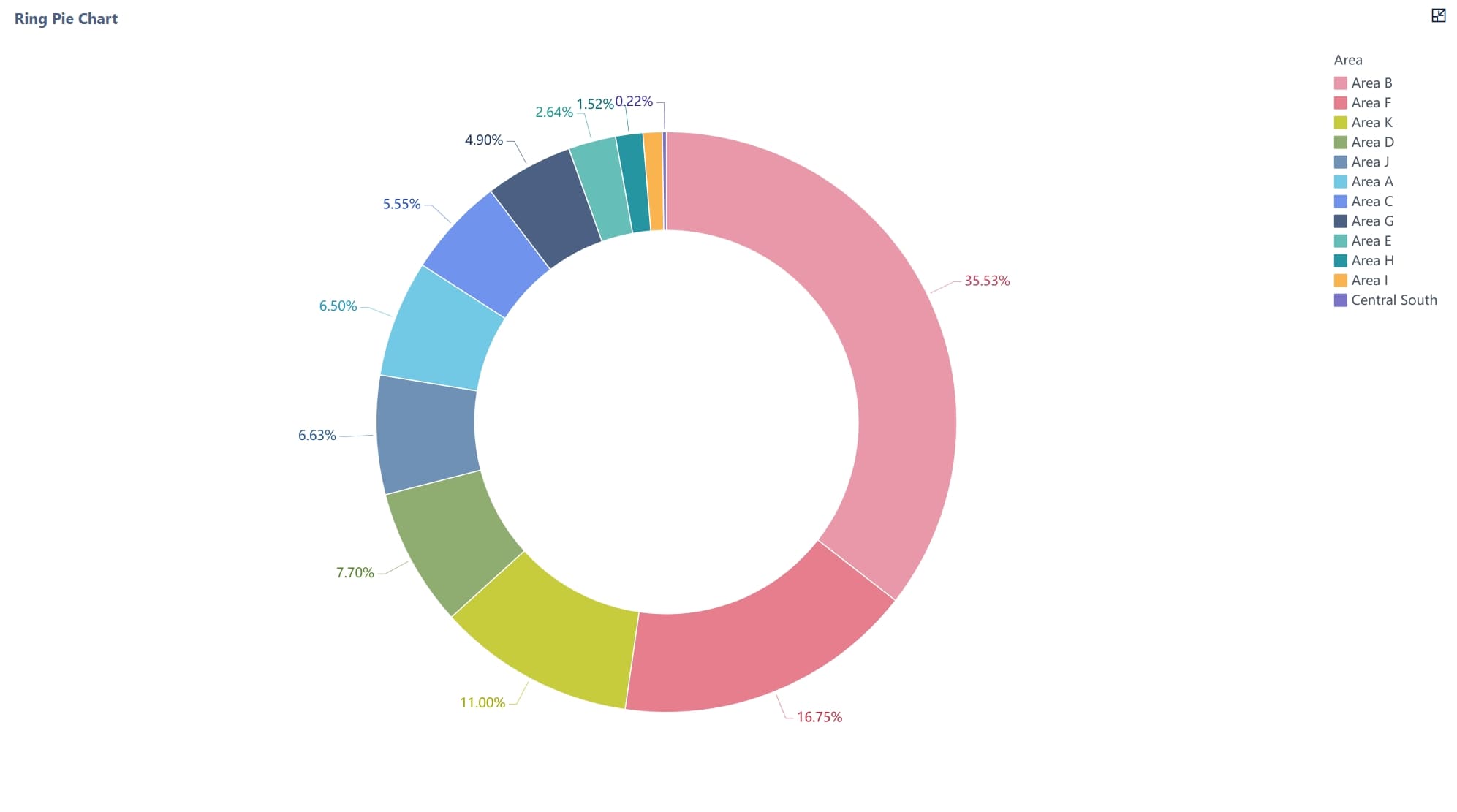
For instance, FineReport offers a variety of built-in color schemes that are designed to enhance readability and provide a visually cohesive experience. These pre-defined palettes help users create well-organized, professional dashboards while ensuring color consistency across all reports.
Use Color Scheme for Dashboard DesignUse Color Scheme for Dashboard Design
Clarity is the cornerstone of effective dashboard design. A clear dashboard ensures users can quickly interpret data and make informed decisions without confusion. By focusing on simplicity, organization, and consistency, you can create dashboards that communicate insights effectively.
Simplify Complex Data
Simplifying complex data is essential for clarity. Use minimal elements to highlight the main insights. For example:
Provide context for metrics to help users understand their significance.
Use descriptive labels and headings to improve comprehension.
Organize information logically to aid interpretation.
A minimalist design reduces cognitive overload, making it easier for users to focus on key information. Positioning important metrics prominently and using size or color contrast can further enhance visibility.
Tip: Avoid clutter by limiting the number of visual elements on a single page. A clean layout improves usability and ensures users can find what they need quickly.
Enhance Readability with Visual Hierarchy
A well-designed visual hierarchy guides users' attention to the most critical information. Highlight essential metrics using bold colors or larger fonts. Arrange data in a logical flow, starting with high-level insights and drilling down into details.
For example:
Place key performance indicators (KPIs) at the top of the dashboard for immediate visibility.
Use contrasting colors to differentiate between positive and negative trends.
Group related data points together to create a cohesive narrative.
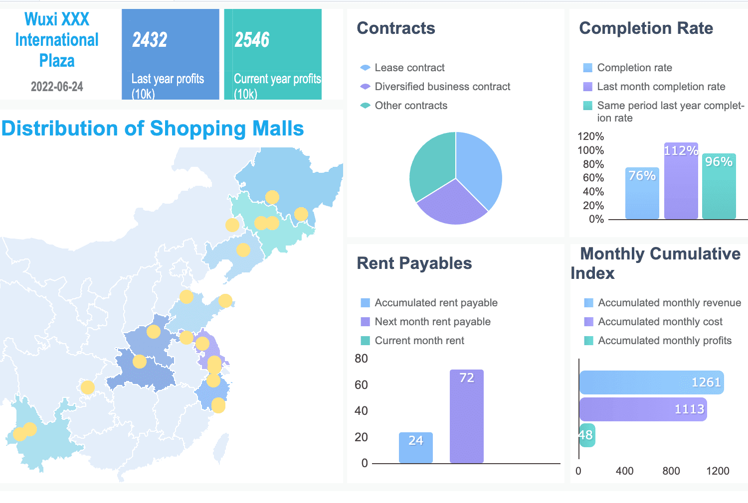
By structuring your dashboard thoughtfully, you ensure users can quickly grasp the most important insights. The following dashboard created with FineReport demonstrates how a visual hierarchy can be effectively applied. Key metrics such as distribution and completion rates are prominently placed at the top, with color-coding used to clearly differentiate between various data points, making the dashboard intuitive and easy to read.
Note: Training stakeholders in data literacy can further enhance their ability to interpret dashboards effectively.
Incorporating Interactivity in Dashboard Design
Adding Filters and Drill-Down Options
Filters and drill-down options are essential features of aninteractive dashboard. They allow users to explore data dynamically and uncover deeper insights. Filters enable you to narrow down data views based on specific criteria, such as time periods, regions, or product categories. Strategically placing filters ensures they are easy to access and use. Cascading filters, which update based on user selections, create a seamless and hierarchical filtering experience.
Drill-down functionality takes interactivity a step further. It allows you to click on data points or visualization elements to access more detailed information. For example, clicking on a bar in a sales chart might reveal sales data for individual products within that category. This feature not only enhances the usability of the dashboard but also empowers you to makedata-driven decisions quickly.
Interactive filters and slicers improve user engagement by enabling dynamic data exploration.
Companies using interactive dashboards are 28% more likely to find timely insights compared to those relying on static reports.
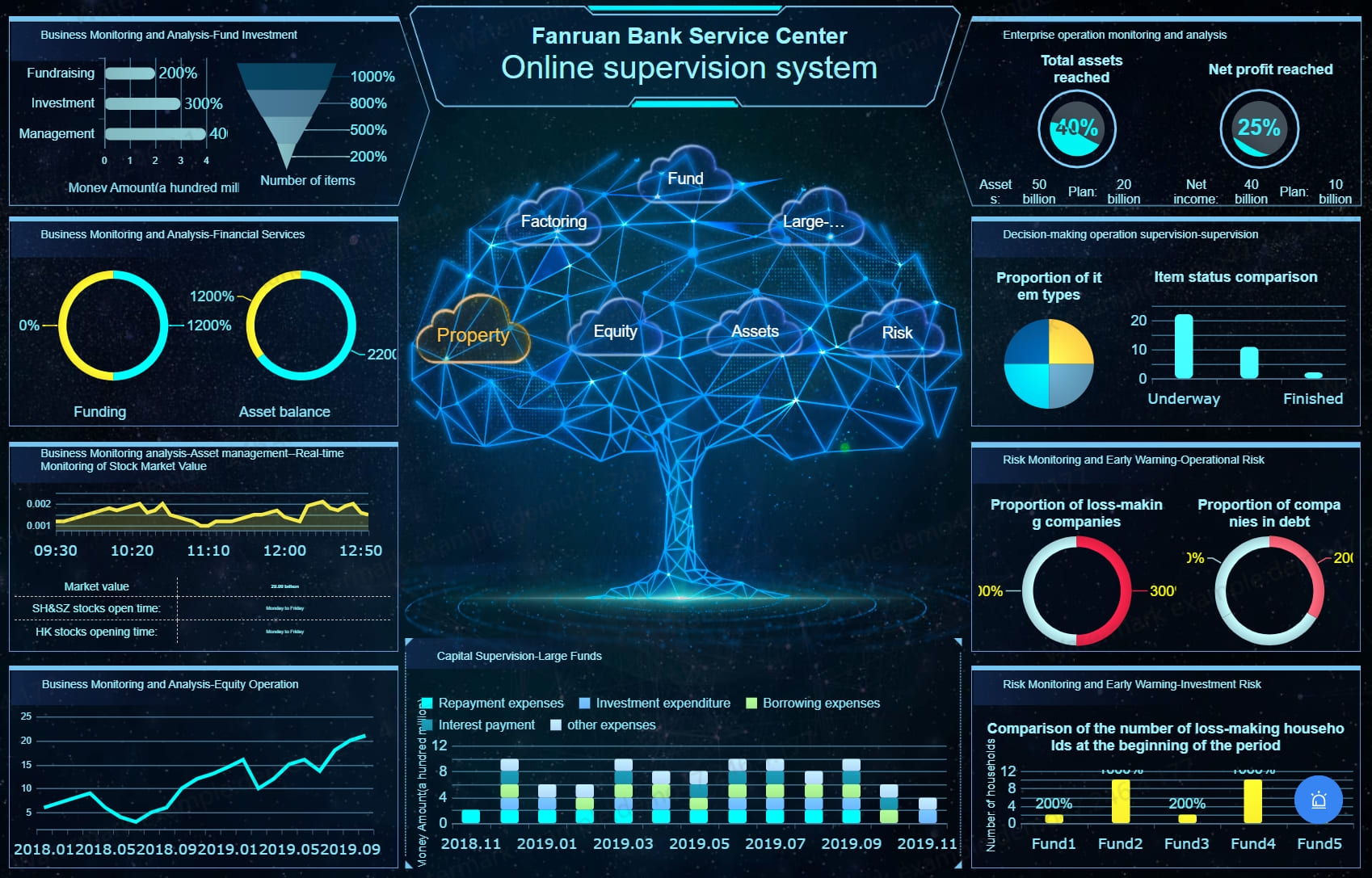
Below is an interactive demo of FineReport's Financial Management System. Click to explore and experience the dynamic options firsthand.
User customization significantly improves the usability of an interactive dashboard. By allowing users to tailor dashboards to their preferences, you ensure they can focus on the data most relevant to their roles. Customizable features might include the ability to rearrange widgets, select preferred chart types, or save personalized views.
Customization fosters a sense of ownership among users, encouraging them to interact with the dashboard more frequently. It also reduces reliance on IT teams for minor adjustments, saving time and resources.
Enhancing User Engagement Through Interactivity
Interactive elements play a crucial role in boosting user engagement in Malaysia. Features like filters, drill-down options, and customization encourage active participation, making the dashboard more than just a static display of data. Interactive dashboards can increase user engagement by up to 40%, as reported by Tableau. Organizations with highly interactive dashboards are also 1.5 times more likely to improve their operational performance.
Key metrics can help you measure the effectiveness of interactivity:
Metric
Description
User Engagement
Tracks unique users, session duration, and frequency of access.
User Feedback
Surveys and feedback forms reveal user preferences and pain points.
Data Utilization
Identifies which data elements are accessed most frequently.
Measures how well the dashboard drives specific actions like sales or sign-ups.
Time-to-Insight
Evaluates how quickly users can derive actionable insights.
Dashboard Adoption
Analyzes adoption rates among user groups to identify underutilized areas for improvement.
Incorporating interactive features users to explore data actively. This approach not only enhances engagement but also ensures that users derive maximum value from the dashboard.
FineBIand FineReport, two leading BI tools developed by FanRuan, areexcellent examples of highly interactive and customizable data visualization platforms.
FineBI is tailored forself-service data analysis. It empowers business users in Malaysia to explore data flexibly through drag-and-drop operations, dynamic filtering, and drill-down capabilities, making it ideal for frequent data consumers who need agile insights.
FineReport, on the other hand, is optimized for professional report development. It excels at producing complex, structured reports with advanced formatting requirements, such as cross-tab reports, multi-level headers, and data entry forms, which are essential for finance or administrative departments.
This distinction is important when selecting the right tool for your dashboard needs. For example, while business teams may rely on FineBI for analyzing real-time sales trends, financial teams can utilize FineReport to generate monthly reports and manage data submission processes efficiently.
In Malaysia, both FineReport and FineBI are supported by a dedicated local team, providing localized project implementation and technical support to ensure seamless deployment and optimized performance tailored to Malaysian enterprises.
Iteration and Feedback in Dashboard Design
Iteration and feedback are essential forcreating dashboards that truly meet Malaysia's user needs. A well-designed dashboard evolves over time, incorporating user insights and adapting to changing requirements. By embracing an iterative approach, you can refine your design and ensure it remains relevant and effective.
Why Iteration Matters
Iterative design allows you to test, learn, and improve continuously. Testing a dashboard with a small group of users before a full rollout helps identify issues early. This process not only saves costs but also boosts stakeholder confidence. For example, gathering feedback on prototypes can reveal errors or usability challenges that might otherwise go unnoticed. Each iteration provides an opportunity to address these issues and enhance the user experience.
Tip: Start with a basic version of your dashboard and gradually add features based on user feedback. This approach ensures that the final product aligns with user expectations.
The Role of Feedback
User feedbackis a powerful tool for improving dashboards. Engaging users during the design process helps you understand their goals and pain points. This insight allows you to define the dashboard’s scope and key metrics effectively. Consulting with users also increases the likelihood of adoption, as they feel involved in the process.
Involve users in Malaysia early to ensure the dashboard reflects their needs, not just internal metrics.
Use feedback to adapt to evolving requirements and market trends.
Regularly review and update the dashboard to maintain its relevance.
Notably, tools like FineBI and FineReport continue to evolve through regular updates and user-driven feedback, improving both interactivity and usability across use cases.
Effective dashboard design combines simplicity, clarity, and functionality. Focus on understanding your audience, selecting relevant metrics, and using visuals strategically. These steps ensure your dashboard delivers actionable insights. Apply these practices to create dashboards that empower decision-making and drive results.
Remember, dashboards evolve over time. Regularly gather user feedback and refine your design to meet changing needs. Iteration ensures your dashboard remains relevant and impactful. By prioritizing user input, you create tools that truly support your goals.
Click the banner below to experience FineReport for free and empower your enterprise to convert data into productivity!
Access a wealth of case studies, industry insights, and solution guides to accelerate digital transformation.
FAQ
What is the ideal number of KPIs for a dashboard?
You should aim for 3-5 key performance indicators (KPIs) per dashboard. This keeps the design focused and prevents information overload. Highlight only the most critical metrics that align with your goals.
How often should you update your dashboard?
Update your dashboard as frequently as your data changes. For real-time insights, use tools like FineBI or FineReport to ensure continuous updates. Static dashboards may only need updates weekly or monthly, depending on your business needs.
What are the best tools for creating interactive dashboards?
Tools like FineBI and FineReport excel at creating interactive dashboards. They offer features like filters, drill-down options, and real-time data integration. These tools simplify complex data and enhance user engagement.
How can you ensure your dashboard is user-friendly?
Focus on simplicity and clarity. Use intuitive layouts, clear labels, and consistent design elements. Incorporate interactive features like filters to let users explore data easily. Test your dashboard with a small group to gather feedback.
Why is color important in dashboard design?
Color enhances readability and draws attention to key insights. Use a limited palette to avoid overwhelming users. Apply color coding for trends, such as green for growth and red for declines. Align colors with your brand for a professional look.