You transform complex data into clear, actionable visuals as a data visualization specialist. Your main role involves visualizing data so stakeholders can quickly grasp trends and patterns. Industry reports show that demand for data visualization professionals has surged in recent years. Companies in IT, healthcare, and retail now rely on specialists like you to turn raw information into visual representations of data that drive decisions. With tools such asFineBI fromFanRuan, you gain the power to deliver real-time data insights through advanced visualization. Even as AI automates basic tasks, your expertise remains essential for guiding business strategy. Data visualization education helps you stay ahead in this rapidly growing field.
Responsibilities of Data Visualization Specialist
Data Visualization Specialist Tasks
Visual Design
As a data visualization specialist, you play a key role in turning raw data into engaging graphics that tell a clear story. You use data visualization techniques to create charts, graphs, and dashboards that highlight important trends and patterns. Your work helps others see what the numbers mean at a glance.
You focus on making visuals accurate and easy to understand. You choose the right colors, labels, and chart types to avoid confusion. Good design means your audience can spot outliers, trends, and key points quickly. You also make sure your visuals are not cluttered or misleading. This attention to detail supports better decision-making across your organization.
Tip: Always preview your visualizations to check for clarity and accuracy before sharing them with others.
Data Analysis
You start every project by cleaning and preparing data. This step removes errors, duplicates, and inconsistencies. Clean data leads to better analysis and more reliable results. You process data so it is ready for visualization, often using programming languages like Python or SQL.
Yourdata analysis skills help you find patterns and insights that matter. You use data visualization tools such as FineBI, Tableau, or Power BI to build dashboards and reports. These tools let you explore data from different angles and share your findings with others. You also use data storytelling to connect your analysis to real business needs, making your insights more meaningful.
Check for accuracy and avoid common visualization mistakes.
Communicate insights through clear and engaging visuals.
Role
Common Daily Tasks and Responsibilities
Data Visualization Specialist
Designing and developing visual reports and dashboards; collaborating with teams to align visualizations with business goals; using tools like Tableau and Power BI.
Data Visualization Analyst
Interpreting data and creating visual stories; building charts, graphs, and interactive dashboards; making data accessible and actionable for stakeholders.
Business Intelligence Developer
Designing, building, and integrating data sources; developing complex dashboards and reports to track organizational performance.
Data Storyteller
Crafting narratives around data to engage and inform audiences; blending analytical skills and creativity to communicate insights effectively.
Collaboration
Working with Teams
You rarely work alone as a data visualization specialist. You often join forces with analysts, engineers, and business leaders to complete data visualization projects. Your job is to analyze large datasets and design visuals that match the goals of each department.
You use collaboration tools like Slack, Notion, or Figma to share ideas and get feedback. Project management platforms such as Trello or Asana help you track progress and coordinate tasks. You adapt your workflow to fit the data literacy of your teammates. Some may need detailed explanations, while others want quick, visual answers.
Note: Collaboration helps you deliver visualizations that meet real business needs and support team goals.
Stakeholder Communication
You act as a bridge between technical experts and non-technical stakeholders. Before you present data, you learn about your audience’s background and goals. You avoid jargon and use simple language to keep everyone engaged.
You focus on key insights and use charts, graphs, and dashboards to make complex data easy to understand. You structure your message as a story: identify the problem, show your analysis, and explain the benefits. You choose the right format—such as reports, slide decks, or interactive dashboards—based on what your audience prefers.
You also prepare for questions and provide clear explanations. This approach ensures your data visualization skills help everyone make informed decisions.
Skills & Tools of Data Visualization Specialist
Technical Skills
Data Integration
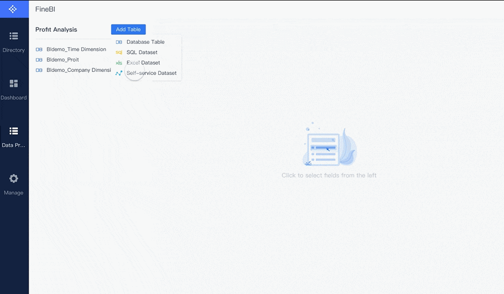
You need strong data integration skills to succeed as adata visualization specialist. You often work with data from many sources, such as databases, spreadsheets, and cloud platforms. You must know how to connect, clean, and combine this data so it is ready for analysis. FineBI by FanRuan makes this process easier. It lets you connect to over 60 data sources, including SQL databases, Excel files, and APIs. You can use FineBI to schedule updates and keep your dashboards current. This helps you deliver real-time insights and ensures your data is always accurate.
Tip: Mastering data integration saves you time and helps you avoid errors in your visualizations.
Programming Languages
You will use several programming languages in your daily work. Python and R are the most popular choices for data visualization specialists. Python offers powerful libraries like Matplotlib, Seaborn, and Plotly. R is great for statistics and advanced graphics, especially with packages like ggplot2. SQL is also essential. You use it to extract and manage data from large databases. Sometimes, you may use JavaScript, especially if you want to create interactive web-based visualizations with libraries like D3.js. Knowing these languages helps you build custom visualizations and handle complex data tasks.
Python: Flexible and beginner-friendly, with many visualization libraries.
R: Designed for statistics and advanced data analysis.
SQL: Key for querying and managing data in databases.
JavaScript: Useful for interactive, web-based visualizations.
Visualization Tools
FineBI by FanRuan
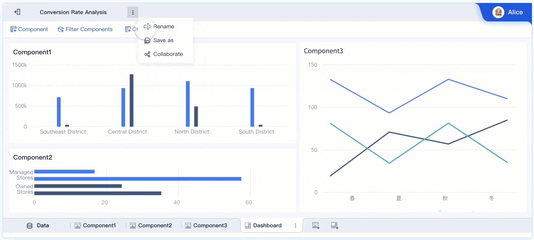
FineBI stands out among data visualization tools. It supports self-service analytics, real-time dashboards, and seamless data integration. You can create interactive dashboards using drag-and-drop features, making it easy to explore and present your data. FineBI offers a wide range of chart types, from simple bar graphs to advanced KPI cards. You can drill down into your data, apply filters, and customize layouts for any device. FineBI also supports team collaboration, allowing you to share dashboards and work together on projects. Its enterprise-level security ensures your data stays safe.
You may also use other business intelligence platforms in your career. Tableau, Power BI, and Looker are popular choices worldwide. Tableau is known for its interactive dashboards and strong mapping features. Power BI is favored for its integration with Microsoft products and user-friendly design. Looker offers cloud-native analytics and works well with Google Cloud. Each tool has unique strengths, but all help you turn raw data into clear, actionable insights.
You must communicate your findings clearly to both technical and non-technical audiences. Good communication helps you explain complex data in simple terms. You use storytelling to make your insights memorable and easy to understand. Active listening is also important. It helps you understand what your team and stakeholders need from your visualizations.
Problem-Solving
Problem-solving is at the heart of your role. You break down complex business questions and design visualizations that answer them. You use critical thinking to choose the best way to present your data. You also adapt to feedback and improve your work based on team input. These skills help you deliver visualizations that drive better decisions.
Note: Strong communication and problem-solving skills set you apart as a data visualization specialist.
Work Environment of Data Visualization Specialist
Industries
Manufacturing
You play a vital role in manufacturing by helping teams monitor production, track inventory, and improve quality control. Many companies in this sector rely on your skills to visualize data from sensors, machines, and supply chains. You help managers spot bottlenecks and reduce downtime. The manufacturing industry often uses dashboards to display real-time data, making it easier to respond quickly to changes on the factory floor. Companies in this field also use data visualization to support lean management and optimize logistics.
You find the finance industry full of opportunities for data visualization specialists. Financial institutions depend on you to analyze large volumes of data, track market trends, and assess risks. You create dashboards that show real-time analytics, helping teams make fast and accurate decisions. Your work supports credit risk assessment, portfolio forecasting, and regulatory compliance. In finance, you often use data to simulate scenarios and evaluate exposure. The demand for your skills continues to grow as the data visualization market expands in banking, insurance, and fintech.
You help healthcare organizations manage complex data from many sources, such as electronic health records, clinical trials, and wearable devices. Your dashboards support real-time monitoring of patient flow and treatment outcomes. You also help hospitals manage resources like ICU beds and staff schedules. Healthcare teams rely on your visualizations to improve patient care, track infectious disease spread, and ensure compliance with regulations. You often work with interactive dashboards and infographics to make clinical and operational data easy to understand.
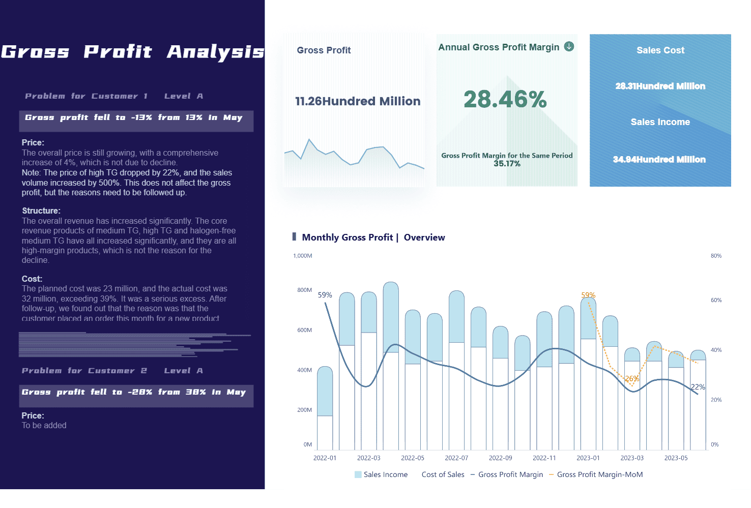
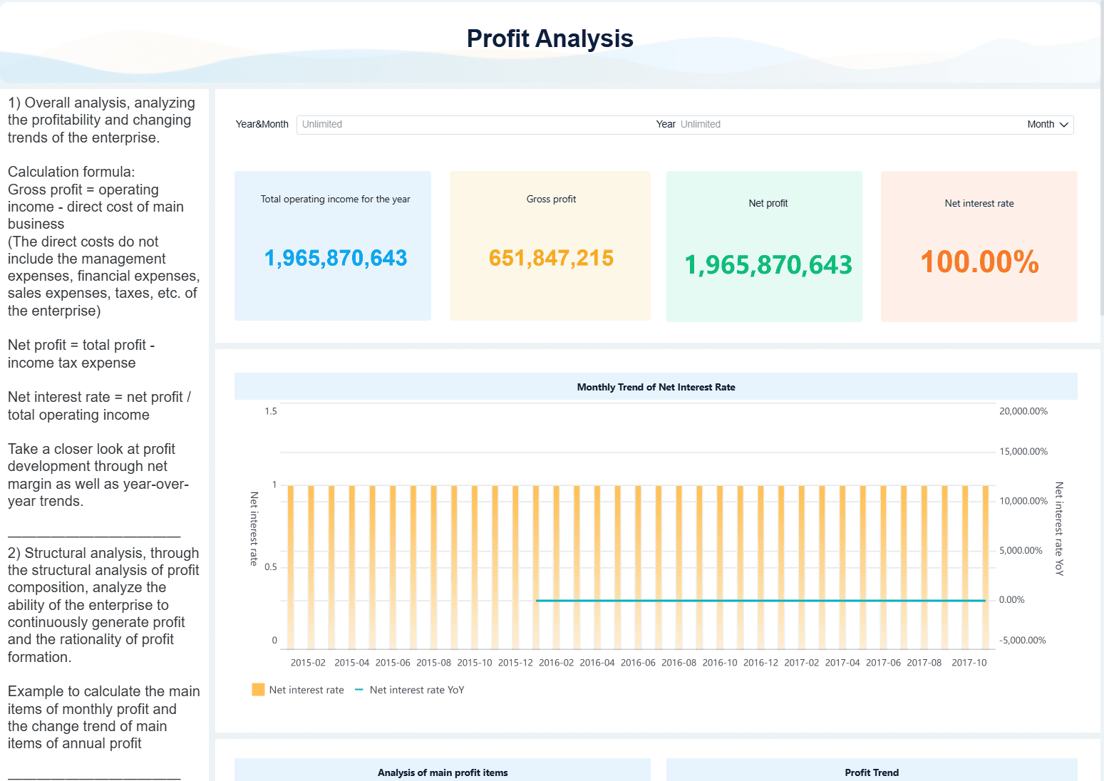
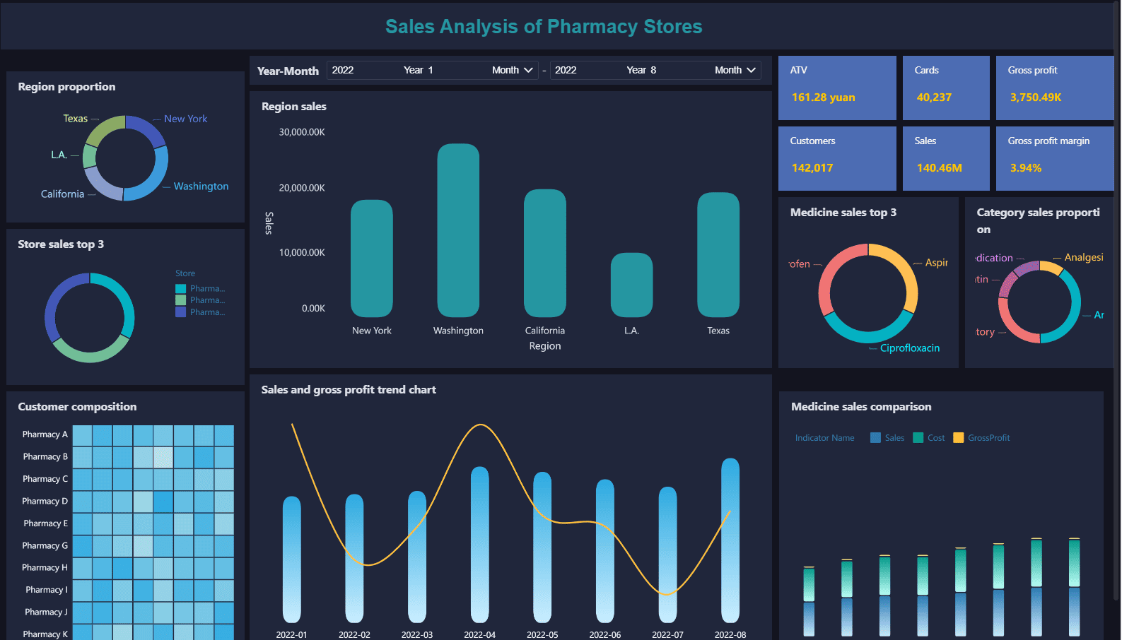
Sales Analysis of Pharmacy Stores Created by FineBI
Note: The top industries employing data visualization specialists include healthcare, finance, manufacturing, IT, consulting, retail, transportation, and logistics. These sectors rely on your expertise to turn raw data into actionable insights.
Employers
Corporations
You may work for large corporations that need to analyze business performance, customer behavior, and market trends. In these settings, you often join teams focused on leadership and strategic planning. Your role involves creating dashboards for executives and supporting data-driven decision-making. Corporations value your ability to integrate data from multiple sources and present it in a clear, visual format. You help drive business growth by making complex information accessible to all departments.
Public Sector
You also find many opportunities in the public sector. Government agencies and public organizations use your skills to improve public safety, emergency response, and healthcare services. You analyze real-time data to help reduce traffic accidents, plan disaster responses, and monitor public health. In the public sector, you often focus on operational roles, working as an analyst to improve service delivery and efficiency. Your work supports cross-department data sharing and helps agencies make informed decisions for the public good.
Role Type
Public Sector Representation
Private Sector Representation
Key Insight
Analysts
Higher
Lower
Public sector focuses on operational analysis
Leaders
Lower
Higher
Private sector emphasizes leadership roles
Collaboration with FanRuan Solutions
You can enhance your impact by using FanRuan solutions like FineBIand FineReport. These tools integrate with major enterprise systems, such as SAP and Oracle, to unify financial and operational data. You benefit from drag-and-drop interfaces that make KPI tracking simple, even for non-technical users. FanRuan solutions support AI-driven analytics, natural language queries, and automated reporting. This helps you generate insights faster and share them across your organization. Large companies and government projects trust FanRuan to improve collaboration, transparency, and decision-making. The platform’s scalability and real-time data analysis capabilities make it a strong choice for organizations with complex data needs.
Tip: FanRuan solutions help you break down data silos and empower teams to act as citizen data scientists, driving better results in any industry.
Impact of Data Visualization Specialist
Business Value
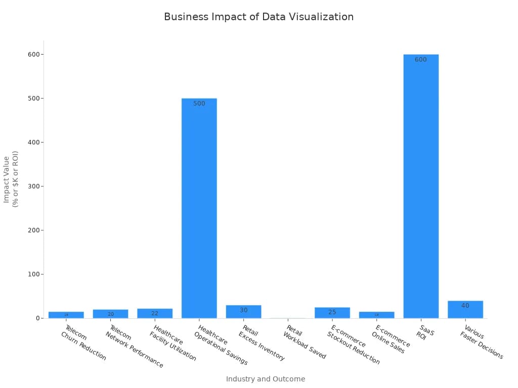
You create measurable business value when you turn raw data into clear visuals. Many organizations seereal financial gains and operational improvementsbecause of your work. For example, a beverage company unlocked $10 million in annual revenue by using decision-driven analytics. A pet care retailer grew by 30% and increased its market share by 50 basis points after gaining access to targeted business analytics. Your skills help companies save money, improve efficiency, and make smarter choices.
Here are some real-world results:
A digital automotive retailer improved both dealer and buyer experiences with better web analytics and visualization tools.
A US manufacturer managed expenses more effectively and increased analytics adoption through user-friendly dashboards.
A regional utility company saved up to $30 million and prevented outages by using predictive analytics and visualization.
You can see the impact across industries in the chart below:
Your work also leads to cost savings and higher returns. Clients using visualization and AI solutions report average cost savings of 40%. Smart automation reduces manual tasks by 70%, and companies see up to five times return on their investment.
Decision-Making
You help organizationsmake faster and better decisions. Data visualization allows leaders to spot trends and patterns quickly. Studies show that companies using visualization are 28% more likely to find timely information. Decision-makers become seven times more effective at analyzing data. Many organizations report that decision-making speed improves by five to six times after adopting visualization tools.
You also make data insights easier to understand for everyone. For example, a retail chain projected a 25% sales increase by using advanced visualization to identify buying patterns. A healthcare provider improved patient outcomes and reduced costs by 30% with interactive dashboards. Capital One saw a 20% productivity boost, and 75% of employees reported better decision-making after using interactive dashboards.
Organizations measure your impact by tracking how quickly and confidently teams make decisions. They look at key performance indicators like revenue growth, cost savings, and customer satisfaction. User adoption rates and feedback also show how your work leads to more data-informed decisions.
FanRuan BI Solutions
FanRuan’s BI solutions, including FineBI, help you maximize your impact as a data visualization specialist. You can create customizable dashboards and reports that adapt to changing business needs. FineBI offers real-time data insights through interactive dashboards and self-service analytics. You can connect to many data sources, ensuring your analysis is always current and accurate.
FanRuan stands out for its scalability, security, and user-friendly design. You can manage growing data and user demands without losing speed or performance. Advanced controls protect sensitive data and ensure compliance. The platform supports remote collaboration, AI automation, and cloud-based data access, making it easy for you to deliver data insights anytime, anywhere.
With FanRuan, you empower your organization to move from intuition-based choices to true data-driven decision-making. You help teams respond quickly to market changes and customer needs, supporting business growth and agility.
As a data visualization specialist, you turn complex data into clear insights that drive business value. Both technical and communication skills are essential for success in data visualization careers. To advance, consider these steps:
Build a strong portfolio with diverse projects.
Earn recognized certifications, such as Tableau or Power BI.
Smarter product, pricing, and inventory management across retail sectors.
FAQ
What skills do you need to become a data visualization specialist?
You need strong analytical skills, attention to detail, and creativity. You should know how to use visualization tools like FineBI. Communication and problem-solving skills help you explain your findings to others.
Which industries hire data visualization specialists?
You can find jobs in finance, healthcare, manufacturing, retail, and government. Many companies need your skills to turn data into clear visuals for better decisions.
How does FineBI help with data visualization?
FineBI lets you connect to many data sources and create interactive dashboards. You can use drag-and-drop features to build charts and reports. FineBI supports real-time analysis and team collaboration.
Do you need programming knowledge for this role?
You benefit from knowing Python, R, or SQL. These languages help you clean data and build custom visualizations. Some tools, like FineBI, let you create dashboards without coding.
What is the value of data visualization education?
Data visualization education gives you the skills to turn complex data into clear visuals. You learn best practices, tool usage, and how to communicate insights. This education helps you stay competitive in the job market.