A line plot is one of the simplest ways to show how often values appear in a small dataset. Despite its simplicity, people frequently confuse it with line graphs and line charts — and that confusion leads to choosing the wrong visualization for the job.
This guide defines a line plot precisely, shows you how to build one step by step, explains when it works (and when it does not), and clarifies the difference between a line plot, a line graph, a line chart, and a scatter plot. If you work in business analytics, the final section explains how these concepts connect to dashboards and BI tools like FineBI.
What Is a Line Plot?
A line plot is a graphical display that shows the frequency of individual values along a number line. Each occurrence of a value is marked with an X, a dot, or another symbol directly above that value on a horizontal axis. The result is a simple distribution view: you can instantly see which values are common, which are rare, and where clusters or gaps exist.
Line plots are also called dot plots or frequency plots in some textbooks. They are most common in education, introductory statistics, and situations where datasets are small enough to count individual observations.
Key characteristics of a line plot
The horizontal axis is a number line with evenly spaced values.
Each mark (X or dot) represents one observation.
Marks are stacked vertically above each value to show frequency.
There is no connecting line between marks — this is what distinguishes it from a line graph.
It works best with small datasets (typically fewer than 50 observations) and discrete or whole-number values.
A line plot answers one question clearly: "How often does each value occur?"
Line Plot vs Line Graph vs Line Chart
These terms are often used interchangeably, but they describe different visualizations. Choosing the wrong one confuses your audience and misrepresents your data.
Chart Type
Best For
Common Use
Line plot
Showing frequency on a number line
Small datasets, classroom math, simple distributions
A line plot displays frequency of discrete values. Marks sit on a number line. No line connects them. The data is categorical or discrete.
A line graph displays continuous change over time (or another continuous variable). Data points are connected by lines to show direction and rate of change. The axes represent continuous scales.
Line graph vs line chart
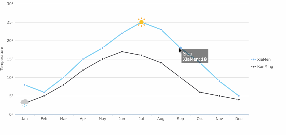
In practice, "line graph" and "line chart" are often synonymous. In business contexts, "line chart" typically refers to time-series visualizations inside dashboards and BI tools, while "line graph" appears more in academic and scientific writing. Functionally, they serve the same purpose: showing trends across a continuous dimension.
When someone says "line plot" but means "line chart": This is the most common source of confusion. If your goal is to track revenue over months, website traffic over days, or any metric over time, you need a line chart — not a line plot. A line plot cannot show temporal trends because its axis represents value frequency, not time.
Components of a Line Plot
Every line plot has four essential components:
Title: States what the data represents (e.g., "Test Scores for Class A").
Number line (horizontal axis): Displays the range of values in the dataset, evenly spaced. The scale must cover all observed values.
Marks (X or dots): Each mark represents one data point. Multiple occurrences of the same value are stacked vertically.
Labels: Axis labels clarify units. A key or legend is only needed if multiple categories share the same number line.
Optional but helpful additions:
Frequency labels: Numbers above the tallest stack to make exact counts readable without counting marks.
Color coding: Different colors for subgroups (e.g., male vs. female scores on the same number line).
Annotations: Callouts highlighting outliers, modes, or notable clusters.
A well-constructed line plot should be readable in under five seconds. If viewers need to count marks laboriously, add frequency labels. If the number line is too crowded, consider grouping values into bins or switching to a histogram.
How to Create a Line Plot Step by Step
Follow these steps to build a line plot manually or in any visualization tool:
Step 1: Collect Your Data
Gather a small dataset of discrete values. Example: test scores from 20 students — [78, 82, 85, 85, 88, 90, 90, 90, 91, 92, 93, 93, 95, 95, 96, 97, 98, 98, 99, 100].
Step 2: Identify the Range
Find the minimum and maximum values. In this example: min = 78, max = 100. Your number line must span at least this range.
Step 3: Draw the Number Line
Create a horizontal axis with evenly spaced tick marks covering the full range. Choose intervals that keep the plot readable (every 1, 2, or 5 units depending on the range).
Step 4: Plot Each Observation
For each value in the dataset, place an X (or dot) above the corresponding position on the number line. Stack marks vertically when values repeat. For example, three students scored 90, so place three X's stacked above "90."
Step 5: Add Title and Labels
Write a descriptive title. Label the axis with the variable name and units (e.g., "Score (points)").
Step 6: Interpret
Identify the mode (most frequent value), range, clusters, gaps, and outliers. In our example: mode = 90 (three occurrences), cluster = 90–100, gap = 79–81, no extreme outliers.
Line Plot Example with Sample Data
Consider a teacher who wants to understand the distribution of quiz scores for a class of 25 students.
Shape: Left-skewed — most scores cluster toward the high end
This level of insight is exactly what line plots deliver: fast, intuitive understanding of small discrete distributions. No software required.
When Should You Use a Line Plot?
Line plots excel in specific situations:
Small datasets (under 50 observations) where individual values matter.
Discrete or whole-number data such as test scores, survey ratings, defect counts, or age groups.
Finding the mode or identifying clusters and gaps quickly.
Educational settings where the goal is teaching basic statistical concepts like frequency, distribution, and central tendency.
Quality control spot checks where a technician records defect counts per batch and needs to see if one count dominates.
Comparing two small groups side by side on the same number line (e.g., before vs. after training scores).
The common thread: you care about how often specific values occur, not about trends over time or relationships between variables.
When Not to Use a Line Plot
Line plots fail when the data or the analytical question falls outside their scope:
Large datasets (50+ observations): Marks become unreadable. Use a histogram or box plot instead.
Continuous data with many unique values: Too many positions on the number line; marks spread out with no stacking. Use a histogram with bins.
Time-series data: Line plots have no time axis. Use a line chart or line graph.
Relationships between two variables: Line plots show one variable's distribution only. Use a scatter plot.
Business KPI tracking: Revenue, conversion rates, and operational metrics change over time. Use a line chart inside a BI dashboard.
Multi-dimensional comparisons: Line plots handle one variable (or two groups on one axis). Use bar charts, grouped histograms, or heatmaps for richer comparisons.
If you find yourself forcing data into a line plot format and the result looks cluttered or uninformative, switch to a more appropriate chart type. The goal is clarity, not fidelity to a specific format.
From Line Plots to Business Dashboards
A line plot is useful for learning basic data distribution, but business teams usually need line charts, trend dashboards, filters, drill-down analysis, and scheduled reporting. In FineBI, teams can turn sales, finance, operations, and customer data into interactive line charts and dashboards without manually rebuilding charts in spreadsheets.
Interactive Line Charts
FineBI supports the full spectrum of business visualizations that go beyond what a line plot can offer:
Line charts for time-series trend analysis with automatic date-axis handling
Interactive filters that let users slice trends by region, product, or team
Drill-down capabilities from annual summaries to daily detail
Scheduled reports delivered to stakeholders automatically
Self-service exploration so business users can build their own trend views without IT support
When dashboard data is governed and connected, Dora can help business users ask follow-up questions, summarize trend changes, and explain why a KPI moved, instead of only viewing the line chart manually.
The progression is natural: learn distribution basics with line plots, graduate to line charts for business trends, and embed those charts in governed dashboards where AI-assisted analysis extends their value.
FAQs
No. A line plot shows frequency of discrete values on a number line using stacked marks. A line graph shows continuous change over time using connected data points. They serve different purposes and are not interchangeable.
Use a line plot when your dataset is small (under 50 observations) and values are discrete. Use a histogram when you have larger datasets or continuous data that needs binning. Histograms group values into ranges; line plots show exact individual frequencies.
Line plots work for small, discrete business datasets — such as defect counts per production batch, customer satisfaction ratings on a 1–5 scale, or number of support tickets per category. For time-based business metrics like revenue or traffic, use a line chart instead.
A line plot shows the frequency of one variable along a number line. A scatter plot shows the relationship between two continuous variables by plotting paired coordinates. Use a line plot for distributions; use a scatter plot for correlations.
Most BI tools, including FineBI, do not have a dedicated "line plot" chart type because it is primarily an educational visualization. You can approximate one using a dot chart or bar chart with narrow bars. For business analysis, BI tools provide line charts, histograms, and distribution plots that serve the same analytical goals at scale.
Your dataset may be too large or have too many unique values for a line plot to remain readable. Try grouping values into bins (effectively converting to a histogram), filtering to a subset, or switching to a different chart type designed for larger datasets.
Product Trial
FineReport
Pixel-perfect reports · Interactive dashboards · Easy data entry · Digital twins
Access a wealth of case studies, industry insights, and solution guides to accelerate digital transformation.
FAQ
What is the main purpose of a line plot?
A line plot helps you see how data changes over time or across categories. You can quickly spot trends, patterns, and outliers in your data.
When should you use a line plot instead of a bar graph?
You should use a line plot when you want to show changes or trends over time. Bar graphs work better for comparing different groups or categories.
Can you make a line plot with FineBI?
Yes, you can create line plots in FineBI. You just drag and drop your data, choose the line plot option, and customize your chart as needed.
How do you handle outliers in a line plot?
You should check if outliers are mistakes or important data points. If they are errors, remove them. If they matter, highlight them for further analysis.
What types of data work best for line plots?
Line plots work best with continuous data, such as time, temperature, or measurements. You can also use them for small sets of discrete values.

 Interactive Line Charts
 FineBI's Drill-Down Capability


