You know how crucial a data pipeline diagram is for managing data flows effectively. It acts like a roadmap, guiding data from its source to its destination. This clarity helps you streamline operations and reduce errors by up to 70%. With a well-crafted diagram, you can automate data flows, cutting down manual intervention by 60%. This not only boosts efficiency but also enhances decision-making speed. Tools like FineDataLinkand FineBImake creating these diagrams easier, ensuring you stay ahead in the data game. So, why not harness the power of a clear data pipeline diagram today?
Selecting the Right Tools and Templates for Data Pipeline Diagram
Choosing the right tools and templates can make a world of difference when designing your data pipeline diagram. Let's dive into some popular tools and how templates can boost your efficiency.
Popular Tools for Creating Data Pipeline Diagrams
Overview of Software Options
When it comes to creating data pipeline diagrams, you have several software options at your disposal. Each tool offers unique features that cater to different needs:
SmartDraw: This tool helps you visualize the flow of information systems or data processes. It allows you to trace data movement between components, identify redundancies, and optimize app performance.
EdrawMax Online: Known for its comprehensive range of symbols and notations, EdrawMax Online excels in creating P&ID diagrams. It provides effective drawing, exporting, and formatting capabilities.
Creately: An online diagram editor that simplifies the creation of data pipeline diagrams. It supports collaboration and exports results to multiple image formats.
Lucidchart: A visual workspace that combines diagramming and data visualization. Lucidchart helps you create clean, streamlined diagrams and share them with others.
ProjectPro: Offers an intuitive visual interface for easy data pipeline design, simplifying the entire process.
Astera: Provides powerful data integration tools with a visual design interface, making pipeline creation efficient and straightforward.
Criteria for Choosing the Right Tool
Selecting the right tool depends on your specific needs and preferences. Consider the following criteria:
Ease of Use: Look for tools with user-friendly interfaces and intuitive design features.
Collaboration Features: If teamwork is essential, choose tools that support real-time collaboration.
Export Options: Ensure the tool can export diagrams in formats compatible with your requirements.
Integration Capabilities: Check if the tool integrates well with other software you use.
Cost: Evaluate the pricing structure to ensure it fits within your budget.
Using Templates for Efficiency
Templates can significantly enhance your efficiency when designing data pipeline diagrams. They provide a starting point that you can customize to fit your needs.
Benefits of Starting with a Template
Starting with a template offers several advantages:
Time-Saving: Templates provide a pre-designed structure, reducing the time spent on initial setup.
Consistency: Using templates ensures uniformity across different diagrams, making them easier to understand.
Guidance: Templates offer a framework that guides you through the diagramming process, ensuring you don't miss critical components.
Customizing Templates to Fit Your Needs
While templates provide a great starting point, customization is key to meeting your specific requirements:
Modify Components: Adjust the components to reflect your unique data sources, processes, and destinations.
Add Annotations: Include notes or labels to clarify complex processes or highlight important data points.
Incorporate Branding: Customize colors and styles to align with your organization's branding guidelines.
By selecting the right tools and leveraging templates, you can create effective data pipeline diagrams that enhance your data management and communication efforts.
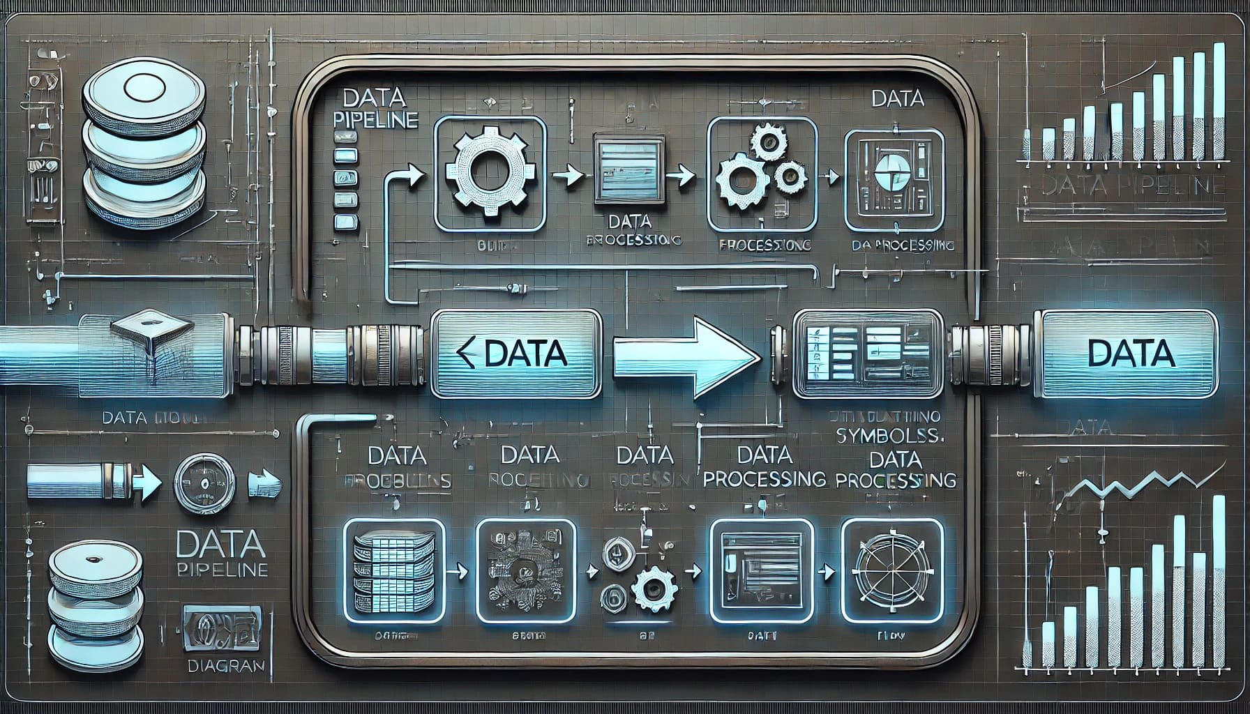
Understanding Symbols and Notations in Data Pipeline Diagram
When you create a data pipeline diagram, symbols and notations play a crucial role. They help you represent different components and processes clearly. Let's explore the common symbols and notations you might use.
Common Symbols Used in Data Pipeline Diagrams
Symbols in data pipeline diagrams act like a universal language. They help you and your team understand the flow and function of the data pipeline without confusion.
Data Sources and Destinations
In your diagram, data sources and destinations are vital. You often represent them with simple shapes like rectangles or ovals. These symbols show where data originates and where it ends up. For example, a database might be a rectangle labeled "Database," while an API could be an oval labeled "API."
Data Processing and Transformation Symbols
Data processing and transformation involve changing data from one form to another. You might use symbols like gears or arrows to represent these processes. Gears can indicate complex transformations, while arrows might show simpler data movements. These symbols help you visualize how data changes as it moves through the pipeline.
Notations for Data Flow and Connections
Notations in your diagram illustrate how data flows and connects between different components. They ensure everyone understands the path data takes.
Arrows and Lines
Arrows and lines are your best friends when showing data flow. Arrows point in the direction data moves. Solid lines might represent direct connections, while dashed lines could indicate optional or conditional paths. By using these notations, you make the data flow clear and easy to follow.
Labeling Data Flows
Labels add clarity to your diagram. They describe what each data flow represents. For instance, you might label an arrow "ETL Process" to show that data is being extracted, transformed, and loaded. Labels help you and your team quickly grasp the purpose of each connection.
"P&ID symbols are essential for representing components in a system, each detailed with codes to identify function and measurements." - Vista Projects
By understanding and using these symbols and notations, you can create a data pipeline diagram that communicates effectively. This clarity ensures that everyone involved can follow the data journey from start to finish.
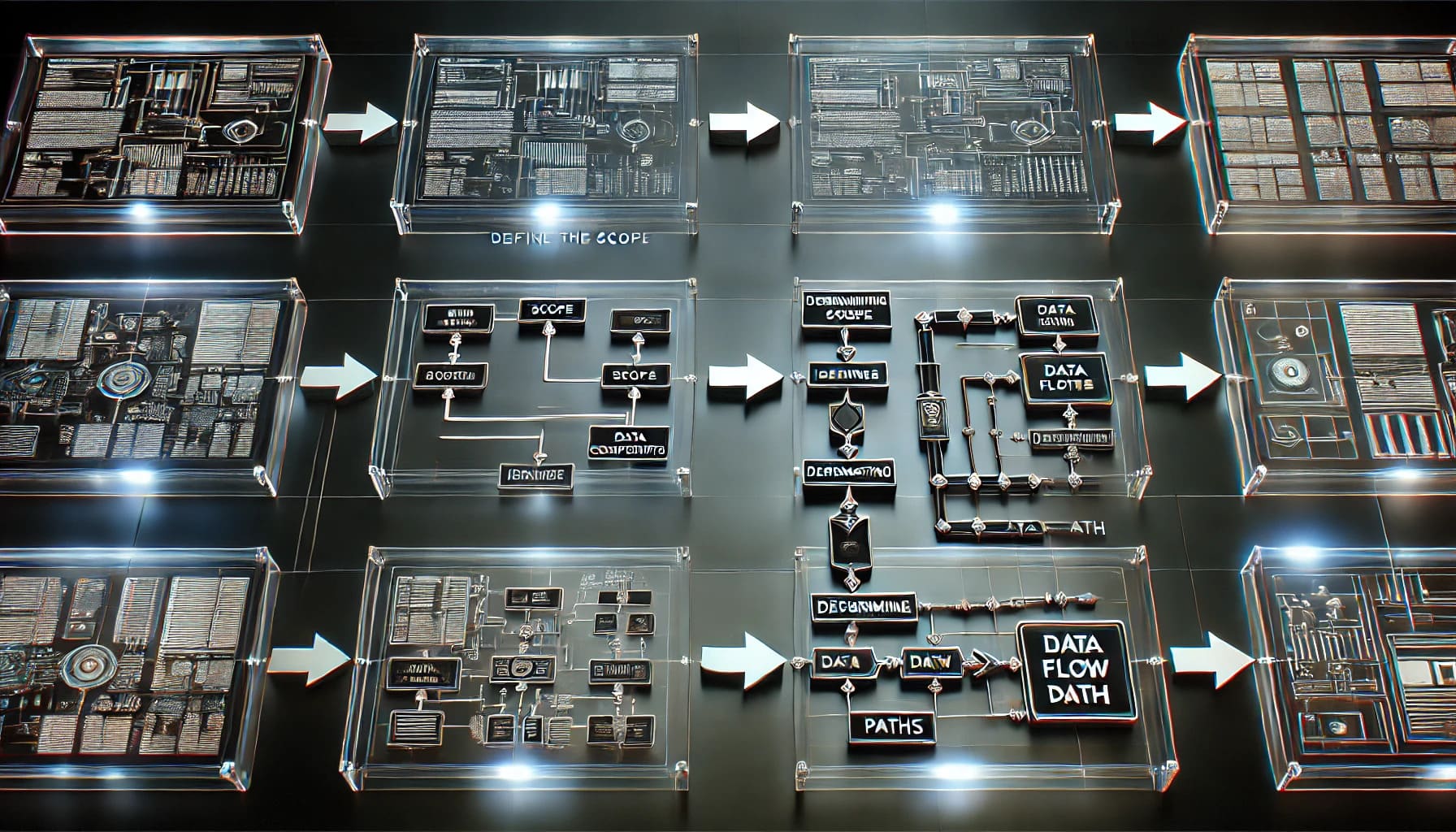
Step-by-Step Process of Creating a Data Pipeline Diagram
Creating a data pipeline diagram involves a systematic approach. You need to define the scope, identify key components, and determine data flow paths. Let's break it down step by step.
Defining the Scope and Purpose
Before you start drawing, it's crucial to understand what you want your data pipeline to achieve. This clarity will guide your design process.
Identifying Key Components
First, list all the components involved in your data pipeline. These might include:
Data Sources: Where does your data come from? Think databases, APIs, or files.
Data Processing Units: What tools or processes will transform your data? Consider ETL tools or custom scripts.
Data Destinations: Where will the processed data go? It could be a data warehouse, a dashboard, or an application.
By identifying these components, you set the foundation for your diagram.
Determining Data Flow Paths
Next, map out how data will move between these components. Ask yourself:
How does data travel from source to destination?
What transformations occur along the way?
Are there any conditional paths or loops?
This step ensures you capture the entire data journey, making it easier to visualize later.
Laying Out the Diagram
With your components and data flow paths defined, it's time to lay out your diagram. This is where you bring your data pipeline to life.
Arranging Components Logically
Start by placing your components in a logical order. Typically, you arrange them from left to right or top to bottom, following the data flow. Keep related components close to each other to maintain clarity.
Tip: Use consistent shapes for similar components. For example, use rectangles for data sources and circles for processing units.
Connecting Components with Arrows
Now, connect your components using arrows. These arrows represent the data flow paths you determined earlier. Make sure they point in the direction of data movement.
Solid Arrows: Use these for direct connections.
Dashed Arrows: Reserve these for optional or conditional paths.
By connecting components with arrows, you create a clear visual representation of your data pipeline.
"A data flow diagram is a flowchart that can help you visualize the data pipeline of a system so you can trace what happens to the data as it moves between components."
Following these steps, you can design a data pipeline diagram that effectively communicates the flow of data. This clarity not only aids in understanding but also enhances collaboration among team members.
Modifying and Customizing the Data Pipeline Diagram
When you design a data pipeline diagram, customization plays a crucial role. It ensures that your diagram is not only functional but also visually appealing and easy to understand. Let's explore how you can modify and customize your diagram effectively.
Adjusting Lines and Arrows
Lines and arrows are the backbone of your data pipeline diagram. They guide the viewer's eye and indicate the flow of data. Here's how you can adjust them for maximum impact.
Ensuring Clarity and Readability
You want your diagram to be clear and easy to read. To achieve this:
Use Consistent Line Styles: Keep line styles uniform across similar connections. This consistency helps viewers quickly grasp the relationships between components.
Avoid Overlapping Lines: Ensure lines don't cross each other unnecessarily. Overlapping lines can confuse viewers and obscure the data flow.
Maintain Adequate Spacing: Leave enough space between lines and components. This spacing prevents clutter and enhances readability.
Using Colors and Styles for Emphasis
Colors and styles can highlight important aspects of your diagram. Consider these tips:
Color-Coding: Assign different colors to various data flows or processes. For example, use blue for data ingestion and green for data transformation.
Bold Lines for Key Paths: Make critical data paths stand out by using bold lines. This emphasis draws attention to essential parts of the pipeline.
Diverse Arrowheads: Use different arrowhead styles to indicate various types of data movement, such as solid for continuous flow and dashed for conditional paths.
Adding Annotations and Labels
Annotations and labels provide context and clarity to your diagram. They explain complex processes and highlight significant data points.
Clarifying Complex Processes
Complex processes can be challenging to understand at a glance. Here's how annotations can help:
Descriptive Notes: Add brief notes next to intricate processes. These notes offer explanations without overwhelming the viewer.
Step-by-Step Labels: Break down complex processes into smaller steps. Label each step to guide the viewer through the sequence.
Highlighting Important Data Points
Certain data points deserve special attention. Use labels to make them stand out:
Key Metrics: Label critical metrics or KPIs directly on the diagram. This labeling ensures viewers can quickly identify essential data.
Annotations for Anomalies: Highlight unusual or noteworthy data points with annotations. These annotations can prompt further investigation or analysis.
By modifying and customizing your data pipeline diagram, you create a tool that communicates effectively. This customization not only enhances understanding but also facilitates collaboration among team members.
Reviewing and Refining the Data Pipeline Diagram
Creating a data pipeline diagram is just the beginning. You need to review and refine it to ensure it accurately represents your data flow. Let's dive into how you can do this effectively.
Checking for Accuracy and Completeness
Your diagram should be a true reflection of your data pipeline. Here's how you can verify its accuracy and completeness.
Verifying Data Flows
Trace Each Path: Follow each data flow from start to finish. Ensure that every arrow points in the right direction and connects the correct components.
Check for Loops: Identify any loops in your diagram. Make sure they represent actual processes and aren't accidental.
Validate Processes: Confirm that each process in your diagram matches the real-world operations. This step ensures that your diagram isn't just visually appealing but also functionally accurate.
Ensuring All Components are Represented
List All Elements: Make a checklist of all components involved in your data pipeline. Compare this list with your diagram to ensure nothing is missing.
Include New Additions: If you've added new components since the initial design, make sure they're included in the diagram.
Double-Check Connections: Verify that all components are connected as they should be. Missing connections can lead to misunderstandings about data flow.
Seeking Feedback and Making Adjustments
Feedback is crucial for refining your diagram. It helps you spot errors and improve clarity.
Collaborating with Team Members
Share Your Diagram: Present your diagram to your team. Use collaborative tools to allow everyone to view and comment on it.
Encourage Questions: Invite team members to ask questions. Their inquiries can reveal areas that need more detail or clarification.
Discuss Improvements: Hold a meeting to discuss potential improvements. Collaboration often leads to innovative solutions and a more robust diagram.
Incorporating Feedback for Improvement
Gather Suggestions: Collect feedback from your team. Pay attention to recurring themes or suggestions.
Make Necessary Changes: Implement changes based on the feedback. Adjust lines, labels, or components as needed.
Review Again: After making adjustments, review the diagram once more. Ensure that the changes enhance clarity and accuracy.
By reviewing and refining your data pipeline diagram, you create a tool that truly represents your data processes. This attention to detail not only improves understanding but also fosters better communication among your team.
Sharing and Exporting the Data Pipeline Diagram
Once you've crafted your data pipeline diagram, sharing and exporting it becomes crucial. This ensures that your team and stakeholders can access and understand the data flow effectively. Let's explore how you can do this seamlessly.
Exporting Options and Formats
When it comes to exporting your data pipeline diagram, choosing the right formatis essential. Different formats serve different purposes, so it's important to select one that aligns with your needs.
Choosing the Right Format for Your Needs
PDF: Ideal for sharing static versions of your diagram. It preserves the layout and design, ensuring that everyone sees the same thing.
PNG/JPEG: Perfect for embedding diagrams in presentations or documents. These formats are widely supported and easy to share.
SVG: Offers scalability without losing quality. Great for web use or when you need to resize the diagram frequently.
Editable Formats (e.g., VSDX, DRAWIO): If collaboration is key, export in a format that allows others to edit and provide feedback.
"Apache Airflow allows you to define and schedule workflows as directed acyclic graphs (DAGs). It's highly extensible and allows you to define your operators and executors." - This flexibility can be mirrored in your choice of export format, ensuring adaptability to various needs.
Ensuring Compatibility with Other Tools
Compatibility is crucial when exporting diagrams. Ensure that the format you choose integrates well with the tools your team uses. For instance:
PDFs work well with most document viewers.
SVGs are compatible with web browsers and design software.
Editable formats like VSDX are perfect for teams using Microsoft Visio.
By selecting the right format, you ensure that your diagram remains accessible and functional across different platforms.
Sharing with Stakeholders
Sharing your data pipeline diagram with stakeholders requires careful consideration. You want to present it in a way that is both informative and engaging.
Best Practices for Presentation
Keep It Simple: Avoid overwhelming stakeholders with too much detail. Focus on the key components and data flows.
Use Visual Aids: Incorporate colors and symbols to highlight important areas. This makes the diagram more engaging and easier to understand.
Provide Context: Explain the purpose of the diagram and how it fits into the larger data strategy. This helps stakeholders see the bigger picture.
"Supports dynamic pipeline generation and modification. Can execute tasks in parallel, making it suitable for parallel processing." - Just as Apache Airflow supports dynamic workflows, your presentation should adapt to the audience's needs, providing clarity and insight.
Using Diagrams in Reports and Documentation
Incorporating diagrams into reports and documentation enhances understanding and retention. Here's how you can do it effectively:
Embed Diagrams: Place diagrams directly within the text to illustrate points. This breaks up large blocks of text and provides visual interest.
Annotate Key Areas: Use labels and annotations to explain complex processes. This ensures that readers grasp the significance of each component.
Update Regularly: Keep diagrams current to reflect any changes in the data pipeline. This maintains accuracy and relevance.
By following these practices, you can share and export your data pipeline diagram effectively, ensuring that it serves as a valuable tool for communication and collaboration.
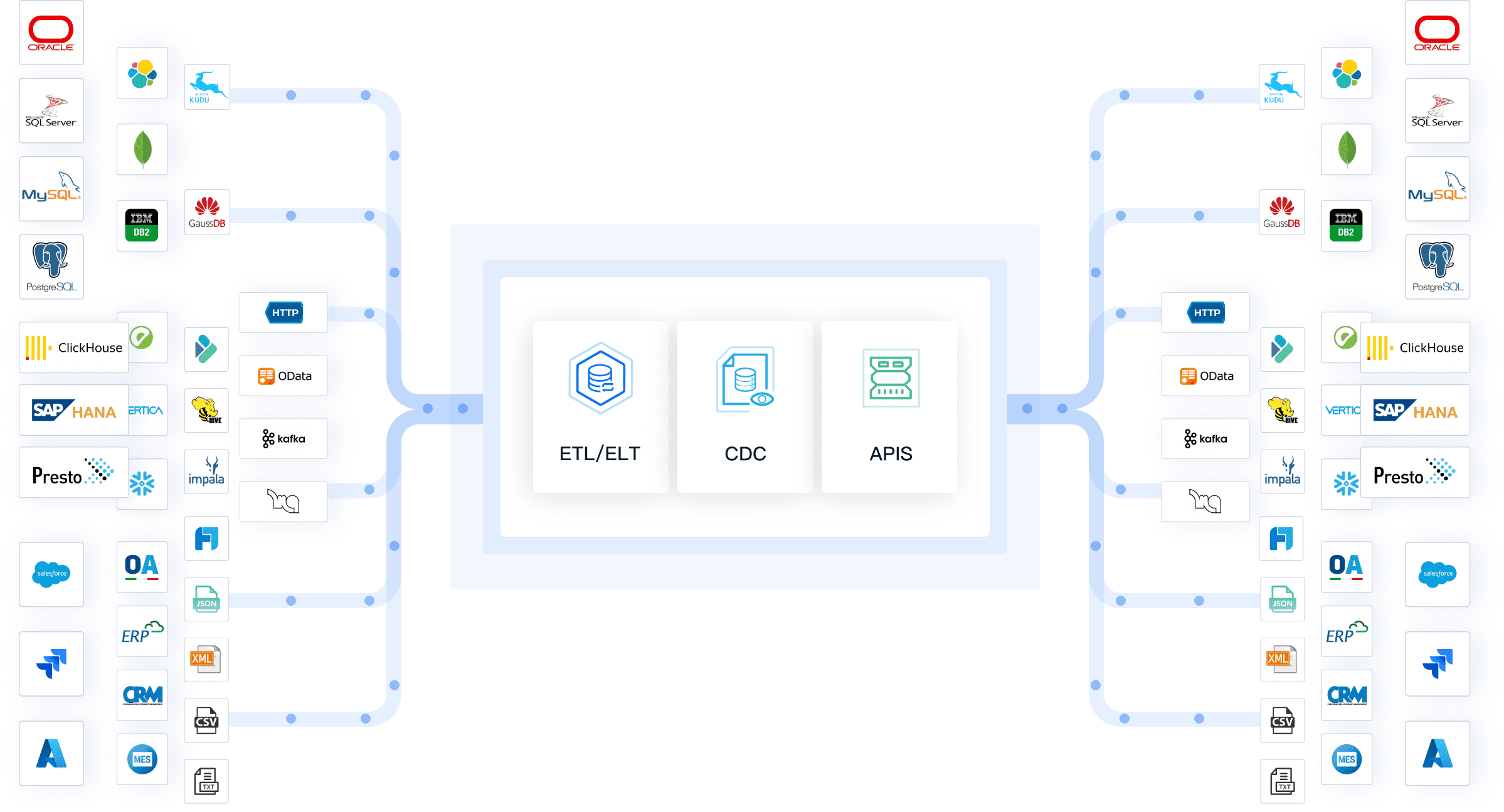
Leveraging FineDataLink for Data Pipeline Visualization
When you think about creating a data pipeline, you might imagine a complex process. But with FineDataLink, you can simplify this task significantly. This tool offers a user-friendly interface and powerful features that make data pipeline creation a breeze.
How FineDataLink Simplifies Data Pipeline Creation
FineDataLink stands out as a robust solution for data pipeline visualization. It has enabled the successful delivery of 1000 data projects, showcasing its reliability and efficiency. Let's dive into how it simplifies the process for you.
Visual and Modern Operation Interface
Imagine having a tool that feels intuitive and modern. FineDataLinkprovides just that with its visual operation interface. You don't need to be a tech wizard to navigate it. The interface is designed to be user-friendly, allowing you to drag and drop components easily. This simplicity means you can focus on designing your pipeline without getting bogged down by technical details.
User-Friendly Design: The interface is straightforward, making it accessible even if you're new to data pipelines.
Drag-and-Drop Functionality: You can quickly arrange and connect components, streamlining the design process.
Real-Time Data Synchronization and ETL/ELT Functions
One of the standout features of FineDataLink is its real-time data synchronization. This capability ensures that your data is always up-to-date, which is crucial for making timely decisions. Additionally, FineDataLinksupports both ETL (Extract, Transform, Load) and ELT (Extract, Load, Transform) processes. This flexibility allows you to handle diverse data processing scenarios with ease.
Real-Time Updates: Keep your data current, reducing the risk of outdated information.
Dual-Core Engine: The tool's dual-core engine efficiently manages both ETL and ELT processes, adapting to your specific needs.
"FineBI 6.0 can integrate FineDataLink as a data development module that houses a dual-core engine for both Extract, Load, Transform (ELT) and Extract, Transform, Load (ETL) processes."
By leveraging FineDataLink, you empower yourself to create effective data pipelines. Its modern interface and real-time capabilities ensure that you stay ahead in the data game. Whether you're a seasoned data professional or just starting, FineDataLink makes the process manageable and efficient.
Enhancing Data Analysis with FineBI for Data Pipeline Diagram
When you think about transforming raw data into actionable insights, FineBIstands out as a powerful tool. It empowers you to explore and analyze your data independently, making it an essential component of your data pipeline diagram.
Transforming Data into Insights with FineBI
FineBI offers a comprehensive suite of features that allow you to turn complex data into clear, actionable insights. Let's dive into how it can enhance your data analysis process.
Self-Service BI and Analytics
With FineBI, you gain the ability to conduct self-service analytics. This means you can explore your data without relying on IT specialists. The tool's intuitive drag-and-drop interface makes it easy for you to manipulate data, create visualizations, and generate reports. You can perform data drill-downs, apply filters, and execute calculations with ease. This self-service capability not only saves time but also empowers you to make informed decisions quickly.
Interactive Dashboards: Create dynamic dashboards that update in real-time, providing you with the latest insights at your fingertips.
Advanced Analytics: Utilize complex calculations and statistical analysis to uncover deeper insights from your data.
Collaborative Features: Share your findings with team members or stakeholders, fostering a collaborative environment for decision-making.
"FineBI empowers users to conduct self-exploratory analysis, giving them the freedom to explore and manipulate their sales data independently."
Real-Time Data Analysis and Visualization
In today's fast-paced world, having access to real-time data is crucial. FineBI excels in this area by offering real-time data analysis and visualization capabilities. You can monitor key performance indicators (KPIs) and track trends as they happen. This real-time insight allows you to respond swiftly to changes in your business environment.
Real-Time Updates: Stay ahead of the curve with data that refreshes automatically, ensuring you always have the most current information.
Visualization Options: Choose from over 50 chart styles to present your data in the most effective way possible. Whether you need a simple bar chart or a complex Sankey diagram, FineBIhas you covered.
Mobile and Large Screen Display: Access your dashboards on mobile devices or display them on large LED screens for presentations.
"FineBI supports more than 50 chart styles, covering basically all basic and high-level charts on the market."
By leveraging FineBI in your data pipeline diagram, you enhance your ability to analyze and visualize data effectively. Its user-friendly interface and robust analytical capabilities make it an invaluable tool for anyone looking to gain deeper insights from their data.
A well-designed data pipeline diagram is crucial for effective data management. It helps you visualize and streamline your data flow, making it easier to answer key questions and support decision-making. By following the step-by-step process outlined in this blog, you can create your own diagrams and enjoy the benefits of improved communication and efficiency.
Benjamin Kennady, a Cloud Solutions Architect, emphasizes that a data pipeline acts as a logical flow, enabling organizations to answer specific questions with their data.
FanRuan's solutions, like FineDataLink and FineBI, offer powerful tools to aid in creating and analyzing these diagrams, ensuring you stay ahead in the data game.
Click the banner below to try FineDataLink for free and empower your enterprise to transform data into productivity!
Access a wealth of case studies, industry insights, and solution guides to accelerate digital transformation.
FAQ
What is a data pipeline diagram?
A data pipeline diagram visually represents how data moves from its source to its destination. It shows the flow of data through various stages, including collection, processing, and storage. This diagram helps you understand the entire data journey, making it easier to manage and optimize.
What are the key components of a data pipeline diagram?
A typical data pipeline diagram includes: Data Sources: Where your data originates, like databases or APIs. Data Processing: The steps involved in transforming and cleaning data. Data Storage: Where the processed data is stored, such as data warehouses. Data Flow: The paths data takes between components.
How do I choose the right tool for creating a data pipeline diagram?
Consider these factors when selecting a tool: Ease of Use: Look for user-friendly interfaces. Collaboration Features: If teamwork is important, choose tools that support collaboration. Export Options: Ensure the tool can export diagrams in formats you need. Integration: Check if it integrates with other software you use.
Can I customize my data pipeline diagram?
Absolutely! Customization allows you to tailor the diagram to your specific needs. You can: Modify Components: Adjust shapes and labels to fit your data sources and processes. Add Annotations: Include notes to explain complex processes. Use Colors: Highlight important paths or components for emphasis.
How often should I update my data pipeline diagram?
Regular updates are crucial. As your data processes evolve, your diagram should reflect these changes. Regular reviews ensure accuracy and help maintain effective communication within your team.
What challenges might I face when creating a data pipeline diagram?
You might encounter challenges like: Complexity: Managing intricate data flows can be daunting. Data Silos: Integrating data from separate systems requires effort. Scalability: Ensuring the diagram remains effective as data volume grows.