A customer 360 dashboard solves a costly enterprise problem: customer data is scattered across CRM, ERP, marketing, billing, support, and product systems, so teams make decisions with partial context. Marketing sees engagement, sales sees pipeline, support sees tickets, finance sees revenue, and no one sees the full relationship.
For IT managers, operations leaders, revenue executives, and analytics teams, this creates real operational pain:
Duplicate records and conflicting customer IDs
Inconsistent KPIs across departments
Slow reporting cycles and manual spreadsheet work
Missed upsell signals and hidden churn risk
Poor customer experiences caused by fragmented context
A customer 360 dashboard brings those signals into a unified, decision-ready view. It helps enterprises understand who the customer is, how they engage, what they buy, where they struggle, and where growth or risk is emerging. The business value is straightforward: better coordination, faster decisions, stronger retention, and more predictable revenue.
All dashboards in this article were generated by FineBI.
Customer 360 Dashboard: definition and core purpose
A customer 360 dashboard is a centralized analytics view that combines customer data from multiple systems into a single, unified picture of the customer relationship. It is designed to show the past, present, and likely future of an account or individual customer in one place.
At a practical level, it pulls together core profile data, transaction history, engagement activity, service interactions, account health, and commercial opportunity signals so teams can work from the same source of truth.
What a customer 360 dashboard actually does
A mature customer 360 dashboard helps enterprises:
Unify customer records across systems
Connect interactions across the lifecycle
Surface key account trends and exceptions
Standardize KPIs for all departments
Support faster operational and executive decisions
This is what makes it more than a reporting layer. It is not just about displaying charts. It is about turning fragmented customer data into operational intelligence.
How it differs from a standard CRM report
A standard CRM report is usually limited to sales-owned records and sales process metrics such as pipeline, opportunities, activities, and close rates. A customer 360 dashboard goes much further.
A CRM report typically shows:
Leads, contacts, accounts
Opportunity stages
Rep activity
Forecast and pipeline movement
A customer 360 dashboard typically adds:
Marketing engagement and attribution signals
Website and campaign behavior
Commerce and billing data
Product usage and subscription activity
Support tickets, SLAs, and escalations
Returns, renewals, churn indicators, and expansion potential
In short, CRM reports are team-specific. A customer 360 dashboard is cross-functional.
How it differs from a single-team analytics dashboard
Many enterprises already have dashboards for marketing, customer success, finance, or support. The issue is that each dashboard optimizes for one function. A customer 360 dashboard connects those functions.
That unified view matters when a single account is:
Engaging heavily with campaigns but not converting
Increasing product usage while support tickets spike
Renewing late despite strong historical revenue
Showing high lifetime value but declining satisfaction
Paying on time in one system but carrying unresolved disputes in another
Only a customer 360 dashboard reveals those cross-functional patterns clearly enough to act on them.
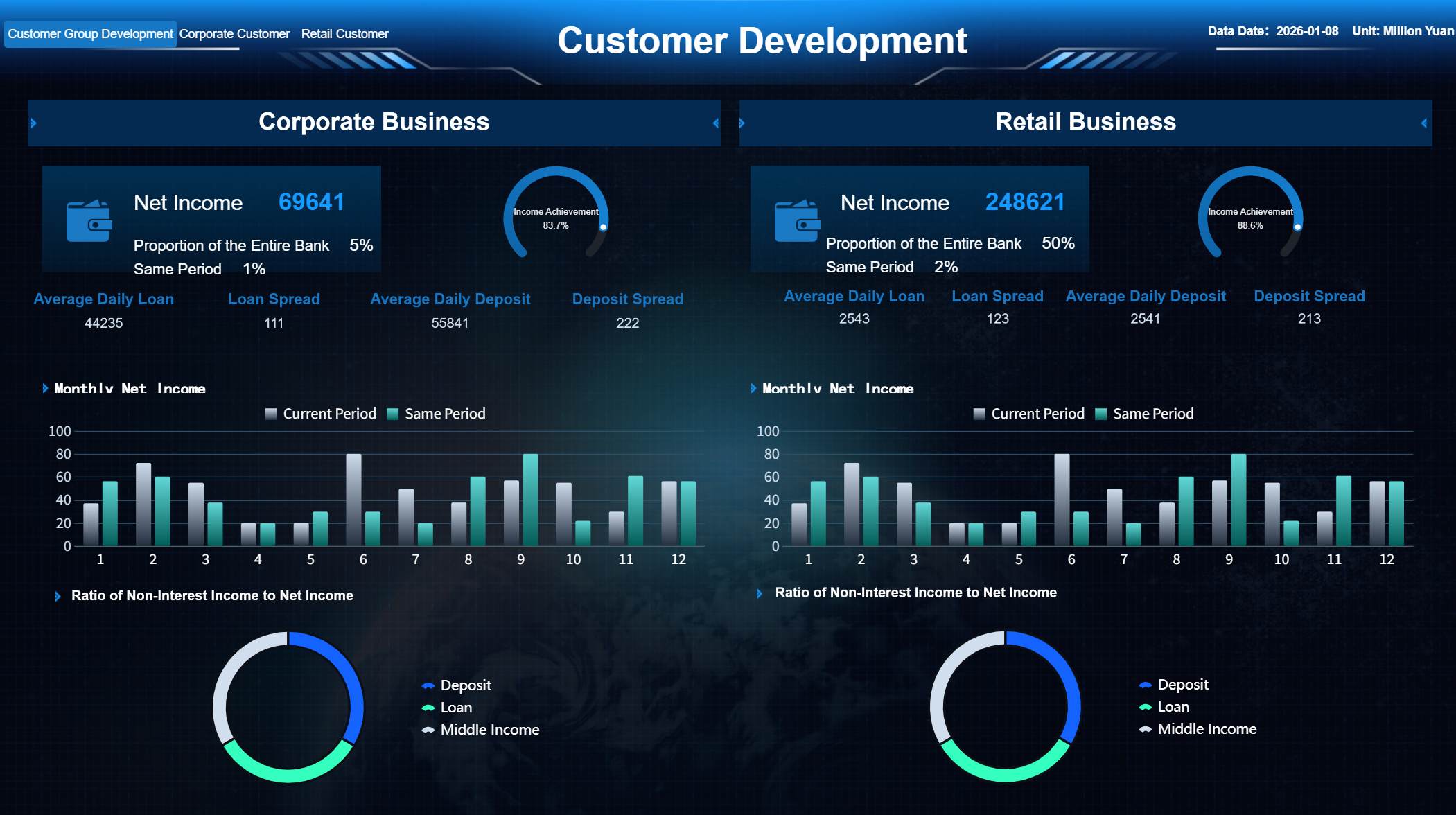
Why enterprises use it across marketing, sales, service, commerce, and finance
Enterprises use a customer 360 dashboard because revenue and retention are no longer controlled by one department. Customer outcomes depend on coordinated execution across the business.
A unified view helps:
Marketing understand which accounts are active, qualified, and ready for nurture or acceleration
Sales prioritize accounts with the strongest propensity to buy or expand
Service resolve issues with full transaction and relationship context
Commerce teams analyze buying behavior, returns, and order patterns
Finance monitor payment behavior, contract value, renewals, and profitability
The result is alignment around one customer narrative instead of five disconnected versions of it.
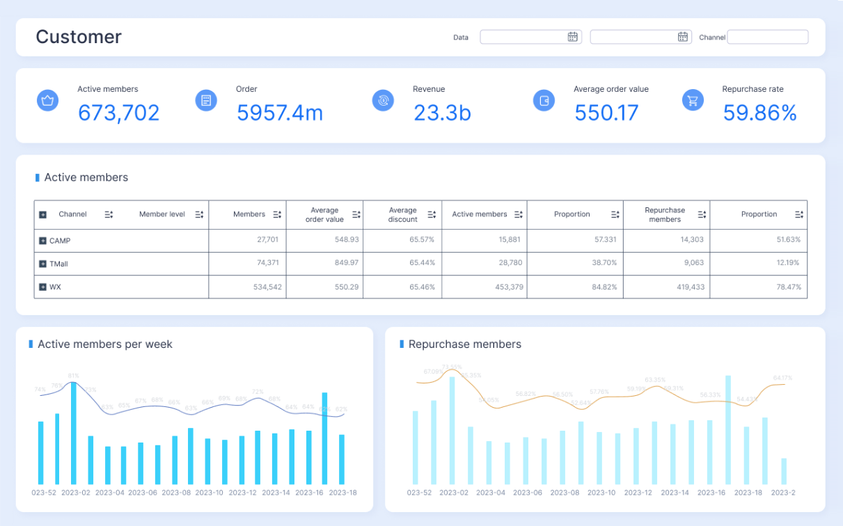
What a Customer 360 Dashboard tracks across the customer lifecycle
A strong customer 360 dashboard should reflect the full lifecycle, from identity and acquisition through engagement, service, retention, and growth. The exact design varies by industry, but the data model usually centers on three layers: customer identity, customer activity, and customer health.
Identity, profile, and account data
The first layer is foundational. Before teams can trust insights, they need confidence that they are looking at the right customer or account.
This section typically includes:
Customer master records
Individual and company names
Firmographics such as industry, size, region, and revenue band
Contacts and stakeholder roles
Consent and communication preferences
Account hierarchies and parent-child relationships
Territory assignments and ownership
Contract and account status
For B2B enterprises, account hierarchy is especially important. A global parent company may have multiple subsidiaries, business units, billing entities, and buying centers. A customer 360 dashboard should make those relationships visible so teams do not treat one enterprise customer like unrelated accounts.
Engagement, transaction, and service activity
The second layer captures what the customer is doing. This is where the dashboard starts to reflect actual behavior rather than static profile data.
Common tracked activity includes:
Website visits and page behavior
Content downloads and campaign responses
Email opens, clicks, and form submissions
Purchases and order history
Subscriptions and usage events
Billing and invoice activity
Support tickets and case history
Returns, refunds, and complaints
Renewal dates and contract events
This activity layer helps teams answer practical questions:
Is this account active or going quiet?
Are current campaigns generating meaningful engagement?
Has buying frequency increased or slowed?
Are service issues affecting expansion potential?
Is the customer nearing a renewal with unresolved support risk?
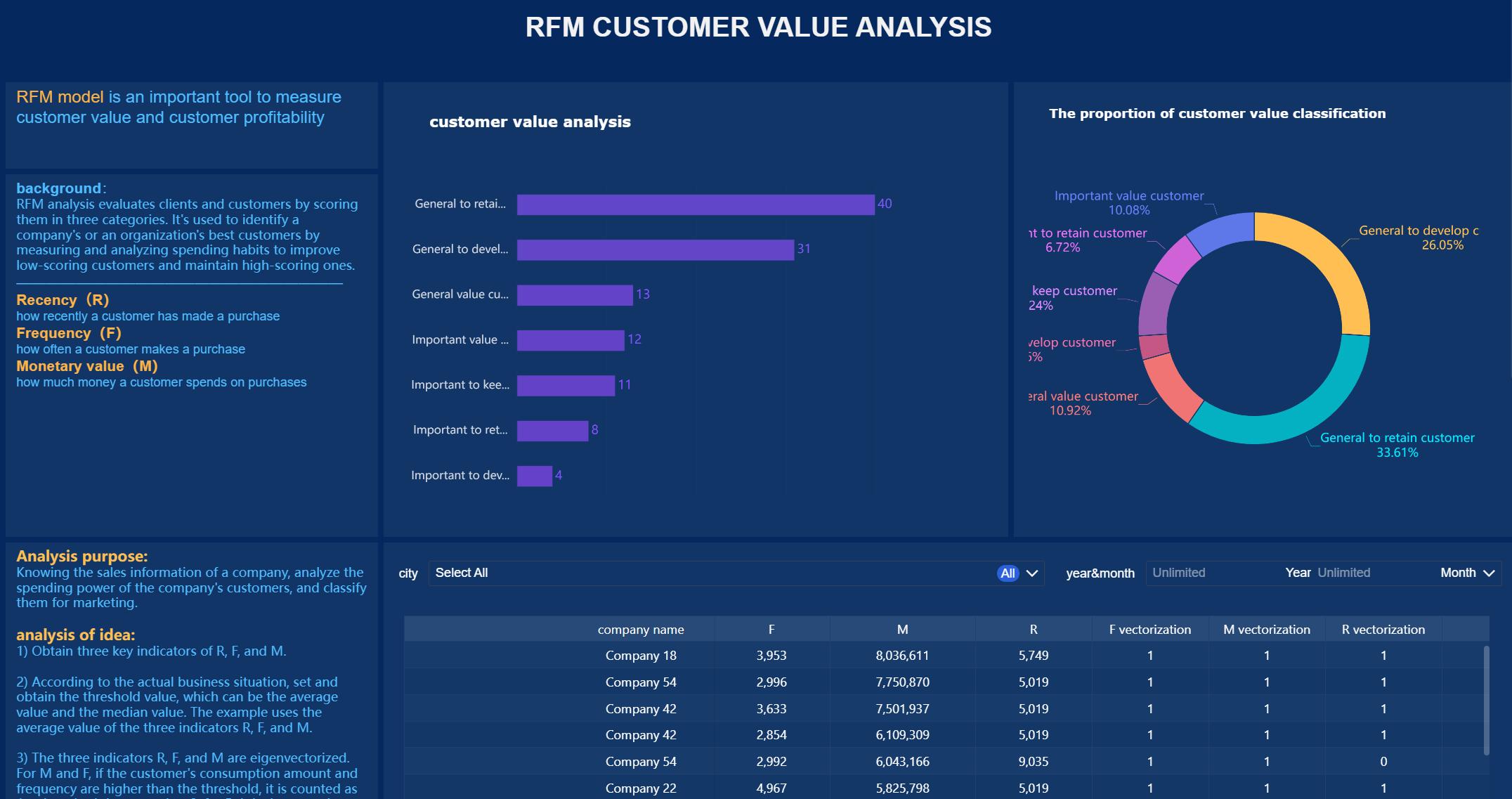
Health, risk, and growth indicators
The third layer translates raw activity into decision signals. This is what makes the customer 360 dashboard operationally useful.
Typical indicators include:
Customer satisfaction scores
Net promoter or sentiment measures
Product adoption and feature usage
Churn risk flags
Customer lifetime value
Upsell and cross-sell potential
Open opportunities
Renewal probability
Expansion pipeline
These indicators are often modeled from multiple data points rather than pulled from a single source. For example, churn risk may combine low usage, declining engagement, negative support trends, and delayed renewal activity.
Key Metrics (KPIs)
For featured-snippet clarity and executive usability, the following are the most important KPIs a customer 360 dashboard should track:
Customer Lifetime Value (CLV): The total projected revenue or profit a customer generates over the full relationship.
Acquisition Source: The channel or campaign that originated the customer or account.
Engagement Score: A composite measure of website, email, event, and campaign interaction.
Purchase Frequency: How often the customer buys within a defined period.
Average Order Value (AOV): The average revenue per order or transaction.
Renewal Rate: The percentage of contracts or subscriptions that renew successfully.
Churn Risk Score: A predictive signal that estimates likelihood of customer loss.
Support Ticket Volume: The number of issues raised by the customer in a given timeframe.
First Response Time: How quickly service teams respond to customer issues.
Resolution Time: The average time required to close customer cases.
Product Usage Rate: The frequency or depth of product interaction by users or accounts.
Customer Satisfaction (CSAT): A direct rating of customer experience after interactions.
Net Revenue Retention (NRR): Revenue retained and expanded from existing customers over time.
Upsell Potential: The estimated opportunity for the customer to buy additional products or services.
Pipeline Value: The total open opportunity value associated with the customer or account.
Payment Status: A view of billing health, including overdue invoices, credits, or disputes.
Return or Refund Rate: The percentage of transactions that result in returns or refunds.
Account Health Score: A composite health metric that blends engagement, usage, service, renewal, and financial signals.
Not every enterprise needs every KPI on day one. The best dashboards start with business-critical metrics and expand over time.
Why enterprises need a unified customer view
A fragmented customer view is not just inconvenient. It actively slows growth and weakens execution. Enterprise teams lose time reconciling data, disputing metrics, and reacting too late to account changes.
A unified customer view changes that.
Reduce data silos that block teams from seeing the full customer relationship
Most enterprises grow through new systems, acquisitions, regional processes, and departmental tools. Over time, customer data spreads across platforms that were never designed to work as one operating model.
That fragmentation causes familiar issues:
Sales cannot see unresolved support cases
Marketing segments off outdated account data
Finance lacks visibility into service-driven retention risk
Customer success misses product and billing context
Executives get conflicting performance reports
A customer 360 dashboard reduces these silos by consolidating customer signals into one view with shared logic and definitions.
Improve decision-making with shared metrics and consistent definitions
One of the biggest enterprise reporting failures is not lack of data. It is lack of consistency.
If “active customer,” “renewal risk,” or “qualified account” means something different in every department, dashboards create more confusion, not more clarity.
A customer 360 dashboard helps standardize:
Metric definitions
Time windows
Customer identity rules
Lifecycle stage criteria
Ownership and accountability
This consistency allows cross-functional teams to make faster decisions without debating which report is correct.
Personalize experiences at scale using timely, trustworthy customer context
Personalization fails when customer context is stale, incomplete, or isolated. A unified dashboard gives teams the context they need to act in the moment.
Examples include:
Suppressing acquisition campaigns for customers with open escalations
Prioritizing expansion outreach to high-usage, low-penetration accounts
Triggering save motions for customers with falling engagement and upcoming renewals
Routing service interactions based on tier, history, and product mix
At enterprise scale, personalization requires more than segmentation. It requires shared, trustworthy customer intelligence.
Strengthen retention, expansion, and forecasting
Retention and growth depend on seeing patterns early.
A customer 360 dashboard helps leaders identify:
Accounts likely to churn before revenue is lost
Product adoption gaps that threaten renewals
Strong-fit customers ready for expansion
Revenue concentration and account dependency risks
Forecast assumptions supported by full customer behavior
This is especially valuable for subscription businesses, multi-product organizations, and account-based sales models where long-term account value matters more than isolated transactions.
How a customer 360 dashboard is built and used
Building a customer 360 dashboard is not just a BI exercise. It is a business architecture project that combines data integration, metric design, governance, and workflow enablement.
Data sources and integration foundations
The quality of the dashboard depends on the breadth and reliability of the source data. Most enterprise deployments draw from a combination of operational and analytical systems.
Typical source systems include:
CRM platforms
ERP systems
Marketing automation tools
E-commerce platforms
Billing and subscription systems
Customer support platforms
Product analytics tools
Data warehouses or lakes
Third-party enrichment providers
The first technical priority is integration. Data needs to be ingested, mapped, normalized, and linked at the customer or account level.
Key integration foundations include:
Identity resolution across systems
Match-and-merge logic for duplicates
Common customer and account keys
Time alignment across event streams
Standardized field mapping
Refresh schedules appropriate to business needs
Without this foundation, the dashboard may look polished but still fail operationally.
Metrics, governance, and dashboard design
Once the data foundation exists, the next step is to define the metrics and control framework.
This is where many projects succeed or fail.
Core elements of a strong dashboard design
Identity resolution: Ensure records from different systems map to the same customer or account.
Standardized KPIs: Define business rules for every major metric before visualization begins.
Data quality rules: Flag missing, stale, duplicate, or conflicting records.
Role-based access: Limit sensitive financial, consent, or personal data based on user roles.
Executive-friendly visualization: Present high-value trends first, then enable drill-down for analysts and operators.
Action context: Pair metrics with alerts, ownership, and next-step guidance wherever possible.
A useful customer 360 dashboard should support multiple layers of use:
Executives need summarized trends, risk concentrations, and forecast signals.
Managers need team- and segment-level performance views.
Frontline teams need account-level context and immediate next actions.
Operational workflows and team adoption
Dashboards create value only when they influence daily decisions. This is why workflow integration matters as much as dashboard design.
A customer 360 dashboard should be used inside core operating rhythms such as:
Account review meetings
Pipeline and forecast calls
Customer success renewal reviews
Service escalation workflows
Marketing targeting and suppression logic
Executive business reviews
It should also support operational triggers like:
Alerts for churn-risk movement
Notifications for major usage declines
Escalations for overdue high-value tickets
Flags for expansion-ready accounts
Playbooks tied to health score changes
When dashboards are embedded into work, adoption rises naturally.
Common implementation challenges and how to avoid them
The idea of a customer 360 dashboard is simple. The execution is not. Most enterprise issues come down to data consistency, metric discipline, and workflow alignment.
Inconsistent customer IDs and duplicate records across systems
This is the most common issue. The same customer may appear differently in CRM, billing, support, and e-commerce systems.
Common symptoms include:
Multiple account records for one customer
Broken parent-child account relationships
Inaccurate revenue rollups
Split service and sales histories
How to avoid it:
Establish a canonical customer or account key.
Use identity resolution and match rules across systems.
Create duplicate management and stewardship processes.
Validate hierarchy logic for enterprise account structures.
Too many metrics without clear business priorities
Many teams try to include every available metric. The result is clutter, low adoption, and unclear decision-making.
How to avoid it:
Start with the business outcomes you need to improve.
Select a focused KPI set tied to those outcomes.
Separate executive KPIs from operational diagnostics.
Add advanced metrics only after core adoption is strong.
Low trust caused by stale data or unclear ownership
If users see conflicting numbers once, confidence drops fast. If refresh timing is unclear, teams may stop relying on the dashboard.
How to avoid it:
Publish refresh frequency and metric definitions clearly.
Assign ownership for each source and KPI domain.
Set data quality thresholds and visible issue flags.
Monitor freshness, completeness, and anomaly exceptions.
Poor adoption when dashboards are not tied to daily workflows
A dashboard no one opens is not a reporting success. It is shelfware.
How to avoid it:
Build use cases around actual team routines.
Embed dashboard reviews into standing meetings.
Connect metrics to playbooks and alerts.
Train users on actions, not just navigation.
Actionable best practices for implementing a customer 360 dashboard
If you want this initiative to deliver enterprise value, approach it like an operating model, not a one-time visualization project.
1. Start with one high-value business scenario
Pick a concrete use case first, such as churn reduction, renewal visibility, key account management, or cross-sell prioritization.
Best practice steps:
Define the business problem in measurable terms.
Identify the teams involved in that decision cycle.
Select the minimum KPI set needed to act.
Build the dashboard around that scenario before expanding.
This creates faster adoption and clearer ROI.
2. Standardize customer definitions before building visuals
Do not begin with chart design. Begin with data logic.
Best practice steps:
Define what counts as a customer, account, active account, renewal, churn event, and expansion signal.
Align those definitions across sales, service, marketing, and finance.
3. Design for tiers of users, not one generic audience
Executives, managers, and frontline operators need different levels of detail.
Best practice steps:
Create an executive summary view for trends and exceptions.
Build management views for segment and team performance.
Include operational drill-down pages at account level.
Use role-based access to protect sensitive data.
This improves usability and relevance.
4. Make the dashboard trigger action, not just observation
The best customer 360 dashboard does not simply tell users what happened. It prompts them on what to do next.
Best practice steps:
Add threshold-based alerts for risk and opportunity.
Connect score changes to recommended playbooks.
Include owner fields and next review dates.
Integrate with workflow tools where possible.
That is how the dashboard becomes operational infrastructure.
5. Treat launch as the start, not the finish
Enterprises often underestimate the need for iteration.
Best practice steps:
Launch with a controlled KPI scope.
Review adoption and business impact monthly.
Remove low-value visuals and refine business logic.
Expand sources and scenarios only after trust is established.
The goal is not to build the biggest dashboard. It is to build the most used and most trusted one.
How to evaluate the right solution for your enterprise
Selecting the right platform is as important as defining the right metrics. A weak tooling decision can create future bottlenecks in scale, governance, and usability.
Questions to ask before selecting a platform
Before committing to a solution, enterprise buyers should ask:
Can it integrate with existing CRM, ERP, marketing, billing, support, and analytics systems?
Can it handle large data volumes and growing user concurrency?
Does it support identity resolution and consistent customer mapping?
Can it enforce governance, permissions, and auditability?
Does it support near-real-time or scheduled refreshes based on business need?
Can business teams self-serve analysis without constant IT intervention?
Does it provide flexible dashboard design for different roles and departments?
Can it scale from one use case to enterprise-wide customer analytics?
These questions help separate lightweight dashboard tools from enterprise-ready platforms.
What success looks like after launch
A successful customer 360 dashboard should lead to measurable business and operational improvements such as:
Faster access to trusted customer insights
Less time spent reconciling reports manually
Better cross-functional alignment on account status and priorities
Higher retention and renewal performance
More targeted expansion efforts
Stronger forecasting confidence
Better customer experiences driven by complete context
Success is not just dashboard usage. It is better execution across the customer lifecycle.
Build a customer 360 dashboard faster with FineBI
Building a customer 360 dashboard manually is possible, but it is complex. Enterprises must integrate multiple systems, standardize metrics, enforce governance, design role-based dashboards, and maintain ongoing refresh and trust. That takes time, specialist skills, and constant coordination between IT and business teams.
This is where FineBI becomes the practical choice.
With FineBI, enterprises can utilize ready-made templates and automate this entire workflow instead of assembling it from scratch. Rather than spending months building dashboards, data models, and reporting logic manually, teams can accelerate delivery with a platform designed for governed self-service analytics and enterprise reporting.
Connect data from CRM, ERP, marketing, support, billing, and other business systems
Build a unified customer 360 dashboard with reusable models and standardized KPIs
Deliver executive summaries and operational drill-down views in one environment
Apply governance, permissions, and role-based access at scale
Reduce manual reporting effort with automated updates and shared dashboards
Improve adoption through intuitive visual analytics and faster time to insight
For enterprise decision-makers, the value is simple: building this manually is complex; use FineBI to utilize ready-made templates and automate this entire workflow.
If your teams are still relying on siloed reports, fragmented systems, and manual account reviews, a customer 360 dashboard is no longer optional. It is a core capability for customer-centric growth. And with FineBI, you can implement that capability faster, more consistently, and with far less operational friction.
A customer 360 dashboard is a unified view that brings customer data from systems like CRM, ERP, billing, support, and marketing into one place. It helps teams see the full customer relationship instead of working from disconnected reports.
A CRM report usually focuses on sales records, pipeline, and rep activity. A customer 360 dashboard adds cross-functional context such as product usage, service issues, billing history, engagement, renewals, and churn risk.
It should track customer identity, account structure, engagement activity, purchases, billing, support interactions, product usage, renewals, and health signals. The goal is to connect customer behavior, value, and risk across the full lifecycle.
Enterprises need it to reduce data silos, standardize KPIs, and improve coordination across marketing, sales, service, commerce, and finance. This leads to faster decisions, better customer experiences, and stronger retention and revenue visibility.
It helps resolve duplicate customer records, inconsistent metrics, slow manual reporting, and missed signals related to churn or expansion. By combining fragmented data, it gives teams a shared source of truth for action.
Product Trial
FineReport
Pixel-perfect reports · Interactive dashboards · Easy data entry · Digital twins
 Not every enterprise needs every KPI on day one. The best dashboards start with business-critical metrics and expand over time.