You need executive dashboard software to keep your business competitive in 2025. Here are the 12 top executive solutions:
FineBI
Tableau
Power BI
Domo
Looker
Sisense
Klipfolio
Zoho Analytics
Qlik Sense
Databox
Geckoboard
Smartsheet
When you evaluate dashboard software, focus on features that matter most for business reporting. These include visual customization, mobile access, and seamless data integration. The table below shows common selection criteria executives use:
You want to choose dashboard software that fits your business needs. The table below gives you a quick look at the top 12 executive dashboard software tools for 2025. You can see which platforms offer cloud support, mobile access, and self-service analytics.
Software Tool
Cloud Support
Mobile Access
Self-Service Analytics
Best For
FineBI
Yes
Yes
Yes
Enterprise, Analytics
Tableau
Yes
Yes
Yes
Visualization, BI Teams
Power BI
Yes
Yes
Yes
Microsoft Ecosystem
Domo
Yes
Yes
Yes
Real-Time Data
Looker
Yes
Yes
Yes
Google Cloud Users
Sisense
Yes
Yes
Yes
Embedded Analytics
Klipfolio
Yes
Yes
Yes
SMBs, Agencies
Zoho Analytics
Yes
Yes
Yes
Budget-Friendly BI
Qlik Sense
Yes
Yes
Yes
Data Discovery
Databox
Yes
Yes
Yes
Marketing, Sales
Geckoboard
Yes
Yes
Yes
KPI Dashboards
Smartsheet
Yes
Yes
Yes
Project Management
Feature Highlights
You get a range of features with these dashboard solutions. FineBIstands out with its drag-and-drop dashboard creation, real-time filtering, and enterprise-grade governance. Tableau gives you advanced visualization and interactive dashboards. Power BI integrates well with Microsoft tools and offers strong data modeling. Domo provides real-time data streaming and collaboration. Looker connects deeply with Google Cloud and supports custom modeling. Sisense lets you embed analytics into your own apps. Klipfolio is easy for small teams and agencies. Zoho Analytics offers affordable analytics with AI insights. Qlik Sense focuses on data discovery and associative exploration. Databox helps you track marketing and sales metrics. Geckoboard makes KPI dashboards simple. Smartsheet combines dashboards with project management.
Tip: You should look for dashboard software that matches your team's workflow and data sources.
Pricing Summary
Pricing for executive dashboard software varies. You pay per user, per month for most tools. For example, Smartsheet starts at $12 and goes up to $25 per user each month. monday work management ranges from $9 to $24. Wrike costs between $10 and $25. FineBI and other enterprise dashboard software tools may offer custom pricing based on your needs. You should compare pricing plans and features before you decide.
Dashboard Software Overview
What Makes a Great Dashboard Tool
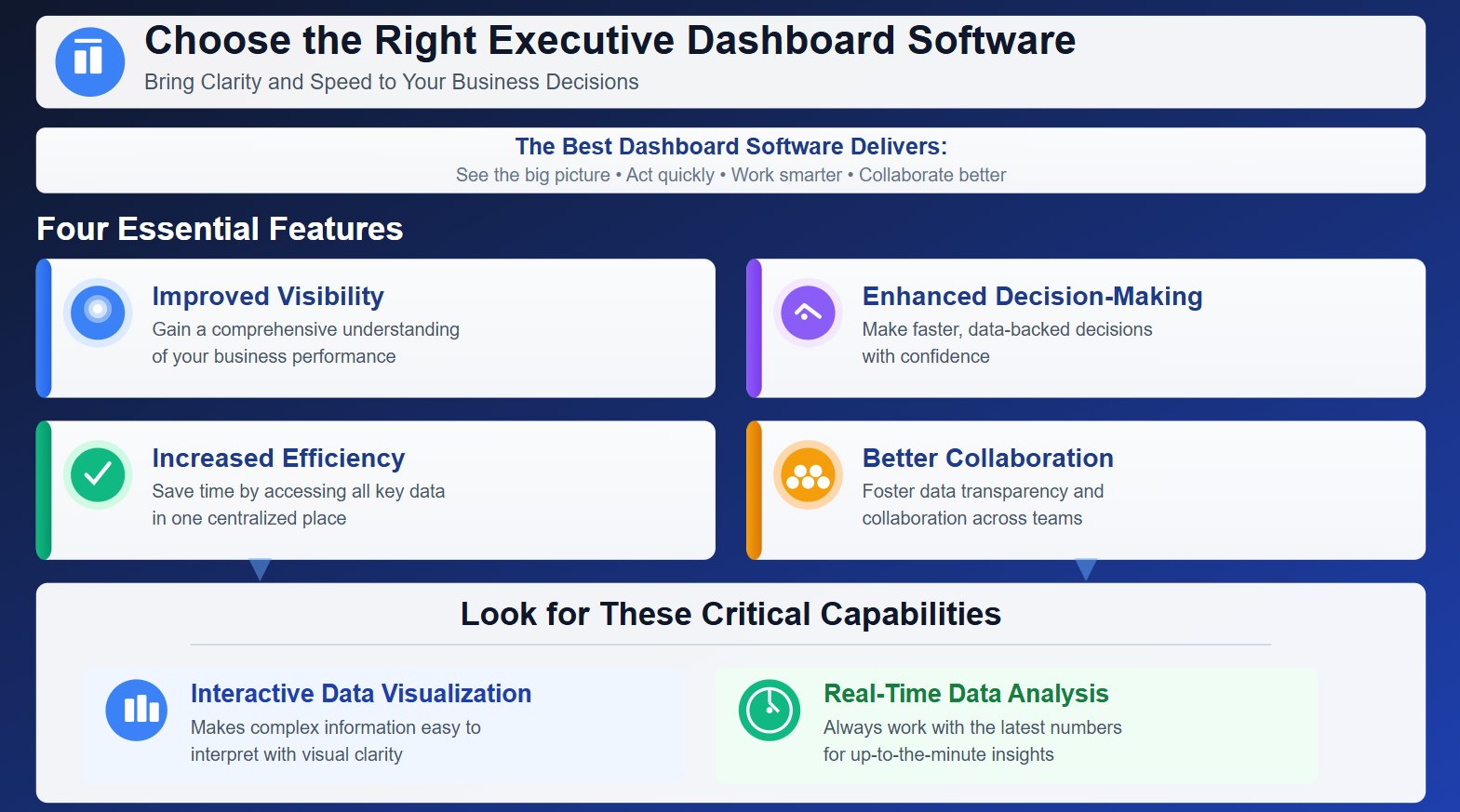
When you choose executive dashboard software, you want a solution that brings clarity and speed to your business decisions. The best dashboard software gives you improved visibility, enhanced decision-making, increased efficiency, and better collaboration. These features help you see the big picture and act quickly.
Feature
Description
Improved Visibility
Gain a comprehensive understanding of your business performance.
Enhanced Decision-Making
Make faster, data-backed decisions.
Increased Efficiency
Save time by accessing all key data in one place.
Better Collaboration
Foster data transparency and collaboration across teams.
You should look for dashboard solutions that offer interactive data visualization. This makes it easier to interpret complex information. A great dashboard tool also supports real-time data analysis, so you always work with the latest numbers.
Key Selection Criteria
Selecting the right dashboard software means focusing on what matters most for your organization. You need a tool that is easy to use, integrates with your existing systems, and adapts as your business grows. The table below highlights essential criteria for evaluating dashboard solutions:
Essential Criteria
Description
Real-time Data
Syncs with data sources in real-time for accurate insights.
Customizable KPIs
Tailored to specific roles like CEOs, CFOs, etc.
Interactive Visuals
Creates visuals that simplify data interpretation.
Multi-Source Integration
Fetches and interprets data from various platforms like CRMs and ERPs.
Instant Collaboration
Enables sharing for quick collaboration among decision-makers.
You should also consider customization and scalability. Customization lets you adapt dashboards to your changing needs. Scalability ensures your dashboard software grows with your business, supporting more users and data sources over time. Integration capability is vital. Dashboards must pull information from systems like ERP and CRM, giving you a complete view and quick access to key metrics.
Tip: Treat dashboard software as an investment in your business infrastructure. This approach helps you maintain efficiency and stay competitive as your company expands.
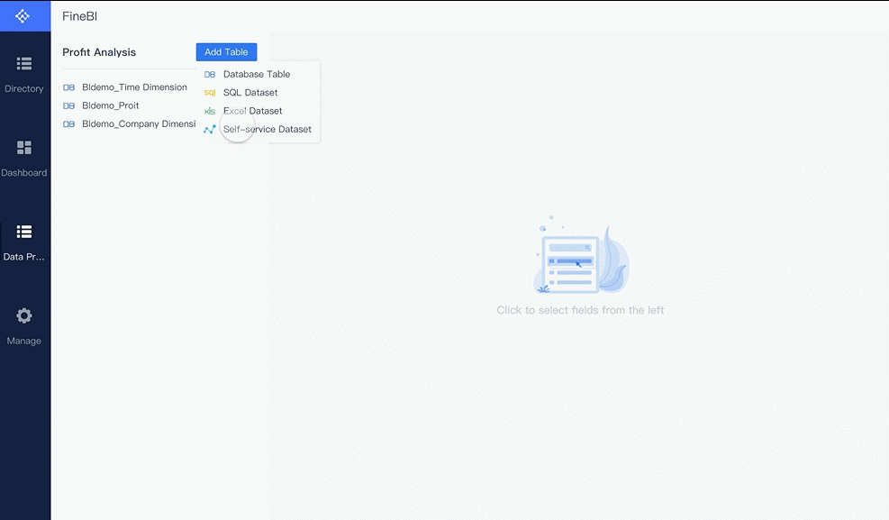
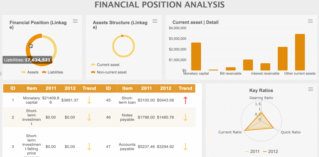
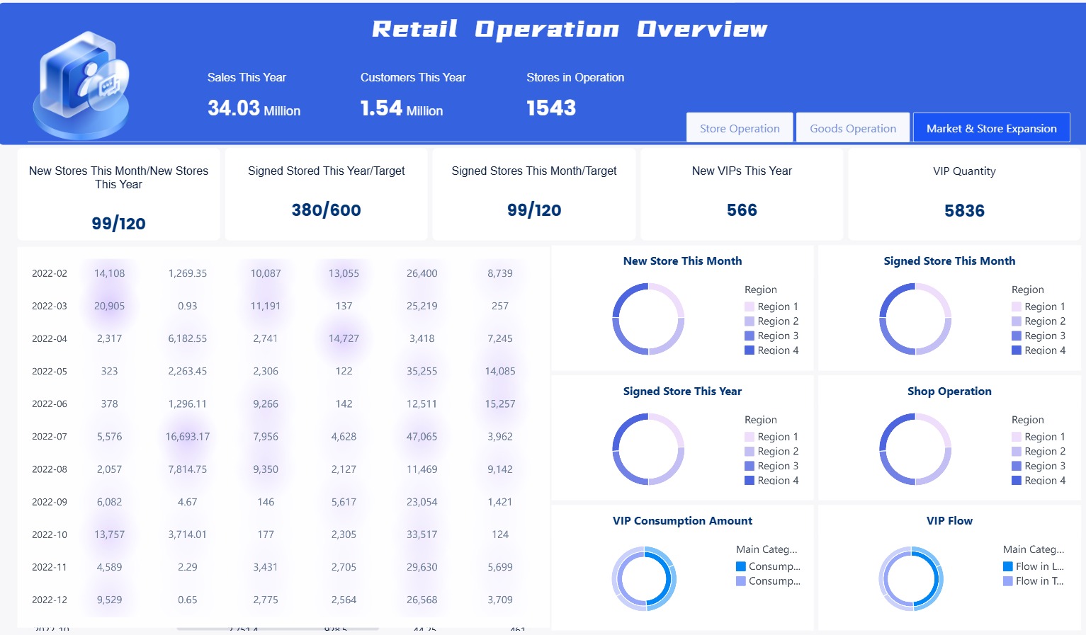
You can use FineBI to connect to over 60 data sources, including databases, cloud warehouses, and APIs. The platform gives you a drag-and-drop interface for building dashboards. You do not need coding skills. FineBI supports real-time data updates, so you always see the latest numbers. You can set up data alerts and use advanced data visualization tools. The software also provides strong governance with role-based access and audit trails.
You can use FineBI for many business needs. Sales teams track pipeline health and customer segments. Finance departments monitor cash flow and budget variances. HR managers analyze employee retention. Executives use the data dashboard for strategic planning. FineBI supports real-time monitoring, so you can respond quickly to changes.
FineBI offers flexible pricing. You can request a custom quote based on your organization’s size and needs. This approach ensures you only pay for what you use. You can start with a free trial to explore the features before making a decision.
Pros and Advantages
FineBI stands out as executive dashboard software because it empowers you to perform self-service data analysis. You can blend data from multiple sources and create interactive dashboards. The platform supports real-time data and advanced business reporting. You can collaborate with your team and share insights securely. FineBI’s mobile access means you can check dashboards anywhere.
BOE Technology Group used FineBI to unify data and standardize metrics. This led to a 5% reduction in inventory costs and a 50% increase in operational efficiency. TXC Corporation improved data analysis and made employees more data-driven. Both companies now use real-time data for better decision-making.
Tip: You can read more about these customer stories on the FineBI website.
You can use Tableau to create interactive dashboards that help you see your business data in new ways. The platform gives you tools for data visualization, predictive modeling, and automated insights. These features help you spot trends and make better decisions. Tableau lets you monitor all parts of your business with one executive dashboard. You can scale your dashboards as your company grows and keep your data secure.
Feature
Description
Data Visualization
Build interactive and visually appealing dashboards for any business area.
Predictive Modeling
Forecast future trends using your historical data.
Automated Insights
Get instant insights without manual work, making decisions faster.
Use Cases
You can use Tableau in many ways. Executives often use it to track key metrics and monitor the health of their business. You can set up dashboards for sales, finance, operations, or HR. Tableau helps you unify data from different sources, so you get a complete view of your organization. You can also use it to share reports with your team and improve collaboration.
Track sales performance and revenue trends.
Monitor financial health and cash flow.
Analyze employee data for HR planning.
Assess operational efficiency across departments.
Tip: Use Tableau to bring together data from different systems and make your executive dashboard software more powerful.
Pricing
Tableau uses a subscription model. The Creator license costs $70 per user each month. This price is higher than many other dashboard software options. For a team of five, you may pay over $4,000 per year. Some users find the cost high, especially for small teams. However, many organizations see value in Tableau’s features and support.
Note: Tableau’s pricing can be a barrier for small businesses, but it offers a wide range of capabilities for larger organizations.
Pros and Cons
Tableau gives you many advantages, but you should also consider its limitations. The table below shows the main pros and cons.
Pros
Cons
Powerful data visualization tools
Higher cost than many alternatives
Interactive dashboards for easy data exploration
No automatic report scheduling
Real-time analytics for up-to-date decisions
Limited custom visual imports
Easy drag-and-drop interface
Some formatting challenges
Advanced mapping and in-memory analytics
Layout issues on different screen sizes
Unifies data from many sources
Limited parameter functionality
You can use Tableau to build executive dashboards that support fast, informed decisions. Make sure you weigh the costs and features before you choose the right solution for your business.
You get a wide range of features with Power BI. The platform gives you access to over 70 connectors, letting you pull data from many sources. You can blend information from databases, cloud services, and third-party apps like Salesforce and Google Analytics. Power BI supports real-time data, so you always see the latest numbers. Drill-down capabilities help you explore details without relying on static reports. You can manage permissions for different roles, which keeps your data secure. The table below shows some key features:
Feature
Description
Real-time data
Provides updated information for timely decision-making.
Database access
Allows drilling down to lower-level details from various databases.
Access to data sources
Integrates with third-party sources for comprehensive data.
Drill-down capabilities
Enables you to ask questions and explore data easily.
Connectors
Offers over 70 connectors for seamless integration.
Data Blending
Correlates information from multiple sources.
Data Governance
Manages permissions for tailored data access.
Use Cases
You can use Power BI for many executive dashboard software needs. Executives track campaign spending or factory performance in real time. You can create personalized dashboards for sales, finance, or operations. Power BI works well with Microsoft 365 tools like Excel and Teams, making collaboration easy. You can share reports across departments and control who sees what data. Artificial intelligence features help you find trends and insights quickly, even if you do not have data science skills.
Tip: Power BI lets you access dashboards from any device, so you stay informed wherever you work.
Pricing
Power BI offers flexible pricing. You can start with a free version, but it has limits on dataset size and sharing. The Pro plan costs $10 per user each month and gives you more sharing options. The Premium plan starts at $20 per user each month and supports larger datasets and advanced features. You can choose the plan that fits your team’s needs and budget.
Pros and Cons
Power BI gives you many advantages, but you should know its limitations. The table below helps you compare the main pros and cons:
Pros
Cons
Strong data source support
Complexity in handling advanced analytics
Affordability
Limited compatibility for tailored requests
Advanced analytics capabilities
Dataset size constraints
User-friendly interface
Complex licensing model
Comprehensive suite for data integration
Limited support for right-to-left languages
Challenges with diverse operating systems
You get a user-friendly interface and strong integration with Microsoft products. Power BI is affordable for most organizations. You may face challenges with advanced analytics or licensing. You should review your needs before choosing the best dashboard software for your business.
You can use Domo to connect your business data from over 1,000 sources. The platform is cloud-native, which means you access your dashboards from anywhere. You build dashboards with drag-and-drop tools, making it easy for non-technical users. Domo sends notifications when your data changes, so you always work with real-time data. You get mobile-friendly dashboards that help executives track performance on the go.
Connect to databases, cloud apps, and spreadsheets
Build dashboards with simple drag-and-drop tools
Receive instant alerts for important changes
Access dashboards on mobile devices
Use Cases
You can use Domo to monitor sales, marketing, finance, or operations. Executives often track KPIs and business health in one place. You share dashboards with your team to improve collaboration. Domo helps you spot trends quickly and respond to changes. You can set up automated reports and schedule updates, so your team always sees the latest numbers.
Tip: Use Domo to unify data from different departments and make faster decisions.
Pricing
Domo uses a flexible, credit-based pricing model. You pay based on how much you use, not by the number of users. This model works well for large enterprises because you can scale up without buying extra licenses. You get volume discounts as your usage grows. Domo provides a credit utilization report, so you track your spending and avoid surprise bills. All features are available from the start, which encourages teams to experiment and innovate. The shift from fixed user licensing to consumption-based pricing means costs may change as your usage increases.
Unlimited users with volume discounts
Consumption-based pricing encourages innovation
Built-in usage reports help you manage costs
Immediate access to all features
Pros and Cons
Here is a quick look at Domo’s strengths and weaknesses for executive dashboard software:
Strengths
Weaknesses
Cloud-native platform with many integrations
Pricing can be high for small teams
Easy dashboard creation for non-technical users
Limited customization for embedded dashboards
Real-time data updates and notifications
Reliance on Domo’s cloud ecosystem
Mobile-friendly executive dashboards
Advanced analytics may feel constrained
You get a powerful dashboard software that supports real-time data and collaboration. You should consider your team size and usage needs before choosing Domo.
You can use Looker to build executive dashboard software that helps you understand your business. The platform connects with many data sources and lets you create custom dashboards. You get access to advanced analytics for different areas of your company. Here are some ways Looker supports your business:
Supply chain and inventory management: Track inventory levels and supply chain performance.
Financial analysis and forecasting: Monitor cash flow and profitability.
HR and workforce analytics: Analyze employee performance and retention rates.
Product analytics and user behavior: See how customers use your products and which features they like.
Operational analytics: Watch key metrics and find ways to improve processes.
Healthcare analytics: Review patient outcomes and measure operational efficiency.
E-commerce analytics: Check customer retention and conversion rates.
You can set up dashboards that show real-time data, so you always know what is happening in your business.
Use Cases
You can use Looker for many executive tasks. If you manage a retail company, you can track sales and inventory. In finance, you can monitor budgets and forecast profits. HR teams use Looker to study employee turnover and performance. Product managers see which features customers use most. Healthcare organizations analyze patient care and efficiency. E-commerce teams follow customer journeys and sales conversions. Looker helps you make better decisions by showing you the data you need.
Tip: You can share dashboards with your team to improve collaboration and keep everyone informed.
Pricing
Looker’s pricing starts at about $35,000 per year. For larger teams, costs can go above $150,000. The price depends on user roles and how much you use the platform. If you have a small team or basic needs, you may find other dashboard software like Power BI more affordable. Tableau offers strong data visualization, which may suit you if you want visual storytelling. Looker’s pricing works best for larger organizations that need advanced analytics and many users.
Pros and Cons
You should know the main strengths and weaknesses before you choose Looker for executive reporting.
Pros
Cons
Extensive integrations with various tools
Steep learning curve and LookML dependency
Semantic modeling ensures report consistency
Performance slowdowns at scale
Enterprise security and governance
Embedding complexity and iFrame limitations
Pricing complexity and user-based growth
Limited white-label control
You get strong integrations and secure data management. You may need time to learn LookML, and costs can rise as your team grows.
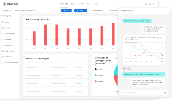
Sisense gives you a flexible way to build executive dashboard software for your business. You can connect data from many sources, including cloud apps, databases, and spreadsheets. Sisense lets you blend and analyze data without writing code. You can use drag-and-drop tools to create dashboards that show real-time data. Sisense supports advanced analytics, so you can dig deeper into your numbers. You also get intelligent alerts and notifications when important changes happen. The platform works well for both small teams and large enterprises.
Recent user satisfaction ratings show that Sisense scores high in several areas:
Dashboard: 84
Collaboration: 83
Data Exploration and Visualization: 83
BI Platform Administration: 82
BI Security: 81
Data Connectors and Data Mashup: 81
Operational Reporting Capabilities: 81
Self Service and Ad Hoc Capabilities: 81
Intelligent Alerts and Notifications: 80
Mobile: 78
Use Cases
You can use Sisense to track sales, monitor operations, or manage financial performance. Executives often choose Sisense for its ability to combine data from different departments. You can set up dashboards for marketing, HR, or supply chain management. Sisense helps you spot trends and make decisions quickly. You can share dashboards with your team to improve collaboration. Many companies use Sisense to automate reporting and reduce manual work.
Tip: Use Sisense to bring together data from all parts of your business for a complete view.
Pricing
Sisense uses a custom pricing model. You pay based on your company’s needs and the number of users. You can request a quote from the Sisense team. This approach helps you get the best dashboard software features for your budget. Sisense offers a free trial, so you can test the platform before you decide.
Pros and Cons
Sisense gives you many advantages as executive dashboard software. You get strong data integration, real-time data, and easy dashboard creation. The platform supports advanced analytics and secure sharing. You can access dashboards on mobile devices, though mobile scores slightly lower in user ratings. Some users say the learning curve is steep at first. You may need time to set up complex data models. Sisense works best for teams that want flexibility and powerful analytics.
Pros
Cons
High dashboard and collaboration scores
Steep learning curve for new users
Strong data blending and mashup tools
Mobile experience could improve
Real-time data and intelligent alerts
Setup can take time for large data
Secure sharing and governance
Custom pricing may not suit all
You can rely on Sisense for a flexible and powerful dashboard software solution.
You can use Klipfolio to build dashboards quickly. The platform gives you a drag-and-drop editor that helps you create custom visualizations. You connect to many data sources, such as spreadsheets, databases, and cloud services. Klipfolio supports real-time data, so you always see the latest numbers. You can set up data refresh intervals to keep your dashboards up to date. The platform also lets you share dashboards with your team or clients using secure links.
Key features include:
Pre-built templates for fast setup
Customizable charts and graphs
Integration with over 100 services
Mobile-friendly dashboards
Use Cases
Klipfolio works well for small and medium businesses. You can track sales performance, marketing campaigns, or financial metrics. Agencies use it to report results to clients. Executives use Klipfolio to monitor KPIs and spot trends. You can set up alerts for important changes in your data. This helps you respond quickly to business events.
Tip: Use Klipfolio to bring together data from different departments and make better decisions.
Pricing
Klipfolio offers several pricing plans. You choose a plan based on your needs. The Starter plan begins at $125 per month. The Team plan costs $250 per month. The Business plan starts at $500 per month. Each plan gives you more users, data sources, and features. You can try Klipfolio for free before you buy a plan.
Plan
Price (per month)
Best For
Starter
$125
Small teams
Team
$250
Growing companies
Business
$500
Larger businesses
Pros and Cons
You get many benefits with Klipfolio as your dashboard software. The platform is easy to use and supports many integrations. You can access dashboards on any device. Some users want more advanced customization options. Pricing may be high for very small teams.
You can use Zoho Analytics to build executive dashboard software that fits your business needs. The platform gives you an intuitive drag-and-drop interface. You create dashboards and reports without technical skills. Zoho Analytics supports data import from many sources, including Google Analytics, Salesforce, and QuickBooks. You get customizable charts, filters, and widgets. The Zia assistant uses AI to deliver insights and answer questions about your data. You can also white-label your dashboards for client presentations.
Here is a quick comparison of Zoho Analytics features with other dashboard software:
Feature
Zoho Analytics
Other Tools
User Interface
Intuitive drag-and-drop
Varies, often more complex
Built-in Connectors
Google Analytics, Salesforce, QuickBooks
Varies, may have fewer options
AI Insights
Yes, via Zia assistant
Not all tools offer this feature
Customization Options
Various chart types, filters, widgets
Varies, some may offer more
White-labeling
Yes
Not all tools provide this
Target Audience
Small to mid-sized businesses
Varies, some target enterprises
Affordability
Generally more affordable
Often more expensive
Scalability
Limited for enterprise needs
Typically better for large enterprises
Tip: Zoho Analytics works best for small and mid-sized businesses that want easy-to-use dashboards and affordable pricing.
Use Cases
You can use Zoho Analytics to track sales, monitor marketing campaigns, and analyze financial performance. The platform supports real-time data dashboards for different business areas. You can import data from spreadsheets, cloud apps, or databases. You customize visualizations to highlight KPIs and trends. Zoho Analytics helps you share reports with your team or clients. You use AI-powered insights to spot patterns and make decisions faster.
Build sales dashboards to monitor revenue growth.
Analyze marketing data to improve campaign results.
Track financial metrics for budgeting and forecasting.
Share dashboards with stakeholders for better collaboration.
Pricing
Zoho Analytics offers affordable plans for businesses. You pay based on the number of users and data rows. The Basic plan starts at $30 per month for two users. The Standard plan costs $60 per month for five users. The Premium plan is $115 per month for fifteen users. You get more features and data capacity as you upgrade. Zoho Analytics provides a free trial so you can test the platform before you buy.
Pros and Cons
You get many benefits with Zoho Analytics. The platform is easy to use and supports many data connectors. You access AI-powered insights and real-time data dashboards. Pricing is lower than most competitors. Some users find scalability limited for large enterprises. Advanced customization may require more setup.
Pros:
Intuitive interface
Wide range of connectors
AI insights with Zia assistant
Affordable pricing
Cons:
Limited scalability for large organizations
Advanced customization options may need extra effort
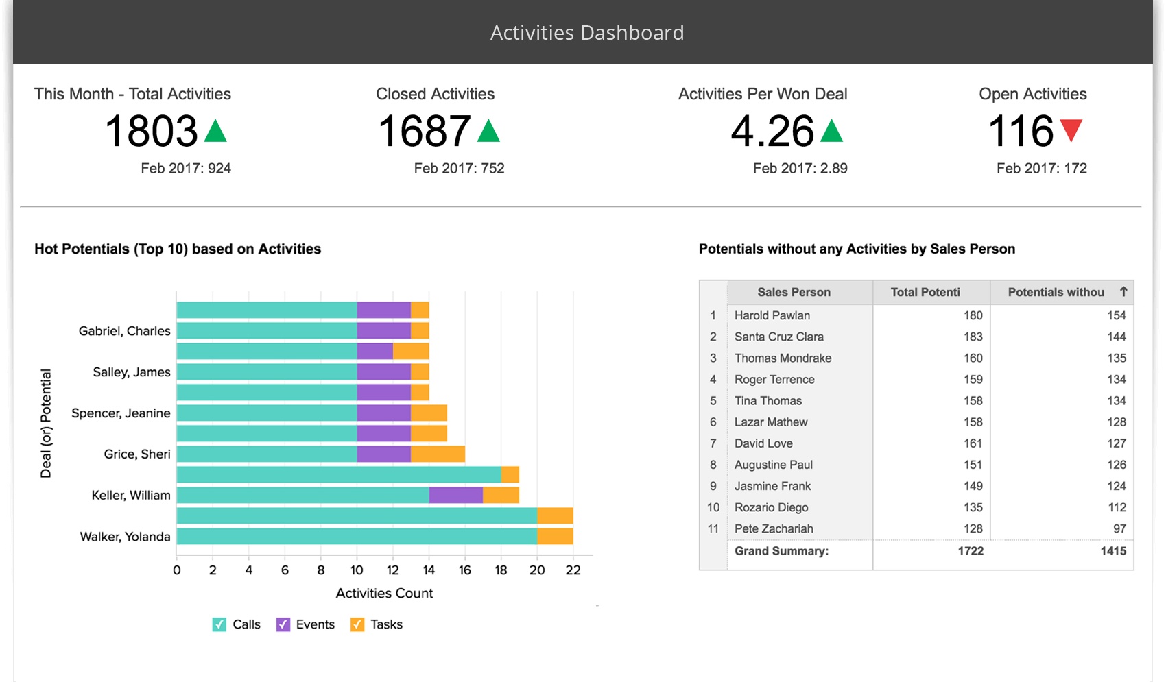
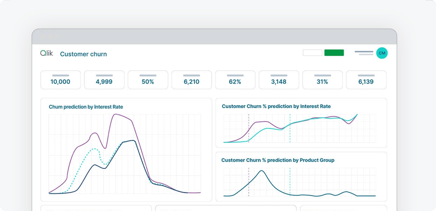
You can use Qlik Sense to create executive dashboard software that helps you see your business clearly. The platform gives you self-service visualization tools. You build interactive dashboards with drag-and-drop features. Qlik Sense supports search and conversational analytics, so you ask questions and get answers fast. You set up alerting and automation to stay informed about important changes. The software also offers advanced analytics for deeper insights. You access dashboards on any device, which helps you make decisions wherever you are.
Use Cases
Qlik Sense works well for many business needs. You track sales performance and monitor financial health. You analyze customer behavior and measure marketing results. You use real-time data to respond quickly to changes in your business. Executives rely on Qlik Sense to unify data from different sources and share insights with their teams. You can set up dashboards for HR, operations, or supply chain management. The platform helps you spot trends and make better decisions.
Tip: Use Qlik Sense to bring together data from all departments and improve collaboration.
Pricing
Qlik Sense uses a subscription pricing model. You pay per user each month. The cost depends on the number of users and the features you need. For small teams, the price is competitive. For larger organizations, costs may increase. You can request a custom quote to match your business requirements. Qlik Sense offers a free trial, so you test the dashboard software before you buy.
Pros and Cons
Qlik Sense gives you many advantages as executive dashboard software. You get self-service visualization and interactive dashboards. The platform supports search and conversational analytics, alerting, and automation. Advanced analytics help you understand your data better. Some users notice slowdowns when processing large data sets. Costs may rise for bigger teams. You may find limitations when exporting customized reports.
Advantages
Disadvantages
Self-Service Visualization
Slows Down When Processing Large Data Sets
Interactive Dashboards
Potential High Costs for Larger Teams
Search and Conversational Analytics
Limitations in Exporting Customized Reports
Alerting and Automation
Advanced Analytics
You can rely on Qlik Sense for the best dashboard software experience if you want flexibility and strong analytics.
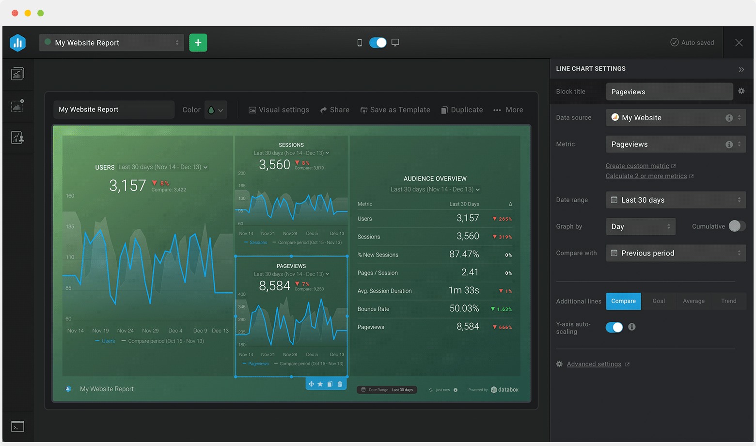
You can use Databox to bring all your business metrics into one place. The platform connects to over 70 data sources, including Google Analytics, HubSpot, and Salesforce. You build dashboards with a simple drag-and-drop editor. Databox gives you pre-built templates, so you start quickly. You set up goals and track progress with visual scorecards. The platform sends daily, weekly, or monthly snapshots to your email or mobile device. You also get alerts when your numbers change. Databox supports real-time data, so you always see the latest results.
Use Cases
Databox helps you monitor performance across sales, marketing, and customer support. You track KPIs for your team and share dashboards with stakeholders. Marketing managers use Databox to watch campaign results. Sales leaders follow pipeline health and revenue trends. Customer support teams measure ticket response times and satisfaction scores. You can set up dashboards for executives, so everyone sees the same numbers. Databox works well for agencies that need to report results to clients.
Tip: Use Databox to keep your team focused on goals and spot issues before they grow.
Pricing
Databox offers a free plan for basic needs. You get three dashboards and daily data updates. Paid plans start at $72 per month. Higher tiers give you more dashboards, data sources, and advanced features. You choose a plan based on your team size and reporting needs. Databox provides a free trial, so you test the platform before you buy.
Pros and Cons
You find Databox easy to set up and use. The platform offers strong integrations and helpful templates. You get mobile access and automated alerts. Some users want more customization options. Advanced analytics may require a higher-tier plan. Databox works best for teams that want simple, visual dashboard software.
You can use Geckoboard to create clear and focused dashboards for your team. The platform gives you a simple drag-and-drop interface. You connect to over 80 data sources, including Google Analytics, Salesforce, and spreadsheets. Geckoboard lets you display key metrics in real time. You can set up visualizations like bar charts, line graphs, and number widgets. The software allows you to customize layouts and colors, so your dashboard matches your brand. You can also display dashboards on TVs in your office to keep everyone updated.
Use Cases
Geckoboard works well for teams that need to track performance at a glance. You can use it to monitor sales targets, customer support tickets, or website traffic. Many companies use Geckoboard to share progress on KPIs with the whole team. You can set up dashboards for marketing, sales, or operations. When you display dashboards in common areas, everyone stays focused on goals. Geckoboard helps you keep your team motivated and informed.
Pricing
Geckoboard offers simple pricing plans. The Essential plan starts at $39 per month and supports one dashboard. The Pro plan costs $79 per month and allows unlimited dashboards and users. You get a 14-day free trial to test the features. You can choose a plan based on your team size and needs. Geckoboard does not charge extra for more users, which makes it cost-effective for growing teams.
Pros and Cons
You will find Geckoboard easy to set up and use. The platform supports many integrations and updates data automatically. You can display real-time data on screens for instant visibility. Some users want more advanced customization or analytics features. Geckoboard focuses on simplicity, so it may not fit complex reporting needs. If you want straightforward executive dashboard software, Geckoboard is a strong choice.
Smartsheet gives you a flexible way to manage projects and track business performance. You can build dashboards that show key metrics and progress. The platform supports drag-and-drop editing, so you design layouts easily. You connect to data from spreadsheets, cloud apps, and databases. Smartsheet lets you automate workflows and set up reminders. You view real-time data, which helps you make quick decisions. The software also includes templates for common business needs.
Tip: Use Smartsheet to create dashboards that update automatically as your team works.
Use Cases
You use Smartsheet for many business tasks. Project managers track deadlines and deliverables. Executives monitor KPIs and team performance. Sales teams follow pipeline stages and revenue goals. Marketing teams measure campaign results. You share dashboards with your team to keep everyone informed. Smartsheet works well for remote teams because you access dashboards from any device.
Track project timelines and milestones
Monitor sales and marketing metrics
Share updates with stakeholders
Manage resources and budgets
Pricing
Smartsheet offers several pricing plans. The Pro plan costs $12 per user each month. The Business plan is $25 per user each month. Enterprise pricing is available for larger organizations. Each plan gives you more features and support. You can start with a free trial to test the dashboard software before you buy.
Plan
Price (per user/month)
Best For
Pro
$12
Small teams
Business
$25
Growing companies
Enterprise
Custom
Large organizations
Pros and Cons
Smartsheet helps you organize work and visualize progress. You get strong collaboration tools and easy dashboard creation. The platform supports real-time data updates. Some users want more advanced analytics. Pricing may increase for large teams. You should review your needs before choosing executive dashboard software.
Pros:
Simple dashboard design
Real-time data visibility
Strong collaboration features
Mobile access
Cons:
Limited advanced analytics
Costs rise with more users
Selecting the Best Dashboard Software
Evaluation Criteria
You want dashboard solutions that match your business reporting needs. Start by listing the features that matter most for your team. The table below shows key considerations when you choose executive dashboard software:
Customization, drag-and-drop interface, color and font selection, graphics variety
Infrastructure Features
Cloud-based access, platform support, mobile options
Data Features
Data blending, drill down, database access, integration with multiple sources
You should check if the dashboard software supports real-time monitoring and easy data blending. Look for a drag-and-drop interface that lets you build dashboards quickly. Make sure you can customize colors and fonts to match your brand. You need mobile access so you can view your data dashboard anywhere. Collaboration tools help your team share insights and work together on data analysis.
Common Mistakes to Avoid
When you set up dashboard solutions, you want to avoid common mistakes that slow down progress. Many teams add too many elements, which confuses users. Focus on essential information for clear business reporting. Use easy-to-read fonts and graphics sized for quick viewing. Always label KPIs, pages, and sections so users can navigate easily. Choose visualizations that fit your data, not ones that distract from the message.
Tip: Place dashboard visualizations in a logical order. Avoid random placement, which can confuse users.
Other mistakes include using distracting color schemes and not making dashboards mobile-friendly. You should provide summaries or tooltips for quick understanding. Make sure your dashboard software supports real-time monitoring and gives context for each visualization. Good navigation helps users find what they need fast.
A well-designed data dashboard improves decision-making and supports efficient data analysis. You help your team stay focused and get the most value from your dashboard solutions.
You have explored the leading executive dashboard software options for modern leaders. To get started, plan your key metrics, involve your team, and test dashboard software with real business data. You can access a free trial of FineBI by visiting the official website and requesting an activation code. When you use data-driven insights, you improve your strategies and increase your chances of exceeding revenue goals. Empower your team with data skills and stay ahead in a fast-changing market.
Access a wealth of case studies, industry insights, and solution guides to accelerate digital transformation.
FAQ
What is executive dashboard software?
Executive dashboard software helps you track key business metrics in one place. You see real-time data, spot trends, and make faster decisions. You use dashboards to monitor sales, finance, operations, and more.
How do you choose the best dashboard tool?
You should list your business needs first. Compare features like data integration, customization, and mobile access. Test free trials before you decide. Look for tools that match your workflow and support your data sources.
Can you connect multiple data sources to one dashboard?
Yes, most dashboard software lets you connect databases, cloud apps, and spreadsheets. You blend data from different systems for a complete view. FineBI, Power BI, and Tableau support multi-source integration.
Is dashboard software secure for sensitive business data?
You get strong security features with top dashboard tools. Role-based access, data masking, and audit trails protect your information. You control who sees each dashboard and report.
Can you access dashboards on mobile devices?
You can view and interact with dashboards on smartphones and tablets. Most executive dashboard software offers mobile apps or responsive web access. You stay informed wherever you go.