Nonprofit leaders rarely struggle because they lack data. They struggle because data lives in too many places: donor CRM, accounting software, program spreadsheets, volunteer tools, grant files, and board reports. The result is slow decisions, inconsistent reporting, and too much time spent reconciling numbers instead of acting on them.
That is where nonprofit dashboard examples become useful. A well-designed dashboard turns scattered data into a role-specific, decision-ready view. For a board member, that means fast oversight. For a development director, it means campaign performance. For a finance lead, it means liquidity, budget control, and fund visibility. For executive leadership, it means seeing cross-functional risks before they become operational problems.
If you are an executive director, CFO, development lead, or operations manager, the practical value is simple: the right dashboard helps your team spot what matters, align around shared metrics, and act faster with greater confidence.
Click To Try The Dashboard
1. What makes nonprofit dashboard examples useful across teams
A nonprofit dashboard is a visual reporting layer that consolidates key data into a single, structured view. Instead of hunting through reports or requesting one-off spreadsheets, teams can monitor performance, exceptions, and trends in one place.
For nonprofits, this matters because performance is multidimensional. You are not only tracking revenue. You are also managing mission outcomes, compliance, resource allocation, staffing capacity, donor relationships, and stakeholder accountability. A dashboard helps connect those moving parts.
Different roles need different views because they make different decisions.
Board members need strategic oversight, not operational detail.
Fundraising teams need campaign, pipeline, and donor behavior data.
Finance teams need budget, cash, reserve, and fund restriction visibility.
Program leaders need service delivery and outcome tracking.
Volunteer coordinators need staffing and engagement data.
Executives need a unified summary across all major functions.
This is why strong dashboard design starts with audience and decision context, not visualization style.
Strategic dashboards vs. management dashboards vs. real-time monitoring views
Not every dashboard serves the same purpose. In practice, nonprofit organizations usually need three reporting layers.
Strategic dashboards
These support long-term governance and planning. They focus on mission progress, strategic plan milestones, budget health, funding mix, and major organizational risks. They are ideal for board reporting and executive review.
Management dashboards
These support department leaders and functional managers. They track performance drivers such as donor retention, program utilization, volunteer coverage, or monthly spend by program. They help teams manage execution.
Real-time monitoring views
These are built for rapid response. They surface immediate exceptions such as campaign underperformance, cash shortfalls, overdue grant reports, or volunteer scheduling gaps. They are especially useful for operations-heavy teams.
A common mistake is trying to force all three into one dashboard. That usually creates clutter, weakens focus, and reduces trust in the reporting.
2. Seven nonprofit dashboard examples by use case
Below are seven practical nonprofit dashboard examples that map to common leadership and operational needs. Use them as models for structure, KPI selection, and user design.
Board reporting dashboard
A board reporting dashboard should answer one question clearly: Are we on track as an organization?
Board members do not need dozens of charts. They need a concise view of mission progress, financial stability, fundraising performance, and major risk signals. This dashboard should reduce presentation time and improve the quality of governance discussion.
The best board dashboards emphasize the few KPIs that support faster oversight. For example, if donor revenue is ahead of target but cash reserves are tightening due to timing issues, the board should see that immediately. If a flagship program is expanding but cost per outcome is worsening, that should be visible too.
This dashboard is most effective when reviewed monthly or quarterly with short commentary attached to each exception.
Fundraising dashboard
A fundraising dashboard is built for development leaders who need to improve revenue predictability and donor performance.
At minimum, it should track:
Campaign revenue
Donor retention rate
Average gift size
Conversion rate
Recurring donor growth
Major gift pipeline status
Pledge fulfillment
Channel performance by source
This is where many nonprofits gain immediate value from better reporting. Instead of looking only at total donations, the dashboard should show where revenue is coming from, how efficiently it is being generated, and whether donor quality is improving over time.
Channel comparison is especially important. Events may create visibility but lower ROI. Email may convert well at low cost. Grants may support stability but create deadline complexity. Major gifts may be high value but highly concentrated. Recurring giving may grow slowly but improve forecasting. A good dashboard helps leaders compare all of these side by side.
For development teams, this dashboard should also expose pipeline health, including open opportunities, expected close timing, stage conversion, and concentration risk among top prospects.
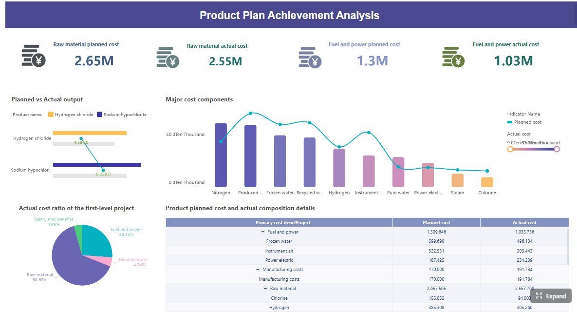
Finance dashboard
A finance dashboard helps nonprofit finance leaders manage stewardship, sustainability, and compliance.
This dashboard should monitor:
Revenue versus budget
Expenses versus budget
Cash on hand
Operating reserves
Burn rate
Restricted versus unrestricted funds
Revenue mix
Expense trends by department or program
Forecast variance
The real value here is not just historical reporting. It is early warning. A finance dashboard should surface signals that support stronger forecasting and better decision-making before month-end closes or board meetings.
For example, if unrestricted revenue is soft while restricted awards are increasing, leadership may face a real operating constraint despite apparently strong top-line funding. If expenses are within budget overall but one program is overspending due to staffing or vendor cost inflation, the dashboard should make that visible immediately.
For nonprofits with multiple funding streams, this dashboard is essential for understanding liquidity, obligation timing, and fund utilization.
A program impact dashboard connects service delivery to mission effectiveness. This is where nonprofits move beyond activity counts and start evaluating whether programs are creating meaningful results.
Useful measures often include:
Number of participants served
Program outputs delivered
Outcome achievement rates
Service utilization trends
Cost per participant or cost per outcome
Geographic or demographic reach
Waitlist or capacity indicators
Program growth versus target
This dashboard helps teams answer critical questions:
Which programs are scaling successfully?
Which are underperforming against mission goals?
Where are outcomes strong but costs rising?
Where is demand growing faster than capacity?
A well-built impact dashboard brings operational data and outcome data together. That matters because a program can appear busy without being effective, or effective without being financially sustainable. Leadership needs both views at once.
This dashboard is especially important when reporting to funders, aligning staff around program goals, and deciding where to invest limited resources.
Volunteer operations dashboard
Volunteer labor is operational capacity. When it is not measured properly, service delivery suffers.
This dashboard helps nonprofit operations teams identify where bottlenecks are limiting impact. If recruitment is strong but onboarding is slow, the issue is process design. If volunteers are trained but shift coverage remains weak, the issue may be scheduling friction or poor role fit. If hours are high but retention is low, engagement quality may be the problem.
For service-driven nonprofits, this is not a “nice to have” dashboard. It is a workforce planning tool.
This is often the most valuable dashboard in the organization because it improves coordination. Many leadership teams discover issues too late because each function reports separately. An executive dashboard exposes cross-functional dependencies early. For example, a grant award may increase program demand, which then requires volunteer expansion and budget reallocation. Seeing these relationships in one view supports better decisions.
Grant tracking dashboard
Grant funding is too important to manage through disconnected files and calendar reminders.
A grant tracking dashboard should show:
Application pipeline by stage
Award amounts
Probability-weighted pipeline value
Reporting deadlines
Compliance status
Spending progress against grant terms
Renewal opportunities
Grant concentration by funder
This dashboard reduces missed deadlines and improves visibility into institutional funding. It is especially useful for nonprofits that manage multiple grants across program areas, reporting cycles, and compliance requirements.
The most effective grant dashboards combine pipeline management and post-award oversight. That means leadership can see not only what funding may be coming in, but also which active grants are at risk due to reporting delays, underutilization, or upcoming renewal needs.
3. The KPIs each nonprofit dashboard should prioritize
A dashboard is only as good as the KPIs behind it. Too many nonprofits overload dashboards with metrics that are interesting but not actionable. The right approach is to prioritize a small set of indicators tied directly to decisions.
Key Metrics (KPIs)
Below is a structured KPI list every nonprofit should use as a starting point.
Board and leadership metrics
Mission progress indicators: Measures of progress toward strategic goals or intended community outcomes.
Strategic plan milestones: Completion status of major initiatives tied to the organization’s roadmap.
Budget health: High-level view of actual revenue and expenses versus plan.
Organizational risk flags: Signals related to compliance, funding concentration, staffing gaps, or delivery risk.
Cash runway: Estimated time the organization can operate with available unrestricted cash.
Reserve ratio: Level of reserves relative to operating needs.
Program performance summary: Snapshot of core service reach and outcomes.
Executive exception indicators: Red, yellow, or green signals showing where leadership attention is needed.
Fundraising and development metrics
Donor acquisition cost: Cost required to acquire each new donor.
Retention rate: Percentage of donors who give again in a defined period.
Campaign ROI: Net return generated by a campaign after related costs.
Average gift size: Average donation value over a selected period.
Pledge fulfillment rate: Percentage of pledged revenue actually received.
Recurring donor growth: Change in active recurring donors over time.
Conversion rate: Percentage of prospects or visitors who become donors.
Pipeline coverage: Value of open opportunities relative to fundraising targets.
Channel performance: Revenue, cost, and return by channel such as events, email, grants, or major gifts.
Financial and program metrics
Liquidity: Ability to meet short-term obligations with available assets.
Program expense ratio: Share of total expenses directed to mission-related programs.
Burn rate: Speed at which cash or budget is being used.
Cost per outcome: Cost required to achieve a defined result or service impact.
Utilization trends: Changes in program usage, capacity, or service demand over time.
Restricted vs. unrestricted funds: Availability of funds for flexible operations versus designated use.
Expense variance: Difference between actual spending and budgeted spending.
Revenue mix: Distribution of funding across donations, grants, events, and other sources.
Participation rate: Share of target population or enrolled participants actively engaged in services.
Outcome attainment rate: Percentage of participants or cases meeting desired result thresholds.
These KPIs work because they are decision-oriented. They help leaders know whether to accelerate, adjust, investigate, or intervene.
4. How to build a nonprofit dashboard for your leadership team
The best dashboards are built around decisions, ownership, and review habits. Below is a practical implementation framework.
Start with decisions, not charts
Before designing any dashboard, define:
Who will use it
What decisions they need to make
How often they review performance
What actions should follow when a metric is off track
This step prevents one of the biggest dashboard failures: creating visuals without operational purpose.
For example, a board dashboard should support oversight and strategic guidance. A fundraising dashboard should support campaign optimization and pipeline reviews. A finance dashboard should support resource planning and liquidity control. Start there, then choose the metrics.
Choose the right data sources and reporting cadence
Most nonprofit dashboards pull from multiple systems, including:
CRM or donor management platform
Accounting or ERP system
Grant tracking records
Volunteer management tools
Program databases
Spreadsheet-based operational logs where necessary
Cadence should match the use case.
Real-time or daily: fundraising campaigns, website conversions, volunteer scheduling, grant deadlines
Weekly: pipeline reviews, staffing coverage, program utilization
Monthly: finance, board prep, department performance
If the dashboard refreshes too slowly, users stop trusting it. If it refreshes too often for a strategic use case, it creates noise. Match timing to decision speed.
Limit each dashboard to the vital few metrics
If a metric does not drive a decision, remove it.
Define every KPI clearly
Everyone should know exactly how donor retention, program participation, or unrestricted cash is calculated.
Use benchmarks and targets
Actual values without context are weak. Show target, variance, and trend.
Make exceptions obvious
Leaders should be able to spot issues in seconds through status indicators, thresholds, or variance highlights.
Add filters and drill-downs where useful
Let users move from organization-level summary to department, campaign, program, or date range.
Include concise notes or commentary
A short explanation can prevent misinterpretation and accelerate action.
3 to 5 actionable best practices for implementation
Here is a pragmatic rollout approach that works in real nonprofit environments.
1. Build one high-value dashboard first
Do not launch six dashboards at once. Start with the use case that solves the biggest reporting pain point, often board reporting, fundraising performance, or finance visibility.
2. Assign metric stewards
Every KPI should have an owner responsible for definition, data quality, and review. Without ownership, dashboard credibility erodes quickly.
3. Standardize definitions across teams
Agree on terms like active donor, retention, program participant, restricted funds, and campaign ROI. If departments use different logic, the dashboard becomes a source of conflict instead of clarity.
4. Review dashboards on a fixed operating rhythm
A dashboard only creates value when it is used consistently. Set a monthly leadership review, quarterly board review, or weekly development meeting tied to the dashboard.
5. Refine after live use
No dashboard is perfect in version one. Watch how leaders use it. Identify ignored metrics, recurring questions, and missing drill-downs. Then improve the structure based on real behavior.
5. Common mistakes to avoid when creating dashboards for nonprofits
Many dashboards fail not because the technology is weak, but because the design logic is wrong.
Here are the most common mistakes.
Trying to serve every audience with one dashboard
A board member, CFO, and volunteer manager do not need the same level of detail.
Tracking too many metrics without ownership or next steps
More data does not equal more insight. It often leads to slower meetings and weaker action.
Using inconsistent definitions across finance, fundraising, and program teams
When numbers do not align, trust breaks down fast.
Failing to review and update the dashboard as goals change
Dashboards should evolve with strategy, funding mix, and operational priorities.
Designing for presentation instead of decision-making
A dashboard is not just a visual report. It is a management tool.
Ignoring exception handling
If users cannot quickly see what is off track, the dashboard is not doing its job.
The most effective nonprofits treat dashboards as part of their operating system, not a one-time reporting project.
6. How to choose the right dashboard example to adapt
Not every organization needs all seven dashboard types immediately. The right approach depends on your nonprofit’s size, reporting maturity, leadership style, and data availability.
Use this decision logic.
If your board asks for clearer oversight, start with a board reporting dashboard
If cash, budget, or fund restrictions are hard to monitor, start with a finance dashboard
If proving mission effectiveness is the priority, start with a program impact dashboard
If volunteer staffing affects service delivery, start with a volunteer operations dashboard
If leadership works across multiple functions and lacks one summary view, start with an executive dashboard
If grant complexity is growing, start with a grant tracking dashboard
Match the format to your organization’s reality.
Smaller nonprofits may need simpler, highly focused dashboards with fewer integrations.
Mid-sized nonprofits often benefit from role-based dashboards across leadership, development, and finance.
Larger nonprofits usually need a full dashboard ecosystem with drill-down capability, automated refreshes, and stronger governance.
Most importantly, treat examples as models, not templates to copy blindly. The structure may transfer, but your KPIs, targets, reporting cadence, and ownership model must reflect your own mission and operating context.
From manual reporting to scalable nonprofit analytics
Building this manually is complex. Pulling from multiple systems, cleaning inconsistent data, aligning definitions, designing role-based views, and maintaining update cycles can overwhelm even capable nonprofit teams.
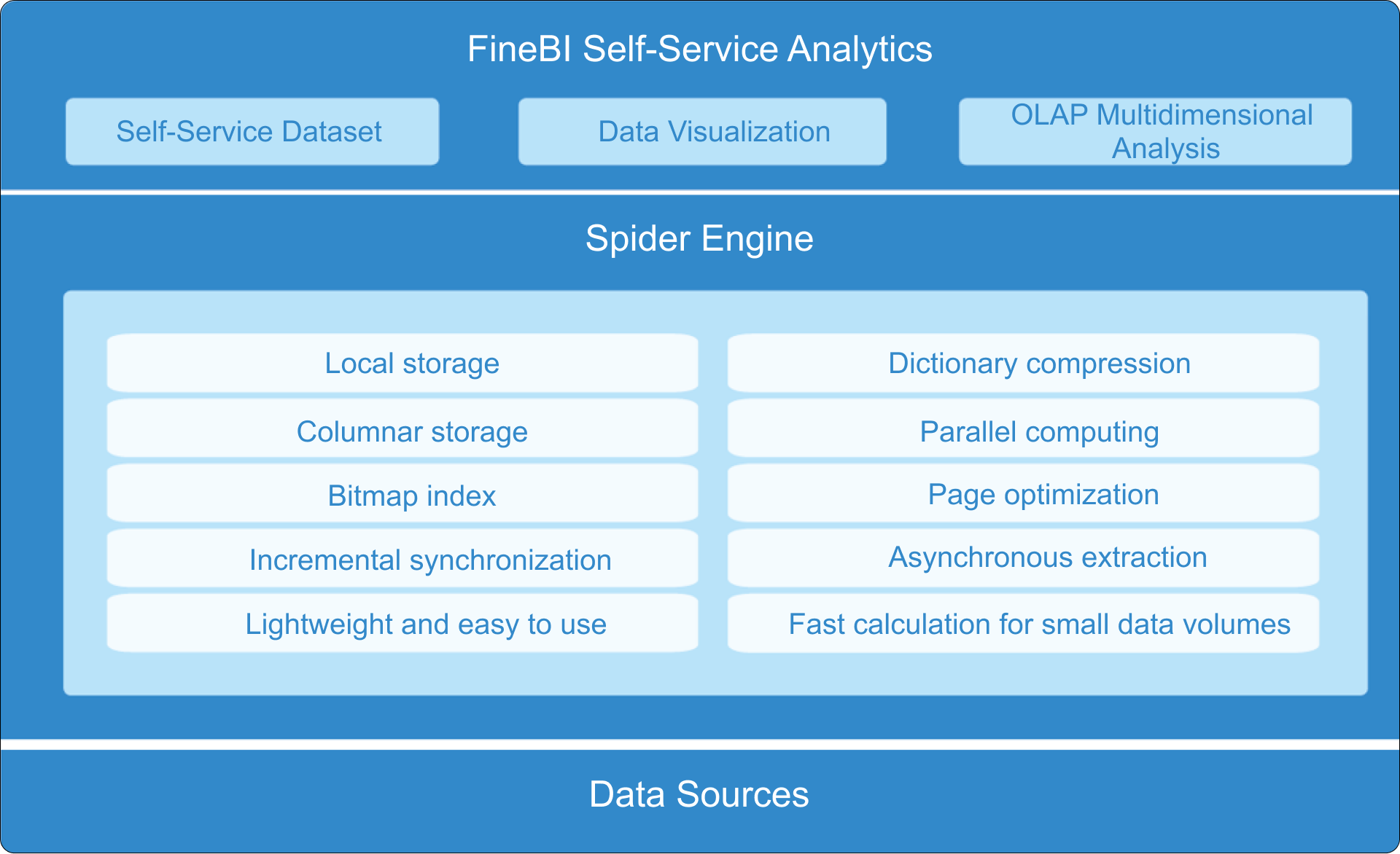
This is where FineBI becomes the practical solution.
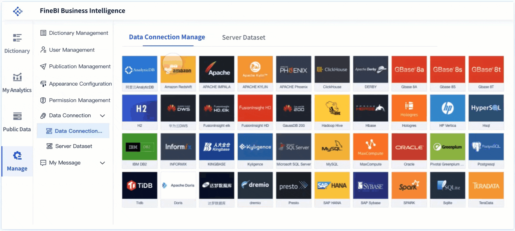
Instead of relying on fragmented spreadsheets and custom reporting workarounds, use FineBI to utilize ready-made templates and automate this entire workflow. FineBI helps nonprofits connect fundraising, finance, program, volunteer, and grant data into one analytics environment, so leadership teams can work from trusted, role-based dashboards without rebuilding reports every cycle.
For enterprise-minded nonprofit decision-makers, the value is straightforward:
Faster dashboard deployment with ready-made templates
More consistent KPI definitions across teams
Automated data refreshes from multiple systems
Self-service analysis for leadership and managers
Better board reporting, planning, and operational visibility
If your goal is to move from reactive reporting to disciplined, scalable decision-making, the smartest next step is not to build more spreadsheets. It is to standardize your dashboard strategy and use a platform like FineBI to operationalize it.
FAQs
A nonprofit dashboard should include the few metrics that help a specific audience make decisions quickly, such as fundraising results, budget versus actuals, cash position, program outcomes, and major risks. The exact KPIs should change based on whether the dashboard is for the board, executives, finance, or program teams.
A board dashboard focuses on strategic oversight, including mission progress, financial health, fundraising performance, and risk indicators. A management dashboard goes deeper into operational drivers like donor retention, program utilization, staffing coverage, or monthly spending trends.
It depends on the use case. Board dashboards are often reviewed monthly or quarterly, while fundraising, finance, and operations dashboards may need weekly or real-time updates to catch issues early.
Common fundraising KPIs include campaign revenue, donor retention rate, average gift size, conversion rate, recurring donor growth, major gift pipeline status, and pledge fulfillment. These metrics help development teams understand both current results and future revenue health.
Start with the decisions the user needs to make, then choose only the vital few metrics that support those decisions. Separate strategic, management, and real-time views instead of forcing every KPI into one dashboard.
Product Trial
FineReport
Pixel-perfect reports · Interactive dashboards · Easy data entry · Digital twins