A boxplot is a powerful visual tool in statistics that helps you quickly understand the distribution of your data. With just one glance, you see important details like the minimum, maximum, median, and quartiles. The box-and-whisker plot also highlights unusual values, called outliers, using a clear mathematical rule. This summary makes it easy to spot patterns, trends, and problems in your data. In business intelligence, using a boxplot lets you compare results across different groups or time periods. For example:
Because people process images much faster than text, a boxplot saves you time and helps you make decisions quickly. FineBI from FanRuan makes it simple for anyone to create and interpret these charts, turning raw data into valuable insights.
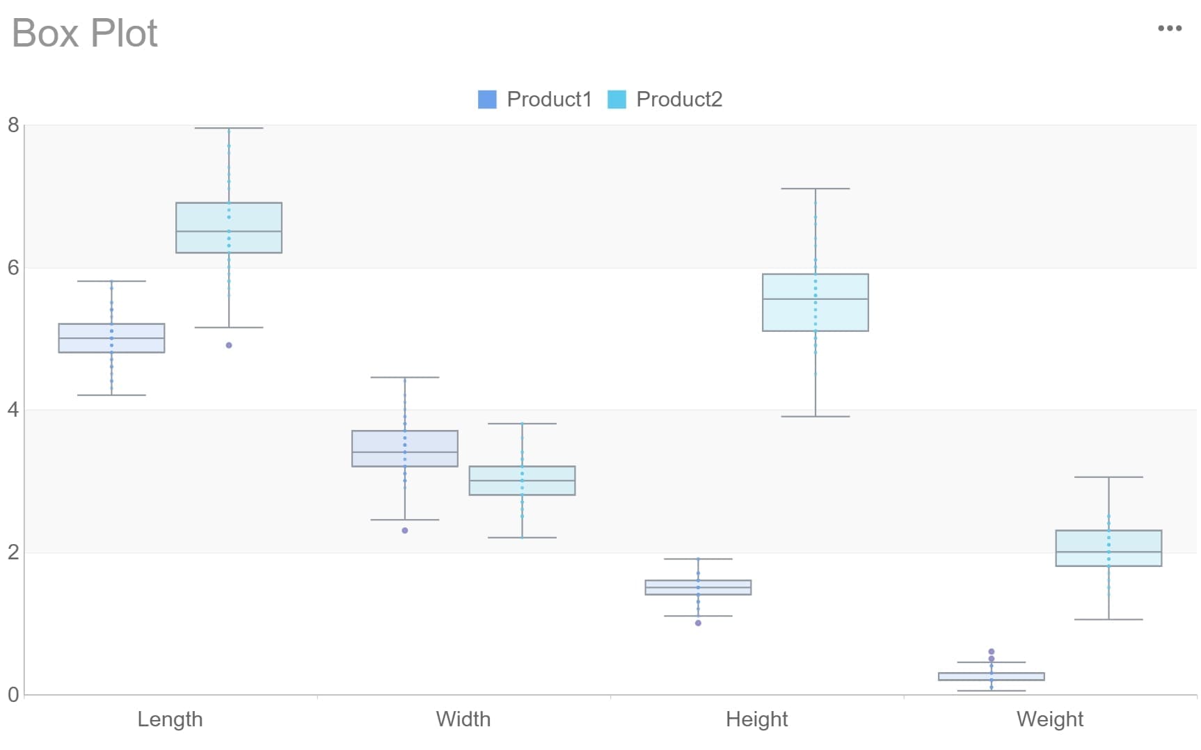
A boxplot is a simple yet powerful chart in statistics that helps you see how your data is spread out. You use a box plot to show the five-number summary: minimum, lower quartile (Q1), median, upper quartile (Q3), and maximum. This summary gives you a quick look at the main features of your data. For example, if you have a set of numbers like {3, 7, 8, 5, 12, 14, 21, 13, 18}, the box plot will show you the smallest value, the largest value, and where most of your data sits. You can use a boxplot to compare groups, spot outliers, and understand trends. FineBI from FanRuan-en lets you create these charts easily, so you can focus on making decisions.
You might hear people call it a box-and-whisker plot. This is just another name for a boxplot. Both terms mean the same thing. The box in the chart shows the middle 50% of your data, from the lower quartile to the upper quartile. The line inside the box marks the median. The whiskers stretch out to the smallest and largest values that are not outliers. If you see dots or stars outside the whiskers, those are outliers—data points that are much higher or lower than the rest. This visual makes it easy to spot the center, spread, and any unusual values in your data.
Let’s break down the anatomy of a boxplot:
Here’s a quick example:
| Data Set | Min | Q1 (Lower Quartile) | Median | Q3 (Upper Quartile) | Max | Interquartile Range |
|---|---|---|---|---|---|---|
| {3, 7, 8, 5, 12, 14, 21, 13, 18} | 3 | 6 | 12 | 16 | 21 | 10 |
You can use a box plot in many real-world situations:
A boxplot helps you quickly understand the distribution, spot outliers, and make better decisions with your data.
When you look at a boxplot, you can quickly see how your data is spread out and where most values fall. To graph and interpret a boxplot, follow these steps:
Tip: Quartiles split your data into four equal parts. The box shows the middle 50% of your data. The whiskers show the range, except for outliers.
FineBI makes this process easy. You can upload your data, and FineBI will automatically create a box plot. You can then use the interactive features to highlight the median, quartiles, and outliers. This helps you focus on the most important parts of your data distribution.
Outliers are values that stand out from the rest of your data. In a boxplot, you spot outliers by looking for points outside the whiskers. The outlier box plot uses a clear rule to find these unusual values. Any data point below Q1 minus 1.5 times the IQR or above Q3 plus 1.5 times the IQR is an outlier. Some boxplots also show "far out" outliers, which are even further from the main group.
Outliers can signal mistakes in your data, rare events, or important trends. For example, a sudden spike in sales could be an outlier that points to a successful campaign. Or, a very low test score might show a data entry error. The outlier box plot helps you see these points right away.
Note: Outliers can change your analysis. Always check if they are errors or if they reveal something important about your data.
FineBI highlights outliers on your box plot with special symbols. You can click on these points to see their exact values. This makes it easy to investigate and decide what to do next.
A boxplot gives you a clear picture of your data distribution. The length of the box shows how spread out the middle half of your data is. Long whiskers mean your data has a wide range. Short whiskers mean most values are close together.
Look at the position of the median inside the box. If the median is in the center, your data is symmetric. If the median is closer to the bottom or top, your data is skewed. For example, if the upper whisker is much longer, your data has a right skew. If the lower whisker is longer, your data has a left skew.
Here is a quick example:
| Statistic | Value |
|---|---|
| Minimum | $0 |
| First Quartile | $29,496 |
| Median | $68,552 |
| Third Quartile | $124,280 |
| Maximum | $780,575 |
In this example, the boxplot shows a right-skewed distribution. The maximum value is much higher than the rest, and the upper whisker is longer. This tells you that most data points are lower, but a few are much higher.
Tip: Compare several boxplots side by side to see differences in spread and symmetry between groups.
FineBI lets you create multiple box plots at once. You can compare different products, regions, or time periods. This helps you spot trends, outliers, and changes in your data distribution quickly.
A boxplot does not show every detail, like the exact number of data points or if your data has two peaks. Always use a box plot with other charts and check your data before making decisions.
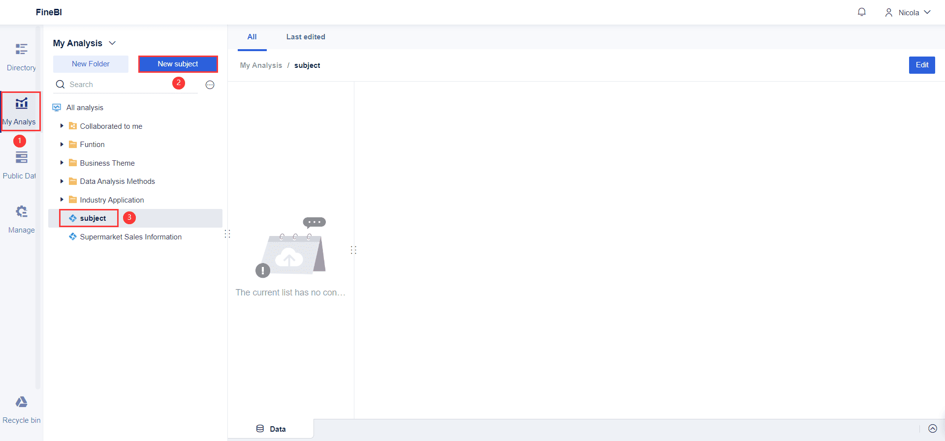
Start by collecting your data and making sure it is clean and organized. FineBI lets you connect to many sources, such as Excel files, databases, or cloud platforms. You should check for missing values and remove any errors. Arrange your data in ascending order if you want to draw a boxplot by hand, but FineBI handles sorting for you. For example, if you want to compare sales across regions, gather all sales numbers for each region. This step sets the foundation for accurate box plot analysis.
Tip: Use FineBI's data cleaning tools to handle duplicates and standardize values before you graph your box plot.
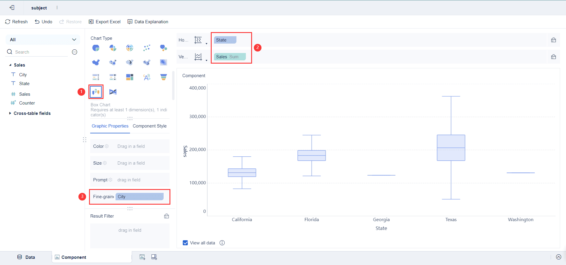
After preparing your data, you can start graphing a boxplot in FineBI. Open the dashboard editor and add a new chart component. Select the box plot chart type from the list. Drag your category field (like product or region) to the Axis area. Place your numeric data (such as sales or scores) in the Values area. FineBI will automatically calculate the quartiles, median, and outliers for you. This makes it easy to draw a boxplot without manual calculations.
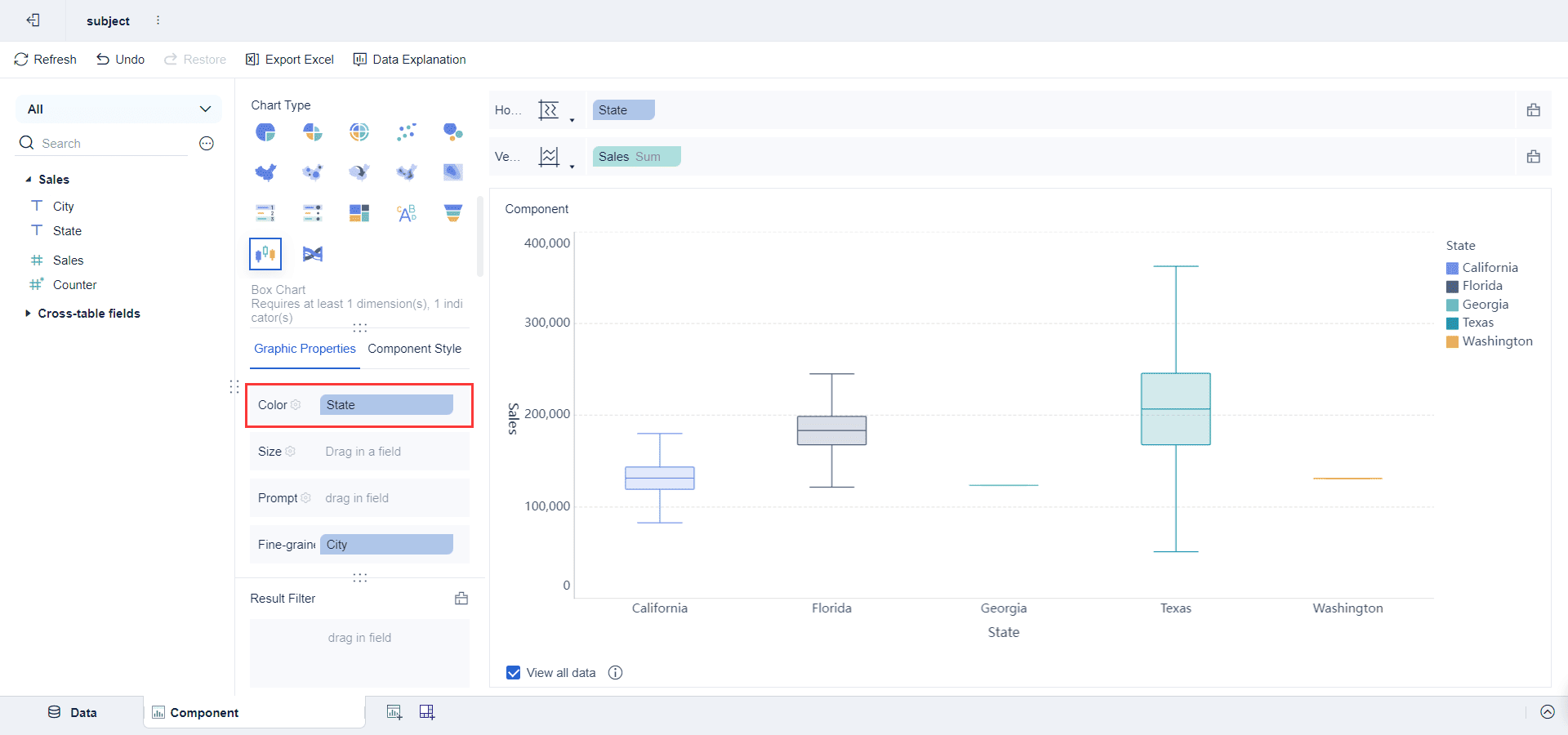
You can customize your box plot to make your insights clearer. Change the color scheme to highlight differences between groups. Add gridlines and legends for better readability. Use annotations to point out important features, such as outliers or the median. FineBI allows you to adjust the scale and labels, making your boxplot easy to understand. You can also enable interactivity, so users can click on parts of the box plot to see exact values.
Note: Consistent colors and clear labels help your audience interpret the box plot quickly.
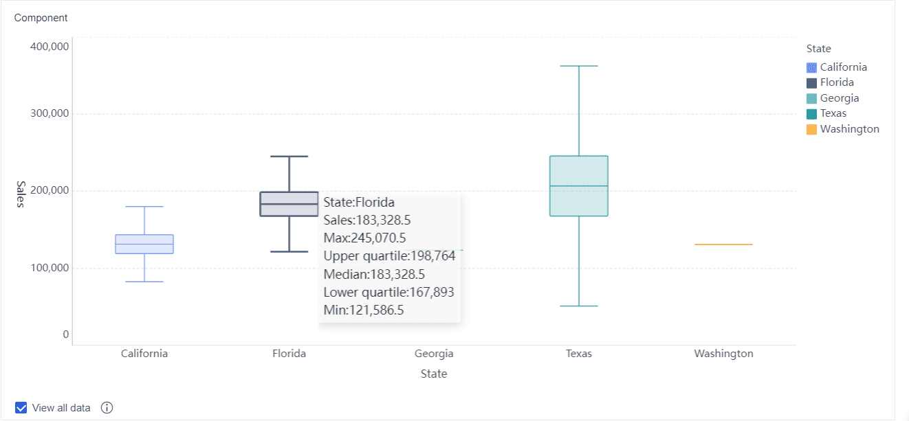
Let’s walk through a quick tutorial on how to graph a boxplot in FineBI using customer satisfaction data:
You can use this tutorial for many real-world cases, such as comparing product quality in manufacturing or analyzing financial returns. FineBI makes graphing a boxplot fast and code-free, so you can focus on insights instead of manual work.
You can use box plots to compare multiple groups or datasets side by side. This approach helps you see differences in distribution, central tendency, and variability at a glance. When you place several box plots next to each other, you can quickly spot patterns that might not be obvious from tables or raw data.
Here’s how you can analyze groups using box plots:
For example, when you compare body fat percentages for men and women using box plots, you might see that men have a lower median and more skewness, while women have a higher median but less variability. In another case, comparing morning and afternoon test scores, the median for the morning group may be higher, showing better performance.
FineBI from FanRuan makes group analysis simple. You can create multiple box plots for different categories, such as regions or products, and instantly see differences in distribution, median, and outliers. This visual approach helps you make faster, more informed decisions.
Box plots give you a powerful way to draw insights from your data. By summarizing the distribution with the interquartile range, median, whiskers, and outliers, you can spot trends and anomalies across several datasets. For instance, environmental studies use box plots to detect pollution spikes by comparing seasonal data. In education, you can identify classrooms that deviate from the norm.
You can also use box plots in manufacturing to monitor product quality. If one production line shows a wider box or more outliers, you know where to focus improvements. Marketing teams use box plots to compare campaign results across regions, quickly spotting over- or under-performing areas.
When you use FineBI, you can customize your box plots with notched or violin options for deeper analysis. The quantile box plot variation helps you see percentiles and quartile groups more clearly. This flexibility lets you compare distribution shapes, spot skewness, and understand the impact of outliers. By using box plots, you gain actionable information that guides your next steps and helps you prioritize what matters most in your data.
You might wonder if there is a difference between a boxplot and a box-and-whisker plot. In statistics, both terms describe the same chart. The Editverse article explains that people use these names interchangeably. Both show the five-number summary: minimum, first quartile, median, third quartile, and maximum. The "box" displays the middle part of your data, while the "whiskers" stretch to the smallest and largest values that are not outliers. The Wikipedia article adds that when you see lines (whiskers) extending from the box, the chart is often called a box-and-whisker plot. John Tukey introduced this plot in 1970. Some software may use one name or the other, but the meaning stays the same. You can use either term when talking about this way of showing a distribution.
You should use a boxplot when you want to compare the distribution of data across different groups. This chart works best when you need to see the spread, center, and outliers in your data. For example, you can use a box plot to compare test scores between classes or sales numbers between regions. Boxplots help you spot differences in distribution quickly. They are also useful when you have large datasets and want to summarize the main features without showing every value. If you need to highlight outliers or see if your data is skewed, a boxplot gives you a clear picture.
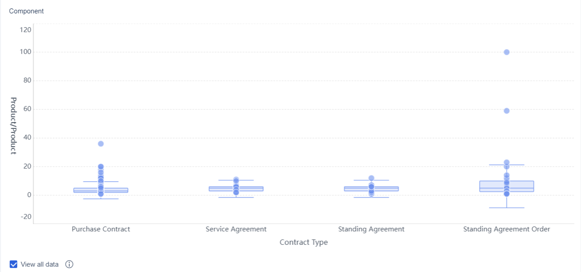
Tip: Use a boxplot when you want to compare several distributions side by side. This makes it easy to see which group has more spread or unusual values.
A boxplot gives you a summary of your data, but it does not show everything. Research shows that boxplots can sometimes mislead readers. The chart puts a lot of focus on the middle quartiles, which may make you think the distribution is always bell-shaped. In reality, your data might have gaps, clusters, or more than one peak, but a boxplot will not reveal these details. Many people also find quartiles hard to understand, which can lead to mistakes when reading the chart.
If you want to see every value or the exact shape of your data, try using a strip plot or a distribution heatmap. These charts make it easier to spot patterns that a boxplot might hide.
You can master the boxplot by focusing on its key parts: minimum, quartiles, median, whiskers, and outliers. This chart gives you a clear summary of your data, making it easy to spot trends and compare groups. The boxplot displays the five-number summary and interquartile range, helping you understand the spread and shape of your data. FineBI from FanRuan lets you create a boxplot quickly, turning raw data into insights for better decisions. Use a boxplot to make your data analysis more effective.
Click the banner below to experience FineBI for free and empower your enterprise to convert data into productivity!

작성자
Seongbin
관련 기사
Types of Graphs 총정리: 막대형·선형·산점도·히트맵을 언제 써야 할까?
데이터를 보여준다고 해서 모두 같은 방식의 $1를 써도 되는 것은 아닙니다. 같은 숫자라도 무엇을 강조하고 싶은지 에 따라 전혀 다른 메시지가 만들어집니다. 그래서 를 이해하는 일은 단순히 차트 종류를 외우는 것이 아니라, 상황에 맞는 시각적 언어를 고르는 과정 에 가깝습니다. 이 글에서는 가장 자주 쓰이는 네 가지 $1인 막대형 $1, 선형 $1, $1, $1 을 중심으로, 각각을 언제 써

Seongbin
2026년 8월 25일

타블루란? 초보자가 10분 안에 이해하는 핵심 개념과 대표 기능
데이터를 숫자 표로만 보면 중요한 변화나 문제를 한눈에 파악하기 어렵습니다. 이때 많이 언급되는 도구가 바로 타블루 입니다. 타블루는 데이터를 연결하고, 보기 좋은 차트로 만들고, 여러 $1를 한 화면에 묶어 빠르게 분석할 수 있게 도와주는 대표적인 $1 도구입니다. 특히 초보자 입장에서는 “타블루가 정확히 뭘 하는 도구인지”, “엑셀과 뭐가 다른지”, “처음엔 어디부터 시작해야 하는지”가
Seongbin
2026년 7월 05일

태블로 커뮤니티에서 실력 2배 빠르게 키우는 법: Tableau Public·과제·피드백 루프 실전 가이드
태블로를 배우는 사람이라면 한 번쯤 이런 고민을 합니다. “강의는 들었는데 실력이 잘 안 늘어요”, “$1는 만들었는데 이게 좋은 건지 모르겠어요”, “실무에서 통하는 감각은 어디서 익히죠?” 이런 질문에 가장 현실적인 답은 태블로 커뮤니티 에 있습니다. 혼자서 기능을 익히는 것과, 작업물을 공개하고 질문하고 피드백을 받으며 성장하는 것은 속도 자체가 다릅니다. 특히 Tableau Publi
Seongbin
2026년 7월 05일