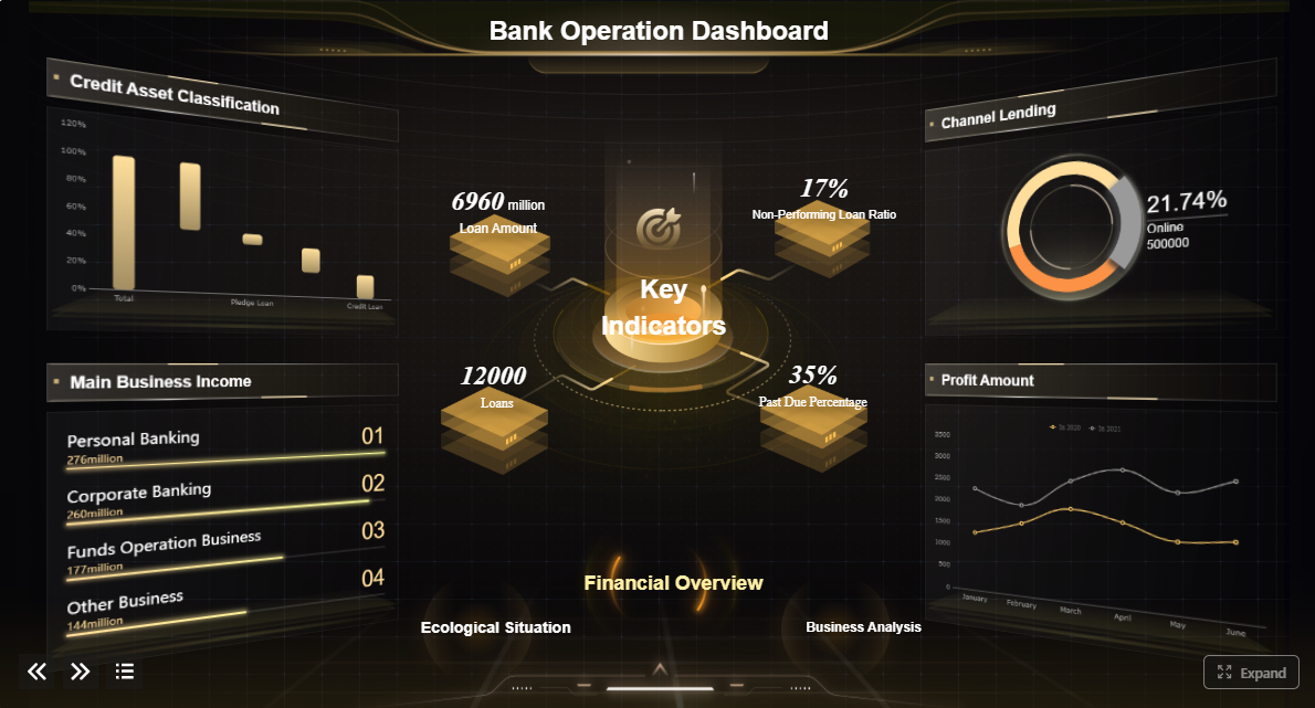
A banking dashboard is a decision system that consolidates financial, customer, risk, compliance, and operational data into one interactive view. For banking leaders, that matters because critical decisions cannot wait for disconnected spreadsheets, delayed monthly packs, or static reports that hide root causes.
If you are a branch manager, operations director, risk lead, or executive, the pain points are familiar: fragmented systems, inconsistent KPI definitions, slow reporting cycles, weak visibility across channels, and too much time spent reconciling numbers instead of acting on them. A well-designed banking dashboard solves this by turning raw banking data into a role-based command center for performance, control, and accountability.
Click To Try The Dashboard
What Is a Banking Dashboard?
A banking dashboard is an interactive reporting interface that brings together data from core banking systems, loan platforms, CRM tools, digital channels, treasury systems, call centers, and compliance workflows into a single decision view.
In practical terms, it helps a bank answer questions like:
Are deposits and loans growing as planned?
Which branches or regions are underperforming?
Where are delinquency and fraud risks increasing?
Which digital journeys are causing customer drop-off?
What operational bottlenecks are hurting service levels?
Unlike a static report, a banking dashboard is built for action. It offers:
Real-time or near-real-time visibility into key banking performance indicators
Drill-down analysis from enterprise summaries to branch, product, customer segment, or transaction detail
Alerts and threshold monitoring for exceptions, emerging risks, and service failures
Interactive filters by region, branch, product, time period, portfolio, or channel
Role-based views so each user sees the metrics that match their decisions
This is why the same banking dashboard framework can serve multiple users across the institution:
Executives need enterprise-wide profitability, portfolio health, and strategic trend visibility
Branch leaders need branch performance, service quality, and sales conversion tracking
Operations teams need queue volumes, turnaround times, and backlog monitoring
Risk and compliance managers need exception tracking, exposure monitoring, and control metrics
Analysts need detailed data exploration to identify drivers and anomalies
The business value is straightforward: faster decisions, earlier interventions, stronger governance, and better performance management across the bank.
Core KPIs a Banking Dashboard Should Track
A banking dashboard is only as useful as the KPIs it surfaces. Too many dashboards become cluttered because they display every available metric rather than the few that drive decisions. The goal is not more charts. The goal is sharper management action.
Financial and profitability metrics
Financial KPIs help banks assess growth quality, margin strength, and product economics.
Key Metrics (KPIs):
Revenue growth: Measures changes in total banking revenue over time across products, segments, or regions.
Net interest margin (NIM): Tracks the spread between interest income and interest expense relative to earning assets.
Cost-to-income ratio: Evaluates operating efficiency by comparing operating expenses to operating income.
Fee income: Monitors non-interest revenue from service charges, cards, wealth, payments, and advisory activities.
Product-level profitability: Shows which products, segments, or portfolios create or erode value.
Deposit growth: Measures change in balances by product, branch, or customer segment.
Loan growth: Tracks origination and portfolio expansion across lending categories.
Return on assets (ROA): Indicates how effectively the bank uses assets to generate profit.
Return on equity (ROE): Measures profitability relative to shareholder equity.
These metrics give finance leaders and executives a top-line and margin view, but they also help department heads understand where profitability pressure is coming from.
Customer and channel performance metrics
Modern banks cannot evaluate performance through branch activity alone. Customer behavior now spans branch, mobile, web, ATM, call center, and relationship channels.
Key Metrics (KPIs):
Customer acquisition rate: Measures how effectively the bank is gaining new customers over a defined period.
Customer retention rate: Tracks the percentage of customers who remain active and engaged.
Digital adoption rate: Shows how many customers actively use mobile or online banking services.
Cross-sell ratio: Measures the average number of products held per customer or segment.
Branch traffic: Tracks branch visits, footfall patterns, and service demand by location.
Channel utilization: Compares transaction and service volumes across digital, branch, contact center, and self-service channels.
Conversion rate: Measures how many leads, applications, or interactions turn into product openings or funded accounts.
Customer churn indicators: Flags segments or accounts at high risk of attrition.
Journey abandonment rate: Tracks where users drop off during onboarding, application, or service flows.
These KPIs help banks balance growth with experience, while also showing whether channel migration strategies are delivering value.
Risk, compliance, and control metrics
Risk visibility is one of the most important reasons banks invest in dashboarding. Senior leaders need early warning signals, not retrospective commentary.
Key Metrics (KPIs):
Non-performing loans (NPLs): Measures the share or value of loans no longer performing as agreed.
Delinquency trends: Tracks late-payment movement across products, geographies, and customer segments.
Liquidity indicators: Monitors short-term funding health and cash coverage capacity.
Capital ratios: Measures the adequacy of capital against regulatory and internal thresholds.
Fraud alerts: Tracks suspicious transactions, confirmed incidents, and investigation status.
Compliance exceptions: Identifies policy breaches, control failures, or unresolved issues.
Concentration risk: Measures exposure to specific sectors, counterparties, geographies, or asset classes.
Early warning indicators: Flags deteriorating borrower behavior, unusual transaction patterns, or portfolio stress signals.
AML/KYC status: Tracks screening completeness, review backlogs, and unresolved due diligence cases.
A good banking dashboard does not just show these risk metrics. It connects them to business units, portfolios, and workflow owners so action can be assigned quickly.
Operational efficiency metrics
Operations dashboards help banking teams improve service speed, control work volumes, and reduce avoidable cost.
Key Metrics (KPIs):
Loan processing time: Measures the time from application to approval, documentation, or disbursement.
Service turnaround time: Tracks how quickly service requests are completed across teams or channels.
First call resolution: Measures how often customer issues are resolved in the first interaction.
Backlog levels: Shows pending work volumes by queue, team, process, or branch.
Employee productivity: Measures output per employee, team, or service center.
Case aging: Tracks how long exceptions, investigations, or service cases remain open.
SLA compliance rate: Measures whether service commitments are being met.
Straight-through processing rate: Shows the percentage of transactions completed without manual intervention.
Error or rework rate: Identifies process quality issues that increase cost and delay service.
These metrics are especially valuable for operations directors who need to move from anecdotal bottlenecks to measurable process control.
One of the biggest mistakes in dashboard design is assuming one dashboard can serve everyone equally. In banking, decisions happen at different layers, and each layer needs different granularity, timing, and context.
The three main decision-making layers are:
Strategic: Long-term direction, profitability, capital allocation, and enterprise risk
Tactical: Department, region, product, or branch management and performance improvement
Operational: Daily monitoring, case handling, service recovery, and exception management
Executive dashboards
Executive banking dashboards are built for strategic oversight. They should focus on trends, exceptions, and target attainment rather than operational clutter.
Top strategic initiatives and progress against targets
Regional or branch performance comparisons
High-level alerts on compliance, liquidity, or portfolio deterioration
For executives, the dashboard must answer one core question: Where does leadership need to intervene now?
That means concise visual design, clear target tracking, and drill-down capability when a number moves outside tolerance.
Department and management dashboards
Management dashboards sit in the tactical layer. These are used by heads of retail banking, lending, operations, contact center, treasury, collections, or regional management.
Their role is to translate strategy into supervised execution. Typical use cases include:
Comparing branch performance by deposits, loans, and sales activity
Reviewing product uptake and profitability by customer segment
Monitoring service team workload and turnaround
Allocating staff based on demand and productivity
Investigating underperformance in a region or business line
Tracking remediation plans for control weaknesses
These dashboards need more context than executive views. Managers need to move quickly from trend to cause, and from cause to accountable owner.
Frontline and analyst dashboards
Operational and analyst dashboards support day-to-day banking execution. They are the most detailed and often the most actively used.
Common features include:
Queue monitoring for service requests or applications
Exception and case management
Customer interaction status
Fraud and AML review queues
Branch service bottlenecks
Live call center demand and resolution metrics
Task aging and SLA countdowns
For analysts, drill-down and filtering are essential. They need to isolate trends by time period, branch, portfolio, risk band, or journey step. For frontline teams, the dashboard should reduce friction and help prioritize the next action.
The value of a banking dashboard becomes clearer when tied to real scenarios. Different banking functions require different dashboard designs, but all share the same goal: turn fragmented activity into coordinated decisions.
Branch and retail banking performance
Retail and branch leaders need visibility across network performance, customer activity, and service quality.
Common dashboard use cases include:
Comparing branches by deposits, loan balances, and customer growth
Tracking sales conversion from leads to funded accounts
Monitoring branch traffic and service wait times
Identifying branches with low product penetration or poor retention
Reviewing teller, advisor, and relationship team productivity
Highlighting service gaps that hurt customer experience
A branch performance dashboard helps management move beyond monthly scorecards. Instead of discovering problems after the fact, leaders can spot weak conversion, low deposit growth, or operational service breakdowns while there is still time to respond.
Commercial and business banking oversight
Commercial banking requires stronger visibility into pipeline quality, relationship performance, and account behavior.
A commercial banking dashboard often tracks:
Lending pipeline health by stage, size, and probability
Account activity and wallet share
Relationship manager performance
Cash-management and treasury product usage
Client segment profitability
Credit renewal status and exposure concentration
Client onboarding progress and documentation bottlenecks
This helps commercial heads answer practical questions: Which pipelines are stalling? Which portfolios are underpenetrated? Which client relationships show cross-sell opportunity or elevated risk?
Risk, treasury, and regulatory monitoring
Risk and treasury teams need dashboards that combine speed, control, and governance readiness.
Typical use cases include:
Liquidity tracking and funding position monitoring
Concentration risk analysis by segment or counterparty
Delinquency and impairment trend analysis
Capital and regulatory ratio monitoring
Stress indicator visualization
Fraud case monitoring and alert prioritization
BCBS-style governance and control reporting views
These dashboards are especially useful when threshold logic and automated alerts are configured correctly. The objective is not only visibility, but fast escalation when indicators move beyond tolerance.
Digital banking and customer experience
Digital leaders need a dashboard that connects usage data to customer behavior and business outcomes.
This is where a banking dashboard becomes a growth tool, not just a reporting tool. Digital journey visibility helps banks improve onboarding, reduce friction, and increase product uptake across self-service channels.
A useful banking dashboard starts with decision design, not chart design. Too many teams begin by asking what data is available. The better question is: What decision must this dashboard improve?
Start with business questions, not just available data
Define the high-value management questions first. For example:
Why is net interest margin declining in certain regions?
Which branches are missing sales targets and why?
Where is delinquency worsening by segment?
Which customer journeys are driving abandonment?
Which operational queues are breaking service levels?
When you start here, your dashboard stays focused on action rather than reporting noise.
Match KPIs to the user’s role and decision frequency
Executives, managers, analysts, and frontline teams do not need the same view.
This role alignment prevents overcomplication and improves adoption.
Use clear hierarchy, thresholds, alerts, filters, and drill-down paths
Banking dashboards should help users move from signal to diagnosis fast. The most effective layouts usually include:
A top row of headline KPIs
Trend charts to show direction over time
Comparative visuals for branch, region, or segment benchmarking
Color-coded threshold logic for risk and service exceptions
Filters for date, branch, region, product, segment, and channel
Drill-down paths from summary to detail
Hierarchy matters. Users should immediately see what changed, where it changed, and what to investigate next.
Balance detail with readability
A banking dashboard must feel usable under pressure. If users cannot interpret it in a few seconds, they will default back to spreadsheets and email.
Practical design rules include:
Keep headline KPIs limited to the most decision-relevant metrics
Avoid overcrowding with too many charts on one page
Use consistent metric definitions across departments
Show targets, variance, and trend together where possible
Prioritize exception visibility over decorative visuals
Reserve deep detail for drill-down layers, not the landing page
Best practices for implementation
If you are building or redesigning a banking dashboard, these are the consultant-level steps that usually make the difference between adoption and abandonment.
1. Standardize KPI definitions before building visuals
Agree on calculation logic, ownership, refresh frequency, and exception thresholds. A dashboard fails quickly when finance, operations, and risk teams each define the same metric differently.
2. Build around decision workflows, not departments alone
Design the dashboard according to how decisions are made. For example, a delinquency dashboard may need credit, collections, and branch inputs in one workflow, not three isolated views.
3. Prioritize data quality and refresh discipline
In banking, trust is everything. If users see stale balances, unexplained discrepancies, or broken drill-down logic, confidence drops immediately. Set clear refresh rules and visible data timestamps.
4. Design for exception management
The best banking dashboard does not only show performance. It highlights where action is required. Add thresholds, alerting, red-amber-green logic, and owner-based escalation paths.
5. Pilot with one high-value use case first
Do not launch an enterprise-wide dashboard framework all at once. Start with a high-impact scenario such as branch performance, loan turnaround, or liquidity monitoring. Prove value, refine adoption, then scale.
When reviewing banking dashboard examples, templates, or vendors, institutions should avoid being impressed by visual polish alone. A banking dashboard must support governance, decision quality, and operational scale.
What to look for in dashboard examples and templates
Whether you are evaluating Power BI showcases, business banking resource hubs, financial dashboard template libraries, BCBS dashboards, or bank performance tools, review them against these criteria:
Banking-specific KPI coverage: Does the example include metrics that actually matter in banking, such as NIM, delinquency, liquidity, or branch performance?
Role-based design: Is the view clearly intended for executives, managers, or analysts?
Drill-down depth: Can users move from high-level summary to product, portfolio, branch, or account-level detail?
Threshold and alerting logic: Does the dashboard make exceptions visible, or just display data?
Customization flexibility: Can the layout, KPIs, and filters adapt to your bank’s products, structure, and policies?
Governance readiness: Does the solution support controlled access, metric consistency, auditability, and secure distribution?
Integration capability: Can it connect to core banking, CRM, lending, treasury, and digital channel systems?
Readability and usability: Can a busy stakeholder understand what matters in seconds?
Benchmarking support: Can teams compare current performance against targets, prior periods, peers, or branch groups?
Checklist for choosing the right banking dashboard approach
Use this shortlist before selecting a dashboard model or platform:
Does it align with your bank’s strategic priorities?
Can it support financial, customer, risk, and operational views in one framework?
Does it fit your compliance and governance requirements?
Can it scale from one department to enterprise use?
Does it support self-service analysis without weakening control?
Can business users adopt it quickly?
Does it reduce manual reporting effort?
Can it handle banking-specific drill-down needs by branch, region, product, and portfolio?
Does it support automated refresh and alerting?
Will it improve decision speed, not just reporting appearance?
From Framework to Execution: Why FineBI Makes Banking Dashboards Easier
The methodology is clear: define business questions, standardize KPIs, design for role-based decisions, and build dashboards that move users from summary to root cause. But building this manually is complex.
Banks typically face the same implementation friction:
Multiple source systems with inconsistent structures
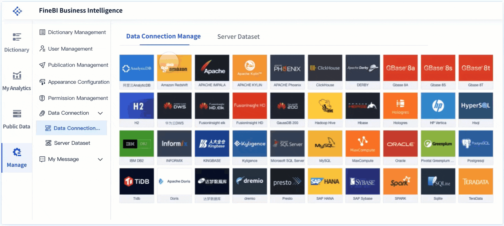
This is where FineBI becomes the practical solution.
Building this manually is complex; use FineBI to utilize ready-made templates and automate this entire workflow.FineBI helps banks accelerate dashboard delivery with faster data integration, reusable dashboard logic, role-based analytics, and scalable self-service reporting. Instead of starting from scratch every time, teams can use templates and standardized components to create banking dashboards for branch performance, risk oversight, customer analytics, operational efficiency, and executive reporting.
For enterprise decision-makers, the advantage is not just speed. It is control with flexibility:
Ready-made templates reduce design time and improve consistency
Interactive drill-down supports fast root-cause analysis
Role-based access supports governance and secure visibility
Scalable deployment helps extend one dashboard framework across functions
If your institution wants a banking dashboard that supports strategic oversight, tactical management, and operational execution, FineBI offers a more efficient path than building and maintaining everything by hand. In practice, that means less time assembling data, more time acting on it, and better decisions across every layer of the bank.
FAQs
A banking dashboard is used to bring key financial, customer, risk, compliance, and operational data into one interactive view. It helps bank leaders monitor performance, spot issues early, and make faster decisions.
A useful banking dashboard should focus on KPIs tied to action, such as revenue growth, net interest margin, cost-to-income ratio, deposit and loan growth, delinquency trends, digital adoption, and customer retention. The exact mix should match the user’s role and business goals.
Traditional reports are usually static and backward-looking, while a banking dashboard is interactive and designed for ongoing decisions. It typically supports drill-down analysis, filtering, alerts, and near-real-time visibility.
Banking dashboards are useful for executives, branch managers, operations teams, analysts, and risk or compliance leaders. Each group can use a role-based view to track the metrics most relevant to their responsibilities.
An effective banking dashboard has clear KPI definitions, reliable data sources, role-based design, and easy drill-down from summary to detail. It should help users act quickly rather than overwhelm them with too many charts.
Product Trial
FineReport
Pixel-perfect reports · Interactive dashboards · Easy data entry · Digital twins