You need product management dashboards to understand your data in 2026. These dashboards let you see analytics right away. They help turn numbers into clear product insights. When you use tools like FineBI and FanRuan, you get advanced analytics. These connect your product goals with useful insights. Analytics models like RFM, Pareto, and conversion analysis help you learn about your users. They track how your product is doing. They guide your team to make decisions using data. With product management dashboards, you can spot trends. You can measure results. You can make decisions based on data faster. With the right dashboards, you turn raw data into insights. These insights help your product grow.
Product Management Dashboards: Essential Tools for 2026
Defining Product Management Dashboards
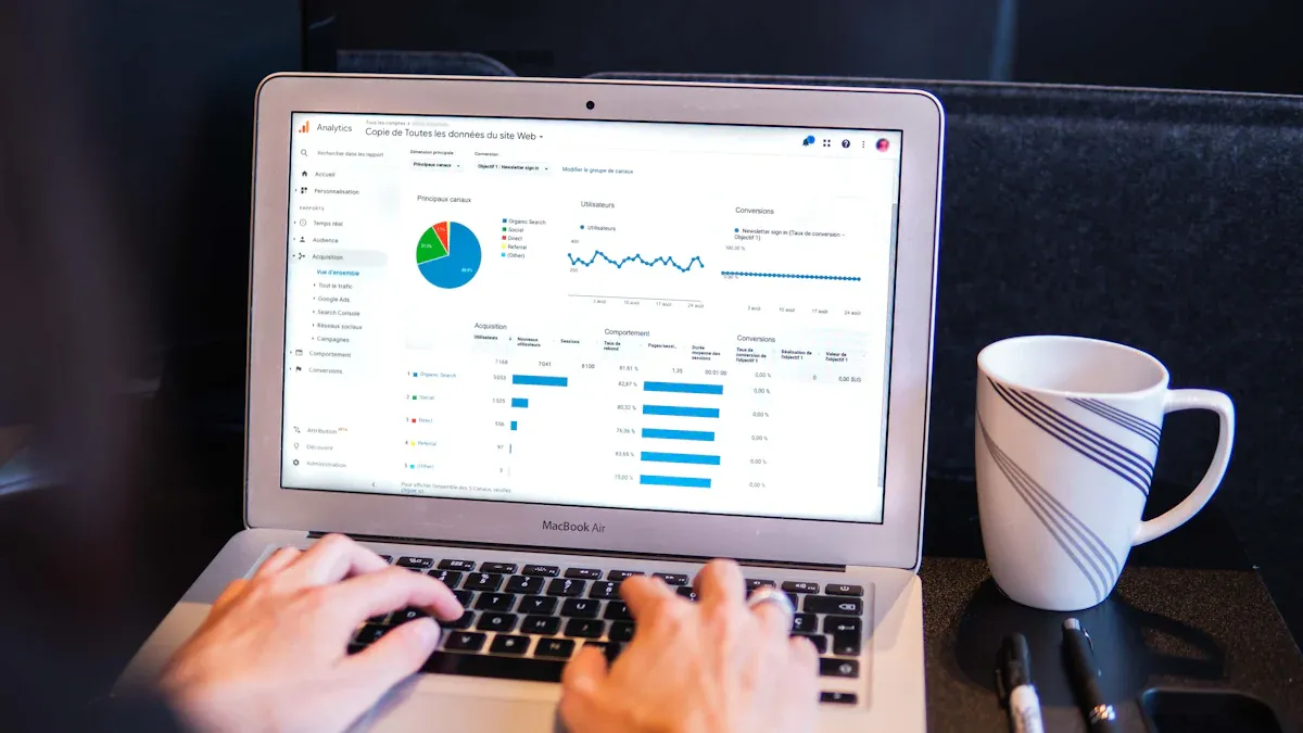
In 2026, you need a dashboard to manage your product. A dashboard is a tool that shows important numbers and facts right away. It helps you see how well your product is doing. You can check what users do, how much you sell, and how your product grows. Dashboards use pictures like charts and graphs to make data easy to understand. This helps you spot trends and patterns fast. Tools like FanRuan and FineBI help you build dashboards. These tools connect to lots of data sources. You can change the analytics to fit your product. You get one place to see your product’s health, user activity, and business goals.
| Feature | Description |
|---|---|
| Bridge technical and business teams | Dashboards turn technical numbers into business results, so teams work together. |
| Enable managers without bottlenecks | Managers can see data themselves, so developers are not slowed down. |
| Foster data-driven culture | Dashboards help everyone use data to make choices. |
| Customize workflows | Users can set up steps that match their work, making things faster. |
| Connect everything without complexity | Dashboards link to many platforms, so information moves easily. |
| Scale from startup to enterprise | Dashboards grow with your company and keep data safe. |
| Dynamic data visualization | Charts and graphs update right away and show new insights. |
| Flexible workflow integration | Dashboards work with other tools to keep data up to date. |
| Cross-platform connectivity | Dashboards bring together data from many places for a full view. |
| Enterprise-grade security | Features like SOC2 and special access keep data safe but let teams work together. |
Dashboards in 2026 do more than just show reports. They are interactive and you can change them to fit your needs. All your product data is in one place. You can use charts to find problems or chances to improve. Dashboards help technical and business teams work together and understand the product’s effect.
Why Dashboards Matter for Product Teams
Dashboards help your team grow your product. They show you numbers and facts right away so you can decide quickly. You can see how people use your product. You can track sales, how many people stay, and how your product grows. Dashboards collect and report data by themselves. This means fewer mistakes and saves time. You get good data to help plan your product.
Dashboards help your team work together. You can share numbers and ideas with everyone. You can add notes and comments to solve problems as a group. Dashboards help everyone use data to make smart choices. You can change steps to match your team’s work. This helps your team work better and stay on track.
Dashboards are not like old reporting tools. They give you new numbers right away and let you click to see more details. You can use charts and graphs to see changes clearly. You can look at five key numbers: how fast you build, how happy customers are, how many use new features, how much money you make, and if your work matches business goals.
| Feature | Product Management Dashboards | Traditional Reporting Tools |
|---|---|---|
| Insights | Shows new numbers right away | Shows old numbers for certain times |
| Interactivity | Lets you click and see more details | Not much clicking or exploring |
| Visualization | Uses charts and graphs to make things clear | More long reports with lots of words |
| User Experience | Makes it easy to see and use data | Not as easy to use or understand |
Dashboards connect all your tools without making things hard. You can link tools like GitHub, Slack, and business intelligence platforms. This makes information move smoothly and saves time. Dashboards can grow with your company and keep your data safe.
Key Benefits for Data-Driven Decisions
Dashboards give you many good things for product analytics. You can make choices faster because you see new data right away. You can focus on the most important numbers to help your product grow. Dashboards help you pick which features to work on and test. You can make sure your team works toward business goals.
- Dashboards show you numbers you can use right away.
- You can choose what to work on and what to test.
- Good numbers help your team work together.
- You see what matters and know if your work helps the product.
- You focus on a few important numbers that show real value.
You can change dashboards to fit your product. You can bring in data from many places for a full picture. You can use charts to spot trends and strange things. Dashboards make reports by themselves, so there are fewer mistakes and the data is right.
- Changing dashboards makes sure they fit your business.
- Bringing in data from many places gives you a full view.
- Special dashboards help you look at the numbers that matter most.
Dashboards help your team work together better. You can share new numbers and charts with everyone. You can add notes and talk about what you see. This helps your team come up with new ideas and fix problems.
You can use power bi best practices to get the most from your dashboards. You can set up dashboards to help your team act, not just look at data. Alerts and signs tell your team what to do next. You can use AI-powered analytics to save time and find important things.
Dashboards are must-have tools for product teams in 2026. You can use FanRuan and FineBI to make dashboards that help your product grow. You can turn data into numbers and charts you can use. You can match your product plan with business goals and power bi best practices. You can help your team use data and grow your product faster.
Product Management Dashboards: Design Dashboards Aligned with Product Goals
Frameworks for Effective Dashboard Design
You need a good plan to make a dashboard that fits your product goals. Start by using a framework to break big ideas into small steps. GIST Planning helps you turn goals into projects and tasks. V2MOM lets you set your vision, values, methods, obstacles, and measures. SMART Goals help you make sure your targets are clear and can be reached. Goal Trees show how each task links to your main goal.
| Framework | Description |
|---|---|
| SMART Goals | Ensures targets are Specific, Measurable, Achievable, Relevant, and Time-bound. |
| Goal Trees | Maps relationships between objectives and initiatives for better alignment. |
| GIST Planning | Breaks down high-level goals into manageable pieces for adaptability. |
| V2MOM | Aligns teams by defining Vision, Values, Methods, Obstacles, and Measures for clear tracking. |
When you use these frameworks, your dashboard is easier to understand. You can set up data so everyone knows what is important. Use charts and graphs to show key metrics. This makes product analytics simple for your team.
Customizing Dashboards for Team Needs
Each team works in its own way. You should change your dashboard to fit your team’s needs. FineBI and FanRuan let you build dashboards that match your work style. You can make views for each job. For example, a product manager can see user growth. A developer can watch feature usage. Real-time data helps your team see progress and make fast choices.
Custom dashboards give you quick access to product analytics. You can find trends, spot problems, and share what you learn with your team. This helps everyone work together and stay on track.
- Custom dashboards show key numbers for each job.
- Real-time data helps teams move quickly.
- Sharing insights helps teamwork and keeps everyone responsible.
Embedding Data for Product Analytics
You can add product analytics to your dashboard in different ways. iFrame and widget embedding let you put dashboards inside your main app. API-driven integration gives you control over your data. SDKs and component libraries help you build custom analytics tools. Headless BI lets you use data in many places by splitting the backend from the frontend.
| Method | Description | Best For |
|---|---|---|
| iFrame and Widget Embedding | Simple way to add dashboards to apps. | Internal teams or B2B portals |
| API-driven Integration | Custom analytics using APIs for dynamic data. | Teams needing full control |
| SDKs and Component Libraries | Prebuilt UI for fast analytics development. | Product-led organizations |
| Headless BI and Composable | Backend analytics for flexible data use in many places. | Enterprises with complex needs |
Embedded analytics gives you real-time data where you need it. You do not have to switch between tools. You can track product analytics, see what users do, and check performance in your workflow. This makes your dashboard stronger and helps your team focus on product goals.
Product Management Dashboards: Critical Metrics Across the User Journey
Acquisition and Activation Data
You start by watching how people find your product. You need to know which channels bring the most customers. You also need to see how many become active users. Dashboards show these numbers in one place. You can use tables to compare awareness, acquisition, and activation. For example, you might track signups and click-through rates. You can also see how many users start using your product. These metrics show if your marketing works. They also show if new users see value fast.
| Metric | Description |
|---|---|
| Awareness | Number of people who see your brand through marketing. |
| Acquisition | Number of people who interact with campaigns, like site visits or clicks. |
| Activation | Number of signups and users who start using the product. |
| Signup conversion rate | How well your channels attract users. |
| CAC | Cost to get a new customer. |
| Time to value | How long it takes for a user to reach a key moment in the product. |
A good dashboard helps you spot trends and problems fast. You can see if your campaigns bring the right customers. You can check if users get value from your product quickly. BOE used dashboards to track these metrics. They improved their product performance by acting on real data.
Engagement and Retention Analytics
After activation, you need to measure engagement and retention. Engagement shows how often users interact with your product. Retention tells you if users keep coming back. You can use analytics to track feature usage and event tracking. Cohort analysis helps you group users by behavior. These metrics help you understand what keeps users interested.
| Analytics Tool | Purpose |
|---|---|
| Event tracking | See which actions users take, like clicks or purchases. |
| Cohort analysis | Group users by behavior to track engagement over time. |
| A/B testing | Test different features to see what works best. |
| Dashboards and reporting | Share key metrics with your team for better decisions. |
Dashboards help you see user engagement and retention. For example, a SaaS insights dashboard shows active users and feature usage. It also shows churn rates. You can spot friction points and see where users drop off. In manufacturing, quality control dashboards track product performance and customer satisfaction. This also supports retention. When you focus on user retention, you improve product performance. You keep customers loyal.
Monetization and Customer Feedback
The last stage is monetization and feedback. You need to know how much revenue each customer brings. You also need to know how satisfied they feel. Important metrics include customer lifetime value and average revenue per user. Churn shows if your product delivers value and keeps customers paying.
| Metric | Description |
|---|---|
| Customer lifetime value | Total revenue expected from a customer over their journey. |
| CAC | Cost to acquire a customer. |
| Churn | Rate at which customers stop using your product. |
| ARPU | Average revenue per user over a set time. |
Dashboards make it easy to see these metrics and act on them. You can review data with your team and find ways to improve product performance. For example, regular dashboard reviews help you spot trends in customer feedback and revenue. When you use analytics to understand customer lifetime value and churn, you can make better decisions for your product. This helps you grow your business and keep customers happy.
Product Management Dashboards: Operational Metrics and Quality Control
Delivery Speed and Efficiency
You have to check how fast your team finishes products. Delivery speed and efficiency show if your team meets goals and keeps up with demand. Dashboards let you see your team’s work as it happens. You can measure development velocity, sprint health, and story points per sprint. These numbers help you find slow spots and fix them before they hurt your product.
| Metric | Description |
|---|---|
| Development velocity | Measures the amount of planned work completed within each sprint. |
| Sprint health | Reflects consistency and indicates achievement of sprint goals. |
| Story points per sprint | Shows if the team’s capacity is stable or declining. |
| Cycle time for user stories | Reveals how long work actually takes versus estimates. |
| Sprint goal achievement rate | Indicates planning accuracy and team focus. |
| Carryover tasks between sprints | Highlights capacity or prioritization issues. |
Dashboards help you compare what you planned with what you finished. You can see if your team gets tasks done on time. This helps you deliver products better and keeps your team working on what matters most.
Quality Indicators in Manufacturing
Quality control is very important for every product. You need to watch defect rates, customer complaints, and return rates. FanRuan solutions help you track these quality numbers with clear data. Dashboards let you see problems as soon as they happen. This means you can act fast and keep your product quality high.
| Quality Indicator | Description |
|---|---|
| Defect Rates | Tracks the percentage of defects in relation to total production. |
| Customer Complaints | Provides insights into product issues reported by end users. |
| Return Rates | Measures the number of products returned by customers. |
You can also track defect density and see which products have the most problems. Dashboards help you spot trends in product quality and fix issues quickly. This keeps your product strong and your customers happy.
Choosing Dashboards for Product Stage
You need to pick the right dashboard for your product’s stage. Each stage needs different data and numbers. For example, a strategic dashboard helps top managers see big results. An operational dashboard gives team leaders real-time data on daily work. Analytical dashboards help you study trends and make your product better over time.
| Dashboard Type | Purpose | Audience |
|---|---|---|
| Strategic | Highlights important KPIs for operational situations | Top management |
| Analytical | Analyzes historical data for trends and correlations | Most organizations |
| Operational | Monitors key KPIs in real-time at department levels | Team leaders, department managers |
| Tactical | Provides detailed insights for problem detection | Managers |
| Social | Displays interesting data for general viewing | General public, stakeholders |
FanRuan solutions let you build dashboards that fit your product’s needs. You can track data for each stage and change your focus as your product grows. This helps you keep your product strong and make better choices with the right data at every step.
You need to use dashboards that match your product goals. Always connect your data to your product plan. FineBI helps you bring all your data together. You can see your product data in one place. This makes it easy to spot trends and fix problems. Review your data often. Change your dashboard as your product grows. Keep your team focused on using data to make your product better.


FAQ

The Author
Lewis
Senior Data Analyst at FanRuan
Related Articles

Portfolio Reporting for PMOs: 9 Executive Metrics Every Weekly Portfolio Dashboard Should Include
Weekly portfolio reporting should help executives answer three questions fast: Are we delivering the right initiatives, are we putting outcomes at risk, and what decisions need leadership this week? For PMOs, that means
Yida Yin
Jul 01, 2026

How to Build an Investment Portfolio Reporting Dashboard for Executives: KPIs, Benchmarks, and Drill-Down Views
Investment portfolio reporting for executives is not about showing every holding, transaction, and chart your investment team can produce. It is about giving CEOs, CFOs, CIOs, boards, and investment committees a fast, re
Yida YIn
Jun 25, 2026

12 KPI Reporting Examples for Executive Dashboards: What to Show in Weekly, Monthly, and Quarterly Reviews
Executive leaders do not need more data. They need decision ready $1 examples that match how often they review the business and what actions they are expected to take. A weekly $1 should surface fast moving risks and per
Yida YIn
Jun 25, 2026