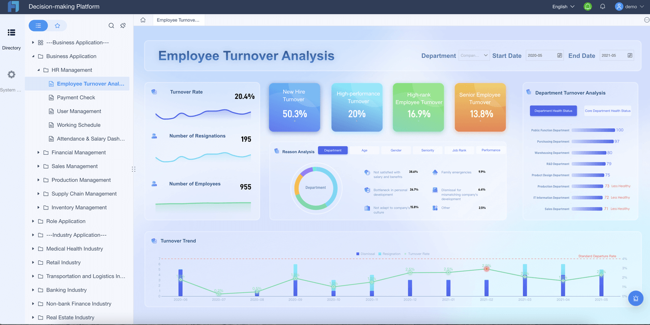
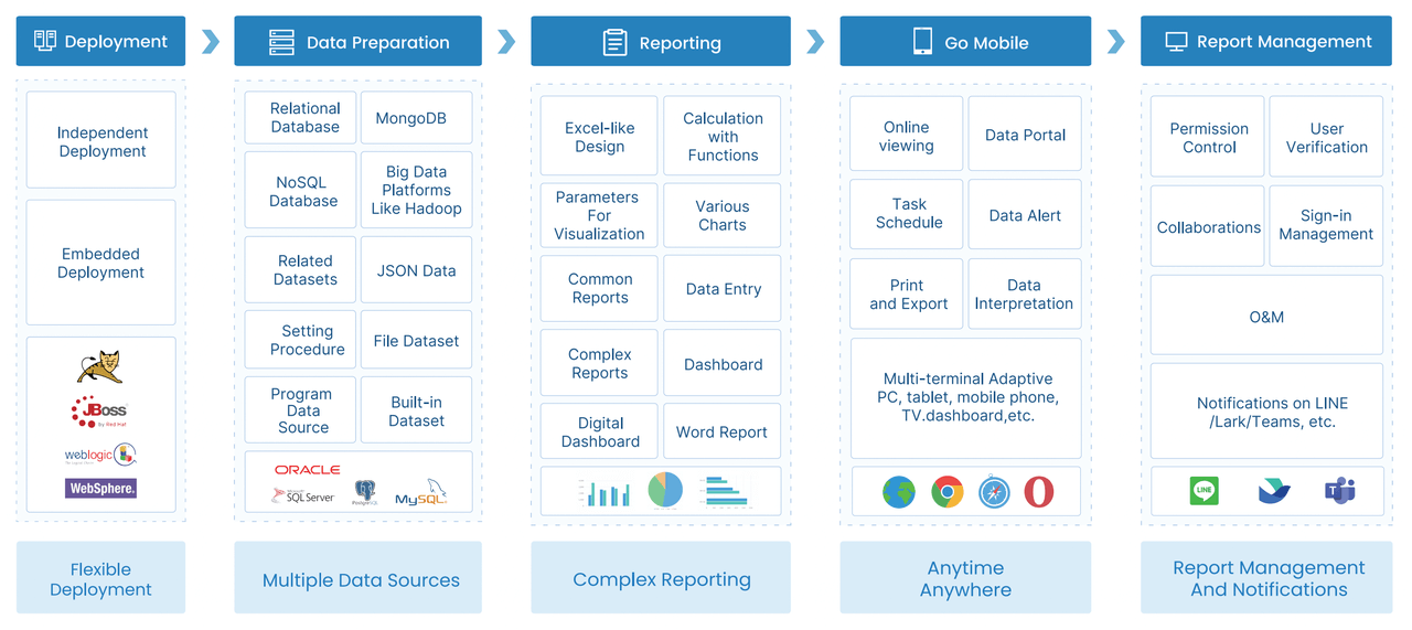
An admin dashboard is a digital workspace that brings together your most important business metrics, visualizations, and tools, giving you a clear overview and helping you make decisions quickly and confidently.
You want your dashboard to boost productivity and improve decision-making. Great design keeps users happy and engaged. Staying ahead with emerging technologies means your dashboard works better and helps your business grow.
Top Admin Dashboard Design Trends 2026
You want your admin dashboard to look modern and work smarter. Let’s explore the dashboard design trends that will shape your workspace in 2026. These trends help you create dashboards that boost productivity, improve user experience, and keep your team inspired.
Minimalist Admin Dashboard Interfaces
Minimalism is more than just a clean look. It’s about making your dashboard design simple and focused. You see only what matters most. This approach helps you work faster and reduces mistakes.
Streamlined processes and reduced cognitive load make tasks easier.
Clear status indicators keep you informed.
Intuitive language and layout match how you think.
Enhanced navigation lets you fix errors quickly.
Standardized design elements create a predictable user experience.
Accessible information means you don’t have to remember details.
Shortcuts and customization help both new and advanced users.
A simplified interface highlights essential functions.
Centralized functionalities turn scattered workflows into one smooth solution.
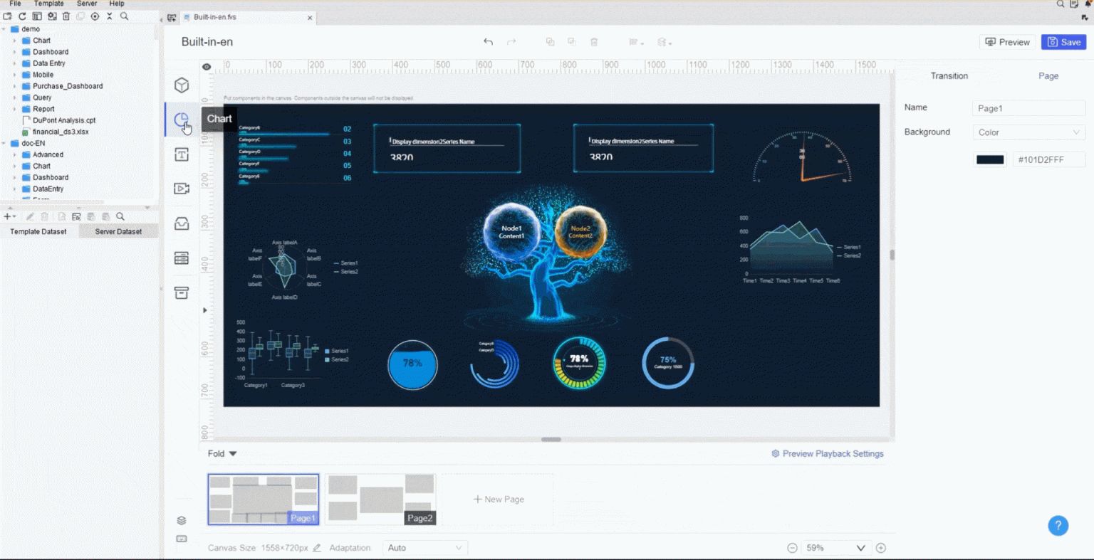
FineReport makes minimalist dashboard design easy. You get drag-and-drop dashboard components, customizable dashboard layouts, and clear data visualization. You can focus on what matters and keep your dashboard clean.
AI is changing dashboard design. You get dashboards that learn your habits and show you what you need. Personalization means your dashboard adapts to your role and preferences.
Benefit Description
Measurable Outcome
Increased user engagement
Enhanced user experiences through tailored interfaces
Improved task efficiency
Reduced task completion times in role-based dashboards
Higher conversion rates
Significant improvement in user interactions
You might notice a 40% increase in benefits utilization from smarter recommendations. AI-driven insights can cut out-of-pocket expenses by 20%. Personalized dashboards lead to higher employee satisfaction.
FineReport uses AI to help you build dashboards that fit your workflow. You can set up role-based dashboards, automate routine tasks, and get smart alerts. Your dashboard design becomes more personal and efficient.
Real-time data visualization is a must-have for dashboard design in 2026. You want to see what’s happening now, not yesterday. Fast updates help you make better decisions.
Benefit
Impact on Decision-Making
Centralized Data Access
Saves time and reduces errors by consolidating information.
Faster Decision-Making
Enables quicker actions based on real-time data.
Proactive Problem Solving
Allows for immediate identification and resolution of issues.
Immediate Performance Monitoring
Facilitates instant assessment and strategy adaptation.
Dynamic Decision Support
Supports responsive decision-making to market changes.
Data-Driven Alerts and Notifications
Ensures timely attention to critical information.
Improved Forecasting Accuracy
Enhances prediction capabilities with real-time insights.
FineReport gives you dashboards with live data feeds, instant alerts, and interactive charts. You can monitor KPIs, track trends, and respond quickly. The dashboard layout supports multiple views, so you see everything at a glance.
You need dashboards that work anywhere. Mobile-first dashboard design puts your data in your pocket. You can check reports, track metrics, and make decisions on your phone or tablet.
FineReport’s mobile dashboard features let you customize layouts for any device. You get responsive dashboard components, easy navigation, and real-time updates. You stay connected whether you’re at your desk or on the move.
Accessibility matters more than ever. You want dashboards that everyone can use, no matter their needs. Dark mode is a popular feature that makes dashboards comfortable for long sessions.
“My eyes have always been very sensitive to bright lights. So ideally, I use dark mode on everything I can. [...] I don't think I can go back to normal. [I have] a lot less eye strain. I don't think I'm getting headaches as much.”
Aspect
Evidence
Eye Strain Reduction
Dark mode can reduce eye strain by up to 30% in low-light environments.
User Satisfaction
Higher user satisfaction and adoption rates reported by organizations implementing dark mode.
Task Completion Efficiency
Users may complete scheduling tasks more efficiently in dark mode, especially in low-light.
Cognitive Load Management
Dark interfaces can reduce visual noise, helping users focus on essential information.
Preference Satisfaction
Offering dark mode enhances overall user satisfaction by responding to user preferences.
You get less cognitive fatigue, better readability, and a friendlier onboarding experience. FineReport supports accessibility best practices and offers dark mode options. You can customize your dashboard design for comfort and usability.
What Makes a Great Admin Dashboard Experience
Essential Features for 2026
You want your admin dashboard to do more than just look good. It should make your work easier and faster. In 2026, you’ll expect dashboards to offer features that fit your needs and keep up with the latest dashboard design trends. Here’s what you should look for:
Accessibility for everyone, including users with disabilities.
You also need tools for user management, data management, and content management. These features help you control who sees what, organize your data, and create content without coding.
Feature
Description
Mobile access
Make decisions anywhere, on any device.
Export and reporting options
Share insights easily with flexible export formats.
Scalability and performance
Handle data growth with smart backend workflows.
User experience
Enjoy intuitive design and responsive layouts.
Security and privacy
Protect data with strong authentication and permissions.
Customisation
Personalize dashboards with alerts and filters.
FineReport brings all these features together, following best practices in dashboard design.
You want to find information fast. Good dashboard design means you get organized layouts and clear menus. Features like collapsible side menus and tabbed navigation keep things tidy and easy to use. When you include feedback from different users, you make sure the dashboard works for everyone.
Security and Data Privacy
You need to trust your dashboard with sensitive data. The latest dashboard design standards focus on identity-centric security and zero-knowledge architecture. You get strong encryption, continuous monitoring, and compliance with global regulations. Real-time visibility and robust governance keep your data safe, even in hybrid or cloud environments.
FineReport Admin Dashboard Inspiration and Use Cases
Looking for real-world dashboard inspiration? Let’s dive into some FineReport admin dashboard examples that show how smart dashboard design solves business problems. You’ll see how these dashboards help you manage quality, drive public sector transparency, and unlock new ways to interact with your data.
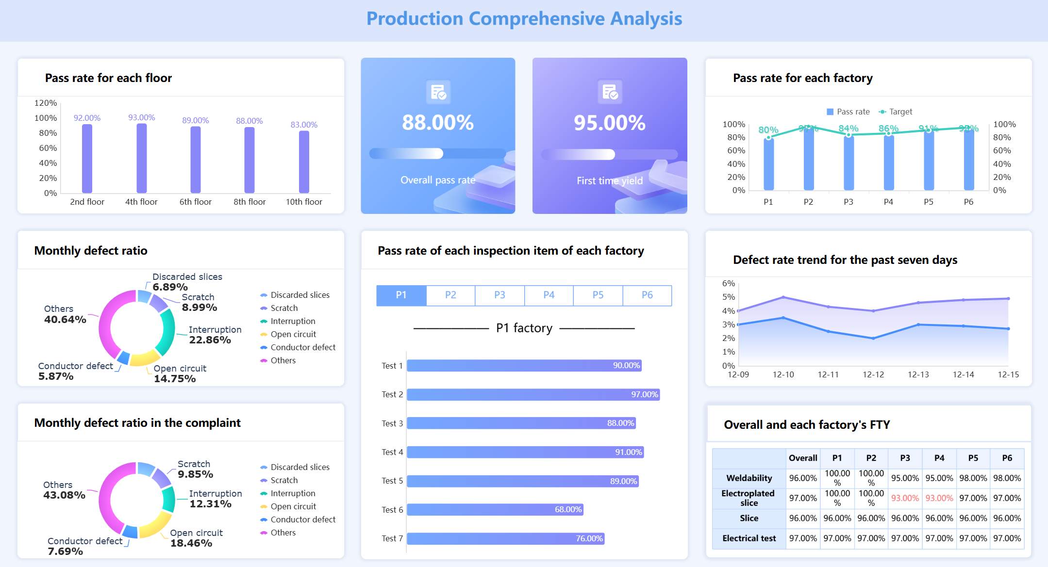
Manufacturing Quality Control Dashboards
Imagine you run a manufacturing plant. You want to keep product quality high and spot problems before they get out of hand. FineReport’s manufacturing quality control dashboards give you a clear view of every step in your production process. You can track qualification rates, defect rates, and scrap rates—all in one place.
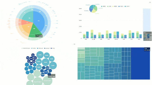
You get dashboards that use bar charts to compare quality across production lines. Line charts help you spot trends in defects over time. Pie charts break down the causes of scrap, so you know where to focus your efforts. You can customize colors, sizes, and styles to match your workflow. With interactive features, you drill down into specific issues and take action fast.
Admin Dashboard created by FIneReport (Click to Engage)
Data visualization that makes complex trends easy to understand
Customizable layouts for different teams or roles
You don’t just react to problems—you prevent them. This approach saves money, reduces waste, and keeps your customers happy. FineReport’s dashboards turn quality control into a proactive, data-driven process.
CXO Dashboards for Public Sector (ADPIC Story)
Managing government projects comes with big challenges. You need to keep everything on track and show the public how resources are used. The Abu Dhabi Projects and Infrastructure Centre (ADPIC) used FineReport to build a CXO dashboard that transformed their operations.
This dashboard design brings together project data, safety metrics, and sustainability goals. Executives see real-time updates on project progress, budget allocations, and quality standards. The dashboard makes it easy to spot delays or risks and respond quickly.
Public-facing dashboards play a huge role in building trust. They let residents see how their government works, where money goes, and how projects move forward. When you use dashboards to share complex data in a visual format, you help everyone understand what’s happening. This kind of data visualization improves transparency and accountability. It also encourages community engagement.
FineReport’s dashboard design for ADPIC shows how you can:
Consolidate data from multiple sources for a single source of truth
Visualize KPIs for better executive decision-making
Communicate progress and challenges to the public
Promote transparency and trust in government operations
You get a dashboard that supports both internal management and public communication. This is a best practice for any organization that values openness and efficiency.
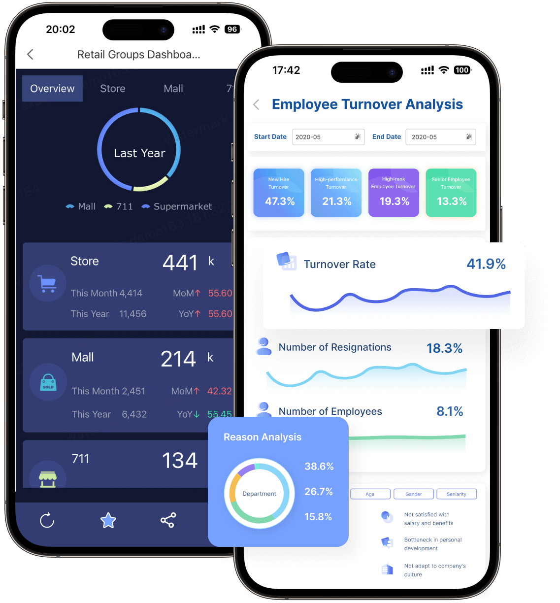
Mobile and 3D Dashboard Solutions
You don’t always work at your desk. Sometimes you need to check data on the go or present insights in a more engaging way. FineReport’s mobile and 3D dashboard solutions give you that flexibility.
With mobile dashboards, you access key metrics from your phone or tablet. The design adapts to any screen size, so you never miss important updates. You can monitor sales, track inventory, or review performance wherever you are. The dashboard layout stays intuitive, with easy navigation and real-time data.
3D dashboards take data visualization to the next level. You see complex information in three dimensions, which helps you understand patterns and relationships faster. For example, in a smart factory, you can visualize equipment status and production flow in a 3D model. In smart cities, you monitor traffic, population density, or resource usage with interactive graphics.
Here’s how these dashboard examples help you:
Stay connected to your business from anywhere
Present data in ways that grab attention and drive action
Customize dashboard design for different devices and scenarios
Drill down into details with interactive features
FineReport’s mobile and 3D dashboards show what’s possible when you combine innovative design with powerful data visualization. You get dashboards that fit your workflow and help you make smarter decisions—no matter where you are.
Tip: When you design your own admin dashboard, think about how your team works. Choose layouts and features that match your real-world needs. The best dashboards are the ones people actually use every day.
These FineReport dashboard examples prove that great dashboard design isn’t just about looks. It’s about solving real problems, supporting your goals, and making data work for you.
Looking for fresh ideas for your next admin dashboard? You have plenty of places to explore. Let’s check out some of the best sources for dashboard design inspiration and resources that can help you create dashboards people love to use.
Design Communities and Online Resources
You can find amazing dashboard ideas by browsing popular design communities. These platforms let you see what other designers are building and help you spot new trends.
Source
Description
99designs
Over 75 admin design ideas and images for quick inspiration.
Untitled UI
Curated React dashboards and admin templates for modern SaaS products.
Eleken
Innovative dashboard examples with links to Dribbble, Behance, Figma, and more.
You might also want to check out:
Dribbble: See creative dashboard designs from top UI designers.
Behance: Dive into detailed case studies and project breakdowns.
Figma Community: Download and remix dashboard UI kits for fast prototyping.
Designspiration: Search for unique design elements and layouts.
Dashboard Templates and UI Kits
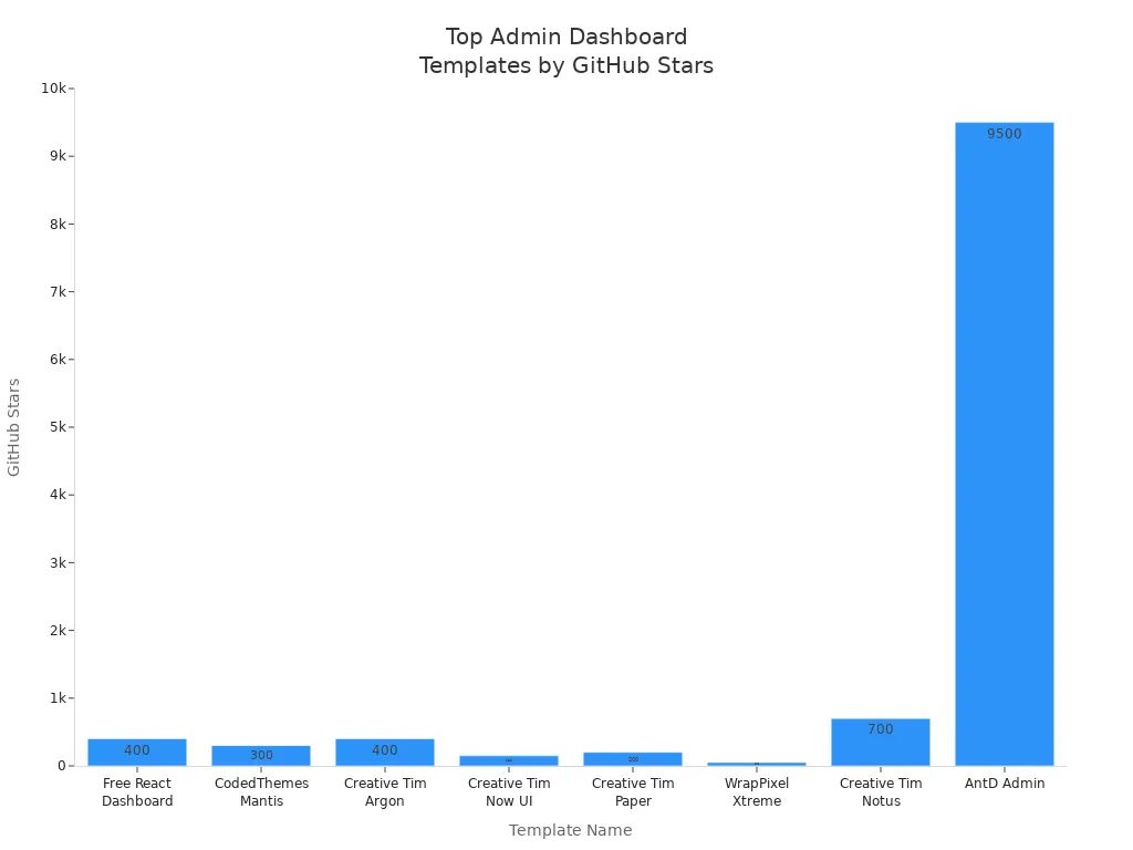
Templates and UI kits save you time and give your dashboard a professional look. Many developers use open-source templates to jumpstart their dashboard projects.
Template Name
Features
GitHub Stars
Free React Dashboard
Icons, maps, notifications, tables, user profiles
400+
CodedThemes – Mantis
Customizable, Material UI components
300+
Creative Tim – Argon
Bootstrap 4, user-friendly, open-source
400+
Creative Tim – Now UI
50 elements, 3 templates, cross-platform
150+
Creative Tim – Paper
Light, easy to use, many components
200+
WrapPixel – Xtreme
Clean code, customizable pages
50+
Creative Tim – Notus
100+ components, Tailwind CSS
700+
AntD Admin
Enterprise-ready, high performance
9.5k+
You can also try TailAdmin V2.0 for its 500+ components or NextAdmin for high security and speed.
Tip: FineReport’s template gallery connects to many databases and makes dashboard design easier. You can find inspiration and ready-to-use layouts for your next project.
Following Industry Leaders
You learn a lot by watching what top designers do. Industry leaders focus on user-centered design, clear data presentation, and smart use of color and icons. They often use asymmetrical layouts to make dashboards more engaging.
User-centered design puts your needs first.
Clear data presentation helps you understand information quickly.
Good dashboards reveal complexity step by step, so you never feel overwhelmed.
“The main challenge with dashboards comes from figuring out just the right tradeoff between 4 dashboard attributes: Screenspace, Abstraction, Pages, and Interaction. Minimizing one parameter increases stress on others, indicating the need for a careful balance in design.”
You can also explore FineReport’s customer stories to see how real companies balance these factors and turn data into actionable insights. This is a great way to find inspiration for your own dashboard design.
You want your admin dashboard to work smarter in 2026. Check out these top design principles:
Principle
Description
Progressive Disclosure
Start with summaries, drill down for details.
Whitespace & Minimalism
Keep it clean and simple.
Visual Grouping
Group related info for clarity.
Interactive Data Visualization
Show trends and insights clearly.
Intuitive Navigation & Search
Move around easily and find what you need.
Actionable Insights & Controls
Act on data right from the dashboard.
Customization & Personalization
Make it fit your workflow.
Responsiveness & Performance
Use it anywhere, anytime.
FineReport stands out for innovation and effectiveness. You get dynamic reports, predictive insights, and templates that cut out tedious work:
Track performance with real-time dashboards.
Plan ahead with predictive analytics.
Save time using ready-made templates.
AI acts as your extra set of hands, helping you work faster and smarter.
Ready to upgrade? Explore FineReport’s features, templates, and customer stories. Start building a dashboard that fits your needs today!