Creating a one-pager transforms professional communication. It condenses complex information into easy-to-digest content, ensuring clarity for your audience. A well-crafted one page report template boosts readability by blending concise text with visuals. Charts, graphs, and infographics simplify comprehension, making the document engaging and memorable. Studies show that combining text with visuals activates both verbal and visual processing, improving retention and aiding faster decision-making. This design approach fosters better communication strategies, leading to higher audience conversion rates.
In this guide, you’ll discover how to use one page report template to craft impactful reports that resonate with your audience.
Key Takeaways
A good headline grabs attention and sets the mood. Use simple and clear words to interest your readers right away.
Share the most important information first so readers understand quickly. Focus on key points and leave out extra details.
Keep the design neat and easy to read. Use empty space well and pick fonts that are easy to see.
Use visual tricks to guide what readers notice. Change size, color, or alignment to show what matters most.
Try FineReporttemplates to make reports faster and easier. These templates have ready-made designs that look professional and save time.
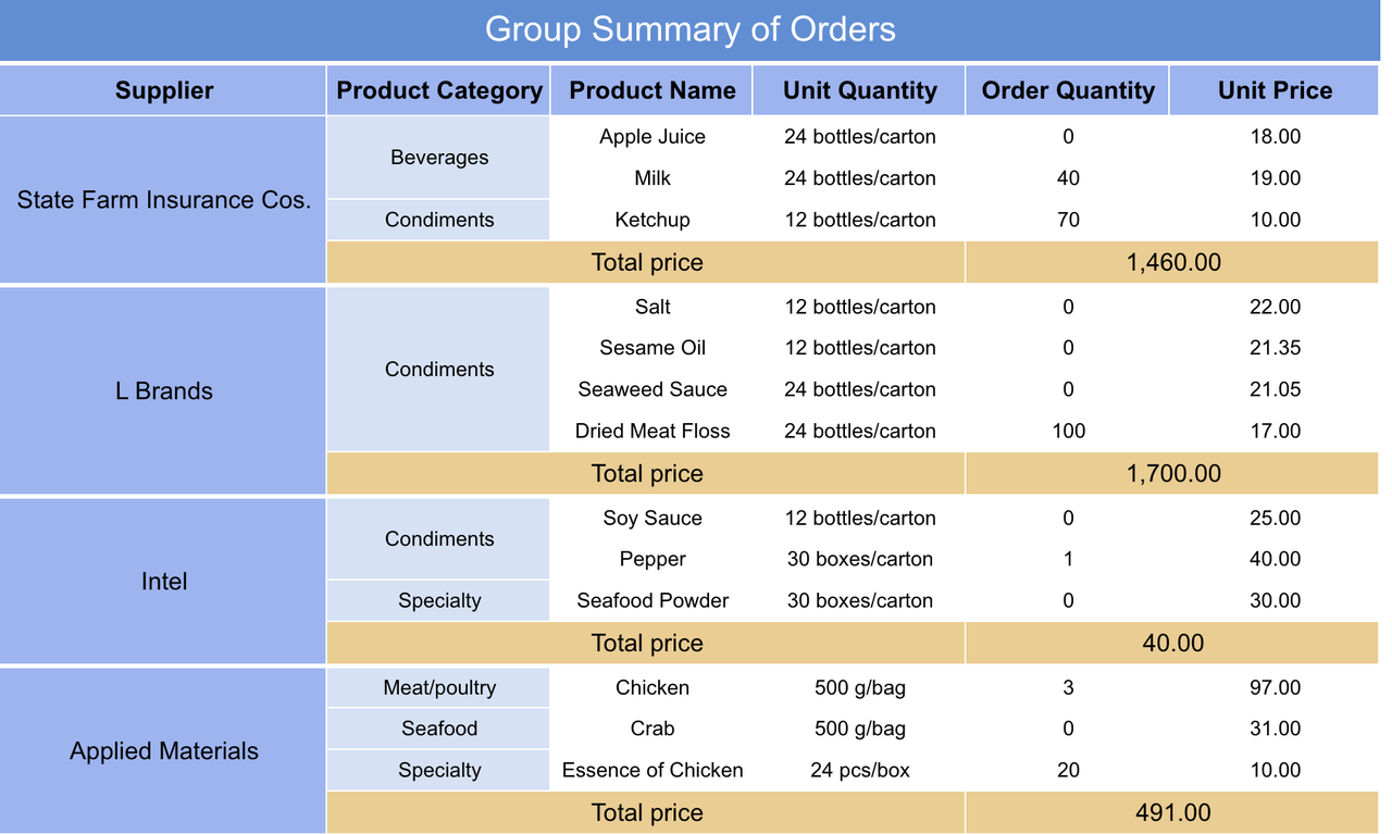
A one page report template is a concise document that distills complex information into a single, visually appealing page. It combines essential data, visuals, and key messages to deliver impactful insights at a glance. Unlike traditional multi-page reports, a one-pager focuses on clarity and brevity, ensuring that your audience can quickly grasp the core message without feeling overwhelmed.
Different industries use one-pagers in unique ways:
Technology Sector: Visualize market trends with infographics, present competitive analysis in quadrant charts, and highlight innovations through bullet points.
Healthcare Industry: Showcase patient satisfaction scores in heat maps, summarize regulatory updates in timelines, and display treatment efficacy rates in bar charts.
Retail Market: Illustrate consumer behavior patterns with pie charts, map sales performance across regions, and list top-selling products with thumbnails.
These examples demonstrate how one-pagers adapt to diverse needs, making them a versatile tool for professional communication.
Visual reports, such as one-pagers, structure information clearly. They use charts and graphs to simplify comprehension, allowing you to gain quick insights. For example, gauge charts can show campaign spending and budget usage at a glance. This efficiency makes one-pagers invaluable for strategic planning and resource management.
Readability plays a crucial role in the success of a one page report template. Clear language and a cohesive structure ensure that your audience can easily understand the content. Research confirms that complex language impairs comprehension, reducing the value of the information presented.
Strategy
Effect on Readability
Use of a well-developed narrative
Facilitates comprehension.
Structural cohesiveness
Aids in understanding.
Easy-to-understand language
Enhances reader engagement.
Improving readability in report design not only enhances stakeholder value but also ensures that your message resonates effectively. A well-designed one page report template with clear visuals and concise text can transform how your audience perceives and acts on the information.
7 Expert Tips for Designing a One Page Report Template
Tip 1: Start with a Strong Headline
Your headline is the first thing your audience notices. It sets the tone for your one-pager and determines whether readers will engage with the content. A strong headline grabs attention, conveys the report's purpose, and encourages further exploration. To create a catchy headline, focus on clarity and brevity. Use action-oriented language or include numbers to make it more compelling. For example, "5 Key Metrics That Define Success" is more engaging than a generic title like "Performance Report."
Research highlights the importance of a well-crafted headline in report design. Consider the following metrics:
Evidence Type
Metric
Description
Engagement Rate
200% increase
Data-rich stories lead to significantly higher reader engagement metrics.
Click-Through Rate
36% higher
Including numbers in headlines boosts click-through rates, indicating stronger engagement.
Consumer Preference
66%
A majority of consumers prefer short-form content, highlighting the importance of brevity in headlines.
These statistics emphasize why your headline should be concise, informative, and visually appealing. A strong headline not only captures attention but also sets the stage for the rest of your one page report template.
Tip 2: Prioritize Key Information
A successful one page report template focuses on delivering the most critical information upfront. Prioritizing key elements ensures that your audience quickly understands the report's purpose and value. Start by identifying the primary message you want to convey. Then, structure the content to highlight essential data, such as KPIs, trends, or actionable insights. Avoid cluttering the page with unnecessary details that could distract readers.
Surveys and performance data underline the importance of prioritizing information in report design:
Evidence
Description
95% of experts agree
Businesses that prioritize monitoring and analysis make smarter, data-informed decisions that help avoid turmoil.
Almost all surveyed companies
Base their business strategies and decisions on data, indicating the importance of data in decision-making.
By focusing on the most relevant elements, you create a clear structure that guides readers through the content. This approach not only enhances readability but also ensures that your one page report template delivers maximum impact.
Tip 3: Use a Clean and Simple Layout
A clean and simple layout is essential for enhancing readability and making your one page report template visually appealing. Avoid overcrowding the page with too many elements. Instead, use white space strategically to create balance and clarity. Choose a sans-serif font like Arial or Helvetica for its readability, and keep the font size between 10-12 points for body text. Break up long paragraphs into shorter sections to improve scannability.
Design studies validate the benefits of a well-structured layout:
Key Element
Description
Font Type
Sans-serif fonts like Arial or Helvetica are preferred for their clarity and ease of reading.
Font Size
Recommended size is between 10-12 points for body text to ensure readability.
Paragraph Length
Keeping paragraphs to 6-8 lines improves scannability and breaks up text effectively.
Layout Choice
Slide format is concise for presentations, while A4 format allows for detailed analysis.
Column Layout
One-column layouts enhance readability, while two-column layouts utilize space efficiently.
White Space
Adding white space creates balance and clarity, making the report more scannable for readers.
A clean layout not only improves readability but also ensures that your audience can focus on the most important information. By keeping the design simple and organized, you make your one page report template more effective and engaging.
Tip 4: Incorporate Visual Hierarchy
Visual hierarchy is the backbone of effective one page report template design. It organizes content in a way that guides your audience's focus, ensuring they process information efficiently. By arranging elements based on their importance, you create a structured flow that enhances readability and comprehension.
To establish a clear hierarchy:
Size and Scale: Use larger fonts for headlines and smaller ones for supporting details. This helps readers identify key points instantly.
Color and Contrast: Bright colors or stark contrasts make essential elements stand out, drawing attention where it matters most.
Alignment and Proximity: Group related items together and align them neatly. This creates logical connections between elements, making the content easier to follow.
Whitespace: Remember whitespace is not empty space—it’s a tool. It separates sections, reduces clutter, and improves focus.
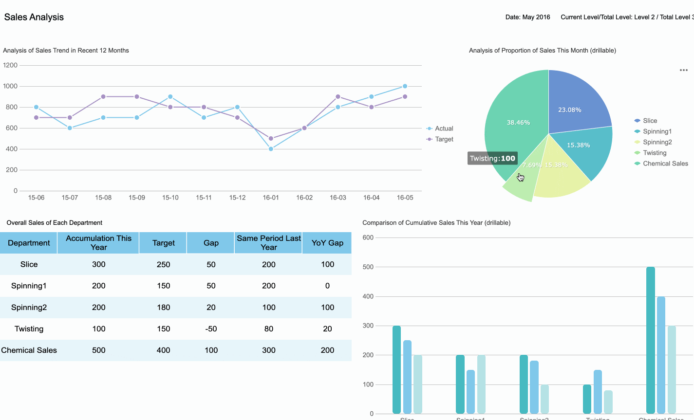
For example, a one-pager summarizing sales performance can use a bold, colorful headline to highlight total revenue, followed by smaller, aligned sections for regional breakdowns. Whitespace around these sections ensures clarity.
Without a clear hierarchy, your audience may feel overwhelmed, struggling to find the information they need. A well-structured layout prevents this confusion, ensuring your one-pager delivers its message effectively.
Pro Tip: Organize content according to natural eye movement patterns, such as the "Z-pattern" or "F-pattern." These layouts align with how people scan pages, improving engagement.
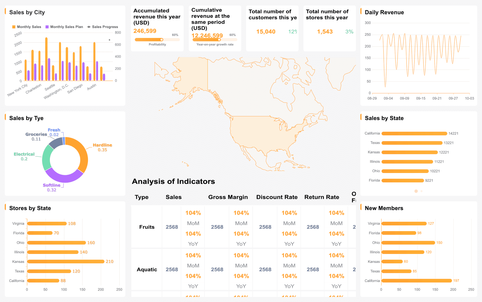
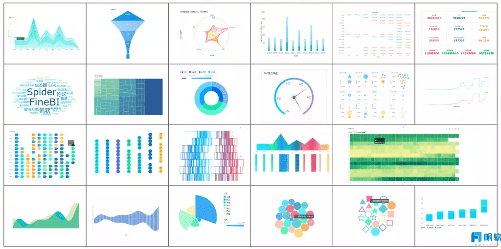
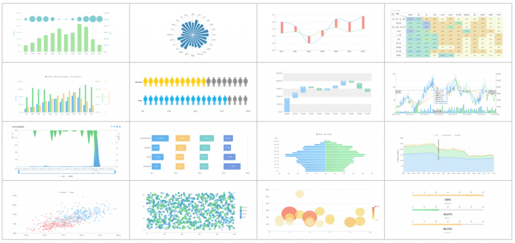
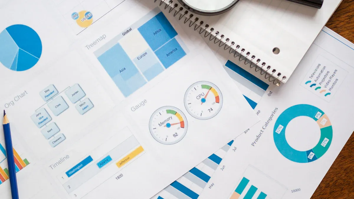
Visuals are a powerful way to enhance your one-pager. They simplify complex data, making it easier for your audience to grasp key insights. Charts, graphs, and infographics complement text and improve overall report design.
Follow these best practices for using visuals:
Choose the Right Type: Use bar charts for comparisons, line graphs for trends, and pie charts for proportions. Avoid 3D graphs, as they can distort data and hinder comprehension.
Limit Extraneous Features: Keep visuals clean and focused. Avoid unnecessary embellishments that distract from the data.
Integrate Text and Visuals: Place captions or brief explanations near visuals to provide context. This helps readers connect the graphic to the content.
Maintain Quality: Ensure all visuals are high-resolution and professionally designed. Poor-quality graphics can reduce the credibility of your report.
For instance, a one-pager on marketing performance might include a 2D bar chart showing campaign ROI. This visual not only reduces word count but also highlights key data points at a glance.
Research shows that non-textual elements like charts and tables break the monotony of text, keeping readers engaged. They also help in understanding data relationships, promoting deeper learning. By using visuals strategically, you can make your one-pager both informative and visually appealing.
Quick Tip: Aim for at least one visual element per 1,000 words. This balance keeps your report engaging without overwhelming the reader.
Tip 6: Test Accessibility Across Devices
Your one-pager must look great and function well on all devices. Readers may view it on desktops, tablets, or smartphones, so testing accessibility is crucial.
Here’s how to ensure your report design works across platforms:
Responsive Layouts: Use tools or templates that automatically adjust to different screen sizes. This ensures your content remains readable and visually appealing.
Font and Text Size: Choose fonts that are legible on smaller screens. A minimum font size of 12 points is recommended for body text.
Interactive Elements: If your one page report template includes clickable links or interactive charts, test them on multiple devices to ensure functionality.
File Format: Save your report in universally accessible formats like PDF. This prevents compatibility issues and maintains the integrity of your layout.
For example, a one-pager designed for a product launch should display key visuals and text consistently, whether viewed on a laptop or a smartphone. Testing ensures that no element gets distorted or lost.
By prioritizing accessibility, you expand your audience reach and ensure a seamless user experience. A well-tested one-pager reflects professionalism and attention to detail, leaving a positive impression on your readers.
Pro Tip: Use online tools like Google’s Mobile-Friendly Test to evaluate how your one-pager performs on different devices.
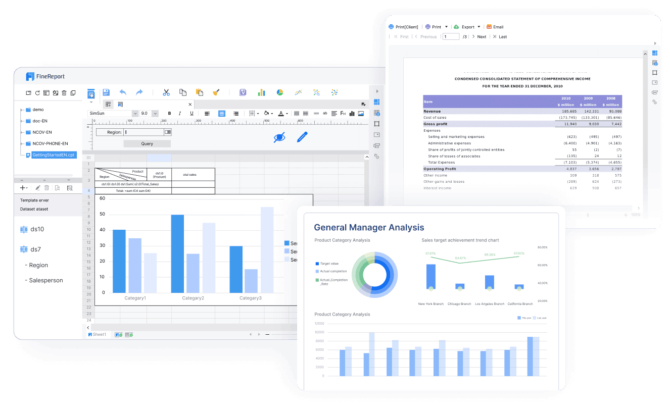
Tip 7: Leverage FineReport Templates for Efficiency
Creating a one-pager can feel overwhelming, especially when you need to balance clarity, design, and time constraints. FineReport templates simplify this process by offering pre-designed layouts tailored for professional reporting. These templates save you time and ensure your one page report template looks polished and impactful.
FineReport templates provide a variety of options to suit different needs. Whether you are summarizing sales data, presenting project updates, or sharing performance metrics, you will find a template that fits your purpose. Each template includes pre-set sections for key information, ensuring your content remains organized and easy to follow. This structure helps you focus on the message rather than worrying about formatting.
Using FineReport templates also enhances the visual appeal of your one-pager. The templates incorporate clean layouts, intuitive charts, and professional fonts. These elements improve readability and make your information stand out. For example, you can use a bar chart to compare quarterly sales or a pie chart to illustrate market share. These visuals not only simplify complex data but also engage your audience effectively.
Another advantage of FineReport templates is their flexibility. You can customize every element to align with your brand or specific requirements. Adjust colors, fonts, and chart styles to match your organization’s identity. This customization ensures your one-pager reflects professionalism while maintaining a unique touch.
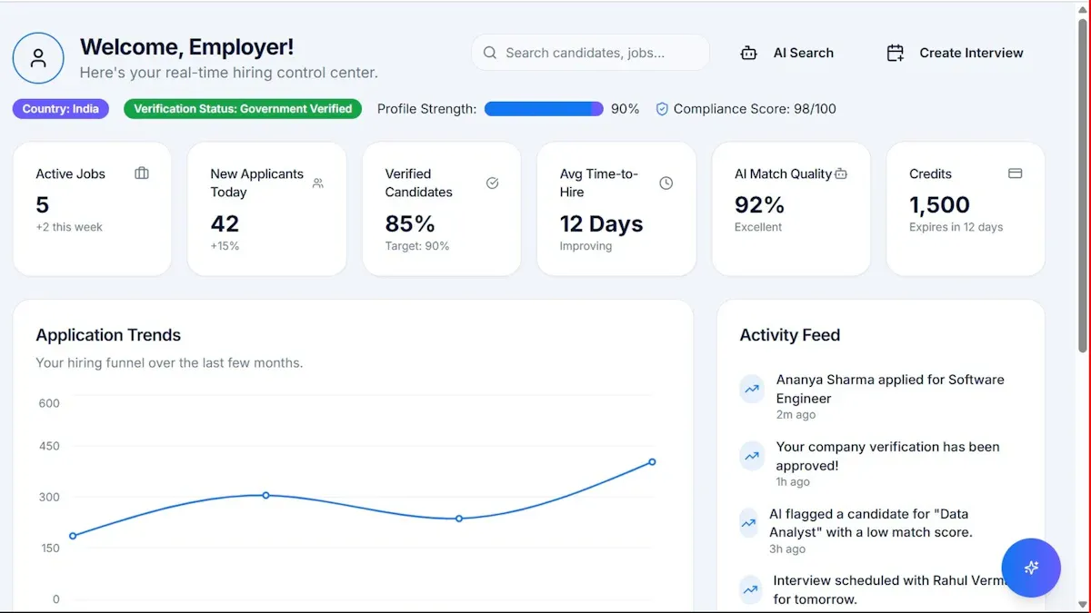
FineReport templates also integrate seamlessly with various data sources. This feature allows you to pull real-time information directly into your one page report template. By automating data updates, you reduce manual effort and minimize errors. For instance, if you are tracking monthly performance, the template can automatically update figures as new data becomes available. This capability ensures your content remains accurate and up-to-date.
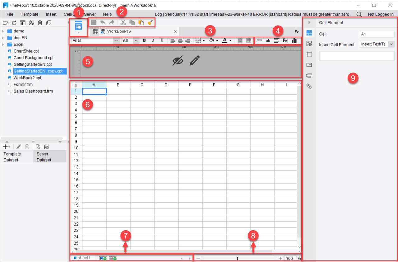
Efficiency is another key benefit of using FineReport templates. The drag-and-drop interface makes it easy to add or rearrange elements. You can quickly create a one-pager without needing advanced technical skills. This user-friendly approach empowers you to focus on delivering valuable insights rather than struggling with design tools.
Pro Tip: Explore FineReport’s library of templates to find one that aligns with your goals. Start with a basic layout and gradually customize it to suit your needs. This approach saves time while ensuring your one-pager remains effective.
By leveraging FineReport templates, you streamline the process of creating a one page report template. These templates help you present information clearly, engage your audience, and maintain a professional appearance. Whether you are a beginner or an experienced report designer, FineReport templates provide the tools you need to create stunning one-pagers with ease.
How FanRuan and FineReport Enhance One Page Report Template
Streamlining One Page Report Template Creation with FineReport
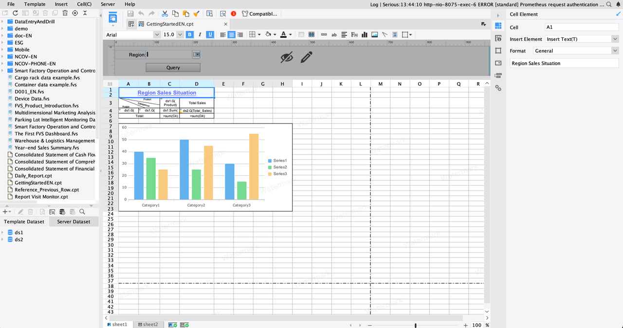
FineReport simplifies the process of creating a one page report template by offering intuitive tools and pre-designed templates. You can use its drag-and-drop interface to arrange elements effortlessly. This feature eliminates the need for advanced technical skills, allowing you to focus on the content rather than the mechanics of report design. FineReport also connects seamlessly with multiple data sources, enabling real-time updates. This ensures your one-pager remains accurate and relevant.
The software’s automation capabilities save time. For example, you can schedule reports to update automatically with the latest data. This feature reduces manual effort and minimizes errors. FineReport’s flexibility allows you to customize templates to match your brand identity. Adjust colors, fonts, and layouts to create a professional and cohesive design that resonates with your audience.
Pro Tip: Use FineReport’s built-in charts to visualize data effectively. This approach enhances readability and ensures your audience grasps key insights quickly.
Leveraging FanRuan's Expertise in Data Visualization
FanRuan excels in data visualization, making it a valuable resource for crafting impactful one-pagers. The company’s expertise ensures that your report design incorporates visuals that simplify complex data. You can use bar charts, line graphs, or pie charts to highlight trends and comparisons. These visuals not only enhance the aesthetic appeal but also improve comprehension.
FanRuan’s solutions prioritize clarity. For instance, their tools emphasize the strategic use of whitespace to avoid clutter. This approach ensures your one-pager remains clean and easy to navigate. By leveraging FanRuan’s visualization techniques, you can create reports that engage your audience and drive informed decision-making.
Why FineReport Is Ideal for One Page Report Template
FineReport templates are specifically designed to meet the needs of one-pager creation. Each template includes pre-set sections for key information, ensuring your content stays organized. These templates integrate seamlessly with data sources, allowing real-time updates. This feature is particularly useful for tracking performance metrics or presenting dynamic content.
Customization is another strength of FineReport templates. You can modify every element to align with your goals. Whether you need to adjust layouts or add visuals, the templates provide the flexibility to create a unique and professional design. This adaptability makes FineReport templates an ideal choice for crafting impactful one-pagers.
Quick Tip: Explore FineReport’s library of templates to find one that suits your specific needs. Start with a basic layout and customize it to reflect your brand.
Designing a stunning one page report template involves mastering the balance between clarity, simplicity, and visual appeal. The 10 tips on how to make one emphasize the importance of focusing on key content, using whitespace effectively, and incorporating visuals that engage your audience. These principles ensure your report communicates information efficiently while maintaining a professional look.
Simplicity removes distractions, clarity ensures easy understanding, and engagement draws readers in. Together, these elements create a design that resonates with your audience. Explore FineReport templates to streamline your process and craft impactful one-pagers that leave a lasting impression.
Click the banner below to try FineReport for free and empower your enterprise to transform data into productivity!
Real-time insights to optimize production, logistics, and decisions.
FAQ
What is the best way to start designing a one-page report template?
Begin by identifying your report's purpose and audience. Focus on the key message you want to convey. Use a clean layout with clear sections for data, visuals, and text. This approach ensures your report remains organized and impactful.
How can I make my one-pager visually appealing?
Use a simple design with balanced whitespace. Incorporate charts and graphics to simplify complex data. Choose a consistent color scheme and readable fonts. These elements enhance the visual appeal and help your audience quickly grasp the information.
Can I customize FineReport templates for my brand?
Yes, FineReport templates allow full customization. You can adjust colors, fonts, and layouts to align with your brand identity. This flexibility ensures your one-pager reflects professionalism while meeting your specific needs.
How do I ensure my one-pager is accessible on all devices?
Test your one-pager on desktops, tablets, and smartphones. Use responsive layouts and save the file in a universal format like PDF. This ensures your audience can view the report seamlessly across different platforms.
Why is readability important in a one-pager?
Readability ensures your audience can quickly understand the content. Clear language, structured sections, and visuals improve engagement and comprehension. A readable one-pager delivers your message effectively and leaves a lasting impression.