You need to ensure your analytical dashboard is clear, useful, and easy to use. A good dashboard helps you decide what to do and makes work faster. FanRuan wants to help your business use data to make smart choices. FineBI and FineReport provide you with top tools for your needs. Studies show that a good analytical dashboard, interactive tools, and what-if analysis help you perform tasks better and understand things faster.
Know Your Analytical Dashboard Audience
It is important to know who will use your analytical dashboard. This helps you make it work well for everyone. People in your company have different goals and use dashboards in their own ways. You need to learn what each person wants and how they use data.
Identify User Roles
Most companies have a few main user roles. Each one needs something different from the dashboard. Here is a table that shows how they are not the same:
| User Role | Description |
|---|---|
| Business Users | Regular users who like self-service tools. |
| IT Administrators | Take care of the dashboard software. |
| Developers | Make and change dashboards for others. |
Executives want quick overviews and to see trends. They like dashboards that are easy to read. They do not use them every day. Operational managers want to see more details. They need filters to check things often or look at special cases. Analysts and specialists want to look very closely at data. They use special features to find answers and patterns.
FineBI and FineReport help all these groups. Business users can look at data by themselves. IT administrators can keep the system safe and running. Developers can make dashboards that fit any job.
Gather Requirements
You should always ask what people need before you build a dashboard. This helps you know what to make and what it should do. Start by asking about the main goal and what the dashboard must do. Find out what problems people want to fix.
- Talk to users and others to learn what they want.
- Show early versions and ask for ideas to make it better.
- Make sure the dashboard is simple and fair for all.
- Test it with real users to see if it works for them.
If you do these things, your dashboard will help everyone make good choices. It will also stay helpful as people’s needs change.
Set Metrics & Goals for Analytical Dashboards
Picking the right metrics and goals is very important. It helps your dashboard work well and supports your business plan. When you choose good key performance indicators (KPIs), everyone can focus on what matters most.
Align with Business Objectives
First, connect your dashboard to your company’s main goals. Every metric should help reach a bigger goal. Here are some steps you can follow:
- Set clear goals for your analytical dashboard. Know what you want to do.
- Pick KPIs that are easy to measure and fit your business goals.
- Ask team members and leaders for their ideas. Make sure the dashboard works for everyone.
- Check your KPIs often. Make sure they match your business needs as they change.
You should know how daily actions link to bigger results. Use leading indicators to guess what might happen. Use lagging indicators to see what already happened. Organize your metrics so you can see how small actions lead to big results.
FanRuan’s tools, like FineBI and FineReport, help you keep your metrics the same for everyone. For example, BOE Technology Group used FineBI to build a data warehouse. They made a system for over 250 metrics. This helped them track performance, compare teams, and make better choices.
Here are some common KPIs you might track on an analytical dashboard:
| Key Performance Indicator | Description |
|---|---|
| Conversion analysis by device, location, and traffic source | See how devices, places, and sources affect conversions. |
| A/B testing results comparing CTA effectiveness across landing pages | Find out which call-to-action works best. |
| Funnel breakdown showing drop-off points from awareness to conversion | Spot where you lose possible customers. |
Prioritize Actionable Data
Focus on data that helps you do something. Actionable insights let you make smart choices, improve prices, and give customers a better experience. When you use good analytics and clear visuals, you turn raw data into useful information.
- Pick only the most important KPIs for your analytical dashboard.
- Make sure each metric helps you make a choice or take action.
- Use dashboards to spot trends, find ways to grow, and work better as a team.
- Update your dashboard often to keep insights new and helpful.
Dashboards that focus on actionable data help you work faster and smarter than old reports. You can see what is happening right now and act quickly.
Analytical Dashboard Structure & Clarity
Storytelling on One Screen
You want your analytical dashboard to tell a clear story as soon as it loads. The 5 Second Rule says users should understand the main message in five seconds or less. If you use simple charts with one clear message, people will not get lost or bored. Place the most important information at the top of the screen. This follows the Inverted Pyramid structure. You help users see key facts first, then let them explore details below. FineReport’s flexible dashboard layout lets you arrange charts, tables, and text so your story flows from top to bottom. This approach helps everyone find what they need quickly.
Minimize Clutter
A clean dashboard makes it easier for users to focus. Start by knowing your goals and your audience. Next, organize your layout so information appears in a logical order. Remove extra charts, colors, or text that do not add value. Here are some steps you can follow:
- Set clear goals for your dashboard.
- Build a layout that guides the eye from most to least important.
- Keep only the data and visuals that help users make decisions.
- Test your dashboard with real users and improve it based on their feedback.
FineReport gives you the tools to group related data and keep your design simple. This makes your analytical dashboard easier to use and understand.
Highlight Key Insights
You should always guide users to the most important numbers or trends. Use color, size, or position to make these stand out. When you highlight key insights, users can make decisions faster. Research shows that dashboards with clear highlights help people decide 25% faster than old-style reports. If you design your dashboard to show the most important data first, you help everyone act quickly and with confidence.
Visualization Choices in Analytical Dashboards
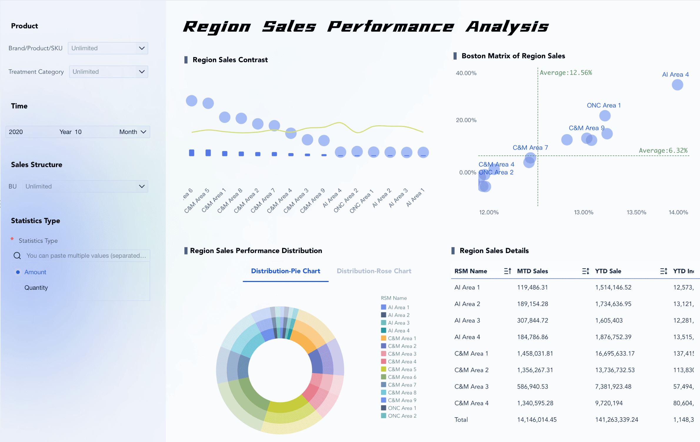
Choosing the right visuals is key to making your analytical dashboard clear and useful. You want to match each type of data with the best chart or table. FineBI gives you a drag-and-drop interface, so you can build complex visualizations without writing code. The system even suggests the best visual effect for your data, which helps you work faster and avoid mistakes.
Match Visuals to Data
You should always pick the chart or table that fits your data. For example, use a table to show categories and values side by side. Line charts help you see trends over time. Bar charts are great for comparing values in the same group. Here is a quick guide:
| Visualization Type | Use Cases | Best Practices |
|---|---|---|
| Tables | Show data in categories and values; break down large sets | Use clear labels; keep it simple with fewer than 10 rows |
| Line Charts | Show trends over time; compare data sets | Use different colors for each group; limit to four groups |
| Bar Charts | Compare values in one category; show parts of a whole | Keep colors and labels the same; start y-axis at zero |
FineBI’s chart variety lets you pick the right tool for every job.
Ensure Consistency
You need to keep your dashboard’s look and feel the same across all pages. Use the same colors, fonts, and chart styles. This builds trust and helps users understand the data quickly. If you change styles or colors for the same metric, people might get confused or doubt the results. A uniform design makes your dashboard look professional and helps users find insights faster.
Use Color Strategically
Color is powerful in data visualization. Use it to highlight important points, not just to decorate. For example, red or orange can show a problem or alert. Blue and green can show good trends or stable results. Neutral colors like gray help the main colors stand out. Here are some tips:
- Color shows meaning in your charts.
- Red or orange signals a warning or drop.
- Blue and green show positive or steady results.
- Gray supports background data and lets key colors pop.
Analytical Dashboard Layout & Interactivity
Optimize Information Placement
Your dashboard should show the most important data first. Put key metrics at the top so people see them right away. Use bigger fonts to make these numbers easy to spot. Group data that belongs together in one place. This helps users find things fast. Add white space between sections so the screen does not look messy. Use the same way to write numbers and dates every time. This makes your dashboard simple to read. A good layout helps people see trends and act quickly. FineBI and FineReport let you move charts, tables, and filters to fit your needs.
Tip: Put the most important data at the top. This helps users pay attention to what matters most.
Enable Responsive Design
People use dashboards on phones, tablets, and computers. Responsive design makes sure your dashboard works on all devices. FineBI and FineReport use special tools for mobile screens. These tools include swiping, zooming, and fast loading. Data updates quickly, so you always see new information. Test your dashboard on different devices to check if it is easy to use. Responsive dashboards help everyone stay up to date, even when they are not at their desk.
- Responsive dashboards fit any screen size.
- Mobile tools like zoom and swipe help you look at data.
- Fast data updates keep your dashboard working well.
Add Interactive Elements
Interactive features make your analytical dashboard better. Filters let you look at data by date, group, or other choices. Drill-down tools let you click a chart to see more details. What-if analysis lets you try out different ideas and see what happens. FineBI and FineReport give you these tools, so you can find answers fast.
| Interactive Element | Description |
|---|---|
| What-if analysis | Try out different ideas and see what could happen. |
| Filtering | Sort and find the most important information. |
| Drill-down capabilities | Click to see more details in the data. |
| User customization | Change the dashboard to match what you need. |
When you group data and add filters, users get more control. They can focus on what is important to them and make smart choices.
Review & Iterate Analytical Dashboards
You should not think your analytical dashboard is finished forever. You need to check and improve it often. This keeps your dashboard helpful as your business changes.
Collect User Feedback
You can learn from people who use your dashboard every day. Try these easy ways to get feedback:
- Put a feedback button on the dashboard.
- Send surveys sometimes to ask for ideas.
- Talk to important users in short interviews.
These steps help you see what works and what needs fixing. When you listen to users, you make your dashboard better for everyone.
Test Usability
You should test your dashboard with real users. Watch how they use it. Notice where they have trouble or get confused. Here are some ways to test usability:
- Ask users to do simple tasks while you watch.
- Use surveys and interviews to find out what is hard or easy.
- Change your design based on what you learn.
Testing helps you find problems early. You can fix them before they slow down your team.
Continuous Improvement
You should plan to check and update your dashboards often. Top companies look at operational dashboards every month and strategic dashboards every quarter.
| Dashboard Type | Recommended Review Frequency |
|---|---|
| Operational | Monthly |
| Strategic | Quarterly |
Regular updates keep your dashboard new and useful. You can see how well your dashboard works by checking user adoption and satisfaction. Companies that focus on improvement get fast delivery, good return on investment, and happy users.
| Key Objectives | Success Factors | Metrics |
|---|---|---|
| Continuous improvement and evolution framework | Agile Development | 98% Client Satisfaction |
| Advanced AI model refinement | User-Centric Design | 85% User Adoption |
| Performance optimization and system scaling | Executive Sponsorship | 95% On-Time Delivery |
| Global rollout and localization | Data Quality First | 340% Average ROI |
FanRuan helps you with new ideas and customer support. You can trust FineBI and FineReport to keep your dashboards up to date and working well.
You can make good analytical dashboards by using these easy tips:
- Pick clear visuals and put data from top left to bottom right.
- Show all important things on one screen.
- Make charts simple and use the same style.
- Use card visualizations to highlight key numbers.
- Check and update dashboards often.
When dashboards are clear and useful, your team makes smart choices and helps your business grow. FineBI and FineReport have tools to build dashboards for everyone.


FAQ

The Author
Lewis
Senior Data Analyst at FanRuan
Related Articles

Portfolio Reporting for PMOs: 9 Executive Metrics Every Weekly Portfolio Dashboard Should Include
Weekly portfolio reporting should help executives answer three questions fast: Are we delivering the right initiatives, are we putting outcomes at risk, and what decisions need leadership this week? For PMOs, that means
Yida Yin
Jul 01, 2026

How to Build an Investment Portfolio Reporting Dashboard for Executives: KPIs, Benchmarks, and Drill-Down Views
Investment portfolio reporting for executives is not about showing every holding, transaction, and chart your investment team can produce. It is about giving CEOs, CFOs, CIOs, boards, and investment committees a fast, re
Yida YIn
Jun 25, 2026

12 KPI Reporting Examples for Executive Dashboards: What to Show in Weekly, Monthly, and Quarterly Reviews
Executive leaders do not need more data. They need decision ready $1 examples that match how often they review the business and what actions they are expected to take. A weekly $1 should surface fast moving risks and per
Yida YIn
Jun 25, 2026