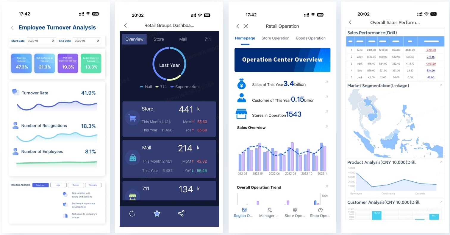
A strong sales report example should do more than display numbers. It should help managers spot risk early, coach reps with precision, and make faster decisions on pipeline, forecast, and revenue performance. For sales managers, operations leaders, and commercial directors, the real pain is not lack of data. It is having too much disconnected data, too many inconsistent definitions, and too few dashboards that match how teams actually review performance day to day, week to week, and month to month.
Click To Try The Dashboard
All reports in this article are built with FineReport
What a Sales Report Example Should Help Managers See at a Glance
A useful sales dashboard must answer one practical question: what should I do next based on what I see right now? That is why the best reporting separates activity tracking, performance measurement, and decision support.
Activity tracking shows what the team did: calls, emails, demos, meetings, follow-ups.
Performance measurement shows what outcomes those actions produced: qualified pipeline, conversion rate, closed revenue, quota attainment.
Decision guidance highlights where intervention is needed: stalled opportunities, underperforming regions, weak forecast confidence, or sudden churn risk.
Daily, weekly, and monthly dashboards each serve a different management purpose:
Daily dashboards answer: What changed today, and what needs action now?
Weekly dashboards answer: Are we on track, and where should coaching focus this week?
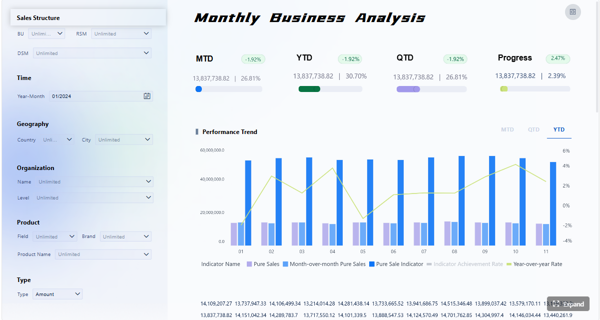
Monthly dashboards answer: Did we hit the business outcome, why did performance change, and what should leadership adjust next?
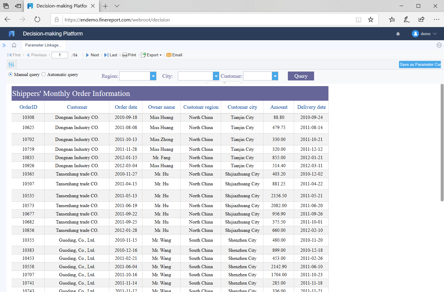
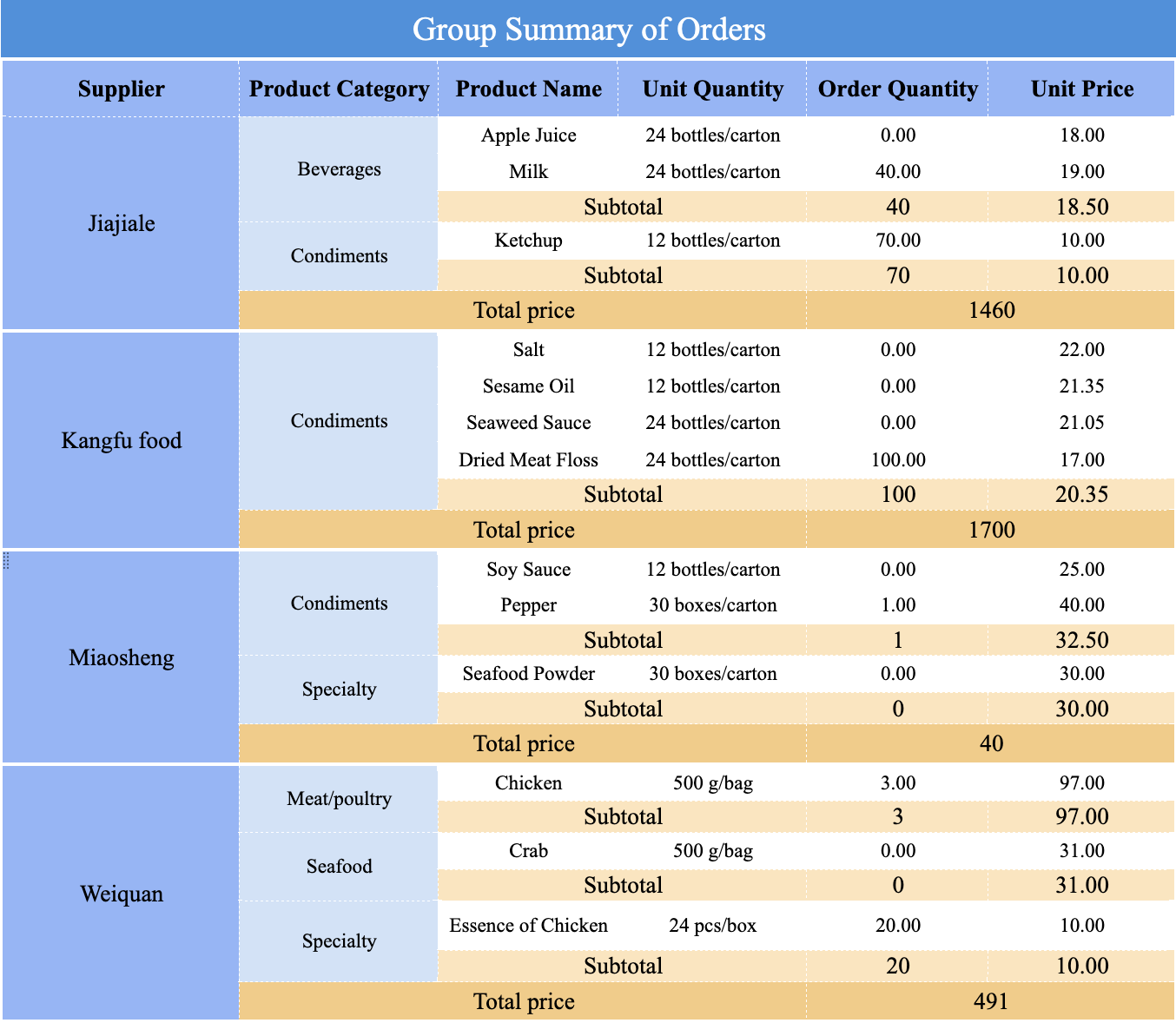
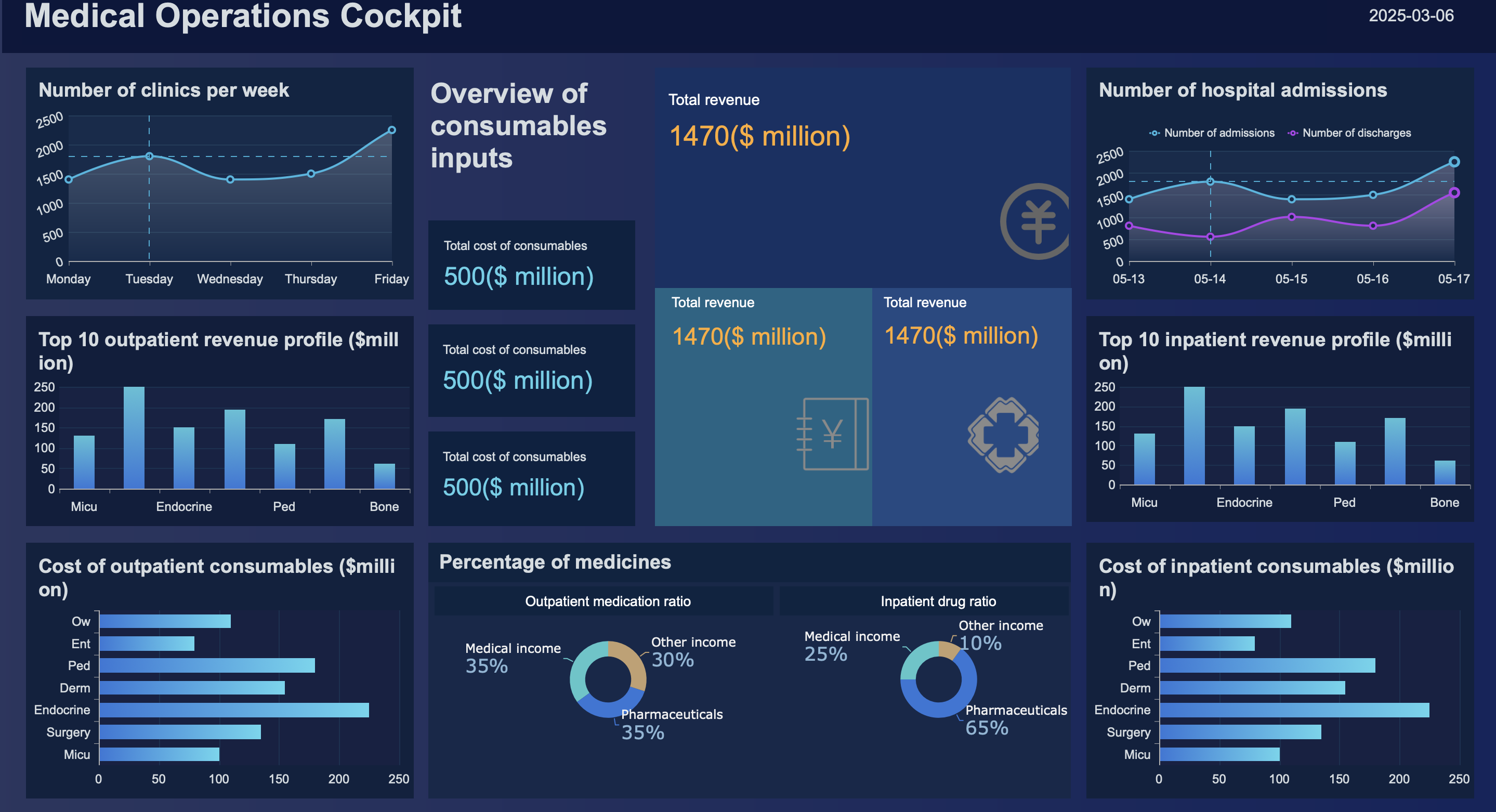
Scenario-based reporting makes dashboards easier to use because each dashboard is designed around a review meeting, a decision point, or a management workflow. Instead of one overloaded report for everyone, managers get the right view for the right cadence.
Key Metrics (KPIs) every manager should review first
Before adding complex views, every sales report example should include a small, reliable KPI layer. These metrics create a shared language across teams.
Revenue booked: Total recognized sales for the reporting period.
Quota attainment: Percentage of target achieved by rep, team, or region.
Pipeline value: Total value of open opportunities currently in the funnel.
Pipeline coverage: Pipeline value divided by sales target; used to assess whether enough opportunity exists to hit goal.
Win rate: Percentage of opportunities converted into closed-won deals.
Average deal size: Mean value of closed deals; helps explain revenue swings.
Sales cycle length: Average time required to close a deal.
Stage conversion rate: Percentage of deals moving from one stage to the next.
Lead volume: Number of new leads created in the period.
Rep activity: Calls, meetings, demos, emails, or follow-ups completed by rep.
Forecast amount: Expected revenue likely to close in the target period.
Forecast accuracy: Difference between forecasted and actual outcomes.
Renewal revenue: Revenue retained from existing customers.
Churn impact: Revenue lost from customer attrition or non-renewal.
Margin: Profitability of sales where commercial strategy requires it.
Daily Dashboards: Fast Reporting for Pipeline, Activity, and Immediate Action
Daily reporting is about operational control. It is not for deep analysis. It is for quick action.
What managers need to monitor every day
A daily dashboard should focus on movement, urgency, and execution quality. Managers typically need to monitor:
New leads created today
Calls completed
Meetings booked or held
Demos delivered
Follow-ups due and overdue
Deals moved by stage
Same-day changes in pipeline value
Short-term conversion movement
Rep activity levels
Exceptions such as stalled deals, missing next steps, or missed SLAs
The point is to catch issues before they become weekly problems. If a rep has high call volume but no stage progression, the issue is likely not effort but qualification quality or messaging. If a large deal has not moved in days, that is not just a data point. It is a coaching trigger.
A practical daily sales report example
A practical daily sales report example should be compact enough for a stand-up and specific enough for an end-of-day review. A strong layout often includes four sections:
1. Top KPI summary
Show only the few numbers that matter today:
New leads
Opportunities created
Deals advanced
Weighted pipeline change
Revenue closed today
2. Rep activity snapshot
Use a rep-level table with:
Calls
Meetings
Demos
Follow-ups completed
Next steps scheduled
Open overdue tasks
3. Pipeline movement panel
Track:
Deals entering each stage
Deals exiting each stage
Stalled deals by aging threshold
Value added or lost today
4. Urgent risk section
Flag exceptions such as:
No next step logged
High-value deals inactive for 3+ days
Follow-ups missed
Sudden drop in stage conversion
CRM records missing owner or close date
Managers can use this structure in a morning stand-up to prioritize outreach and in an end-of-day review to assess execution discipline.
Daily dashboards often fail because teams treat them like mini monthly reports. That creates noise and slows action.
The most common mistakes are:
Tracking too many metrics at once: A daily dashboard should not try to explain everything.
Focusing on volume without quality: Calls alone do not matter if deals are not progressing.
Ignoring data freshness: If CRM updates lag, managers react to stale information.
Using inconsistent stage definitions: Movement becomes meaningless when teams classify deals differently.
Burying urgent issues in general charts: Risks need explicit flags, not hidden trends.
The rule is simple: if a metric does not support a same-day action, it probably does not belong on the daily dashboard.
Weekly Dashboards: Trend Reviews, Team Performance, and Forecast Confidence
Weekly reporting is where managers move from reaction to coaching. It connects daily execution with short-term outcomes.
The weekly view managers use to coach teams
A weekly dashboard should compare current performance to target and reveal patterns that do not appear in daily snapshots. Managers typically review:
Weekly target vs actual by rep, team, or region
New pipeline created
Win rate by segment or rep
Average deal size
Sales cycle movement
Pipeline coverage
Forecast status for the month
Slippage risk on expected close dates
This is the level where coaching becomes specific. Instead of telling a rep to “work harder,” managers can identify that their opportunities are entering proposal stage but failing in negotiation, or that one territory is producing pipeline but at below-target deal value.
A manager-friendly weekly dashboard should be organized around four practical blocks.
Goal progress
Display:
Weekly bookings vs target
Month-to-date progress
Quota pacing
Gap-to-goal by team and rep
Pipeline health
Display:
Open pipeline by stage
Pipeline aging
Coverage ratio
New pipeline created this week
Deal slippage and inactive deal count
Rep performance
Display:
Win rate by rep
Average deal size by rep
Activity-to-opportunity conversion
Stage progression by owner
Forecast updates
Display:
Commit, best case, and upside categories
This week’s forecast change
High-value deals at risk
Commentary fields for explanation and next step
Commentary is important. Numbers show what changed. Manager notes explain why it changed and what action follows. That makes weekly dashboards more useful in review meetings and forecast calls.
How weekly reporting supports better forecasting and analysis
Weekly reporting improves forecasting because it links trend movement to likely month-end outcomes.
For example:
If pipeline coverage is healthy but stage conversion is weakening, the month may still finish below target.
If average deal size is rising but sales cycle length is also increasing, forecast timing may slip.
If a team is hitting activity goals but producing weak qualified pipeline, the issue may be lead quality or qualification discipline.
This weekly lens helps managers adjust:
Coaching focus
Resource allocation
Territory support
Deal prioritization
Forecast confidence level
In practice, weekly dashboards are where forecast discipline is built. They turn assumptions into visible patterns.
Monthly Sales Reporting: Executive Summaries and Performance Analysis
Monthly dashboards should help leadership understand business outcomes, not just activity trends. This is where the reporting becomes more strategic.
What to include in monthly sales reporting
A monthly sales report example should usually include:
Revenue booked
Quota attainment
New business revenue
Renewal revenue
Churn impact
Gross margin where relevant
Performance by segment
Performance by channel
Performance by product line
Performance by territory
Forecast vs actual comparison
Summary of improvements, declines, and business implications
Monthly reporting should explain not just what happened, but why it matters. That requires a layer of interpretation tied to sales execution, market conditions, product mix, and customer behavior.
A manager-friendly monthly dashboard example
A practical monthly dashboard structure usually starts broad, then drills into drivers.
1. Executive summary
Include:
Revenue vs target
Month-over-month trend
Forecast accuracy
Top positive and negative drivers
2. KPI trends
Show:
Win rate trend
Average deal size trend
Sales cycle trend
Pipeline coverage trend
New vs existing customer revenue
3. Team results
Show:
Quota attainment by rep or manager
Region or territory comparison
Product or segment mix
Top and bottom performers
4. Risks, opportunities, and actions
Summarize:
Underperforming segments
Renewal or churn risk
Expansion opportunities
Next-month action plan
This structure works well because it matches the flow of monthly business review meetings. Leadership sees the result first, then the explanation, then the recommended action.
As reporting maturity improves, monthly dashboards can add deeper analytical views without becoming unreadable.
Useful advanced additions include:
Cohort performance by acquisition month
Lead source analysis
Funnel conversion by stage and segment
Historical comparisons over 6 to 12 months
Forecast accuracy over time
Product profitability views
Regional trend decomposition
The key is discipline. Advanced does not mean crowded. Add complexity only when a view supports a recurring management decision.
Building Your Own Dashboard Template Step by Step
Creating a repeatable sales report example is easier when you build around decisions, cadences, and users instead of charts.
A 7-step process managers can follow
1. Define the reporting goal and audience
Start with the meeting or decision the report supports.
Daily: action and exception management
Weekly: coaching and forecast review
Monthly: performance review and executive alignment
A dashboard for frontline managers should not look like a dashboard for senior leadership.
2. Choose metrics tied to decisions, not just visibility
Every metric should answer a business question. If it does not change behavior, remove it.
For example:
Use stage conversion if you want to improve funnel efficiency
Use coverage ratio if you need forecast confidence
Use churn impact if retention affects monthly revenue planning
3. Set daily, weekly, and monthly update cadences
Do not force one refresh rhythm for all dashboards.
Daily dashboards need near-real-time or same-day updates
Weekly dashboards need stable weekly snapshots
Monthly dashboards need validated close-period data
4. Standardize data sources and metric definitions
This is where many reporting projects fail. Make sure sales, finance, and operations agree on definitions for:
Revenue
Closed-won
Active opportunity
Forecast categories
Renewal and churn
Pipeline stages
Without metric governance, your dashboards create debate instead of clarity.
5. Design dashboard sections around scenarios and actions
Group charts by management use case, not by system source.
Examples:
“What needs action today?”
“Which reps need coaching this week?”
“Why did forecast change this month?”
This makes the dashboard intuitive across teams.
6. Test with real review meetings and refine based on usage
A dashboard is successful when people use it naturally in operating routines. Sit in on stand-ups, pipeline reviews, and monthly business reviews. Watch where people pause, ask questions, or ignore charts.
That tells you what to simplify, add, or move.
7. Create a repeatable template for future periods
Once the layout works, lock in a template with consistent sections, definitions, filters, and visual logic. This makes historical comparison easier and reduces reporting effort each cycle.
Different teams need different reporting formats depending on size, maturity, and reporting complexity.
Spreadsheets: Best for early-stage teams or lightweight reporting, but hard to scale and govern.
CRM dashboards: Good for live sales activity and pipeline views, but often limited for cross-functional analysis.
BI tools: Best for structured analysis, blending sources, and role-based dashboards.
Presentation summaries: Useful for executives, but should come from a governed dashboard layer rather than manual copy-paste.
As a consultant, my advice is simple: use the least complex format that still supports trust, speed, and repeatability. Once teams start arguing over versions or rebuilding the same charts every month, it is time to move beyond spreadsheets.
Advanced and Annual Reporting Scenarios Managers Can Add Later
Once daily, weekly, and monthly dashboards are reliable, managers can layer in more advanced scenarios that support strategic planning.
Useful advanced dashboard views
The most valuable advanced views typically include:
Forecast accuracy over time: Measures whether forecast discipline is improving.
Funnel conversion by stage: Helps diagnose exactly where pipeline leaks occur.
Territory comparisons: Reveals structural differences across markets or account portfolios.
Product comparisons: Highlights where revenue growth comes from and where margin pressure exists.
Leading vs lagging indicators: Connects current activity and pipeline signals to future bookings.
These views are especially useful for sales operations, regional directors, and revenue leadership teams.
Extending monthly dashboards into quarterly and annual reports
Quarterly and annual reports should not start from scratch. They should roll up the same logic already used in monthly reporting.
This approach makes annual reporting easier because managers already have trusted building blocks. They are simply aggregating monthly truth into a strategic narrative.
Turn the Method Into an Automated Reporting System with FineReport
Building this manually is complex; use FineReport to utilize ready-made templates and automate this entire workflow.
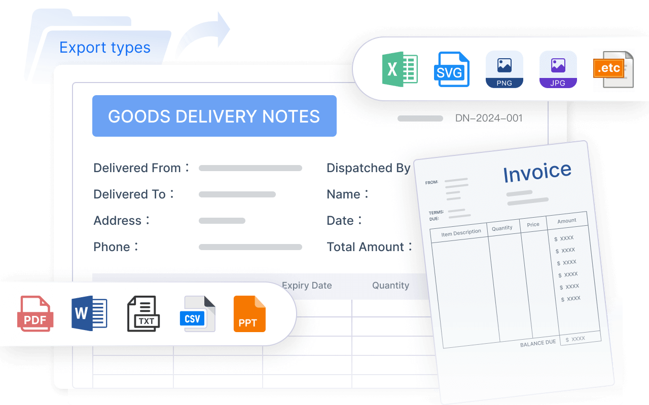
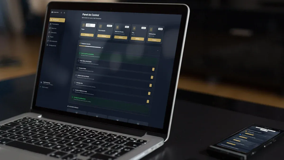
FineReport helps teams move beyond static spreadsheets and fragmented exports by turning daily, weekly, and monthly reporting into a governed dashboard system. Instead of rebuilding a new sales report example every cycle, managers can standardize KPI definitions, connect CRM and business data, automate refresh schedules, and deliver role-based dashboards for frontline sales leaders and executives alike.
This is especially valuable when you need to:
Build separate daily, weekly, and monthly views from one data foundation
Standardize metrics across sales, finance, and operations
Add commentary, drill-downs, and alerts for decision support
Reuse dashboard templates across regions, teams, or reporting periods
Scale reporting without increasing manual workload
Get Ready-to-Use Dashboard Templates in Fine Gallery
With FineReport, managers can build dashboards that fit the way reviews actually happen: stand-ups, weekly pipeline calls, monthly business reviews, and executive forecast meetings. That is the difference between reporting that looks impressive and reporting that drives action.
If your team is still assembling reports manually, now is the time to standardize the process. Start with a clear dashboard structure for daily, weekly, and monthly reviews, then automate the delivery and governance layer so every manager works from the same numbers.
A strong sales report should show a small set of core KPIs, clear pipeline movement, rep activity, and risks that need action. It should help managers decide what to do next, not just display numbers.
Daily dashboards focus on immediate changes like new leads, deal movement, and overdue follow-ups. Weekly dashboards are better for coaching and target tracking, while monthly dashboards evaluate overall results, trends, and strategy adjustments.
Start with revenue booked, quota attainment, pipeline value, pipeline coverage, win rate, and forecast accuracy. These metrics give a quick view of performance, pipeline health, and whether the team is likely to hit target.
It highlights where reps are stuck, where deals are aging, and where activity is not turning into results. That makes it easier to coach specific behaviors, fix bottlenecks, and prioritize high-impact actions.
Dashboard tools reduce manual work, keep metrics consistent, and make it easier to review live data from one place. Platforms like FineReport also help teams build reports for different review cadences without recreating the same analysis each time.
Product Trial
FineReport
Pixel-perfect reports · Interactive dashboards · Easy data entry · Digital twins