A sales dashboard serves as a vital tool to monitor and enhance your sales performance in Malaysia. It consolidates critical data into a single, easy-to-read platform, helping you track progress and identify areas for improvement. An effective sales dashboard empowers you to make informed decisions quickly. It eliminates guesswork, saves valuable time, and boosts productivity by streamlining data analysis. By focusing on actionable insights, you can align your strategies with business goals and drive meaningful results in Malaysia.
The data panel and system construction of the cases in this article are implemented by FanRuan's products. Click the button below to use the functions of the latest version of FanRuan's products for free, come and try it!
A well-designed sales dashboard is more than just a collection of charts and graphs. It serves as a strategic tool that empowers you to monitor, analyze, and optimize your sales performance in Malaysia. To achieve this, your dashboard must incorporate several essential features.
Relevant and Actionable KPIs
Your sales dashboard should focus onkey performance indicators(KPIs) that directly impact your business goals in Malaysia. These KPIs provide actionable insights, helping you make informed decisions and prioritize your efforts. For example, tracking metrics like customer acquisition cost and churn rate allows you to evaluate the effectiveness of your sales strategies and identify areas for improvement in Malaysia.
Here’s a table showcasing some critical KPIs you might include:
Metric
Description
Trial-to-paid conversion rate
Measures the percentage of users who convert from trial to paid subscriptions.
Customer acquisition cost
The total cost of acquiring a new customer, crucial for assessing profitability.
Retention rate
Indicates the percentage of customers who continue using the product over time.
Churn rate
The rate at which customers stop using the service, important for understanding customer satisfaction.
Customer lifetime value
The total revenue expected from a customer throughout their relationship with the business.
Monthly recurring revenue
The predictable revenue generated from subscriptions each month.
By focusing on these KPIs, you can align your sales efforts with your business objectives. For instance, a retail chain improved its customer satisfaction scores by 15% and increased its Net Promoter Score (NPS) from 25 to 45 by using KPI insights to guide targeted training. This led to stronger customer loyalty and better sales performance.
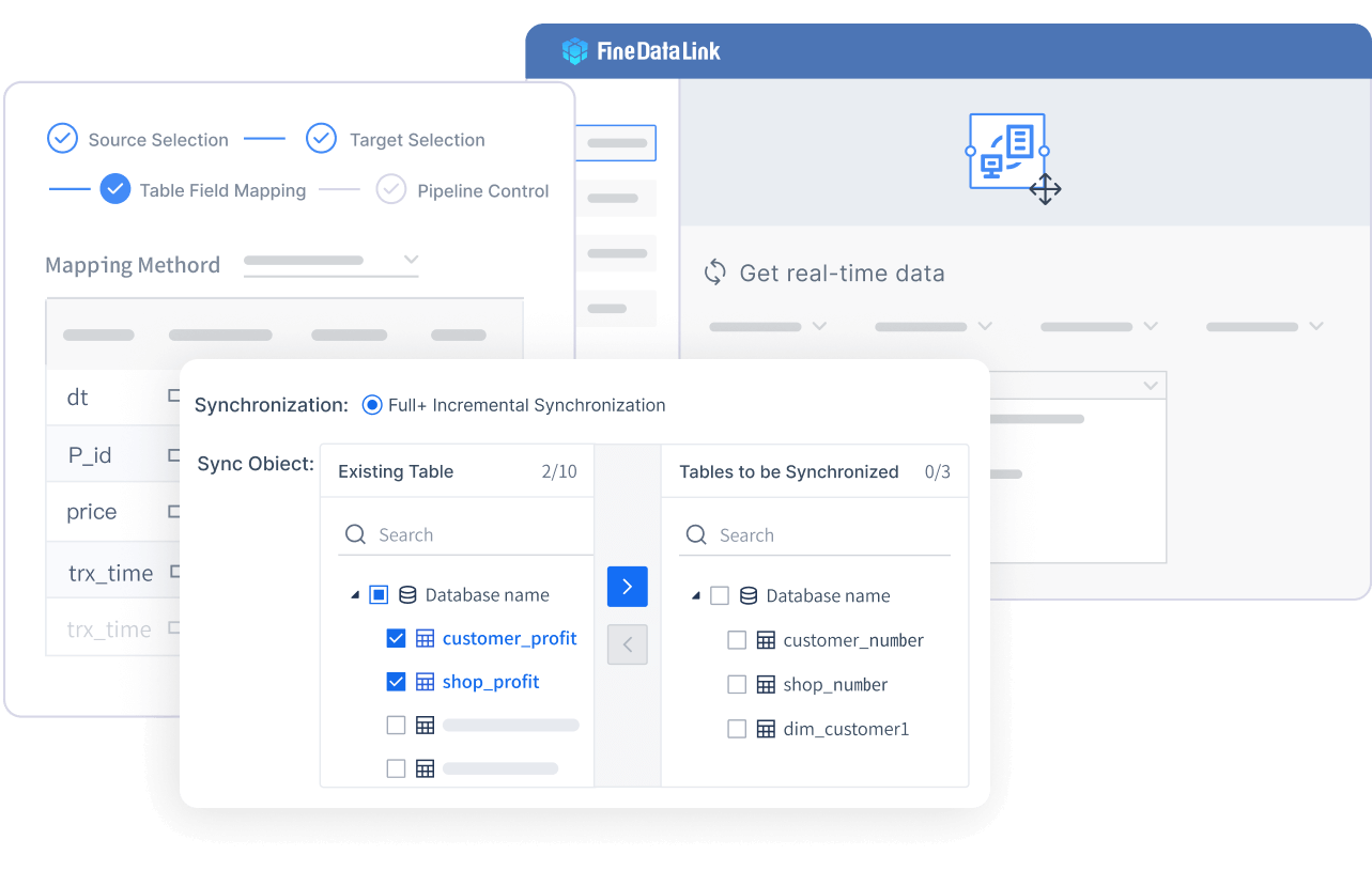
Real-Time Data Integration with FineDataLink
Real-time data integration is a game-changer for sales dashboards. It ensures that you always have access to the most up-to-date information, enabling you to respond quickly to market changes and customer needs. FineDataLink, a robust data integration platform, excels in this area by synchronizing data across multiple sources with minimal latency.
With FineDataLink, you can:
Build real-time data pipelines to reduce the load on your business database.
Use ETL/ELT functions for seamless data transformation and preprocessing.
Develop APIs in minutes to share data across systems without writing code.
These capabilities not only enhance the accuracy of your sales metrics but also improve operational efficiency. For example, companies in Malaysia using real-time data integration have reported a 30% rise in sales performance and a 40% reduction in time spent on incentive management. This level of efficiency allows your team in Malaysia to focus on strategic tasks rather than manual data handling.
Customization for Different Teams in Malaysia and Roles
Every team in Malaysia within your organization has unique needs and priorities. A customizable sales dashboard ensures that each team member can access the data most relevant to their role. For instance, sales managers might focus on overall revenue and team performance in Malaysia, while individual representatives may prioritize their conversion rates and customer interactions.
This level of flexibility fosters better collaboration and decision-making across teams in Malaysia. In fact, organizations that implemented role-specific dashboards saw a 25% increase in the number of representatives qualifying for incentives. By tailoring the dashboard to meet diverse needs, you create a tool that supports everyone in achieving their objectives.
Actionable Tips for Designing a Sales Dashboard
Define Clear Objectives and Goals
A successful sales dashboard begins with a clear purpose. Without defined objectives, your dashboard in Malaysia risks becoming cluttered and ineffective. Start by identifying what you want to achieve. Are you tracking sales performance, monitoring sales conversion rates, or analyzing customer retention? Knowing your goals will guide every design decision.
For example, a dashboard designed to improve sales conversion rates might focus on metrics like lead-to-customer ratios or average deal size. By narrowing your focus, you can create a tool that delivers actionable insights and supports informed decision-making.
Keep the Design Simple and Focused
Simplicity is key to an effective sales dashboard. A cluttered design overwhelms users and makes it harder to find critical information. Instead, focus on including only the most important metrics that align with your objectives in Malaysia.
Benefit
Explanation
Improves Efficiency
A focused dashboard reduces unnecessary data, saving time and allowing users to act on key insights faster.
Aligns Metrics with Goals
Each metric should connect to a business goal, ensuring relevance and focus in the dashboard design.
Leverage Visuals for Enhanced Data Understanding
Visuals play a crucial role in making data more accessible. Charts, graphs, and heatmaps simplify complex information, allowing you to identify trends and patterns quickly. This approach enhances your ability to make informed decisions.
A hospital reduced readmission rates by 20% within six months by using visual analytics to identify key risk factors.
A retail company increased sales by 30% in one quarter by uncovering customer buying patterns through visual analytics.
A manufacturing firm achieved a 25% reduction in operational costs by visualizing supply chain data to identify inefficiencies.
Visual analytics transforms raw data into actionable insights. For example, a line graph showing monthly sales performance can help you spot seasonal trends, while a bar chart comparing sales conversion rates across regions can highlight areas needing attention.
Tip: Choose visuals that match the type of data you’re presenting. Use pie charts for proportions, line graphs for trends, and bar charts for comparisons.
Ensure Mobile-Friendly and Responsive Design
A mobile-friendly and responsive design is essential for modern sales dashboards. Many users rely on smartphones and tablets to access data on the go. A dashboard that adapts seamlessly to different screen sizes ensures you can monitor sales performance anytime, anywhere.
A responsive design not only improves usability but also boosts engagement. For example, 73% of users leave websites due to non-responsive designs. By addressing this issue, you can retain more users and enhance their experience.
A sales dashboard is not a one-time project. Regular updates and refinements are crucial to ensure it remains relevant and effective. As your business evolves, so do your data needs. Keeping your dashboard up-to-date allows you to adapt to changing priorities and market conditions.
By committing to regular updates, you create a sales dashboard that evolves with your business. This proactive approach ensures your team in Malaysia always has access to the insights they need to succeed.
How FineBI and FineReport Enhance Sales Dashboard
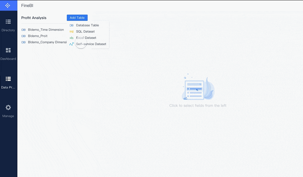
FineBI for Self-Service Analytics and Real-Time Insights
FineBIempowers you to create effective BI dashboards by offering self-service analytics. You can explore data independently without relying on IT support. This tool provides real-time insights, allowing you to make quick decisions based on the latest information. FineBI's user-friendly interface makes it easy to connect to various data sources. You can visualize data through interactive charts and graphs. This capability helps you identify trends and patterns that drive sales performance. By using FineBI, you can transform raw data into actionable insights, enhancing your ability to create effective BI dashboards.
FineReport for Advanced Reporting and Customization
FineReporttakes your sales dashboards to the next level with advanced reporting features. You can customize reports to meet specific business needs. This flexibility ensures that your dashboards align with your organizational goals. FineReport supports pixel-perfect document creation, allowing you to present data professionally. You can integrate data from multiple sources, providing a comprehensive view of your sales performance. With FineReport, you can automate report generation and distribution, saving time and reducing errors. This tool enhances your ability to design effective BI dashboards tailored to your unique requirements in Malaysia.
Combining FineBI and FineReport for Comprehensive Solutions
By combining FineBI and FineReport, you can create comprehensive solutions for your sales dashboards. FineBI offers self-service analytics and real-time insights, while FineReport provides advanced reporting and customization. Together, they enable you to buildeffective BI dashboards that cater to diverse business needs. You can leverage the strengths of both tools to gain a holistic view of your sales data. This approach enhances decision-making and boosts productivity. By integrating FineBI and FineReport, you can ensure your sales dashboards remain effective and aligned with your business objectives.
FineReport and FineBI are supported by a dedicated local team in Malaysia, providing localized project implementation and technical support to ensure seamless deployment and optimized performance tailored to Malaysian enterprises.
Pharmaceutical companies rely heavily on data to drive their sales strategies. Sales dashboards provide a centralized platform to analyze market trends, monitor drug performance, and track sales representatives' activities. This data-driven approach ensures that sales efforts align with market needs.
Real-time data analytics has transformed the pharmaceutical industry. It enables companies to:
Identify high-potential markets for new drug launches.
Monitor the effectiveness of marketing campaigns in real time.
Adjust sales strategies based on customer feedback and market conditions.
For example, a study highlighted eight use cases where real-time data analytics improved pharmaceutical sales outcomes. Another report emphasized how real-time data enhances pharma marketing strategies, leading to better sales performance. By making data-driven decisions, pharmaceutical companies can stay competitive and meet the needs of healthcare providers and patients. Click the interactive demo of pharmacy stores' sales analysis created by FineBI to experience it.
In retail, sales dashboards empower you to make smarter selling decisions. They provide real-time insights into customer behavior, sales trends, and inventory levels. This information helps you optimize pricing, promotions, and product placement.
Retailers that use real-time analytics often see significant improvements in sales outcomes. For instance:
Dashboards help track customer preferences, enabling personalized marketing campaigns.
Real-time data allows retailers to adjust pricing strategies during peak shopping seasons.
Businesses can monitor inventory levels and restock popular items promptly.
A source with 25 examples of real-time analytics showcases how retailers leverage data to enhance sales performance. By focusing on data-driven decisions, you can improve customer satisfaction and boost revenue in Malaysia. Below is an interactive demo created by FineBI. Click to explore and experience the dynamic options firsthand.
A sales leaderboard report ranks your sales team in Malaysiabased on their performance. It highlights top performers and motivates others to improve. This report tracks metrics like revenue generated, deals closed, and customer acquisition rates. By analyzing these numbers, you can identify high achievers and reward their efforts.
This report fosters healthy competition among your team in Malaysia. For example, tracking the quote-to-close ratio helps you identify sales reps who excel at closing deals. By sharing this data, you encourage others to adopt similar strategies and improve their performance.
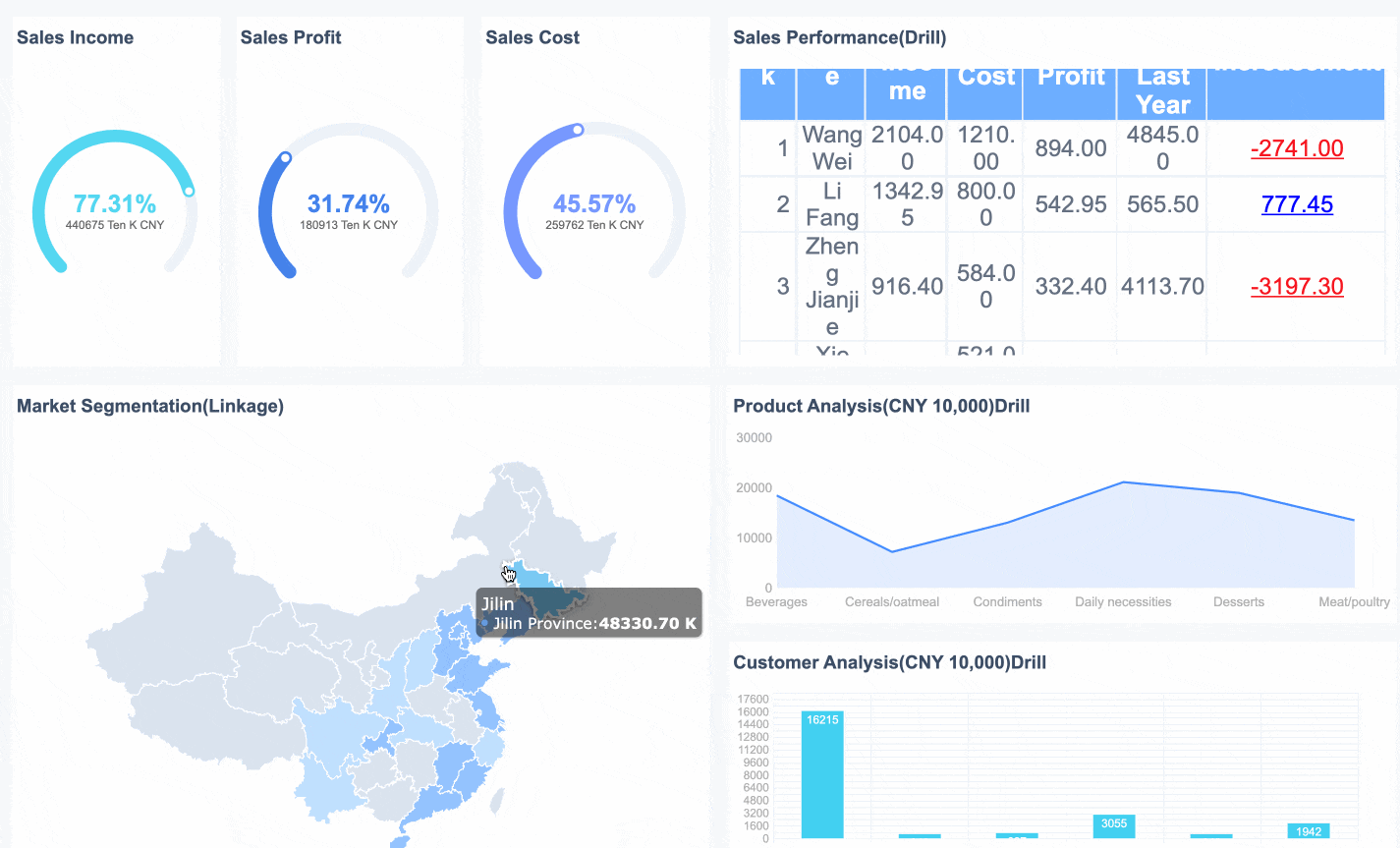
Overall Sales Performance Dashboard
Overall Sales Performance Dashboard Created byFineReport
An overall sales performance report provides a comprehensive view of your team’s achievements in Malaysia. It combines key metrics like total revenue, growth rates, and customer retention. This report helps you evaluate whether your sales strategies align with business goals.
Use this report to monitor trends over time. For instance, month-over-month growth reveals how well your team in Malaysia generates new business. A steady increase indicates strong performance, while a decline signals areas needing improvement. Including metrics like lead-to-sale conversion rates ensures you focus on actionable insights.
Tip: Add visual elements like bar charts or line graphs to make trends easier to understand. This approach simplifies complex data and enhances decision-making.
A multi-dimensional sales report dives deeper into specific aspects of your sales process. It analyzes data across multiple dimensions, such as regions, products, or customer segments. This report uncovers patterns that might otherwise go unnoticed.
For example, tracking sales qualified leads (SQLs) helps you identify prospects most likely to convert. Monitoring the number of emails sent and calls made reveals productivity levels among your team in Malaysia. Trials, especially in SaaS models, show how many accounts sign up for product demos.
SQLs: Leads with high potential for conversion.
Emails and calls: Indicators of sales rep activity.
Trials: Key metric for SaaS businesses.
By leveraging this report, you can refine your strategies and target areas with the highest growth potential. This level of detail ensures your sales efforts remain efficient and effective.
A sales management report provides a detailed overview of your team’s performance in Malaysia, helping you track progress and identify areas for improvement. It serves as a strategic tool for monitoring sales activities, evaluating team efficiency, and aligning efforts with business goals.
Key Metrics to Include
Your sales management report should focus on metrics that reflect team performance and operational efficiency. Here are some essential metrics to consider:
Metric
What it Measures
Why It Matters
Sales Pipeline Status
Tracks the number of deals in each pipeline stage
Helps you identify bottlenecks and optimize the sales process.
Average Deal Size
Measures the average revenue per closed deal
Indicates the quality of leads and sales opportunities.
Win Rate
Percentage of deals closed successfully
Reflects the effectiveness of your sales strategies.
Sales Cycle Length
Time taken to close a deal
Highlights areas where the process can be streamlined.
Benefits of a Sales Management Report
A well-structured report empowers you to make informed decisions. It highlights trends, uncovers inefficiencies, and provides actionable insights. For example, tracking the sales cycle length can help you identify delays and implement strategies to close deals faster. Monitoring win rates allows you to evaluate the effectiveness of your team’s approach and adjust training programs accordingly in Malaysia.
Tip: Share the report with your team in Malaysia during regular meetings. This practice fosters transparency and encourages collaboration.
By using a sales management report, you can ensure your team in Malaysia stays aligned with organizational goals. It also helps you maintain accountability and drive continuous improvement in sales performance.
A well-designed sales dashboard transforms how you manage sales performance. It improves decision-making by providing real-time insights and aligning your team in Malaysia with business goals. For example, Lyft increased efficiency by integrating Salesforce with Slack for instant updates. Dashboards also enhance sales enablement by identifying skill gaps and surfacing trends to focus on high-potential prospects.
By applying the tips shared and leveraging tools like FineBI and FineReport, you can create dashboards tailored to your needs. These tools empower you to make data-driven decisions, boosting productivity and ensuring success. A great sales dashboard is more than a tool—it’s your pathway to achieving excellence.
Click the banner below to experience FineReport and FineBI for free and empower your enterprise to convert data into productivity!
Access a wealth of case studies, industry insights, and solution guides to accelerate digital transformation.
FAQ
What is the primary purpose of a sales dashboard?
A sales dashboard helps you monitor performance, track key metrics, and make informed decisions. It consolidates data into one platform, saving time and improving productivity. By focusing on actionable insights, you align your strategies with business goals and drive better results.
How often should you update your sales dashboard?
You should update your dashboard regularly to keep it relevant. Schedule reviews monthly or quarterly to ensure metrics align with current objectives. Frequent updates improve accuracy and help you adapt to changing market conditions.
Can FineBI and FineReport work together?
Yes, FineBI and FineReport complement each other. FineBI provides self-service analytics and real-time insights, while FineReport offers advanced reporting and customization. Together, they create a comprehensive solution for designing effective sales dashboards tailored to your needs.
Why is mobile optimization important for sales dashboards?
Mobile optimization ensures you can access your dashboard anytime, anywhere. A responsive design improves usability, boosts engagement, and supports decision-making on the go. It’s essential for modern teams relying on smartphones and tablets.
What are the key metrics to include in a sales dashboard?
Include metrics like customer acquisition cost, churn rate, retention rate, and monthly recurring revenue. These KPIs provide actionable insights, helping you evaluate strategies and prioritize efforts. Focus on metrics that align with your business goals.