An open source metrics dashboard is a self-hosted or customizable platform that helps teams visualize, monitor, and share metrics from systems, applications, databases, and business data sources.
The 9 open source metrics dashboard tools compared
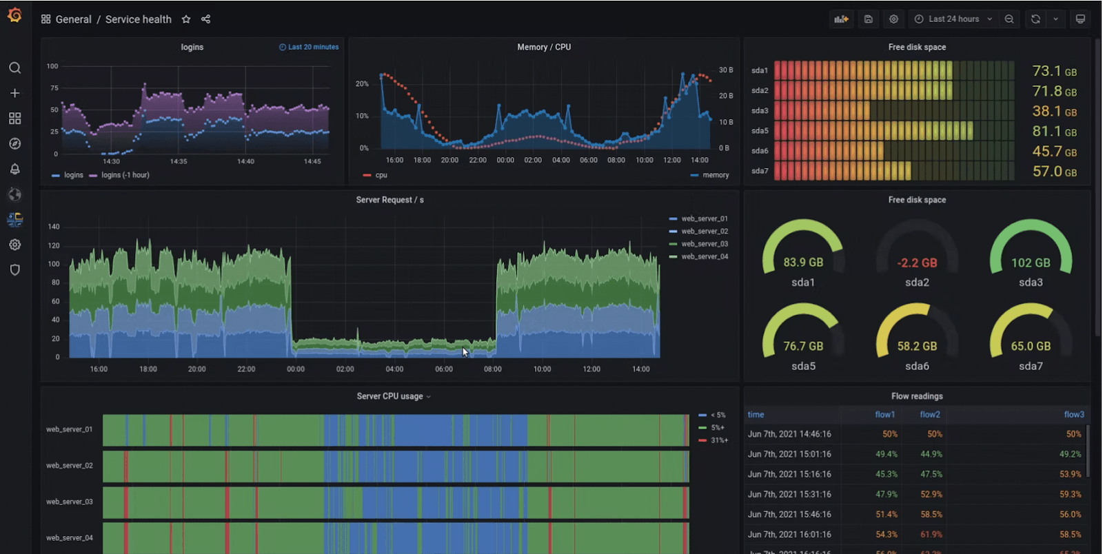
1. Grafana
One-sentence overview: Grafana is the most widely adopted open source metrics dashboard for teams that need flexible visualizations, broad integrations, and mature observability workflows.
Key Features:
Support for metrics, logs, and traces through connected backends
Pros & Cons:
Pros: Large ecosystem, flexible panels, strong community support, mature alerting, good fit for observability-heavy environments
Cons: Can become complex to govern at scale, advanced setup often requires careful permission and data-source management
Best For: Engineering teams, platform teams, and organizations building full-stack observability environments
Grafana remains the default benchmark for many open source metrics dashboard evaluations because it works across so many backends. If your team already uses Prometheus, Elasticsearch, InfluxDB, PostgreSQL, or cloud monitoring services, Grafana usually fits naturally into the stack.
Its main trade-off is operational complexity. Small teams can launch Grafana quickly, but larger companies often run into dashboard sprawl, inconsistent access controls, and plugin governance challenges. That makes Grafana excellent for technical teams, but not always the easiest choice for standardized enterprise reporting.
2. Metabase
One-sentence overview: Metabase is an open source analytics and dashboarding platform built for business teams that want fast self-service reporting without a steep learning curve.
Key Features:
No-code query builder
SQL editor for analysts
Interactive dashboards and filters
Sharing, subscriptions, and alerts
Broad support for databases and warehouses
Pros & Cons:
Pros: Approachable interface, useful SQL support, fast dashboard creation, good for internal reporting
Cons: Less specialized for deep infrastructure monitoring and advanced observability use cases
Best For: Business teams, analysts, internal reporting use cases, and lightweight embedded analytics
Metabase is a strong choice when your definition of a metrics dashboard is closer to KPI tracking, business reporting, or embedded product analytics than infrastructure monitoring. It helps non-technical users answer questions quickly, while still giving SQL users enough flexibility to go deeper.
Compared with Grafana, Metabase is less focused on telemetry-heavy operations. If your main need is service health, traces, and incident response, it is not the most specialized fit. If your main need is internal dashboards that product, finance, marketing, or operations teams will actually use, Metabase becomes much more compelling.
3. Apache Superset
One-sentence overview: Apache Superset is an open source BI platform designed for data teams that need highly customizable dashboards on top of large analytical datasets.
Key Features:
Cons: Setup and administration can be heavier for small teams without data engineering support
Best For: Data teams, analytics engineers, and organizations running warehouse-centric BI workflows
Superset sits closer to the BI end of the open source metrics dashboard spectrum. It is well suited for organizations that already centralize reporting in data warehouses and want more control than lightweight dashboard tools usually offer.
Its advantage is flexibility. Its drawback is that flexibility often comes with more administration, more setup, and more internal expertise requirements. For data-mature teams, that is acceptable. For lean teams that just want a dashboard online quickly, it may feel heavy.
4. Redash
One-sentence overview: Redash is a lightweight, SQL-first dashboard tool for teams that want straightforward querying and simple reporting workflows.
Key Features:
SQL query editor
Broad database connectivity
Dashboard assembly from query results
Scheduling and sharing
Visualizations for common analytical use cases
Pros & Cons:
Pros: Simple workflow, broad data source support, fast time to value, easy for SQL-centric teams
Cons: Narrower feature depth than newer BI and observability-focused tools
Best For: Analysts, data-savvy operations teams, and companies that prioritize simple SQL-based dashboarding
Redash still appeals to teams that prefer simplicity over platform breadth. It does not try to be a complete observability suite or a highly governed enterprise BI layer. Instead, it focuses on helping users query data and turn results into shareable dashboards quickly.
That makes Redash useful for lean analytics reporting. It is less ideal if you need advanced governance, extensive semantic modeling, or multi-layer observability.
5. Prometheus with dashboard layer
One-sentence overview: Prometheus is an open source monitoring system for time-series metrics that becomes a practical dashboard solution when paired with a visualization layer such as Grafana.
Cons: Not a complete dashboard experience on its own for cross-functional reporting
Best For: SRE, DevOps, and platform engineering teams focused on metrics monitoring and alerting
Prometheus is critical in many open source metrics dashboard stacks, but it is important to frame it correctly: Prometheus is primarily a metrics collection and querying system, not a polished dashboard product by itself. Most teams pair it with Grafana or another visualization layer.
If your team thinks in terms of scrape targets, exporters, service discovery, latency histograms, and alert rules, Prometheus is one of the strongest foundations available. If your stakeholders want business-ready dashboards for executives, sales leaders, or customers, you will likely need another layer on top.
6. Kibana
One-sentence overview: Kibana is the dashboard and analysis layer for Elasticsearch, optimized for log exploration, search-driven analysis, and operational visibility.
Key Features:
Log and event visualization
Search-first exploration
Dashboards and saved views
Elastic ecosystem integrations
Security and operational workflows within the stack
Cons: Best experience often depends on commitment to the broader Elastic ecosystem
Best For: Teams centered on Elasticsearch, log analysis, and search-heavy operations monitoring
Kibana is strong when logs are the center of the monitoring workflow. It supports dashboards well enough, but its biggest advantage is not generic dashboarding. It is fast exploration of event and log data stored in Elasticsearch.
That specialization is both its strength and limitation. If your organization already standardizes on Elastic, Kibana may be an obvious choice. If not, its value depends heavily on whether you are willing to build around the Elastic stack.
7. Zabbix
One-sentence overview: Zabbix is a mature open source monitoring platform with built-in dashboards, alerting, templates, and broad infrastructure coverage.
Key Features:
Server and network monitoring
Built-in alerting
Template-based monitoring
Dashboards for infrastructure health
Agent and agentless monitoring options
Pros & Cons:
Pros: Mature monitoring capabilities, strong templates, built-in alerting, good coverage for networks and servers
Cons: Interface and customization can feel less flexible than newer dashboard-first tools
Best For: IT operations teams and organizations managing traditional infrastructure environments
Zabbix remains highly relevant for infrastructure-first monitoring, especially in mixed environments with physical servers, network devices, VMs, and legacy systems. It offers more built-in monitoring depth than some dashboard-only tools.
Its trade-off is user experience. Teams that expect modern dashboard composition and highly flexible visual storytelling may find it less fluid than Grafana or BI-focused tools. But for classic infrastructure monitoring, it still performs well.
8. Dashy
One-sentence overview: Dashy is a lightweight, customizable dashboard homepage designed more for service links, status views, and internal portals than deep analytics.
Key Features:
Homepage-style dashboard layouts
Service and link organization
Status widgets and simple integrations
Easy deployment
Custom themes and personalization
Pros & Cons:
Pros: Easy to deploy, visually simple, useful for internal portals and team landing pages
Cons: Not designed for deep analytics, advanced metrics exploration, or enterprise reporting
Best For: Small teams that want a central portal for tools, services, and lightweight status visibility
Dashy belongs in this list because some teams searching for an open source metrics dashboard actually want a practical operations homepage rather than a full analytics platform. For that use case, Dashy is easy to set up and easy to maintain.
It should not be confused with a true BI or observability dashboard solution. It is better seen as a useful interface layer for visibility and navigation.
9. Appsmith
One-sentence overview: Appsmith is an open source low-code platform for building internal tools that can include dashboard elements, workflows, and operational interfaces.
Cons: Stronger as an app-building platform than as a dedicated monitoring dashboard product
Best For: Teams building internal tools that combine KPIs, actions, workflows, and operational data in one workspace
Appsmith is useful when a dashboard alone is not enough. If your users need to view metrics, trigger actions, update records, and move through workflows in one place, Appsmith can be more practical than a pure dashboard tool.
The key caveat is that it is not purpose-built for observability or classic BI. It is best when metrics are one component of a larger internal application.
What to look for in an open source metrics dashboard in 2026
Before choosing any open source metrics dashboard, define the core use case. That sounds obvious, but it is where many shortlists go wrong. A tool built for infrastructure monitoring is not automatically the right platform for executive reporting, customer-facing analytics, or embedded dashboards inside a SaaS product.
Start by clarifying whether your primary need is:
Infrastructure monitoring
Product analytics
Executive reporting
Embedded customer-facing dashboards
Operational workspaces for internal teams
Once the use case is clear, compare tools on the dimensions that actually affect adoption:
Data-source support: Can the platform connect to your databases, warehouses, telemetry systems, APIs, and log stores?
Query flexibility: Do users need no-code exploration, SQL, PromQL, or search-driven analysis?
Alerting: Is alerting native, usable, and appropriate for your workflows?
Permissions: Can you separate access by role, team, tenant, or customer?
Visualization depth: Are the chart types and interactive capabilities enough for real use?
Operational fit matters just as much as features. Open source software may have no license fee, but it still creates engineering work. Evaluate:
Self-hosting complexity
Upgrade and patching effort
Scalability model
Plugin dependency risk
Community activity
Long-term maintenance confidence
In 2026, observability is also a bigger factor in dashboard selection. Many engineering teams no longer evaluate metrics in isolation. They want a platform or stack that supports:
Metrics
Logs
Traces
Distributed system context
Incident response workflows
That is why Grafana, Prometheus-based stacks, and Kibana remain strong in engineering environments, while Metabase, Superset, and Redash continue to lead more business-oriented dashboard scenarios.
How the top tools differ by team and use case
Best for full-stack observability and engineering teams
For engineering and SRE teams, the strongest open source metrics dashboard options are usually Grafana, Prometheus-based setups, and Kibana.
Grafana is the most flexible visualization layer across multiple telemetry backends. It is usually the best fit when teams want one interface for metrics dashboards, operational views, and cross-tool observability.
Prometheus with a dashboard layer is ideal when metrics collection, time-series alerting, and cloud-native monitoring are the priority. It shines in Kubernetes, microservices, and service reliability workflows.
Kibana is strongest when logs and search are central to troubleshooting. It is less general-purpose than Grafana, but very effective in Elastic-centric environments.
If your team handles incidents regularly, ask these questions:
How well does the tool support logs, metrics, and traces together?
Can it handle high-cardinality operational data?
Are alerting workflows mature enough for on-call use?
Can dashboards be governed across many services and teams?
For most engineering organizations, the answer is rarely a single tool in isolation. It is often a combination, such as Prometheus for collection and alerting plus Grafana for dashboarding.
Best for BI, reporting, and embedded analytics
For business intelligence and internal reporting, the strongest candidates are Metabase, Apache Superset, and Redash.
Metabase is the easiest entry point for broad self-service analytics. It is often the best fit for business users who need fast answers without a heavy technical setup.
Superset is more powerful for data teams that want flexibility, warehouse-scale analytics, and richer control over analytical exploration.
Redash works well for SQL-centric reporting where speed and simplicity matter more than advanced governance.
When comparing these tools, prioritize:
SQL accessibility
Dashboard usability for non-technical stakeholders
Permission controls
Sharing and embedding options
Governance and semantic consistency
If external or customer-facing analytics is part of the roadmap, the embedded experience becomes especially important. Not every open source metrics dashboard handles multi-tenant delivery or polished embedding equally well.
Best for internal portals and operational workspaces
When the goal is less about classic analytics and more about centralizing tools, KPIs, workflows, and service visibility, Dashy and Appsmith stand out.
Dashy is better for simple portal-style interfaces with links, statuses, and lightweight views.
Appsmith is better for custom internal applications that mix dashboards with forms, approvals, actions, and workflow logic.
In these use cases, the selection criteria change. Instead of asking only about charts and queries, ask:
How quickly can teams customize the interface?
Does the tool support authentication cleanly?
Can it integrate multiple internal systems?
Will users take actions from the same workspace?
That distinction matters because many teams start by searching for a dashboard tool when what they really need is an internal operations hub.
Pros, trade-offs, and hidden costs to weigh before choosing
The main appeal of an open source metrics dashboard is flexibility. You can self-host, customize, and avoid immediate license costs. But open source does not mean zero cost.
The real trade-off is often license savings versus implementation burden.
Here are the hidden costs teams often underestimate:
Hosting and infrastructure
Upgrades and version compatibility
Backup and recovery planning
Access control setup
Dashboard governance
User onboarding and training
Plugin maintenance
Security hardening
Migration effort later
This is where many organizations discover an important divide: open source tools are excellent for flexibility and technical control, but enterprises often need a more standardized dashboard platform with stronger governance, security, and management workflows.
For small teams, open source can be the right long-term answer. For larger companies, especially those serving multiple departments or external users, the operational overhead of stitching tools together can grow quickly. A modular stack may still be right, but the governance layer becomes more important than the initial dashboard itself.
That is also why many enterprises eventually move from open source experimentation to an enterprise dashboard platform for broader reporting, governed analytics, and executive-level visibility.
Which open source metrics dashboard fits your team best?
Choose by team size and technical maturity
Small teams usually benefit most from tools with fast setup and lower administrative overhead. That often points toward:
Metabase for internal reporting
Redash for SQL-based dashboards
Dashy for lightweight portal use cases
Larger or more technical organizations may need stronger extensibility and governance, which often points toward:
Grafana for observability-heavy environments
Prometheus-based stacks for cloud-native metrics monitoring
Superset for data-team-led BI
Zabbix for infrastructure operations
The key question is not only who builds dashboards, but also who consumes them. A dashboard platform that works for engineers may fail with executives. A tool analysts love may not work for incident response.
Choose by data complexity and growth plans
If your reporting needs are lightweight and stable, a simpler tool is usually enough. But if your data volume, query complexity, or number of stakeholders is growing, choose for the future state, not just the current pilot.
Also reassess what kind of platform you actually need. Some teams say they need an open source metrics dashboard, but over time realize they really need one of three things:
The smartest way to choose is to narrow your options to two or three tools and run a time-boxed proof of concept.
During the proof of concept, compare:
Setup time
Query usability
Dashboard performance
Permission handling
Alerting workflows
Maintenance effort
Stakeholder adoption
This is often where gaps become obvious. A tool may look strong in feature checklists but fail in daily usability. Another may be easy to start but hard to scale.
For many organizations, the right decision is to use open source tools where they fit best, while recognizing when a dedicated enterprise dashboard becomes the better long-term platform.
If your team is evaluating open source options but your end goal is enterprise-grade reporting, governed dashboards, cross-department analytics, and scalable dashboard management, an enterprise BI platform is often the more practical choice. In that scenario, FineBI is worth considering as the next step. It gives organizations a more centralized dashboard environment with stronger governance, broader business reporting capabilities, and a structure better suited to enterprise-wide decision-making than most open source tools alone.
Choose Grafana or Prometheus-based setups for engineering observability
Choose Kibana for Elastic-centered log analysis
Choose Metabase, Superset, or Redash for BI-style reporting
Choose Dashy or Appsmith for portal and operational workspace use cases
Choose FineBI when your organization has outgrown fragmented open source dashboards and needs an enterprise dashboard platform
The best open source metrics dashboard is the one that fits your workflows today without creating unnecessary complexity tomorrow.
FAQs
It helps teams visualize, monitor, and share metrics from applications, infrastructure, databases, and business systems. Most teams use one to track performance, spot issues faster, and keep stakeholders aligned.
Start with your primary use case: observability, business reporting, or warehouse-based analytics. Then compare data source support, ease of setup, permissions, alerting, and how much maintenance your team can handle.
Grafana is usually stronger for infrastructure monitoring, real-time metrics, and observability workflows. Metabase is often a better fit for self-service business reporting and dashboards used by non-technical teams.
Prometheus is mainly a metrics collection and querying system, not a full dashboard platform. Most teams pair it with a visualization layer like Grafana to build richer dashboards and share them more easily.
Redash is a strong option for simple SQL-first reporting, while Metabase also works well if you want an easier experience for mixed technical and non-technical users. Superset is more flexible for larger analytics environments but usually takes more setup.
Product Trial
FineReport
Pixel-perfect reports · Interactive dashboards · Easy data entry · Digital twins
 Key Features:
 Key Features:
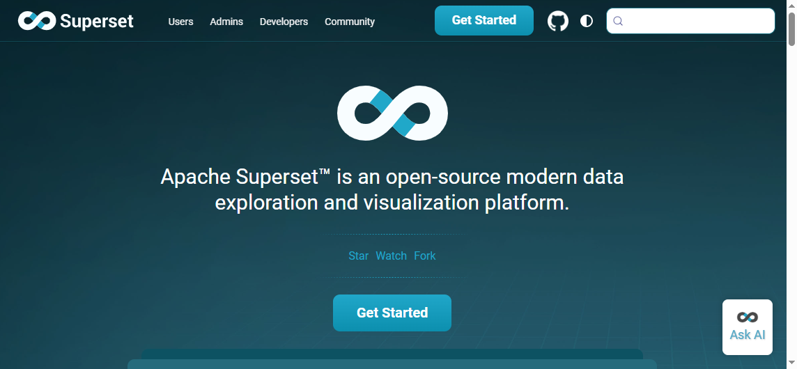 Key Features:
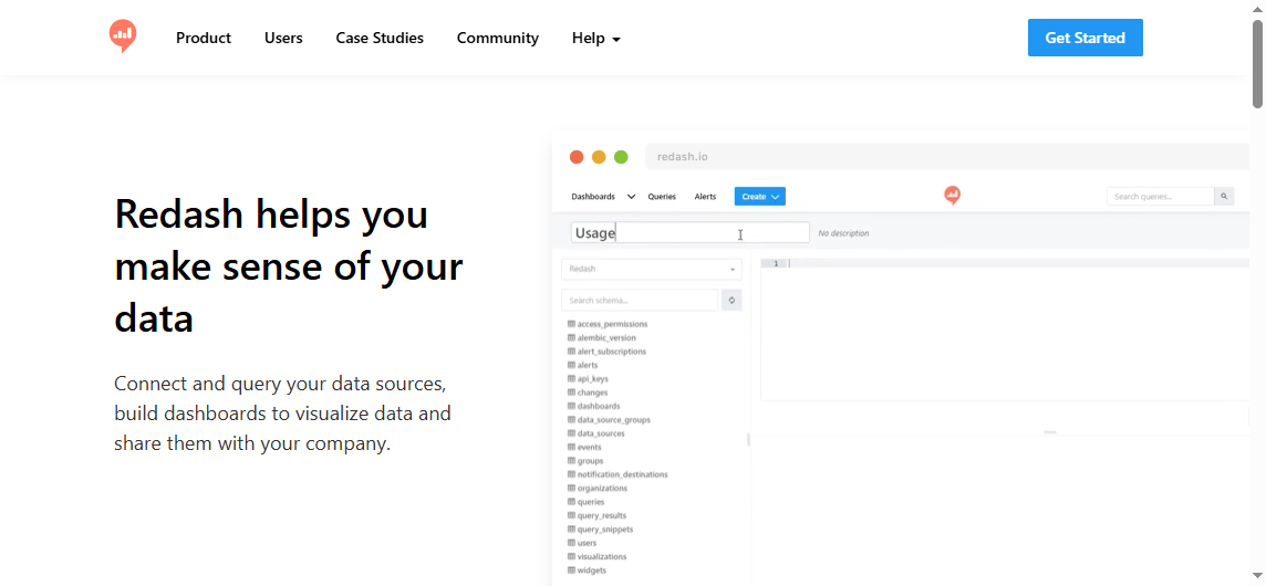 Key Features: