Dashboard
Most Effective Healthcare Dashboard Examples and How They Improve Outcomes
Lewis Chou
Mar 20, 2026
You can make healthcare better by using dashboards. These dashboards change hard data into easy ideas you can use. The best healthcare dashboard examples mix clinical, operational, and financial data. This mix helps people make good choices and see progress. Hospitals that use real-time analytics work faster and safer. They also help patients get better results.
| Evidence Description | Outcome Impact |
|---|---|
| Analytics match money results with clinical success. | Makes the whole organization do better. |
| Real-time analytics keep efficiency and quality even. | Helps patients and makes work smoother. |
More people are using healthcare dashboard technology now. This is happening a lot in Asia Pacific. Groups are buying cloud and AI to help with more needs.

Healthcare Dashboard Examples: What Makes it Effective
Actionable Insights and Real-Time Data
You need a healthcare dashboard that shows clear information. This helps you make choices fast. You can see important data right away. Real-time data lets you find problems early. You can act quickly to fix them. For example, you can check patient safety, staff work, and how resources are used in one place.
Here is how real-time data visualization helps in healthcare:
| Benefit | Description |
|---|---|
| Consolidation of Information | Healthcare dashboards collect data from many places. This helps you make smart decisions. |
| Tracking Performance Metrics | Dashboards help you watch key numbers. They show where you can do better. |
| Timely Interventions | Dashboards help you act fast when issues come up. This makes patient care better. |
FanRuan’s FineReport makes this easy. You can link data from different systems. You see it all in one dashboard. The drag-and-drop tool lets you build reports and dashboards. You can spot trends and patterns. This helps you make care better for patients.
User-Centered Design and Accessibility
You want a healthcare dashboard that is simple to use. A good design helps you find things fast. Dashboards should use methods where users help build them. This means you and others shape the dashboard to fit your work.
- Getting users and stakeholders involved is important.
- Looking at old systems helps make new dashboards better.
- Dashboards made with users fit clinical needs more closely.
FineReport supports user-centered design. You can change dashboards for doctors, nurses, or managers. The platform works on computers and phones. You can see data anywhere you need.
Alignment with Healthcare Goals
A healthcare dashboard should match your group’s goals. You use dashboards to track key numbers for safety, care, and efficiency. This shows if you meet your targets and where you can do better.
- Healthcare dashboards show real-time numbers for clinical, operational, financial, and patient experience.
- They help people make choices using data. This lets you manage problems early and act fast.
- Dashboards help with planning and tracking progress using scorecards and trend charts.
FineReport lets you set up dashboards for your improvement plans. You can watch progress, share results with your team, and change your plans as needed. This makes your dashboard a strong tool for better outcomes.
Healthcare Dashboard Examples: Clinical and Operational Use
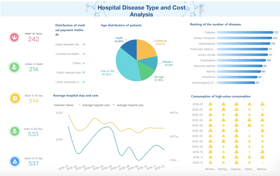
Clinical Quality and Safety Dashboards
A quality and safety dashboard helps keep hospitals safe. It lets you track patient safety metrics. You can see data about infections, medication errors, and patient falls. This helps you find problems early and fix them fast. You can also check for pressure injuries and adverse events.
The dashboard shows how your hospital is doing. Most hospitals use dashboards to watch many metrics at once. You can see if you meet your targets and compare results to other hospitals. Dashboards show trendlines, so you know if things are getting better or worse.
| Aspect | Details |
|---|---|
| Number of hospitals studied | 10 |
| Dashboard type | Mostly operational (9/10), 1 decision support |
| Average number of metrics | 28 (range 7 to 84) |
| Common features | Performance status indicators included in all operational dashboards |
| Use of targets | 4 out of 9 operational dashboards have explicit targets |
| Use of benchmarks | 5 out of 9 operational dashboards include performance benchmarks |
| Use of trendlines | 5 out of 9 operational dashboards show trendlines indicating performance direction |
| Variation | High heterogeneity in format, presentation, color coding, and timeframe of metrics |
| Purpose | Visualize KPIs and required actions at a glance with minimal cognitive load |
You can track these metrics in your dashboard:
- Healthcare-acquired infections like bloodstream, urinary tract, and surgical site infections
- Medication errors such as wrong drug or dose
- Pressure injuries from poor mobility
- Patient falls during a hospital stay
- Adverse events, including surgical complications
A clinical operations dashboard helps you focus on patient care and safety. You can use data from electronic health records, lab results, and patient vitals. This helps you improve patient outcomes and meet quality standards.
Operational Efficiency Dashboards with FineReport
A clinical operations dashboard helps your hospital run better. It shows how well beds, staff, and resources are used. You can see how long patients stay and how many beds are full. This helps you plan and use resources wisely.
FineReport lets you build dashboards with real-time data. You can track how fast patients move and where delays happen. This helps you save money and make work easier for staff.
| Metric | Improvement |
|---|---|
| Reduction in labor costs | 30% |
| Increase in patient satisfaction | 67% |
| Facilities reporting improved efficiency | 73% |
You can use a dashboard to:
- Watch bed utilization rates and staffing ratios
- Track the average length of stay for patients
- See how well your hospital meets efficiency goals
FineReport helps you connect data from different systems. You can see all your information in one place. This makes it easier to spot trends and make changes. You can set up targets and benchmarks to measure progress.
| Feature | Clinical Dashboards | Operational Dashboards |
|---|---|---|
| Data Sources | Electronic health records (EHRs), lab results, patient vitals | Hospital operational systems, bed management, staffing |
| Outcome Measures | Readmission rates, infection rates, medication error rates | Bed utilization rates, average length of stay, staffing ratios |
| Focus | Quality of care, patient safety, regulatory compliance | Efficiency, resource allocation, patient throughput |
A clinical operations dashboard helps improve patient care and hospital performance.
Patient Care and Readmission Dashboards
A clinical operations dashboard helps you watch patient care and readmissions. It tracks the 30-day readmission rate. You see how many patients come back within 30 days after leaving. You can also check readmission rates for conditions like heart failure or pneumonia.
| Metric Type | Description |
|---|---|
| Readmission Rate | Percentage of patients readmitted within a specific time frame, typically 30 days post-discharge. |
| Condition-Specific Readmission | Metrics that focus on readmission rates for specific conditions like heart failure or pneumonia. |
| All-Cause Readmission Rate | Measures the overall percentage of patients readmitted for any reason within 30 days. |
A dashboard helps you spot trends in readmissions. You can see what causes patients to return and check if your plans work. If rates are high, you need to improve care or follow-up. Lower rates show your care is working well.
You can use these dashboards to:
- Monitor readmission trends and find causes
- Check how well your plans reduce readmissions
- Improve patient care by acting on the data
A healthcare dashboard gives you tools to improve patient outcomes. You can use real-time data to make quick decisions. This helps patients stay healthy after they leave the hospital.
Healthcare Dashboard Examples: Financial and Analytics
Revenue Cycle Management Dashboards
A revenue cycle dashboard helps your healthcare group’s money. It shows patient insurance details before any procedure. You can check coverage early to stop denied claims. Patients learn their coverage limits when they register. This stops surprise bills and keeps them happy. Insurance companies see fewer wrong claims. This makes their work faster and costs less.
The dashboard puts data from many places together. You can handle data better and not repeat tasks. You get key numbers on resource use and room turnover speed. This helps you move more patients in money-making departments. By checking costs for each procedure, you find ways to save and earn more. You can also look at patient types and appointment times. For example, you might change appointment lengths to see more patients daily.
Healthcare Analytics Dashboard for Financial Performance
A healthcare analytics dashboard shows your operations and money clearly. You can track patient numbers and see how costs are spread. You can check how much you earn for services. This helps you find ways to do better with money. Using a revenue cycle dashboard for reports helps you make choices using data. This lowers admin costs and helps your group grow in a hard market.
FineReport links financial data from different systems. You can make detailed reports and see real-time analytics. FineReport works with other business intelligence tools. You can watch your operations and make quick choices.
Compliance and Claims Dashboards
You must follow many rules in healthcare. A compliance dashboard helps you track rules in real time. You can keep all compliance data in one place. This makes it easier to meet deadlines and finish tasks. You can spot problems before they get big. A compliance dashboard helps you make good choices and avoid breaking rules.
A revenue cycle dashboard helps with claims too. You can see claim status, check for mistakes, and fix them before sending. This cuts denials and speeds up payments. Using healthcare dashboards like these makes your group stronger and more efficient.
Healthcare Dashboard Examples: Enhancing Patient Engagement
Patient Experience and Feedback Dashboards
You can make patient care better with a dashboard. This tool lets you get feedback after each visit. You see what is good and what needs to change. Listening to patients builds trust and improves their experience. You can track satisfaction scores, wait times, and comments. This helps you find patterns and fix problems fast.
A dashboard lets you share results with your team. You can set goals for care quality and check progress. Acting on feedback shows patients you care about their opinions. This leads to more engagement and better outcomes. You can compare your results with other clinics using dashboards. This helps you learn new ways to make patient care better.
Mobile and Real-Time Patient Engagement Dashboards
A mobile dashboard gives you health data right away. You can check your vital signs, appointments, and test results on your phone. This makes it easy to stay involved in your care. When you see your numbers change, you understand your health better. You feel more in control and want to follow your treatment plan.
Here is how mobile and real-time dashboards help with engagement and patient care:
| Study | Findings |
|---|---|
| Telemedicine and e-Health Study | Using RPM technology helped diabetes patients control blood sugar. Patients who uploaded data daily had lower HbA1c levels than those who uploaded less often. |
| Real-time Data Access | Patients who see their condition in real time understand why they need to follow treatment plans. This helps them feel motivated and responsible. |
| Regular Vital Sign Readings | Patients who check their vital signs often know more about their health. This leads to better habits and more talking with their doctor. |
- More engagement helps you take medicine and follow your schedule.
- Real-time data makes you feel responsible for your health.
- Regular checks lead to better habits and more talking with your doctor.
Dashboards let you and your provider share feedback quickly. You can send questions or updates right away. Your doctor can answer fast and change your care if needed. This makes the patient experience smoother and safer. FineReport lets you build mobile dashboards that connect to patient-level data. You get secure, real-time updates that help make patient care and experience better.
Healthcare Dashboard Examples: Best Practices for Implementing
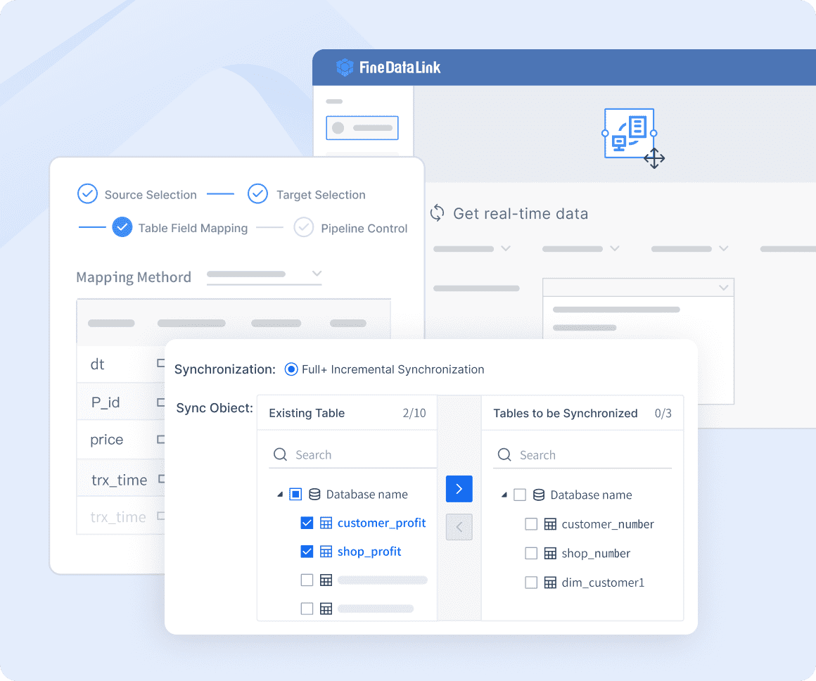
Data Integration and Quality with FanRuan
When you make healthcare dashboards, you need to use data from many places. This includes clinical data, financial records, and operational systems. FineReport and FineDataLink help you connect these sources fast. You get a real-time view of your hospital’s performance. FineDataLink lets you update and change data, so you always see the newest numbers.
Good data is important for making smart choices. If your data is wrong or late, your dashboard can show bad information. This can hurt clinical decisions and patient care. Good data should be easy to find, complete, consistent, and useful. FineReport lets you set up rules and automate checks. This helps you avoid confusion and keeps your dashboards trustworthy.
- Accurate and timely data helps you watch patient-level clinical metrics.
- Consistent data lets you compare results in different departments.
- Automated data integration lowers manual mistakes.
Custom healthcare dashboards made with FanRuan give you a real-time view and help you make smart choices every day.
Security, Compliance, and User Training
You must keep patient information safe and follow strict rules. Security and compliance are big challenges in healthcare. You need to control who can see or change data. You also need to keep track of all devices and vendors that connect to your system. Weak access controls or missing lists can expose patient data and cause big problems.
- Always use strong access controls and keep asset lists current.
- Encrypt sensitive data and test your response plans.
- Check vendor security and write down compliance steps.
User training is important for using dashboards well. When you train your team, you help them use dashboards in their daily work. Training lowers resistance to new tools and builds trust in the system. You should involve users early and give ongoing support. This makes it easier to add dashboards to your workflow.
| Barrier Type | Specific Barriers | Strategies to Overcome Barriers |
|---|---|---|
| User-related factors | Users’ needs, preferences, and computer skills; trust; resistance | Involve users in development; provide training; use a socio-technical approach |
| Organizational-related factors | Lack of support; culture and readiness | Make sure the organization supports dashboards |
| Interoperability and data sharing | Lack of data standardization; terminology issues | Use data exchange standards |
| Integration of dashboards | Workflow embedding; technical integration | Add features slowly |
When you follow these best practices, you make sure your custom healthcare dashboards give value and help improve outcomes.
You get real results when you use good healthcare dashboards. FanRuan and FineReport dashboards help you collect more patient-reported outcomes. They also help you gather better test data. These tools support more protocol-driven interventions. This means patient care gets better. Both patients and clinicians feel more involved. When you pick a dashboard, look at these important metrics:
| Category | Key Metrics |
|---|---|
| Clinical KPIs | Readmission rates, infection rates, medication error rates, fall rates, hospital-acquired conditions. |
| Operational KPIs | Bed utilization rates, average length of stay, nurse-to-patient ratios, overtime percentages. |
| Financial KPIs | Cost per patient, claim denial rates, gross charges, net revenue, days in accounts receivable. |
| Patient Experience KPIs | Patient satisfaction scores, net promoter scores. |
To get the best results, follow these steps: 1. Set clear goals for clinical, operational, and financial outcomes. 2. Pick the most important metrics with your team. 3. Make sure your dashboard works with your current systems. 4. Keep your data correct and safe. 5. Design your dashboard so it is easy to use and gives the right people access.
You can beat challenges by including stakeholders, rolling out changes in steps, and giving training all the time. Start now to make your dashboard plan better and improve results for patients and your business.


FAQ

The Author
Lewis Chou
Senior Data Analyst at FanRuan
Related Articles

Portfolio Reporting for PMOs: 9 Executive Metrics Every Weekly Portfolio Dashboard Should Include
Weekly portfolio reporting should help executives answer three questions fast: Are we delivering the right initiatives, are we putting outcomes at risk, and what decisions need leadership this week? For PMOs, that means
Yida Yin
Jul 01, 2026

How to Build an Investment Portfolio Reporting Dashboard for Executives: KPIs, Benchmarks, and Drill-Down Views
Investment portfolio reporting for executives is not about showing every holding, transaction, and chart your investment team can produce. It is about giving CEOs, CFOs, CIOs, boards, and investment committees a fast, re
Yida YIn
Jun 25, 2026

12 KPI Reporting Examples for Executive Dashboards: What to Show in Weekly, Monthly, and Quarterly Reviews
Executive leaders do not need more data. They need decision ready $1 examples that match how often they review the business and what actions they are expected to take. A weekly $1 should surface fast moving risks and per
Yida YIn
Jun 25, 2026