A metrics dashboard gives you a powerful way to monitor and measure business performance. You can use it to track key metrics, view real-time data, and see trends instantly through data visualization. Many companies rely on dashboards for performance tracking.
26% of large companies use dashboards and scorecards, with more in the process of adopting them.
The global business intelligence adoption rate stands at 26%.
Study Title
Key Findings
The Power of Real-Time Dashboards
Real-time dashboards enhance decision-making by providing immediate insights.
How Data Visualization Improves Decision-Making
Visual dashboards deliver insights almost instantly, improving decision-making efficiency.
With real-time data visualization, you can make decisions faster and spot performance gaps quickly. Managers who use these tools gather information 28% more promptly. Metrics dashboards, like those from FanRuan and FineBI v7.0, let you bring together data from many sources, visualize metrics in real time, and drive better performance tracking across your organization.
Metrics Dashboard Overview
What Is a Metrics Dashboard
A metrics dashboard is a visual tool that helps you track, analyze, and understand the most important metrics for your business. You can use it to monitor key performance indicators, spot trends, and make informed decisions. In business intelligence, a metrics dashboard acts as your command center for data visualization and real-time data monitoring.
You will find several types of dashboards in business intelligence literature. Each type serves a unique purpose and audience. The table below outlines the most common types:
Definition Type
Description
Business Dashboard
A visual display of key performance indicators and metrics that help you understand business performance in relation to strategic goals.
Executive Dashboard
Provides executives with insights into performance, modeled after automobile dashboards.
Analytical Dashboard
Serves analytical purposes and helps you perform in-depth data analysis.
Operational Dashboard
Offers real-time data for day-to-day operations and boosts operational efficiency.
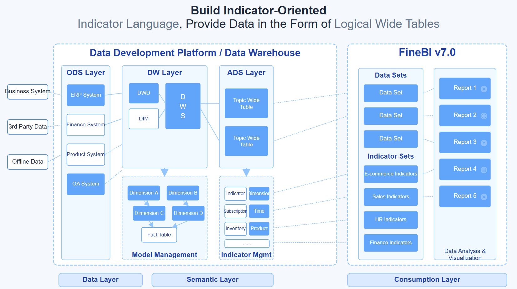
You can use a metrics dashboard to bring together data from many sources. This centralization makes it easier to track key performance indicators and other metrics in one place. FineBI v7.0supports all these dashboard types through its flexible architecture and unified data layer. The platform's metric center functionality ensures consistent metric definitions across your organization, eliminating data silos and reducing the risk of conflicting reports.
With tools like FanRuan and FineBI v7.0, you gain access to advanced data visualization and real-time data updates. These platforms help you transform raw data into actionable insights, making your dashboard a vital part of your business intelligence strategy.
A metrics dashboard does more than just display numbers. It gives you the power to see your business performance at a glance and take action quickly. Here are the top functions you will find in most metrics dashboards:
You get a clear view of critical metrics.
You can turn data into actionable insights for smoother operations.
You consolidate information into a single dashboard, reducing the need to check multiple data sources.
You enhance decision-making by visualizing key metrics.
You identify strengths and areas for improvement in service delivery and customer engagement.
When you use a metrics dashboard, you unlock many benefits for your organization:
You improve employee engagement and morale by making performance data visible.
You close learning gaps by tracking progress and outcomes.
You measure performance and set specific goals with clear metrics.
You make better decisions using real-time data and visualization.
You detect patterns over time, which helps you spot trends and risks early.
You gain instant performance visibility, so you always know how your team is doing.
You align decision-making across departments because everyone works from the same data.
You react faster to changes, issues, or opportunities.
You create accountability by making metrics transparent.
You reduce the reporting burden with automated updates.
You build a data-driven culture that values transparency and continuous improvement.
You gain a competitive advantage by spotting risks and opportunities before others do.
Tip: FineBI v7.0's metric center addresses a critical challenge in enterprise analytics: ensuring data trustworthiness and usability. By implementing dimensional modeling theory and establishing a unified semantic layer, FineBI v7.0 guarantees that every metric has a clear definition and single source of truth. This foundation is essential for AI-powered analytics scenarios, including ChatBI capabilities, where accurate metric identification directly impacts answer quality.
Metrics dashboards have become essential for organizations that want to stay ahead. By using real-time data and powerful visualization tools, you can track KPIs, measure performance, and drive better results every day.
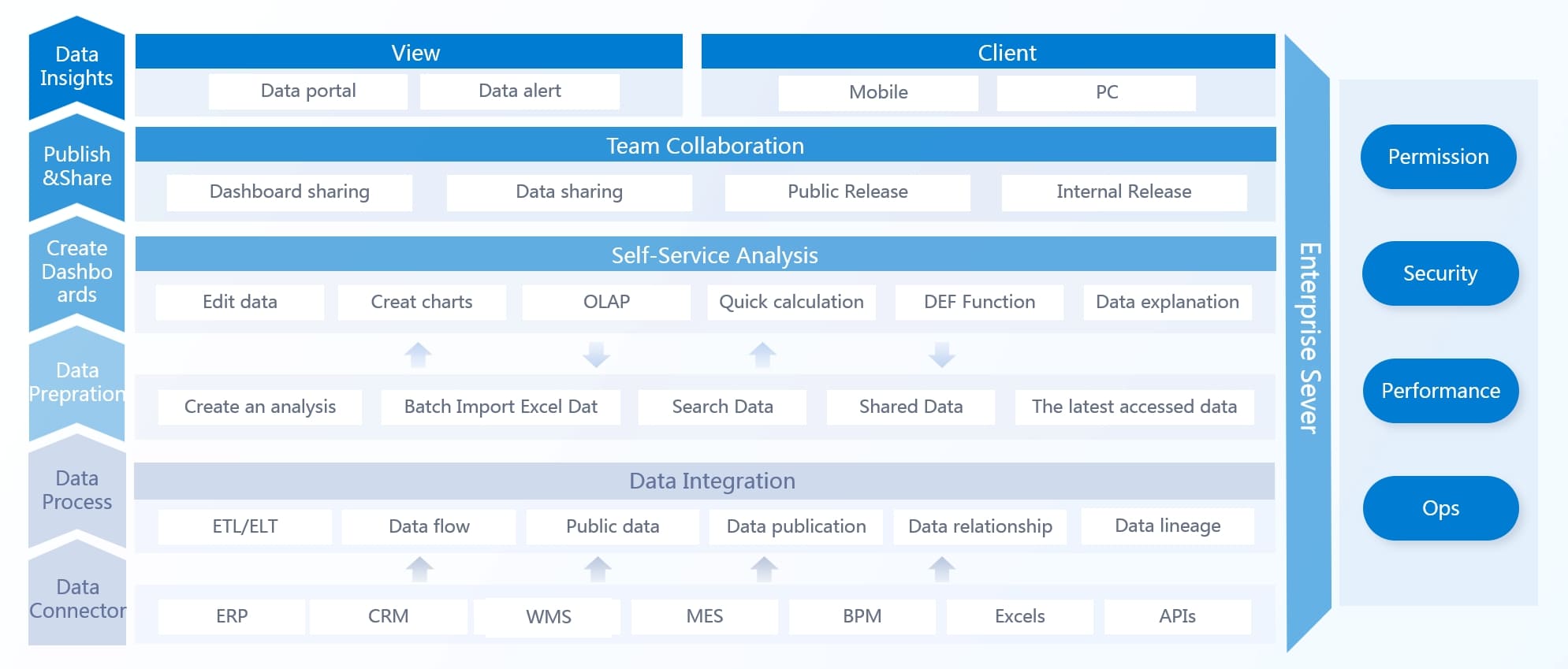
How Metrics Dashboards Work
Data Integration and Sources
You need to bring all your data together before you can use a metrics dashboard effectively. Most organizations store data in many places—cloud platforms, on-premises databases, spreadsheets, and even web APIs. A strong metrics dashboard connects to all these sources and centralizes your information for easy access.
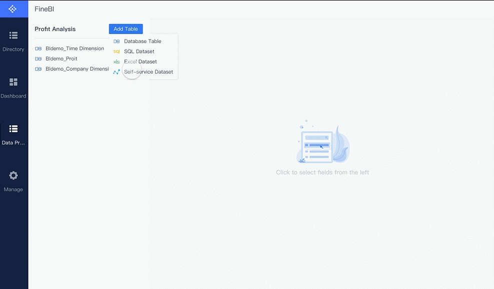
FineBI v7.0 makes this process simple. You can connect to both cloud-based and on-premises data sources using FineBI v7.0’s integration features. FineDataLink, the platform behind FineBI v7.0, helps you break down data silos. It supports real-time and offline data management, so you can always access the latest information. This means you do not have to worry about missing or outdated data when you need to make important decisions.
You can use ETL (Extract, Transform, Load) or ELT (Extract, Load, Transform) processes to clean and prepare your data. These processes help you organize, filter, and standardize your metrics before they appear on your dashboard. With FineBI v7.0, you can automate these steps, which saves time and reduces errors.
Tip: Centralizing your data with a metrics dashboard helps you see all your key metrics in one place. You do not need to switch between different tools or systems.
Real-Time Monitoring
Real-time monitoring is a core feature of modern metrics dashboards. You can track performance as it happens, not just at the end of the day or week. Real-time data flows into your dashboard with very low latency—often less than a second or just a few seconds. This speed is important for business operations that need quick reactions.
When you use real-time monitoring, you get instant visibility into your performance metrics. You can spot trends, identify problems, and make fast decisions. For example, if you see a sudden drop in sales or a spike in production errors, you can act right away.
Metrics dashboards with real-time monitoring improve operational efficiency. Here is how they help:
Metric
Improvement
Customer satisfaction
Increased by 18%
Profit margins
Improved by 12%
Employee productivity
Rose with training
Operating efficiency
Increased
Delays
Reduced by 25%
You can see performance changes as they happen.
You can prioritize tasks based on live data.
You can adjust resources quickly to improve results.
You can turn raw numbers into actionable insights with data visualization.
FineBI v7.0 supports real-time data analysis and real-time updates. You can monitor your metrics dashboards without delay, which helps you stay ahead of issues and opportunities.
Visualization and User Experience
A metrics dashboard is only useful if you can understand the data it shows. Data visualization turns complex numbers into clear charts, graphs, and tables. You can use different types of dashboards for different needs:
Executive dashboards give you a high-level view of company performance.
Operational dashboards show inventory, production, and productivity.
Sales dashboards track sales growth, conversion rates, and revenue.
The best metrics dashboards use a variety of visualization types. For example, line graphs show changes over time, bar charts compare categories, and pie charts display proportions. You should choose the right visualization for each metric to make your dashboard easy to read.
Visualization Type
Description
Best Practices
Line Graphs
Show change over time by connecting data points.
Use multiple lines for comparison; use different colors for clarity.
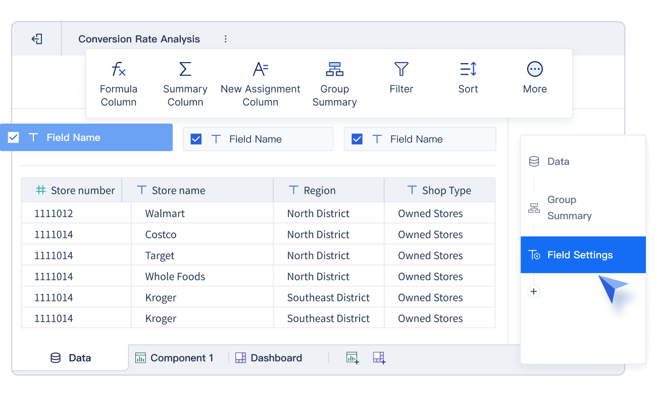
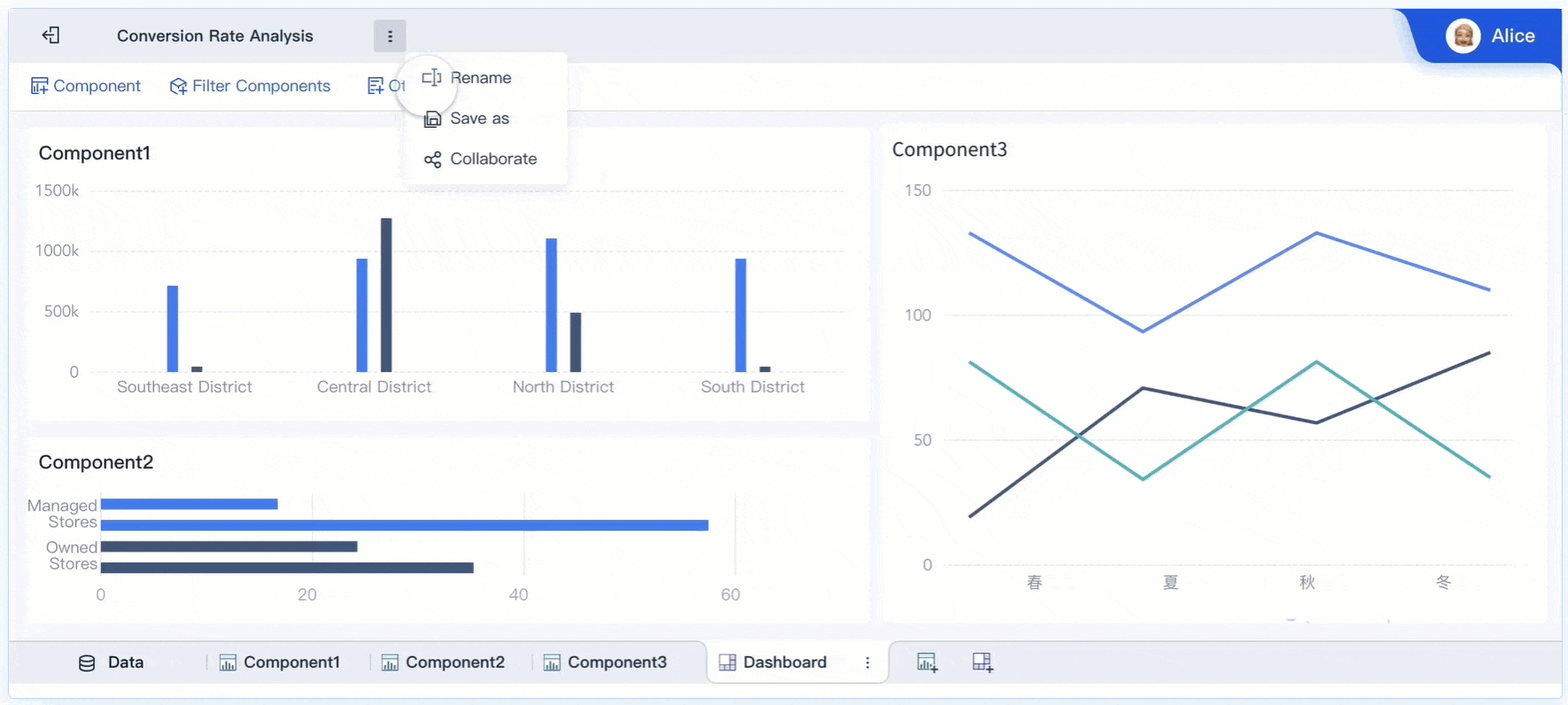
FineBI stands out for its user-friendly interface. You can build interactive dashboards with drag-and-drop tools. You do not need advanced technical skills. FineBI’s dashboards are accessible to everyone, including non-technical users. You can explore data, filter results, and customize your view with just a few clicks.
Compared to other business intelligence tools, FineBI offers strong self-service features and real-time analytics. You do not need specialized training to get started. This makes it easier for your team to adopt metrics dashboards and use them every day.
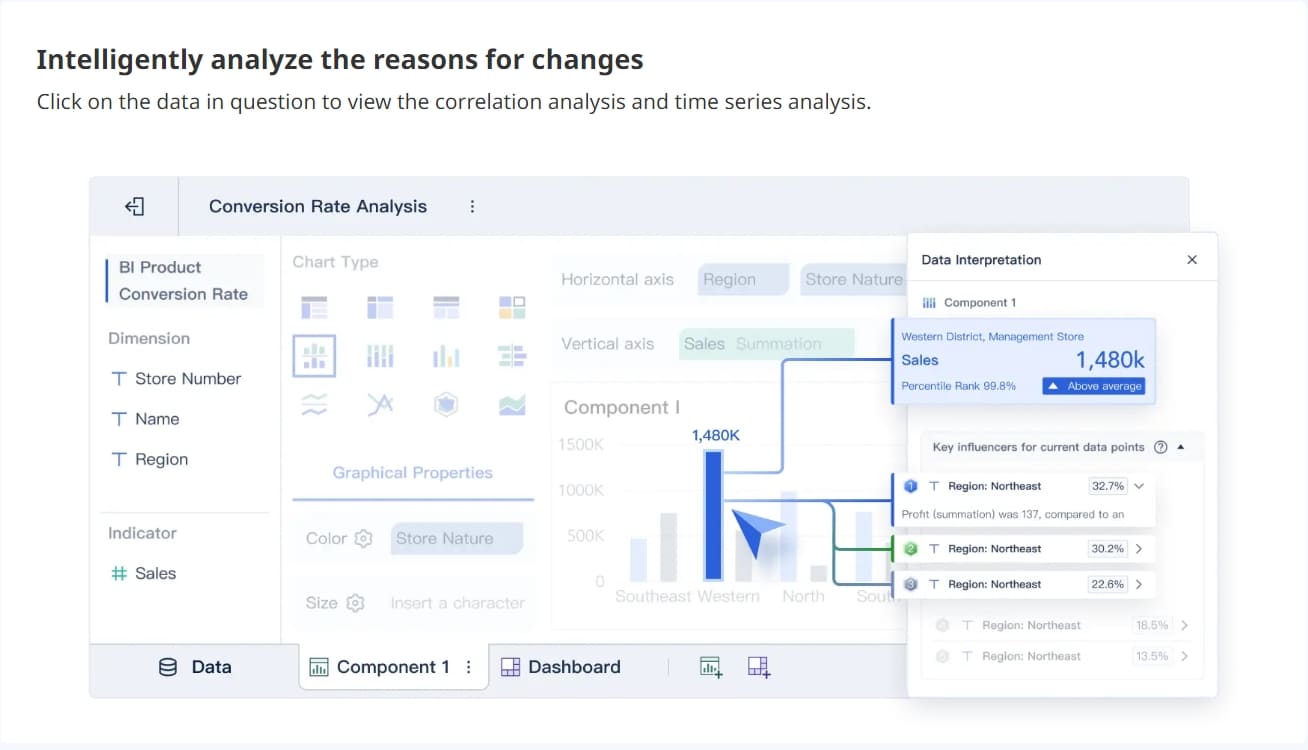
Note: Interactive dashboards let you drill down into details, apply filters, and explore data from different angles. This helps you find answers quickly and supports better decision-making.
Metrics dashboards combine data integration, real-time monitoring, and powerful visualization. You can track performance, analyze trends, and respond to changes with confidence. FineBI v7.0 gives you the tools to create dashboards that work for your business—no matter your industry or technical background.
Core Features of FineBI Dashboards
Self-Service Dashboard Creation
You can build metrics dashboards quickly with FineBI’s drag-and-drop interface. This feature lets you create custom dashboards in minutes, not days. You do not need coding skills to design data visualization layouts or add performance metrics. Both technical and non-technical users can analyze data and track metrics efficiently. This approach saves time and reduces costs for your organization.
Build dashboards in minutes, speeding up metrics dashboard development and performance tracking.
Accessibility
Create dashboards and reports without coding, making data visualization easy for everyone.
Cost Efficiency
Lower the need for analyst teams, saving time and budget while improving performance monitoring.
You can use a wide range of visualization options, such as bar charts, line graphs, and pie charts, to display your performance metrics. FineBI v7.0 supports real-time data updates, so your dashboards always show the latest metrics and trends. This helps you make faster decisions and respond to changes in performance.
Advanced Analytics and Collaboration
FineBI gives you advanced analytics tools to explore your data and uncover insights. You can use interactive dashboards to drill down into performance metrics and compare results across departments. The platform supports real-time data visualization, so you always see up-to-date performance information.
Metrics dashboards in FineBIalso support collaboration. You can share dashboards with your team and discuss performance metrics during meetings. Teams can align objectives and share best practices for dashboard optimization. This unified approach improves communication and helps everyone focus on the same performance goals.
Regular meetings help teams discuss metrics and performance updates.
Sharing dashboards encourages best practices and cross-departmental learning.
Security and Governance
You need strong security and governance for your metrics dashboards. FineBI v7.0 uses enterprise-grade security features to protect your data and metrics. The platform supports role-based access, so you can control who sees and edits each dashboard. This ensures only authorized users can view sensitive performance metrics.
Feature
Description
Hierarchical Authorization
Assign permissions at different levels for secure metrics dashboard management.
Unified Allocation
Use structured workflows for permission allocation, following best practices in data governance.
Role-Based Controls
Define roles and responsibilities to maintain data quality and secure performance metrics.
FineBI’s governance tools help you manage data access and ensure compliance with industry standards. You can audit user activity and monitor how teams use metrics dashboards. This supports transparency and builds trust in your data-driven decisions.
FanRuan continues to innovate and put customers first. With FineBI v7.0, you get a metrics dashboard solution that combines powerful data visualization, advanced analytics, and robust security for your business.
Industry Applications and Use Cases
Call Center Metrics Dashboard
You can use a call center metrics dashboard to track and improve service delivery in real time. This dashboard brings together data from multiple sources, giving you a clear view of agent performance, customer satisfaction, and operational efficiency. You can monitor key metrics that matter most for your call center’s success.
Category
Focus Area
Key Metrics
Goal / Business Outcome
Operational efficiency
Workflow and service delivery
Service Level, Call Abandonment Rate, Call Volume, Peak Hour Traffic
A call center metrics dashboard gives you actionable insights by displaying these metrics in real time. You can spot issues quickly and track trends over time. Improved agent performance leads to higher customer satisfaction. You also streamline quality assurance, save time, and improve outcomes for your call center.
Metric
Description
Customer Satisfaction
Measures satisfaction through surveys. High scores show positive experiences.
Net Promoter Score
Assesses loyalty and likelihood to recommend.
First Call Resolution
Shows percentage of calls resolved on first contact.
Call center metrics dashboards provide real-time insights.
They help you identify issues and track trends.
You can enhance customer satisfaction and streamline processes.
Manufacturing Quality Control
In manufacturing, you need to monitor quality at every stage. A metrics dashboard helps you visualize and analyze production data, so you can maintain high standards and reduce defects. You can track important metrics such as yield, first pass yield, rate of return, customer return rate, and supplier’s quality incoming.
A manufacturing dashboard lets you see how your production lines perform. You can use these metrics to find root causes of defects and take action before problems grow. Here are some common quality control metrics:
You can also track defects per million opportunities, customer complaint rate, and the number of compliant versus non-compliant units. These metrics help you improve quality and meet regulations. A metrics dashboard gives you actionable insights for continuous improvement.
Metric
Description
Defects per million opportunities
Measures defect rates and highlights areas for improvement.
Customer complaint rate
Shows product issues reported by users.
Number of compliant units
Assesses quality in real time.
Root causes of defects
Helps you fix production issues early.
Quality achievement rate (%)
Tracks products meeting standards.
You can use a manufacturing dashboard to automate quality checks and respond quickly to changes in production data.
Customer Success Stories
Many organizations have transformed their operations with metrics dashboards. BOE Technology Group used FineBI to unify data, standardize metrics, and build a comprehensive dashboard for operational analysis. This project reduced inventory costs by 5% and increased operational efficiency by 50%. BOE now uses actionable insights from dashboards to monitor KPIs and benchmark performance across factories.
TXC Corporation also improved its business with metrics dashboards. The company democratized data access and empowered employees to analyze performance independently. With FineBI, TXC streamlined reporting, enhanced data governance, and unlocked actionable insights for process improvements.
You can explore more about manufacturing quality control solutions here, and read the full BOE case study or TXC Corporation story for deeper insights.
Metrics dashboards help you turn data into actionable insights, improve performance, and drive better results in any industry.
A metrics dashboard helps you track KPIs, optimize operations, and enhance decision-making. You gain real-time insights and interactive tools for business growth. FanRuan and FineBI let you create dynamic visualizations and act on data quickly. When choosing a dashboard, follow these steps:
Define your business goals.
Select key metrics that matter most.
Involve your team in the process.
A user-friendly design and clear navigation make dashboards easier to use and boost adoption. Start exploring FineBI v7.0 to unlock the full value of your data.
Access a wealth of case studies, industry insights, and solution guides to accelerate digital transformation.
FAQ
What is a metrics dashboard?
A metrics dashboard is a tool that lets you track and visualize key business data in one place. You can see trends, measure performance, and make decisions faster.
How does FineBI v7.0 connect to my data sources?
You can connect FineBI v7.0 to over 60 types of data sources, including databases, cloud platforms, and Excel files. FineBI v7.0 supports real-time updates and easy integration.
Can I customize dashboards without coding?
Yes! FineBI7.0 uses a drag-and-drop interface. You can build and customize dashboards without writing any code. This makes it easy for everyone to use.
Is my data secure in FineBI v7.0?
FineBI v7.0 uses role-based access and enterprise-grade security. You control who can view or edit dashboards. This keeps your data safe and private.