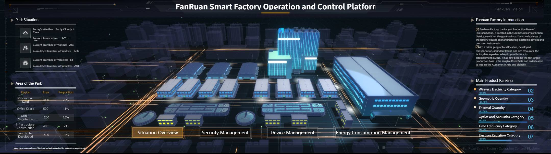
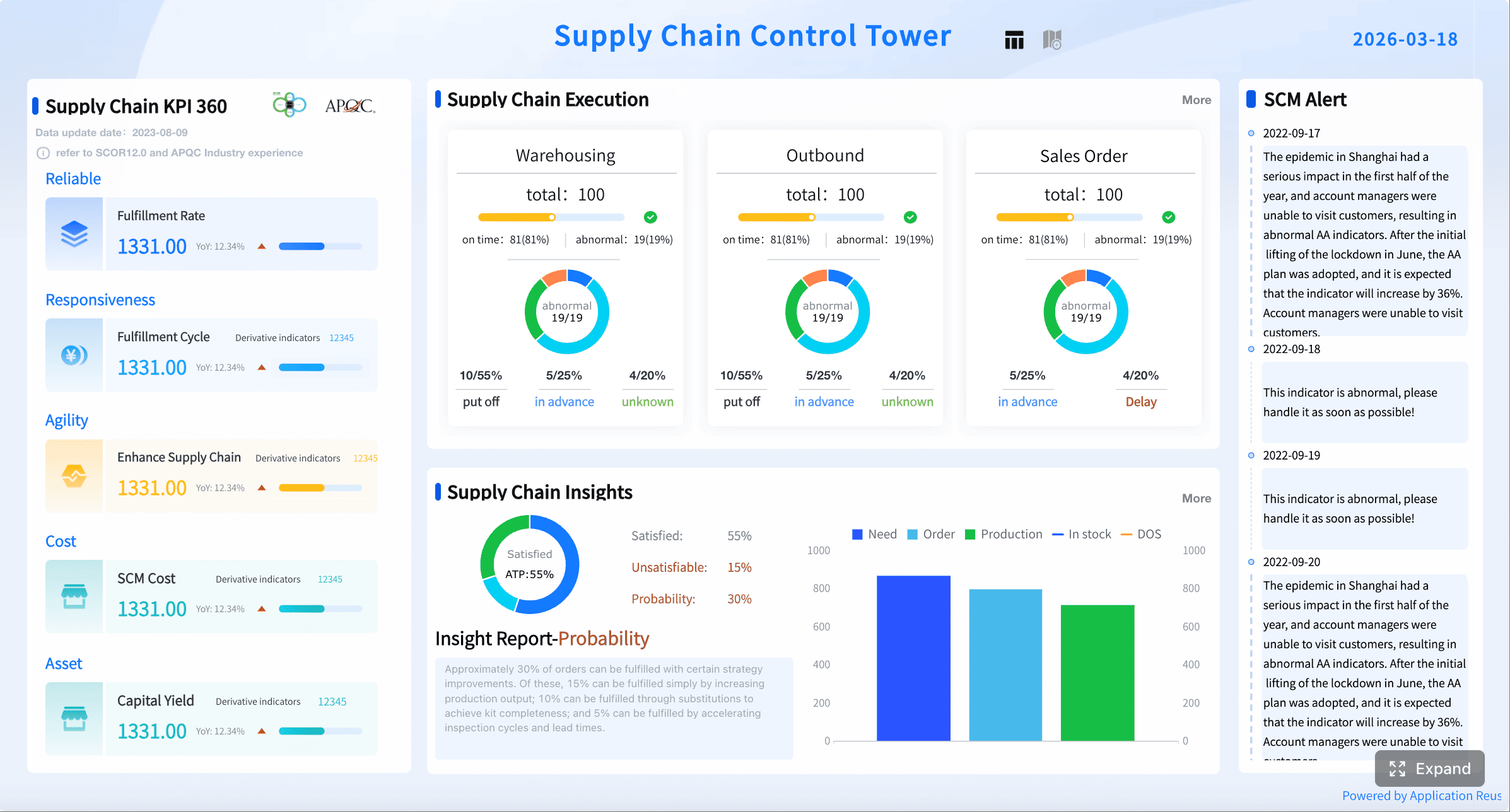
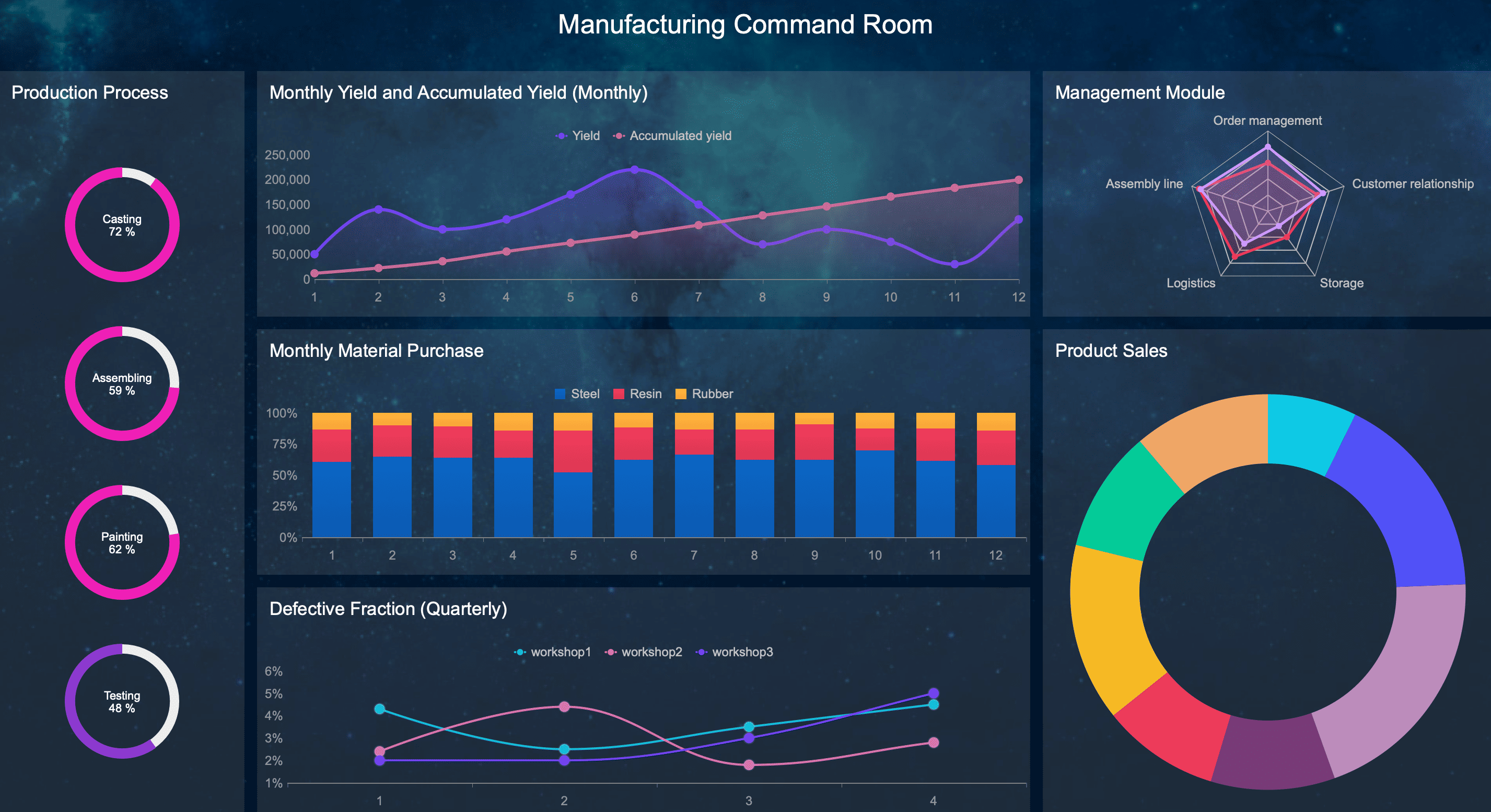
A manufacturing metrics dashboard is not just a reporting screen. It is the operational command center that helps plant managers, production supervisors, maintenance leaders, and quality teams make faster decisions with fewer blind spots. When a line slows down, scrap rises, or a machine starts missing targets, the dashboard should show it immediately—before the issue turns into lost output, missed shipments, or margin erosion.
For most plants, the real pain is not a lack of data. It is delayed, scattered, and inconsistent data. Production sees one number, maintenance sees another, and leadership gets a static report after the shift is over. By then, the opportunity to intervene has already passed. A strong manufacturing metrics dashboard fixes that by creating a single, trusted view of plant performance in real time.
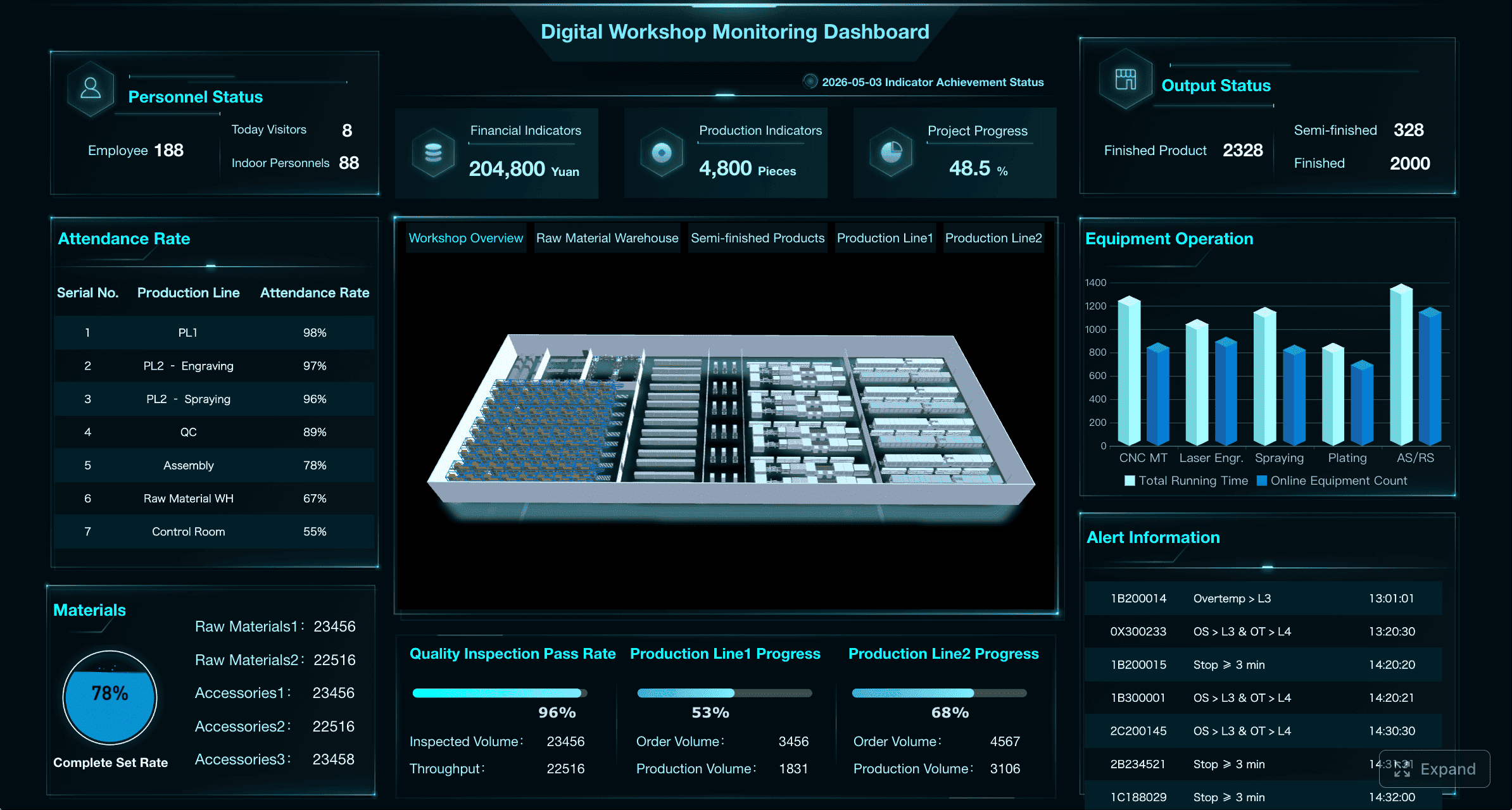
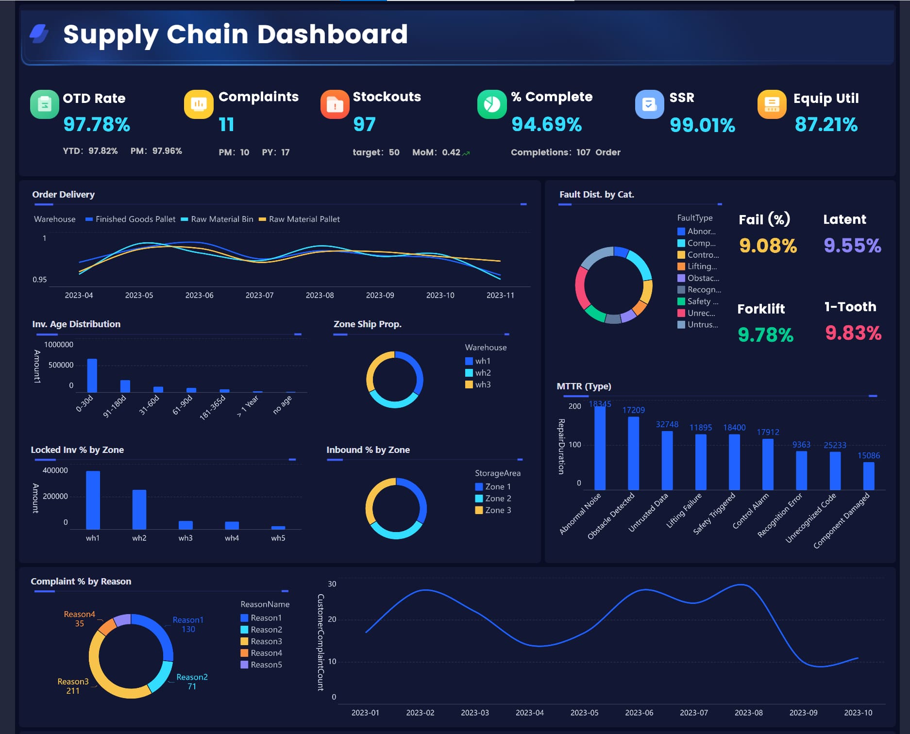
All the dashboards in this article are created by dashboard software: FineReport
What a manufacturing metrics dashboard should show in real time
A plant-wide dashboard should help teams answer one question continuously: Are we on track, and if not, what needs action now?
That means the dashboard must do more than summarize production. It should connect performance across production, maintenance, quality, labor, and delivery so teams can respond in the moment instead of reacting after the fact.
Why plant-wide visibility matters
A good manufacturing metrics dashboard improves three things immediately:
Decision speed: Supervisors can act during the shift, not after end-of-day reporting.
Operational alignment: Production, quality, and maintenance work from the same KPI definitions.
Issue detection: Teams spot bottlenecks, drift, and exceptions before they spread across the plant.
This is the difference between managing by hindsight and managing by live operations.
Lagging reports vs. live operational visibility
Traditional reports are useful for review, but they are usually lagging indicators. They tell you what happened yesterday, last week, or last month. They support analysis, but not immediate intervention.
Live operational visibility is different. It surfaces current conditions such as:
Line status
Units produced vs. target
Downtime events
Quality losses
Changeover overruns
Delivery risk
If your dashboard only helps with monthly reviews, it is a reporting tool. If it helps a supervisor prevent a missed schedule in the next 30 minutes, it is a real manufacturing metrics dashboard.
How to choose KPIs that are actually actionable
Not every KPI belongs on every screen. The right metric depends on who needs to act and at what level.
Line-level KPIs
These should help operators and frontline leads respond quickly:
Current run rate
Machine status
Downtime reason
FPY
Scrap trend
Cycle time vs. standard
Shift-level KPIs
These help supervisors manage execution:
Schedule attainment
OEE by line
Changeover duration
Labor efficiency
Rework volume
Escalated downtime events
Plant-level KPIs
These help operations leaders manage performance and risk:
Throughput
OEE trend
Cost of poor quality
On-time delivery
Energy per unit
Capacity and WIP trend
Key Metrics (KPIs) a manufacturing metrics dashboard should standardize
To make dashboard data trustworthy, each KPI should have a clear business definition. At minimum, standardize:
KPI name: The exact label everyone uses.
Calculation logic: The formula and inclusion rules.
Data source: MES, ERP, machine data, quality system, manual input, or historian.
Update frequency: Real time, every 5 minutes, hourly, or per shift.
Owner: The department responsible for accuracy and action.
Target or threshold: The expected value, alert limit, or control range.
Drill-down path: What users can click next to investigate the issue.
Without this structure, plants end up arguing about numbers instead of fixing problems.
The 12 real-time KPIs every manufacturing metrics dashboard needs to track
The best manufacturing metrics dashboard does not try to show everything. It focuses attention on the few measures that reveal whether the plant is producing efficiently, maintaining quality, protecting capacity, and meeting customer commitments.
Throughput and schedule attainment
These two KPIs answer the most immediate production question: Are we making enough, fast enough, to hit the plan?
1. Throughput
Throughput measures how many units are produced over a defined period—hour, shift, or day. In real time, it helps teams identify slowing lines before output loss becomes a serious issue.
Track:
Units produced
Good units produced
Run rate per hour
Actual output vs. expected output
A sudden drop in throughput is often the first sign of a bottleneck, material delay, operator issue, or machine degradation.
2. Schedule attainment
Schedule attainment compares actual production against the planned schedule. It shows whether the plant is likely to meet shift or daily commitments.
This KPI matters because high throughput alone can be misleading. A line may be producing steadily but still falling behind the required schedule.
Use it to monitor:
Output vs. production plan
Shift target completion
Missed or delayed orders
Variance by line or product family
Overall equipment effectiveness and downtime
These KPIs expose how much productive capacity the plant is truly getting from its assets.
3. Overall Equipment Effectiveness (OEE)
OEE combines three factors in one view:
Availability: How much planned time the equipment is actually running
Performance: How fast it runs compared to standard speed
Quality: How much output meets quality standards
OEE is valuable because it compresses multiple sources of loss into one operational metric. But it becomes truly useful only when users can drill into the three components.
A practical dashboard should show:
Current OEE by line or machine
OEE trend by shift/day/week
Availability, performance, and quality losses separately
4. Downtime
Downtime deserves its own KPI even if OEE is already on the dashboard. Why? Because teams need a direct, actionable view of lost time.
The dashboard should also classify top downtime causes, duration, frequency, and impact on lost capacity. That is what drives root-cause action instead of generic firefighting.
First-pass yield and defect rate
Real-time quality visibility is essential because poor quality does not just affect scrap. It also creates hidden capacity loss, schedule delays, labor waste, and delivery risk.
5. First-pass yield (FPY)
FPY measures the percentage of units made correctly the first time without rework or repair.
This is one of the clearest signals of process stability. If FPY drops, the plant is spending more labor and machine time correcting avoidable errors.
Monitor FPY by:
Line
Machine
Product
Shift
Operator
Material lot
6. Defect rate
Defect rate tracks the proportion of units with quality defects. Unlike FPY, which focuses on first-time success, defect rate helps teams see where quality problems are accumulating.
A useful real-time view should show:
Total defect count
Defect rate by line or product
Top defect categories
Trend over time
Alerts for threshold breaches or abnormal rises
This allows quality teams to isolate whether the issue is localized or systemic.
Scrap, rework, and cost of poor quality
These KPIs translate quality losses into financial language that plant leadership can act on.
7. Scrap rate
Scrap rate measures the percentage of units or materials that must be discarded because they cannot be recovered.
It should be tied to:
Material loss
Product family
Machine or process step
Shift and operator
Cost impact
The reason scrap belongs on the manufacturing metrics dashboard is simple: it converts process variation into visible margin loss.
8. Rework rate
Rework rate tracks the share of output that requires additional labor, machine time, or inspection before it can ship.
Rework often hides behind acceptable shipment numbers. A plant may hit output goals while quietly burning capacity on avoidable correction work. Real-time tracking makes that cost visible.
9. Cost of poor quality (COPQ)
COPQ combines the business impact of scrap, rework, defects, inspections, returns, and other quality-related losses.
This KPI is especially useful for plant managers and operations directors because it links shop-floor problems to financial performance.
A strong dashboard can show COPQ by:
Line
Product family
Plant area
Shift
Defect category
Cycle time, changeover time, and WIP
These KPIs measure how efficiently work flows through the plant.
10. Cycle time
Cycle time shows how long it takes to complete one unit or one batch. It is essential for understanding whether a process is flowing at the speed required by demand.
Track cycle time in real time to identify:
Slow stations
Process drift
Hidden stoppages
Bottleneck accumulation
Cycle time becomes much more useful when compared with standard cycle time or takt expectations.
11. Changeover time
Changeover time measures the duration required to switch a line, machine, or process from one product to another.
Long or variable changeovers reduce flexibility, consume labor, and shrink productive capacity. For plants with high-mix production, this KPI is critical.
The dashboard should show:
Actual changeover vs. standard
Changeover trend
Variance by team or line
Delay causes during setup
12. Work-in-progress (WIP)
WIP tracks inventory currently moving through production but not yet completed.
Too much WIP often signals poor flow, hidden bottlenecks, scheduling mismatch, or unbalanced stations. Too little WIP can create starvation and idle time. Real-time visibility helps teams maintain the right balance.
On-time delivery, labor efficiency, and energy use
These are also high-value metrics for many plants, even if they may sit on a secondary dashboard depending on role and operational maturity.
On-time delivery: Whether production supports customer commitments
Labor efficiency: Output relative to labor hours
Energy consumption or energy per unit: Cost and sustainability performance tied to actual production
In many plants, these are critical roll-up KPIs for operations leadership, even if the frontline dashboard focuses first on the 12 core real-time indicators above.
How to design a dashboard that operators and managers will actually use
The biggest dashboard failure is not technical. It is behavioral. If the dashboard is too complex, too crowded, or too abstract, people stop using it.
Match views to each role
A single screen cannot serve every audience equally well. Different users need different levels of detail.
Operators need simple line-level signals
Operators need immediate, visual answers:
Is the machine running?
Are we ahead or behind target?
Is quality drifting?
Has an alert been triggered?
This view should be fast to read and impossible to misinterpret.
Supervisors need exception-based control
Supervisors need to see:
Which lines are off target
What issue is causing the variance
Whether escalation is required
Where to drill down first
Their dashboard should prioritize exceptions, alerts, and comparisons to target.
Plant leaders need roll-up trends
Leaders need a plant-wide view of:
Performance by line or area
Daily and weekly trends
Financial impact
Delivery and quality risk
The structure should remain consistent so all teams interpret metrics in the same way.
Make problems visible at a glance
Good dashboards reduce cognitive load. They do not force users to interpret raw tables under pressure.
Use design elements carefully:
Threshold colors: To show normal, warning, and critical states
Variance indicators: To highlight gap from target
Sparklines: To show trend without taking too much space
Drill-down paths: To move from plant to line to machine to cause code
The goal is not to make the dashboard visually impressive. The goal is to make urgent issues unmistakable.
Balance a core KPI set with deeper analysis
Most plants make the mistake of cramming too many measures onto one screen. Start with a compact set of must-watch KPIs, then allow drill-down into supporting metrics when needed.
A practical structure looks like this:
Executive view: 6 to 10 high-level KPIs with trends and exceptions
Production view: Throughput, schedule attainment, cycle time, changeover, WIP
Maintenance view: OEE, downtime, cause codes, asset status
This keeps the dashboard useful for daily control while still supporting deeper analysis.
Common dashboard mistakes and how to avoid them
Even well-funded dashboard projects fail when the KPI model and operating process are weak.
Tracking too many metrics
A long KPI list looks comprehensive but usually creates confusion. Teams lose focus because they cannot tell which numbers require action now.
To avoid this:
Tie each KPI to a decision or intervention.
Limit the main dashboard to the most operationally important indicators.
Use secondary views for supporting analysis.
Remove metrics that are interesting but not actionable.
If nobody changes behavior because a metric moved, it probably does not belong on the primary dashboard.
Using stale, inconsistent, or hard-to-trust data
Nothing kills dashboard adoption faster than data credibility problems. If operators believe the screen is wrong, they will go back to spreadsheets, whiteboards, or verbal updates.
This creates a shared data language and prevents constant disputes over “whose number is right.”
Measuring output without context
Output alone is dangerous. A plant can hit unit targets while losing money through downtime, excess labor, scrap, overtime, or missed delivery promises.
Always connect production metrics to context:
Throughput plus schedule attainment
Output plus quality loss
Productivity plus downtime
Labor efficiency plus staffing level
Delivery plus changeover disruption
This is how a manufacturing metrics dashboard becomes a management system, not just a scoreboard.
How to implement and improve your dashboard over time
A dashboard rollout should be treated like an operational improvement program, not just a BI project.
Start with clear business questions
Before selecting charts or layouts, define the business questions the dashboard must answer.
Examples:
Which lines are most likely to miss today’s schedule?
Where are we losing the most capacity right now?
Is quality drift isolated or systemic?
Which downtime causes require escalation this shift?
Are changeovers impacting customer commitments?
Once those questions are clear, define:
KPI targets
Review cadence
Alert logic
Escalation rules
Ownership for response
This ensures the dashboard drives action instead of passive observation.
Build from pilot to plant-wide rollout
Do not launch plant-wide on day one. Start with one line, area, or process where data quality and business need are both high.
Step-by-step implementation approach
Choose a pilot area with measurable pain points such as downtime, scrap, or schedule misses.
Define KPI formulas and owners before building the dashboard.
Validate data against real operations so the screen matches what teams observe on the floor.
Train users on response behavior—not just what the charts mean, but what actions should follow.
Refine before scaling across additional lines, departments, and plants.
This phased approach reduces resistance and improves trust.
Review, refine, and expand
Dashboard maturity should evolve with the business. As product mix, equipment, customer demand, and staffing change, some KPIs become more important while others lose relevance.
Review the dashboard regularly to assess:
Whether each KPI still supports an active decision
Whether targets are still realistic
Whether alerts are too sensitive or too weak
Whether new supporting views are needed for maintenance, inventory, quality, or capacity planning
The best dashboards are not static. They improve as the organization learns how to use them.
Build a manufacturing metrics dashboard faster with FineReport
Building this manually is complex. Most plants need to combine machine data, ERP transactions, quality records, maintenance events, and manual inputs into one trusted view. Then they must standardize KPI definitions, design role-based dashboards, enable drill-down, automate refreshes, and push alerts to the right people at the right time. That is a lot of moving parts to manage with spreadsheets or custom one-off reporting.
This is where FineReport becomes a practical advantage.
FineReport helps manufacturers build a high-performance manufacturing metrics dashboard with less manual effort by supporting the full workflow from data integration to dashboard delivery. Instead of stitching together disconnected tools, teams can use ready-made templates and automate the entire reporting and monitoring process.
Pull data from ERP, MES, APIs, and other operational systems into a single governed reporting environment
Standardize KPI logic so production, maintenance, quality, and operations all work from the same definitions
Publish role-specific dashboard views for operators, supervisors, and executives
Set up automated daily and shift-based report distribution
Trigger alerts when quality yield drops, downtime spikes, or schedule attainment falls behind target
Enable drill-down analysis so teams move from anomaly detection to root-cause investigation quickly
In short, building this manually is complex; use FineReport to utilize ready-made templates and automate this entire workflow.
For manufacturers trying to improve decision speed, reduce manual reporting, and create a trusted operational view across the plant, FineReport is not just a dashboard tool. It is a scalable platform for turning production data into action.
It should show the KPIs teams can act on immediately, such as throughput, schedule attainment, OEE, downtime, quality losses, and line status. The goal is to help operators, supervisors, and plant leaders see whether production is on track and where intervention is needed now.
The most important KPIs are the ones tied directly to output, equipment performance, quality, and delivery. In most plants, that includes throughput, schedule attainment, OEE, downtime, first pass yield, scrap, changeover time, and on-time delivery.
A standard report explains what already happened, often after the shift or day has ended. A real-time dashboard updates continuously so teams can spot delays, downtime, or quality issues early enough to take corrective action.
Start with the decisions each role needs to make and select only the metrics that support those actions. Operators usually need line-level KPIs, supervisors need shift-level execution metrics, and plant leaders need broader performance and risk indicators.
Standardization ensures everyone uses the same definitions, formulas, and data sources for each metric. That reduces confusion, builds trust in the numbers, and keeps teams focused on solving problems instead of debating the data.
Product Trial
FineReport
Pixel-perfect reports · Interactive dashboards · Easy data entry · Digital twins