You may wonder how to make a box plot using your own data set. A box and whisker plot gives you a clear way to see data distribution and find outliers fast. If you want to compare distributions, spot skewed data, or visualize trends, box and whisker plots help you summarize large amounts of numbers quickly. Many industries use box plots step by step to analyze trends, risks, or effectiveness. For example, finance tracks stock prices, healthcare compares recovery times, and machine learning detects outliers. This tutorial shows you how to make a box plot step by step, using FineBIfor easy creation. Try this simple data set: [5, 7, 8, 12, 15, 18, 22].
Table: Common business use cases for box plots
Industry
Use Case Description
Finance
Analyze stock price fluctuations, investment risk, and market trends.
Healthcare
Compare patient recovery times, treatment effectiveness, and medical test results.
Machine Learning
Detect outliers, compare feature distributions, and assist in data preprocessing.
How to Make a Box Plot: Prepare Data for Box Plot
Before you create a box and whisker plot, you need to prepare your data set. This step is important because a well-organized data set helps you get accurate results and clear visualizations. If you skip this part, your box and whisker plot may not show the true distribution of your data.
Organize Data
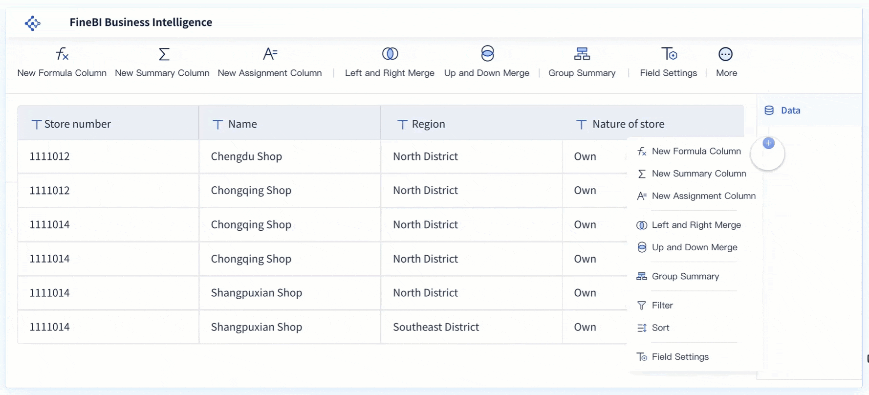
Start by collecting all the values you want to analyze. Make sure your data set is complete and free from errors. You can use FineBI to connect to many types of data sources, such as databases, Excel files, or APIs. FineBI makes it easy to bring together information from different places, so you can work with a single, unified data set. Here are some ways FineBIhelps you organize your data:
You can retrieve data from multiple databases.
You can perform calculations across different data sets in one report.
Once you have your data set in FineBI, sort the values in order from smallest to largest. Sorting is a key part of how to make a box plot because it helps you find the median and quartiles easily. FineBI lets you sort your data set with just a few clicks, saving you time and reducing mistakes. Remember, a box and whisker plot works best with a large data set. Small data sets can give misleading results when you calculate medians and quartiles.
Dataset Size
Suitability for Box Plots
Reason
Large Datasets
Suitable
Accurately reflects quartile summaries.
Very Small Datasets
Not Suitable
May lead to misleading representations.
By organizing and sorting your data set in FineBI, you set the foundation for an accurate and meaningful box and whisker plot. This step ensures your analysis will be reliable and easy to interpret.
To continue with how to make a box plot, you need to find several key values in your data set. These values include the median, the quartiles, and the minimum and maximum. Each value plays a crucial role in building an accurate box and whisker plot. FineBI’s self-service data preparation features make these calculations simple, even if you have little experience with statistics.
Find Median
The median is the middle value in your sorted data set. When you learn how to make a box plot, you start by finding the median because it divides your data into two equal halves. If your data set has an odd number of values, the median is the center value. If your data set has an even number of values, you calculate the median by averaging the two middle numbers.
For example, using the sample data set [5, 7, 8, 12, 15, 18, 22], you sort the values and find the median. The middle value is 12, so the median is 12. FineBIallows you to use built-in functions to calculate the median instantly. You can also view the median in summary tables or visualizations.
Tip: The median helps you understand the central tendency of your data. It is less affected by outliers than the mean.
Measure
Value
Minimum value
59
Maximum value
77
First quartile (Q1)
64.5
Median (Q2)
66
Third quartile (Q3)
70
Calculate Quartiles
Quartiles split your data into four equal parts. When you learn how to make a box plot, you need to find the first quartile (Q1) and the third quartile (Q3). The first quartile is the median of the lower half of your data. The third quartile is the median of the upper half.
Let’s use the same sample data set [5, 7, 8, 12, 15, 18, 22]. After finding the median (12), you look at the lower half [5, 7, 8] and the upper half [15, 18, 22]. The median of the lower half is 7, which is Q1. The median of the upper half is 18, which is Q3. FineBI’s calculation tools let you select your data and get quartile values with a single click.
Term
Definition
Minimum
The lowest data point in the data set excluding any outliers.
Maximum
The highest data point in the data set excluding any outliers.
Median
The middle value in the data set.
First Quartile
The median of the lower half of the dataset, also known as the lower quartile (Q1 or 25th percentile).
Third Quartile
The median of the upper half of the dataset, also known as the upper quartile (Q3 or 75th percentile).
Note: Quartiles help you see how your data spreads out. They show where most values fall and help you spot unusual data points.
Identify Min and Max
The minimum and maximum values show the range of your data. When you learn how to make a box plot, you need to identify these values after removing any outliers. You calculate the interquartile range (IQR) by subtracting Q1 from Q3. You then set limits: Q1 minus 1.5 times the IQR for the lower limit, and Q3 plus 1.5 times the IQR for the upper limit. Any data outside these limits are outliers. The minimum and maximum for your box and whisker plot are the lowest and highest values within these limits.
FineBI'sself-service analytics let you filter out outliers and display the minimum and maximum values clearly. You can use summary tables or visualizations to check these values.
Key Value
Calculation
Minimum value
4
Lower quartile (Q1)
13
Median (Q2)
18
Upper quartile (Q3)
23 (calculated as Q1 + IQR)
Maximum value
27 (calculated as lowest value + range)
Tip: Always check for outliers before setting your minimum and maximum. This step ensures your box and whisker plot shows the true spread of your data.
When you follow these steps in FineBI, you quickly find the median, quartiles, minimum, and maximum. These values form the backbone of your box and whisker plot. You can now move on to drawing the plot and analyzing your results.
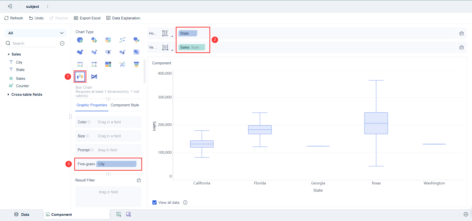
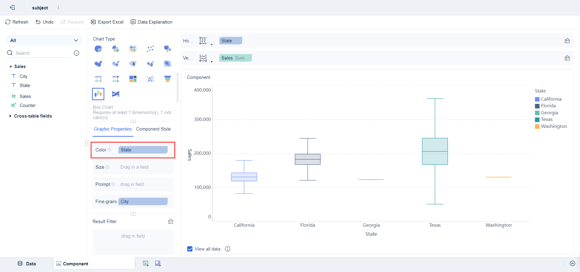
Creating a box and whisker plot helps you visualize the distribution of your data and spot outliers. You have already learned how to make a box plot by preparing your data and finding key values. Now, you can use FineBI to turn these values into a clear box-and-whisker plot chart type. FineBI’s drag-and-drop interface makes this step simple and efficient.
Draw Box
Start by selecting the box-and-whisker plot chart type in FineBI. Drag your data fields into the appropriate areas. The box in a box and whisker plot represents the interquartile range (IQR), which covers the middle 50% of your data. The lower edge of the box marks the first quartile (Q1), and the upper edge marks the third quartile (Q3). The line inside the box shows the median. FineBI highlights these components so you can interpret your box and whisker plot easily.
Tip: The box helps you see where most of your data points fall. You can identify clusters and density by looking at the width of the box.
FineBIallows you to customize your box and whisker plot. You can adjust colors by dragging values into the 'Color' column and choosing 'Custom' for gradient intervals. You can also edit labels by selecting text in the text box, changing font style, size, and color. This makes your box and whisker plots more readable and tailored to your needs.
Customization Aspect
Description
Color Adjustment
Set colors based on value ranges for better visual distinction.
Label Customization
Change font style, size, and color for labels to improve clarity.
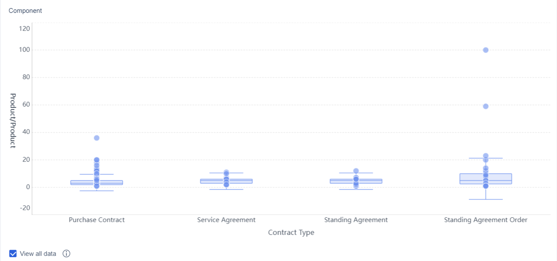
After drawing the box, add whiskers to your box and whisker plot. The whiskers extend from the edges of the box to the smallest and largest values within the data range, excluding outliers. FineBIdisplays these whiskers clearly, helping you see the full spread of your data. Outliers appear as individual points outside the whiskers.
Component
Description
Smallest Value
The lowest data point in the dataset.
Largest Value
The highest data point in the dataset.
Lower Quantile
The value at the 25th percentile (Q1).
Median
The middle value dividing the dataset.
Upper Quantile
The value at the 75th percentile (Q3).
Outliers
Points outside the whiskers, indicating unusual data.
Clusters
Groups of points close together, showing data density.
FineBI’s visual exploration features let you select, customize, and analyze your box and whisker plots. You can export your box plot as a PDF or Excel file for sharing or further analysis. Select Export > Export PDF to generate a file that reflects your dashboard layout. You can also export to Excel for a preview of your entire analysis.
By following this step, you create a box and whisker plot that shows the IQR, median, min, max, and outliers. FineBI makes the process easy, letting you focus on interpreting your results.
How to Make a Box Plot: Analyze Box Plot Results
When you reach this step in how to make a box plot, you begin to interpret the results. FineBI provides augmented analytics and data interpretation features that help you gain deeper insights from your box and whisker plot. You can use these tools to understand the spread of your data, spot outliers, and make informed decisions for your business.
Find IQR
The interquartile range (IQR) shows the spread of the middle 50 percent of your data. You calculate the IQR by subtracting the first quartile (Q1) from the third quartile (Q3). FineBI makes this calculation simple. Follow these steps:
Organize your data in ascending order.
Find the median to split your data set.
Identify Q1 and Q3.
Subtract Q1 from Q3 to get the interquartile range.
FineBI visualizes the IQR as the box in your box and whisker plot. The box highlights the middle 50 percent, helping you see where most values fall. This step in how to make a box plot allows you to compare variability between different groups or time periods. In business analytics, a narrow IQR suggests consistent performance, while a wide IQR may indicate volatility or risk.
Tip: Use color coding in FineBIto make the IQR stand out. This helps you quickly spot trends and patterns.
Outliers are values that fall outside the expected range. You identify outliers in how to make a box plot by using statistical thresholds. Here is a simple process:
Sort your data.
Calculate Q1 and Q3.
Find the IQR.
Compute the lower bound (Q1 - 1.5 × IQR) and upper bound (Q3 + 1.5 × IQR).
Mark any data points outside these bounds as outliers.
FineBI’s data interpretation features automatically highlight outliers on your box and whisker plot. Outliers can signal errors, unusual events, or opportunities. In business scenarios, spotting outliers helps you detect fraud, monitor quality, or identify areas for improvement.
Note: Always review outliers before making decisions. Outliers may require further investigation or adjustment.
Best Practices for Interpreting Box Plots
Understand quartiles and outliers
Compare multiple datasets for trends
Use color coding for clarity
Add individual data points for detail
Combine with other visualizations
You can create a box plot by following each step: arrange your data, find the minimum and maximum, calculate the median, determine Q1 and Q3, construct the box, and add the whiskers. Box and whisker plots give you a clear view of data distribution, highlight outliers, and make it easy to compare trends across datasets. FineBIlets you handle data integration, visualization, and analysis with ease, so you can focus on making informed decisions.
Smarter product, pricing, and inventory management across retail sectors.
FAQ
How do you choose the right data set for a box plot?
You should select a data set with enough values to show meaningful distribution. Avoid very small data sets. FineBI helps you connect to various sources, making it easy to gather and prepare your data for analysis.
Can you create a box plot in FineBI without coding?
Yes, you can create a box plot in FineBI using a drag-and-drop interface. You do not need to write any code. FineBI guides you through each step, from data preparation to visualization.
What does the box in a box plot represent?
The box shows the interquartile range (IQR), which contains the middle 50% of your data. The line inside the box marks the median. This helps you see where most values fall.
How does FineBI help you spot outliers?
FineBI highlights outliers automatically on your box plot. You can use built-in data interpretation features to identify unusual values and investigate them further.
Can you export your box plot from FineBI?
You can export your box plot as a PDF or Excel file. This makes it easy to share your analysis with others or include it in reports.