A digital marketing reports dashboard is the control layer that helps executives and marketing leaders turn scattered channel data into fast, confident decisions. If you are a CEO, CMO, operations director, or marketing analytics lead, the real problem is rarely a lack of data. It is a lack of clarity. Teams have campaign reports, ad platform exports, web analytics, CRM data, and ecommerce numbers, but leadership still struggles to answer basic business questions: What is driving revenue? Which channels deserve more budget? Where is performance slipping? A well-built dashboard solves that by aligning marketing activity to pipeline, revenue, efficiency, and accountability.
All reports in this article are built with FineReport.
What a Digital Marketing Reports Dashboard Should Include for Executives
An executive-ready digital marketing reports dashboard should not look like a media buyer’s workspace or a data analyst’s sandbox. It should answer business questions quickly, surface risks early, and make ownership obvious.
Define the dashboard’s purpose: fast decision-making, trend visibility, and accountability across channels
The primary purpose of an executive dashboard is not to display everything. It is to reduce decision latency. Leaders need to see whether marketing is contributing to growth, whether performance is moving toward targets, and where intervention is required.
At minimum, the dashboard should help executives do three things:
Make fast decisions on budget, priorities, and corrective action
Spot trends early before they become revenue problems
Create accountability across paid, organic, email, social, partner, and lifecycle teams
A good dashboard acts as an operating system for reviews, not just a reporting artifact.
Separate views for CEOs, CMOs, and channel managers so each audience sees the right level of detail
One of the most common dashboard failures is forcing every stakeholder to use the same view. That creates clutter for executives and not enough detail for operators.
A stronger approach is role-based reporting:
CEO dashboard: business outcomes, efficiency, forecast risk, exception alerts
Without a reporting cadence, even a strong digital marketing reports dashboard becomes shelfware.
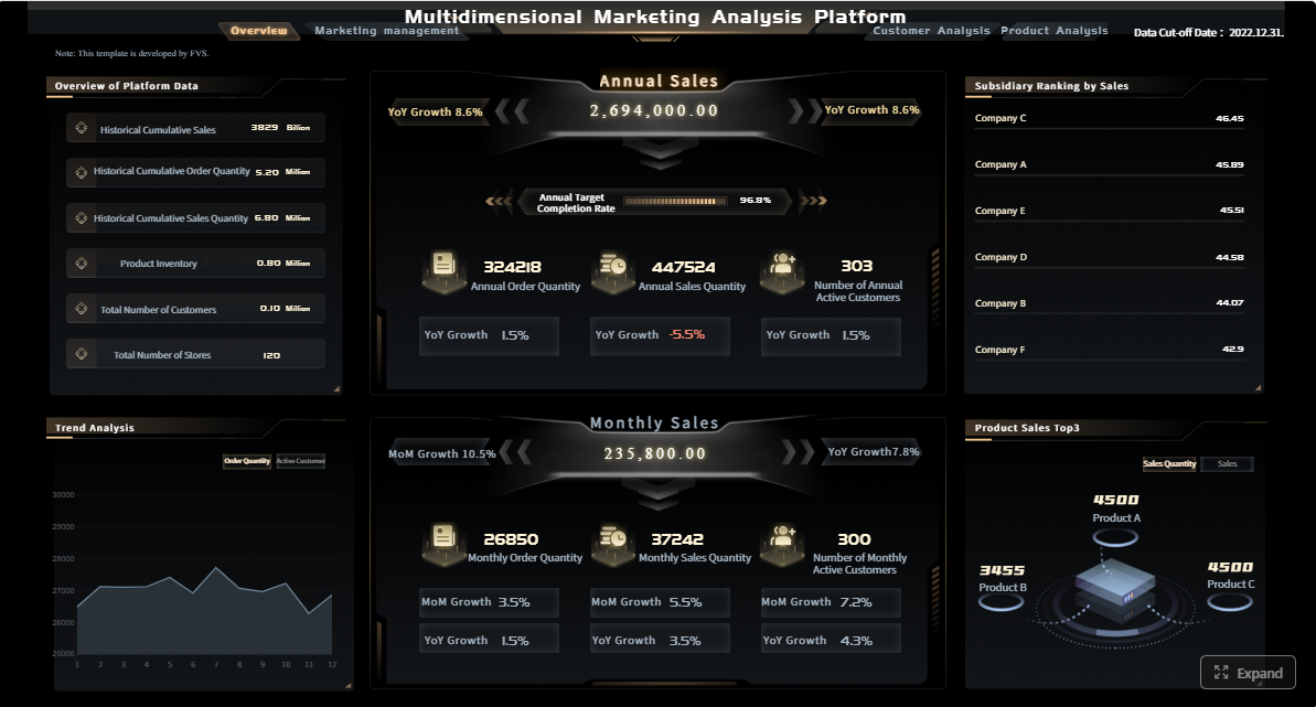
Executive Digital Marketing Reports Dashboard Examples by Role
Different leaders need different dashboard experiences. The smartest reporting environments do not force one format onto every role.
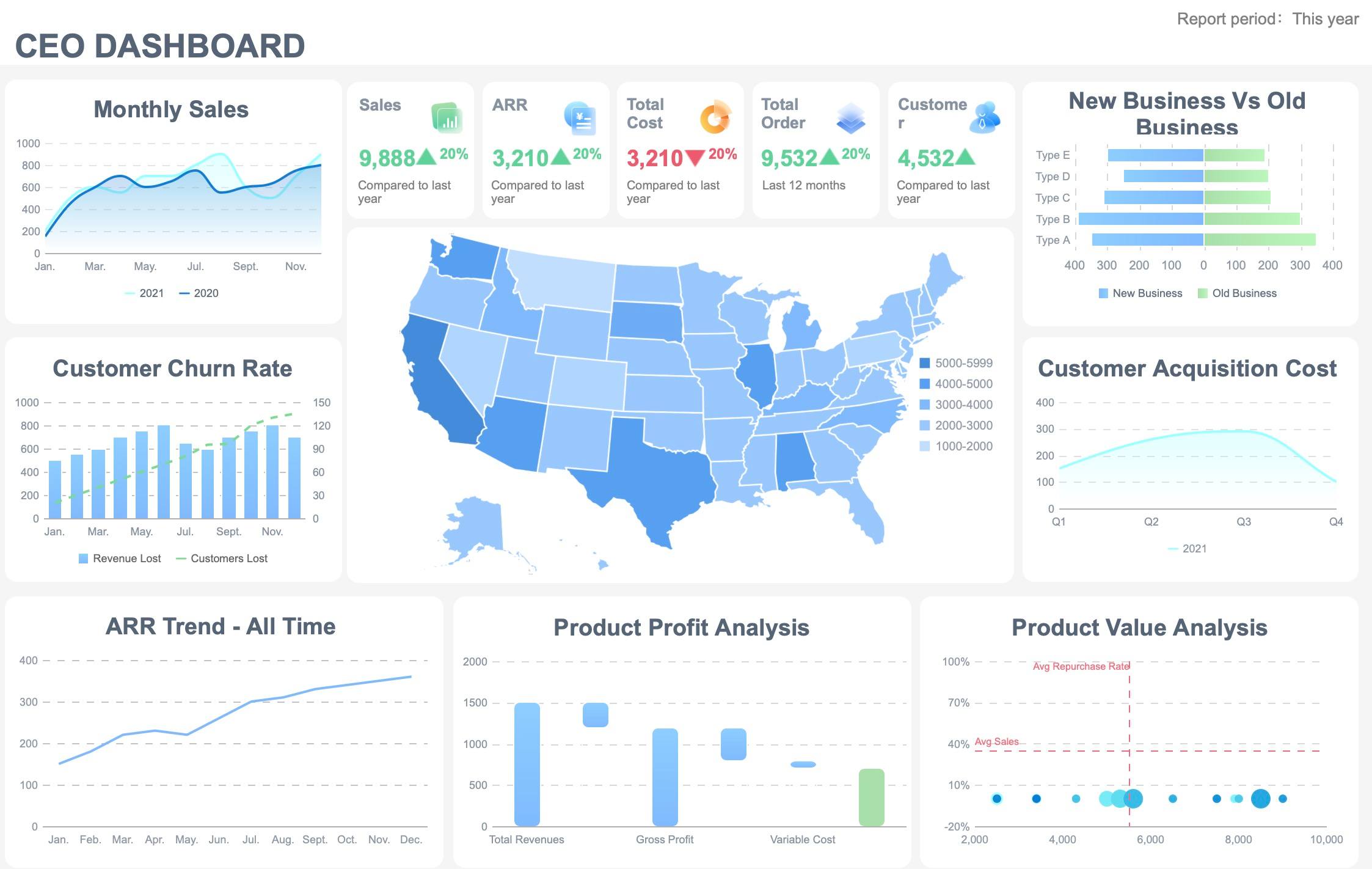
CEO view: revenue, pipeline, efficiency, and forecast confidence
The CEO view should be compact, high signal, and tied directly to growth. This dashboard is not for campaign management. It is for strategic oversight.
The key is to show where spending creates efficiency and where reallocation is needed. A CMO should be able to answer, in one screen, which channels are scaling, which are plateauing, and which are wasting budget.
Recommended CMO layout:
Section
What to show
Why it matters
Executive summary
Revenue, pipeline, CAC, ROI, target variance
Keeps focus on business impact
Channel mix
Paid, organic, email, social, partner comparison
Supports budget allocation
Campaign performance
Top and bottom performers
Identifies reallocation opportunities
Funnel view
Visitor to lead to opportunity to customer
Exposes leakage points
Budget pacing
Spend versus plan
Prevents over- or under-investment
Channel manager view: platform metrics, creative performance, and optimization opportunities
Channel managers need operational detail. Their dashboard should move from summary to action.
This level of reporting should support daily and weekly decisions, such as pausing ad sets, shifting bids, adjusting audience exclusions, or refreshing creative.
Channel manager essentials:
Campaign-level trend charts
Audience and placement breakdowns
Creative ranking tables
Cost and conversion trend lines
Alert flags for pacing or frequency fatigue
Core KPIs to Track in a Digital Marketing Reports Dashboard
KPIs should be selected based on decisions, not availability. A dashboard overloaded with vanity metrics slows down reviews and weakens trust.
Revenue and pipeline KPIs
These metrics connect marketing to actual commercial results.
Key Metrics (KPIs):
Marketing-sourced revenue: Revenue generated from leads originally created by marketing
Influenced revenue: Revenue from deals where marketing had measurable touchpoints
Qualified leads: Leads that meet agreed qualification standards
Pipeline value: Total potential revenue associated with active opportunities
Lead-to-opportunity conversion rate: Percentage of leads that progress to pipeline
Opportunity-to-customer conversion rate: Percentage of opportunities that close
Stage conversion rate: Movement efficiency between funnel stages
Average deal value: Revenue size by closed-won deal, useful for segment analysis
Efficiency and cost KPIs
These KPIs tell executives whether growth is becoming more or less expensive.
Key Metrics (KPIs):
Customer acquisition cost (CAC): Total acquisition cost divided by new customers
Cost per lead (CPL): Spend required to generate one lead
Return on ad spend (ROAS): Revenue generated for each unit of ad spend
Blended ROI: Return across all marketing investment, not just paid media
Payback period: Time required to recover customer acquisition cost
Cost per opportunity: Spend needed to generate one sales opportunity
Budget pacing: Actual spend versus planned spend over time
Engagement and channel health KPIs
These are diagnostic KPIs. They should support action, not dominate the dashboard.
Key Metrics (KPIs):
Traffic quality: Sessions that show intent through low bounce, high engagement, or high conversion
Click-through rate (CTR): Percentage of impressions that generate clicks
Engagement rate: Interaction level with content or campaigns
Bounce rate: Percentage of visitors leaving without meaningful action
Email open rate: Share of delivered emails that are opened
Email click rate: Share of opens or deliveries that generate clicks
Branded search demand: Volume of brand-related searches, often a signal of market traction
Landing page conversion rate: Percentage of visitors completing the desired action
Retention and lifecycle KPIs
For subscription, ecommerce, SaaS, and lifecycle-led models, retention must appear in the dashboard.
Key Metrics (KPIs):
Repeat purchase rate: Share of customers who buy again
Churn rate: Percentage of customers who leave in a given period
Customer lifetime value (CLV): Projected revenue per customer over time
Expansion revenue: Additional revenue from existing customers
Retention rate: Percentage of customers retained over a set period
Lifecycle conversion rate: Movement from first purchase to repeat or upsell stages
How to Structure the Digital Marketing Reports Dashboard for Clear Reporting
Even the right KPIs can fail if the layout is confusing. Structure matters because executives scan before they analyze.
Start with an executive summary row for goals, current performance, and major changes versus target
The first row should answer three questions immediately:
What were we trying to achieve?
Where are we now?
What changed versus target or last period?
This row usually includes:
Revenue versus goal
Pipeline versus goal
CAC versus target
ROI versus target
Lead volume or conversion trend
Alert indicators for unusual movement
This is the summary layer leaders should understand in under a minute.
Group metrics by funnel stage so stakeholders can connect awareness, acquisition, conversion, and retention
A funnel-based structure helps stakeholders understand cause and effect. Instead of random channel blocks, organize reporting by customer journey stage.
A dashboard is only as strong as the reporting layer behind it. To build a reliable digital marketing reports dashboard, connect data from the systems that actually define performance.
Ad platforms such as Google Ads, Meta Ads, LinkedIn Ads, TikTok Ads
Web analytics platforms
CRM and sales systems
Ecommerce platforms
Email automation tools
Attribution or marketing measurement tools
Internal budget or finance systems
When evaluating software, prioritize:
Integration coverage
Refresh frequency
Custom visualization flexibility
Role-based permissions
Governance controls
Sharing and export options
Ability to build executive and operational views from the same model
FineReport is a strong fit when you need highly customized dashboards, enterprise data connectivity, permission management, and report formats that work across executive, operational, and analytical use cases.
Templates should never stay generic for long. Customization is where dashboards become decision tools.
Adapt each template based on:
Your revenue model
Sales cycle length
Marketing channel mix
Executive reporting expectations
Attribution model
Market segment or geography
A B2B pipeline-driven business will emphasize MQLs, opportunities, and influenced pipeline. An ecommerce brand may prioritize ROAS, conversion rate, average order value, and repeat purchase rate. The right template reflects how your company actually grows.
Most importantly, keep only the KPIs that support decisions. Remove vanity metrics that do not change action.
Common Mistakes and a Practical Digital Marketing Reports Dashboard Build Process
Many dashboard projects fail not because the team lacks tools, but because the design logic is weak.
Mistakes that make dashboards hard to use
The most common dashboard problems are predictable.
Avoid these mistakes:
Too many metrics on one screen: Creates noise and slows decisions
Inconsistent definitions: Causes endless debate over whose number is correct
Missing targets: Makes trends hard to interpret
No clear owner: Leads to broken updates and trust erosion
Channel-only reporting: Hides business impact by isolating media metrics
No drill-down path: Prevents teams from moving from symptom to root cause
Overemphasis on vanity metrics: Makes dashboards look busy but strategically weak
A dashboard should reduce ambiguity, not multiply it.
A step-by-step process to launch your dashboard
A practical rollout process is more important than a perfect first version.
1. Identify stakeholders and decisions the dashboard must support
Start with decision use cases, not charts. Ask:
What decisions will this dashboard improve?
Who uses it?
How often is it reviewed?
What action should each KPI trigger?
This prevents overbuilding and keeps the dashboard tied to operational value.
2. Define KPI formulas and data sources before designing visualizations
Before choosing a single chart, lock down:
KPI definitions
Attribution logic
Source systems
Refresh frequency
Ownership
If CAC, influenced revenue, or qualified lead definitions vary across teams, fix that first.
3. Build a minimum viable version, validate it in live reviews, and refine based on stakeholder feedback
Do not wait for a perfect enterprise-wide rollout. Launch a focused version with the metrics leaders actually use.
A practical MVP includes:
Summary KPI row
Funnel structure
Channel comparison
One drill-down path
Basic alerts or variance indicators
Use real review meetings to observe where users hesitate, ask for more context, or ignore sections entirely. Then refine.
4. Document ownership, update cadence, and governance so reporting stays reliable over time
That is how a dashboard remains trusted after launch, not just during the initial build.
Best Practices to Implement a High-Value Digital Marketing Reports Dashboard
If I were advising an enterprise marketing team, these would be the non-negotiables.
1. Build from business questions backward
Start with five to seven leadership questions such as:
Is marketing driving profitable growth?
Which channel deserves more budget?
Where is funnel conversion weakening?
Are we on track for quarterly targets?
Then map KPIs and visuals to each question.
2. Use a layered reporting model
Create one summary layer for executives, one management layer for functional leaders, and one detail layer for channel operators. This avoids the classic mistake of trying to make one dashboard serve everyone equally.
3. Standardize KPI definitions across marketing, sales, and finance
A dashboard becomes politically fragile when teams do not trust the math. Align definitions for pipeline, sourced revenue, influenced revenue, CAC, ROI, and qualified lead status before rollout.
4. Design for exception-based management
Leaders do not need to inspect every fluctuation. Use alert thresholds, target variance highlights, and simple red-amber-green logic to draw attention to areas requiring action.
5. Review the dashboard in live operating meetings
Dashboards become valuable when they shape decisions in real time. Make the digital marketing reports dashboard the default view in weekly optimization meetings and monthly executive reviews.
Why FineReport Works Well for Digital Marketing Reporting
For enterprise teams, dashboard success depends on more than attractive charts. You need data integration, governance, customization, and stakeholder-friendly output. FineReport supports that operating model well.
It is particularly useful when you need to:
Combine marketing, CRM, ecommerce, and finance data in one reporting layer
Build different views for executives, CMOs, and channel managers
Create highly customized visual layouts instead of fixed templates
Manage permissions across teams and leadership roles
Deliver dashboards plus printable reports for formal review settings
That combination is especially valuable when marketing reporting must satisfy both operational teams and executive leadership.
A great digital marketing reports dashboard does not just centralize metrics. It improves how the business decides. For executives, it creates immediate visibility into revenue impact, efficiency, and forecast risk. For CMOs, it clarifies channel mix and budget allocation. For channel managers, it enables faster optimization.
If you want your dashboard to be used consistently, keep it role-based, KPI-driven, funnel-structured, and tightly connected to business outcomes. Start with a minimum viable version, validate it in real meetings, and refine it around the decisions that matter most.
If you are ready to build a dashboard that works for both leadership reporting and day-to-day optimization, FineReport is a practical platform to evaluate.
FAQs
It is a high-level reporting view that combines data from channels like ads, web analytics, CRM, and ecommerce into one place. Its purpose is to help executives quickly understand revenue impact, efficiency, risks, and where action is needed.
The most important KPIs usually include marketing-sourced revenue, influenced pipeline, customer acquisition cost, ROI or ROAS, conversion rate trends, and budget pacing. Supporting metrics like traffic and clicks should appear only if they explain business outcomes.
An executive dashboard focuses on summary metrics, trends, and exceptions tied to growth and profitability. A channel manager dashboard goes deeper into platform-level details such as campaign performance, creative tests, and daily optimization metrics.
Daily checks are useful for spend pacing, lead flow, and sudden performance changes, while weekly reviews help guide channel and budget adjustments. Monthly reviews are best for executive decisions around targets, forecasting, and strategic reallocation.
Start by defining the decisions the dashboard needs to support, then choose a small set of business-first KPIs and connect reliable data sources. Keep the layout simple, tailor views by role, and make sure the dashboard supports drill-down when leaders need more context.
Product Trial
FineReport
Pixel-perfect reports · Interactive dashboards · Easy data entry · Digital twins