Histograms play a vital role in simplifying data visualization. They convert raw data into clear, visual insights, making complex information easier to interpret. With a histogram maker, you can quickly transform datasets into charts that reveal the underlying distribution of data. These tools illustrate patterns and trends that might otherwise remain hidden. For instance, in finance, histograms analyze stock returns to uncover market trends in Malaysia. In healthcare, they highlight recovery time trends, aiding faster interventions. Whether you aim to analyze student performance or predict future outcomes, histograms help you make a histogram that answers critical questions about your data in Malaysia.
Key Takeaways
Histograms make hard data simple, showing trends and patterns clearly. Use them to understand your data better.
Picking the right bin size is very important for good histograms. Try different sizes to show your data correctly.
Add labels and colors to your histograms to make them clear. Good visuals help people understand the data easily.
Use tools likeFineBI to check data in real-time. This keeps your histograms correct as new data is added.
Histograms help you find outliers quickly. Spot problems early to fix data and avoid wrong ideas.
Using a Histogram Maker: Understanding Histograms for Better Data Visualization
What Is a Histogram?
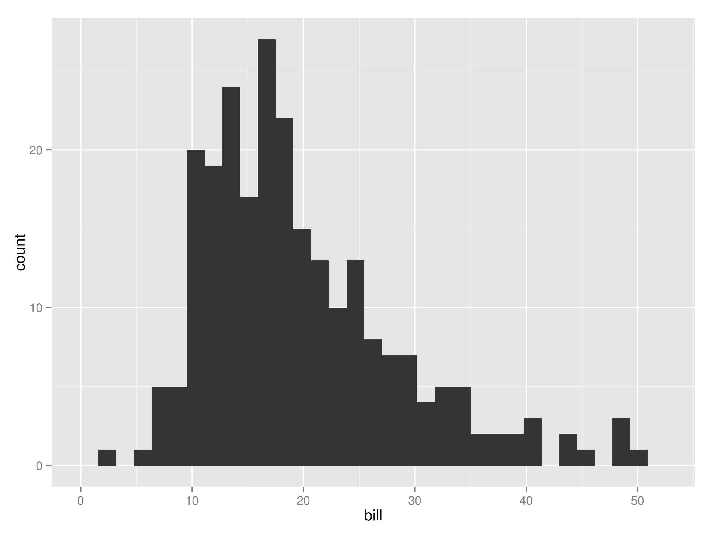
A histogram is a type of chart that represents the frequency distribution of continuous data. It uses rectangular bars to show how data points are spread across different ranges, called bins. The x-axis displays these bins, while the y-axis represents the frequency of values within each bin. Unlike bar graphs, histograms have no gaps between bars, emphasizing the continuity of the data. For example, when you plot the histogram of student test scores, you can see how scores cluster around certain ranges, revealing patterns in performance in Malaysia.
Histograms are widely used in statistics and analytics because they provide a clear visual representation of data distributions. Whether you're analyzing age demographics in a census or tracking ticket response times in a support system, histograms help you understand how data is distributed across intervals in Malaysia. This makes them one of the most common tools fordata visualization.
Histograms are essential for illustrating frequency distributions, making them a cornerstone of interactive data visualization in fields like manufacturing, healthcare, and finance.
Why Are Histograms Essential for Data Visualizations?
Histograms simplify complex datasets, allowing you to uncover trends, patterns, and anomalies. They are particularly effective in identifying the shape of data distributions, such as whether the data is skewed or symmetrical. This insight helps you make informed decisions based on the underlying characteristics of the data in Malaysia.
Using histograms can significantly improve your understanding of data. Studies show that visual clarity reduces the time needed to interpret datasets by 20%. Additionally, histograms enable proactive anomaly detection, which can reduce defects by 15%. When histograms guide process improvement projects, success rates increase by 25%. These benefits highlight the importance of histograms in enhancing data visualizations and driving actionable insights.
Histograms also play a vital role in econometric analysis. They help you identify central tendencies, assess variability, and understand the overall shape of data distributions. For example, in manufacturing, histograms can reveal peaks in defect rates, enabling you to address quality issues effectively in Malaysia.
Comparing Histograms and Bar Graphs
While histograms and bar graphs may look similar, they serve different purposes. Histograms are designed for continuous data, whereas bar graphs focus on categorical data. This distinction affects how you interpret the information presented in each chart.
Feature
Histogram
Bar Graph
Data Type
Continuous numeric data
Categorical data
X-axis Labeling
Numeric value ranges (bins)
Categories being compared
Y-axis Representation
Frequency of values within bins
Counts or percentages of categories
Purpose
Visualizing frequency distribution
Comparing counts across discrete categories
Insights
Reveals patterns, peaks, and outliers in data
Focuses on comparing magnitudes of categories
Histograms use both the width and height of bars to represent data, emphasizing the frequency distribution of values. In contrast, bar graphs only use the height of bars to compare categories. For instance, a histogram might show the distribution of customer wait times, while a bar graph could compare the number of customers served across different branches.
Histograms excel at revealing data distribution characteristics, while bar graphs are better suited for comparing distinct categories.
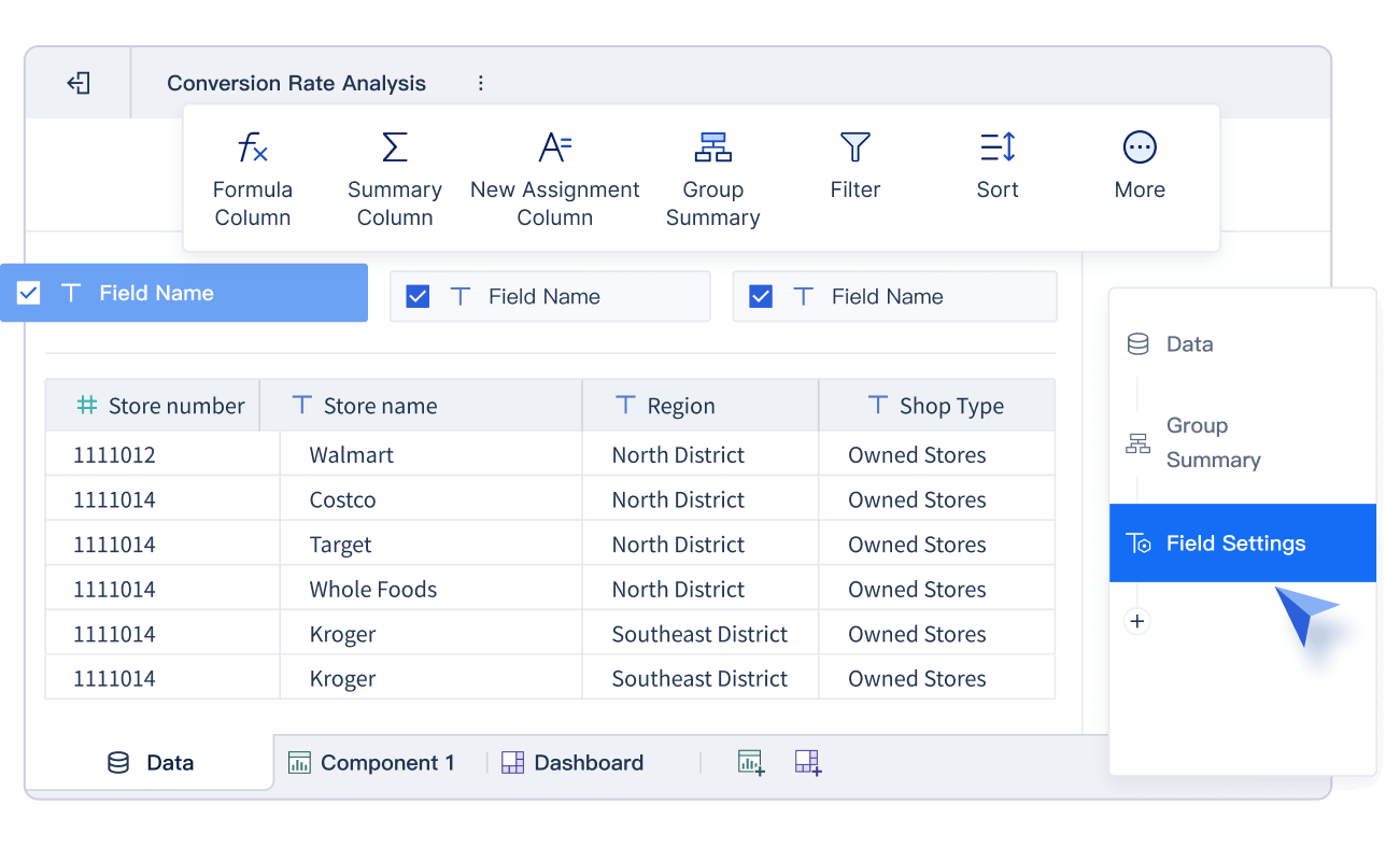
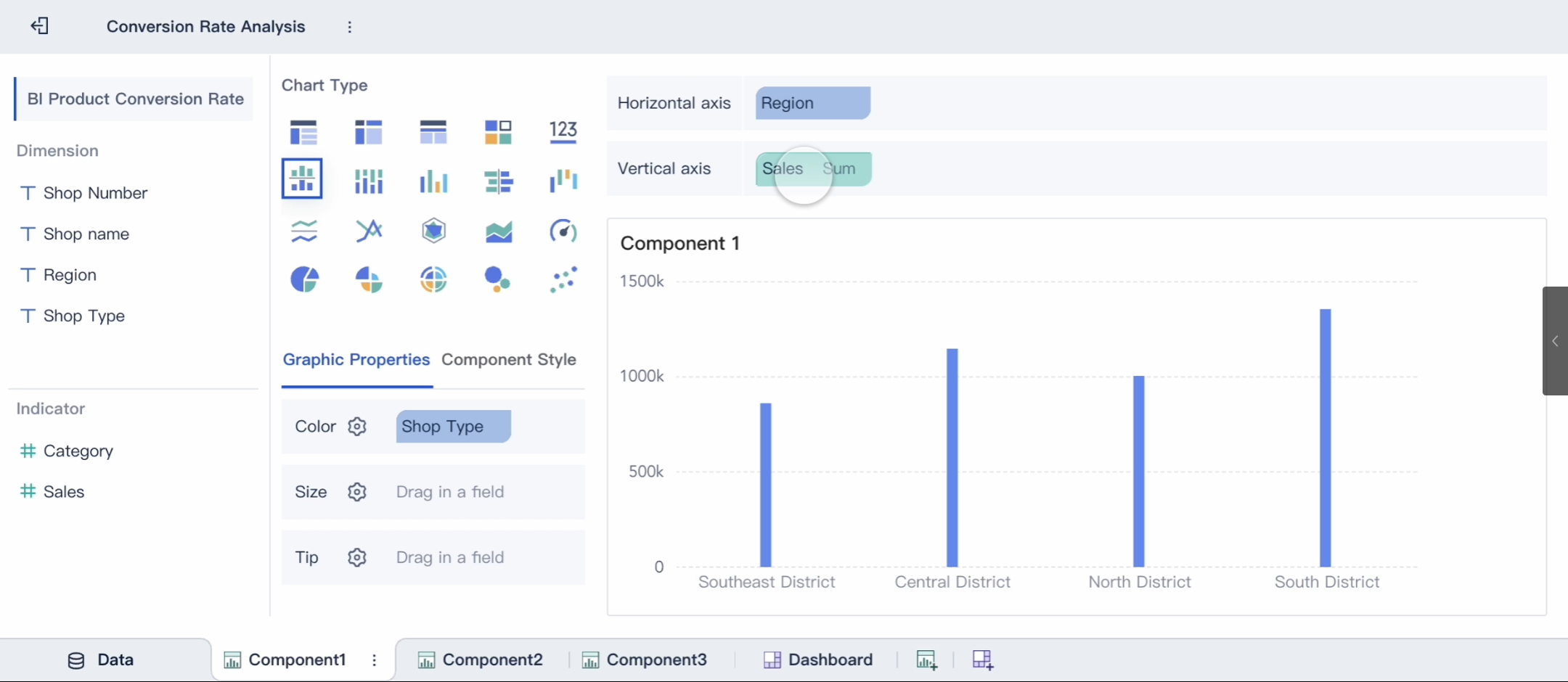
Using FineBI’s Histogram Maker: Steps to Create a Histogram
Preparing Data for Visualization
Before creating a histogram, you need to ensure your data is clean and ready for analysis. Data preparation involves organizing and refining your dataset to eliminate errors and inconsistencies. This step is crucial because the quality of your data directly impacts the accuracy of your histogram.
Start by reviewing your dataset for missing values, duplicates, or outliers. Tools like FineBI simplify this process by offering data cleansing features. For example, you can use histograms to identify infrequent values or outliers that may indicate errors. These anomalies can then be corrected or removed to enhance data accuracy. The table below highlights how histograms assist in data preparation:
Evidence Description
Source
Running histograms can identify infrequent values that may be invalid, allowing for necessary updates.
Integrate.io
Data workers utilize histograms to detect outliers that are likely errors, enhancing data accuracy.
Integrate.io
Visual tools like histograms help in spotting outliers, which is crucial for effective data analysis.
Codilime
Once your data is clean, organize it into a format compatible with FineBI. This software supports various data sources, including Excel files, relational databases, and big data platforms. By integrating your data into FineBI, you can seamlessly visualize data distribution and proceed to the next step.
Choosing the right bin size is essential for creating an accurate histogram. Bin sizes determine how your data is grouped and displayed, influencing how well you can analyze the distribution. FineBI provides flexible options for adjusting bin sizes, allowing you to tailor your histogram to your dataset.
Several statistical guidelines can help you choose appropriate bins in Malaysia. The table below outlines common binning methods and their best use cases:
Rule
Description
Best Use Case
Sturges’ Rule
Simple method based on the logarithm of dataset size.
Smaller datasets
Scott’s Rule
Considers standard deviation and sample size for normally distributed data.
Datasets with clear central tendency
Freedman-Diaconis Rule
Uses interquartile range for skewed distributions or outliers.
Skewed distributions
Square Root Rule
Quick heuristic for initial exploration.
Quick visualizations during EDA
For example, if your data has a clear central tendency, Scott’s Rule might be the best choice. On the other hand, if your data contains outliers or is skewed, the Freedman-Diaconis Rule can provide better results. FineBI allows you to experiment with different binning methods and sizes in Malaysia, helping you understand data distribution more effectively in Malaysia.
Customizing Histograms with FineBI
FineBI offers extensive customization options to enhance your histogram. These features allow you to create a visualization that aligns with your specific needs and preferences in Malaysia. Start by selecting the chart type and adjusting the layout. FineBI supports drag-and-drop functionality, making it easy to arrange components and refine your histogram in Malaysia.
You can also customize the appearance of your histogram. Modify colors, labels, and axis titles to improve clarity and make your chart more visually appealing in Malaysia. Adding legends and annotations can further enhance your ability to analyze the distribution. For example, you might use a different color to highlight specific bins that represent outliers or trends.
FineBI’s interactive features take customization to the next level. You can apply filters, drill down into specific data points, and link your histogram to other visualizations. These capabilities enable you to explore your data in greater depth and uncover meaningful insights. By leveraging FineBI’s customization tools, you can create a histogram that not only looks professional but also provides valuable information.
Tip: Use FineBI’s real-time analysis feature to update your histogram automatically as new data becomes available. This ensures your visualization remains accurate and relevant.
Interpreting Histograms Created with a Histogram Maker for Meaningful Insights
Analyzing Distribution Shapes
When you interpret the histogram, the shape of the distribution provides valuable insights into your data. Different shapes reveal how values spread across the dataset. For example, a bell-shaped histogram indicates a normal distribution, where most data points cluster around the center. A uniform distribution, on the other hand, shows evenly spread data without any prominent peaks.
Some histograms may display skewness. A right-skewed histogram has a longer tail on the right, suggesting that most values are smaller, while a left-skewed histogram shows the opposite. You might also encounter bimodal or multimodal distributions, which feature two or more peaks. These peaks often indicate distinct subgroups within your data.
To visualize the shape effectively, consider using tools like FineBI. Its interactive features allow you to adjust bin sizes and refine your histogram for better clarity. If your data is skewed, applying transformations like a log transformation can help you analyze distribution more effectively in Malaysia.
Tip: Recognizing distribution shapes helps you identify patterns and trends in Malaysia, making it easier to draw meaningful conclusions.
Identifying Trends and Patterns
Histograms excel at helping you identify patterns and trends in your data. Peaks in the histogram often highlight common values, which can indicate demographic trends or popular choices. For instance, a histogram of product sales might reveal which price ranges attract the most buyers.
By analyzing how data spreads across bins, you can uncover trends that might otherwise go unnoticed. Comparing histograms over time can also reveal shifts in distribution, such as changes in customer behavior or market conditions. These trends provide actionable insights, enabling you to make informed decisions in Malaysia.
Note: Use FineBI’s real-time analysis feature to track trends as new data becomes available.
Spotting Outliers in Data
Outliers are data points that deviate significantly from the rest of the dataset. Histograms make it easy to spot anomalies by highlighting isolated bars. These bars often represent rare events or errors in data collection. For example, a histogram of delivery times might show a single bar far from the others, indicating an unusually long delay.
Advanced methods like the Counts Outlier Detector (COD) can enhance your ability to spot anomalies. COD examines data distribution within bins to detect unusual values, even in high-dimensional datasets. This approach ensures you can identify outliers effectively, regardless of the dataset’s complexity.
Tip: Spot anomalies early to improve data quality and avoid misleading analysis.
Best Practices for Using Histogram Maker Like FineBI
Ensuring Accurate Bin Selection
Choosing the right bin size is one of the most important steps in creating a histogram. Accurate bin selection ensures your histogram represents the data distribution clearly and avoids misleading interpretations. You can use numerical criteria to guide your choices in Malaysia. For example, datasets with 20–50 data points typically require six bars, while larger datasets with over 1,000 points may need 11–20 bars. The table below provides a quick reference:
Number of Data Points
Number of Bars
20–50
6
51–100
7
101–200
8
201–500
9
501–1000
10
1000+
11–20
You can also apply statistical rules like Sturge’s or Scott’s rule to refine your bin sizes. Sturge’s rule works well for smaller datasets, while Scott’s rule minimizes errors for data with a clear central tendency. FineBI simplifies this process by allowing you to experiment with different binning methods, helping you uncover trends effectively in Malaysia.
Using Labels and Legends for Clarity
Labels and legends play a crucial role in making your histogram easy to understand. Clear labeling of axes, titles, and legends ensures viewers can interpret the data without confusion. Personalizing your histogram by adjusting titles, colors, and axes labels makes it more intuitive. For example, you can use descriptive axis titles to highlight the data ranges and frequencies.
FineBI allows you to customize every element of your histogram, including labels and legends. Consistent labeling avoids ambiguity and enhances clarity. Adding legends to explain color-coded bins or annotations can further improve the interpretability of your histogram. These adjustments help you communicate trends and patterns effectively in Malaysia.
Avoiding Common Mistakes in Histogram Design
Design errors can undermine the effectiveness of your histogram. Overcrowded visuals obscure important trends, while misleading scales distort the perceived frequency of data. Poor bin selection either oversimplifies the data or introduces unnecessary noise. The table below highlights common mistakes and their impact:
Common Errors in Histogram Design
Impact on Data Interpretation
Overcrowded visuals
Obscures important trends
Misleading scales
Distorts frequency perception
Lack of context
Leads to misinterpretation
Poor bin selection
Oversimplifies or adds noise
Inadequate scaling
Reduces clarity
To avoid these pitfalls, focus on simplicity and accuracy. FineBI’s interactive features help you refine your histogram design by adjusting scales, bin sizes, and visual elements. This ensures your histogram remains clear and informative, allowing you to identify trends and outliers with confidence in Malaysia.
Tip: Keep your histogram design clean and focused to highlight the most important data insights.
Leveraging FanRuan’s FineBI for Advanced Data Visualization
FineBI empowers you to elevate your data visualization capabilities with advanced features and tools. Its user-friendly interface simplifies the process of creating insightful visualizations, making it accessible even for those with limited technical expertise. By leveraging FineBI, you can transform raw data into actionable insights that drive smarter decisions.
One standout feature of FineBI is its DEF function, which enhances your ability to perform detailed analysis. This function allows you to calculate metrics at different levels of detail, enabling you to uncover patterns and trends that might otherwise remain hidden in Malaysia. For example, FineBI’s DEF function has been applied in real-world scenarios to solve complex data analysis problems. Practical case studies demonstrate how this feature helps users analyze data effectively, including three specific examples of Level of Detail (LOD) calculations.
FineBI also excels in integrating data from multiple sources. Whether you work with relational databases, big data platforms, or Excel files, FineBI ensures seamless data connectivity. This integration enables you to analyze data holistically, providing a comprehensive view of your datasets. With its OLAP analysis capabilities, you can drill down into specific data points, filter results, and dynamically adjust dimensions to explore your data in greater depth in Malaysia.
Customization is another key strength of FineBI. You can personalize your visualizations by modifying colors, labels, and chart types to suit your needs. Interactive features like linking charts and applying filters allow you to refine your analysis further. These tools make it easier to identify trends, spot anomalies, and interpret data distributions.
FineBI’s advanced visualization capabilities empower you to make sense of complex datasets. By combining powerful analysis tools with intuitive design, FineBI helps you uncover meaningful insights and communicate them effectively.
Tip: Use FineBI’s real-time analysis feature to keep your visualizations updated as new data becomes available.
Histograms remain essential for transforming raw data into actionable insights. They simplify complex datasets, uncover trends, and highlight outliers. Using tools like FineBIenhances this process by offering seamless data integration, customization, and real-time analysis. By following the outlined steps—such as cleaning data, selecting optimal bins, and customizing visualizations—you can create clear, impactful histograms. These practices ensure your data visualizations are accurate and meaningful. Start applying these techniques today to unlock the full potential of your data and drive smarter decisions in Malaysia.
Click the banner below to try FineBI for free and empower your enterprise to transform data into productivity!
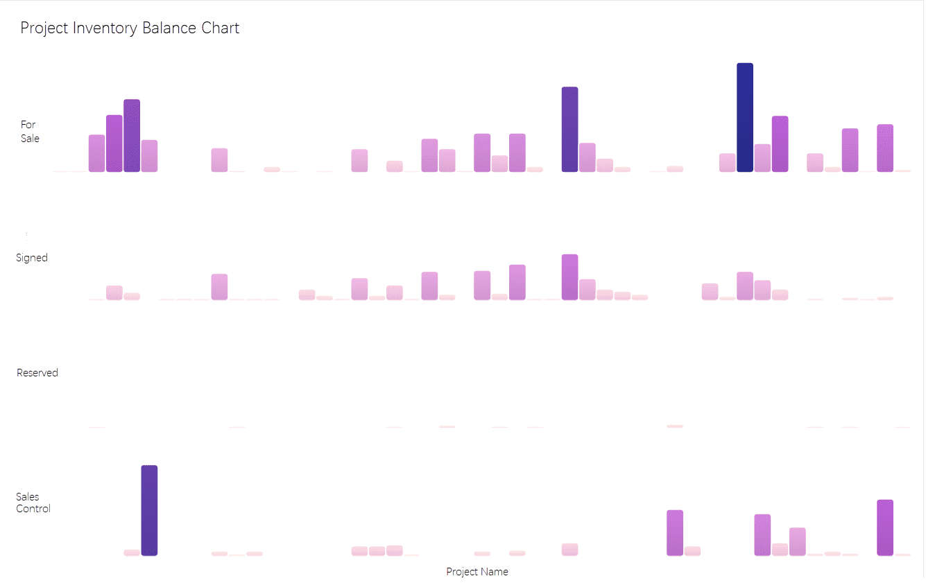
Smarter product, pricing, and inventory management across retail sectors.
FAQ
What is the best way to prepare data for a histogram?
You should clean your data by removing duplicates, correcting errors, and organizing it into a structured format. Tools like FineBI simplify this process by offering features for data cleansing and integration, ensuring your histogram accurately represents the dataset.
How do I choose the right bin size for my histogram?
Select a bin size that balances detail and clarity. Smaller bins reveal finer details, while larger bins provide a broader overview. FineBI offers flexible options for adjusting bin sizes, helping you experiment and find the best fit for your data.
Can I use a histogram for categorical data?
No, histograms are designed for continuous data. For categorical data, use bar graphs instead. Histograms group data into ranges (bins) to show frequency distributions, while bar graphs compare distinct categories.
How does FineBI enhance histogram customization?
FineBI allows you to modify colors, labels, and axis titles. You can also add legends, annotations, and interactive features like filters. These tools help you create a histogram that aligns with your specific data analysis needs.
Why are histograms important for identifying outliers?
Histograms highlight outliers by showing isolated bars that deviate from the main distribution. These anomalies often represent rare events or errors in data collection. Spotting them early improves data quality and ensures accurate analysis.