In 2026, data visualization projects hold immense significance. They transform complex data into clear visual stories, making information easier to grasp. Businesses using these tools are 48% more likely to find information quickly. The global data analytics market, valued at $103 billion in 2021, is projected to reach $201 billion by 2026. Identifying top projects becomes crucial as they set benchmarks for innovation and usability. Projects like FineBI and FineVis exemplify this trend, offering user-friendly solutions that enhance decision-making and storytelling.
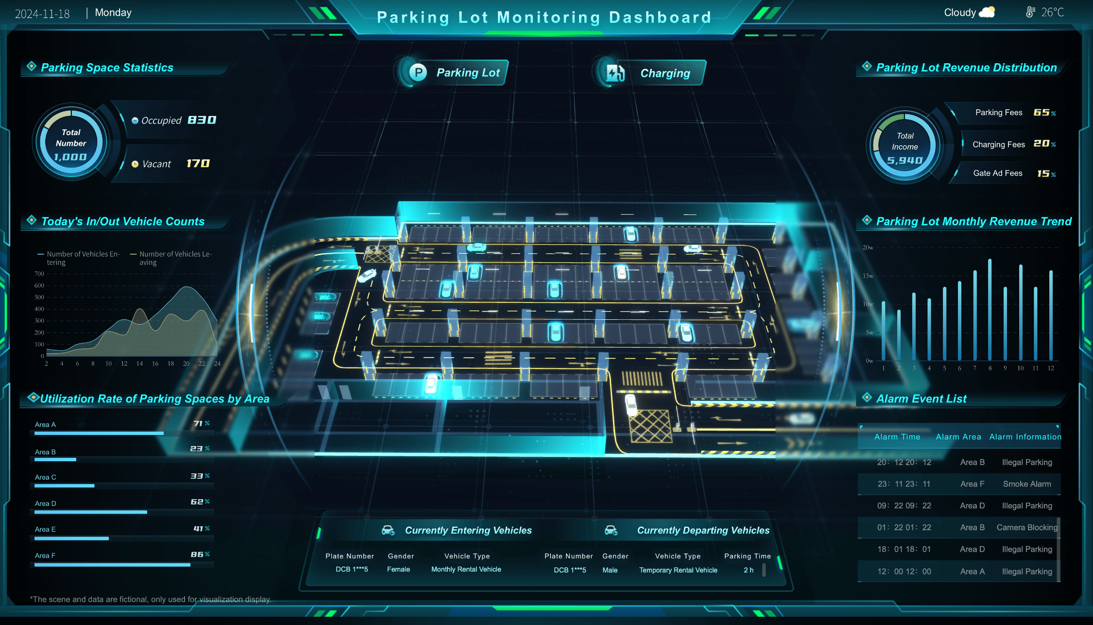
Parking Lot Monitoring Dashboard Created By FineVis
The Importance of Data Visualization Projects in 2026
In 2026, data visualization projects play a pivotal role in transforming raw data into meaningful insights. These projects help you understand complex information quickly and effectively. As you explore the evolving trends in data visualization, you'll notice how these projects are shaping various industries.
Evolving Trends in Data Visualization Projects
Data visualization tools have significantly evolved, incorporating more sophisticated features that meet a wide range of user requirements. Modern tools offerreal-time data analysis capabilities, enabling timely and informed decision-making. The leading tools in this field prioritize user-friendliness and accessibility, ensuring that individuals from various professional backgrounds can effortlessly understand and interpret complex datasets. Moreover, these tools increasingly emphasize interactive and dynamic visualizations, which enhance user engagement with the data by allowing for more personalized and interactive exploration. This evolution not only supports better data-driven decisions but also enriches the overall user experience in data analysis.
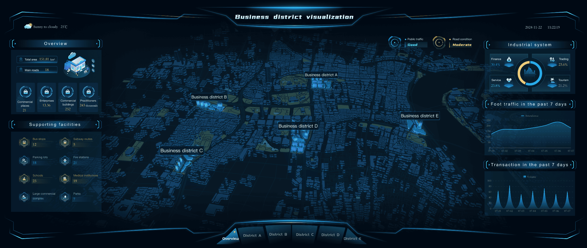
Business District Visualization Dashboard Created By FineVis
Data visualization projects wield substantial influence across various sectors by transforming complex data into actionable insights. In healthcare, they enable medical professionals to track disease outbreaks in real-time, optimize patient care through better data on health trends, and manage resources more effectively by visualizing patient flow and treatment outcomes. This leads to improved diagnostic accuracy and more personalized patient care strategies.
In the finance sector, data visualization tools assist analysts and investors by providing clear visual representations of financial data, market trends, and risk assessments. These tools help in making swift, data-driven investment decisions and in understanding market behaviors through interactive dashboards that highlight key financial indicators and historical market data.
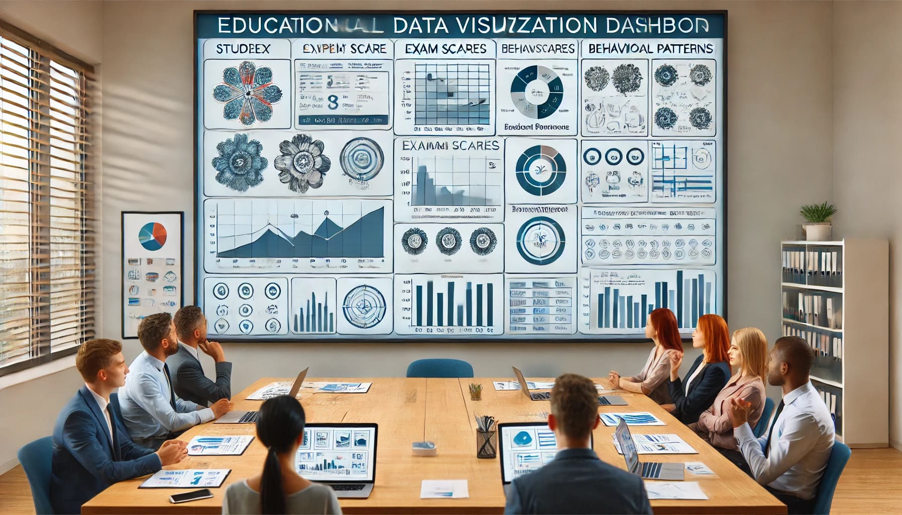
Educational institutions use data visualization to analyze and improve student performance, monitor learning progress, and tailor educational content to meet the needs of diverse student populations. Visualizations help educators identify patterns in test scores and attendance, facilitating targeted interventions to enhance educational outcomes.
Overall, data visualization projects enhance decision-making and strategic planning in these sectors by presenting data in more intuitive and accessible ways, promoting efficiency and innovation.
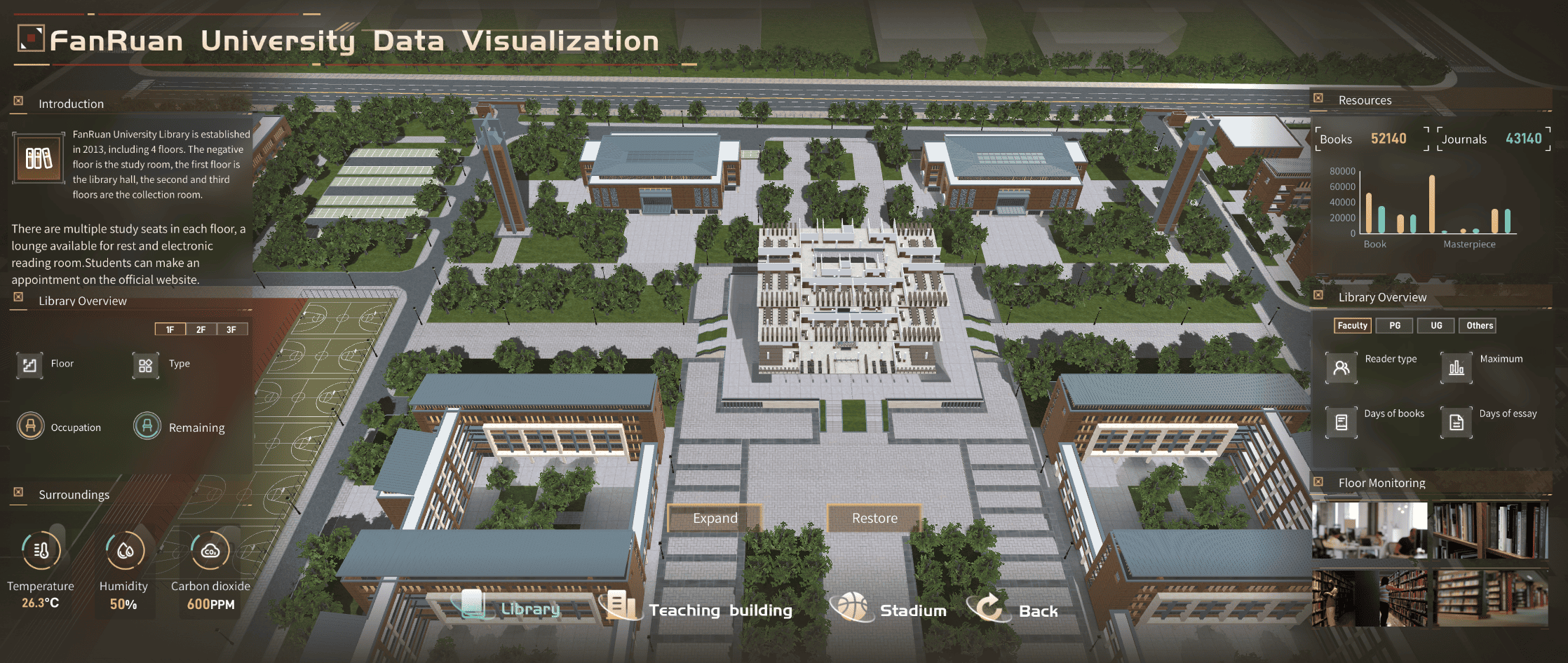
FanRuan University Data Visualization Dashboard Created By FineVis
In the healthcare sector, data visualization tools play a crucial role in enhancing patient care by enabling the tracking of patient outcomes, monitoring disease trends, and optimizing resource allocation. These tools convert complex medical data into clear, comprehensible visual formats, making it easier for healthcare professionals to interpret and act on critical information quickly. For example, visual dashboards can display patient vitals, treatment progress, and recovery timelines, allowing doctors to make informed decisions and tailor treatments to individual patient needs. Additionally, these tools facilitate the identification of disease outbreaks and health anomalies by illustrating patterns and correlations in patient data across different demographics and regions.
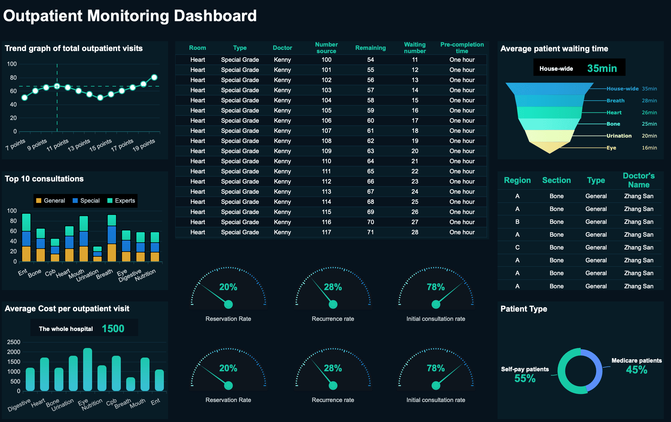
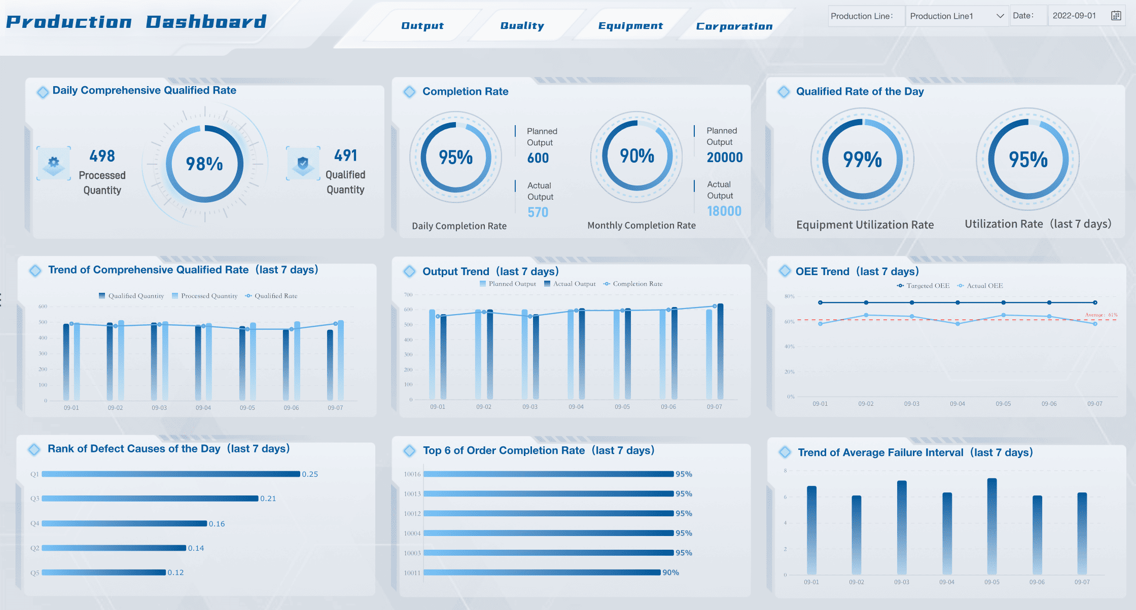
Outpatient Monitoring Dashboard Created By FineReport
By providing a holistic view of healthcare dynamics, data visualization supports effective management of medical resources, ensuring that facilities are adequately staffed and stocked based on predictive analysis of patient flow and demand. Ultimately, these tools not only streamline operations but also significantly improve the quality of care delivered to patients.
Finance
The finance industry reaps considerable advantages from the use of data visualization software, which serves as a powerful tool for professionals aiming to make well-informed investment decisions. These tools enable users to analyze market trends, assess potential risks, and strategize investment moves with greater precision. By transforming complex financial datasets into clear, intuitive visual formats, stakeholders can discern patterns and correlations that might be overlooked in raw data. This visual approach not only simplifies the understanding of market dynamics but also enhances the ability to swiftly adapt to market fluctuations.
As a result, financial analysts, traders, and portfolio managers can execute strategies that are both proactive and reactive, optimizing financial performance and mitigating risks more effectively. In essence, data visualization acts as a critical component in the finance sector's toolkit, facilitating a deeper and more immediate grasp of financial landscapes, which is essential in today's fast-paced market environments.
Education
In the field of education, data visualization projects significantly enhance the way educators convey information and interact with their students. By employing these innovative tools, teachers can analyze detailed aspects of student performance, pinpoint specific learning gaps, and adjust their teaching strategies to better meet individual needs. Data visualization enables educators to transform complex student data—ranging from test scores to behavioral patterns—into clear, digestible visual formats. This not only aids in identifying trends and outliers but also facilitates more informed discussions during staff meetings and parent-teacher conferences. Furthermore, these visual tools support the creation of a more personalized learning environment.
By clearly understanding each student's unique challenges and strengths, educators can design tailored interventions that promote better learning outcomes. Ultimately, data visualization empowers educators to make data-driven decisions that enhance instructional quality and foster a more engaging, responsive educational experience for all students.
Criteria for Selecting the Best Data Visualization Projects
When choosing the top data visualization projects, you should consider several key criteria. These factors ensure that the projects not only stand out but also provide significant value to users.
Innovation and Creativity
Innovation is the linchpin that sets apart exceptional data visualization projects, providing a competitive edge by integrating novel approaches and cutting-edge techniques. When evaluating such projects, it’s essential to look for those that not only employ traditional methods but also venture beyond conventional boundaries. These innovative visualizations often reimagine the presentation of data, transforming intricate datasets into visually engaging and easily comprehensible formats. By leveraging creativity, these projects make complex information accessible and engaging to a broader audience, enhancing the interpretative experience.
Embracing innovation allows data visualization initiatives to explore new possibilities in data representation, from interactive dashboards to immersive data narratives. This not only enriches the user's interaction with the data but also amplifies understanding by highlighting trends, anomalies, and correlations in memorable ways. Ultimately, by pushing the boundaries of current visualization technologies, innovative projects enhance analytical capabilities, empower decision-makers, and drive forward the field of data visualization with fresh perspectives and methodologies. Such pioneering efforts are pivotal in shaping the future of how data is perceived and utilized across industries.
Usability and Accessibility
Usability is a fundamental element of effective data visualization software, demanding tools that are not only powerful but also intuitive and easy to navigate. For these tools to serve their purpose, they must prioritize a user-centric design, ensuring that the interface is straightforward enough for users to quickly and clearly comprehend the information displayed. This focus on user experience is crucial, as it reduces the learning curve and enhances the ability to derive insights from complex datasets efficiently.
Accessibility is another critical aspect of data visualization, which necessitates that these tools are designed to cater to a diverse audience. Whether it's providing options for color blindness, enabling text-to-speech functionalities, or ensuring compatibility with various devices and screen sizes, accessibility features are essential. They ensure that all users, regardless of their technical skill or sensory abilities, can benefit from the insights provided by data visualizations.
By combining usability with accessibility, data visualization tools not only reach a wider audience but also increase the overall impact and effectiveness of the data presented. This inclusivity ultimately fosters a more informed and engaged user base, which is vital for any project aiming to make a meaningful impact through data.
Impact and Reach
The true impact of a data visualization project is gauged by its capacity to influence decision-making and instigate change. When evaluating the effectiveness of such a project, it's essential to assess how well it communicates its intended message and the breadth of its reach. Effective data visualization should deliver clear, compelling insights that not only inform but also persuade its audience, leading to actionable outcomes.
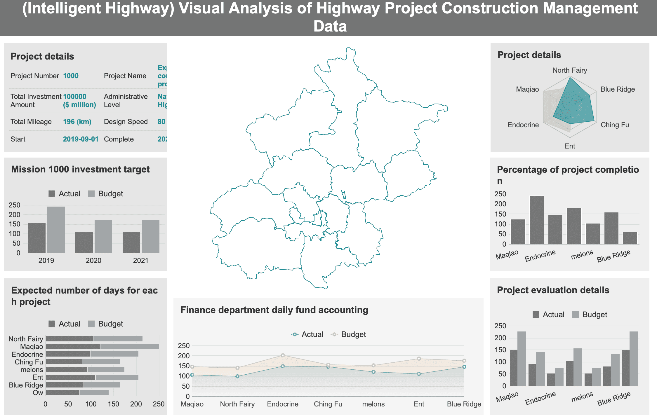
Highway Project Construction Management Dashboard Created By FineReport
Projects that succeed in reaching a broad audience have the potential to inspire significant action across diverse sectors, from healthcare and finance to education and public policy. This widespread engagement amplifies the project's impact, making its insights more valuable and transformative on a larger scale.
By prioritizing impact and reach, you ensure that data visualization tools do more than just present data; they catalyze real-world change. This focus on making a meaningful difference drives the development of more effective, innovative visualization techniques that can address complex issues and communicate crucial information to a wide array of stakeholders. Thus, the ultimate measure of a project's success lies in its ability to turn data into a catalyst for informed decision-making and progressive change.
Top Data Visualization Projects of 2026
Project 1: Cricket Data Visualization with Google Maps
Cricket enthusiasts have teamed up with Google Maps to create an innovative project that visualizes cricket-related data. This project stands out for its unique approach to integrating sports data with geographic information.
Features
Interactive Maps: You can explore cricket data on interactive maps, providing a geographical context to the statistics.
Real-Time Updates: The project offersreal-time data analysis, ensuring you always have the latest information.
User-Friendly Interface: The interface is intuitive, making it easy for you to navigate and understand the data.
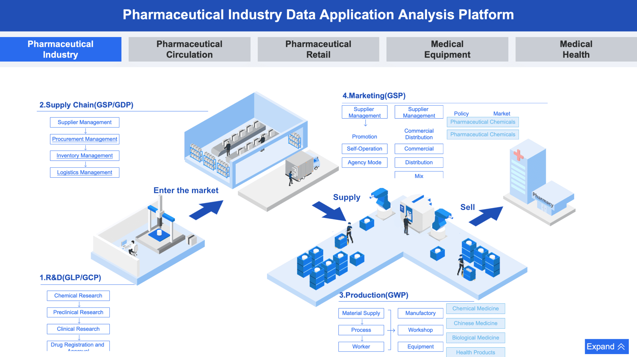
Pharmaceutical Industry Data Application Analysis Platform Created By FineReport
Enhanced Engagement: By visualizing cricket data on maps, you gain a more engaging experience.
Improved Understanding: The geographical context helps you better understand the impact of location on cricket statistics.
Accessibility: The project makes cricket data accessibleto a wider audience, including those who may not be familiar with traditional data visualization tools.
Potential Drawbacks
Limited Scope: The focus on cricket may not appeal to those interested in other sports.
Data Overload: The abundance of data might overwhelm users who prefer simpler visualizations.
Project 2: NBA Data Analytics by Interview Query
The NBA Data Analytics project by Interview Query offers a comprehensive analysis of basketball data. This project uses advanced data visualization tools to provide insights into player performance and game dynamics.
Features
Custom Dashboards: You can create custom dashboards to track specific metrics and trends.
Advanced Analytics: The project utilizes sophisticated analytics to deliver in-depth insights.
Collaboration Tools: You can collaborate with others in real-time, enhancing teamwork and decision-making.
The Information is Beautiful Awards recognize outstanding data visualization projects. The winning project for 2026 exemplifies creativity and innovation in data visualisation.
Features
Stunning Visuals: The project features visually striking graphics that captivate your attention.
Interactive Elements: You can interact with the visualizations to explore data in depth.
Broad Applicability: The project applies to various fields, showcasing the versatility of data visualization tools.
Benefits
Inspiration: The project inspires you to think creatively about data visualisation.
Versatility: Its broad applicability demonstrates how data visualization can enhance understanding across different sectors.
Engagement: The interactive elements keep you engaged and encourage exploration.
High Expectations: The award-winning status may set high expectations that could be challenging to meet.
Niche Appeal: The project's focus on aesthetics might not appeal to users seeking purely functional visualizations.
Project 4: Make Your Data Speak Dataviz Award Winner
The Make Your Data Speak Dataviz Award Winner showcases the pinnacle of creativity and innovation in data visualization. This project exemplifies how visualisation can transform raw data into compelling stories that resonate with audiences.
Features
Dynamic Visuals: The project employs dynamic visuals that adapt to user interactions, enhancing engagement.
Interactive Dashboards: You can explore data through interactive dashboards, offering a hands-on experience.
Cross-Platform Compatibility: The visualizations work seamlessly across various devices, ensuring accessibility.
Project 5: Beginner-Friendly Visualization with Matplotlib
The Beginner-Friendly Visualization with Matplotlib project offers an accessible entry point into the world of data visualization. It provides simple yet effective tools for creating insightful visualisations.
Features
User-Friendly Interface: The project features an intuitive interface, making it easy for you to create visualizations.
Basic Chart Types: You can use basic chart types like scatter plots and bar charts to represent data clearly.
Comprehensive Documentation: The project includes detailed documentation to guide you through the visualization process.
Benefits
Ease of Use: The straightforward tools allow you to focus on data insights rather than technical complexities.
Educational Value: By using this project, you can learn the fundamentals of data visualization tools and techniques.
Cost-Effective: The project offers a cost-effective solution for those starting their journey in data visualization.
Potential Drawbacks
Limited Advanced Features: The project may lack advanced features found in more sophisticated data visualization tools.
Basic Visuals: The simplicity of the visuals might not meet the needs of users seeking more complex visualisation options.
Applications of These Data Visualization Projects in Real-World Scenarios
Data visualization projects have become indispensable in various industries, offering practical solutions to complex challenges. By transforming raw data into insightful visualizations, these projects enable you to make informed decisions and drive positive outcomes. Let's explore how these projects apply to the healthcare and finance industries.
Case Study 1: Healthcare Industry
Data visualization tools are indispensable in the healthcare sector, significantly enhancing patient care and improving operational efficiencies. These tools enable healthcare professionals to effectively track patient outcomes, monitor disease trends, and optimize resource allocation across various levels of care. For instance, by visualizing comprehensive patient data, hospitals can detect underlying patterns and preemptively identify potential health risks. This proactive approach empowers medical staff to intervene early, markedly improving patient outcomes and potentially saving lives.
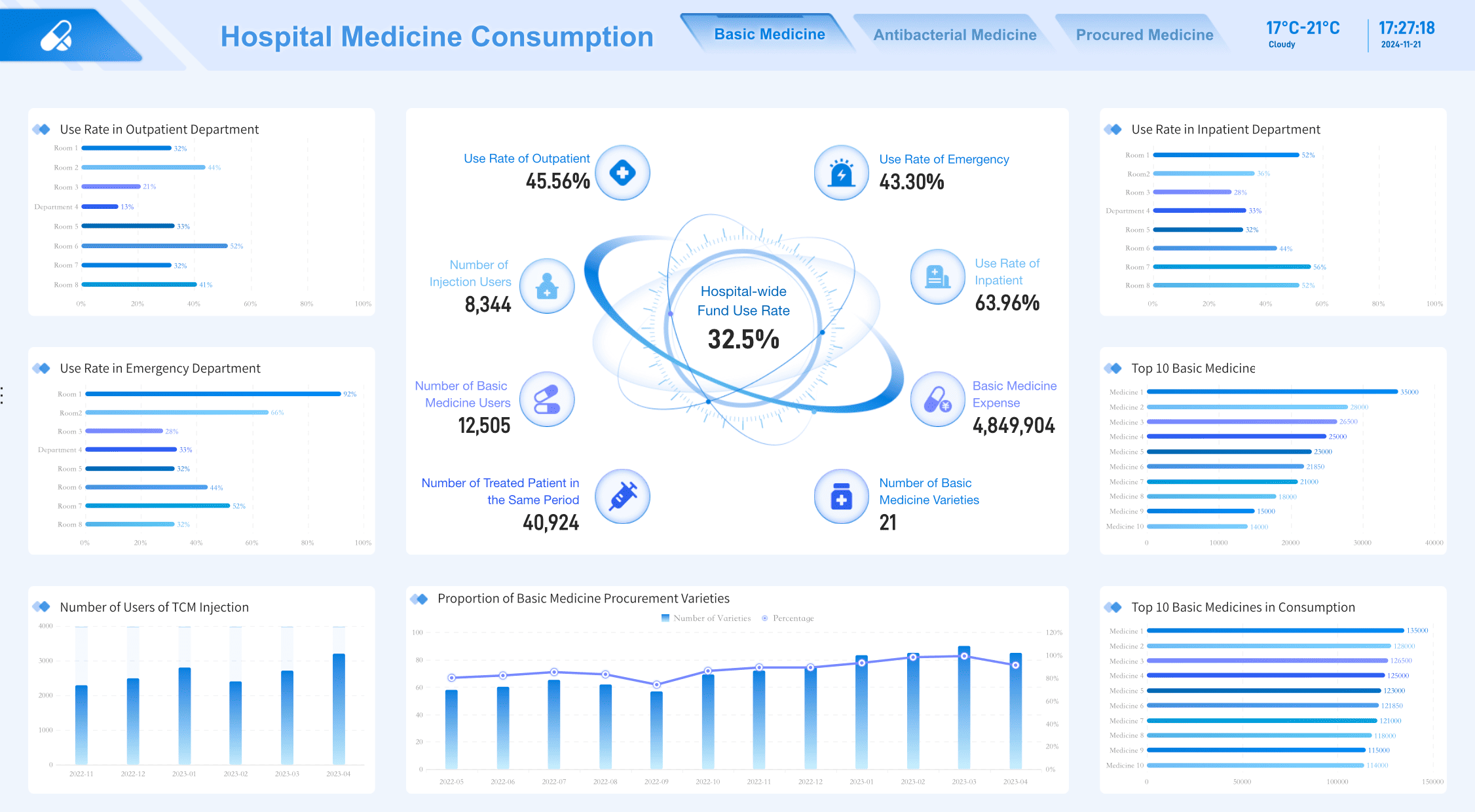
Hospital Medicine Consumption Dashboard Created By FineReport
Additionally,real-time data analysis facilitated by these tools provides healthcare providers with immediate access to up-to-date information. This capability is crucial for making informed, timely decisions that directly impact patient care. Interactive dashboards allow for quick assessments of critical metrics such as patient wait times, bed occupancy rates, and staffing levels, helping to streamline operations and allocate resources more effectively.
By integrating data visualization into their routines, healthcare providers can enhance the quality of care delivered. The insights gained from these tools not only improve individual patient management but also contribute to broader healthcare improvements, optimizing procedures and treatments across the board. This strategic use of data visualization thus plays a pivotal role in elevating healthcare standards and efficiency.
Case Study 2: Finance Industry
Data visualization tools are transformative in the finance industry, providing professionals with the means to effectively analyze market trends, assess risks, and make informed strategic investment decisions. By converting complex financial data into clear, intuitive visuals, these tools offer a deeper understanding of market dynamics, enabling users to swiftly adapt to market changes and seize opportunities.
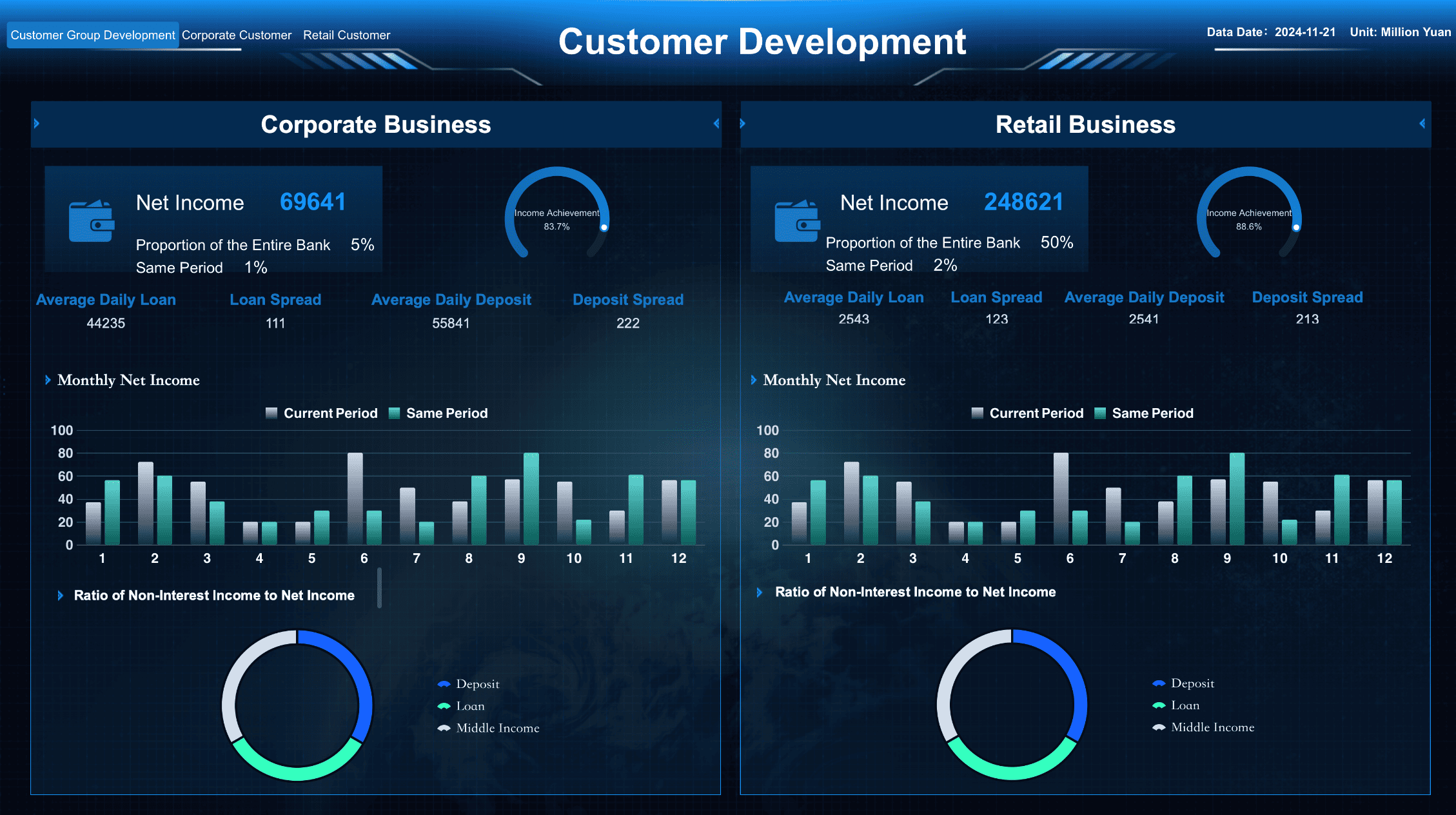
Customer Development Dashboard Created By FineReport
Beyond individual analysis, data visualization tools also promote a collaborative work environment. Features like shared dashboards andreal-time datafeeds allow financial analysts to disseminate insights quickly and efficiently across teams. This fosters a culture of data-driven decision-making, ensuring that all stakeholders are well-informed and can coordinate effectively to leverage emerging market opportunities.
Further enhancing their utility, many data visualization platforms now incorporate AI-driven features like automated journey mapping. This technology identifies and addresses friction points in customer journeys, offering critical insights that can improve customer satisfaction and drive business growth. By integrating these advanced functionalities, finance professionals can refine their strategies, enhance user experiences, and ultimately achieve superior financial outcomes. This comprehensive approach not only streamlines operations but also bolsters overall productivity and competitiveness in the fast-paced financial sector.
FanRuan's Contribution to Data Visualization Projects
FanRuan stands at the forefront of data visualization innovation. You can explore their contributions through two remarkable products: FineBI and FineVis. These tools empower you to harness data effectively, transforming it into actionable insights.
FineBI: Empowering Business Intelligence
FineBI revolutionizes how you approach business intelligence. This self-service analytics software enables you to connect, analyze, and share data seamlessly across your organization. With FineBI, you can transform raw data into insightful visualizations that drive informed decision-making.
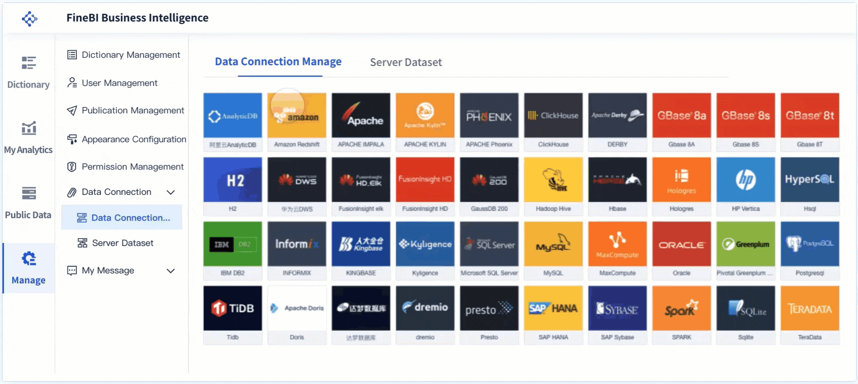
Data Connection: FineBI supports various data sources, including big data platforms and relational databases. You can easily integrate data from multiple systems, streamlining your analysis process.
Visual Analysis: The drag-and-drop functionality allows you to create multidimensional analyses effortlessly. You can explore data through interactive dashboards, gaining a deeper understanding of complex information.
Real-Time Insights: FineBI offers real-time data analysis, enabling you to make decisions based on the latest information. This feature enhances your ability to respond promptly to changing business conditions.
"FineBI empowers business users and data analysts to connect, analyze, and share data across the organization, facilitating informed decision-making."
FineVis takes data storytelling to the next level. This agile platform provides you with tools to create interactive charts, dynamic 3D visualizations, and customizable dashboards. FineVis caters to users of all technical levels, making data visualization accessible to everyone.
Zero-Code Development: You can create visualizations without any coding skills. The intuitive drag-and-drop interface simplifies the process, allowing you to focus on the story your data tells.
Dynamic Visuals: FineVis supports over 60 chart types and dynamic 3D visualizations. You can present data in engaging ways, capturing your audience's attention and enhancing understanding.
Real-Time Analytics: With real-time analytics, you can access up-to-date insights that drive quick decision-making. This feature ensures you stay ahead in fast-paced environments.
"FineVis provides significant value to its users by offering a comprehensive and user-friendly platform for data visualization and storytelling."
FanRuan's FineBI and FineVis exemplify the power of data visualization in 2026. By leveraging these tools, you can unlock the full potential of your data, driving growth and innovation in your organization.
Throughout this blog, you've explored the transformative potential of data visualization projects in 2026. These projects not only simplify complex data but also enhance communication and decision-making in a data-driven world. By embracing these tools, you can make data-driven decisions that propel your field forward. Consider diving deeper into these projects to see how they can apply to your specific needs. As you continue your journey, remember that visualisation is a powerful ally in understanding and leveraging data effectively.
Click the banner below to experience FineBI for free and empower your enterprise to convert data into productivity!
Product Trial
FineReport
Pixel-perfect reports · Interactive dashboards · Easy data entry · Digital twins
Access a wealth of case studies, industry insights, and solution guides to accelerate digital transformation.
FAQ
What is data visualization?
Data visualization transform raw data into visual formats like charts and graphs. This process makes complex information easier to understand and analyze.
Why is data visualization important in 2025?
In 2025, data visualization plays a crucial role in decision-making. It helps you quickly interpret large datasets, identify trends, and communicate insights effectively.
What are some popular data visualization tools?
Tools like FineBI and FineVis offer powerful features for creating interactive and dynamic visualizations. They cater to users of all skill levels, making data analysis accessible to everyone.
How do I choose the right data visualization tool?
Consider factors like usability, accessibility, and the specific needs of your industry. Look for tools that offer real-time analytics and support various data sources.
Can beginners use data visualization tools?
Yes, many tools provide user-friendly interfaces and comprehensive documentation. Projects like the Beginner-Friendly Visualization with Matplotlib offer an excellent starting point for newcomers.
What are some data visualization examples?
Examples include interactive maps for cricket data, custom dashboards for NBA analytics, and award-winning projects recognized by the Information is Beautiful Awards.
How do data visualization projects impact industries?
These projects enhance decision-making across sectors like healthcare and finance. They enable professionals to visualize trends, optimize resources, and improve outcomes.
What is the role of FanRuan in data visualization?
FanRuan, through products like FineBI and FineVis, empowers businesses to unlock insights and visualize success. These tools facilitate data-driven decision-making and storytelling.