You might wonder what a data visualization engineer does. Imagine transforming complex data into visuals that are easy to grasp. That's their magic! They help you see patterns and trends, making decision-making a breeze. Did you know that visuals can convince over two-thirds of an audience? Plus, they can shorten business meetings by 24%. Tools like FineBIand FineVismake this possible, turning raw data into insightful stories. So, next time you see a colorful chart or graph, remember there's a skilled engineer behind it, making data speak.
The Purpose and Importance of Data Visualization
Data visualization plays a pivotal role in today's data-driven world. It transforms complex datasets into visual formats that are easy to understand and interpret. This section explores why data visualization matters and its impact on decision-making.
Why Data Visualization Matters
You might wonder why data visualization is so important. Imagine trying to make sense of rows and columns filled with numbers. It can be overwhelming, right? Visual representations make complex data more accessible and understandable. They bring complicated concepts to life, allowing you to see patterns and trends that might otherwise go unnoticed.
Simplification: Data visualization simplifies complex information. It enables you to quickly grasp key insights without getting lost in the details.
Clarity: Visuals provide clarity. They help you discover important trends and patterns within large datasets.
Engagement: Engaging visuals capture your attention. They make data more relatable and easier to digest.
Impact on Decision Making
Data visualization doesn't just make data pretty; it drives better decision-making. When you can see the story behind the numbers, you make informed choices. Here's how it impacts decision-making:
Speed: Visuals allow you to process information faster. You can identify issues and opportunities at a glance.
Accuracy: By simplifying information, data visualization reduces the need to fill gaps with biases. You get more accurate insights.
Communication: Visuals enhance communication. They help you convey complex ideas to others, making collaboration more effective.
In essence, data visualization empowers you to make smarter decisions. It turns raw data into actionable insights, helping you navigate the complexities of the modern world.
Key Responsibilities of a Data Visualization Engineer
As a data visualization engineer, you hold the key to transforming raw data into compelling visual stories. Your role involves several critical responsibilities that ensure data becomes accessible and insightful for everyone.
Designing and Developing Visualizations
You start by designing and developing visualizations that bring data to life. Imagine taking complex datasets and turning them into interactive charts and graphs. You use tools like Tableau or Looker to create user-friendly dashboards. These dashboards help business teams understand data at a glance. Your expertise in data visualization allows you to craft visuals that are not only informative but also engaging.
Creativity: You need a creative eye to design visuals that capture attention.
Technical Skills: Proficiency in BI tools is essential for developing effective data visualisation dashboards.
Problem-Solving: You troubleshoot and fix bugs to ensure smooth functionality.
Collaborating with Data Scientists and Analysts
Collaboration is at the heart of your role. You work closely with data scientists and analysts to gather insights and ensuredata accuracy. Together, you transform raw data into meaningful visualizations. This teamwork enhances the quality of the data visualisation dashboards you create.
Communication: Clear communication with team members is crucial for successful collaboration.
Integration: You integrate data from various sources to provide a comprehensive view.
Feedback: You seek feedback to refine and improve visualizations continually.
Ensuring Data Accuracy and Integrity
Accuracy and integrity are paramount in data visualization. You ensure that the data you present is reliable and trustworthy. By maintaining high standards, you empower stakeholders to make informed decisions based on accurate insights.
Attention to Detail: You meticulously check data for errors or inconsistencies.
Validation: You validate data sources to ensure their credibility.
Quality Control: You implement quality control measures to maintaindata integrity.
In essence, as a data visualisation developer, you play a vital role in making data understandable and actionable. Your skills in designing, collaborating, and ensuring accuracy make you an indispensable part of any data-driven team.
Essential Skills for a Data Visualization Engineer
To excel as a data visualization engineer, you need a blend of technical and creative skills. These skills help you transform raw data into compelling visual stories that drive decision-making and enhance understanding.
Technical Skills of a Data Visualization Engineer
Proficiency in Programming Languages
You must master programming languages to create effective data visualizations. Languages like Python and R are essential. They allow you to manipulate data and develop custom visualizations. With these skills, you can build interactive dashboards and tools that make data accessibleto everyone.
Python: Widely used for data analysis and visualization. It offers libraries like Matplotlib and Seaborn.
R: Known for statistical analysis and visualization. It provides packages like ggplot2 for creating stunning visuals.
Understanding of Data Structures
A solid grasp of data structures is crucial. You need to know how to organize and manage data efficiently. This knowledge helps you handle large datasets and ensures your visualizations are accurate and reliable.
Arrays and Lists: Basic structures for storing data.
DataFrames: Used in Python and R for handlingtabular data.
Databases: Understanding SQL and NoSQL databases is beneficial.
Creative and Analytical Skills
Ability to Interpret Data
Interpreting data is at the heart of data visualization. You need to extract meaningful insights from complex datasets. This skill allows you to tell compelling stories through your visuals, making data more relatable and understandable.
Pattern Recognition: Spot trends and anomalies in data.
Critical Thinking: Analyze data to draw accurate conclusions.
Design Thinking
Design thinking enhances your ability to create engaging and informative visuals. You must consider the user's perspective and design visuals that are intuitive and easy to navigate. This approach ensures your visualizations communicate the intended message effectively.
User-Centric Design: Focus on the needs and preferences of your audience.
Aesthetics: Use color, layout, and typography to enhance visual appeal.
Tools Used by Data Visualization Engineers
As a data visualization engineer, you have a variety of tools at your disposal to transform raw data into compelling visual stories. These tools help you create interactive dashboards, charts, and reports that makedata accessible and insightful.
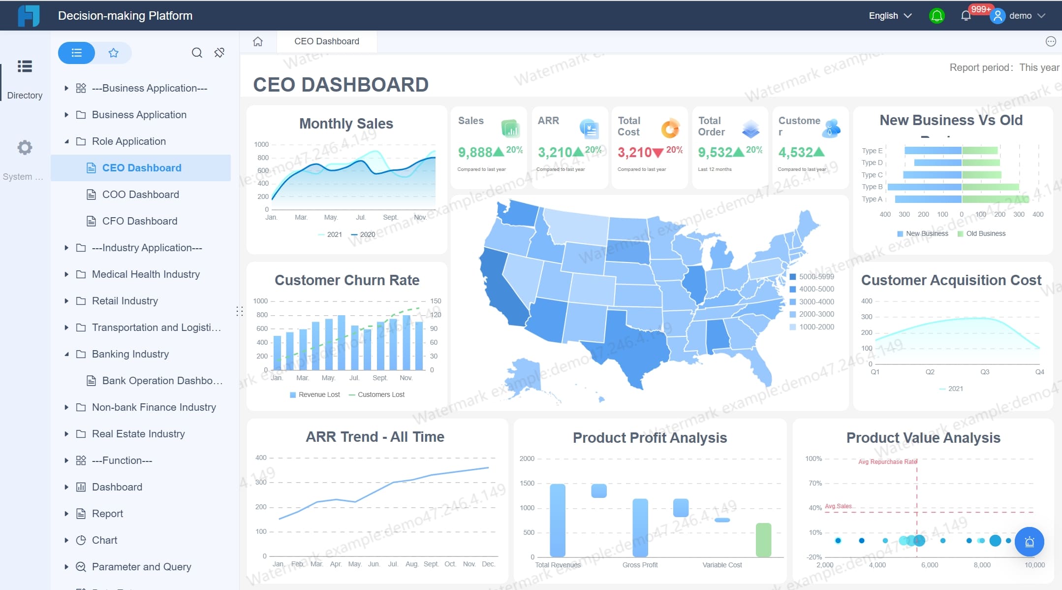
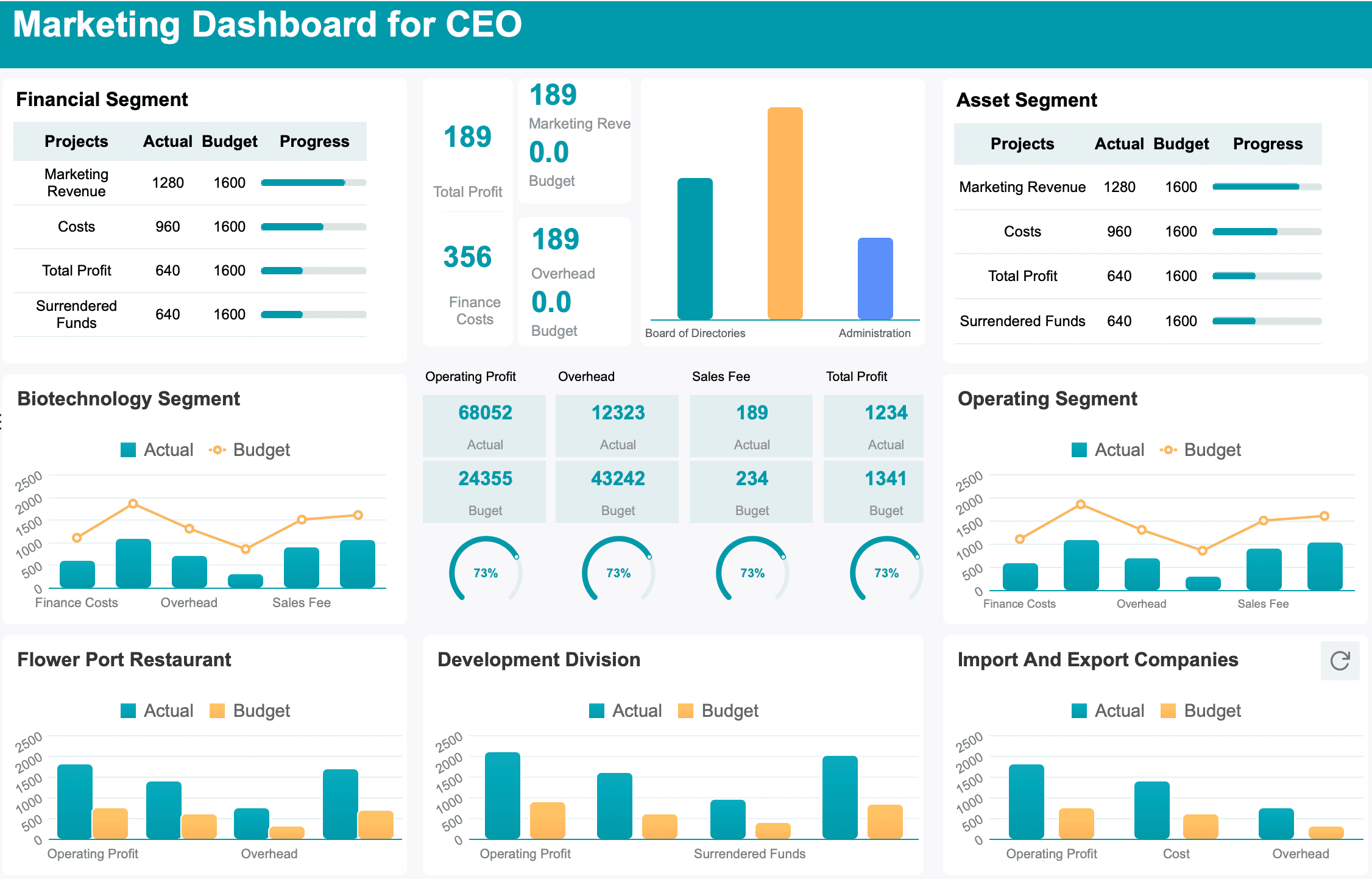
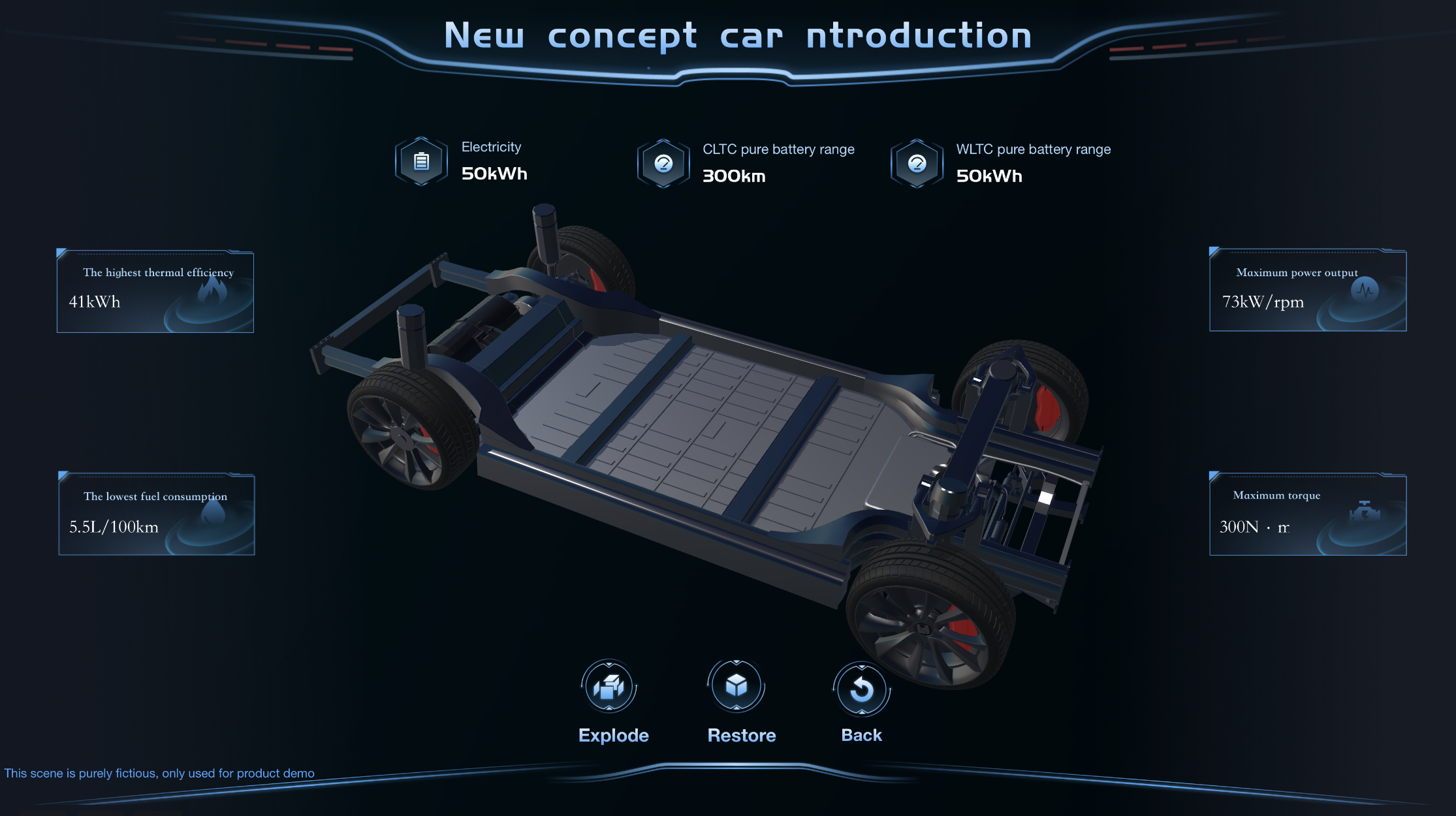
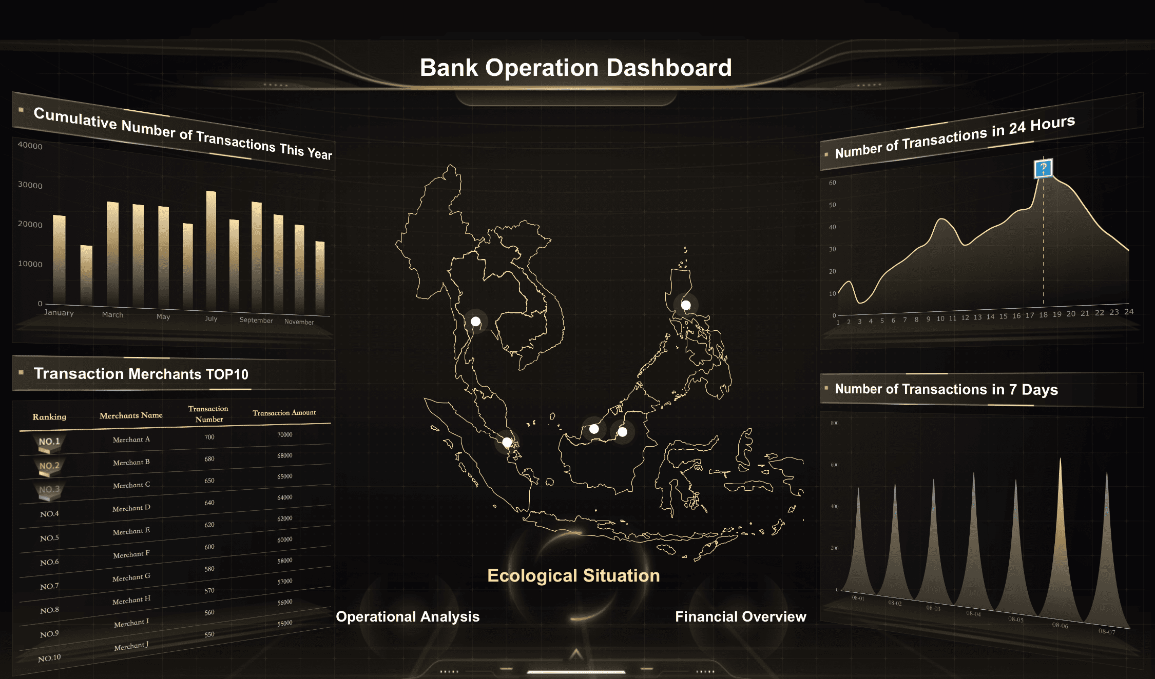
FineBIand FineVisare powerful data visualization tools that empower you to create stunning visuals with ease. FineBI offers a self-service business intelligence platform, allowing you to connect, analyze, and share data across your organization. It transforms raw data into insightful visualizations, helping you track KPIs and identify trends. FineVis, on the other hand, focuses on storytelling with data. It provides dynamic 3D visualizations and customizable dashboards, making it ideal for users of all technical levels.
New Concept Car Ntroduction Dashboard Created By FineVis
Tableau stands out as a leading data visualization software. It helps you create interactive dashboards with advanced visual analytics. You can design charts, maps, and graphs that bring your data to life. Tableau's flexibility allows you to install the software on your devices or use cloud hosting directly on Tableau's server. This versatility makes it a favorite among data visualization engineers.
Power BI
Power BI is another popular choice for developing interactive dashboards and reports. It connects to various data sources, including databases, cloud services, and spreadsheets. Power BI is suitable for both small and large organizations, catering to technical and non-technical users alike. Its user-friendly interface makes it easy for you to create visually appealing graphics that drive insights.
Programming Languages
Python: Python is a go-to language for data visualization engineers. It offers a range of data visualisation libraries like Matplotlib and Seaborn, which allow you to create detailed and informative visuals. Python's versatility and ease of use make it an essential tool in your data visualization toolkit.
R: R is another powerful language for data visualization. Known for its statistical analysis capabilities, R provides data visualisation libraries like ggplot2, which enable you to create stunning visuals. With R, you can manipulate data and develop custom visualizations that meet your specific needs.
Educational Background and Pathways of a Data Visualization Engineer
Becoming a data visualization engineer opens up a world of opportunities. You might wonder what educational background you need to pursue this exciting career. Let's explore the relevant degrees, certifications, and alternative learning paths that can set you on the right track.
Relevant Degrees and Certifications
To kickstart your journey as a data visualization engineer, consider pursuing a bachelor's degree in fields like Computer Science, Engineering, or Mathematics. These disciplines provide a strong foundation in technical and analytical skills, which are crucial for this role. Employers often look for candidates with these qualifications.
Computer Science: This degree equips you with programming skills and an understanding of data structures, both essential for creating effective visualizations.
Engineering: An engineering background helps you develop problem-solving skills and technical expertise, valuable in designing and developing visual tools.
Mathematics: A mathematics degree enhances your analytical abilities, enabling you to interpret complex datasets and extract meaningful insights.
Certifications can also boost your credentials. Consider obtaining certifications in data visualization tools like Tableau or Power BI. These certifications demonstrate your proficiency in using industry-standard software, making you a more attractive candidate to potential employers.
Alternative Learning Paths
If traditional degrees aren't your thing, don't worry! There are alternative learning paths to become a data visualization engineer. Online courses and bootcamps offer flexible options to gain the necessary skills.
Online Courses: Platforms like Coursera and Udemy offer courses in data visualization and analytics. These courses cover programming languages like Python and R, as well as visualization tools.
Bootcamps: Intensive bootcamps provide hands-on experience in data visualization. They focus on practical skills, allowing you to build a portfolio of projects that showcase your abilities.
Self-study is another viable option. You can explore free resources, tutorials, and forums to learn at your own pace. This approach requires discipline and motivation, but it allows you to tailor your learning to your specific interests and goals.
Salary Expectations for Data Visualization Engineers
Curious about how much you can earn as a data visualization engineer? Let's dive into the salary expectations for this exciting career path.
Average Salary Range
Data visualization engineers enjoy competitive salaries. In the United States, the average annual salary for this role is around $94,000. If you're just starting out, you might expect to earn approximately $62,000 per year. As you gain experience and expertise, your salary can rise significantly. Advanced-level professionals can earn up to $145,000 annually.
In major cities like New York, NY, the compensation can be even more attractive. The average annual pay for data visualization engineers in New York is about $154,796. The base salary typically ranges from $139,029 to $170,555, while total cash compensation can go from $143,699 to $181,004. These figures highlight the lucrative nature of this profession, especially in areas with high demand for data skills.
Factors Influencing Salary
Several factors can influence your salary as a data visualization engineer. Understanding these can help you navigate your career path more effectively.
Experience Level: Your experience plays a significant role in determining your salary. As you gain more experience, you become more valuable to employers, which can lead to higher pay.
Location: Where you work can greatly impact your earnings. Cities with a high cost of living or a strong demand for data skills, like New York, often offer higher salaries.
Industry: Different industries have varying salary scales. Sectors such as finance, technology, and healthcare tend to offer higher compensation for data visualization roles.
Skills and Expertise: Your proficiency in data visualization tools and programming languages can also affect your salary. Mastery of popular tools like Tableau, Power BI, and programming languages like Python and R can make you a more attractive candidate.
Education and Certifications: Holding relevant degrees and certifications can boost your earning potential. Employers often value formal education and certifications in data visualization tools.
By understanding these factors, you can better position yourself for success in the field of data visualization engineering. Whether you're just starting out or looking to advance, knowing what influences salary can help you make informed career decisions.
Career Prospects and Growth Opportunities in Data Visualization Jobs
Data visualization jobs offer exciting career prospects and growth opportunities. As a data visualisation developer, you can explore various paths that align with your skills and interests. Let's dive into the industry demand and potential career paths in this field.
Industry Demand
The demand for data visualization skills is on the rise. Many industries recognize the value of transforming complex data into visual insights. This skill set is crucial for making informed decisions and driving business success. Companies across sectors like finance, healthcare, and technology seek professionals who can convey data findings visually. Your ability to create compelling visuals makes you a valuable asset in today's data-driven world.
Data visualization is a sought-after skill set in a range of professions. Those with the training to visually convey data findings draw from critical thinking, problem-solving, technical training, and communication skills.
In data visualization jobs, you play a key role in helping organizations understand their data. Your work enables stakeholders to see patterns and trends, leading to better decision-making. As more businesses embrace data-driven strategies, the demand for skilled data visualisation developers continues to grow.
Potential Career Paths
As a data visualisation developer, you have several career paths to explore. Each path offers unique opportunities to apply your skills and advance your career.
Data Visualization Engineer: In this role, you design and develop visualizations that bring data to life. You work closely with data scientists and analysts to create interactive dashboards and reports. Your expertise in tools like Tableau and Power BI helps organizations make sense of their data.
Data Analyst: As a data analyst, you focus on interpreting data and extracting insights. You use visualization techniques to present your findings in a clear and engaging manner. This role involves collaborating with business teams to support data-driven decision-making.
Business Intelligence Analyst: In this position, you analyze business data to identify trends and opportunities. You create visual reports that help executives understand key performance indicators. Your work supports strategic planning and drives business growth.
Data Scientist: As a data scientist, you combine data analysis with advanced statistical techniques. You use visualization to communicate complex models and predictions. This role requires a deep understanding of data structures and programming languages.
Data visualization jobs offer diverse opportunities for growth and advancement. Whether you choose to specialize in engineering, analysis, or science, your skills as a data visualisation developer will open doors to exciting career prospects.
FanRuan's Role in a Data Visualization Engineer
Empowering Businesses with FineBI
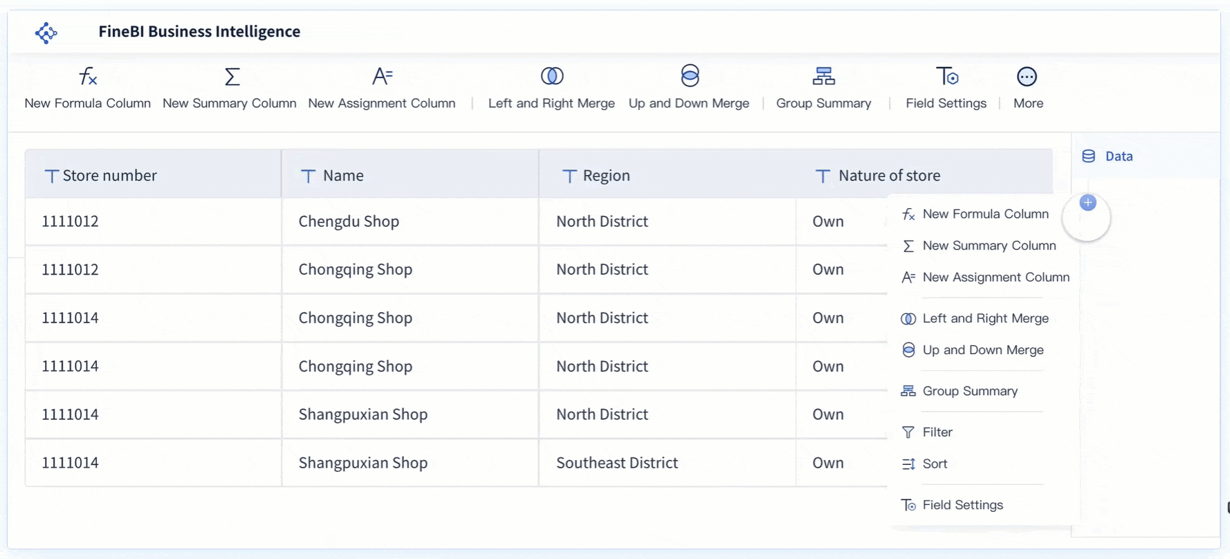
FineBI stands out as a powerful tool for data visualization engineers like you. It empowers you to transform raw data into insightful visualizations. With FineBI, you can connect, analyze, and share data across your organization. This self-service business intelligence platform simplifies complex data, making it accessible to everyone.
Data Connection: FineBI connects to various data sources, including big data platformsand relational databases. This feature allows you to integrate data seamlessly.
Visual Analysis: You can create interactive dashboards with drag-and-drop functionality. This makes it easy to perform OLAP multidimensional analysis.
Real-Time Insights: FineBI supportsreal-time data analysis. You can conduct analysis instantly after data updates, boosting efficiency.
FineBI enhances your ability to track KPIs, identify trends, and predict future outcomes. It provides a comprehensive data analytics platform suitable for various sectors. By using FineBI, you empower your organization to make informed decisions and drive strategic growth.
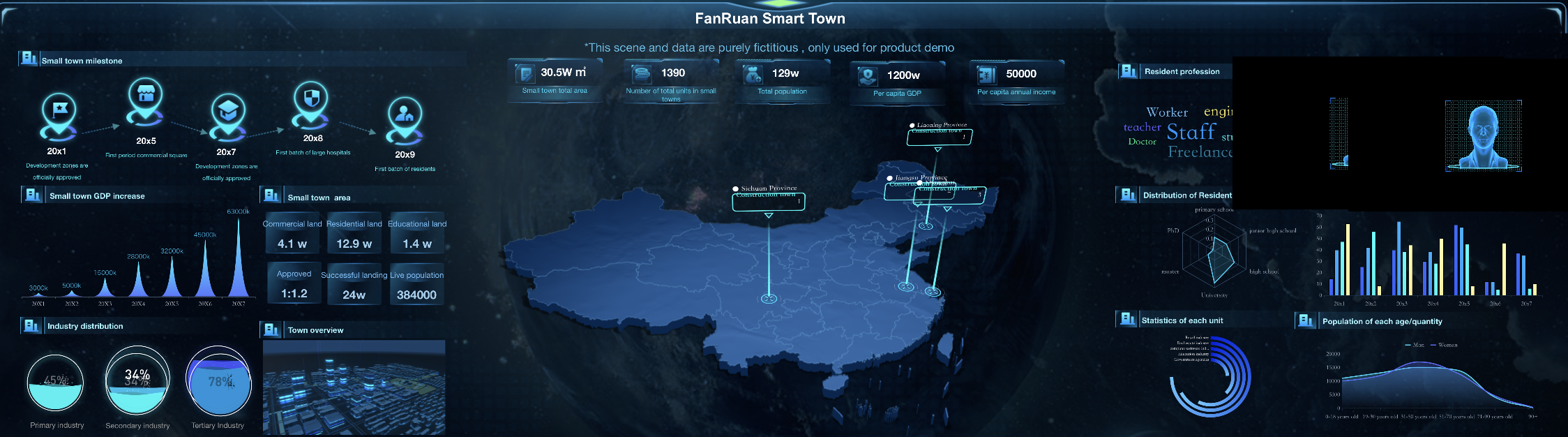
FineVistakes your data visualization skills to the next level. It focuses on storytelling with data, providing dynamic 3D visualizations and customizable dashboards. FineVis caters to users of all technical levels, making it an ideal choice for you.
Zero-Code Development: FineVis features a drag-and-drop interface. You can create stunning visuals without any coding skills.
Dynamic Visuals: The platform supports over 60 chart types and 3D visualizations. This variety allows you to present data in engaging ways.
Real-Time Analytics: FineVis offers real-time analytics, helping you make informed decisions quickly.
FineVis enhances your ability to convey complex ideas through visuals. Its industry-specific solutions make it versatile for sectors like manufacturing, healthcare, and logistics. By leveraging FineVis, you can optimize data insights and streamline decision-making.
FanRuan, through FineBI and FineVis, equips you with the tools needed to excel as a data visualization engineer. These platforms empower you to create compelling visual stories that drive business success.
As a data visualization engineer, you play a crucial role in translating complex data into actionable insights. Your skills make data visualization an essential tool for decision-making. The field of data visualization offers promising career prospects. You can explore various data visualization jobs that provide opportunities for growth and advancement. With the right skills and tools, you can thrive in this dynamic and rewarding career. Your passion for visualizing data and storytelling drives you to convey insights in compelling ways. Embrace this journey and make a significant impact in the world of data.
Click the banner below to experience FineReport for free and empower your enterprise to convert data into productivity!
Product Trial
FineReport
Pixel-perfect reports · Interactive dashboards · Easy data entry · Digital twins
Track energy and carbon in real time to reduce cost, meet disclosures, and prove ESG impact.
FAQ
What skills do I need to become a data visualization engineer?
To excel in this role, you need a mix of technical and creative skills. Proficiency in programming languages like Python and R is essential. You should also be familiar with data visualization tools such as Tableau, Power BI, and FineBI. Understanding data structures and having a knack for design thinking will set you apart. Your ability to interpret data and tell compelling stories through visuals is crucial.
How do I prepare for a data visualization engineer interview?
Preparation is key. Familiarize yourself with various data visualization tools and techniques. Understand the benefits of data visualizations and be ready to tackle real-world scenarios. Practice your storytelling skills with data. Showcasing your expertise in creating user-friendly dashboards using BI tools can make a significant impact during interviews.
What are the main responsibilities of a data visualization engineer?
Your primary responsibility involves designing and developing data visualizations and dashboards. You work with data sets from various sources to create insightful visuals. Collaboration with data scientists and analysts is crucial to ensure data accuracy. You also focus on storytelling with data, making complex information accessible and engaging for business teams.
What educational background is recommended for this career?
A bachelor's degree in Computer Science, Engineering, or Mathematics provides a strong foundation. These fields equip you with the necessary technical and analytical skills. Certifications in data visualization tools like Tableau or Power BI can enhance your credentials. Alternative learning paths, such as online courses and bootcamps, offer flexible options to gain relevant skills.
What tools do data visualization engineers commonly use?
Data visualization engineers use a variety of tools to create compelling visuals. FineBI and FineVis are popular choices for their powerful features. Tableau and Power BI are also widely used for developing interactive dashboards. Programming languages like Python and R offer libraries that help in creating detailed and informative visuals.
How does data visualization impact decision-making?
Data visualization simplifies complex information, making it easier to understand. It allows you to see patterns and trends, leading to informed decision-making. Visuals enhance communication, helping you convey complex ideas effectively. By providing clarity and engagement, data visualization empowers you to make smarter decisions.