A customer support dashboard is not just a reporting screen. For enterprise support leaders, it is the operating layer that helps teams protect SLAs, prevent backlog growth, spot customer risk early, and coordinate action across channels, regions, and escalation paths.
If you manage support operations, you already know the pain points: ticket spikes appear without warning, queues become uneven, escalations hit leadership too late, and reporting often arrives after the damage is done. A well-designed dashboard fixes that by turning live support data into fast operational decisions.
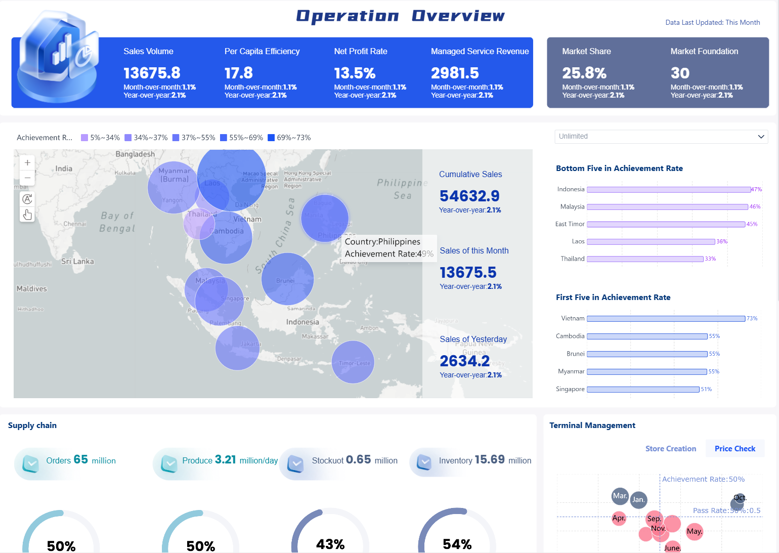
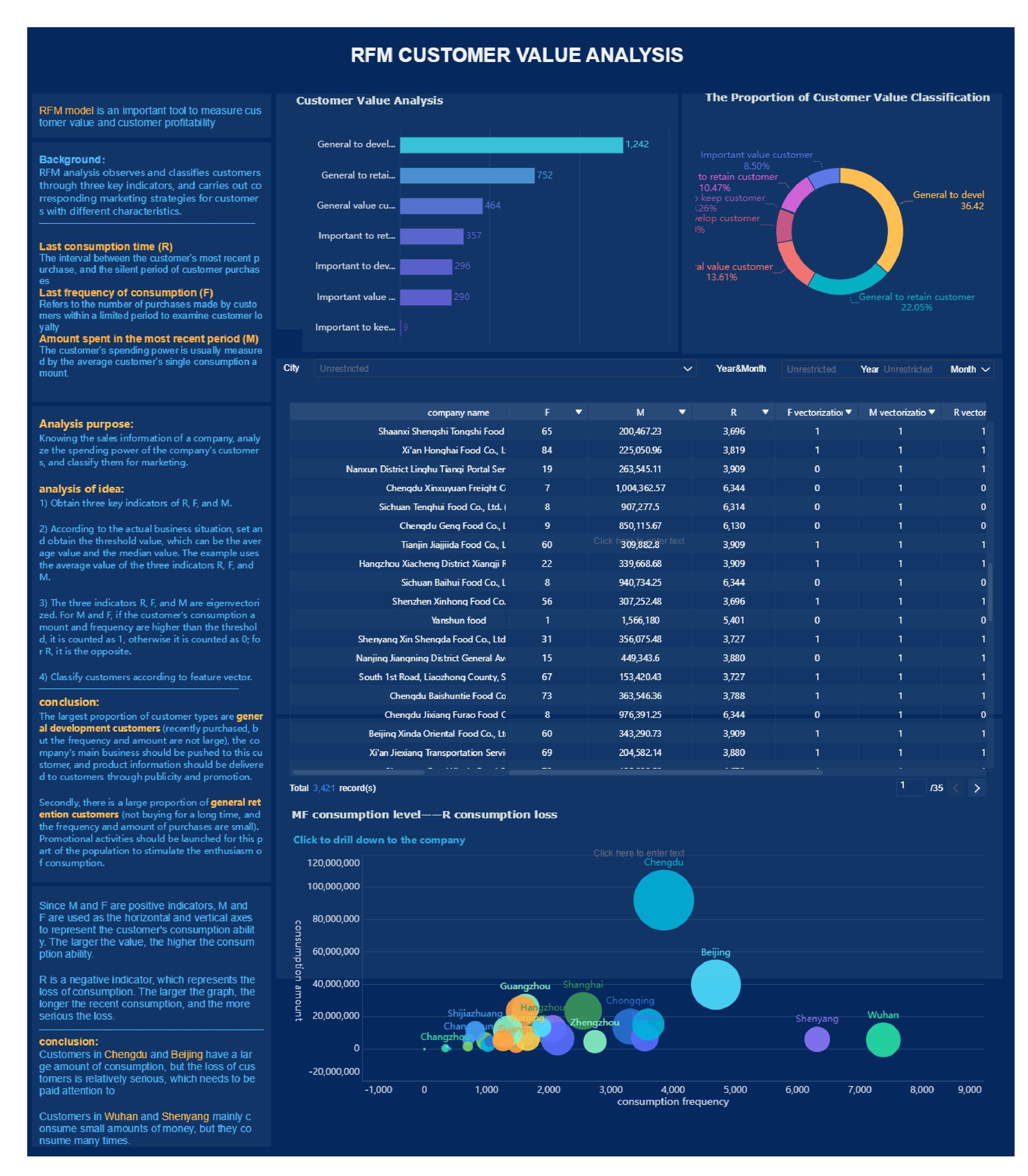
All dashboards in this article are created by FineBI
What a customer support dashboard does for enterprise teams
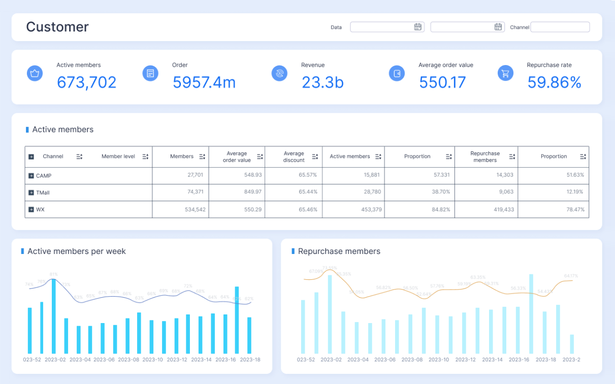
A customer support dashboard functions as a real-time command center for support operations, customer health, and team performance. It gives leaders, managers, and frontline teams a shared view of what is happening now, what is at risk next, and where intervention is needed immediately.
In enterprise environments, this matters because support is rarely simple. Teams are working across multiple channels, product lines, service tiers, languages, and geographies. Without a unified dashboard, support becomes reactive, fragmented, and difficult to govern.
A strong dashboard helps enterprise teams answer questions like:
Which queues are approaching SLA breach?
Where is backlog growing fastest?
Which agents or teams are overloaded?
Are premium accounts or strategic customers exposed?
What escalation themes are increasing?
Is customer sentiment deteriorating before CSAT confirms it?
Dashboard vs. report vs. scorecard
These three tools are often confused, but they serve different business purposes:
Dashboard: Built for monitoring and rapid action. It shows live or near-real-time metrics and alerts teams to operational risk.
Report: Built for analysis. It explains trends, compares time periods, and helps teams understand root causes after reviewing data.
Scorecard: Built for executive review. It summarizes a short list of strategic KPIs against targets for weekly, monthly, or quarterly governance.
For enterprise support teams, all three are necessary. But the customer support dashboard is the one that drives immediate operational control.
The enterprise support scenario
In a typical enterprise setup, support leaders are managing:
Multiple ticket queues by product, issue type, or service tier
SLA commitments by customer segment or contract level
Omnichannel inflow from email, chat, phone, web forms, and messaging
Regional handoffs across time zones
Escalation paths to engineering, account management, compliance, or leadership
Priority handling for VIP, regulated, or revenue-sensitive accounts
That complexity is exactly why a customer support dashboard must be intentional. It should not be a generic KPI wall. It should reflect how your support organization actually runs.
Step-by-step guide to building your customer support dashboard from the ground up
Start with the decisions the dashboard must support
The first mistake most teams make is starting with charts. Start with decisions instead.
Your dashboard should help specific roles make specific decisions within defined time windows. If a metric does not trigger a decision, it probably does not belong on the main dashboard.
Typical daily real-time decisions include:
Support leaders deciding whether to reassign coverage between queues
Team managers deciding when to intervene on at-risk SLAs
Workforce coordinators deciding whether staffing needs to shift by hour or region
Agents deciding which tickets to prioritize next
Escalation managers deciding which issues require cross-functional response
Executives deciding whether a service issue is materially affecting revenue, retention, or brand risk
Map each decision to three things:
Owner: Who is accountable for acting?
Response window: How fast must they respond?
Success threshold: What outcome defines acceptable performance?
A practical structure looks like this:
Queue backlog > owner: support manager > response window: 30 minutes > threshold: backlog under target by end of shift
VIP escalation opened > owner: escalation manager > response window: immediate > threshold: response within contract commitment
Agent overload > owner: team lead > response window: 1 hour > threshold: workload rebalanced across team
Choose the metrics that drive action
Metrics should drive intervention, not just visibility. For a high-value customer support dashboard, prioritize indicators that tell teams where to act now and what to improve over time.
Key Metrics (KPIs)
Service Level (SLA Attainment): Percentage of tickets responded to or resolved within defined SLA commitments.
First Response Time (FRT): Time between ticket creation and first human or qualified support response.
Resolution Time: Total elapsed time from case creation to final resolution.
Backlog Volume: Number of open unresolved tickets, often segmented by age, priority, and queue.
Reopen Rate: Percentage of resolved tickets reopened by customers, indicating resolution quality issues.
CSAT: Post-interaction satisfaction score reflecting customer-perceived service quality.
Escalation Volume: Number of issues escalated internally or externally, often tied to severity or account importance.
Wait Time: Time customers spend waiting in live support channels such as chat or phone.
Ticket Intake by Channel: Distribution of support demand across email, chat, phone, portal, or messaging.
Queue Aging: How long tickets remain open, especially in risk categories such as high priority or strategic accounts.
Agent Capacity Utilization: Workload level per agent or team, useful for staffing and workload balance.
First Contact Resolution: Share of issues resolved without follow-up, often a strong indicator of efficiency and quality.
Sentiment or Frustration Signals: Early-warning indicators from conversations that suggest customer dissatisfaction before survey data arrives.
Critical Incident Count: Open major issues affecting multiple customers, services, or contractual obligations.
The most effective dashboards also separate metrics into two categories:
Leading indicators
These help teams act before service failure spreads:
Rising queue volume
SLA risk tickets
Aging backlog
Agent overload
Escalation spikes
Negative sentiment trend
Wait time increase
Lagging indicators
These confirm performance after the fact:
CSAT
Reopen rate
Final resolution time
Monthly SLA attainment
Trend in churn-linked support cases
The rule is simple: use leading indicators to manage operations, and lagging indicators to improve the system.
Design the layout for speed and clarity
A customer support dashboard should reduce cognitive load. In high-pressure support environments, clutter is operational risk.
Design the screen so users can scan from top-left to bottom-right and immediately understand current health, active risk, and next steps.
A proven enterprise layout groups widgets into four zones:
1. Queue health
This section answers: where is service risk building?
Include:
Live open ticket count
New vs. resolved tickets
Backlog aging by queue
SLA breach risk table
Priority case count
Regional or channel queue split
2. Agent capacity
This section answers: do we have enough coverage to respond effectively?
Include:
Available vs. active agents
Workload by team member
Tickets per agent
Shift coverage by region
Handoff delay indicators
3. Customer sentiment
This section answers: are customers becoming frustrated before formal surveys show it?
Include:
CSAT trend
Negative feedback count
Sentiment trend by queue or product
Top complaint themes
Recovery status on failed experiences
4. Critical incidents and escalations
This section answers: which issues need immediate leadership attention?
Include:
Major incident status
Escalation volume by cause
VIP account risk alerts
Engineering dependency queue
Communication status for affected customers
Use visual discipline:
Red only for true urgent risk
Threshold markers on every critical KPI
Drill-down paths from summary tiles to queue, agent, account, or ticket detail
Consistent time windows across widgets
Minimal chart variety to keep interpretation fast
Connect data sources and set refresh rules
Even the best dashboard fails if the data is stale, inconsistent, or disputed.
Enterprise support dashboards usually need data from:
Ticketing systems
Chat platforms
Phone or contact center tools
CRM systems
Knowledge base or help center platforms
Incident management systems
Workforce management tools
Customer health or success platforms
Your integration model should define:
Refresh frequency: Real-time, every 5 minutes, every 15 minutes, hourly, or daily by metric type
Data ownership: Which team owns the integrity of each source
Metric definitions: One agreed definition for every KPI
Data-quality checks: Rules for missing statuses, duplicate tickets, stale timestamps, and broken channel mappings
A practical standard is to refresh high-risk operational metrics more frequently than strategic trend metrics. For example:
Queue volume, SLA risk, and wait times: every 1 to 5 minutes
Agent performance and backlog trends: every 15 to 60 minutes
CSAT and executive summaries: hourly or daily depending on collection logic
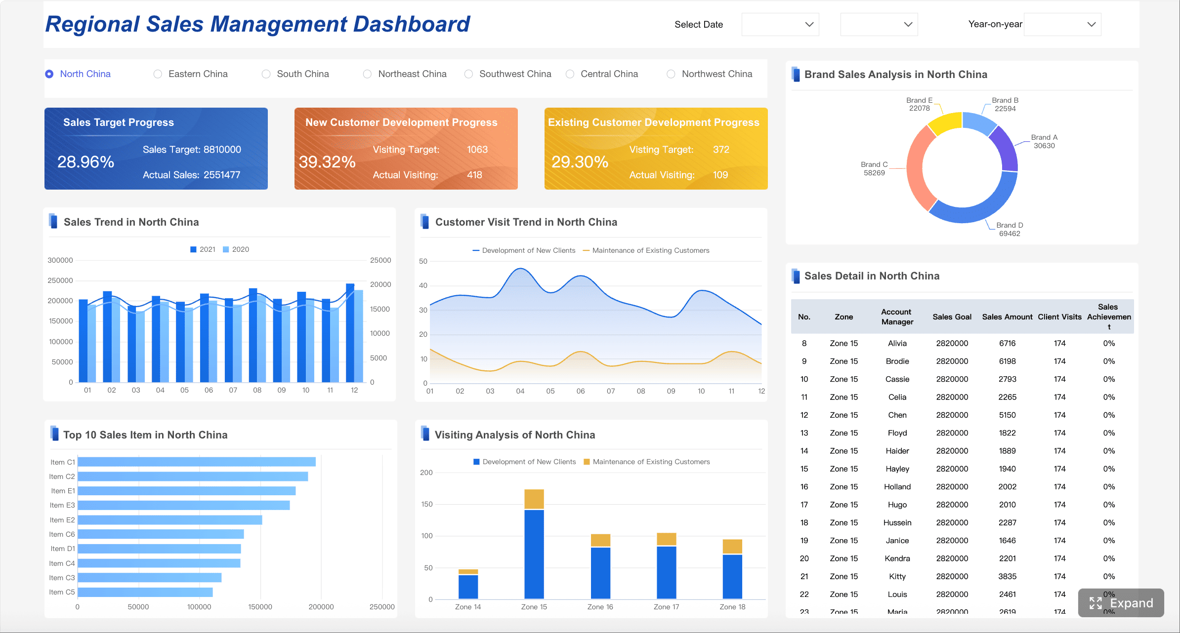
Core customer support dashboard views every support command center should include
Real-time operations view
This is the frontline control tower. It should show the current state of support operations and identify where service levels are under threat.
Key elements include:
Live queue volume
Tickets approaching SLA breach
Current wait times by channel
Priority and severity-based case counts
Staffing coverage by shift and region
Open critical incidents
Recent surge patterns by hour
This view is ideal for support managers, command center leads, and workforce planners.
Team performance and coaching view
This view should help managers improve execution quality, not just compare people.
Track:
Productivity by team and agent
Handle time and response time patterns
Quality assurance scores
Reopen trends by issue type
Coaching flags
Training opportunity clusters
Performance versus complexity mix
This view is best used weekly or in recurring manager reviews, even if underlying data updates continuously.
Customer experience and service view
Operational metrics alone do not tell the full story. This view connects support performance to customer perception and downstream business risk.
Include:
CSAT by channel, queue, and segment
Sentiment trend over time
Churn risk indicators tied to support behavior
Escalation themes
Service recovery workflow status
Top complaint categories
Customer effort or friction patterns
This is where support leaders start translating activity into customer health insights.
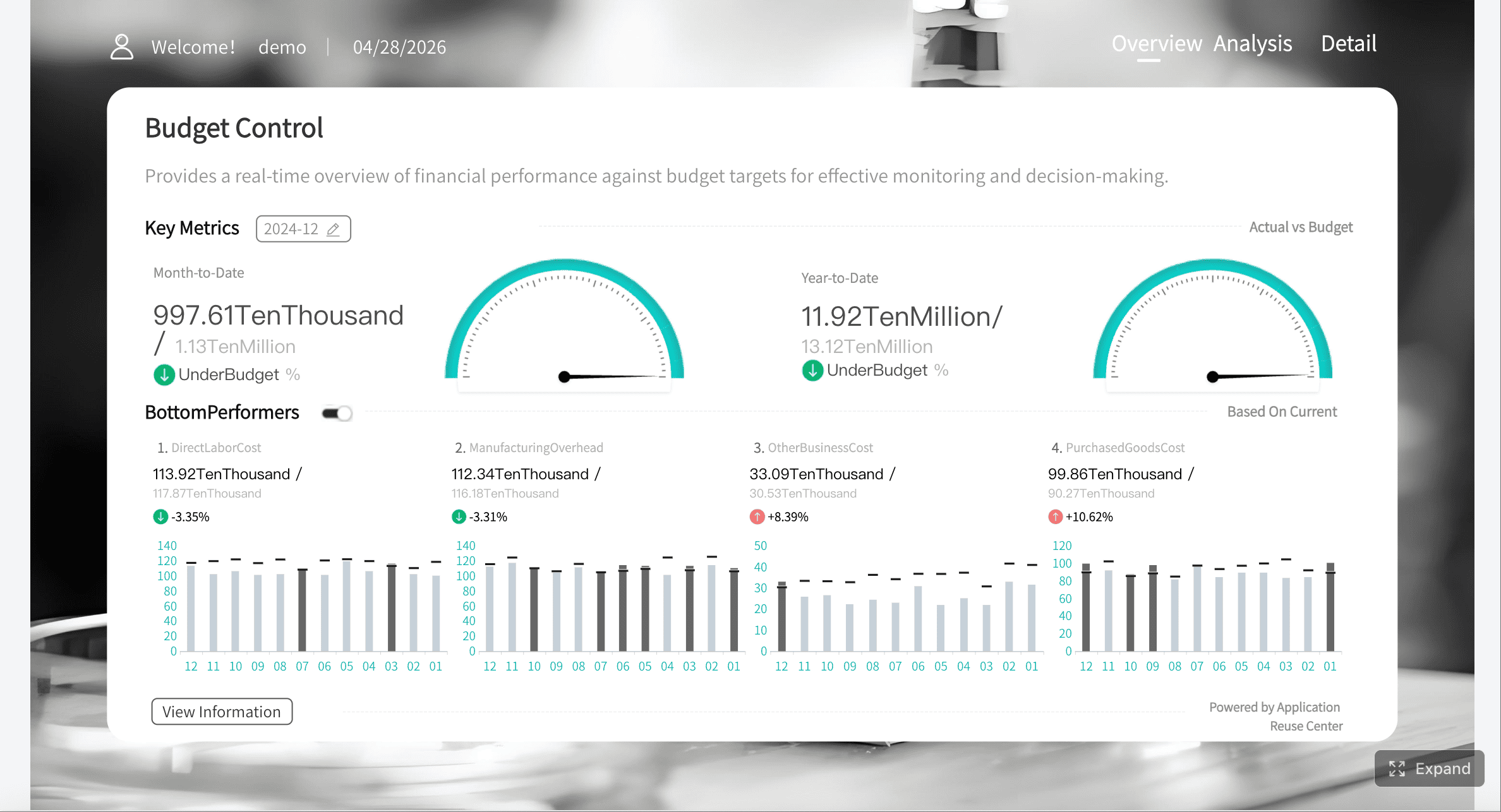
Executive reporting view
Executives do not need operational noise. They need trends, exceptions, and business impact.
An executive view should summarize:
SLA trend against target
Ticket demand trend
Escalation and incident exceptions
Customer satisfaction movement
Enterprise account risk summary
Cost or productivity trend
Support impact on retention, renewals, or expansion risk
This view supports weekly business reviews, leadership updates, and cross-functional governance.
Customer support dashboard examples for common B2B scenarios
High-growth SaaS support team
A fast-scaling SaaS company usually faces sharp fluctuations in ticket volume tied to onboarding, product releases, and renewal cycles.
A customer support dashboard for this scenario should emphasize:
Onboarding-related ticket categories
Product issue spikes after releases
Premium account coverage
FRT and resolution time by segment
Renewal-risk accounts with repeated support friction
Knowledge base deflection opportunities
The goal is not just queue control. It is protecting growth and retention while the support team scales.
Global enterprise help desk
A global help desk needs visibility across locations, languages, and handoffs. The biggest risk is often not volume itself, but fragmented execution between regions.
This dashboard should highlight:
Regional queue health
Multilingual coverage gaps
Handoff delays between time zones
Follow-the-sun staffing status
SLA attainment by geography
Local incident clusters
Shared services dependency bottlenecks
This setup helps operations leaders maintain consistency in a distributed support model.
Technical support and incident response team
Technical support teams need a dashboard that blends support metrics with engineering dependencies and incident severity.
Focus on:
Severity levels
Root-cause categories
Time to triage
Engineering escalation load
Open bug-linked cases
Incident communication status
Customer impact footprint
In this use case, your customer support dashboard becomes a bridge between support, SRE, and engineering.
Account-based support model
In account-based support, the unit of analysis is not only the ticket. It is the customer account.
The dashboard should show:
Top accounts with open risk
VIP escalations
Ticket concentration by strategic account
Support trend by segment
Customer health by account tier
Renewal-sensitive support issues
Executive sponsor notifications
This enables account teams and support leaders to work from the same operational truth.
Common mistakes to avoid when building a real-time customer support dashboard
Many dashboards fail because they try to satisfy everyone at once. Enterprise support teams should avoid these common errors:
Tracking too many metrics without clear decisions attached
A dashboard overloaded with KPIs creates noise, not action. Every metric should answer a practical question and support a defined operational response.
Mixing executive KPIs with agent-level operational signals in one crowded screen
Executives need summary and business impact. Managers need queue detail. Agents need prioritization. Separate views by role instead of forcing one universal screen.
Ignoring data definitions, refresh timing, and ownership for metric accuracy
If teams disagree on what “resolution time” or “SLA breach” means, your dashboard loses trust immediately. Governance is part of dashboard design, not an afterthought.
Launching without alert rules, escalation playbooks, or review cadences
Visibility alone does not improve support performance. Teams need alerting logic, ownership rules, and standard actions for common risk patterns.
A good customer support dashboard always has an operating model behind it.
How to roll out, review, and improve the customer support dashboard over time
A dashboard should be treated like an operational product, not a one-time BI project.
Pilot with one support team first
Start with one queue, region, or business unit. Validate the KPI definitions, thresholds, and user workflows before scaling across the support organization.
During the pilot, test:
Whether users can act on signals fast enough
Whether drill-down paths are useful
Whether thresholds are too sensitive or too loose
Whether the data refresh rate matches operational needs
Create weekly and monthly review routines
A dashboard becomes valuable when it shapes behavior consistently.
Set review cadences such as:
Daily: queue health, SLA risk, staffing, active incidents
This protects consistency as teams, tools, and workflows evolve.
Keep reusable templates and example layouts
As support organizations expand, new regions, queues, and teams often need similar views. Build a template library so you can scale dashboard adoption faster without rebuilding from scratch every time.
Building this manually is complex; use FineBI to utilize ready-made templates and automate this entire workflow.
Utilize ready-made templates and automate this entire workflow with FineBI
For enterprise teams, the challenge is not just visualization. It is consolidating data from ticketing, chat, phone, CRM, knowledge base, and incident systems, then translating that data into role-based dashboards that refresh reliably and support action in real time.
Connect multiple support data sources into one governed analytics layer
Use ready-made dashboard templates to accelerate rollout
Build role-based views for operations, team leads, and executives
Automate refresh schedules and standardize KPI definitions
Create drill-down paths for queues, agents, channels, regions, and accounts
Scale reusable dashboard frameworks across teams and business units
If your goal is to create a customer support dashboard that actually functions as a real-time command center, speed and governance both matter. FineBI gives enterprise support leaders a faster path to production without sacrificing control.
The most effective support organizations do not just measure service. They operationalize it. A well-built customer support dashboard makes that possible by turning live support data into coordinated action, stronger customer outcomes, and more confident executive oversight.
A customer support dashboard gives teams a real-time view of ticket volume, SLA risk, backlog, escalations, and customer sentiment so they can act quickly. It is designed to support daily operational decisions, not just historical reporting.
The most useful metrics usually include SLA attainment, first response time, resolution time, backlog volume, reopen rate, CSAT, wait time, and escalation volume. Enterprise teams often also track queue health, channel performance, and VIP account risk.
A dashboard is meant for live monitoring and immediate action, while a report explains trends after the fact. A scorecard is typically a higher-level summary of strategic KPIs against targets for periodic reviews.
For operational use, it should refresh in real time or near real time so managers can respond to spikes, breaches, and queue imbalance quickly. Less frequent updates reduce its value as a command center.
Support leaders, team managers, workforce planners, escalation managers, agents, and executives can all use it, but each role needs a view tied to its decisions. The best dashboards match metrics, thresholds, and alerts to the actions each audience must take.
Product Trial
FineReport
Pixel-perfect reports · Interactive dashboards · Easy data entry · Digital twins


 The most effective support organizations do not just measure service. They operationalize it. A well-built customer support dashboard makes that possible by turning live support data into coordinated action, stronger customer outcomes, and more confident executive oversight.


