A customer service dashboard consolidates support metrics—ticket volume, response time, SLA compliance, CSAT, agent workload—into a single interactive view, enabling support managers to monitor performance, identify bottlenecks, and make data-driven decisions in real time. Organizations using visual data discovery tools are 28% more likely to find timely information, and analytics investments deliver $13.01 of value for every dollar spent (Forrester). Yet many support teams still rely on static spreadsheets or disconnected reports that lag behind actual operations.
This guide defines customer service dashboards, distinguishes them from related dashboard types, covers essential KPIs and examples, explains data source integration, and shows how FineBI enables self-service support analytics at scale.
What Is a Customer Service Dashboard?
A customer service dashboard is a visual interface that aggregates and displays key support team metrics from ticketing systems, CRM platforms, survey tools, and communication channels. It provides real-time or near-real-time visibility into operational performance, allowing managers to:
Monitor ticket volume, backlog, and resolution trends as they happen.
Track SLA compliance and escalate breaches before they impact customers.
Measure customer satisfaction (CSAT), effort (CES), and sentiment across touchpoints.
Assess agent productivity, utilization, and quality scores.
Identify recurring issues, product defects, or process gaps from support data patterns.
Unlike periodic reports, customer service dashboards are interactive: users filter by channel, product, region, team, priority, or time period without requesting new extracts. This self-service capability compresses the insight-to-action cycle from days to minutes.
Customer Service Dashboard vs Customer Dashboard vs CX Dashboard
These terms are frequently conflated but serve distinct audiences and purposes. Confusing them leads to dashboards that satisfy no one.
Dashboard Type
Main User
Main Purpose
Customer service dashboard
Support managers, service teams
Track tickets, SLA, response time, resolution, CSAT
Track calls, queue time, abandon rate, agent workload
Key distinctions:
Customer service dashboards focus on operational support performance: how fast, how well, and how consistently the team resolves issues.
Customer dashboards focus on individual customer relationships: purchase history, contract status, engagement score. They belong to sales and account management.
CX dashboards focus on holistic experience quality: NPS trends, journey friction, verbatim sentiment analysis. They span touchpoints beyond support.
Call center dashboards are a subset of customer service dashboards specialized for voice/channel-specific metrics (abandon rate, average handle time, queue depth).
Anchor text and internal links should reflect these distinctions. Linking "customer service dashboard" to customer dashboard content confuses search intent and dilutes topical authority.
Why Support Teams Need Customer Service Dashboards
Support operations generate high-volume, time-sensitive data. Without centralized visibility, teams face four systemic problems that dashboards solve:
Delayed awareness. Weekly reports surface issues after they have already impacted customers. Real-time dashboards enable intraday course correction.
Siloed data. Ticketing, CRM, survey, and chat data live in separate systems. Integrated dashboards create a unified view that reveals cross-system patterns.
Reactive management. Without trend visibility, managers respond to escalations rather than preventing them. Dashboards surface leading indicators (backlog growth, CSAT decline, SLA breach acceleration) before they become crises.
Inconsistent measurement. Ad-hoc spreadsheets produce conflicting numbers. Governed dashboards establish a single source of truth for support KPIs.
Organizations with high data-driven decision-making are 5% more productive and 6% more profitable (MIT Sloan). For support teams specifically, dashboard-enabled visibility correlates with reduced resolution times, improved CSAT, and lower agent attrition.
Customer Service Dashboard KPIs and Metrics
Selecting the right KPIs prevents dashboard overload. Below are the ten most actionable customer service metrics, organized by diagnostic purpose.
KPI
What It Measures
Why It Matters
First response time
How fast agents reply to new tickets
Directly impacts customer perception; top driver of CSAT
Average resolution time
How long it takes to solve issues end-to-end
Indicates process efficiency and complexity management
Customer satisfaction rating after service interaction
Outcome metric reflecting overall service quality
CES (Customer Effort Score)
How easy it was for customers to get help
Stronger predictor of loyalty than CSAT in many industries
Reopen rate
Cases reopened after being marked resolved
Signals premature closure, quality gaps, or misdiagnosis
Agent utilization
Active work time vs. available capacity
Balances productivity against burnout; informs staffing
KPI selection principles:
Limit primary dashboards to 5–8 KPIs. Secondary detail belongs in drill-down views.
Pair efficiency metrics (response time, resolution time) with quality metrics (CSAT, FCR, reopen rate). Optimizing speed alone degrades outcomes.
Set thresholds with color-coded status indicators. Numbers without context do not trigger action.
Track trends, not just snapshots. A CSAT of 4.2 means little without knowing whether it was 4.5 last month.
Customer Service Dashboard Examples
Dashboards should be designed around user roles and decision contexts. Below are proven customer service dashboard types with representative KPIs and primary consumers.
Dashboard Example
Key KPIs
Primary Users
Decision Supported
Support operations overview
Ticket volume, backlog, avg resolution time, SLA %
Support managers, directors
Daily operational health check; resource allocation
Agent performance dashboard
FCR, CSAT, utilization, avg handle time, quality score
Team leads, supervisors
Coaching, recognition, workload balancing
CSAT and feedback dashboard
CSAT trend, CES, NPS, verbatim sentiment, tag distribution
Support leaders, CX teams
Service quality monitoring; improvement prioritization
All dashboard examples above can be built with FineBI's drag-and-drop interface, supporting drill-down, filtering, cross-highlighting, and scheduled refresh for distributed support teams.
Match survey responses to ticket IDs for correlation
Call center / telephony (Genesys, Five9, Amazon Connect)
Call records, queue metrics, recordings
High-volume streaming; may require aggregation layer
Chat / messaging (Intercom, LiveChat, Teams)
Conversation transcripts, session metadata
Semi-structured; needs parsing for metric extraction
Knowledge base (Confluence, Notion, Help Scout Docs)
Article views, search queries, feedback ratings
Identifies self-service gaps and content improvement opportunities
Product / telemetry systems
Error logs, feature usage, crash reports
Correlates support volume with product events
FineDataLink connects and synchronizes data from ticketing systems, CRM, call center platforms, chat tools, survey systems, and databases, giving FineBI a reliable data foundation for customer service dashboards. Automated pipelines eliminate manual exports, ensure freshness, and apply validation rules before data reaches dashboards.
Building an effective dashboard follows a structured process—not a tool-first approach.
Define the audience and question. Who will use this dashboard daily? What specific decision does it inform? "Support manager morning standup: where are we breaching SLA today?" is actionable. "Show all support data" is not.
Select 5–8 primary KPIs. Map each KPI to the defined question. Exclude interesting-but-not-actionable metrics.
Identify and integrate data sources. Inventory required fields from each system. Use FineDataLink to automate synchronization and validate data quality before dashboard consumption.
Design for hierarchy and flow. Place the most critical metric top-left. Group related KPIs. Use color semantically (red = breach, green = healthy). Avoid decorative elements.
Enable self-service exploration. Add filters for channel, team, product, priority, and date range. Support drill-down from summary to detail. Business users should answer follow-up questions without IT involvement.
Set refresh frequency to decision cadence. Operational dashboards may need 5–15 minute refresh. Strategic views can update hourly or daily. Match infrastructure investment to actual need.
Implement access controls. Row-level security ensures team leads see their teams; managers see consolidated views; executives see enterprise summaries. Protect sensitive customer data.
Test with real users. Conduct usability sessions. Ask users to find a specific insight within 30 seconds. Iterate based on feedback before broad rollout.
Establish governance. Document KPI definitions, data lineage, and ownership. Schedule quarterly reviews to retire unused widgets and incorporate evolving needs.
Measure adoption and iterate. Track dashboard usage, query patterns, and user feedback. Low adoption signals design or relevance problems—not user deficiency.
Best Practices for Customer Service Dashboard Design
Practice
Rationale
Common Pitfall to Avoid
Lead with the business question
Ensures every widget serves a decision
Building around available data instead of needed insights
Balance speed and quality metrics
Prevents optimizing response time at CSAT's expense
Tracking only efficiency KPIs
Show trends, not just current state
Reveals direction and velocity of change
Single-point snapshots without historical context
Use consistent definitions across dashboards
Eliminates conflicting numbers in meetings
Each team calculating CSAT differently
Design mobile-first for frontline staff
Support supervisors check dashboards between interactions
Desktop-only layouts unreadable on phones
Automate distribution for routine consumption
Pushes insights to users rather than requiring pull
Expecting users to remember to check dashboards
Embed alerts for threshold breaches
Surfaces exceptions without constant monitoring
Relying solely on visual scanning
Separate operational from strategic views
Prevents cognitive overload in daily standups
Cramming 20 KPIs into one screen
Validate data quality at pipeline level
Ensures dashboard trustworthiness
Debugging dashboard numbers during executive reviews
Review and prune quarterly
Keeps dashboards relevant as priorities shift
Accumulating legacy widgets nobody uses
How FineBI Supports Customer Service Dashboards
FineBI helps customer service teams connect support, CRM, survey, and operations data into interactive dashboards. Managers can monitor ticket volume, SLA performance, CSAT, backlog, agent workload, and issue trends in one place, then drill down by channel, product, region, priority, or team.
Key capabilities for customer service analytics include:
Self-service dashboard builder. Drag-and-drop interface with pre-built support analytics templates. No coding required for business users.
Multi-source connectivity. Native connectors for major ticketing, CRM, and survey platforms. FineDataLink handles complex ETL pipelines underneath.
Interactive exploration. Drill-down, filtering, cross-highlighting, and parameter controls let managers investigate root causes without returning to IT.
Scheduled refresh and alerting. Automate data updates and push dashboard snapshots via email or embedded links. Threshold-based alerts notify managers of SLA breaches or CSAT drops.
Mobile-native experience. Responsive dashboards render correctly on phones and tablets for supervisors managing distributed or remote teams.
Enterprise-grade security. Row-level permissions ensure team leads see only their teams; regional managers see their territories; executives see consolidated views. Sensitive customer PII can be masked at the field level.
Customer service dashboards show what is happening across tickets, SLA, CSAT, and agent workload. Support managers often need the next layer: why a KPI moved, which team or product drove the change, and what action to take before the next review cycle.
Dora helps managers ask follow-up questions, summarize weekly service changes, detect unusual KPI movements, and receive role-based briefings based on trusted support dashboards and business data. Dora operates as an AI analysis layer on top of governed FineBI dashboards—it does not replace them.
Practical applications for support teams:
Natural-language Q&A. Ask "Why did first response time increase last week?" and receive a narrative summary grounded in actual dashboard data.
Weekly service summaries. Automatically generate concise briefings highlighting significant KPI movements across teams, channels, or products.
Anomaly detection. Surface unusual patterns in ticket volume, CSAT, or SLA breach rates that static thresholds may miss, with contextual explanations.
Role-based briefings. Deliver personalized daily or weekly summaries tailored to each stakeholder's scope—team lead, support director, or CX executive.
Support dashboards provide visibility. Dora accelerates the path from visibility to understanding and action.
A customer service dashboard tracks support team performance: tickets, SLA, response time, resolution, CSAT. Its primary users are support managers and service teams. A customer dashboard displays individual customer data: profiles, orders, history, lifetime value. Its primary users are sales and account managers. The two serve different functions and should not be conflated in design, naming, or internal linking.
Prioritize KPIs tied to actionable decisions: first response time, average resolution time, first contact resolution, SLA compliance, CSAT, and open backlog. Balance efficiency metrics with quality metrics to avoid optimizing speed at the expense of outcomes. Limit primary dashboards to 5–8 KPIs; move secondary detail to drill-down views. See the KPI section above for detailed definitions and rationale.
Match refresh frequency to decision cadence. Operational dashboards used in daily standups or real-time monitoring may require 5–15 minute refresh. Strategic dashboards reviewed weekly or monthly can update hourly or daily. Reserve true real-time streaming for high-volume call centers or critical SLA monitoring. Over-engineering refresh frequency increases infrastructure cost without proportional business value.
Yes. Self-service BI platforms like FineBI provide drag-and-drop interfaces, pre-built support templates, and guided workflows that allow business users to create and modify dashboards without SQL or programming. IT retains governance over data connections and permissions while managers customize their own views. This reduces the analytics bottleneck and accelerates insight-to-action cycles.
Core sources include ticketing systems (Zendesk, Jira, Freshdesk), CRM platforms, survey tools, call center/telephony systems, and chat/messaging platforms. Supplementary sources include knowledge base analytics, product telemetry, and workforce management systems. Integration quality determines dashboard reliability. FineDataLink automates synchronization across these sources, ensuring FineBI dashboards reflect accurate, current data.
Dora adds an AI analysis layer on top of governed FineBI dashboards. It enables natural-language questions, automated weekly summaries, anomaly detection, and role-based briefings—all grounded in trusted support data. Dora does not replace dashboards; it helps managers move faster from seeing metrics to understanding causes and deciding actions.
Product Trial
FineReport
Pixel-perfect reports · Interactive dashboards · Easy data entry · Digital twins
Access a wealth of case studies, industry insights, and solution guides to accelerate digital transformation.
FAQ
What is a customer service dashboard?
A customer service dashboard is a digital tool that shows key metrics for your support team. You use it to track performance, monitor customer experience, and respond to feedback quickly. This dashboard helps you improve customer experience and make better decisions using real-time customer insights.
How does a customer service dashboard improve customer experience?
You gain instant access to customer feedback and experience data. The dashboard highlights trends and patterns, helping you spot issues early. You use these insights to adjust your support strategy and deliver a better customer experience every day.
What metrics should you track on a customer service dashboard?
You should track customer satisfaction scores, feedback volume, ticket resolution times, and agent performance. These metrics help you measure experience quality, monitor customer feedback, and identify areas for improvement in your customer experience.
Can you customize a customer service dashboard for your business?
You can customize dashboards to fit your business needs. You choose which experience metrics to display, set up alerts for feedback, and design layouts that help your team focus on improving customer experience and responding to customer feedback.
How does FineReport support customer experience management?
FineReport lets you build dashboards that visualize customer experience, feedback, and customer insights. You connect multiple data sources, analyze customer feedback, and track experience trends. This helps you make informed decisions and enhance customer experience across your organization.
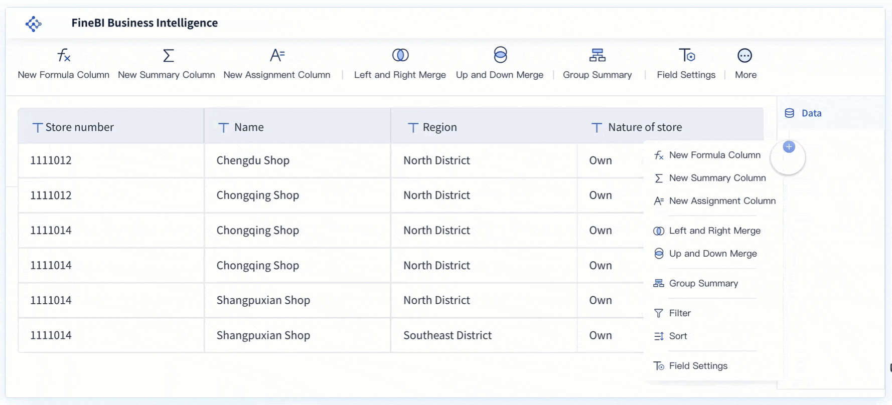 FineBI Drag-and-drop Interface
 Drill-down Capability


