A financial reporting dashboard is the control center finance leaders use to turn scattered numbers into decisions. For CFOs, FP&A managers, controllers, and operations directors, the real challenge is not access to data—it is getting trustworthy, timely visibility into revenue, margin, liquidity, variance, and risk without waiting on manual spreadsheets. The right dashboard shortens reporting cycles, flags issues early, and gives every stakeholder a version of the truth they can act on.
All reports in this article are built with FineReport.
What a financial reporting dashboard is and why teams use it
A financial reporting dashboard is a centralized visual reporting interface that consolidates data from ERP systems, accounting software, spreadsheets, planning models, and operational systems into one decision-ready view. Its purpose is simple: help finance and executive teams monitor performance, identify exceptions, and take action faster.
Unlike static financial statements, dashboards make financial information easier to scan, compare, and investigate. Instead of reviewing dozens of tabs and exported reports, users can see headline KPIs, trend lines, variance indicators, and drill-down detail in one place.
Finance teams use dashboards because they solve three persistent problems:
Reporting delays caused by manual consolidation
Inconsistent definitions across systems and business units
Low executive visibility into fast-changing financial conditions
A good dashboard transforms raw transactions into actionable insight. It helps answer questions such as:
Operational reporting is built for action at the team level. Management reporting supports monthly and quarterly reviews. Board reporting focuses on the few metrics that shape strategic confidence, capital decisions, and forward-looking risk.
15 financial reporting dashboard examples by use case
Below are 15 practical financial reporting dashboard examples, organized around four high-value use cases. These are the dashboard types most often requested by finance leaders because they align directly with executive decision cycles.
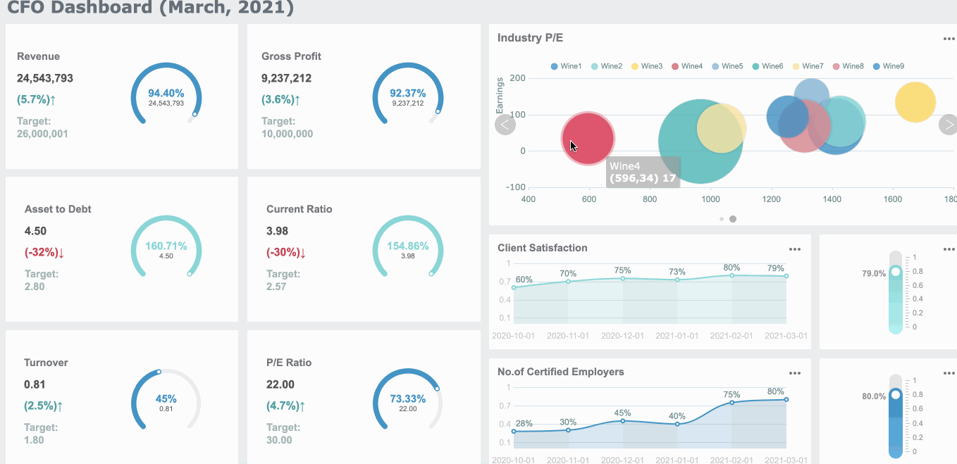
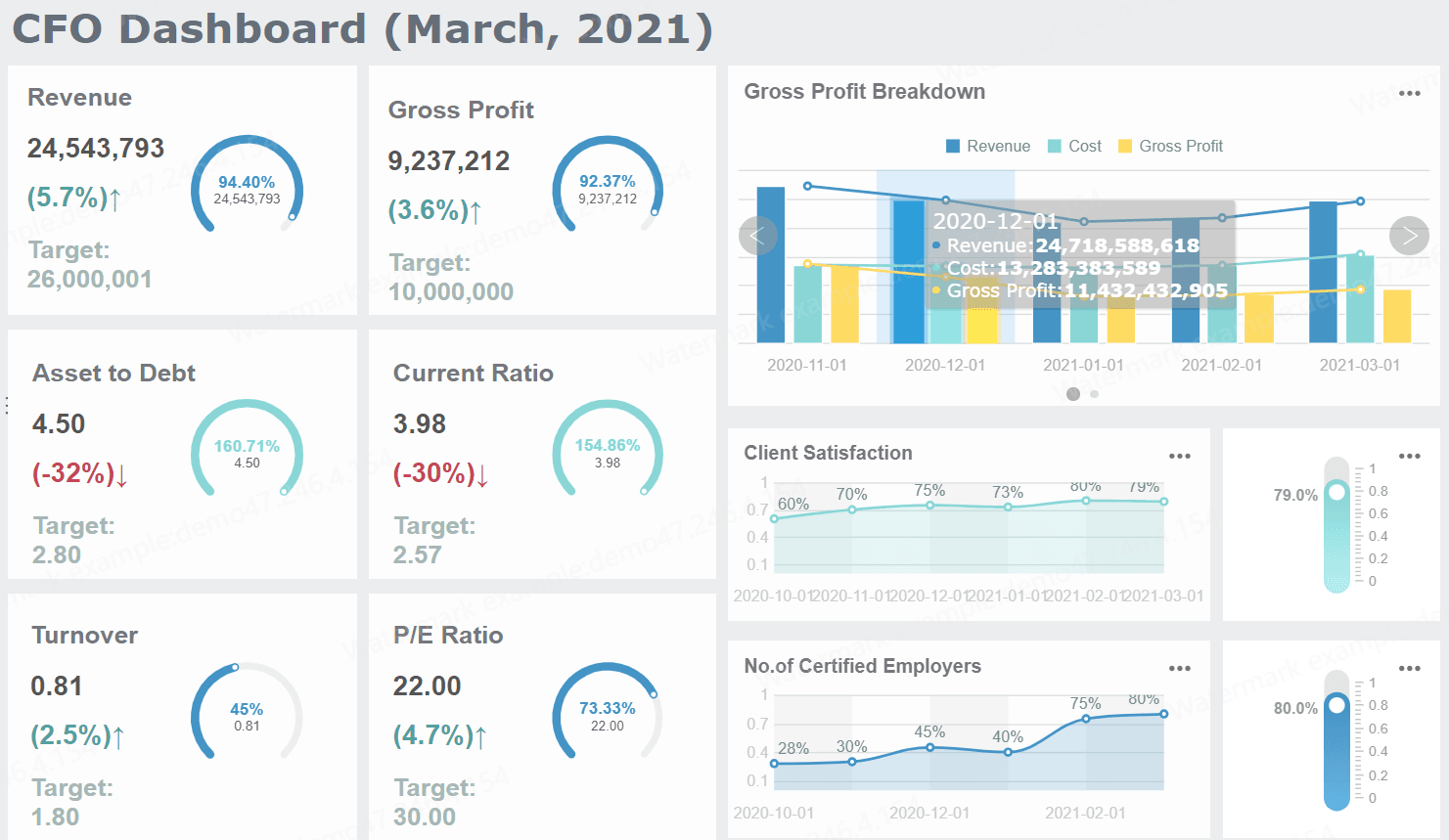
CFO dashboard
The CFO dashboard is the executive finance overview. It should answer one question immediately: How is the business performing financially right now, and where do I need to intervene?
Typical metrics include revenue, gross margin, EBITDA, operating expense, free cash flow, net income, runway, and forecast accuracy. The best versions also include exception alerts so the CFO can spot major changes without reviewing every line item.
1. Executive financial performance dashboard
This dashboard presents the top-line view of business health across revenue, profitability, and cost structure. It is usually the first page in a CFO reporting pack.
Key metrics (KPIs):
Revenue: Total recognized income for the period
Gross margin: Revenue minus cost of goods sold, shown as value and percentage
EBITDA: Earnings before interest, taxes, depreciation, and amortization
Operating expense: Total overhead and controllable spending
Net income: Bottom-line profitability after all expenses
YoY growth: Change versus the same period last year
2. Profitability and margin dashboard
This version helps leadership understand where margins are improving or deteriorating by business unit, product line, geography, or channel.
What it should show:
Gross margin by segment
Contribution margin trends
Operating margin by department
Variance to target margin
Margin bridge showing pricing, volume, and cost impacts
3. Forecast accuracy dashboard
Finance credibility depends on forecast quality. This dashboard compares budget, forecast, and actual performance across time periods and categories.
What it should show:
Forecast vs actual by month
Absolute and percentage forecast error
Revenue forecast accuracy
Expense forecast accuracy
Rolling forecast trends
Driver-level variance analysis
4. Runway and capital efficiency dashboard
For high-growth companies and capital-sensitive businesses, runway matters as much as profit. This dashboard shows how long current cash lasts under current assumptions.
CAC payback or capital efficiency proxy if relevant
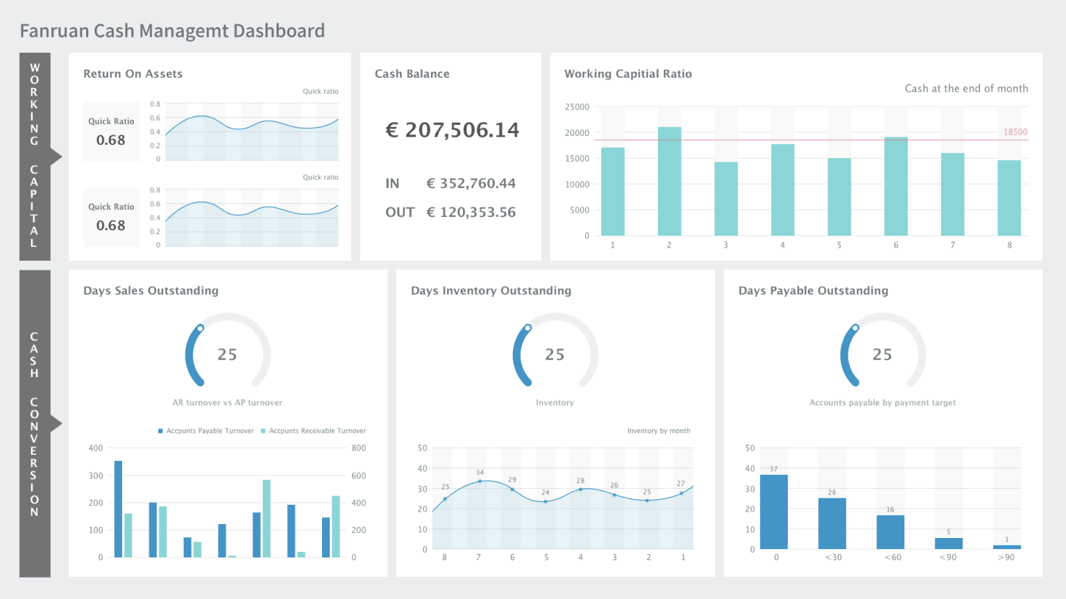
Cash flow dashboard
A cash flow dashboard is essential when liquidity risk, working capital pressure, or short-term planning is a concern. It should make timing visible, not just totals. Many companies look healthy on paper while still facing avoidable cash crunches because collections, payables, or inventory are out of sync.
5. Daily cash position dashboard
This dashboard is designed for treasury, controllers, and finance leadership that need immediate visibility into available cash.
Key metrics (KPIs):
Opening cash balance: Cash available at the start of the day or period
Cash in: Incoming receipts from customers, financing, or other sources
Cash out: Payments for payroll, vendors, tax, debt, and operations
Net cash movement: Cash in minus cash out
Closing cash balance: Ending cash position
Available liquidity: Cash plus available credit lines
6. Burn rate and runway dashboard
This use case is especially valuable for startups, PE-backed firms, and project-driven organizations.
What it should show:
Gross burn
Net burn
Monthly recurring cash obligations
Runway by current plan
Runway under best/base/worst scenarios
Headcount cost impact on cash horizon
7. Working capital dashboard
Working capital dashboards reveal where cash is trapped. They connect receivables, payables, and inventory performance to actual liquidity.
A cash forecast dashboard looks ahead 13 weeks or longer and highlights timing gaps that could affect payroll, debt service, vendor commitments, or expansion plans.
What it should show:
Weekly or monthly cash forecast
Expected inflows and outflows
Planned financing activity
Scenario sensitivity
Covenant or minimum cash threshold alerts
Variance between projected and actual cash movements
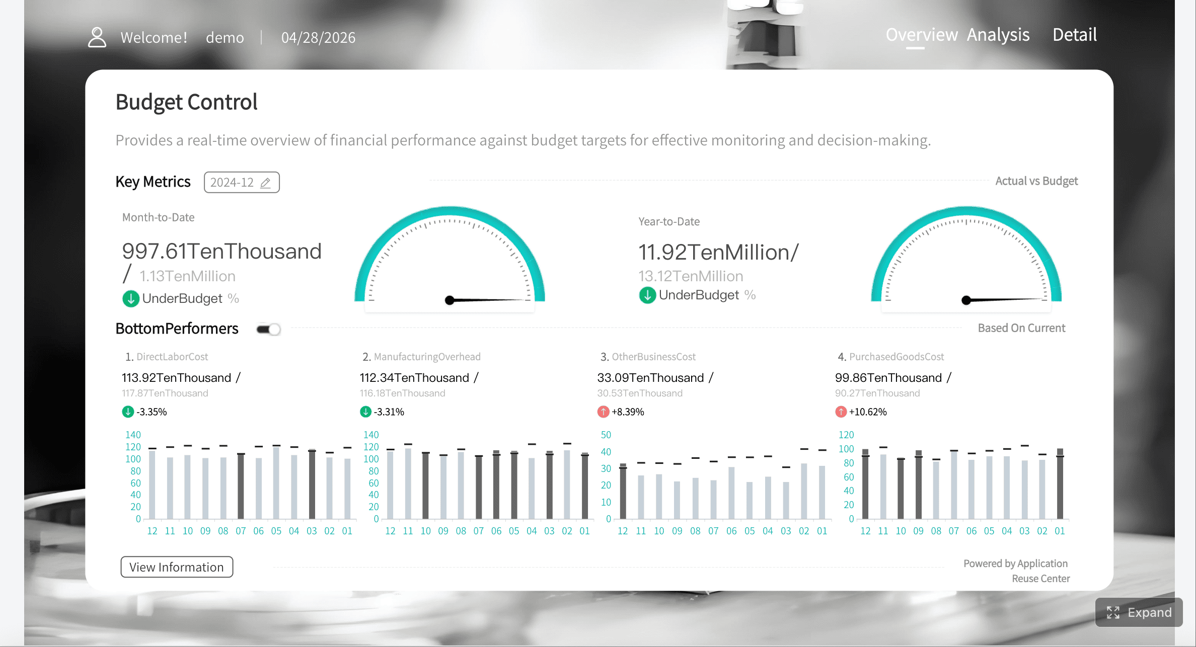
Budget vs actual dashboard
The budget vs actual dashboard is often the most widely used financial reporting view in the business. It helps department leaders and finance teams quickly see whether spending, revenue, and profit are aligned to plan.
9. Department budget vs actual dashboard
This is the accountability dashboard for department heads. It compares planned spend and actual performance at a controllable level.
Key metrics (KPIs):
Budget: Approved target amount for the period
Actuals: Recorded financial outcome
Variance: Difference between budget and actual
Variance %: Difference shown as a percentage
Spend rate: Pace of spend relative to time elapsed
Run-rate projection: Estimated year-end result based on current trend
10. Cost center variance dashboard
This dashboard goes deeper into operational accountability by showing variance by cost center, account category, or manager.
What it should show:
Cost center performance ranking
Labor vs non-labor variance
Fixed vs variable expense movement
Period-over-period changes
Commentary fields for explanations and actions
11. Revenue plan vs actual dashboard
For commercial finance and FP&A teams, revenue variance must be broken down into meaningful drivers.
What it should show:
Plan vs actual revenue by product line
Volume, price, and mix variance
Regional or entity-level breakdown
Sales pipeline linkage where relevant
Contribution to total growth gap
12. Consolidated multi-entity budget dashboard
Groups with multiple legal entities, subsidiaries, or business units need a dashboard that rolls up performance while preserving local accountability.
What it should show:
Entity-level summary
Currency normalization
Consolidated actual vs budget
Intercompany impact indicators
Group variance bridge
Local drill-down with standardized KPI logic
Board reporting dashboard
Board reporting dashboards should be concise, strategic, and credible. They are not meant to replicate internal operating reports. The board wants a high-confidence summary of performance, strategic progress, and emerging risk.
13. Board financial summary dashboard
This dashboard gives directors a high-level view of the company’s financial position and trajectory.
Key metrics (KPIs):
Revenue growth: Direction and pace of top-line expansion
EBITDA or operating profit: Operating financial performance
Cash balance: Current liquidity position
Runway or leverage: Financial flexibility and capital risk
Budget variance: Whether the company is tracking to plan
Outlook: Forward estimate for upcoming periods
14. Strategic KPI and risk dashboard
Boards increasingly expect finance to connect financials with strategic execution. This dashboard blends financial and business indicators.
This use case combines visuals, commentary, and context. It is often the most effective format for board meetings because it explains not just what changed, but why it matters.
What it should show:
Headline KPI summary
Trend charts with annotations
Variance commentary
Risks and mitigation actions
Forward-looking assumptions
Decision items for board approval
How to choose the right financial reporting dashboard metrics and views
Choosing the right metrics is where many dashboard projects succeed or fail. A dashboard should not try to display everything the finance team can calculate. It should display what the audience needs to decide.
Core KPIs to include
At minimum, your financial reporting dashboard should cover four decision domains: profitability, liquidity, efficiency, and growth.
Opex ratio: Shows operating expense as a share of revenue
YoY or QoQ growth: Reveals momentum and trend direction
The best dashboards balance summary KPIs with drill-down views. A CFO may want a top-level EBITDA variance first, but the finance team must be able to drill into the account, cost center, or driver causing the issue.
Visual design and layout tips
Finance dashboards should be easy to read under time pressure. If a senior executive cannot understand the state of the business in 30 seconds, the layout needs work.
Daily, weekly, or monthly depending on close cadence
Board reporting
Monthly or quarterly with controlled refreshes
Tools and implementation options when making a financial reporting dashboard
The right tool depends on your data complexity, governance needs, and the audience you are serving. In practice, most organizations evaluate a mix of enterprise BI, finance-specific platforms, and no-code reporting tools.
Using BI tools such as Power BI
BI platforms like Power BI are commonly used to build a financial reporting dashboard because they can connect to multiple data sources, support semantic modeling, and publish interactive reports at scale.
They are a strong fit when you need to:
Combine ERP, CRM, HR, and spreadsheet data
Build role-based dashboards for different audiences
Support self-service analysis
Apply enterprise permissions and governance
Publish dashboards across departments
However, finance teams should plan carefully for model design, security, metric definitions, and maintenance. A dashboard that looks polished but relies on fragile manual data prep will not scale.
No-code and finance software alternatives
No-code builders and finance-focused platforms can reduce deployment time, especially when the goal is faster reporting standardization rather than highly customized enterprise analytics.
Native integrations with ERP and accounting systems
Handling of multi-entity structures
Auditability and permission controls
Dashboard customization
Commentary and narrative reporting support
Export and sharing options
FineReport is a strong option for organizations that need flexible dashboard design, strong data integration, pixel-perfect report output, and enterprise-friendly governance. It works well when finance teams need both interactive dashboards and formal reporting deliverables in the same environment.
Data Integration
Best practices for building a financial reporting dashboard that stakeholders trust
A dashboard is only successful if stakeholders trust the numbers, understand the view, and use it repeatedly in decision-making. These are the practices I recommend most often in finance transformation projects.
Governance and consistency
Start by defining every major KPI before building visuals. Agree on formulas, source systems, period logic, and exception rules across finance, accounting, and operations.
Best practices:
Create a KPI dictionary with clear definitions and owners
Standardize period logic for MTD, QTD, YTD, and rolling periods
Document assumptions behind forecast and scenario metrics
Establish approval workflows for board-facing dashboards
Audit source-to-report mapping before launch
Usability for executives and finance teams
Different audiences need different depths of detail. Do not force the board to read cost center tables, and do not force analysts to stop at summary cards.
Best practices:
Design by persona: CFO, controller, FP&A manager, board, and department leader
Use layered reporting: summary first, details on click
Add context: commentary, annotations, and threshold alerts
Test real workflows: make sure users can answer their most common questions quickly
4 actionable implementation steps from a finance consultant
If you want adoption, avoid trying to solve every reporting need at once. Build in a phased, high-trust sequence.
1. Start with one high-value use case
Choose the use case with the clearest business impact—usually CFO summary, cash flow, or budget vs actual. This keeps scope manageable and adoption measurable.
2. Fix the data model before polishing the visuals
Do not design charts on top of unresolved account mapping, duplicate source logic, or conflicting definitions. Trust is won in the backend before it is visible in the frontend.
3. Design for review meetings, not just screen aesthetics
Ask how the dashboard will be used in a weekly executive meeting, monthly close review, or board session. Build pages around those conversations.
4. Add exception logic and commentary
Static numbers rarely drive action. Add alerts for unusual variance, threshold breaches, forecast slippage, and liquidity risks. Pair them with narrative fields for interpretation.
5. Pilot, refine, then scale
Launch with a limited audience, gather usage feedback, revise layout and definitions, and only then expand to more entities, departments, or reporting packs.
Common mistakes to avoid when making a financial reporting dashboard and next steps
Many financial dashboards fail for predictable reasons. The issues are usually not the charts themselves—they are scope, trust, and process problems.
Common mistakes include:
Overloading the dashboard with too many KPIs, visuals, and competing time periods
Mixing audiences so one dashboard tries to serve analysts, executives, and directors equally
Relying on manual preparation that creates delays and version-control conflicts
Ignoring variance explanation and forcing users to interpret changes without context
Using inconsistent definitions across ERP data, spreadsheets, and management packs
Refreshing too slowly for the business questions the dashboard is supposed to answer
A better next step is to prioritize one use case, validate the reporting logic, and build from there. For most organizations, the right sequence is:
That phased approach reduces implementation risk and increases stakeholder trust.
A modern financial reporting dashboard should do more than visualize data. It should reduce reporting friction, improve financial visibility, and help leadership act faster with confidence. If your current process still depends on spreadsheet stitching, manual commentary, and late-cycle reconciliation, this is the right moment to redesign it around high-value use cases.
A financial reporting dashboard is a centralized view of key financial metrics pulled from systems like ERP, accounting tools, and spreadsheets. It helps finance teams monitor performance, spot issues quickly, and make faster decisions.
Most CFO dashboards track revenue, gross margin, EBITDA, operating expense, net income, cash position, and forecast accuracy. The exact mix depends on whether the focus is profitability, liquidity, or strategic performance.
Financial statements are static reports that summarize past results, while dashboards provide a more visual and interactive view of current performance. Dashboards also make it easier to compare trends, monitor variances, and drill into details.
Financial reporting dashboards are commonly used by CFOs, FP&A managers, controllers, department leaders, and board stakeholders. Each audience typically needs a different level of detail, from operational analysis to high-level board reporting.
It puts budget, forecast, and actual results in one view so teams can identify variances faster and understand what is driving them. This reduces manual reporting work and supports more timely corrective action.
Product Trial
FineReport
Pixel-perfect reports · Interactive dashboards · Easy data entry · Digital twins
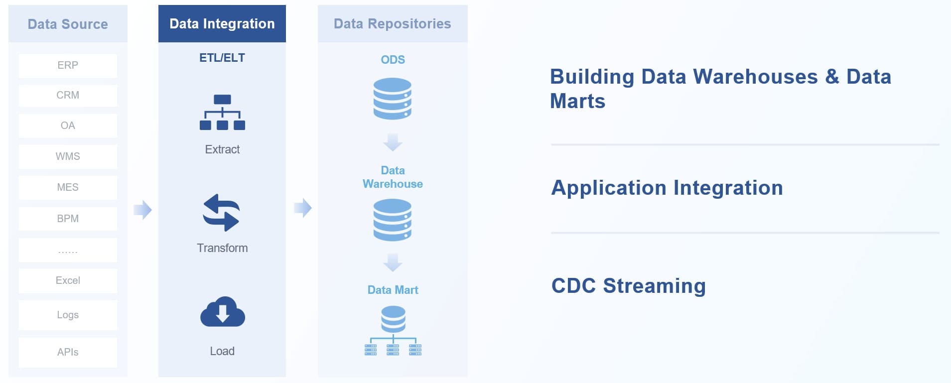 Data Integration