If you are searching for the best KPI reporting tools, you are likely trying to solve a practical problem: how to track the metrics that matter, present them clearly, automate recurring updates, and turn performance data into decisions.
For some teams, that means building executive dashboards. For others, it means creating departmental scorecards, automated weekly reports, or structured reports that can be shared across finance, operations, sales, and management. The challenge is that not all KPI tools do all of these jobs equally well. Some are excellent for visual dashboards. Some are stronger in automation. Others are better for formal reporting workflows with scheduled distribution, printable layouts, and governed access.
This guide is designed for operations leaders, BI teams, department managers, and growing businesses that need to compare KPI platforms in a practical way. Rather than focusing only on chart variety, we will look at what actually matters in day-to-day reporting: dashboard flexibility, reporting depth, automation, integrations, governance, usability, and budget fit.
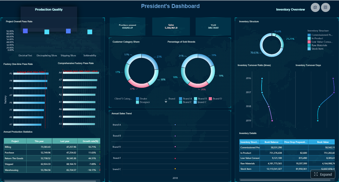 Click To Try The Dashboard
Quick Comparison Table
Before diving into the detailed reviews, here is a balanced side-by-side view of 12 leading KPI reporting tools.
| Tool | Best for | Dashboarding | Automation | Reporting depth | Plan positioning |
|---|---|---|---|---|---|
| Power BI | Microsoft-centric businesses needing BI and KPI dashboards | Strong interactive dashboards and drill-down | Good refresh and sharing options | Moderate to strong, depending on setup | Budget-friendly to mid-range |
| Tableau | Advanced visual analytics and executive storytelling | Very strong visualization flexibility | Good alerts and subscriptions | Moderate; stronger in analysis than formal reporting | Mid to premium |
| FineReport | Teams needing KPI dashboards plus structured enterprise reporting | Strong dashboards combined with report design | Strong scheduling, distribution, parameter queries | Strong for paginated, printable, and operational reporting | Enterprise-focused |
| Looker | Centralized metric governance and modeled analytics | Strong governed dashboards | Strong scheduled delivery and data modeling workflows | Moderate to strong | Enterprise-focused |
| Qlik Sense | Associative exploration and self-service analytics | Strong exploratory dashboards | Good alerting and refresh | Moderate to strong | Mid to enterprise |
| Klipfolio | Mid-market teams needing fast KPI dashboard setup | Strong for cloud KPI boards | Good automated dashboard updates | Moderate | Mid-market |
| Databox | Small teams and marketing/sales KPI tracking | Strong mobile-friendly scorecards | Good alerts and snapshots | Light to moderate | SMB to mid-market |
| Geckoboard | Simple real-time KPI visibility on TVs and wallboards | Strong for at-a-glance views | Good threshold alerts | Light | SMB-focused |
| SimpleKPI | Straightforward KPI dashboards and reports | Moderate to strong | Good scheduled reports | Moderate | SMB-focused |
| Smartsheet | Teams combining project tracking with KPI visibility | Moderate dashboarding | Strong workflow automation in work management contexts | Moderate | Mid-market |
| Domo | All-in-one cloud analytics with broad business use | Strong dashboarding | Strong alerts and data apps | Moderate to strong | Mid to enterprise |
| Zoho Analytics | Cost-conscious businesses wanting BI plus reporting | Good dashboarding for the price | Good scheduled reporting | Moderate | SMB to mid-market |
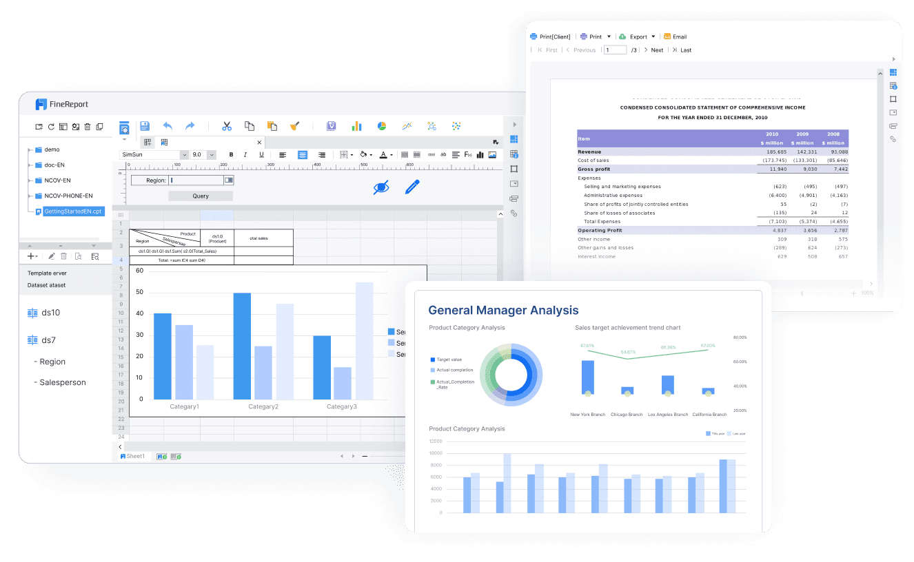
How We Evaluated the Best KPI Reporting Tools for 2026
Choosing a KPI platform is not just about finding the prettiest charts. The right tool depends on how your organization uses metrics operationally.
We evaluated these tools using seven practical criteria:
- Dashboard flexibility: Can teams build executive summaries, department scorecards, and drill-down views without heavy custom work?
- Reporting depth: Does the platform support more formal reporting, including exports, printable layouts, recurring stakeholder reports, and role-based views?
- Automation: Can it schedule refreshes, send alerts, distribute reports, and reduce manual reporting work?
- Integrations: How easily can it connect to core systems such as ERP, CRM, databases, spreadsheets, and cloud apps?
- Ease of use: Can business users adopt it, or does it depend heavily on technical specialists?
- Governance and security: Can it scale with permissions, centralized definitions, and controlled access?
- Pricing position: Is it realistic for small teams, scaling companies, or enterprise rollouts?
It is also important to separate three related but different needs:
- KPI tracking is about monitoring targets and trends.
- Dashboarding is about visualizing those KPIs interactively.
- Formal reporting workflows involve scheduled reports, stakeholder distribution, parameterized views, printable outputs, and sometimes write-back or data entry processes.
Many buyers assume one tool will handle all three equally well. In practice, some tools are optimized for dashboard exploration, while others are better for repeatable business reporting.
12 Best KPI Reporting Tools Compared at a Glance
What to look for before choosing a platform
Before choosing a KPI reporting platform, clarify what type of reporting you actually need.
- Executive dashboards: Best for high-level KPI visibility and fast decision-making.
- Team-level scorecards: Best for departmental performance reviews and operational tracking.
- Scheduled reports: Best when stakeholders expect weekly, monthly, or daily report delivery in consistent formats.
- All three together: Best for organizations with cross-functional reporting needs.
Then check these practical requirements:
- Data-source coverage: Can it connect to your systems on day one?
- Refresh frequency: Are near-real-time updates necessary, or are daily refreshes enough?
- Alerting: Can it notify teams when KPIs cross thresholds?
- Permissions: Can leaders, analysts, and managers each see the right version of the data?
- Export and sharing options: Do you need PDF, Excel, email subscriptions, or portal access?
A final consideration is trade-off. Faster setup usually means less flexibility. Deep customization usually means more design and admin effort. The best KPI tool is the one that fits both your current maturity and your likely growth.
Quick comparison table of the 12 tools
| Tool | Category | Best-fit use case | Standout dashboarding capability | Automation and alerting | Reporting depth and sharing |
|---|---|---|---|---|---|
| Power BI | Enterprise BI | Microsoft-based reporting and KPI analysis | Rich visuals and interactive filters | Scheduled refresh, subscriptions, alerts | Good exports and sharing inside Microsoft environments |
| Tableau | Enterprise BI | Advanced visual analytics and executive dashboards | Highly customizable visual storytelling | Data-driven alerts and subscriptions | Strong dashboard sharing, lighter for formal paginated workflows |
| FineReport | Enterprise reporting + BI | KPI dashboards plus scheduled operational reporting | Dashboard and report integration | Strong scheduling and automated distribution | Strong paginated, printable, and parameter-driven reporting |
| Looker | Governed analytics | Centralized semantic metrics and self-service BI | Governed dashboards from modeled data | Strong scheduled delivery | Strong for governed analytics, less focused on pixel-perfect print-style reporting |
| Qlik Sense | Enterprise BI | Associative exploration across business data | Flexible discovery and drill paths | Alerts and reload scheduling | Good for analysis and governed sharing |
| Klipfolio | Mid-market KPI software | Fast cloud KPI boards for growing teams | Quick setup of live KPI dashboards | Automated updates and snapshots | Moderate reporting and exports |
| Databox | Business dashboard tool | Sales and marketing KPI tracking | Mobile-first scorecards and templates | Alerts and scorecard updates | Light to moderate reporting |
| Geckoboard | Lightweight KPI dashboard | Wallboards and simple operational visibility | TV-friendly live KPI layouts | Threshold alerts | Limited formal reporting depth |
| SimpleKPI | KPI reporting tool | Simple KPI dashboards and reports | Easy-to-read KPI widgets and charts | Scheduled reports and sharing | Moderate export and report support |
| Smartsheet | Work management + reporting | KPI tracking tied to projects and operations | Practical widgets for work dashboards | Strong workflow automation | Moderate reporting tied to work processes |
| Domo | Cloud analytics platform | Broad cloud reporting for mixed teams | Interactive cloud dashboards | Strong data alerts and automation features | Good sharing and app-style distribution |
| Zoho Analytics | SMB BI | Affordable reporting across common business apps | Solid dashboards with broad appeal | Scheduled refreshes and delivery | Moderate reporting for smaller teams |
In-Depth Review of the 12 KPI Reporting Tools
Enterprise BI and advanced analytics platforms
These platforms are typically chosen by organizations with larger data environments, cross-functional stakeholders, and stronger governance requirements.
1. FineReport
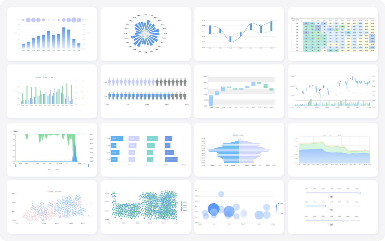
FineReport is best understood as an enterprise reporting platform that also supports dashboards, making it especially relevant for teams that need more than KPI visualization alone. It is commonly used in scenarios where organizations need KPI dashboards, parameterized reports, scheduled delivery, printable layouts, and operational reporting workflows in one environment.
Strengths
- Supports pixel-perfect and paginated reporting for formal business reporting
- Combines dashboards with detailed structured reports
- Strong report scheduling and automated distribution
- Supports parameter queries for users who need to filter by date, department, region, product, or other business dimensions
- Useful for operational reporting in finance, manufacturing, logistics, management, and sales contexts
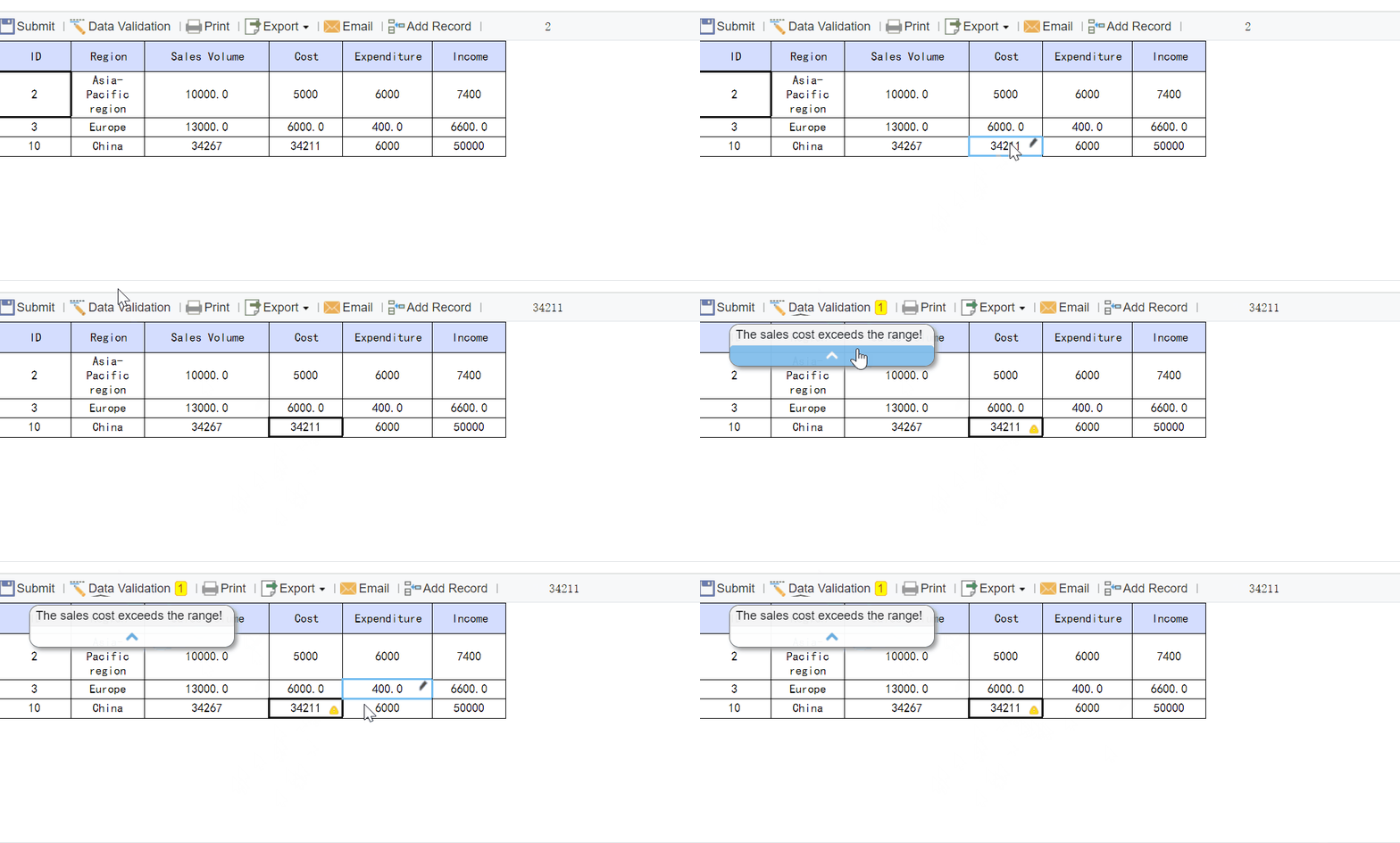
- Can support data entry and form-based workflows where reporting is part of a broader business process
Trade-offs
- More reporting-oriented than lightweight KPI apps
- Best fit when reporting depth matters, not just quick charts
- Teams looking only for very simple dashboard setup may prefer lighter tools
This makes FineReport especially relevant for companies that need KPI monitoring plus repeatable, governed reporting workflows.
2. Power BI
Power BI is a common choice for businesses already invested in Microsoft 365, Excel, Azure, and related services. It combines data modeling, dashboarding, and report development in one ecosystem.
Strengths
- Strong value for organizations already using Microsoft tools
- Flexible dashboarding with drill-down and filtering
- Broad adoption among analysts and business teams
- Good fit for financial, sales, and operations KPI tracking
Trade-offs
- Advanced modeling and governance can require specialist support
- Formal pixel-perfect reporting may require additional setup or companion approaches
- Self-service can become messy without strong data governance
Power BI works well when you want business dashboards and analytical reporting in a familiar environment.
3. Tableau

Tableau is widely used for visual analytics and interactive executive dashboards. It is often favored by analyst teams that want flexibility in visual storytelling and exploratory analysis.
Strengths
- Excellent dashboard customization and interactivity
- Strong support for visual exploration and drill-down analysis
- Useful for executive reporting and data storytelling
- Well-suited for cross-functional KPI analysis
Trade-offs
- Can have a steeper learning curve for advanced authoring
- Costs may be harder to justify for smaller teams
- Better known for dashboards than highly structured operational reporting
If your priority is analytical dashboarding and visual exploration, Tableau remains a strong contender.
4. Looker
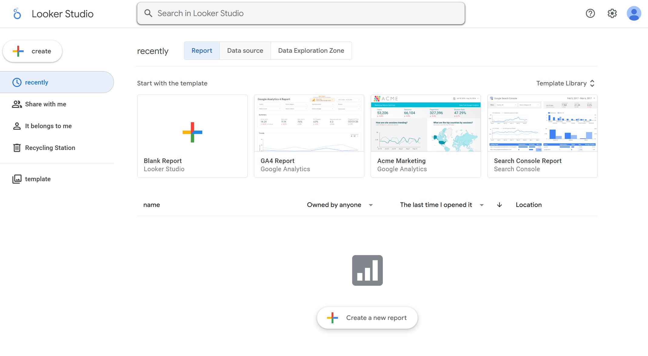
Looker is often selected by organizations that want governed metrics built on a centralized semantic layer. It can be a strong choice when consistency in KPI definitions matters across teams.
Strengths
- Strong metric governance
- Useful for self-service analytics on top of modeled data
- Good for organizations standardizing KPI logic centrally
- Strong scheduled dashboard and data delivery workflows
Trade-offs
- Requires data modeling discipline
- Less oriented toward traditional printable reporting layouts
- Setup can be more involved than dashboard-first tools
Looker is a good fit for mature data teams focused on metric consistency and governed analytics.
5. Qlik Sense
Qlik Sense is known for associative exploration, helping users move through related data without rigid query paths. That can be useful for KPI analysis across multiple dimensions.
Strengths
- Strong exploratory analysis
- Flexible interaction with large datasets
- Good for discovering relationships behind KPI changes
- Suitable for cross-department analysis
Trade-offs
- May require experienced authors for best results
- Some business users may need guidance to use its exploration model effectively
- Formal reporting may not be its primary strength compared with dedicated reporting tools
Qlik Sense is a strong option for organizations that want discovery-oriented KPI analysis.
Mid-market KPI software and business dashboard tools
These tools are usually easier to deploy and are often designed for teams that want quick KPI visibility without a full enterprise BI rollout.
6. Klipfolio
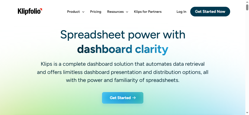
Klipfolio is often used by growing businesses that want cloud-based KPI dashboards from multiple sources without heavy implementation.
Strengths
- Quick to get KPI dashboards up and running
- Useful for consolidating cloud business metrics
- Good selection of KPI-focused templates and widgets
- Suitable for mid-market reporting needs
Trade-offs
- Deep analytics may be more limited than enterprise BI tools
- Formal reporting workflows may need workarounds
- Complex governance requirements may outgrow the platform
Klipfolio is a practical mid-market choice when speed matters more than enterprise complexity.
7. Databox
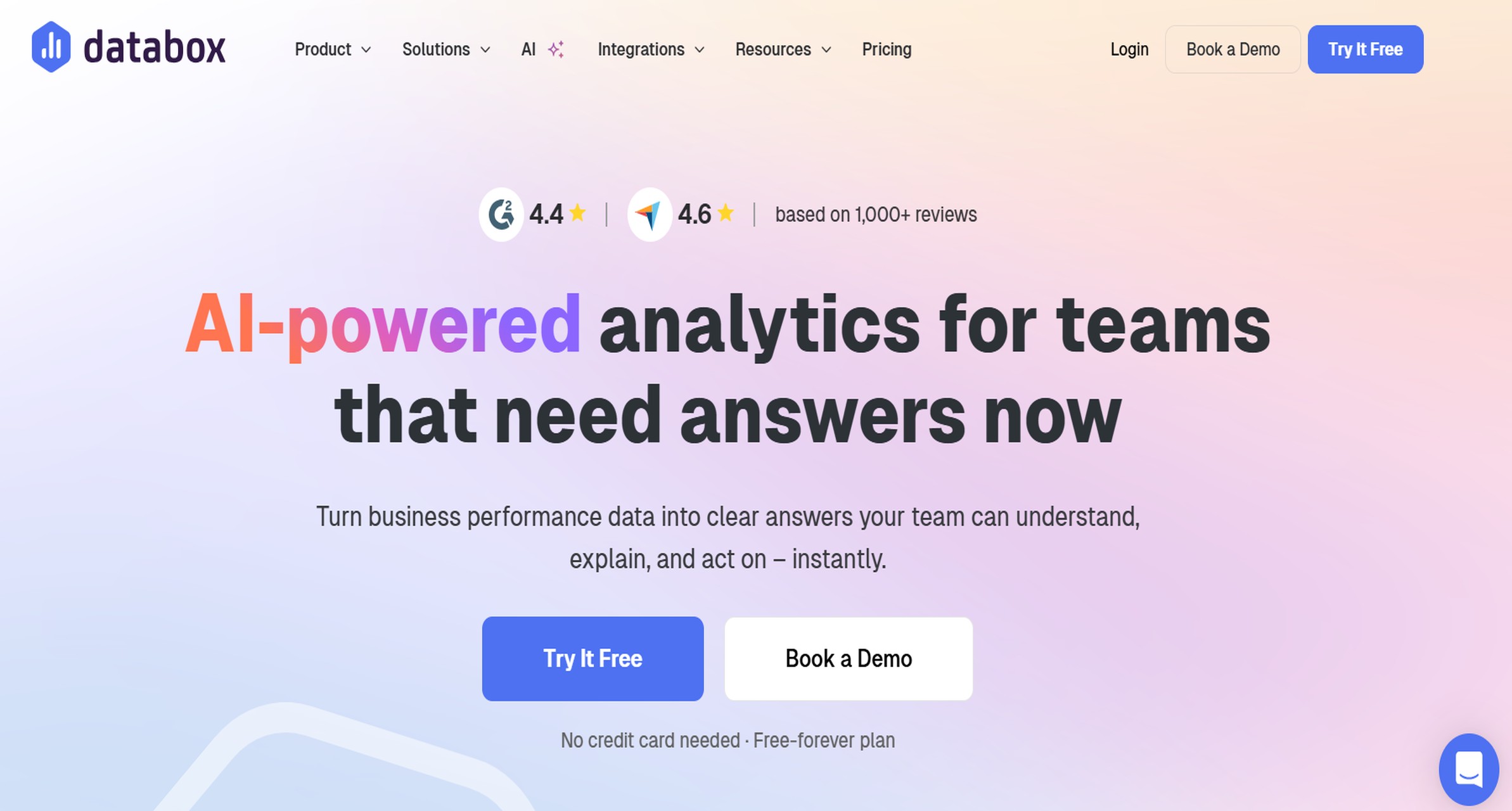
Databox is especially popular among sales, marketing, and SMB teams that need straightforward KPI tracking and mobile visibility.
Strengths
- Strong mobile-first KPI viewing
- Easy scorecard-style dashboards
- Good for recurring performance reviews
- Template-driven setup helps speed adoption
Trade-offs
- More focused on KPI visibility than deep enterprise reporting
- Custom reporting may be less flexible
- Better for teams consuming KPI dashboards than building highly customized analytics systems
Databox works well for businesses that want quick adoption and accessible KPI summaries.
8. Smartsheet
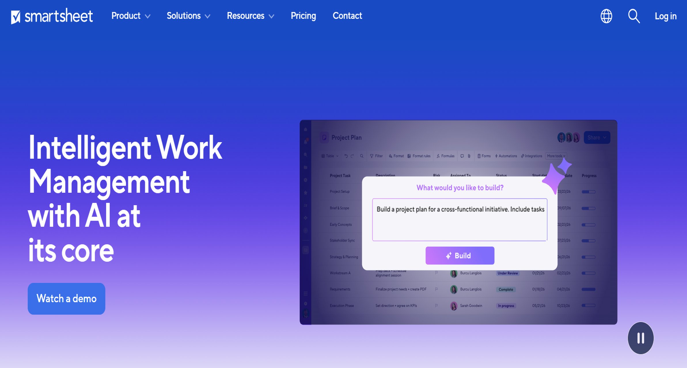
Smartsheet sits closer to work management than traditional BI, but it can be useful where KPI tracking is tightly linked to project execution and operations.
Strengths
- KPI visibility tied to workflows and project status
- Strong workflow automation in operational use cases
- Familiar spreadsheet-style experience
- Useful for teams that want action tracking alongside KPIs
Trade-offs
- Not as deep as dedicated BI platforms for analysis
- Dashboards are practical rather than highly analytical
- May not satisfy advanced reporting teams
Smartsheet is a good fit when process management and KPI monitoring need to live together.
9. Domo
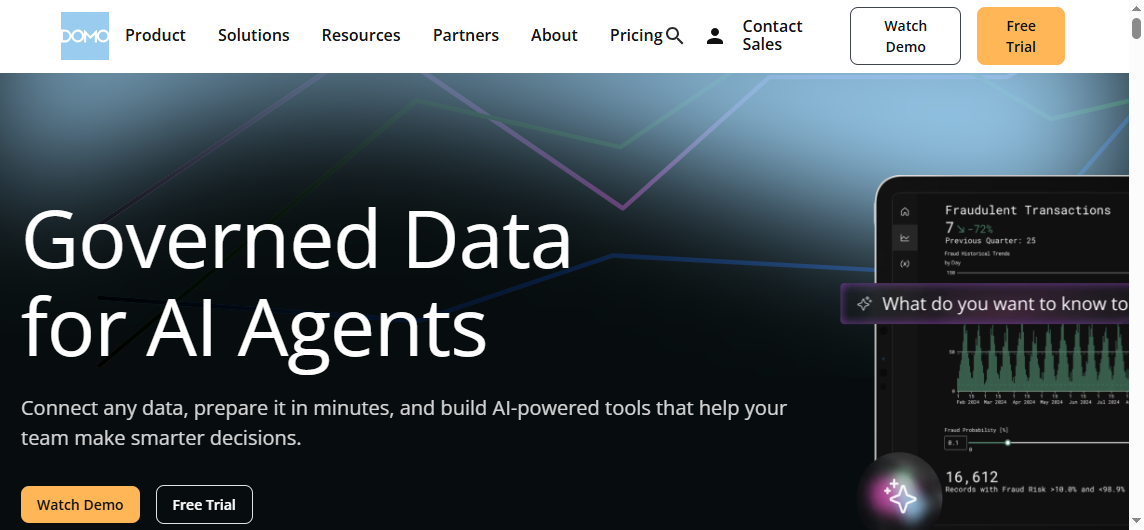
Domo positions itself as a cloud analytics platform that blends dashboards, alerts, and broad business access.
Strengths
- Strong cloud dashboarding experience
- Broad support for business-facing KPI use cases
- Good alerts and automation capabilities
- Useful for mixed technical and business audiences
Trade-offs
- Can be more than smaller teams need
- Cost and implementation may be heavier than lighter KPI tools
- Fit depends on how much of its broader platform value you intend to use
Domo suits organizations that want a cloud-native KPI platform with broad reach.
10. Zoho Analytics
Zoho Analytics is often attractive to smaller or budget-conscious businesses that want reporting and dashboarding without enterprise-level cost.
Strengths
- Accessible pricing position
- Good enough dashboarding for many common KPI needs
- Useful reporting features for SMB environments
- Broad appeal for businesses already using Zoho tools
Trade-offs
- Advanced analytics depth may not match enterprise BI platforms
- Large-scale governance needs may stretch the platform
- Custom report sophistication can be more limited
Zoho Analytics is a reasonable choice for businesses that need affordability and broad usability.
Lightweight and specialized reporting tools
These platforms are often best for focused KPI monitoring, executive snapshots, or departmental reporting where simplicity is the main goal.
11. Geckoboard
 Geckoboard is built for simple, visible KPI tracking, especially on office screens or shared displays.
Strengths
- Very easy to set up and understand
- Great for real-time visibility in operations or sales teams
- Strong for TV dashboards and wallboards
- Useful for top-line metric awareness
Trade-offs
- Limited depth for formal reporting
- Not built for complex analytics workflows
- Better for monitoring than for detailed analysis
Geckoboard is often enough when your goal is visibility rather than reporting depth.
12. SimpleKPI
SimpleKPI focuses on making KPI dashboards and reports straightforward for smaller teams and businesses.
Strengths
- Easy-to-use KPI setup
- Dashboard and report functionality in one place
- Good for small teams needing quick business visibility
- Useful exports and report sharing for practical use
Trade-offs
- Less suited to advanced enterprise analytics
- Less depth in custom reporting than heavier platforms
- May become restrictive as governance needs expand
SimpleKPI is a practical tool for straightforward KPI reporting without a heavy implementation burden.
Pros and Cons by Dashboarding, Automation, and Reporting Depth
Which tools are strongest for dashboarding
If dashboarding is your top priority, these tools stand out:
- Tableau: Strong for visual storytelling, executive dashboards, and interactive analysis
- Power BI: Strong for flexible dashboards and widespread business use
- Qlik Sense: Strong for exploratory dashboarding and associative analysis
- Domo: Strong for cloud dashboards and broad business access
- Databox and Geckoboard: Strong for simple, fast KPI visibility
For executive overviews, Geckoboard, Databox, Tableau, and Power BI are often effective. For analyst-led exploration, Tableau, Power BI, Qlik Sense, and Looker typically offer more depth.
Which tools are strongest for automation
Automation matters when KPI reviews are recurring and teams cannot afford manual updates.
Tools that stand out here include:
- FineReport: Strong for scheduled reports, automated distribution, and parameterized reporting workflows
- Power BI: Good refresh and subscription capabilities
- Looker: Strong governed delivery of scheduled data and dashboard views
- Domo: Strong alerts and cloud automation workflows
- Smartsheet: Strong workflow automation when KPIs connect to operational tasks
- Databox and Geckoboard: Useful alerts for threshold-based metric monitoring
Automation saves time in weekly leadership packs, monthly operational reviews, daily KPI summaries, and exception-based reporting.
Which tools are strongest for reporting depth
There is a meaningful difference between tools that visualize KPIs well and tools that support formal reporting processes.
The strongest for reporting depth include:
- FineReport: Best suited here when teams need paginated reports, printable outputs, scheduled delivery, parameter queries, and dashboard-plus-report workflows
- Power BI: Good reporting depth, especially for organizations comfortable with the Microsoft stack
- Looker: Strong when governed KPI logic and controlled reporting matter
- Tableau: Good for interactive reporting, though less centered on traditional print-style reporting
- SimpleKPI and Zoho Analytics: Adequate for smaller-scale reporting needs
If your KPI process includes commentary, presentations, auditability, stakeholder-specific versions, and recurring operational documents, reporting depth should weigh heavily in your decision.
How to Choose the Right KPI Reporting Tool for Your Team
Match the tool to your reporting maturity
Your best option depends on how mature your reporting process is.
Startups and very small teams
- Usually benefit from lightweight tools like Geckoboard, Databox, or SimpleKPI
- Priority is speed, ease of use, and basic KPI visibility
- Governance and complex reporting are often secondary
Scaling teams
- Often need a balance between usability and customization
- Tools like Klipfolio, Zoho Analytics, Smartsheet, and Power BI can work well
- Focus shifts toward cross-team consistency and automation
Enterprise environments
- Usually need governance, broader integration, more robust access control, and standardized reporting
- Power BI, Tableau, Looker, Qlik Sense, Domo, and FineReport are more relevant here
- Formal reporting processes become increasingly important
As stakeholder count, data volume, and compliance expectations grow, dashboards alone are rarely enough.
Questions to ask before making a shortlist
Before you shortlist a KPI reporting tool, ask these questions:
- What data sources must connect on day one?
- Who will build dashboards and reports, and who will maintain them?
- How often do KPIs need to refresh?
- How widely do reports need to be shared?
- Do executives need summaries while managers need detailed operational views?
- Do you need printable, exportable, or scheduled reports?
- What level of customization, security, and governance is realistic for your team?
- What budget can you support not just now, but after scale-up?
A tool that looks simple in a demo may become limiting later. A tool that looks powerful may become underused if the team cannot maintain it.
Practical Recommendations for Choosing KPI Reporting Tools
Here are five practical recommendations from a reporting and BI perspective:
-
Decide whether dashboards alone are enough.
If your organization runs weekly business reviews, board packs, operational summaries, or department-specific reports, you likely need more than dashboarding. -
Evaluate automation early, not later.
Manual KPI reporting creates long-term friction. Prioritize scheduling, distribution, alerts, and recurring refresh workflows from the start. -
Check how the tool handles stakeholder variation.
Executives, department managers, analysts, and frontline teams often need different KPI views. A good tool supports that without duplicating work. -
Test reporting depth with a real use case.
Do not judge a platform only by chart demos. Build one real KPI workflow: dashboard, scheduled report, export, permissions, and exception alerting. -
Match complexity to team capability.
A highly flexible platform only adds value if your team can operate it sustainably.
Final Recommendations by Use Case
Here is a practical way to think about the best fit by scenario.
-
Best option for small teams that need quick setup and simple KPI visibility:
Databox or Geckoboard -
Best option for companies that want balanced dashboarding and reporting:
Power BI or Zoho Analytics, depending on budget and ecosystem -
Best option for automation-heavy reporting workflows:
FineReport, especially when scheduled reports, parameter-driven outputs, and formal reporting matter -
Best option for enterprises that need governance and advanced analytics:
Looker, Power BI, Tableau, or Qlik Sense, depending on data maturity and analytics style -
Best option for teams prioritizing ease of use over deep customization:
SimpleKPI or Databox
When FineReport Is a Good Fit
Tools like Tableau and Power BI are widely used for visualization and BI analysis, but teams with complex reporting workflows may also need a dedicated enterprise reporting platform like FineReport.
That is especially true when KPI reporting includes not just dashboards, but also:
- Pixel-perfect report design
- Paginated and printable reports
- Parameter queries for business users
- Scheduled report generation and automated distribution
- Dashboard and report integration in one platform
- Operational reporting for finance, sales, manufacturing, logistics, and management
- Data entry and form-based workflows tied to reporting processes
For example, if an operations team needs an executive KPI dashboard, a daily production summary, a regional manager report, and a parameterized exception report delivered automatically, a dashboard-only approach may not be enough. This is where FineReport can be a practical fit.
Get Ready-to-Use Dashboard and Report Templates in Fine Gallery
For teams evaluating KPI reporting tools in 2026, the right choice depends less on hype and more on workflow fit. If you mainly need visual exploration, platforms like Tableau, Power BI, and Qlik Sense are strong candidates. If you need fast KPI visibility for small teams, tools like Databox, Geckoboard, and SimpleKPI are often enough. If you need a combination of dashboards, structured reports, automation, and enterprise reporting discipline, FineReport deserves a closer look.
FAQs
KPI tracking focuses on monitoring specific metrics against targets over time. Dashboarding emphasizes interactive visual views, while KPI reporting is usually more structured and includes scheduled delivery, exports, and stakeholder-ready formats.