Explore the top dashboard tools for business intelligence. These best dashboard tools help you visualize data, track key performance indicators, and drive smarter decisions. FineReportstands out for its flexible reporting and mobile dashboards. Microsoft Power BI offers seamless integration with Microsoft services. Tableau leads with advanced data visualization. Qlik Sense excels at interactive analytics. Google Looker simplifies cloud-based dashboards. Sisense delivers powerful data modeling. Domo supports real-time collaboration. Zoho Analytics makes self-service dashboards easy. SAP Analytics Cloud connects data across enterprise systems. Dundas BI provides customizable dashboards for any business.
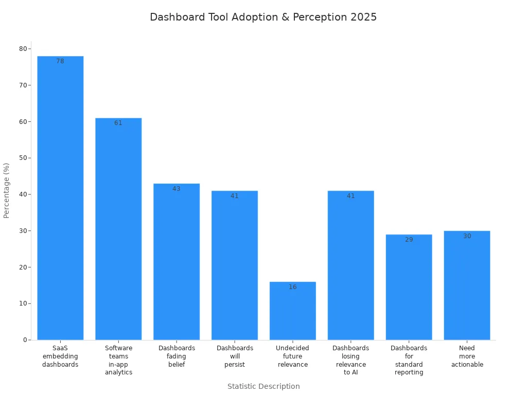
Dashboards now play a crucial role in business intelligence software. You use dashboard tools to analyze data, monitor trends, and share insights. Most SaaS companies embed dashboards, with 78% adoption. You can see how dashboard adoption and perceptions are changing in the chart below.
Dashboards help you make sense of complex data and support your business intelligence software needs. You will learn how each dashboard tool supports different data visualization and reporting strategies. You can choose the best dashboard tools for your business by understanding each dashboard’s strengths and how they handle data.
Why Best Dashboard Tools Matter for Business Intelligence
Role of Dashboards in BI
You rely on topdashboard tools for business intelligence to transform raw data into actionable insights. Dashboards serve as the central hub for analytics, bringing together data from multiple sources and presenting it in user-friendly, interactive dashboards. You can use these tools to visualize trends, monitor key performance indicators, and make data-driven decisions. Dashboards and data visualization simplify complex information, making it easier for you to interpret analytics and spot opportunities for growth.
Self-service BI features let you explore data without technical expertise. You can access real-time data updates and leverage cloud-native business intelligence for instant insights. Dashboards provide a holistic view of your organization, integrating analytics from sales, finance, and operations. You foster a data-driven culture by sharing dashboards across teams, which enhances collaboration and transparency.
Dashboards synthesize large data sets into actionable insights for data-driven decisions.
Visualization capabilities help you identify patterns and trends.
Interactive dashboards align teams and illuminate hidden opportunities.
Real-time analytics keep you updated with the latest performance metrics.
Data visualisation supports self-service analytics and empowers you to make informed choices.
Key Benefits for Organizations
Top dashboard tools for business intelligence deliver measurable benefits for your organization. You gain empowered decision-making, increased data accessibility, and enhanced productivity. Dashboards improve data quality and reduce complexity, making analytics more user-friendly and efficient.
Benefit
Description
Empowered Decision-Making
Business intelligence tools provide clear data visualizations for informed decisions.
Increased Data Accessibility
BI tools allow you to access necessary data on demand, supporting remote work and efficiency.
Enhanced Productivity
Centralized analytics and insights help teams focus on actionable insights, not data gathering.
Improved Data Quality
BI tools ensure data integrity through analysis and cleansing.
Reduced Complexity
BI tools simplify management of disparate data sources for easier analytics.
Lower Costs
Improved decision-making and reduced errors save time and money.
You benefit from real-time insights and ai-driven insights that fuel innovation. Dashboards foster a data-driven business environment, supporting self-service BI and cloud-native business intelligence. You build a data-driven culture that encourages collaboration and continuous improvement. Interactive dashboards and advanced data visualization capabilities help you streamline operations and identify growth opportunities. You use leading BI tools to centralize analytics, enhance communication, and drive data-driven decision-making.
You can unlock advanced analytics with FineReport, a standout among top dashboard tools for business intelligence. FineReport gives you effortless data analysis and extensive customization options. You tailor each dashboard to fit your business needs. The platform engages you with interactive data visualizations and supports easy collaboration across teams. You use FineReport to simplify analytics and create dashboards that deliver actionable insights.
Feature
Description
Effortless data analysis
Simplifies the process of analyzing data.
Extensive customization options
Allows you to tailor dashboards to your needs.
Interactive data visualizations
Engages you with dynamic and responsive visuals.
Easy collaboration
Facilitates teamwork through shared reports.
FineReportsupports mobile BI, letting you access dashboards and analytics on any device. You benefit from a drag-and-drop interface that makes dashboard creation simple. The platform connects to multiple data sources, ensuring your analytics remain accurate and up-to-date.
You use FineReport for a wide range of analytics scenarios. The platform enables rapid report design with a low-code interface. You integrate data from various databases and business applications. FineReport provides advanced charting and dashboard capabilities, helping you visualize complex data. You design interactive reports that allow users to explore analytics in real time. The system automates report distribution, streamlining how you share insights. You embed analytics directly into business workflows, ensuring data-driven decisions at every step.
Use Case
Description
Report Design
Enables rapid creation of reports using a low-code interface.
Data Integration
Connects to various databases and business applications.
Visualization
Provides advanced charting and dashboard capabilities.
Interactive Reports
Allows users to design reports that can be interacted with.
Automate Report Distribution
Streamlines the process of sharing reports automatically.
Real-time Data Integration
Ensures data is up-to-date and relevant in reports.
Embed Analytics in Workflows
Integrates analytics directly into business processes.
Unique Benefits for Enterprises
FineReport delivers unique benefits for enterprise users. You unlock the full potential of your data, gaining deeper insights and tailored solutions. The user-friendly and flexible features address IT staff pain points in report development. You achieve management goals through diverse visualization capabilities. FineReporthelps you build a digital collaboration ecosystem, driving data and business synergy. You transform your organization into a data-driven enterprise, using dashboards and analytics to guide every decision.
User
Benefit
Hsien-Ju Wu, Senior Consultant, NTT Data Taiwan
FineReport empowers organizations to unlock the full potential of their data by enabling better understanding and tailored solutions.
The user-friendly and flexible features of FineReport address IT staff pain points in report development and help achieve management goals through diverse charting capabilities.
Chen Chhiu Lim, Deputy Manager, TXC Corporation
FineReport facilitates the creation of a digital collaboration ecosystem that drives data and business synergy, leading to intelligent enterprise transformation.
You use FineReport to centralize analytics, foster collaboration, and drive data-driven strategies. The platform supports your journey toward smarter business management and continuous improvement.
You can unlockpowerful analytics with Microsoft Power BI, one of the top dashboard tools for business intelligence. This platform gives you a wide range of features that help you transform raw data into actionable insights. You use visualization tools to create dashboards and reports that highlight trends and patterns. Power BI offers a rich library of custom visualizations, so you can tailor your analytics to fit your needs. You import datasets from many sources using Power Query, which lets you manipulate and clean data before analysis. The platform supports flexible tiles, allowing you to customize dashboard layouts for better presentation. You can use the Q&A box to ask questions in natural language and get instant answers. Power BI integrates with R for advanced analytics and supports embedding dashboard tiles in custom apps with PowerApps.
Visualization features for dashboards and reports
Power Query for data import and manipulation
Structured reports for sharing key findings
Filtering features and built-in data connectors
Q&A box for natural language queries
Flexible tiles for custom dashboard layouts
Integration with R and PowerApps
Use Cases
You can apply Power BI to manybusiness intelligence scenarios. You track financial performance and create dashboards for budget analysis. You monitor sales metrics and visualize supply chain data to improve efficiency. Power BI helps you analyze customer behavior and monitor IT infrastructure. You compare budget versus actual results and manage quality control. You track student performance, analyze energy usage, and monitor network performance. You build risk assessment dashboards and oversee project portfolios. You measure customer service metrics, monitor vendor performance, and integrate social media analytics. You automate compliance reporting and track research and development progress.
Financial reporting and dashboard creation
Sales performance tracking
Supply chain visibility
Customer behavior analysis
IT infrastructure monitoring
Budget vs actual reporting
Quality control management
Student performance tracking
Energy usage analytics
Network performance analysis
Risk assessment dashboards
Project portfolio overview
Customer service metrics
Vendor performance monitoring
Social media integration
Compliance reporting automation
Research and development tracking
Benefits
You gain many advantages when you use Power BI as one of your business intelligence tools. The platform’s AI integration lets you ask questions in natural language and receive instant insights. You use interactive visualization options to turn complex data into clear stories. Power BI connects with many data sources, giving you a complete view of your operations. You benefit from cost-effectiveness, with strong community support and resources. You access dashboards and analytics on any device, ensuring insights are always available. Power BI provides robust security measures, including row-level security and encryption. You analyze large datasets efficiently and benefit from continuous innovation through regular updates. The platform promotes a data-driven culture, empowering you to make informed decisions. You use data governance features to ensure data quality and compliance.
Benefit
Description
AI Integration
Ask questions in natural language and get instant insights for better decision-making.
Interactive Visualizations
Transform complex data into engaging stories for easier understanding.
Data Integration
Connect with many data sources to eliminate silos and get a comprehensive view.
Cost-Effectiveness
Access strong community support and resources for reliable analytics.
Accessibility
View dashboards and analytics on any device, anytime, anywhere.
Security Measures
Protect sensitive data with row-level security and encryption.
Big Data Analysis
Analyze large datasets efficiently without performance issues.
Continuous Innovation
Benefit from regular updates that keep analytics aligned with industry trends.
Data-Driven Culture
Empower employees to make data-backed decisions and foster a data-literate workforce.
Data Governance
Ensure data quality and compliance with robust governance features.
You use Power BI to drive analytics, improve visualization, and create a data-driven environment. The platform helps you centralize analytics, share insights, and make better decisions with your business intelligence tools.
You can unlock powerful analytics with Tableau, one of the top dashboard tools for business intelligence. Tableau gives you instant access to analytic solutions through Accelerators, which provide ready-to-use dashboards that you can customize for your needs. You group data points easily using bins, which help you simplify analysis and create clear histograms. Tableau Catalog organizes all your data assets in one place, making it easier to discover and trust your data. You use Data Stories to summarize key insights, saving time and resources. Explain Data helps you uncover relationships and understand the “why” behind your analytics. You build predictive models directly in Tableau, improving your ability to make data-driven decisions. The platform offers a wide range of visualization options, including interactive charts and graphs. You access dashboards on mobile devices, ensuring you stay connected to your analytics anywhere. Tableau supports real-time communication and data exchange among users, making collaboration seamless.
Feature Description
Explanation
Instant access to analytic solutions
Accelerators provide customizable dashboards for quick insights.
Group data points
Bins allow grouping continuous data for better visualization.
Centralized data catalog
Tableau Catalog organizes assets for fast discovery.
Natural language insights
Data Stories summarize analytics for easy understanding.
Discover relationships
Explain Data reveals connections in your data.
Predictive analytics
Build models to forecast trends within Tableau.
Use Cases
You can apply Tableau across many business intelligence scenarios. Bentley Motors uses Tableau for self-service analytics, improving manufacturing and customer experience. Trajektory integrates Tableau for sports data analytics, enhancing sponsorship asset visualization. Verizon developed over 1,500 dashboards to optimize customer service, reducing call volume and dispatches. You use Tableau in IT for asset inventory and helpdesk analytics. In finance, you manage budget planning and accounts payable. Marketing teams track campaign engagement and web analytics. Tableau supports data-driven decisions in every department.
Self-service analytics for manufacturing and customer experience
Sports data analytics for sponsorship visualization
Customer service optimization with dashboard analytics
IT asset management and helpdesk analytics
Finance budget planning and accounts payable
Marketing campaign and web engagement analytics
Benefits
You gain many benefits when you use Tableau as one of your business intelligence tools. Data visualization helps you identify patterns and trends, leading to improved decision-making. Tableau enables you to create engaging narratives with your analytics, which enhances stakeholder engagement. You visualize client demographics, ensuring your programs meet community needs. Real-time data visualization lets you measure impact and attract donors with insightful presentations. Tableau empowers you to make data-driven decisions, streamline operations, and foster a culture of analytics and insights.
Benefit
Description
Improved Decision-Making
Visualization reveals patterns for better decisions.
Enhanced Storytelling
Analytics create engaging narratives for stakeholders.
Better Understanding of Clients
Visualization of demographics ensures programs meet needs.
Real-Time Data Visualization
Measure impact and attract donors with insightful analytics.
You use Tableau to centralize analytics, share insights, and drive data-driven strategies across your organization.
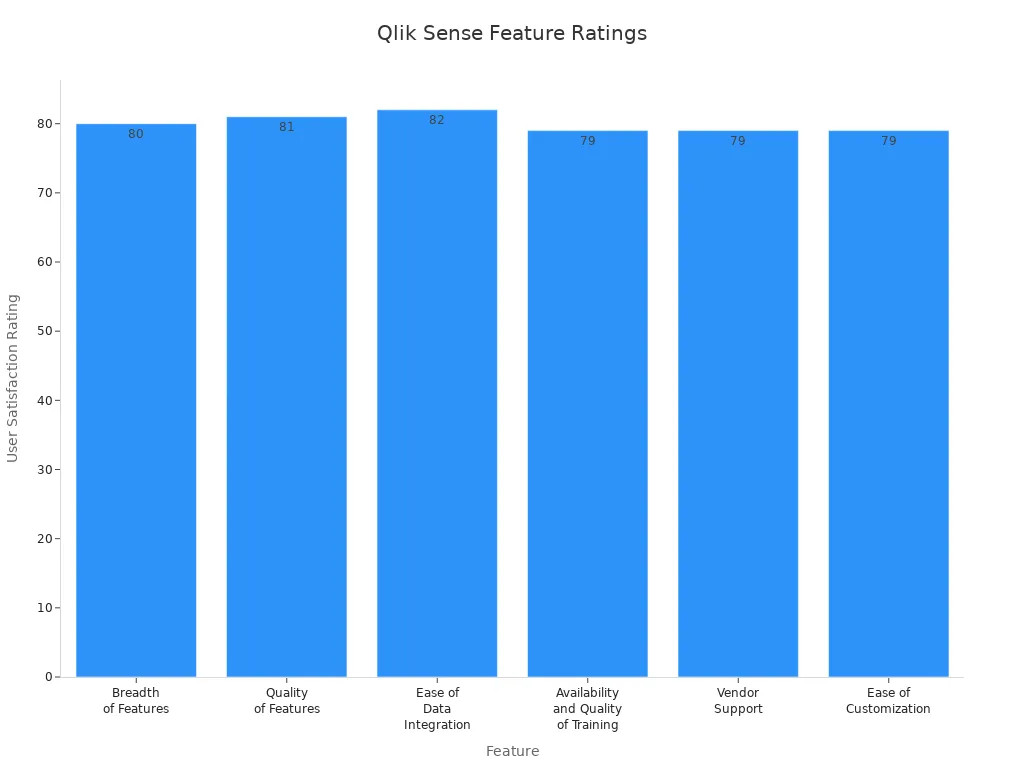
You gain a powerful set of features when you use Qlik Sense as one of thetop dashboard toolsfor business intelligence. The platform stands out for its breadth and quality of features, making analytics accessible for everyone in your organization. You can integrate data from multiple sources with ease, thanks to its strong data integration capabilities. The intuitive navigation helps you explore analytics and discover insights quickly. The Associative Data Engine lets you analyze relationships between data points, enhancing your data visualization experience. You also benefit from high-quality training and vendor support, which helps you maximize the value of your dashboard and analytics projects.
Feature
User Satisfaction Rating
Breadth of Features
80
Quality of Features
81
Ease of Data Integration
82
Availability and Quality of Training
79
Vendor Support
79
Ease of Customization
79
You appreciate how Qlik Sense makes data exploration accessible and actionable. The dashboard interface is easy to use, and you can customize visualizations to fit your needs. Many users highlight the platform’s ability to handle analytics tasks efficiently, although some mention performance issues with very large datasets.
Use Cases
You can apply Qlik Sense to a wide range of analytics scenarios. The platform supports sales and marketing analytics, helping you analyze market trends and customer behavior. You use it for financial analysis, monitoring KPIs and making informed decisions about budgeting and forecasting. Qlik Sense enhances supply chain management by providing insights into inventory and demand forecasting. You improve talent management with human resources analytics, and you streamline operations by identifying bottlenecks. The dashboard also supports risk management, allowing you to visualize compliance data and mitigate risks.
Sales and marketing analytics for trend and performance analysis
Financial analysis for budgeting and forecasting
Supply chain management with inventory and demand insights
Human resources analytics for talent management
Operational efficiency through process optimization
Risk management with compliance visualization
You use Qlik Sense dashboards to centralize analytics and share insights across departments. The platform’s data visualization capabilities help you communicate findings clearly and drive better business decisions.
Benefits
Qlik Sense delivers significant benefits as one of the top dashboard tools for business intelligence. You reduce infrastructure costs by leveraging its efficient architecture. The platform provides automatic updates and maintenance, so you always have the latest analytics features. You access Qlik Sense globally, which supports collaboration and data sharing. Elastic scalability lets you adjust usage based on demand, ensuring flexibility for your organization. Enhanced disaster recovery features protect your data and ensure business continuity. You create intuitive dashboards that communicate insights effectively, and you choose from flexible pricing structures to fit your budget. Comprehensive security features safeguard sensitive information, and continuous updates keep your analytics capabilities current.
Benefit
Description
Reduced infrastructure costs
Lower IT expenses with efficient architecture
Automatic updates and maintenance
Regular updates without manual intervention
Global accessibility and collaboration
Access from anywhere, facilitating teamwork
Elastic scalability based on demand
Scale usage flexibly as needed
Enhanced disaster recovery capabilities
Robust features for data protection and business continuity
Intuitive dashboard creation
Easily build visualizations that communicate insights
Flexible pricing structures
Choose licensing options that fit your needs
Comprehensive security features
Advanced protocols to protect sensitive data
Continuous updates and improvements
Regular enhancements for up-to-date analytics
You rely on Qlik Sense to deliver analytics, visualization, and insights that drive your business forward. The platform helps you create dashboards that support data-driven decisions and foster collaboration across your organization.
You gain awide range of features when you use Google Looker Dashboard for your analytics needs. The user-friendly interface makes data analysis simple for everyone, regardless of technical skill. You can create customizable dashboards that fit your business requirements. Looker supports real-time data exploration and analysis, letting you interact with visualizations and perform ad hoc analytics on the fly. The platform offers advanced reporting tools, including pre-built templates and a drag-and-drop report builder, so you can generate reports quickly and keep your insights current.
You benefit from strong collaboration and sharing features. You can comment on dashboards, edit them with your team, and control access with role-based permissions. Looker connects to a wide variety of data sources and supports API integrations, making it easy to blend data for richer analytics. The platform also integrates machine learning models for predictive analytics and supports custom calculations. Security and compliance are built in, with robust encryption and adherence to standards like GDPR and HIPAA. Mobile accessibility ensures you can view dashboards and analytics on any device, so you never miss important insights.
Feature
Description
User-Friendly Interface
Intuitive design for easy data analysis and dashboard customization.
Data Exploration and Analysis
Real-time interaction and interactive visualizations for accurate analytics.
Advanced Reporting Tools
Pre-built templates and drag-and-drop report building.
Collaboration and Sharing
Easy sharing, commenting, and collaborative editing with access controls.
Integration and Connectivity
Connects to many data sources and supports API integrations.
Advanced Analytics
Machine learning integration and custom calculations.
Security and Compliance
Data encryption and compliance with industry standards.
Mobile Accessibility
Dashboards and analytics accessible on any device.
Use Cases
You can apply Google Looker Dashboard across many industries to unlock valuable analytics and insights. In healthcare, you analyze patient data to improve care and optimize resources, reducing readmission rates. Retailers use Looker to study purchasing patterns, personalize marketing, and manage inventory more effectively. Finance teams rely on Looker for risk management, fraud detection, and regulatory reporting. In manufacturing, you monitor production lines, predict maintenance needs, and ensure quality control with real-time analytics. Educational institutions use Looker to track student performance and optimize resources, leading to better outcomes.
Healthcare: Improve patient care and operational efficiency with analytics.
Retail: Analyze sales data for personalized marketing and inventory optimization.
Finance: Enhance risk management and compliance with advanced analytics.
Manufacturing: Monitor production and quality with predictive analytics.
Education: Track student outcomes and resource allocation for better results.
You use Looker to centralize your analytics, making it easier to share dashboards and insights across your organization.
Benefits
When you adopt Google Looker Dashboard, you experience severalkey benefits that set it apart among top dashboard tools for business intelligence. You centralize your data from multiple sources, so you no longer need to switch between different tools. Real-time insights give you instant access to analytics, helping you respond quickly to changes and opportunities. The platform allows you to customize and interact with dashboards, aligning your data visualization with your business goals.
Collaboration improves as you share dashboards and analytics across teams, ensuring everyone works with the same up-to-date information. You make better decisions because data becomes more accessible and actionable at every level of your organization.
Benefit
Description
Data Centralization
Unifies data from multiple sources into one dashboard.
Real-Time Insights
Provides instant analytics for quick responses.
Customizable and Interactive
Lets you tailor dashboards and interact with data for deeper insights.
Enhanced Collaboration
Facilitates sharing and teamwork with up-to-date analytics.
Improved Decision-Making
Makes data accessible for better choices at all levels.
You rely on Google Looker Dashboard to deliver powerful analytics, clear data visualization, and actionable insights that drive your business forward.
You can use Sisense to power your analytics with advanced features that make your dashboard experience seamless. Sisense uses AI and machine learning to deliver automated analytics and predictive insights. You interact with your data using natural language, which makes analytics more accessible. The platform supports flexible deployment, so you can access your dashboards in the cloud, on-premises, or in hybrid environments. Sisense provides a centralized connection manager, letting you create, manage, and share data connections securely from one place. You can co-author dashboards with your team, building and editing visualizations together in real time. The analytical engine update improves query performance and supports advanced data modeling. Conversational interfaces like the AI Assistant allow you to interact with analytics through dialogue-driven prompts. Contextual AI features, such as Sisense Narratives, generate dynamic insights and guidance within your analytics workflow.
Key Feature
Description
AI-powered insights
Automated analytics, predictive insights, and natural language queries.
Flexible deployment
Cloud, on-premises, and hybrid support for dashboards.
Centralized connection manager
Securely manage and share data connections.
Dashboard co-authoring
Collaborate on dashboards and visualizations in real time.
Analytical engine update
Improved query performance and advanced data modeling.
Conversational Interfaces
Dialogue-driven prompts for analytics interaction.
Contextual AI
Dynamic insights and guidance within the analytics workflow.
Use Cases
You can apply Sisense to manybusiness intelligence scenarios. Bluefield Research used Sisense to enhance analytics capabilities. They unified over 1.2 million data points from 15 sources. This eliminated manual data preparation and empowered non-technical users with AI-driven insights. You can use Sisense to speed up analytics by asking questions in natural language. The platform creates a centralized data experience, making it easy to manage and share dashboards. You can support teams across departments by providing real-time analytics and visualization tools. Sisense helps you break down data silos and deliver actionable insights to everyone in your organization.
Unify data from multiple sources for comprehensive analytics.
Empower non-technical users with AI-driven insights.
Eliminate manual data preparation for faster analytics.
Enable natural language queries for quick answers.
Centralize dashboards and visualization for easy sharing.
Benefits
Sisense gives you several benefits when you use it for business intelligence. You integrate diverse data sources, which provides a holistic view of your business operations. The platform scales with your needs, supporting everything from simple dashboards to complex data modeling. AI-driven insights enhance your analytics, making it easier to spot trends and act quickly. Sisense offers an AI-first interface for analytics creation, which simplifies the process for non-experts. The GenAI suite includes narrative summaries, key driver explanations, and trend predictions. These features empower you to analyze data and share insights with your team. You can make proactive decisions and improve your business outcomes with advanced analytics and data visualization.
Benefit
Description
Seamless Data Integration
Combine data from many sources for complete analytics.
Scalability and Flexibility
Grow your dashboards and analytics as your business expands.
AI-Driven Insights
Use predictive analytics and automated insights for better decision-making.
Sisense helps you transform analytics into actionable insights, making your dashboards a central part of your business intelligence strategy.
You can useDomo dashboard softwareto transform your business intelligence strategy. The platform gives you real-time access to analytics, allowing you to analyze and visualize data instantly. You connect to over 1,000 apps and data sources, making integration seamless. The user-friendly interface helps you create dashboards without tutorials. Domo offers a mobile-first design, so you access analytics and dashboards on any device. You collaborate with your team using built-in workflow features. The platform supports AI and machine learning, enabling natural language processing and data forecasting. You benefit from pre-built apps and templates that speed up setup.
Real-time data access for instant analytics and visualization
Integration with more than 1,000 apps and data sources
User-friendly interface for easy dashboard creation
Customizable dashboards with no tutorials required
Mobile-first design for analytics on-the-go
Collaboration features for team workflows
AI and machine learning for natural language processing and forecasting
Pre-built apps and templates for quick setup
Domo also provides data apps and workflow apps for building custom workflows and data collections. You use reporting and dashboards with over 150 chart types and customizable options. The platform includes Magic ETL and SQL dataflows for data transformation. Embedded analytics capabilities let you share secure visualizations. Security and governance features help you manage data effectively.
Use Cases
Domo dashboard software supports manybusiness intelligence scenarios. You can combine marketing data from multiple sources to gain insights into performance and trends. Financial analytics lets you analyze accounting data and visualize key financial statements. The table below shows common use cases.
Use Case
Description
Marketing Analytics
Combines online marketing data from multiple sources, providing insights into performance and trends.
Financial Analytics
Analyzes accounting data to inform financial management decisions, visualizing key financial statements.
You also use Domo for sales analytics, operations management, and customer service dashboards. The platform helps you centralize analytics and share insights across departments.
Benefits
When you implement Domo dashboard software, you unlock several benefits for your organization. You enhance the value of your data by centralizing KPIs and visual comparisons. Real-time updates improve team cohesion, keeping everyone informed. Compelling data visualizations help you gain faster stakeholder buy-in. The platform flags metrics outside expected ranges, allowing early problem detection. You increase cross-functional collaboration with a unified data view. Continuous tracking of long-term goals gives you real-time performance insights.
Enhanced value from data through centralized KPIs and visual comparisons
Improved team cohesion with real-time updates
Faster stakeholder buy-in with compelling visualizations
Early problem detection by flagging metrics outside expected ranges
Increased cross-functional collaboration with a unified data view
Continuous tracking of long-term goals with real-time performance insights
You use Domo dashboard software to drive analytics, improve visualization, and deliver actionable insights. The platform supports your journey toward smarter business management and data-driven decision-making.
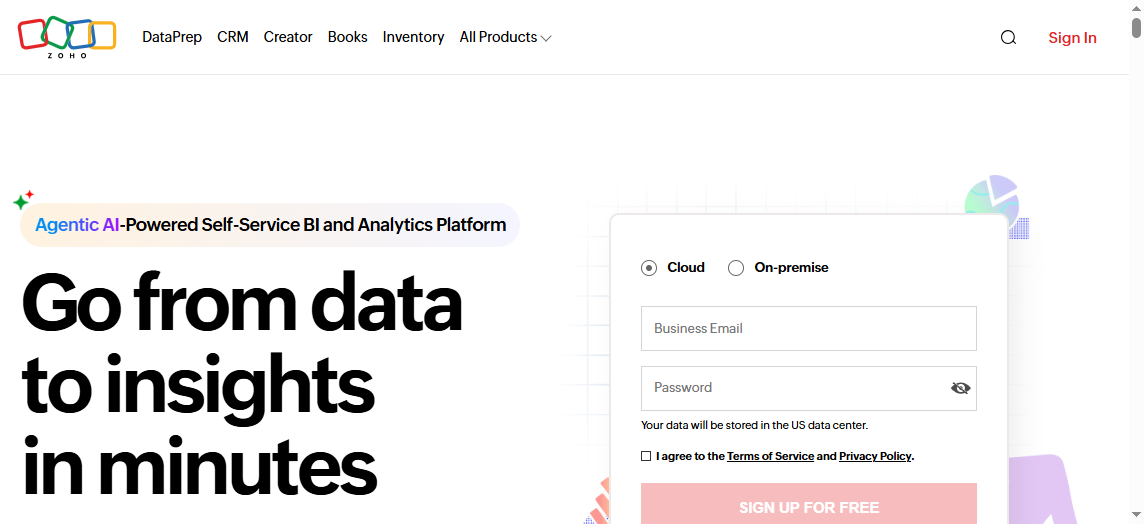
Zoho Analytics stands out among the Top dashboard tools for business intelligence. You gain powerful analytics and data visualization features that help you turn raw data into actionable insights. The platform makes it easy to create interactive dashboards and reports, so you can explore trends and patterns in your business data.
Features
You use Zoho Analytics to simplify analytics and enhance your dashboard experience. The drag-and-drop interface lets you build dashboards quickly, even if you have no technical background. You customize charts, graphs, and tables to fit your needs. The platform offers interactive dashboards with widgets that make data visualization engaging and clear. You benefit from AI-powered features like Zia Insights, which deliver automated analytics and instant answers to your questions. Collaboration tools allow you to share dashboards and reports with your team, supporting group analytics and decision-making. You integrate Zoho Analytics with other Zoho apps and third-party platforms, expanding your data sources and improving accessibility.
Drag-and-drop dashboard builder for easy analytics creation
Customizable charts, graphs, and tables for advanced visualization
Interactive dashboards with widgets for clear data visualization
AI and machine learning features such as Zia Insights for automated analytics
Collaboration tools for sharing dashboards and reports
Integration with Zoho and third-party applications for enhanced analytics
Use Cases
You apply Zoho Analytics across many business functions. Sales teams track deal velocity and pipeline movements in real time using dashboards. Finance teams forecast cash flow and identify unprofitable accounts with analytics. Customer support monitors ticket volumes and resolution times to maintain satisfaction. Marketing teams consolidate campaign data and compare ROI, optimizing budget allocation. Operations and leadership access cross-functional dashboards to monitor KPIs and drive performance.
Business Function
Use Case Description
Industry Example
Sales Teams
Track deal velocity, win rates, and pipeline movements in real-time
Tech Startups
Finance Teams
Forecast cash flow and identify unprofitable accounts
Professional Services
Customer Support
Monitor SLAs, ticket volumes, and resolution times
Construction & Property Services
Marketing
Consolidate campaign data and compare ROI
Digital Agencies
Operations & Leadership
Access cross-functional dashboards and monitor KPIs in real-time
Growing SMEs
Benefits
Zoho Analytics delivers several benefits that make it a top choice among dashboard tools for business intelligence. You access extensive visualization options, including widgets and charts, for informative dashboards and reports. Collaborative analytics features let you work with your team to analyze data and share insights. Smart modeling capabilities connect relevant data tables, improving the quality of your analytics. You analyze data across departments, supporting cross-functional analytics and better decision-making. The platform supports data uploads from spreadsheets and various file types, and you can pull data from online storage services. Intelligent data suggestions help you filter and cleanse data, ensuring high-quality analytics. Responsive customer support assists you whenever you need help.
Benefit/Feature
Description
Extensive Visualization Options
Widgets, charts, and tabular views for informative dashboards and reports
Collaborative Analytics
Work together on analytics and share insights
Smart Modeling Capabilities
Connect relevant data tables for deeper analytics
Cross-Functional Analytics
Analyze data across departments for better business insights
Data Upload Flexibility
Upload data from spreadsheets and various file types
Integration with Online Storage
Pull data from services like Google Drive and Dropbox
Intelligent Data Suggestions
Filter and cleanse data for improved analytics
Responsive Customer Support
Get help when you need it
You use Zoho Analytics to create dashboards that drive analytics, support data visualization, and deliver actionable insights for your organization.
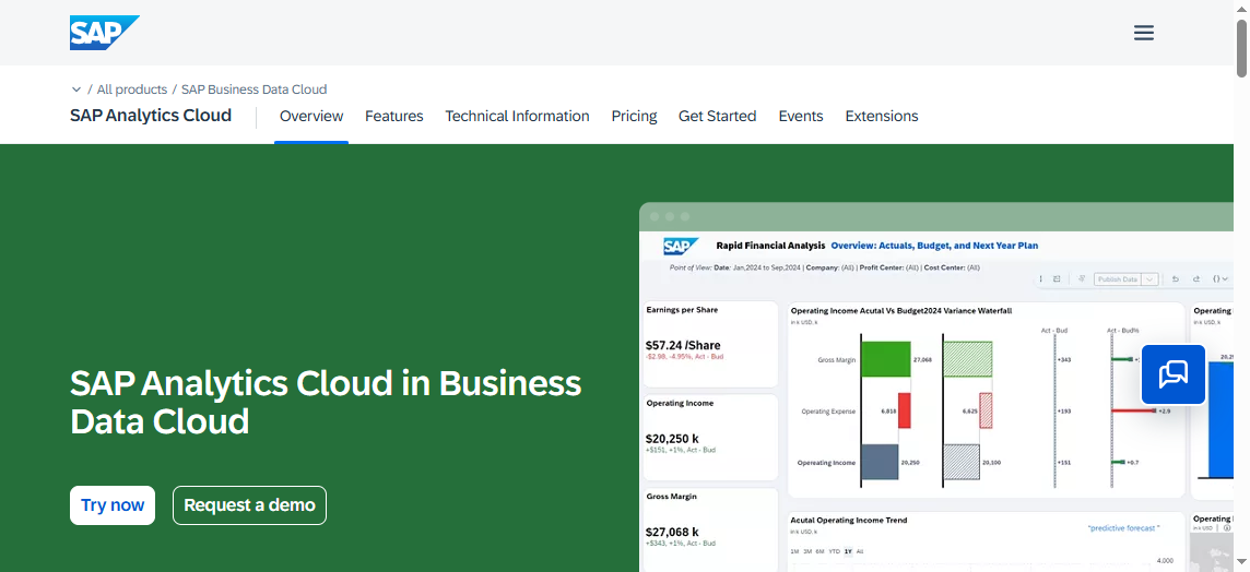
You can use SAP Analytics Cloud Dashboard to bring together analytics, planning, and predictive capabilities in one platform. The dashboard lets you connect to both cloud and on-premise data sources. You create interactive dashboards with drag-and-drop tools. The platform supports advanced visualization, including geo maps and custom widgets. You access real-time analytics and share insights with your team. The dashboard includes smart features like augmented analytics, which use machine learning to help you discover trends and patterns. You can schedule reports and automate analytics workflows. The platform also offers strong security and compliance features.
Tip: Use the built-in data visualization tools to make your analytics more engaging and easier to understand.
Use Cases
You apply SAP Analytics Cloud Dashboard across many industries. In finance, you track budgets, forecast revenue, and monitor expenses with real-time analytics. Sales teams use the dashboard to analyze pipeline performance and customer trends. In supply chain management, you visualize inventory levels and supplier performance. HR departments use analytics to monitor workforce metrics and improve hiring strategies. You can also use the dashboard for project management, tracking milestones and resource allocation. The platform supports collaboration, so you share insights and work together on analytics projects.
Department
Use Case Example
Value Delivered
Finance
Budget tracking and forecasting
Improved financial planning
Sales
Pipeline and customer analytics
Better sales strategies
Supply Chain
Inventory and supplier visualization
Streamlined operations
HR
Workforce analytics
Enhanced talent management
Project Teams
Milestone tracking
On-time project delivery
Benefits
You gain several benefits when you use SAP Analytics Cloud Dashboard as one of thetop dashboard tools for business intelligence. The platform centralizes analytics, making it easy to access all your data in one place. You get faster insights because the dashboard updates in real time. Advanced visualization helps you spot trends and outliers quickly. The platform supports self-service analytics, so you do not need to rely on IT for every report. You improve collaboration by sharing dashboards and analytics with your team. Automated workflows save you time and reduce manual work. Strong security features protect your data and ensure compliance with regulations. You make better decisions because you have access to accurate, up-to-date insights.
Note: SAP Analytics Cloud Dashboard helps you turn analytics into action by delivering the right insights to the right people at the right time.
You can use Dundas BI to enhance your analytics strategy as you explore the Topdashboard toolsfor business intelligence. Dundas BI gives you a flexible dashboard design environment. You build dashboards with drag-and-drop tools and customize every element. The platform supports advanced analytics, letting you connect to many data sources. You use real-time data visualization to monitor key metrics. Dundas BI offers interactive visualization options, such as charts, maps, and gauges. You can embed dashboards into your existing applications. The platform supports scripting for advanced customization. You also automate analytics workflows and schedule report delivery. Dundas BI provides strong security features to protect your data.
Use Cases
You apply Dundas BI across many industries when you need advanced analytics and actionable insights. In healthcare, you track patient outcomes and resource utilization with real-time dashboards. Retailers use Dundas BI to analyze sales trends and optimize inventory. Financial teams rely on the platform for risk analytics and regulatory reporting. You can monitor manufacturing processes and improve quality control with interactive dashboards. Government agencies use Dundas BI for public data visualization and performance tracking. You also support education analytics by monitoring student performance and resource allocation. The platform adapts to your business needs, whether you need embedded dashboards or standalone analytics portals.
Benefits
Dundas BI gives you several advantages as you evaluate the Top dashboard tools for business intelligence. You gain a unified analytics platform that brings together data from multiple sources. The flexible dashboard design lets you create custom analytics experiences. You benefit from real-time insights that help you respond quickly to business changes. The platform’s interactive visualization features make it easy to explore data and uncover trends. You share dashboards and analytics with your team, improving collaboration. Dundas BI supports self-service analytics, so you do not need to rely on IT for every report. You also automate analytics processes, saving time and reducing manual work. The platform’s security features ensure your data stays protected. With Dundas BI, you turn analytics into actionable insights and drive better decisions for your organization.
Comparison of Best Dashboard Tools
Feature Overview
You want to choose from theTop dashboard toolsfor business intelligence. Each dashboard offers unique analytics and visualization features. FineReportprovides flexible dashboard layouts, interactive data visualization, and mobile analytics. Microsoft Power BI stands out with AI-powered analytics and seamless integration with Microsoft services. Tableau leads with advanced visualization and real-time analytics. Qlik Sense delivers associative analytics and intuitive dashboard design. Google Looker focuses on cloud-based analytics and customizable dashboards. Sisense offers AI-driven analytics and natural language queries. Domo supports real-time analytics and mobile dashboards. Zoho Analytics makes dashboard creation simple with drag-and-drop analytics. SAP Analytics Cloud combines planning and analytics in one dashboard. Dundas BI excels at customizable dashboards and embedded analytics.
Tool
Dashboard Features
Visualization Strengths
Analytics Capabilities
FineReport
Flexible layouts, mobile access
Interactive, 3D charts
Real-time, multi-source
Power BI
AI, seamless integration
Custom visuals
Advanced, scalable
Tableau
Real-time, Accelerators
Advanced, interactive
Predictive, fast
Qlik Sense
Associative, intuitive
Customizable
Fast, associative
Google Looker
Cloud, customizable
Modern, interactive
Ad hoc, predictive
Sisense
AI, natural language
Dynamic, contextual
Automated, scalable
Domo
Real-time, mobile
Compelling, varied
Instant, collaborative
Zoho Analytics
Drag-and-drop, widgets
Engaging, easy
Automated, cross-functional
SAP Analytics
Planning, real-time
Geo maps, custom widgets
Augmented, self-service
Dundas BI
Custom, embedded
Interactive, advanced
Automated, flexible
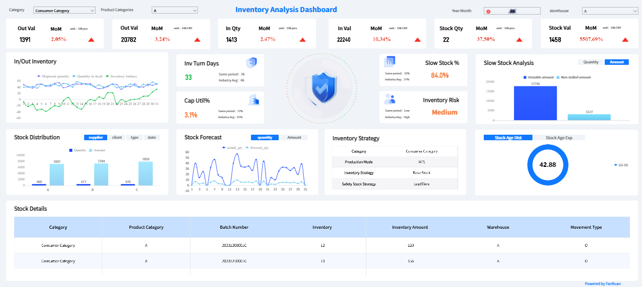
FineReport'sMultiple Built-in Charts For Visualization
You need to consider pricing and scalability when selecting Top dashboard tools for business intelligence. FineReport offers enterprise-level scalability and flexible licensing. Power BI provides affordable plans for small businesses and scalable enterprise options. Tableau uses tiered pricing for individuals and organizations. Qlik Sense supports elastic scalability and flexible pricing. Google Looker uses subscription pricing and scales for cloud analytics. Sisense offers custom pricing and supports hybrid deployments. Domo provides scalable cloud analytics with subscription models. Zoho Analytics features competitive pricing and easy scaling. SAP Analytics Cloud uses subscription pricing and supports large enterprises. Dundas BI offers flexible licensing and scalable deployment.
Tip: Always review the latest pricing details on each vendor’s website. You can scale most dashboard tools as your analytics needs grow.
Integration and Support
You want dashboard tools that integrate with your existing systems and provide strong support. FineReportconnects to over 500 data sources and offers robust support for analytics projects. Power BI integrates with Microsoft services and third-party apps. Tableau connects to many databases and supports extensive analytics. Qlik Sense offers broad integration and vendor support. Google Looker connects to cloud and on-premise sources. Sisense provides centralized connection management and strong analytics support. Domo integrates with over 1,000 apps. Zoho Analytics connects with Zoho and third-party platforms. SAP Analytics Cloud supports enterprise system integration. Dundas BI embeds dashboards into applications and offers advanced analytics support.
Note: Integration and support play a key role in maximizing the value of your dashboard and analytics investments. You gain better insights and smoother workflows when your dashboard tools connect seamlessly.
You start by identifying your organization’s goals and requirements.Top dashboard toolsfor business intelligence help you analyze data and deliver insights that match your business objectives. You consider your company size, industry, and the complexity of your analytics needs. Small businesses often need simple dashboards and basic analytics. Large enterprises require advanced analytics, real-time data visualization, and scalable dashboard solutions. You list the types of data you want to track and the insights you expect from your analytics platform. You also think about how many users will access dashboards and what level of collaboration you need.
You compare the features oftop dashboard toolsfor business intelligence. You look for platforms that offer interactive dashboards, strong visualization options, and seamless analytics integration. You test the usability of each dashboard tool. A user-friendly interface helps you create dashboards and visualizations quickly. You check if the platform supports drag-and-drop dashboard design and customizable analytics workflows. You review the available data visualization types, such as charts, graphs, and maps. You also explore how each tool handles analytics, including real-time updates and automated insights. You choose a dashboard tool that makes analytics accessible and supports your team’s workflow.
Budget and Support Considerations
You set a budget for your analytics investment. Top dashboard tools for business intelligence offer different pricing models, so you compare costs and scalability. You look for dashboard solutions that fit your budget and can grow with your analytics needs. You check the vendor’s support options, including training, documentation, and customer service. Reliable support ensures you get the most from your analytics and dashboard platform. For enterprises that need flexible, scalable dashboards and advanced reporting, FineReport stands out as a strong option. FineReportdelivers robust analytics, interactive dashboards, and powerful data visualization, making it ideal for organizations seeking actionable insights and efficient business management.
You explored the Top dashboard tools for business intelligence and learned how each dashboard supports your analytics goals. You saw that choosing the right dashboard helps you visualize data, improve decision-making, and drive business growth. Review your organization’s needs, compare dashboard features, and test usability before making a selection. You can start by listing your requirements and evaluating which dashboard aligns best with your business intelligence strategy.
Access a wealth of case studies, industry insights, and solution guides to accelerate digital transformation.
FAQ
What is a dashboard in business intelligence?
A dashboard is a visual tool that helps you track, analyze, and display key data points. You use dashboards to monitor business performance and make informed decisions quickly.
How do dashboards improve decision-making?
Dashboards give you real-time access to important metrics. You can spot trends, identify issues, and act faster. This helps you make better decisions based on current data.
Can I customize dashboards for different teams?
Yes, you can customize dashboards to show the most relevant data for each team. This ensures everyone sees the information they need to do their job well.
Are dashboards secure for sensitive business data?
Most dashboard tools offer strong security features. You can control who accesses each dashboard and protect sensitive information with permissions and encryption.
How do I choose the right dashboard tool for my business?
Start by listing your needs. Look for dashboard tools that connect to your data sources, offer easy customization, and provide good support. Test a few options before making your choice.