Dashboard programs are software platforms that connect business data, visualize KPIs, and automate reporting so teams can monitor performance and make decisions faster.
The 10 Best Dashboard Programs for Business Reporting in 2026
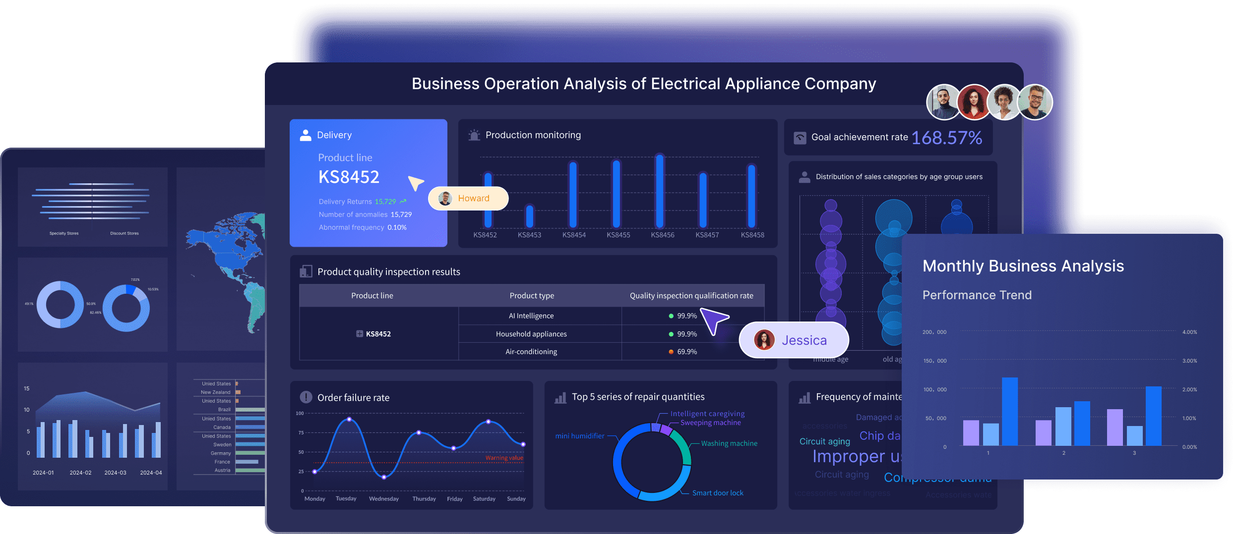
1. FineBI
One-sentence overview:FineBI is a modern self-service BI and dashboard platform designed for business reporting, interactive analysis, and governed data access across growing companies and enterprises.
Key Features
Self-service dashboard creation with drag-and-drop design
Broad data connectivity for databases, cloud sources, and business systems
Interactive drill-down, filtering, and cross-analysis
Centralized data governance and permission management
Pixel-level report design for structured business reporting
Real-time and scheduled refresh options
Mobile access and dashboard sharing
Support for enterprise deployment and large-scale reporting environments
Pros & Cons
Pros
Strong balance between usability and enterprise control
Well-suited for both dashboards and formal business reports
Flexible enough for executives, operations, finance, and analysts
Cons
More capability than very small teams may need at the start
Full value depends on setting up data models and governance properly
Best For (Target user/scenario)
Mid-sized businesses and enterprises that need scalable reporting
Teams that want to replace manual spreadsheet reporting with interactive dashboards
Organizations looking for a practical alternative to heavier BI stacks
If your priority is building a repeatable, governed reporting environment instead of just creating a few isolated charts, FineBI is one of the most complete dashboard programs to shortlist in 2026. It is especially strong when multiple departments need access to shared metrics but still require role-based permissions, reusable datasets, and consistent KPI definitions. For companies that want a dashboard tool that supports both day-to-day monitoring and more structured management reporting, FineBI stands out as a strong business-first option.
One-sentence overview: Microsoft Power BI is a widely adopted dashboard and analytics platform known for strong data modeling, Microsoft ecosystem integration, and enterprise reporting depth.
Key Features
Deep integration with Excel, Azure, Teams, and Microsoft Fabric
Power BI remains one of the safest choices among dashboard programs when data governance, modeling, and internal reporting matter more than simplicity alone. It is not always the easiest platform for casual users to build in, but it is highly capable for organizations that need scalable dashboards, reusable datasets, and consistent metrics across teams.
3. Tableau
One-sentence overview: Tableau is a visualization-first analytics platform that excels at interactive dashboards, exploratory analysis, and high-impact data storytelling.
Key Features
Excellent for visual analysis and presentation-quality dashboards
Strong flexibility for analysts and BI teams
Mature ecosystem and broad enterprise adoption
Good for uncovering patterns through exploration
Cons
Can be expensive for broader deployments
Less approachable for some business users than lighter tools
Governance and semantic consistency may require stronger BI management
Best For (Target user/scenario)
Analyst-led teams
Data-heavy organizations that prioritize visual exploration
Companies that want polished executive dashboards
Tableau is one of the most recognized dashboard programs for teams that care about analysis depth and visual clarity. It is particularly effective when dashboards are not just for KPI display, but also for investigating trends, outliers, and business drivers. For pure business reporting, however, some teams may find it more analyst-centric than necessary.
4. Looker
One-sentence overview: Looker is a governed BI and dashboard platform built around centralized metrics, reusable models, and strong integration with the Google Cloud ecosystem.
Key Features
Less ideal for teams seeking fast, no-code dashboarding
Pricing may not suit small organizations
Best For (Target user/scenario)
Data-mature organizations
Teams using Google Cloud and centralized warehouse data
Businesses that need strict metric consistency
Among dashboard programs, Looker is strongest when reporting maturity is already high. It is less about quick standalone dashboards and more about building a governed analytics layer that supports scalable reporting across departments.
5. Qlik Sense
One-sentence overview: Qlik Sense is an analytics and dashboard platform known for associative data exploration, flexible filtering, and strong enterprise analytics capability.
Key Features
Associative analytics engine
Interactive dashboards and self-service exploration
Qlik Sense is a strong option if your reporting needs go beyond simple scorecards and into multi-dimensional analysis. It is one of the more capable dashboard programs for complex enterprise use cases, though not the easiest place for a lean team to start.
6. Domo
One-sentence overview: Domo is a cloud-native dashboard platform focused on real-time connectivity, executive visibility, and cross-functional business reporting.
Key Features
Organizations willing to invest in a centralized dashboard layer
Domo fits businesses that want one platform for broad visibility across departments. Compared with other dashboard programs, it is often chosen for business accessibility and executive reporting, though budget can become a limiting factor.
7. Looker Studio
One-sentence overview: Looker Studio is a free or low-cost dashboard tool for lightweight business reporting, especially for marketing and web analytics use cases.
Key Features
Free dashboard builder
Native integration with Google products
Shareable reports and dashboards
Custom charts and community connectors
Lightweight filtering and interactivity
Simple collaboration features
Pros & Cons
Pros
Low barrier to entry
Good for quick dashboards and stakeholder reporting
Useful for Google Analytics, Ads, and Search Console reporting
Easy to share across teams
Cons
Governance is limited compared with enterprise BI tools
Performance can vary with large or complex datasets
Not ideal for advanced modeling or strict reporting control
Best For (Target user/scenario)
Small teams
Marketing teams and agencies
Businesses needing free dashboard programs for simple reporting
Looker Studio is one of the most accessible dashboard programs for organizations that need quick visibility without a major investment. It works well when reporting complexity is modest and the business mainly needs shareable dashboards rather than a full BI environment.
8. Databox
One-sentence overview: Databox is a KPI-focused dashboard platform built for straightforward performance monitoring, automated reporting, and easy stakeholder visibility.
Key Features
Prebuilt templates for sales, marketing, and SaaS metrics
Advanced enterprise governance is limited compared with BI suites
Can feel template-driven for custom analytics needs
Best For (Target user/scenario)
Small and growing companies
Sales, marketing, and leadership reporting
Teams that want dashboards without a heavy BI implementation
Databox is one of the more practical dashboard programs for lean teams that care about speed and visibility. It is best when your reporting goal is to monitor defined KPIs rather than support deep exploratory analysis.
9. Klipfolio
One-sentence overview: Klipfolio is a flexible cloud dashboard tool aimed at KPI tracking, lightweight custom dashboards, and business reporting for small to mid-sized teams.
Key Features
User experience can feel less polished than top-tier platforms
Complex custom logic may require extra setup effort
Not ideal for advanced governed analytics
Best For (Target user/scenario)
SMBs and agencies
Teams that need customized KPI dashboards
Businesses wanting more flexibility than basic reporting tools
Klipfolio sits between lightweight KPI tools and full BI platforms. Among dashboard programs, it is a reasonable fit for companies that need some custom reporting without committing to a larger enterprise stack.
10. Metabase
One-sentence overview: Metabase is an open-source BI and dashboard tool that offers SQL-friendly analytics, simple dashboards, and a cost-effective path for technical teams.
Key Features
Open-source deployment option
SQL queries and visual question builder
Dashboard sharing and embedding
Database connectivity
Alerts and scheduled pulses
Self-hosted and cloud options
Pros & Cons
Pros
Affordable entry point
Strong choice for technically capable teams
Good for internal reporting and ad hoc dashboards
Open-source flexibility appeals to engineering-led organizations
Cons
Less polished for enterprise business-user adoption
Governance and advanced semantic modeling are more limited
Setup and maintenance can require technical ownership
Best For (Target user/scenario)
Startups and technical teams
Organizations comfortable with self-hosting
Businesses seeking low-cost dashboard programs with SQL access
Metabase is a practical choice when budget matters and the team has enough technical skill to manage setup and maintenance. It is less suited to non-technical business users who expect highly curated self-service reporting.
How to Choose the Best Dashboard Programs for Business Reporting
What business reporting teams actually need in 2026
In 2026, business reporting teams need more than attractive charts. The most useful dashboard programs help teams centralize metrics, reduce spreadsheet work, automate recurring reports, and keep definitions consistent across departments. Reporting is no longer just a monthly exercise for analysts. Executives, finance teams, operations managers, and revenue leaders all expect on-demand visibility.
That means the right platform should support:
Fast access to trusted KPIs
Dashboards that non-technical users can actually understand
Reusable datasets and metric definitions
Scheduled and self-service reporting
Permissions for different roles and business units
Flexible sharing across desktop, mobile, and presentations
The gap between a simple dashboard and a reporting system is now more important than ever. If your organization depends on board packs, operational reviews, budget tracking, pipeline visibility, or delivery metrics, your tool needs to support process and governance, not just visualization.
The core evaluation criteria: data connections, ease of use, customization, governance, collaboration, and pricing
When comparing dashboard programs, use the following criteria:
Data connections: Can it connect to your CRM, ERP, spreadsheets, databases, cloud warehouse, and marketing tools?
Ease of use: Can business users build or edit reports without constant analyst help?
Customization: Does it support your preferred layouts, drill paths, calculations, and branding?
Governance: Can you define permissions, control access, and maintain consistent KPIs?
Collaboration: Is it easy to share dashboards, comment, export, schedule, or embed reports?
Pricing: Does the total cost still make sense as more users, data sources, and departments join?
A tool may score well in one area and poorly in another. For example, some platforms are excellent for visual exploration but weak in business-user simplicity. Others are easy to use but limited once your reporting needs become more structured.
When a simple reporting tool is enough versus when you need a full dashboard platform
Reporting is limited to weekly or monthly KPI reviews
You do not need strict access control or reusable data models
You likely need a full dashboard platform if:
Multiple teams rely on the same metrics
Data comes from several business systems
Different roles need different views of the same data
You need drill-down, governance, alerts, mobile access, or embedded analytics
Reporting volume and complexity are increasing every quarter
For many growing businesses, this is where FineBI becomes especially relevant. It gives teams more structure and governance than lightweight dashboard tools, while still supporting self-service analysis and interactive reporting.
At a Glance: The 10 Best Options Compared
Here is a quick comparison of the best dashboard programs for business reporting in 2026.
If your company is analyst-led and highly data-driven
Consider Tableau, Looker, or Qlik Sense
If you need cloud-first executive visibility across many functions
Consider Domo
For most businesses that are serious about scaling reporting in 2026, FineBI is one of the most balanced options available. It combines business-user accessibility, interactive dashboards, reporting flexibility, and governance in a way that suits both growing companies and enterprise teams. If your current reporting stack feels too manual, too fragmented, or too dependent on spreadsheets, FineBI is a strong place to start your evaluation.
FAQs
The best dashboard program depends on your data complexity, team skills, and reporting goals. FineBI, Power BI, Tableau, and Looker are strong options, but the right choice comes down to whether you prioritize self-service use, governance, visual analysis, or cloud integration.
Start by checking data source support, ease of use, governance features, refresh options, and sharing capabilities. You should also compare pricing, scalability, and whether the tool fits KPI monitoring, deeper analysis, or formal reporting.
Good dashboard software should connect to multiple data sources, support interactive filtering and drill-down, automate refreshes, and make dashboards easy to share. For larger teams, role-based permissions and centralized metric governance are also important.
Small businesses often do best with tools that are easy to set up, affordable, and simple to maintain. If reporting needs are still basic, lighter platforms or spreadsheet-based workflows may work at first, while tools like FineBI or Power BI can support growth later.
A KPI dashboard tool is usually focused on making key metrics easy to monitor and share at a glance. A BI platform goes further by supporting deeper analysis, data modeling, governance, and more advanced reporting across teams.
Product Trial
FineReport
Pixel-perfect reports · Interactive dashboards · Easy data entry · Digital twins
 Key Features
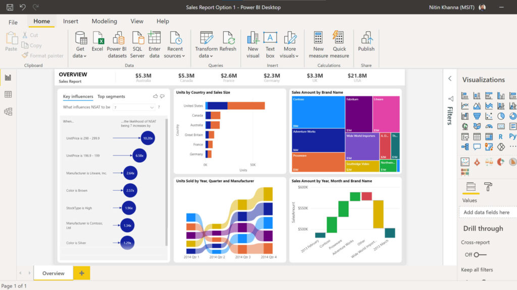 Key Features
 Key Features
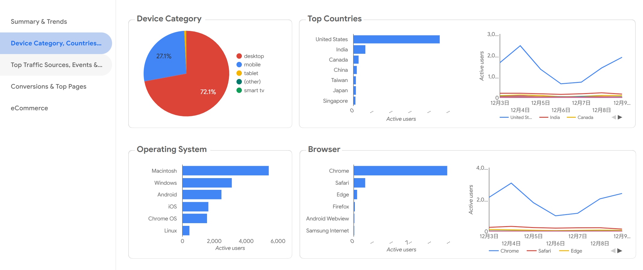 Key Features
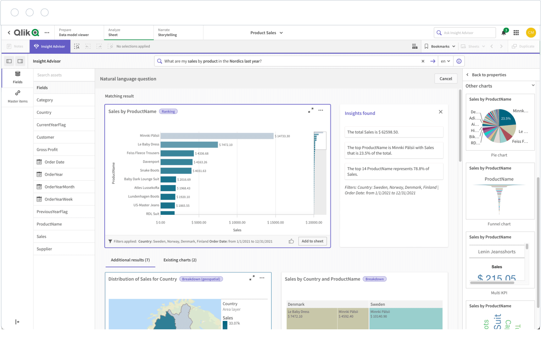 Key Features
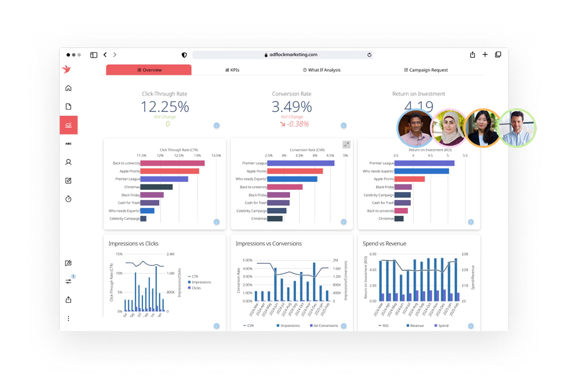 Key Features
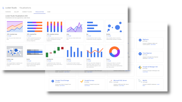 Key Features
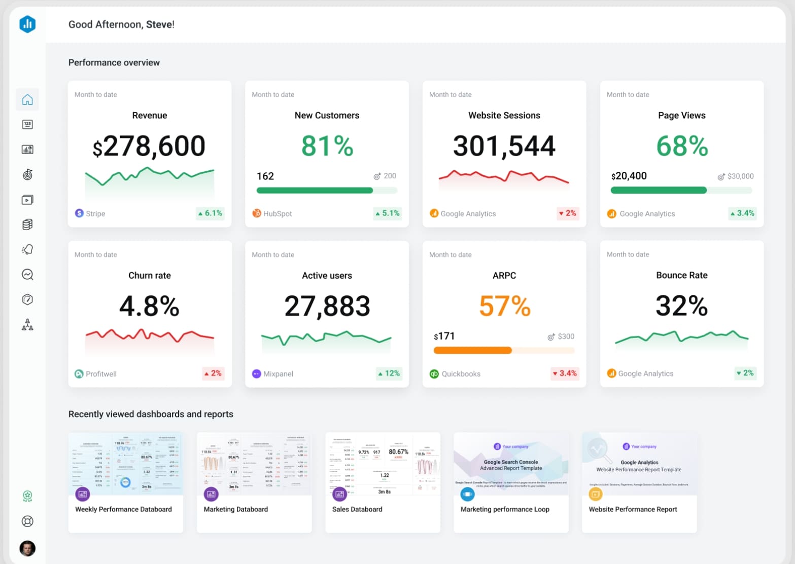 Key Features
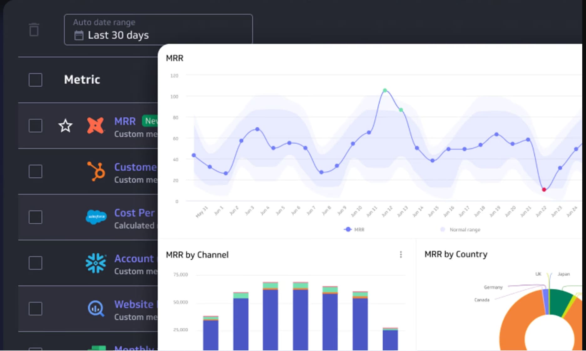 Key Features
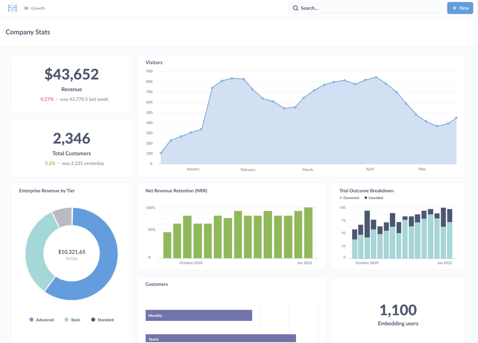 Key Features


