A SaaS dashboard is a visual tool that lets you monitor, analyze, and act on your company’s most important metrics in real time, all from a single interface. For 2026, you need to track these 10 essential SaaS dashboard metrics and KPIs: Monthly Recurring Revenue (MRR), Customer Churn Rate, Customer Lifetime Value (CLV), Customer Acquisition Cost (CAC), Net Promoter Score (NPS), Active Users (DAU/WAU/MAU), Expansion Revenue, Gross Margin, Average Revenue Per User (ARPU), and Lead-to-Customer Conversion Rate.
Modern BI tools like FineBI help you visualize, track, and share these KPIs, making data-driven decisions faster and easier.
SaaS dashboard and KPI metrics overview
A SaaS dashboard gives you a unified view of your business’s most important metrics and KPIs, helping you make faster, smarter decisions.
What are SaaS metrics and KPIs?
SaaS metrics and KPIs measure the health and growth of your business. You track these numbers to understand how your company earns revenue, retains customers, and grows over time. Leading companies in 2026 focus on metrics such as:
- Monthly Recurring Revenue (MRR)
- Customer Churn Rate
- Customer Lifetime Value (CLV)
- Customer Acquisition Cost (CAC)
- Net Promoter Score (NPS)
- Active Users (DAU/WAU/MAU)
- Expansion Revenue
- Gross Margin
- Average Revenue Per User (ARPU),
- Lead-to-Customer Conversion Rate
- Net Revenue Retention (NRR)
These metrics differ from traditional business metrics. SaaS metrics focus on ongoing payments and customer retention. Traditional metrics often measure one-time sales. The table below shows the main differences:
| Metric Type | SaaS Metrics | Traditional Metrics |
|---|---|---|
| Revenue Model | Subscription-based | One-time sales |
| Customer Relationship | Ongoing engagement and retention | Transactional |
| Key Metrics | MRR, ARR, Churn Rate | Gross Margin, One-time Revenue |
| Business Impact | Long-term customer value | Immediate sales |
Why track SaaS dashboard metrics?
You track SaaS metrics to spot trends and solve problems quickly. For example, a company saw a drop in user engagement. The dashboard showed that the onboarding process was too complex. After making it easier and adding support, user engagement and retention improved. Tracking these metrics helps you boost revenue and keep customers happy.
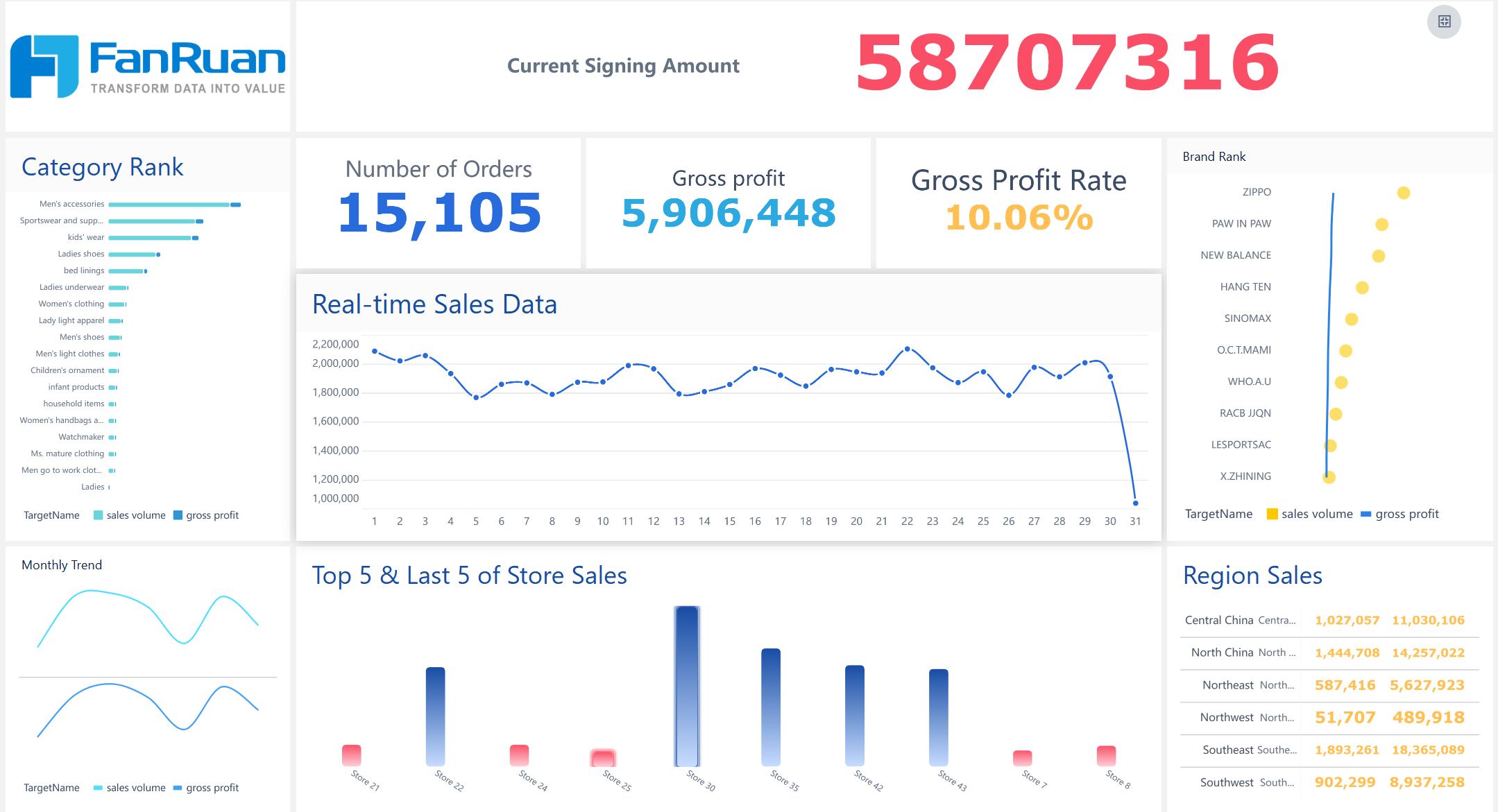
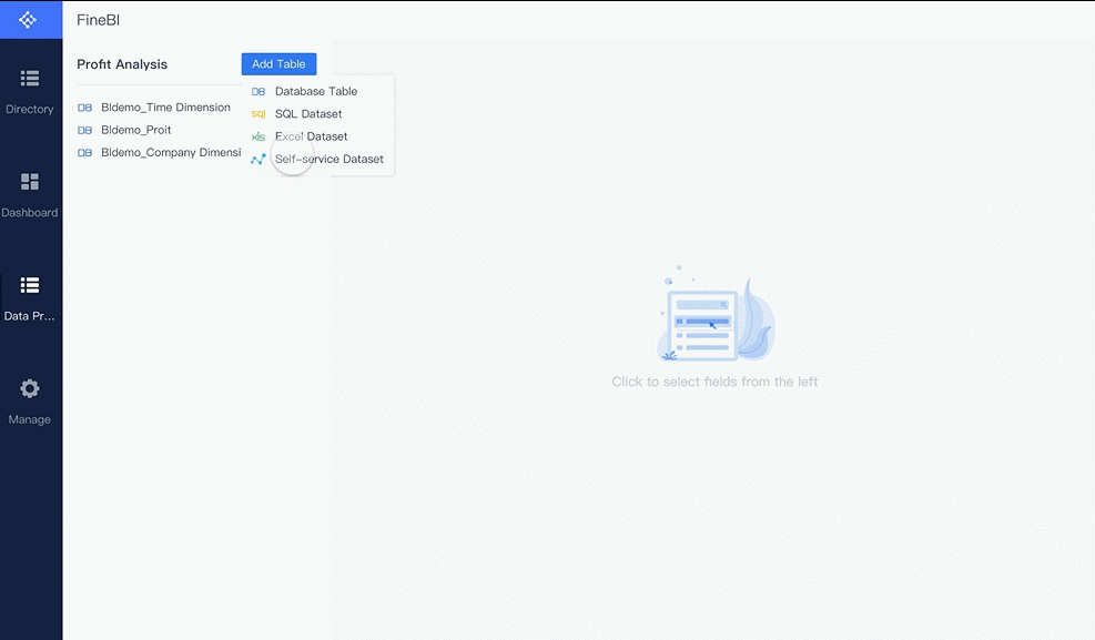
FineBI for SaaS kpi dashboards
FineBI helps you create SaaS KPIs dashboards that show real-time insights. You connect data from many sources, clean and manage it, and visualize key metrics. FineBI supports collaboration, so your team can share dashboards and work together. You use adaptive layouts and customizable themes to highlight important KPIs and monitor performance. FineBI’s data cleaning tools ensure your metrics are accurate and reliable.
SaaS dashboard: Monthly Recurring Revenue (MRR)
MRR definition and importance
Monthly recurring revenue is the total predictable income your business earns from subscriptions each month. You use this metric to measure the health and growth of your SaaS company. MRR helps you understand how much revenue you can expect every month. It shows if your business is growing or shrinking. You track MRR on your SaaS dashboard to spot trends and make better decisions.
MRR is one of the most important SaaS KPIs. It gives you a clear picture of your company’s financial stability. You can compare your growth rate to industry benchmarks. For startups with less than $1 million in annual recurring revenue, a median growth rate of 50% year-over-year is excellent. Top-performing companies often exceed 100% growth. These numbers help you set realistic goals and measure your progress.
Calculating MRR in SaaS KPI dashboards
You calculate MRR by adding up all recurring revenue from active subscriptions. You exclude one-time fees and variable usage charges. You standardize revenue to a monthly amount, even if customers pay quarterly or yearly. You break down MRR into components:
- Identify recurring revenue sources.
- Standardize revenue calculation for different billing cycles.
- Calculate individual components, including new customers, churn, reactivations, upgrades, and downgrades.
- Aggregate the components to get net MRR.
You can also track committed monthly recurring revenue. CMRR factors in new bookings, cancellations, and downgrades. It gives you a clearer forecast of future revenue.
Improving MRR with FineBI
FineBI helps you monitor MRR in real time. You connect data from multiple sources and visualize trends on your SaaS dashboard. You use self-service tools to clean and process data, ensuring your metrics are accurate. FineBI lets you set up alerts for sudden changes in revenue. You share dashboards with your team to collaborate on strategies that boost MRR.
A leading technology company used FineBI to unify its metrics and KPIs. The company reduced inventory costs by 5% and increased operational efficiency by 50%. You can use FineBI to track monthly recurring revenue, compare performance across departments, and make data-driven decisions that grow your SaaS business.


SaaS dashboard: Customer Churn Rate
Churn rate meaning for SaaS
You need to understand churn rate if you want to measure how well your SaaS business keeps customers. Churn rate shows the percentage of customers who leave your service during a set period. High churn means you lose more customers, which can hurt your revenue and growth. Low churn means your product keeps users happy and loyal. You track churn on your SaaS dashboard to spot problems early and take action.
The average churn rate depends on company size. You can use the table below to compare your numbers with industry standards for 2026:
| Company Size | Monthly Churn Rate | Annual Churn Rate |
|---|---|---|
| Small and Medium-sized | 3-5% | 6-10% |
| Mid-market | 1.5-3% | 10-15% |
| Enterprise-level | 1-2% | 5-7% |
Churn calculation in SaaS dashboards
You calculate churn using simple formulas. These formulas help you track both customer loss and lost revenue. Here are the most common ways to measure churn in SaaS dashboards:
- Customer Churn Rate: Divide the number of customers lost in a period by the total customers at the start. Multiply by 100 to get a percentage.
- Revenue Churn Rate: Divide the monthly recurring revenue lost from churn by the MRR at the start of the period. Multiply by 100.
- Net Revenue Churn Rate: Subtract lost MRR and expansion MRR from starting MRR, then divide by starting MRR.
- Gross Churn: Divide total MRR lost by total MRR at the start of the period. Multiply by 100.
For example, if you start with 1,000 customers and lose 20, your customer churn rate is (20 ÷ 1,000) × 100 = 2%. If your MRR is $100,000 and you lose $5,000, your revenue churn rate is (5,000 ÷ 100,000) × 100 = 5%.
Reducing churn with FineBI insights
You can use FineBI to lower churn and improve your SaaS metrics. FineBI helps you find patterns in your data and spot why customers leave. For example:
- You might see that customers leave because they do not get enough support.
- You can improve onboarding and add better support tools.
- After making these changes, you may see churn drop by 20% and customer lifetime value rise by 35%.
FineBI lets you track KPIs and set alerts for sudden changes in churn. You can share dashboards with your team and work together to keep more customers. This approach helps you protect your revenue and grow your SaaS business.
SaaS dashboard: Customer Lifetime Value (CLV)
CLV definition for SaaS
Customer Lifetime Value (CLV) measures the total revenue you can expect from a customer throughout their relationship with your business. This metric helps you understand how much value each customer brings over time. In the SaaS industry, CLV guides your decisions on marketing, retention, and product development. You use CLV to justify your marketing spend and to assess the profitability of your customer base. For example, a B2B SaaS company with a monthly recurring revenue of $299, a gross margin of 75%, and a monthly churn rate of 5% will have a CLV of $4,485 per customer. Enterprise customers often have much higher CLV, sometimes reaching $46,000 or more, especially when you factor in expansion revenue.
CLV calculation in SaaS KPI dashboards
You can calculate CLV using several approaches. The most common method multiplies the average customer value by the average customer lifespan. This gives you a clear estimate of the total revenue from each customer. The table below summarizes the main methods:
| Method | Description |
|---|---|
| Average Customer Value | The average revenue generated from a customer over a set period. |
| Average Customer Lifespan | The average time a customer stays with your company. |
| CLV Calculation | Multiply average customer value by average customer lifespan. |
To break it down further, follow these steps:
- Identify the average purchase value.
- Determine the average purchase frequency.
- Calculate the customer lifespan.
- Use the formula: CLV = Average Purchase Value × Average Purchase Frequency × Customer Lifespan.
A project management platform, for instance, with an annual subscription of $1,200, a gross margin of 70%, and an annual churn rate of 25%, would have a CLV of $3,360.
SaaS dashboard: Customer Acquisition Cost (CAC)
CAC meaning in SaaS
Customer Acquisition Cost (CAC) shows how much you spend to gain a new customer. You use this metric to measure the efficiency of your sales and marketing efforts. CAC helps you understand if your spending leads to profitable growth. In the SaaS industry, keeping CAC low while increasing revenue is a key goal. You compare CAC with other SaaS metrics and KPIs to see if your business model is sustainable. If CAC rises faster than revenue, you may need to adjust your strategy.
The average CAC varies by industry. You can use the table below to compare your numbers with 2026 benchmarks:
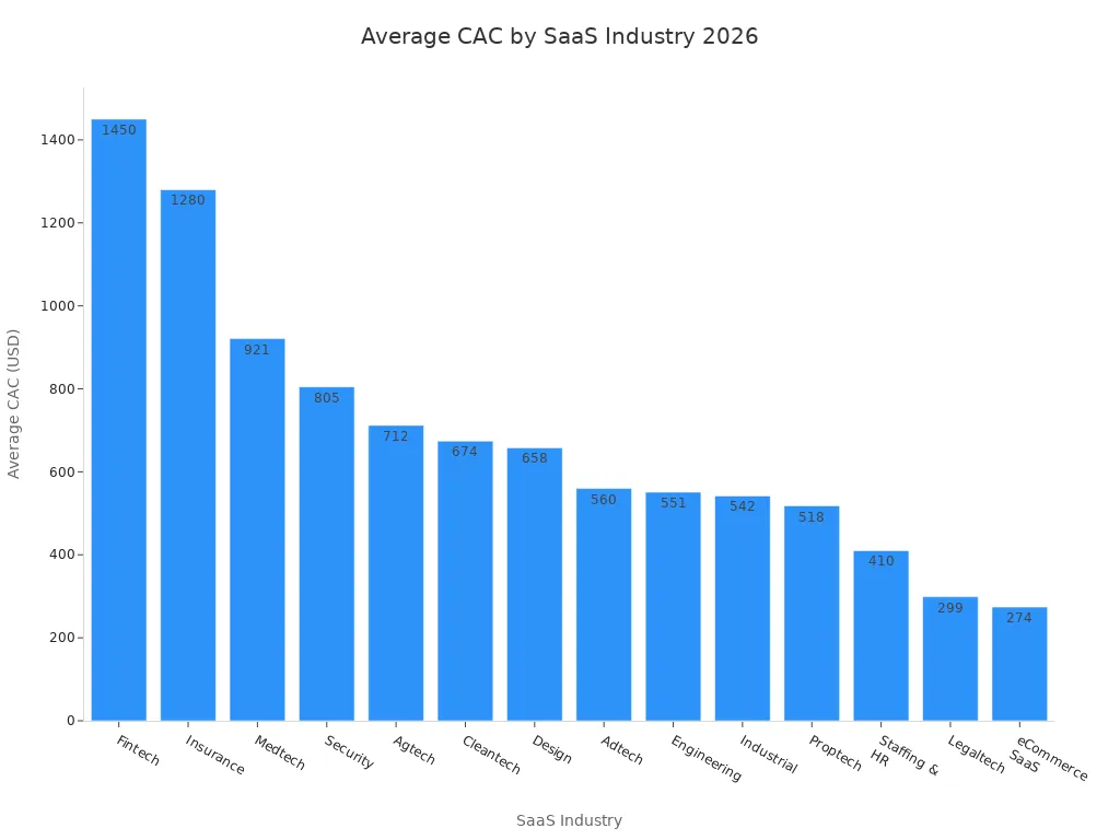
CAC calculation in SaaS dashboards
You calculate CAC by dividing your total sales and marketing costs by the number of new paying customers. This simple formula gives you a clear view of how much you spend to acquire each customer. You use your SaaS dashboard to track CAC and compare it with other KPIs. Best practices for calculating CAC include:
- Integrate key data sources such as CRM systems and accounting software.
- Visualize key metrics like overall CAC and CAC by channel.
- Monitor trends to identify changes in acquisition costs and growth opportunities.
You check these metrics regularly to spot patterns and make quick decisions. Tracking CAC helps you control spending and improve revenue.
Optimizing CAC with FineBI
You use FineBI to optimize CAC and improve your SaaS KPIs. FineBI connects data from multiple sources, cleans it, and visualizes CAC trends on your SaaS dashboard. You set up alerts for sudden changes in acquisition costs. You share dashboards with your team to find ways to lower CAC and boost revenue. FineBI helps you analyze which channels bring in the most valuable customers. You use these insights to adjust your marketing strategy and increase profitability. By focusing on accurate metrics, you make smarter decisions and grow your SaaS business.

SaaS dashboard: Net Promoter Score (NPS)
NPS definition for SaaS
Net Promoter Score (NPS) measures how likely your customers are to recommend your product or service to others. You use NPS to understand customer loyalty and satisfaction. In the SaaS industry, NPS is a key metric for tracking how well your company meets customer needs. You ask customers to rate their likelihood to recommend your service on a scale from 0 to 10. Scores of 9 or 10 are promoters, 7 or 8 are passives, and 0 to 6 are detractors. You subtract the percentage of detractors from the percentage of promoters to get your NPS. In 2026, the average NPS for SaaS companies is 30. This score shows a balance of customer loyalty across the industry.
NPS calculation in SaaS KPI dashboards
You can calculate NPS using several reliable methods. Your SaaS dashboard should make it easy to collect, organize, and analyze NPS responses. The table below shows the most common ways to calculate NPS for SaaS KPIs. You can choose the method that fits your workflow.
| Method | Description |
|---|---|
| Excel or Google Sheets | Organize NPS responses with COUNTIF and subtract detractors' percentage from promoters'. |
| NPS Calculator | Input NPS response data to get the score automatically. |
| NPS Tool | Trigger surveys, collect insights, and visualize NPS data automatically. |
SaaS dashboard: Active Users (DAU/WAU/MAU)
Active user metrics in SaaS
You track active user metrics to understand how many people use your product every day, week, or month. These metrics show you how engaged your users are and help you spot trends in usage. DAU, WAU, and MAU measure unique users over different time periods. The DAU/MAU ratio is a key indicator of product stickiness. If your ratio is above 20%, you see high engagement, which means users find daily value. Ratios between 10% and 20% show moderate engagement, while less than 10% signals low engagement and possible retention risks. Use these benchmarks to compare your product with industry standards and set goals for improvement.
Tracking user engagement in SaaS dashboards
You need to track user engagement to improve your product and increase revenue. Your SaaS dashboard helps you monitor how users interact with your platform. You can use several strategies to get the most accurate insights:
- Create a knowledge base to help users solve problems and stay engaged.
- Use continuous onboarding to educate users and drive expansion revenue.
- Run A/B tests to find which features boost engagement.
- Develop health scores that show healthy usage patterns.
- Build predictive models to identify accounts at risk of churn.
- Set up team-specific dashboards for different departments.
- Analyze correlations between engagement and business outcomes.
- Combine user research with quantitative data for deeper insights.
Avoid tracking vanity metrics that do not connect to business outcomes. Make sure every metric you track leads to actionable insights.
FineBI for user activity analysis
FineBI gives you powerful tools to analyze user activity and engagement. You connect data from multiple sources and visualize active user metrics on your SaaS dashboard. You use drag-and-drop features to build dashboards that show DAU, WAU, and MAU trends. FineBI lets you set up alerts for drops in engagement, helping you respond quickly. You share dashboards with your team to focus on key KPIs and improve customer retention. With FineBI, you see how changes in engagement affect revenue and other SaaS KPIs. You make data-driven decisions that help your business grow.
FineBI for conversion optimization
FineBI helps you optimize your conversion rate by bringing all your data together. You can connect sales, marketing, and customer data in one place. Use visual tools to spot trends and find bottlenecks in your funnel. FineBI lets you build custom dashboards that highlight key metrics and KPIs. You can share these dashboards with your team to focus on improving revenue. With real-time insights, you make quick decisions and test new strategies. FineBI supports your efforts to turn more leads into loyal customers and grow your SaaS business.
SaaS dashboard visualization and monitoring
Best practices for SaaS KPI dashboards
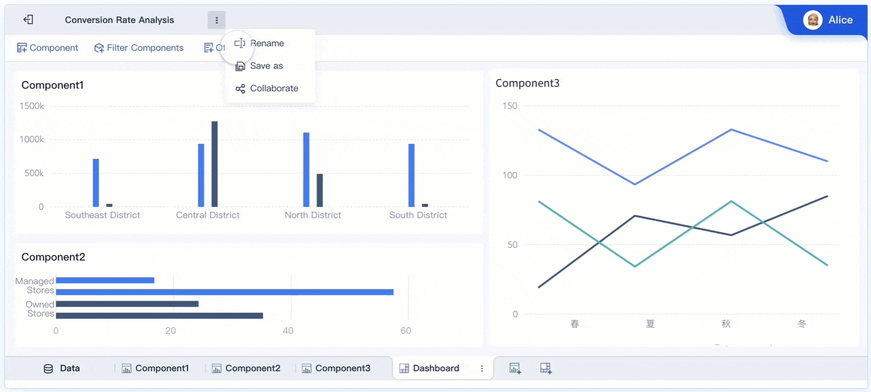
You need clear and actionable dashboards to track SaaS metrics and KPIs. Start by defining unified metric standards across your organization. Use simple layouts that highlight the most important KPI and revenue trends. Choose visualizations that make complex data easy to understand. For example, use line charts to show revenue growth and bar charts to compare customer segments. Set up filters so you can view metrics by product, region, or time period. Share dashboards with your team to encourage collaboration and faster decision-making.
FineBI features for SaaS dashboard monitoring
FineBI gives you powerful tools for monitoring SaaS dashboard performance. You connect data from many sources and create interactive dashboards with drag-and-drop features. FineBI supports real-time filtering, so you see the latest revenue and customer data instantly. You set up alerts for sudden changes in KPIs, such as drops in revenue or spikes in churn. FineBI’s role-based access control keeps sensitive metrics secure while allowing your team to work together. You use templates to save time and ensure consistency across dashboards.
Real-time insights and collaboration
You gain real-time insights with FineBI. The platform updates dashboards automatically when new data arrives. You spot trends in revenue, customer retention, and other key metrics without delay. FineBI lets you annotate dashboards and share them with your team. Everyone can comment and suggest actions based on the latest KPIs. The BOE customer story shows how unified dashboards improved operational efficiency by 50% and reduced inventory costs by 5%. You use these insights to make quick decisions and drive business growth.
You gain a clear view of your business when you track SaaS dashboard metrics and key performance indicators. You see how revenue changes and how customer actions affect growth. FineBI helps you visualize SaaS KPIs, monitor customer trends, and act on insights. You use modern BI tools to improve revenue, understand SaaS metrics, and make better decisions.
Continue Reading About SaaS Dashboard Metrics


FAQ

The Author
Lewis
Senior Data Analyst at FanRuan
Related Articles

Portfolio Reporting for PMOs: 9 Executive Metrics Every Weekly Portfolio Dashboard Should Include
Weekly portfolio reporting should help executives answer three questions fast: Are we delivering the right initiatives, are we putting outcomes at risk, and what decisions need leadership this week? For PMOs, that means
Yida Yin
Jul 01, 2026

How to Build an Investment Portfolio Reporting Dashboard for Executives: KPIs, Benchmarks, and Drill-Down Views
Investment portfolio reporting for executives is not about showing every holding, transaction, and chart your investment team can produce. It is about giving CEOs, CFOs, CIOs, boards, and investment committees a fast, re
Yida YIn
Jun 25, 2026

12 KPI Reporting Examples for Executive Dashboards: What to Show in Weekly, Monthly, and Quarterly Reviews
Executive leaders do not need more data. They need decision ready $1 examples that match how often they review the business and what actions they are expected to take. A weekly $1 should surface fast moving risks and per
Yida YIn
Jun 25, 2026