A metric dashboard is a visual tool that lets you track, analyze, and display key business metrics in real time. You use a metric dashboard to monitor performance, spot trends, and make informed decisions quickly. Tracking and visualizing metrics helps you detect risks sooner, align strategy across teams, and increase efficiency. For example, boards using dashboards report a 35% reduction in meeting time on routine reporting and earlier risk detection. Tools like FineBI make building and sharing dashboards simple for everyone in your organization.
What Is a Metric Dashboard

Definition and Core Purpose
A metric dashboard is a visual tool that helps you track, analyze, and understand essential business metrics. In business intelligence, a metrics dashboard acts as a command center for data visualization and real-time monitoring. You use metrics dashboards to see the most important numbers in one place. This approach allows you to focus on what matters most for your business.
The main purpose of a metrics dashboard is to give you a clear view of your key metrics. You can monitor performance, spot trends, and make decisions quickly. Metrics dashboards help you avoid wasting time searching through different tools or reports. You get the information you need at a glance.
The objectives of using a metrics dashboard in your organization include:
| Objective | Description |
|---|---|
| Visualizing important KPIs | Dashboards provide a visual representation of key performance indicators for easy monitoring. |
| Tracking performance in real time | Real-time data allows organizations to see trends and react promptly to changes. |
| Improving decision-making | Centralized data helps in making informed decisions without the need to sift through multiple tools. |
| Enhancing communication | Visual summaries facilitate better communication among teams and stakeholders. |
You can see that a metrics dashboard supports your business goals by making data accessible, actionable, and easy to share.
Key Elements of a Metrics Dashboard
A metrics dashboard includes several important components that make it effective for tracking and analyzing data. You will often find these common elements in leading metrics dashboards:
- Data visualization
- Intuitive layout
- Global filters
- Customizable views
- Collaboration tools
- Dashboard tabs
- Goal tracking
Each element plays a role in helping you understand your metrics. The table below explains how these key elements contribute to effective data visualization:
| Key Element | Contribution to Data Visualization |
|---|---|
| Clear Objectives | Ensures the dashboard remains focused on delivering relevant insights to stakeholders. |
| Thoughtful Data Selection and Organization | Curates relevant metrics that support the dashboard's purpose, avoiding information overload. |
| Intuitive and Visually Appealing Design | Enhances user comprehension through clean, logical layouts and visual appeal. |
| Interactive and Customizable Features | Engages users by allowing them to explore data dynamically and tailor the dashboard to their needs. |
| Regular Updates and Maintenance | Keeps the dashboard relevant and effective by adapting to changing business needs and incorporating user feedback. |
You benefit from metrics dashboards that combine these elements. They help you focus on your KPIs, track progress toward goals, and collaborate with your team. Metrics dashboards make it easier to filter, drill down, and customize your view, so you always see the most relevant data.
Metrics Dashboard vs. Traditional Reports
You might wonder how metrics dashboards compare to traditional business reports. The main difference is that metrics dashboards offer interactivity and real-time data updates. You can make quick decisions because you see the latest information. Traditional reports are static documents. They provide detailed analysis but do not update in real time.
The table below highlights the main differences:
| DASHBOARD | REPORT |
|---|---|
| Visual display of data for tracking key metrics and performance indicators. | Traditional, text-based document providing data analysis and insights. |
| Designed to be interactive. | Meant to be read passively. |
| Presents data in real-time. | Tends to be static snapshots of data. |
| Customized to show relevant data for the user. | Includes all data collected, regardless of relevance. |
| Focuses on themes explored over time with real-time updates. | Monitors projects or themes of specific duration. |
| Designed for specific audiences. | Created for a general audience. |
| Allows drilling down into data for detailed analysis. | Provides a high-level overview of data. |
| Can be shared electronically. | Often needs to be printed or distributed manually. |
| Easy to update and change. | More time-consuming and difficult to change. |
| Created relatively quickly. | Takes longer to generate than dashboards. |
Metrics dashboards give you actionable insights. You can see real-time information from multiple data sources. This helps you align sales, marketing, and other teams. You avoid errors and keep everyone informed. Traditional reports are useful for deep analysis, but metrics dashboards are better for ongoing monitoring and fast decision-making.
Metrics dashboards are designed for quick, at-a-glance monitoring of key metrics. Reports are meant for more in-depth analysis and understanding of data. Metrics dashboards provide real-time data and interactivity. Reports are static and focus on comprehensive analysis.
You gain more value from metrics dashboards when you need to track KPIs, monitor trends, and respond quickly to changes in your business.
How Metrics Dashboards Work
Understanding how metrics dashboards work helps you unlock the full value of your business data. You can follow a clear process that starts with integrating data from multiple sources, preparing it for analysis, visualizing it in an interactive way, and finally, using advanced tools like FineBI to streamline every step. Let’s break down each stage so you can see how a metrics dashboard delivers real-time monitoring and actionable insights.
Data Integration and Sources
You begin by connecting your metrics dashboards to the right data sources. This step is essential because the quality and variety of your data determine the accuracy of your metrics. Most organizations pull information from several systems to create a unified view. Here is a table showing common categories and examples of data sources you might integrate into your metrics dashboard:
| Category | Examples |
|---|---|
| Financial Systems | Xero, MYOB, QuickBooks, Stripe, PayPal |
| Customer Data | HubSpot, Salesforce, CRM platforms, Support ticketing systems |
| Product Usage | Google Analytics 4 (GA4), Application databases, Tools for tracking user behavior |
You can also connect to internal databases, cloud data warehouses, and even APIs. By bringing together these sources, you ensure your metrics dashboards reflect the most current and complete information. This integration supports real-time monitoring, which is critical for fast decision-making.
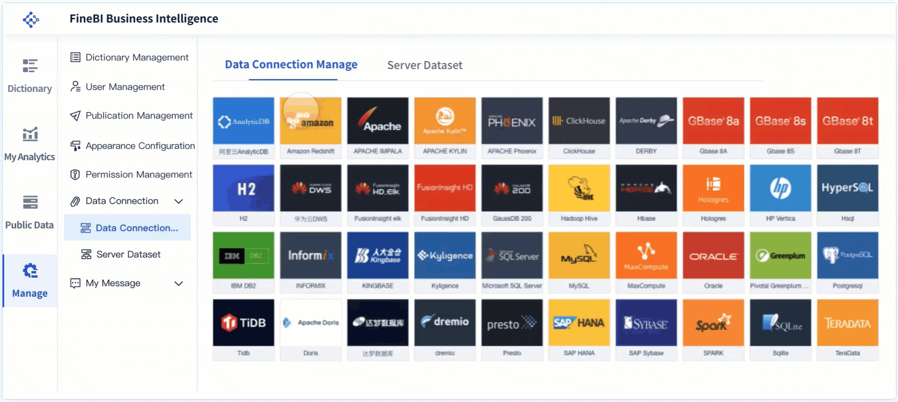
FineBI makes this process easier with over 60 built-in connectors. You can link to relational databases, big data platforms, cloud warehouses, and file-based data. FineBI also supports custom connections, so you can unify all your business data in one place.
Data Processing and Preparation
Once you have connected your data sources, you need to prepare and process the data for your metrics dashboards. This step ensures your metrics are accurate, consistent, and trustworthy. You follow a series of actions to get your data ready for analysis:
- Retrieve the necessary data and evaluate its health.
- Prepare the data by cleaning, validating, and applying quality policies.
- Create visualizations that make the data easy to understand.
- Interpret the data by analyzing the visualizations and applying business rules.
- Continuously improve the dashboard by updating it based on feedback.
Proper data preparation is crucial. If you skip this step or do it poorly, you risk conflicting reports and costly mistakes. In fact, organizations lose millions each year due to poor data quality. When you invest in data preparation, you build trust in your metrics dashboards and make better decisions.
| Aspect | Description |
|---|---|
| Data Preparation Importance | Ensures information entering dashboards is accurate, consistent, and trustworthy. |
| Consequences of Poor Prep | Leads to conflicting reports and costly missteps, eroding trust in analytics programs. |
| Financial Impact | Organizations lose an average of $12.9 million per year due to poor data quality. |
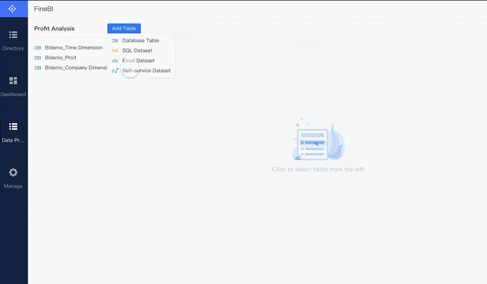
FineBI provides self-service tools for creating, joining, and cleaning data sets. You can merge tables, add calculated fields, and apply filters without writing code. This makes it easy for you to prepare data for your metrics dashboards, even if you do not have technical expertise.
Visualization and User Interaction
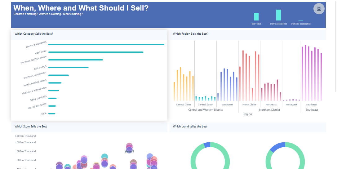
After preparing your data, you move to the visualization stage. Metrics dashboards use charts, graphs, and tables to turn raw data into clear, actionable insights. The best metrics dashboards do more than display numbers—they let you interact with the data. You can filter results, drill down into details, and compare trends across different time periods.
Effective visualization methods include:
- Adding multiple lines to charts for easy comparison.
- Using different colors to highlight key metrics.
- Incorporating interactivity, such as filters and highlighting, to encourage exploration.
Interactive features transform you from a passive viewer into an active participant. You can explore the data, uncover patterns, and share insights with your team. Research shows that 60% of business users prefer customizable dashboards because they enhance engagement and insight extraction. Companies using interactive metrics dashboards are 28% more likely to find timely insights compared to those relying on static reports.
| Evidence | Description |
|---|---|
| 60% of users | Prefer customizable dashboards that enhance engagement and insight extraction. |
| 28% more likely | Companies using interactive dashboards find timely insights. |
FineBI supports drag-and-drop dashboard creation, real-time filtering, and responsive design. You can build dashboards that adapt to any device, making it easy to access your metrics wherever you are.

FineBI Workflow for Data Dashboards
FineBI streamlines the entire process of building and using metrics dashboards. You follow a four-stage workflow:
- Data Integration: Connect to all your data sources using FineBI’s wide range of connectors. Schedule automatic updates to keep your metrics dashboards current.
- Data Processing: Prepare your data with self-service tools. Create data sets, join tables, add formulas, and clean records—all without coding.
- Visual Exploration: Use drag-and-drop features to build interactive dashboards. Apply filters, customize layouts, and save templates for future use.
- Publishing & Governance: Share your dashboards securely with your team. FineBI provides role-based permissions and audit trails to ensure data security and compliance.
| Feature | Benefit |
|---|---|
| Connectors | Enable efficient connection to various data sources, streamlining the data retrieval process for users. |
| Self-service capabilities | Allow business users to design dashboards independently, reducing reliance on IT personnel. |
| Integration with FineDataLink | Facilitates data processing and synchronization, improving performance by reducing redundancy and shortening data update times. |
FineBI also offers FineChatBI, a conversational analytics module. You can ask questions in plain language and get instant answers from your data dashboard. This feature lowers the barrier to data access and makes metrics dashboards even more accessible for everyone in your organization.
By following this workflow, you can create metrics dashboards that deliver real-time monitoring, support KPI tracking, and drive better business outcomes. FineBI empowers you to take control of your data and turn metrics into actionable insights.
Benefits of Metrics Dashboards
Real-Time Insights and Decision-Making
You gain a major advantage when you use a metric dashboard for real-time monitoring. You see your metrics as they happen, which means you can spot trends and outliers right away. This immediate access to visual summaries helps you identify patterns and anomalies in your data without delay. You do not need to wait for manual reports or sift through spreadsheets.
Metric dashboards also improve alignment and accountability. Everyone on your team sees the same key metrics, so you all work toward the same goals. By automating data processes, you reduce manual reporting time and free up resources for analysis. Companies that use real-time monitoring and dashboards report a 20% improvement in decision-making speed. You get more clarity, focus, and predictive insights, which help you act faster.
- Clear actionable insights from complex data
- Improved alignment and accountability across teams
- Higher productivity and efficiency through automation
Performance Tracking and KPI Monitoring
Metric dashboards make it easy for you to track performance and monitor kpis. You can follow key metrics that matter most to your business, whether you work in sales, supply chain, IT, or another field. The table below shows common metrics tracked in different industries:
| Industry/Function | Common Metrics Tracked |
|---|---|
| Startup | Customer Acquisition Cost, Revenue Growth, Churn Rate, Burn Rate |
| Supply Chain | Inventory Levels, Order Fulfillment Rates, Lead Times, Transportation Efficiency |
| Waste Management | Waste Generation Rate, Recycling Rate, Waste Disposal Costs, Waste Diversion Rate |
| Construction | Real-time Progress, Safety, Cost Variance |
| Sustainability | Carbon Emissions, Energy Usage, Waste Management Metrics |
| Fleet Management | Fuel Efficiency, Vehicle Utilization, Maintenance Costs |
| Golf Club | Performance Trends, Membership Data, Revenue Streams |
| Theme Park | Live Ride Queues, Guest Sentiment, Spending Behavior |
| IT Operations | Server Uptime, Incident Resolution Times, Backup Success Rates, Resource Utilization |
| Innovation | Idea Generation, Pipeline Velocity, R&D ROI, Time-to-Market |
| Insurance Claims | Claim Frequency, Processing Time, Settlement Ratios, Customer Satisfaction |
Automated tracking in a metric dashboard improves accuracy. You avoid errors that come from manual entry or spreadsheet management. The dashboard pulls data directly from your source systems, so everyone sees the same numbers. Real-time data validation and audit trails add another layer of trust and transparency.
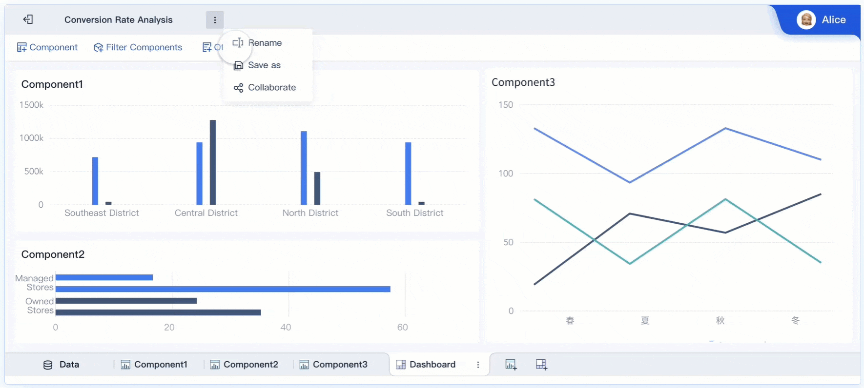
Collaboration and Data Sharing with FineBI
You can boost teamwork and productivity by sharing data through your metric dashboard. FineBI offers features that make collaboration simple and effective. Teams can edit dashboards together, share folders for group analysis, and publish data tables for wider access. The table below highlights some collaborative features in FineBI:
| Feature | Description |
|---|---|
| Collaborative Editing | Teams work together on data analysis in real time |
| Folder Sharing | Users share folders to collaborate on analysis subjects |
| Public Data Publishing | Users publish analyzed data tables for public access |
When you collaborate through dashboards, you help your organization work smarter. A Stanford study found that productivity can increase by 50% in collaborative environments. Real-time data sharing and synchronization let teams update and access information in one place. This approach helps you monitor performance, align goals, and make better decisions together.
Essential Features of a Data Dashboard
Customization and Interactivity
You need a data dashboard that adapts to your unique business needs. Leading platforms give you flexible layouts, multiple visualization options, and tailored dashboards for different teams. The table below shows common customization options:
| Customization Option | Description |
|---|---|
| Flexible Layouts | Adapt the dashboard structure to fit your workflow. |
| Multiple Visualization Options | Choose from charts, graphs, and tables to display metrics. |
| Tailored Dashboards | Customize for departments or specific use cases. |
You can also use tools to adjust logos, graph colors, and time filters. Dynamic time fields help you compare metrics across different periods. Interactivity plays a big role in user engagement. Features like cross-filtering, drill-down, and real-time feedback let you explore data and uncover deeper insights. These interactive elements turn your data dashboard into a powerful tool for real-time monitoring and analysis.
Security and Access Control
Protecting your data is essential. A robust data dashboard includes strong security measures such as incident response, insider threat monitoring, data loss prevention, and user access monitoring. The table below highlights key security features:
| Security Measure | Description |
|---|---|
| Incident Response Effectiveness | Respond quickly to security events to reduce risk. |
| Insider Threat Monitoring | Track user behavior for unusual activity. |
| Data Loss Prevention | Stop unauthorized sharing or export of sensitive data. |
| User Access Monitoring | Monitor access attempts and flag suspicious actions. |
Role-based permissions add another layer of protection. You can assign specific rights to users based on their department or role. Only authorized users can view or export dashboards. If someone tries to access restricted data without permission, the system blocks them and sends an alert.
Responsive Design and Mobility
You want your data dashboard to work on any device. Responsive design ensures that key metrics are clear and readable whether you use a desktop, tablet, or smartphone. This flexibility means you can check metrics and kpis wherever you are. Although most organizations report that less than 25% of users access dashboards on mobile devices, the need for mobile access continues to grow.
Responsive design does more than improve appearance. It supports real-time monitoring and decision-making by making data accessible anytime. You can collaborate with your team and act on insights without being tied to a single device.
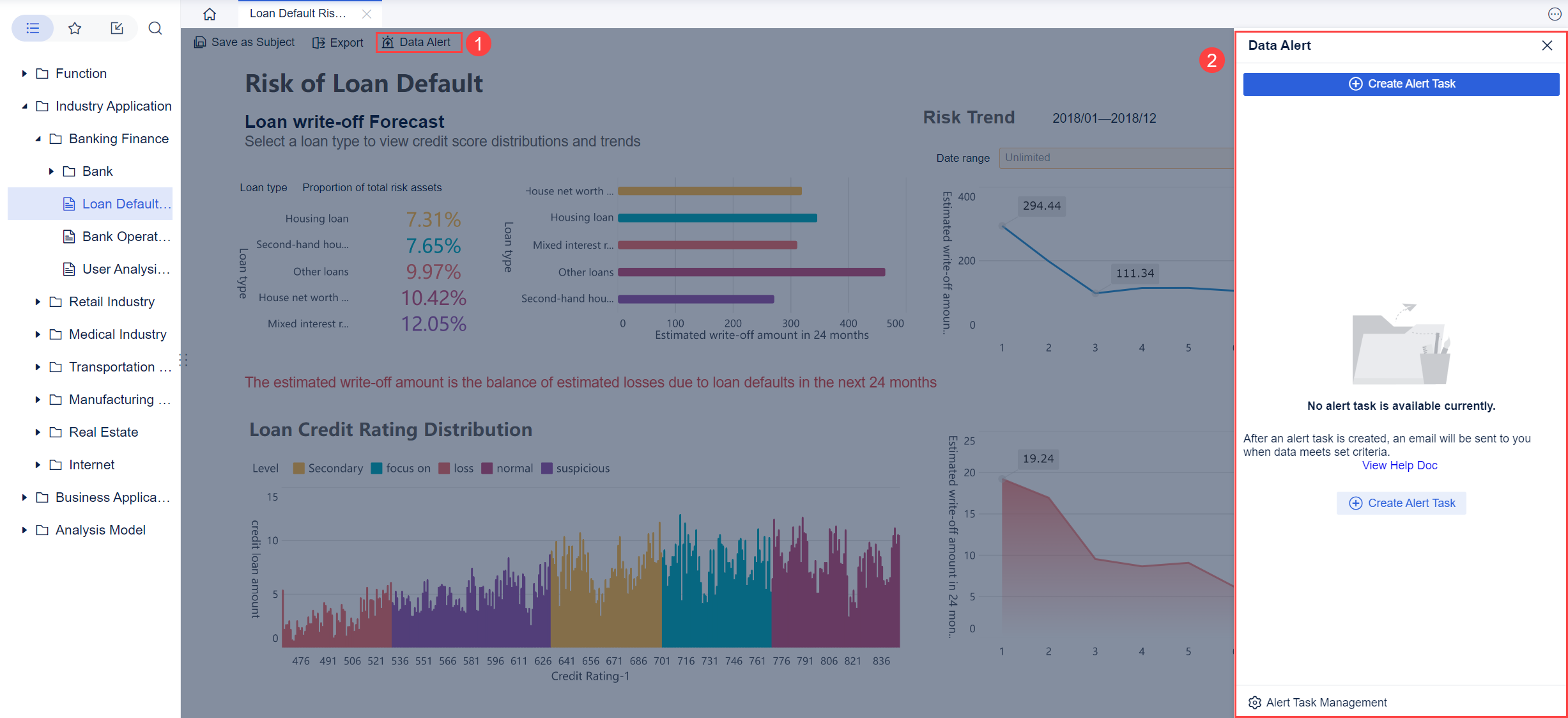
FineBI supports all these essential features. You get self-service customization, advanced OLAP analysis, data alerts, and secure, mobile-ready dashboards for your business needs.
Real-World Applications of Dashboards
Business and Finance Use Cases
You can use metrics dashboards to transform how you manage business and finance operations. These dashboards help you track essential metrics and make informed decisions quickly. You see all your important data in one place, which improves your ability to monitor financial health and performance. The table below shows common types of metrics dashboards used in business and finance, along with the key metrics they include and their main purposes:
| Dashboard Type | Key Metrics Included | Purpose |
|---|---|---|
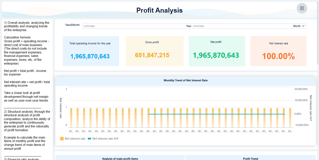
| Financial Performance Dashboard | Gross profit, Gross profit margin, Net operating income, Operating margin | Track general financial health and efficiency in generating profit. |
| Executive Overview Dashboard | Working capital, Current ratio, Net burn, Cash runway, Debt-to-equity ratio | Gain insights for long-term sustainability and investment decisions. |
| Cash Flow Analysis Dashboard | Cash balance, Cash inflows and outflows, Runway, Net burn trends | Monitor cash movement and ensure sufficient liquidity for operations. |
| Marketing Financial Dashboard | Customer lifetime value, Cost of acquisition, LTV vs CAC ratio, Sales growth rate | Evaluate marketing effectiveness and optimize spending for customer acquisition. |
Metrics dashboards give you a clear view of your financial data. You can spot trends, compare periods, and respond to changes in real time. This approach helps you keep your business on track and supports better planning.
Manufacturing Quality Control Solutions
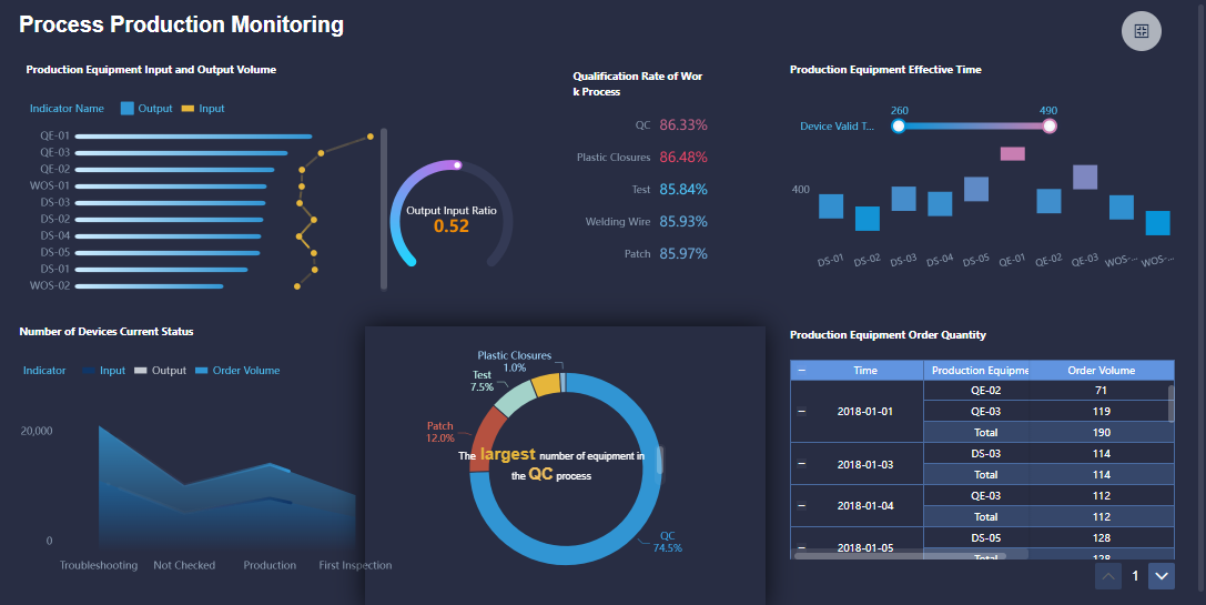
Metrics dashboards play a key role in manufacturing quality control. You can use these dashboards to monitor production metrics and improve product quality. They help you track data such as defect rates, customer complaints, and compliance levels. Here are some ways metrics dashboards support quality control:
- Track defects per million opportunities to measure production quality.
- Monitor customer complaint rates to address recurring issues.
- Compare compliant and non-compliant units in real time.
- Identify root causes of defects early for quick resolution.
- Measure quality achievement rates to ensure products meet standards.
Metrics dashboards eliminate manual effort in gathering and calculating metrics at each stage. You can analyze data points over time and gain insights through graphical reports. This process links yield and cycle time metrics with quality events, making it easier to maintain high standards.
Customer Story: BOE and FineBI
You can see the impact of metrics dashboards in the story of BOE Technology Group. BOE faced challenges with fragmented data and inconsistent metrics. The company used FineBI to build a unified data platform and standardize kpis. With metrics dashboards, BOE reduced inventory costs by 5% and increased operational efficiency by 50%. The dashboards allowed teams to monitor performance, benchmark across factories, and make data-driven decisions. FineBI helped BOE turn complex data into actionable insights, supporting digital transformation and long-term growth.
Metrics dashboards solve industry-specific challenges by giving you real-time access to data, improving quality control, and driving better results across your organization.
A metric dashboard gives you a clear way to track and understand your business data. You follow a simple workflow: connect your data, prepare it, visualize key metrics, and share insights. This process helps you make better decisions and respond quickly to changes. Tools like FineBI make building and using a metric dashboard easy for everyone. Start exploring metric dashboards to unlock real-time insights and drive your business forward.

Continue Reading About Metric Dashboard
Best Dashboard Apps for Business Insights
What is a Call Center Dashboard and Why Does It Matter
What is a Reporting Dashboard and How Does it Work
What is An Interactive Dashboard and How Does It Work
What is a Call Center Metrics Dashboard and How Does It Work


FAQ

The Author
Lewis
Senior Data Analyst at FanRuan
Related Articles

Portfolio Reporting for PMOs: 9 Executive Metrics Every Weekly Portfolio Dashboard Should Include
Weekly portfolio reporting should help executives answer three questions fast: Are we delivering the right initiatives, are we putting outcomes at risk, and what decisions need leadership this week? For PMOs, that means
Yida Yin
Jul 01, 2026

How to Build an Investment Portfolio Reporting Dashboard for Executives: KPIs, Benchmarks, and Drill-Down Views
Investment portfolio reporting for executives is not about showing every holding, transaction, and chart your investment team can produce. It is about giving CEOs, CFOs, CIOs, boards, and investment committees a fast, re
Yida YIn
Jun 25, 2026

12 KPI Reporting Examples for Executive Dashboards: What to Show in Weekly, Monthly, and Quarterly Reviews
Executive leaders do not need more data. They need decision ready $1 examples that match how often they review the business and what actions they are expected to take. A weekly $1 should surface fast moving risks and per
Yida YIn
Jun 25, 2026