Executive marketing reporting exists to answer one high-stakes question for leadership: is marketing spend creating qualified pipeline and revenue, and where should the next dollar go? For CMOs, CFOs, revenue leaders, and operations directors, the pain is familiar—data is scattered across ad platforms, CRM, web analytics, and finance systems; teams debate definitions; and executive dashboards often show activity instead of business impact. A strong executive dashboard fixes that by turning fragmented metrics into a decision system for budget allocation, forecasting, and performance accountability.
Click To Try The Dashboard
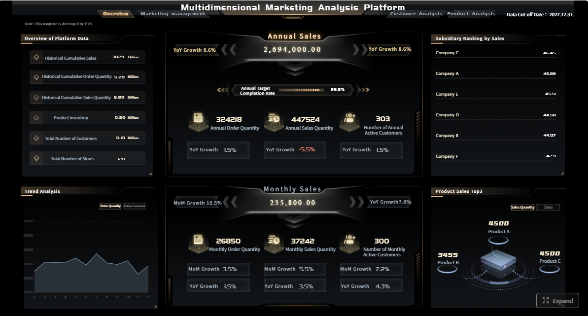
All reports in this article are built with FineReport
What executive marketing reporting should answer for leadership
Executive dashboards should not read like channel scorecards stitched together. They should answer a small set of business questions that leadership can act on immediately.
At the highest level, executives want to know three things: where budget is going, what pipeline it influences, and how revenue is affected. If the dashboard cannot connect those three layers, it is not an executive reporting asset—it is just a marketing activity summary.
Leadership also needs a clear distinction between reporting levels:
Channel reporting explains performance inside a specific channel such as paid search, email, events, or social.
Campaign reporting evaluates the effectiveness of a defined initiative, launch, promotion, or demand generation program.
Executive summary reporting rolls up performance across channels and campaigns to show business outcomes, risk areas, and investment decisions.
That distinction matters because executives rarely need to inspect click-through rates by ad group. They need to know whether pipeline targets are on track, whether customer acquisition costs are rising, and whether spend should be shifted across channels, segments, or regions.
A leadership dashboard should therefore focus on decision-making, not raw activity metrics. Website sessions, impressions, or email opens may appear as supporting signals, but they should never dominate the executive view unless they directly explain pipeline or revenue movement.
Core metrics that connect spend to pipeline and revenue
The best marketing reporting dashboards simplify complexity into a compact KPI system. Every metric should have a clear formula, owner, reporting window, and decision use case.
Spend, efficiency, and contribution metrics
Start with the financial layer. Executives need to see how much was planned, how much was spent, whether spending is pacing correctly, and whether efficiency is improving or deteriorating.
Key Metrics (KPIs)
Budget: The approved marketing investment for a defined period.
Actual Spend: The real amount spent across channels, programs, vendors, and campaigns.
Pacing: The rate of spend versus budget and time elapsed.
Cost per Lead (CPL): Total spend divided by total leads generated.
Cost per Opportunity (CPO): Total spend divided by qualified opportunities created.
Customer Acquisition Cost (CAC): Total sales and marketing acquisition cost divided by new customers won.
Channel Contribution: The share of total pipeline or revenue attributed to a specific channel.
Campaign Contribution: The portion of pipeline or revenue connected to a specific campaign.
Regional Efficiency: Comparative spend efficiency across geographies or territories.
Segment Efficiency: Comparative performance across customer segments, industries, or account tiers.
These metrics should be visible not only in aggregate, but also by channel, campaign, segment, and region when those cuts support executive decisions. If paid search shows rising spend but falling opportunity efficiency in one region, leadership should be able to see that quickly.
Pipeline and revenue metrics
Financial efficiency alone is not enough. Executive marketing reporting must connect upstream spend to downstream commercial outcomes.
Key Metrics (KPIs)
Marketing Sourced Pipeline: Pipeline created from opportunities where marketing was the primary originating source.
Marketing Influenced Pipeline: Pipeline where marketing had at least one meaningful touch before opportunity creation or close.
Win Rate: Closed-won deals divided by total opportunities.
Average Deal Size: Total closed-won revenue divided by number of won deals.
Marketing Attributed Revenue: Closed revenue assigned to marketing according to the chosen attribution model.
Return on Marketing Investment (ROMI): Revenue impact or contribution margin relative to marketing spend.
Pipeline Velocity: The speed at which opportunities move through the funnel.
Lead-to-Opportunity Conversion Rate: The percentage of leads that become qualified opportunities.
Opportunity-to-Customer Conversion Rate: The percentage of opportunities that close as customers.
Revenue by Channel: Closed revenue contribution broken down by acquisition or influence channel.
A useful executive dashboard also separates leading indicators from lagging outcomes. Leading indicators include lead volume, MQL quality, meeting creation, and opportunity generation. Lagging outcomes include win rate, revenue, and ROMI. This distinction helps executives understand whether weak revenue results come from recent underperformance or from normal sales-cycle delay.
A dashboard becomes trustworthy when its KPIs are disciplined. Without governance, the same metric can mean different things to marketing, sales, and finance.
Use these principles when designing executive marketing reporting:
Keep the KPI set small: Focus on metrics that directly influence executive action.
Use consistent formulas: Avoid changing calculation logic across dashboards or business units.
Assign metric ownership: Each KPI should have a clear operational owner.
Standardize reporting windows: Monthly, quarterly, and trailing-period views must align.
Tie every KPI to a decision: If a metric does not support a budget, strategy, staffing, or forecasting decision, remove it.
Add targets and thresholds: A KPI without a benchmark is just a number.
Show variance: Executives need actual versus target, plan, and prior period comparisons.
For example, if CAC rises 18% quarter over quarter, the dashboard should make that visible against target, and also show whether the increase is concentrated in a specific region, channel, or customer segment.
How to structure the dashboard for clarity and action
A good executive dashboard is not just a collection of charts. It should tell a strategic story in the order leaders naturally think.
Build the dashboard around an executive narrative
Structure the dashboard in layers:
At-a-glance summary
Pipeline impact
Revenue contribution
Channel performance
Risks and recommendations
That sequence mirrors executive review behavior. First, they want to know whether the business is on track. Next, they want to understand why. Finally, they want to know what action is needed.
Use trends, targets, and variance views to show what changed. Then add concise commentary to explain why it matters. A well-designed executive summary page should let leadership absorb the state of performance in under a minute.
Segment data without overwhelming the audience
Segmentation is valuable only when it supports a decision. Executives do not need every possible cut of the data on the main page.
Use segmentation selectively for:
Time period
Business unit
Region
Funnel stage
Campaign type
Customer segment
The rule is simple: if a segmentation view does not change an executive decision, keep it out of the leadership layer. Preserve drill-down access for operators and analysts, but keep the top view concise.
This design principle protects the dashboard from becoming overloaded and helps preserve attention on strategic exceptions, not operational detail.
Executive design should emphasize speed and clarity.
Use:
Simple bar, line, and waterfall charts
Benchmark or target lines
Variance indicators
Conditional color highlights
Short written annotations
Avoid dense tables unless they are used in a supporting drill-down. The dashboard should make exceptions, anomalies, and underperformance immediately visible. If pipeline is below target in North America while spend is above plan, that relationship should stand out without explanation.
Good visual hierarchy also matters. Place the most strategic KPIs at the top, supporting diagnostics below, and deeper analysis behind interaction layers or secondary tabs.
Data sources, attribution, and reporting tools you need
Executive marketing reporting is only as good as the data model behind it. Most failures happen before visualization begins.
Connect the systems behind the dashboard
To connect spend to revenue, you need a unified reporting model that combines data from multiple systems:
CRM
Ad platforms
Web analytics
Marketing automation
Finance systems
Sales outcome data
The first priority is integration. The second is standardization. Before building charts, fix naming conventions, campaign taxonomy, region labels, and funnel stage definitions. If campaign names differ across ad platforms, CRM, and automation systems, the dashboard will be unreliable from day one.
A common reporting model should map spend, response, lead creation, opportunity progression, and closed revenue into one structure. This is what allows leaders to move from top-line budget views to pipeline and revenue outcomes without conflicting numbers.
Choose an attribution and measurement approach
Attribution is where many executive dashboards lose credibility. The right model depends on the reporting purpose.
Common approaches include:
Sourced attribution: Best when leadership wants to know which motion originated the opportunity.
Influenced attribution: Useful when marketing touches multiple stages of a long buying cycle.
First-touch attribution: Good for understanding initial demand creation.
Last-touch attribution: Useful for evaluating conversion-driving interactions near form fill or handoff.
Multi-touch attribution: Best for more advanced organizations that want a fuller picture across the journey.
No attribution model is perfect. Executive teams should see the chosen approach and understand its limitations. For example, sourced reporting may understate long-term nurture impact, while influenced reporting may over-credit marketing if touch governance is weak. Multi-touch models offer nuance but are harder to explain and govern.
The key is consistency. Choose the model that best supports executive decision-making, then document what it can and cannot prove.
Native platform dashboards: Useful for channel-level visibility, weak for cross-functional executive reporting
BI platforms: Strong for customization and governance, but often resource-intensive
Customer data and reporting solutions: Better for unified models, automation, and enterprise control
The right answer depends on complexity, governance needs, internal technical resources, and scale. For most enterprise teams, reusable dashboard templates provide a major advantage. They reduce design time, preserve metric consistency, and accelerate stakeholder adoption.
Step-by-step process to build and launch the dashboard
A successful executive dashboard is built through governance, alignment, and iteration—not by jumping straight into chart design.
Define stakeholders, decisions, and success criteria
Begin with stakeholder interviews. Talk to executive leadership, finance, sales, revenue operations, and marketing heads. Ask what decisions the dashboard must support.
Typical examples include:
Should budget shift between channels?
Are we pacing to pipeline targets?
Which segments deserve more investment?
Where is efficiency deteriorating?
Are we on track to revenue contribution goals?
Then define success criteria:
Agreed KPI definitions
Reporting cadence
Thresholds for action
Dashboard adoption expectations
Review workflows
Without this stage, the dashboard becomes a reporting artifact with no decision authority.
Model the data and validate reporting logic
Once decisions are clear, map source fields to your funnel and revenue model. Connect spend fields, campaign IDs, lead objects, opportunity stages, account relationships, and revenue outcomes.
Validate four areas rigorously:
Data quality: Missing values, duplicates, inconsistent naming
Refresh timing: Whether source systems update on a schedule leadership can trust
Attribution logic: How touches, sources, and influence are assigned
Reconciliation: Whether dashboard totals match finance and CRM source-of-truth reports
This is the stage where many teams discover hidden process issues, such as inconsistent campaign member updates or incomplete opportunity-source tagging. Fixing these issues early improves confidence far more than polishing visuals later.
Launch with a usage guide, not just a link. Show executives how to read the dashboard, what each KPI means, and what actions each section is intended to support.
Then create a regular review loop:
Measure dashboard usage
Gather stakeholder feedback
Refine underused sections
Update targets and thresholds
Adjust KPIs as go-to-market strategy evolves
A dashboard should change as the business changes. New segments, regions, routes to market, or pipeline definitions should trigger structured revisions rather than ad hoc edits.
Common executive dashboard mistakes to avoid
Even mature teams can undermine trust with avoidable reporting errors.
The most common mistakes include:
Reporting too many metrics without linking them to business outcomes
Mixing inconsistent definitions across teams, platforms, or reporting periods
Overstating attribution confidence when data quality or buying journeys are incomplete
Failing to add context, benchmarks, and next-step recommendations for leadership
A practical rule: if leadership cannot answer “what should we do next?” after looking at the dashboard, the reporting design is incomplete.
How to implement executive marketing reporting faster with FineReport
Building this manually is complex; use FineReport to utilize ready-made templates and automate this entire workflow.
For enterprise teams, the challenge is rarely just visualization. It is unifying data sources, standardizing KPI logic, supporting drill-downs, scheduling refreshes, and delivering a clean executive layer without creating a maintenance nightmare. FineReport helps solve that by combining dashboard building, enterprise reporting, data integration flexibility, and reusable templates in one environment.
Connect CRM, marketing, and finance data into one reporting layer
Create role-based views for executives, operators, and analysts
Automate recurring refreshes and scheduled reporting
Reuse templates to scale reporting across regions, teams, or business units
Get Ready-to-Use Dashboard Templates in Fine Gallery
If your team is still managing executive marketing reporting through spreadsheets, disconnected platform exports, or custom BI builds that require constant rework, this is the point where standardization pays off. FineReport gives you a faster path to a trusted dashboard that leadership will actually use.
The end goal is not just a prettier dashboard. It is a reporting system that helps leadership allocate budget with confidence, identify pipeline risk early, and prove marketing’s contribution to revenue. That is what executive marketing reporting should do.
It should show budget, actual spend, pipeline contribution, revenue impact, and efficiency metrics such as CAC, CPO, and ROMI. The goal is to help leadership decide where to invest, cut, or reallocate budget.
You connect data from ad platforms, CRM, web analytics, and finance systems using shared definitions and attribution rules. This allows the dashboard to trace spend through lead generation, opportunity creation, and closed revenue.
The most important KPIs usually include budget, spend pacing, marketing sourced pipeline, marketing influenced pipeline, attributed revenue, CAC, win rate, and ROMI. These metrics tie marketing activity to business outcomes instead of vanity metrics.
Sourced pipeline refers to opportunities that marketing directly originated. Influenced pipeline includes opportunities where marketing played a meaningful role before creation or close, even if it was not the first source.
Most teams update them daily or weekly so leaders can monitor pacing, trends, and risks without waiting for month-end reports. The right cadence depends on sales cycle length, budget volatility, and how quickly decisions need to be made.
Product Trial
FineReport
Pixel-perfect reports · Interactive dashboards · Easy data entry · Digital twins