A demand graph shows how much of a product people want at different prices. In economics, you use this tool to see how price changes affect what buyers do. Understanding a demand graph helps you predict how customers might react to new prices or trends. You can use it to spot patterns in demand and make better choices in business or studies.
Demand Graph Basics
What Is a Demand Graph
A demand graph is a visual tool you use to show how much of a product people want at different prices. In economics, you see the demand graph as a way to understand how price changes affect buying behavior. Most textbooks define demand as the amount of a good or service consumers are willing and able to purchase at each price. The law of demandstates that when the price rises, the quantity demanded usually falls. When the price drops, the quantity demanded increases. You see this relationship clearly on a demand graph, which places price on the vertical axis and quantity on the horizontal axis.
The demand curve illustrates that as the price of a product decreases, the quantity demanded increases, which is a fundamental principle known as the law of demand. This relationship is graphically represented with price on the vertical axis and quantity demanded on the horizontal axis.
A demand graph helps you distinguish between demand and quantity demanded. Demand refers to the entire curve, while quantity demanded is a specific point on that curve. You use the demand graph to analyze consumer reactions to price changes and predict market trends.
Components of a Demand Graph
When you look at a demand graph, you notice several key components that help you interpret market behavior:
Price: Shown on the vertical axis, it represents what buyers pay for the product.
Quantity Demanded: Placed on the horizontal axis, it shows how much buyers want at each price.
Demand Curve: The line or curve that connects different price and quantity combinations.
Labels: Clear labeling of axes and curves is essential for accurate interpretation.
The demand and supply graph is one of the most fundamental graphs in economics, serving as a basis for various models. It is essential to note that while the laws of demand and supply apply broadly, not every function can be represented graphically, highlighting the importance of specific demand and supply curves in economic analysis.
Several factors influence the position and shape of the demand curve on a demand graph. You should consider these when analyzing demand:
Income
Tastes and preferences
Prices of related goods and services
Consumers' expectations about future prices and incomes
Number of potential consumers
Advertising
Shifts in the demand curve, either to the left or right, indicate changes in overall demand due to factors other than the price of the good itself. For example, higher consumer income usually shifts the demand curve to the right, showing increased demand. Negative news about a product can shift the curve to the left, reflecting decreased demand.
The demand curve is the main feature of a demand graph. You use it to visualize the relationship between price and quantity demanded. The curve usually slopes downward from left to right, showing that lower prices lead to higher quantities demanded. This downward slope reflects the law of demand.
Demand curves can take different shapes depending on the market and product. You often see linear, iso-elastic, or exponential curves. Each type has unique characteristics and implications for market analysis.
Demand Curve Type
Characteristics
Implications
Linear
Assumed function is seldom linear
Commonly leads to similar conclusions in single-echelon systems
Iso-elastic
More prevalent in empirical estimations
Can lead to very different results in multi-echelon systems
Exponential
Sometimes used in demand estimations
Shows significant counter-intuitive effects on optimal solutions
You estimate demand curves using data on past prices and quantities. Statistical methods, especially multiple regression, help you analyze demand. Bayesian hierarchical models also provide a robust framework for understanding consumption patterns. These models allow you to integrate various data sources and predict demand with high accuracy.
Empirical studies show that demand graphs are valuable for analyzing market behavior. For example, in electricity markets, residual demand curves are highly non-linear, which affects optimal bidding strategies. Simplified monotonic smoothing can help researchers achieve expected profits efficiently.
Key Findings
Implications
Residual demand curves are highly non-linear
This affects optimal bidding strategies in electricity markets.
Non-monotonic, downward sloping offer curves can violate common bidding behavior restrictions
This can lead to misleading conclusions in empirical analyses.
Simplified monotonic smoothing can achieve expected profits
Offers a computationally efficient alternative for researchers.
Demand graphs are used across sectors such as manufacturing and retail. In manufacturing, you rely on demand graphs for effective demand shaping and real-time adaptation to market changes. In retail, demand graphs help automate forecasting and replenishment, especially during supply chain disruptions.
You may face challenges when interpreting demand graphs. Common issues include forgetting to label axes, mixing up shifts and movements, and creating cluttered graphs. To avoid these problems, always double-check labels, use clear fonts, and limit grid lines.
Demand graphs give you a powerful way to analyze consumer behavior, forecast trends, and make informed decisions in economics.
Interpreting the Demand Graph
Price and Quantity Relationship
When you study a demand graph in economics, you see a clear relationship between price and quantity demanded. The demand curve typically slopes downward from left to right. This visual pattern shows that as the price of a product increases, the quantity demanded decreases. If the price drops, the quantity demanded rises. You can see this relationship in the table below:
Price Change
Quantity Demanded Change
Increase
Decrease
Decrease
Increase
You notice this inverse relationship every time you look at a demand graph. Higher prices discourage buyers, while lower prices attract more interest. The demand curve helps you predict how consumers will respond to price changes. You can use the demand graph to analyze market behavior and make informed decisions.
Economists use the concept of price elasticity of demand to measure how sensitive quantity demanded is to price changes. Elasticity is calculated as the percentage change in quantity demanded divided by the percentage change in price. For example, if a 10% increase in price leads to a 2% decrease in quantity demanded, the elasticity would be -0.2. This negative value confirms the law of demand. The magnitude of elasticity tells you whether demand is elastic or inelastic.
The demand curve slopes downward.
Higher prices lead to lower quantity demanded.
Lower prices lead to higher quantity demanded.
Price elasticity of demand quantifies sensitivity to price changes.
Shifts in Demand
You often see shifts in the demand curve on a demand graph when factors other than price change. These shifts reflect changes in consumer behavior or external market conditions. Several key factors cause the demand curve to move:
Changes in income: More income usually increases demand for normal goods.
Changes in preferences and tastes: New trends can boost or reduce demand.
Prices of related goods: If the price of a substitute rises, demand for your product may increase.
Expectations about the future: Anticipated shortages or price hikes can raise current demand.
Demographic changes: Population growth affects demand for many products.
External shocks and events: Natural disasters or global events can shift demand suddenly.
Government policies: Taxes or subsidies can alter demand by changing effective prices.
For example, if consumers expect a shortage due to a hurricane, they may buy more before the event, shifting the demand curve to the right. An increase in income raises demand for normal goods but lowers demand for inferior goods. The demand graph helps you visualize these shiftsand understand how market conditions affect demand.
You should remember that demand graphs have limitations. Relying only on past data may not account for future changes. External events, such as celebrity endorsements or global disruptions, can distort forecasts. The choice of forecasting model also impacts predictions. Always consider these factors when using a demand graph to analyze market trends.
Using FineReport for Demand Graph
Visualizing Demand Data
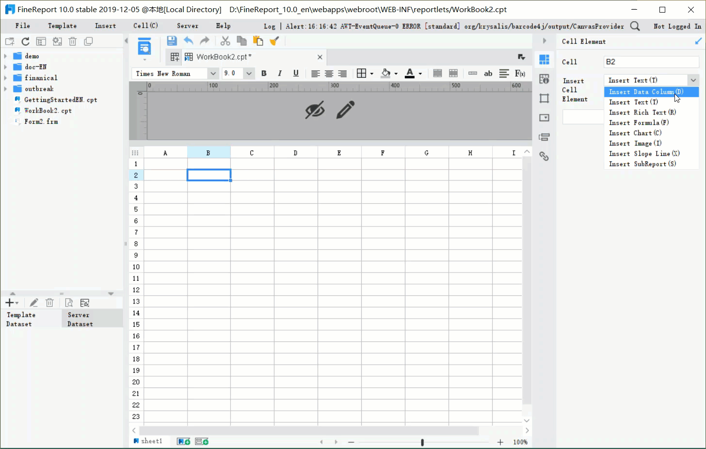
You need clear visuals to understand how demand changes over time. A demand graphhelps you see the relationship between price and quantity demanded. When you want to analyze demand, you often look for tools that make the process simple and effective. FineReportgives you an intuitive drag-and-drop interface, so you can build demand graphs without advanced technical skills. You can customize your reports, add your company’s branding, and schedule automatic report delivery. This saves you time and ensures your demand data stays up to date.
Tip: Always label your axes and curves clearly when creating a demand graph. This helps everyone interpret the data correctly.
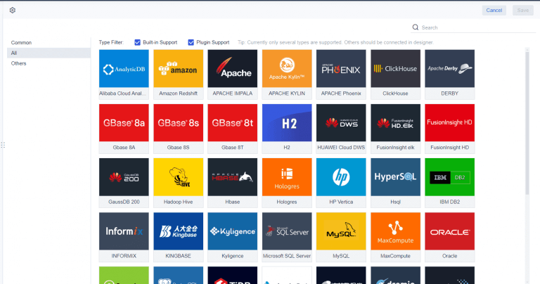
FineReport connects to many data sources, including databases and spreadsheets. You can integrate real-time data, which means your demand graph always reflects the latest market conditions. The table below shows how FineReport compares to other reporting tools:
You want to track demand trends and respond quickly to market changes. FineReport supports real-time reporting, so you can see demand patterns as they happen. You can connect directly to databases and use SQL queries to retrieve and display demand data. This helps you make timely decisions and adjust your strategies.
Businesses use FineReportto monitor sales, inventory, and market demand. For example, a retail company can use trend analysis reports to spot seasonal peaks in demand. Sales reports help you identify top-performing products and refine your sales approach. Inventory reports show which items sell fastest, so you can reorder supplies before running out.
Type of Report
Purpose
Example Use Case
Trend Analysis MIS
Identifies patterns and changes over time, aiding in forecasting and strategic planning.
A retail business discovers sales peak during holidays, allowing for better inventory planning.
Sales MIS
Tracks sales performance across various dimensions to identify top performers and areas for improvement.
A sales report highlights unstaged leads and lost leads, helping to refine sales strategies.
Inventory MIS
Monitors stock levels and product movement to maintain balance and avoid stock issues.
A stock movement report indicates fast-selling items, prompting quick reordering of supplies.
Best practices for integrating demand graph analysis into your business intelligence workflow include designing for scalability, optimizing performance for large datasets, and prioritizing user experience. You should integrate your BI tools with existing systems and create a unified data infrastructure. Collaboration between IT and business teams ensures your demand analysis aligns with company goals.
Integrate BI tools seamlessly with existing systems.
Focus on creating a unified data infrastructure.
Collaborate closely between IT and business stakeholders.
FineReportempowers you to visualize demand data, analyze trends, and make informed decisions with ease.
You often start with an individual demand graph when you study consumer behavior. This graph shows how much of a product one person wants at different prices. The demand curve on an individual demand graph reflects that person's preferences and willingness to pay. For example, Marco's demand graph for pizza slices reveals how many slices he will buy at each price.
In most markets, many households purchase the good or the service traded. We need to add together all the demand curves of the individual households to obtain the market demand curve.
When you want to understand the whole market, you use a market demand graph. This graph aggregates the demand curves of all consumers in the market. The market demand curve shows the total quantity demanded at each price level.
Individual demand graphs show the quantity demanded by a single consumer at different prices.
Market demand graphs aggregate the demands of all consumers, providing a total demand at each price.
You construct the market demand graph by summing individual demand curves at each price point. This process helps you analyze how changes in income or prices affect market equilibrium. The interaction between individual and market demand graphs is essential for predicting shifts in overall demand.
Consider Marco's individual demand for pizza slices, which indicates how many slices he will buy at various prices.
To find the market demand for pizza slices in Marco's neighborhood, you must sum the individual demands of all consumers in that area.
Elasticity and the Demand Curve on a Demand Graph
Elasticity measures how sensitive the quantity demanded is to changes in price. You use the demand curve on a demand graph to analyze elasticity. If the demand curve is steep, demand is inelastic. If the curve is flat, demand is elastic.
Method
Description
Point Elasticity
Measures elasticity at a specific point on the demand curve, assuming a linear relationship between variables.
Geometric Method
Used for infinitely small changes in demand and price, with elasticity varying at different points on the demand curve.
Industries with many substitutes, such as fast food, tend to have elastic demand curves. Small price increases can lead to significant drops in sales as consumers switch to alternatives. Essential goods, like medicine, often show inelastic demand curves. Price changes have little effect on the quantity demanded.
In industries with many substitutes, demand tends to be more elastic.
Essential goods often show inelastic demand, where price changes have little effect.
Understanding elasticity on a demand graph helps you set prices and develop marketing strategies. Policymakers also use demand graph variations to guide economic decisions. For example, a rightward shift in the demand curve signals increased consumer preference, leading to higher prices and quantities. A leftward shift may prompt regulatory changes to stabilize the market.
By analyzing elasticity and demand graph variations, you gain insights into consumer behavior and market dynamics.
FineReport'sBuilt-in Charts For Data Visualization
Understanding demand graphs gives you a clear view of how buyers and sellers interact in economics. These graphs help you spot market trends and make better business choices. FineReportmakes it easy to visualize and interpret demand data with a user-friendly interface, real-time reporting, and mobile access. Modern reporting tools also improve your analysis by automating data collection and turning complex information into clear visuals.
Key Finding
Explanation
Clarity
The graph shows how price and quantity are set in the market.
Flexibility
You can use it for single products or broad economic trends.
Practical Insight
It helps you find surpluses and shortages for smarter decisions.
Accurate forecasting with demand graphs helps you manage inventory and plan for the future.
FineReportlets you act quickly with up-to-date insights, no matter where you are.
Access a wealth of case studies, industry insights, and solution guides to accelerate digital transformation.
FAQ
What is a demand graph in economics?
A demand graph shows how much of a product you want at different prices. You use it to understand how price changes affect your buying decisions. The demand graph helps you predict market trends and analyze consumer behavior.
How do you read a demand graph?
You look at the demand graph by checking the price on the vertical axis and the quantity demanded on the horizontal axis. The demand curve slopes downward, showing that lower prices lead to higher demand. You use this graph to spot patterns in demand.
Why does the demand curve on a demand graph slope downward?
The demand curve on a demand graph slopes downward because you buy more when prices drop. Higher prices make you buy less. This pattern follows the law of demand, which explains how price changes affect quantity demanded.
What factors can shift the demand curve on a demand graph?
You see the demand curve on a demand graph shift when factors like income, tastes, or prices of related goods change. These shifts show changes in overall demand, not just movements along the curve due to price changes.
How can FineReport help you analyze a demand graph?
FineReport lets you create and customize demand graphs easily. You can connect to multiple data sources, visualize real-time demand data, and automate reporting. This helps you track demand trends and make better business decisions.