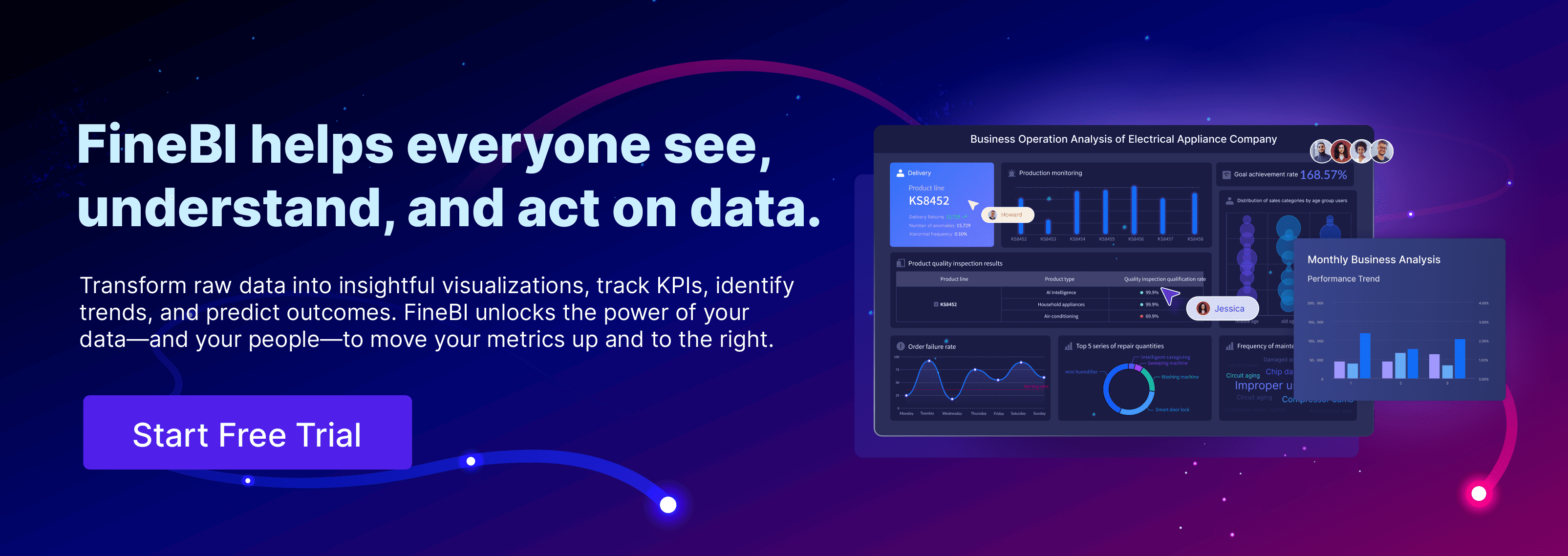
Dashboards have become essential in modern applications. They provide at-a-glance views of key performance indicators (KPIs) relevant to specific objectives or business processes. A well-designed dashboard serves as a canvas for storytelling, effectively communicating data to relevant users. This facilitates quicker app adoption and makes apps attractive to non-technical users. Tools like FineReport, FineBI, and FineDataLink offer comprehensive solutions for building a core app dashboard. These tools enable real-time data visualization and customization, enhancing user engagement and providing instant insights.
Understanding the Basics of a Core App Dashboard
Defining the Purpose and Goals of a Core App Dashboard
A core app dashboard must serve a clear and well-defined purpose, centered around delivering value to its users. Understanding user needs is crucial to the design process, as users require quick and easy access to relevant data that informs their decisions. Identifying these needs helps in crafting a dashboard that not only presents information effectively but also adds tangible value to the user experience. For instance, FineBI empowers users to efficiently connect, analyze, and visualize data, aiding in the identification of trends and the tracking of key performance indicators (KPIs). This capability ensures that the dashboard is not just a static display but a dynamic tool that drives business insights.
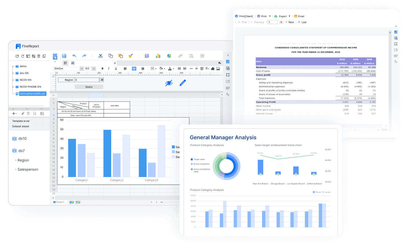
Setting clear objectives is essential to ensure the dashboard aligns with broader business goals. These objectives act as a blueprint for the design and functionality of the dashboard, guiding everything from the layout to the data presented. A well-defined goal streamlines the development process and ensures that the final product meets the specific needs of its users. Tools like FineReport offer tailored reporting and analytics solutions, supporting businesses in achieving their unique objectives through customized and actionable data insights.
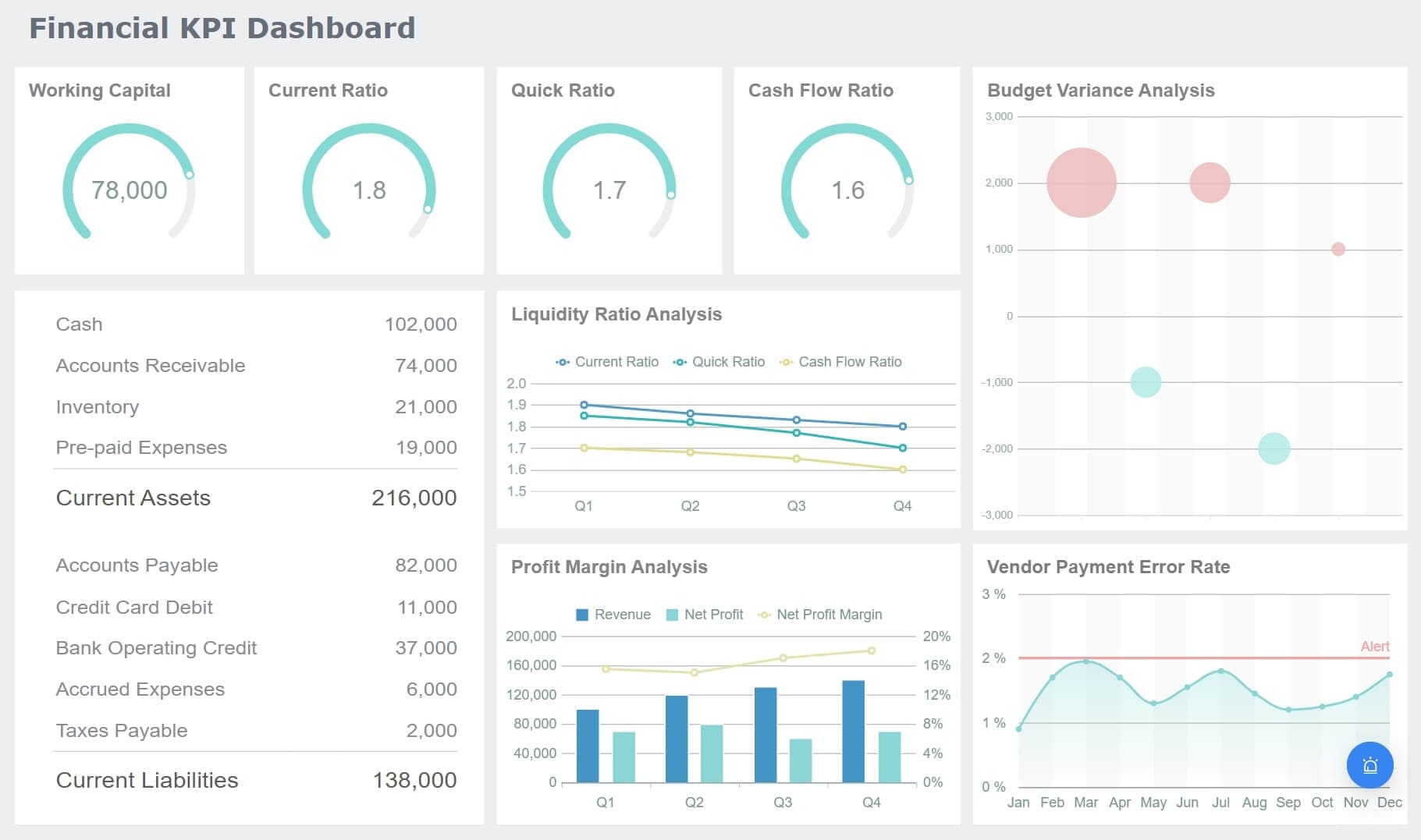
Data visualization is a cornerstone of any effective core app dashboard. Visual elements like charts, graphs, and maps are essential for making complex data more accessible and understandable. FineBI, developed by FanRuan, excels at transforming raw data into dynamic reports and dashboards, providing users with insightful visualizations. These tools allow users to easily track performance metrics, enabling quick, data-driven decisions based on the most current information. FineBI’s powerful visualizations are indispensable for professionals who need to respond swiftly to evolving data, making it a critical tool for effective decision-making.
A user-friendly interface is equally important in enhancing the dashboard experience. Simplicity and ease of use are vital, as users should be able to navigate the dashboard effortlessly. The low-code dashboard builder available in many platforms allows for extensive customization, enabling users to create compelling and visually appealing dashboards with minimal technical effort. These features ensure that the dashboard not only meets functional requirements but also provides an intuitive and engaging user experience.
Choosing the Right Tools and Technologies for a Core App Dashboard
Selecting the appropriate frontend frameworks is a key decision in the development of a core app dashboard. The choice of framework influences the look, feel, and interactivity of the dashboard. Developers can choose from a variety of options, such as React, Angular, or Vue.js, depending on the specific needs and goals of the project. These frameworks provide the structural foundation for building responsive and interactive user interfaces that enhance the overall user experience.
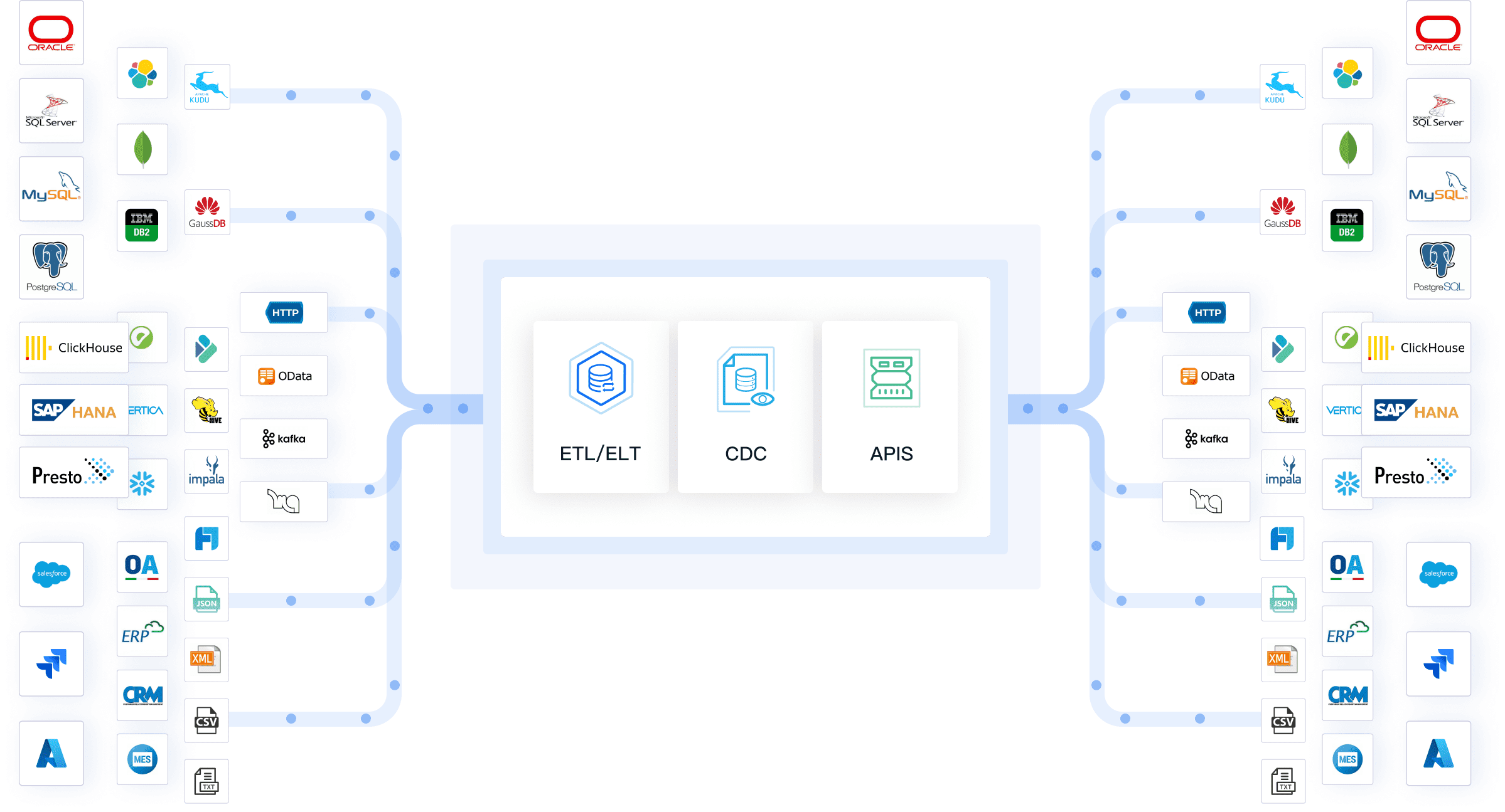
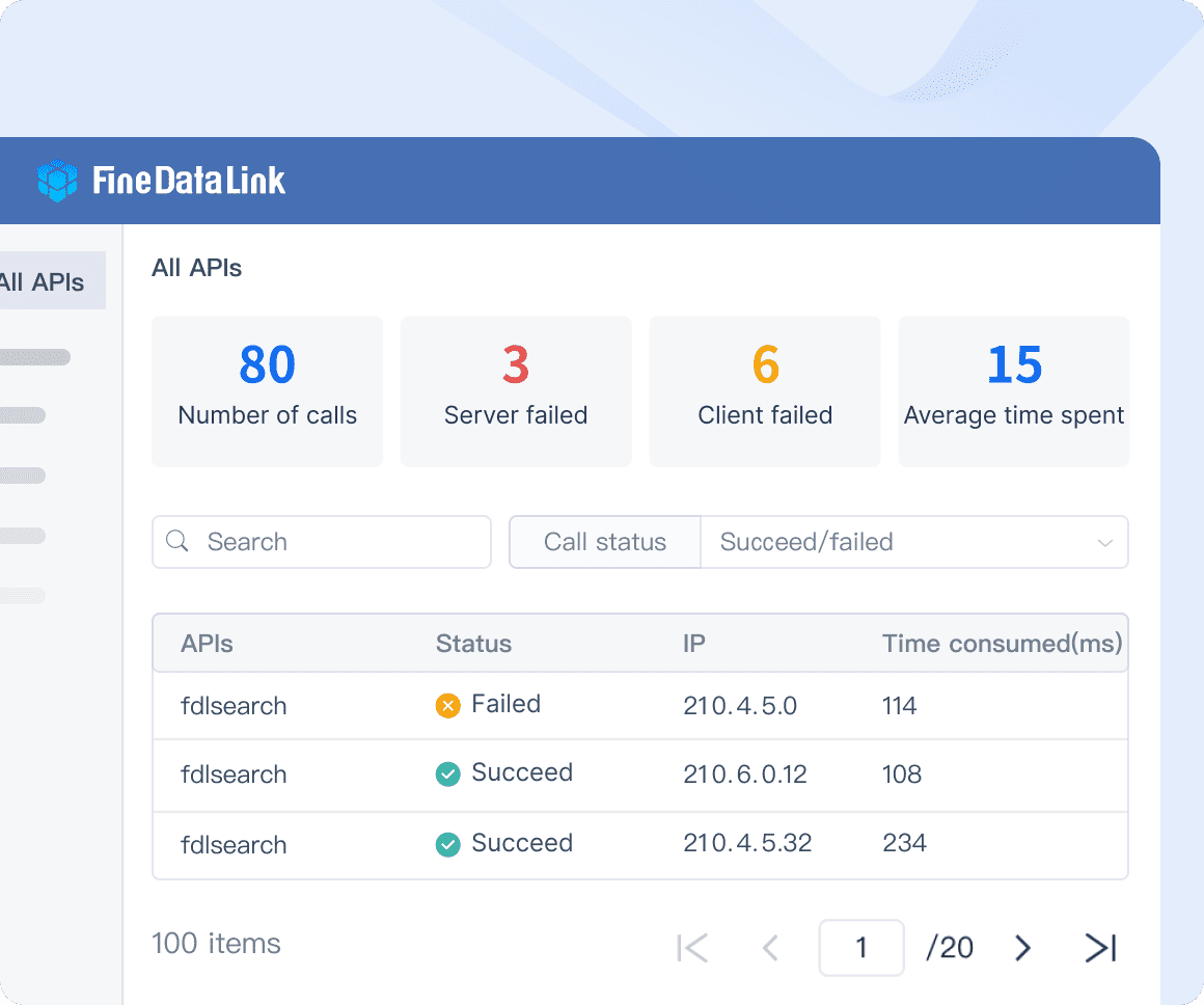
Backend integration is equally important, as it supports seamless data management and ensures that the dashboard receives and processes data in real time. Effective integration with data sources is crucial for maintaining the accuracy and relevance of the information displayed. FineDataLink’s Data Integration Solutions, for example, offer enterprise-level reporting capabilities by connecting different data sources into a unified view. This level of integration enhances the functionality of the core app dashboard, making it a powerful tool for business intelligence and decision-making.
In summary, a successful core app dashboard is built on a clear understanding of its purpose and goals, incorporates essential features like data visualization and a user-friendly interface, and leverages the right tools and technologies for both frontend and backend development. With solutions like FineBI, FineReport, and FineDataLink, businesses can create dashboards that not only meet their needs but also drive strategic insights and actions.
Designing the Core App Dashboard Layout
Wireframing and Prototyping of a Core App Dashboard
Wireframing is the essential first step in designing a core app dashboard, serving as the blueprint that guides the entire development process. Start by sketching initial designs to visualize the layout and structure, whether using traditional pencil and paper or digital tools. The key focus during wireframing should be on logically arranging elements to ensure intuitive navigation, and prioritizing the placement of essential data and key performance indicators (KPIs). This stage allows you to experiment with different layouts, ensuring that the dashboard meets user needs and business objectives.
Once wireframes are established, prototyping tools transform these static designs into interactive models. Use advanced tools like Adobe XD, Sketch, or Figma to simulate user interactions, enabling you to explore how users will navigate the dashboard. These tools allow for the incorporation of clickable elements, transitions, and animations, offering a more realistic preview of the final product. Prototyping is crucial for testing functionality, identifying potential usability issues, and fine-tuning the user experience before development begins. This iterative process ensures that the final dashboard design is both functional and user-friendly, reducing the need for costly revisions later on.
Implementing Design Principles of a Core App Dashboard
Effective dashboard design is built on the principles of consistency, simplicity, and clarity. Maintaining uniformity in design elements, such as colors, fonts, and icons, across the dashboard ensures a cohesive and professional look. Consistency not only enhances the visual appeal but also aids in creating a seamless user experience, where users can quickly learn to navigate the interface without confusion. Simplifying complex data through clear and intuitive visualizations is equally important. Tools like FineBI excel in transforming raw data into precise, easy-to-understand visuals that convey insights at a glance.
Responsive design is another critical consideration in modern dashboard development. With users accessing dashboards from a variety of devices—ranging from desktop monitors to tablets and smartphones—it’s essential that the layout adapts fluidly to different screen sizes. Implementing responsive design ensures that the dashboard maintains its usability and readability across all platforms. Testing the dashboard on multiple devices and screen orientations is necessary to guarantee that it delivers a consistent experience, regardless of how or where it is accessed. A well-executed responsive design not only improves accessibility but also enhances user engagement and satisfaction, making the dashboard a valuable tool for decision-making on the go.
In summary, a well-designed core app dashboard starts with thoughtful wireframing and prototyping, followed by the application of key design principles that prioritize consistency, simplicity, and responsiveness. By carefully planning and testing each stage of the design process, you can create a dashboard that is both visually appealing and highly functional, driving better user engagement and more informed decision-making.
Building the Core App Dashboard
Setting Up the Development Environment
Installing Necessary Software
The first step in building your core app dashboard is selecting and installing the appropriate software tools. Start by identifying the tools that best align with your project’s specific requirements. For instance, FineBI is an excellent choice for data analysis and visualization, offering robust capabilities to transform raw data into actionable insights. Additionally, FineDataLink can be used for seamless data integration across multiple sources, ensuring a consistent flow of information. Make sure to install all necessary software components and verify that the installations are complete and functional before moving forward. This preparation is crucial for laying a strong foundation for your dashboard development.
Configuring the Workspace
A well-organized workspace is key to streamlining the development process.Begin by arranging files, folders, and resources logically, ensuring they are easily accessible. Consider using a version control system like Git to manage your codebase, which will help track changes and collaborate with other developers efficiently. Set up project-specific configurations, such as environment variables, database connections, and API keys, to match the unique specifications of your dashboard. A clean and structured workspace not only enhances productivity but also reduces the likelihood of errors, making the development process smoother and more efficient.
Developing Core Features
Implementing Data Fetching
Data fetching is a critical component of any core app dashboard, as it provides the real-time information that users rely on. Start by connecting your dashboard to reliable data sources, whether they are databases, APIs, or cloud services. FineDataLink offers powerful tools for ensuring seamless data integration across these sources, allowing you to fetch data efficiently and accurately. Implement strategies to minimize latency and ensure that data is updated in real time, providing users with the most current insights. Properly managed data fetching is essential for delivering a responsive and informative dashboard experience.
Creating Interactive Elements
Interactive elements are what make a dashboard truly engaging and user-friendly. Design features that allow users to explore and interact with the data presented. Incorporate dynamic charts, graphs, filters, and drill-down options using tools like FineBI. These features enable users to customize their view, dive deeper into specific data points, and uncover insights that are most relevant to their needs. Ensure that these interactive elements are intuitive and responsive, making data exploration both informative and enjoyable. The goal is to create a dashboard that not only displays information but also encourages users to engage with and analyze the data effectively.
Thorough testing is crucial to ensure that your core app dashboard functions as intended. Perform rigorous tests on all features and interactions to verify their performance under various conditions. Utilize automated testing tools where possible to simulate user interactions, covering a wide range of scenarios. Additionally, conduct performance testing to ensure the dashboard remains responsive even with large data sets or high user traffic. Comprehensive testing helps identify potential issues early, ensuring that the final product offers a seamless and reliable user experience.
Fixing Bugs and Issues
During the testing phase, it’s inevitable that some bugs and issues will surface. Prioritize the resolution of critical errors that impact the functionality or user experience of the dashboard. Use debugging tools to trace the root cause of these problems and apply fixes efficiently. Pay attention to both major bugs and minor glitches, as even small issues can affect user satisfaction. Once all known issues are resolved, conduct a final round of testing to confirm that the dashboard is bug-free. A polished, error-free dashboard builds user trust and ensures a smooth launch.
In summary, building a core app dashboard involves meticulous planning, from setting up the development environment to implementing core features and ensuring a flawless user experience through rigorous testing and debugging.
Enhancing the Core App Dashboard with Advanced Features
Adding Customization Options for the Core App Dashboard
User Preferences
Customization is a critical aspect of modern dashboards, allowing users to tailor their experience to meet individual needs and preferences. By offering the ability to fine-tune dashboard elements, users can create a workspace that aligns with their specific workflows and priorities. This personalization could include adjusting data filters, rearranging widgets, or selecting specific metrics to be displayed prominently. When users can configure the dashboard to highlight the information that matters most to them, engagement and efficiency naturally increase. Fine-tuning not only enhances usability but also fosters a sense of ownership, leading to higher productivity and overall satisfaction.
Theme Settings
The visual appeal of a dashboard plays a significant role in user interaction and satisfaction. Providing theme customization options allows users to modify the look and feel of their dashboard to suit their preferences. With tools like FineReport, users can choose from a variety of themes, color schemes, and layouts, enabling them to create a visually appealing interface that resonates with their personal or brand aesthetics. This flexibility can be especially useful for organizations that wish to maintain consistent branding across all user interfaces. A well-designed, aesthetically pleasing dashboard not only makes data more engaging but also helps users connect with the information on a deeper level, making it easier to interpret and act upon.
Integrating Third-Party Services for the Core App Dashboard
API Connections
APIs (Application Programming Interfaces) significantly extend the capabilities of a core app dashboard by facilitating integration with a wide range of third-party services. By leveraging API connections, users can incorporate external tools, platforms, and data sources directly into their dashboards. FineDataLink, for instance, supports seamless API integration, allowing businesses to pull in data from CRM systems, marketing platforms, or other business-critical applications. This enhanced connectivity ensures that users have access to a broader spectrum of data, which leads to more comprehensive analysis and better-informed decision-making. The ability to integrate with various services also enables the dashboard to evolve alongside the organization’s needs, adding new functionalities as required.
External Data Sources
Access to a diverse array of data sources is essential for delivering a holistic view of business performance. By integrating external data streams into the dashboard, users can analyze information from different systems in one centralized location. FineDataLinkexcels in connecting and aggregating data from various sources, whether they are internal databases, cloud services, or third-party applications. This capability allows users to create dashboards that offer a unified perspective on business metrics, combining data from finance, sales, marketing, and operations into a single, coherent view. Such integration not only enriches the depth and breadth of insights but also enables more accurate forecasting, trend analysis, and strategic planning.
Implementing Advanced Data Visualization Techniques
Interactive Visuals
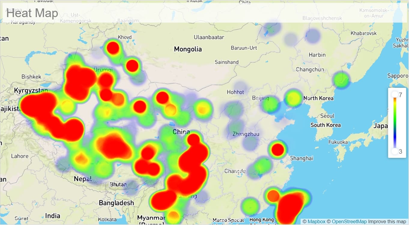
Beyond basic charts and graphs, incorporating advanced data visualization techniques can greatly enhance the user experience and the value of the dashboard. Interactive visuals, such as drill-down charts, heat maps, and dynamic graphs, allow users to explore data more deeply and uncover hidden patterns or correlations. These advanced visualizations provide a more engaging and insightful way to present complex data, making it easier for users to analyze trends, compare metrics, and draw conclusions. The interactivity of these visuals encourages users to interact with the data directly, leading to more meaningful and actionable insights.
For many businesses, real-time data is crucial for making timely decisions. Implementing real-time data updates in the dashboard ensures that users always have the most current information at their fingertips. This is particularly important in fast-paced environments like financial trading, logistics, or digital marketing, where data can change rapidly and decisions must be made quickly. By integrating live data feeds and automatic refresh mechanisms, the dashboard becomes a powerful tool for real-time monitoring and decision-making, keeping users informed and agile in their responses.
In summary, enhancing the core app dashboard with advanced features such as user customization, API integrations, and real-time data updates transforms it from a basic reporting tool into a dynamic, user-centric platform that meets diverse business needs. These enhancements not only improve functionality but also elevate the overall user experience, making the dashboard an indispensable asset for data-driven decision-making.
Building a core app dashboard involves several key steps. You must define the purpose, choose the right tools, and design an intuitive layout. User feedback plays a crucial role in refining the dashboard. Iteration based on this feedback enhances functionality and user satisfaction. Start experimenting with tools like FineBI and FineReport to create dynamic dashboards. Embrace the process of building and learning. Each iteration brings you closer to a more effective and engaging dashboard.
Product Trial
FineReport
Pixel-perfect reports · Interactive dashboards · Easy data entry · Digital twins
Access a wealth of case studies, industry insights, and solution guides to accelerate digital transformation.
FAQ
What is a Core App Dashboard?
A Core App Dashboard provides a centralized interface for monitoring and managing key performance indicators (KPIs). Users can access real-time data visualizations and insights. FineBI and FineReport offer tools for creating dynamic dashboards.
Why are dashboards important in modern applications?
Dashboards enhance decision-making by presenting data visually. Users can quickly identify trends and patterns. Dashboards improve user engagement and facilitate data-driven strategies. FineBI empowers users with intuitive data analysis capabilities.
How do you choose the right tools for building a dashboard?
Selecting tools depends on project requirements. Consider factors like ease of use, integration capabilities, and customization options.
What features should a core app dashboard include?
A core app dashboard should include data visualization, user-friendly interfaces, and customization options. FineBI offers advanced features like API connections and theme settings. These features enhance the dashboard's functionality and appeal.
How can you ensure the dashboard remains user-friendly?
Maintain simplicity and consistency in design. Use clear visualizations and intuitive navigation.
Can third-party services be integrated into the dashboard?
Yes, third-party services can enhance dashboard capabilities. APIs enable connections to external tools and data sources. FineBI facilitates seamless integration for enriched data analysis. This connectivity broadens the scope of insights available.
What role does data fetching play in a dashboard?
Data fetching retrieves information from various sources. Users gain real-time insights through efficient data integration. Reliable data fetching is crucial for dashboard performance.
How do you address bugs and issues in a dashboard?
Identify and prioritize critical errors during testing. Use debugging tools to trace and resolve problems. Regular updates and maintenance keep the dashboard running smoothly. A bug-free dashboard fosters user trust and reliability.