A top sales analytics dashboard for content teams helps marketing and sales leaders answer one critical question: which content assets actually generate pipeline and revenue. Without a connected dashboard, content teams often optimize for traffic, downloads, or engagement while sales leaders care about opportunity creation, deal velocity, and closed-won revenue. The result is misalignment, weak budget justification, and slow decision-making. A well-built dashboard solves this by tying content performance to lead quality, pipeline influence, and revenue outcomes in one operating view.
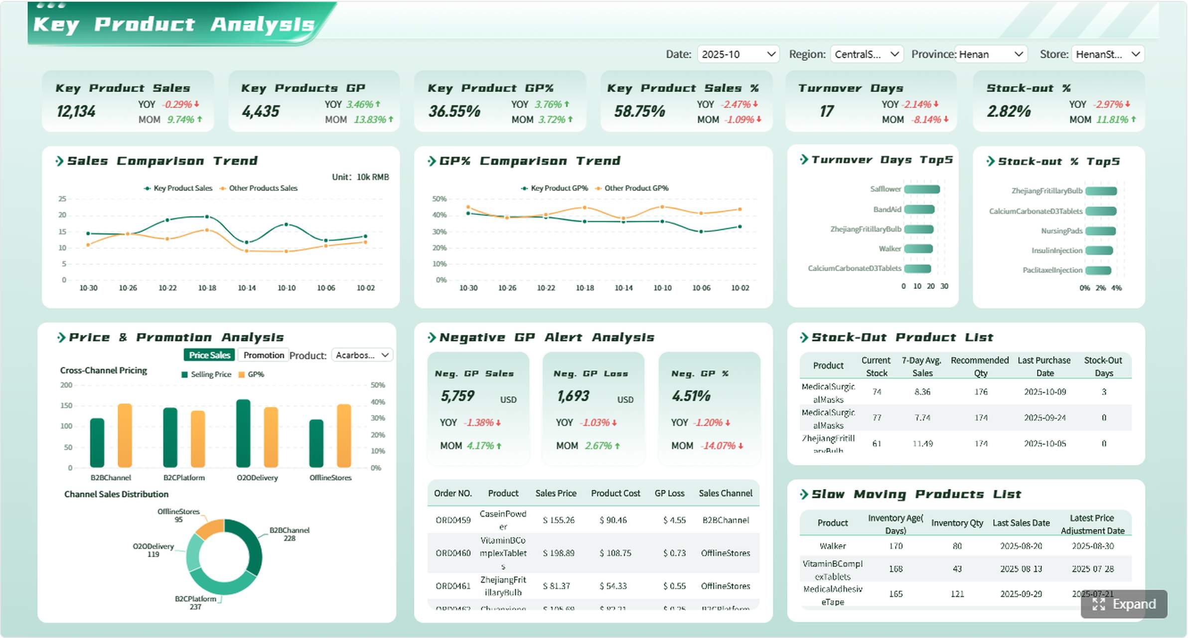
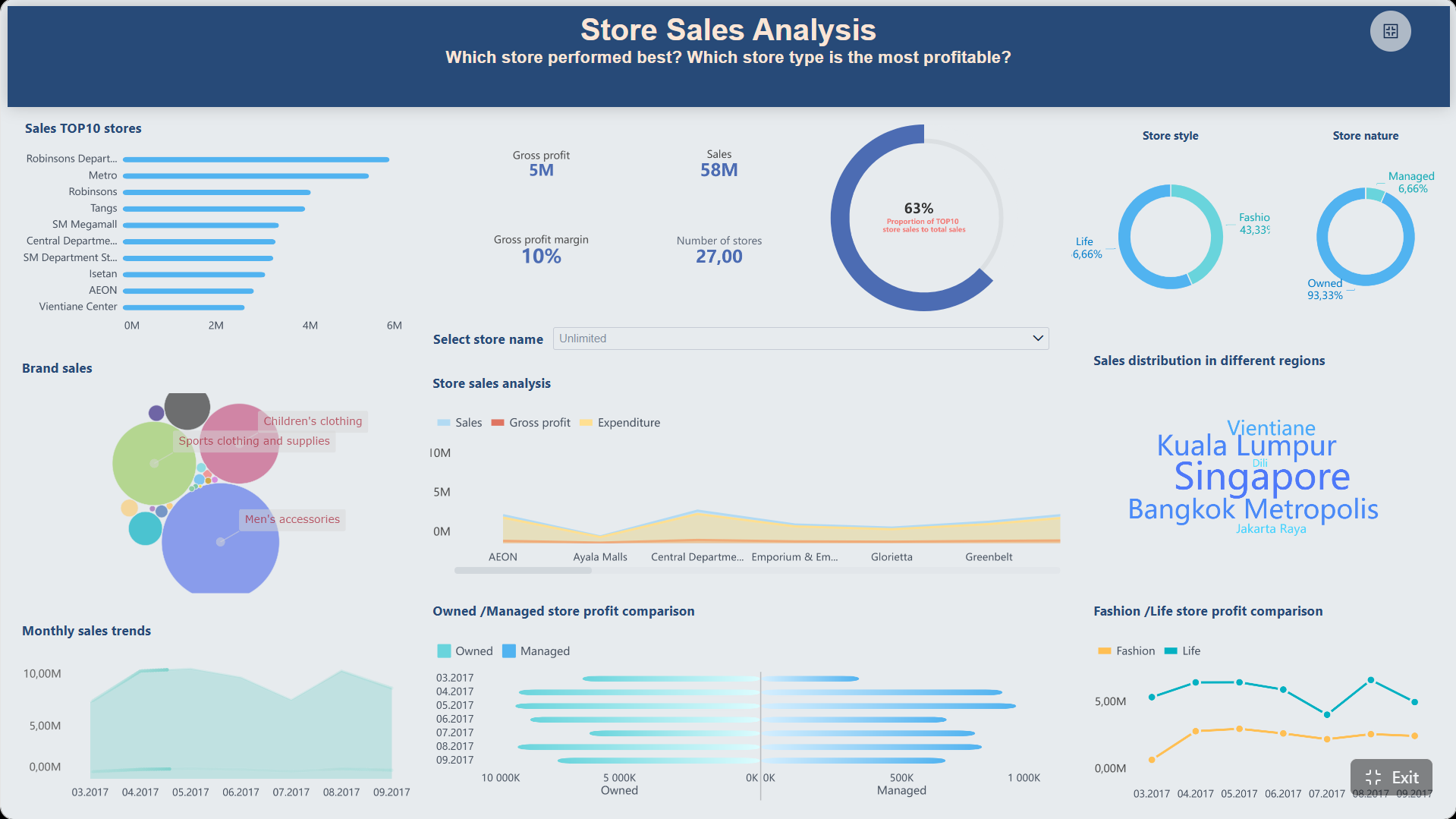
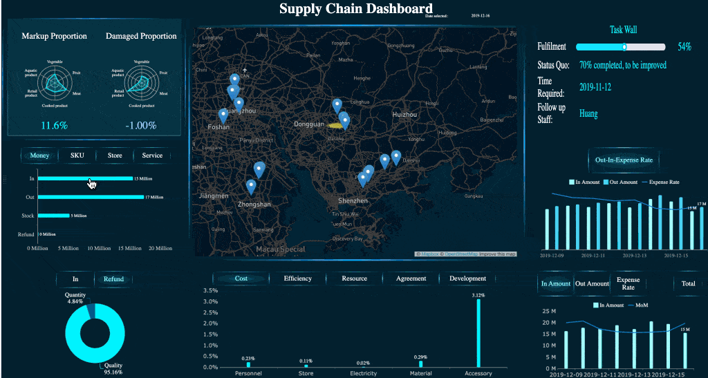
All dashboards in this article are built with FineBI.
What a Top Sales Analytics Dashboard for Content Teams Should Measure
A strong dashboard is not just a reporting layer. It is a decision system for content marketers, demand generation teams, sales leadership, and executives. It should reveal whether content is attracting the right audience, generating qualified demand, influencing opportunities, and accelerating revenue.
At a minimum, the dashboard should answer these business questions:
Which content types attract the highest-quality leads?
Which channels drive traffic that converts into pipeline?
Which assets influence opportunities and closed-won deals?
Where does content contribute to faster or slower sales cycles?
Which campaigns deserve more budget based on revenue impact?
Who the dashboard is for
Different stakeholders use the same dashboard differently, so the structure should support multiple decision layers:
Content marketers need asset-level and topic-level performance.
Demand generation teams need campaign, source, and conversion visibility.
Sales leadership needs pipeline influence, opportunity quality, and win rate.
Executives need concise summaries of revenue contribution and trend direction.
Map Your Data Sources Before Building a Top Sales Analytics Dashboard for Content Teams
Most dashboard failures are data-model failures. Before opening any BI tool, define how GA4, CRM, and optionally your warehouse will work together. This step is where reporting reliability is won or lost.
GA4 data to collect
GA4 should capture the full content engagement and conversion journey, not just pageviews. That means you need visibility into how users arrive, what they consume, what actions they take, and where they drop off.
Focus on collecting:
Traffic source and medium
Campaign and UTM parameters
Landing page and page path
Engagement events such as scroll, video view, click, and file download
Conversion events such as form submissions and demo requests
Content path sequences before conversion
Standardizing UTM tagging is essential. If one team uses paid-social and another uses paidsocial, your channel reporting becomes unreliable fast. Create one naming taxonomy for source, medium, campaign, content type, and offer name.
CRM data to connect
Your CRM is where sales impact becomes measurable. Without CRM integration, content reporting remains a marketing activity report rather than a revenue report.
The key CRM objects and fields typically include:
Leads
Contacts
Accounts
Opportunities
Opportunity stages
Revenue or amount fields
Lifecycle status
Lead source and campaign attribution fields
Opportunity owner and segment fields
You also need process discipline. If opportunity stages are not updated consistently, or if ownership rules vary by team, your dashboard will show misleading pipeline trends.
BI and warehouse considerations
Some teams can report directly from GA4 and CRM connectors. Others need a warehouse for cleaner joins, historical stability, and more advanced attribution models. The right choice depends on scale, complexity, and governance requirements.
GA4 is the front-end behavior layer of your dashboard. If the event design is weak, downstream content-to-revenue analysis will be incomplete.
Create the right events and conversions
Start by mapping buyer actions that matter commercially, not just behaviorally. Common events include:
Form submission
Demo request
Newsletter sign-up
Resource download
Webinar registration
Pricing page click
Contact sales click
Qualified lead event
Mark high-value actions as conversions in GA4, then align their naming with CRM fields wherever possible. This makes joins and interpretation easier later.
A good rule: if sales or demand generation uses the event for decision-making, define it cleanly and consistently from day one.
Build content-focused reporting views
Raw page-level reporting is too fragmented for strategic decisions. Build content views that group assets by business logic such as:
Content type
Topic cluster
Funnel stage
Campaign
Product line
Industry vertical
Region
This structure helps content teams compare not just individual URLs, but strategic content programs.
Use GA4 explorations to identify:
The content paths most likely to precede conversion
The top landing pages for qualified traffic
Pages with high engagement but weak downstream conversion
Content clusters that contribute to sales-qualified sessions
Strengthen attribution foundations
Attribution quality depends on setup discipline. Review these items carefully:
Default channel groupings
UTM consistency
Cross-domain tracking
Session stitching logic
Internal traffic filtering
Referral exclusion settings
The most important test is continuity: does source and medium stay consistent from first visit through key conversion actions? If not, your dashboard will over-credit or under-credit channels and content.
Connect CRM Data to Show Pipeline and Revenue Impact
This is the step that transforms a marketing dashboard into a revenue dashboard. CRM integration allows content teams to prove influence beyond top-of-funnel engagement.
Align marketing and sales definitions
Do not build the dashboard until sales and marketing agree on definitions. Misaligned terminology destroys trust faster than any technical issue.
You need clear definitions for:
Lead
MQL
SQL
Opportunity
Influenced pipeline
Closed-won revenue
Content touchpoint
Attribution window
For example, if marketing defines an influenced opportunity as any account that viewed content in the last 180 days, but sales expects only opportunities with pre-opportunity engagement in the last 30 days, the same number will be interpreted very differently.
Build join logic between content and sales records
In practice, joining web analytics to CRM is never perfect. The goal is not theoretical perfection. It is a practical, auditable model that supports decision-making.
Typical join inputs include:
Form submission identifiers
Email addresses captured through conversions
Campaign parameters
CRM campaign member data
Contact and account IDs
Opportunity associations
First-touch and multi-touch fields
For B2B teams especially, lead-to-account mapping matters. Buyers often consume multiple content assets before an opportunity is created. Your model should account for both individual and account-level influence.
Clean and govern the data
No dashboard can outperform poor operational hygiene. Run audits for:
Duplicate leads and contacts
Missing source values
Inconsistent stage names
Stale opportunities
Incorrect owner assignments
Broken campaign mappings
Document metric formulas clearly. Every executive-facing KPI should have a plain-language definition. Trust increases when teams know exactly how the number is calculated.
Design the Top Sales Analytics Dashboard for Content Teams in Your BI Tool
Once the data model is stable, the dashboard design should mirror how decisions get made. Good dashboards reduce interpretation time and make actions obvious.
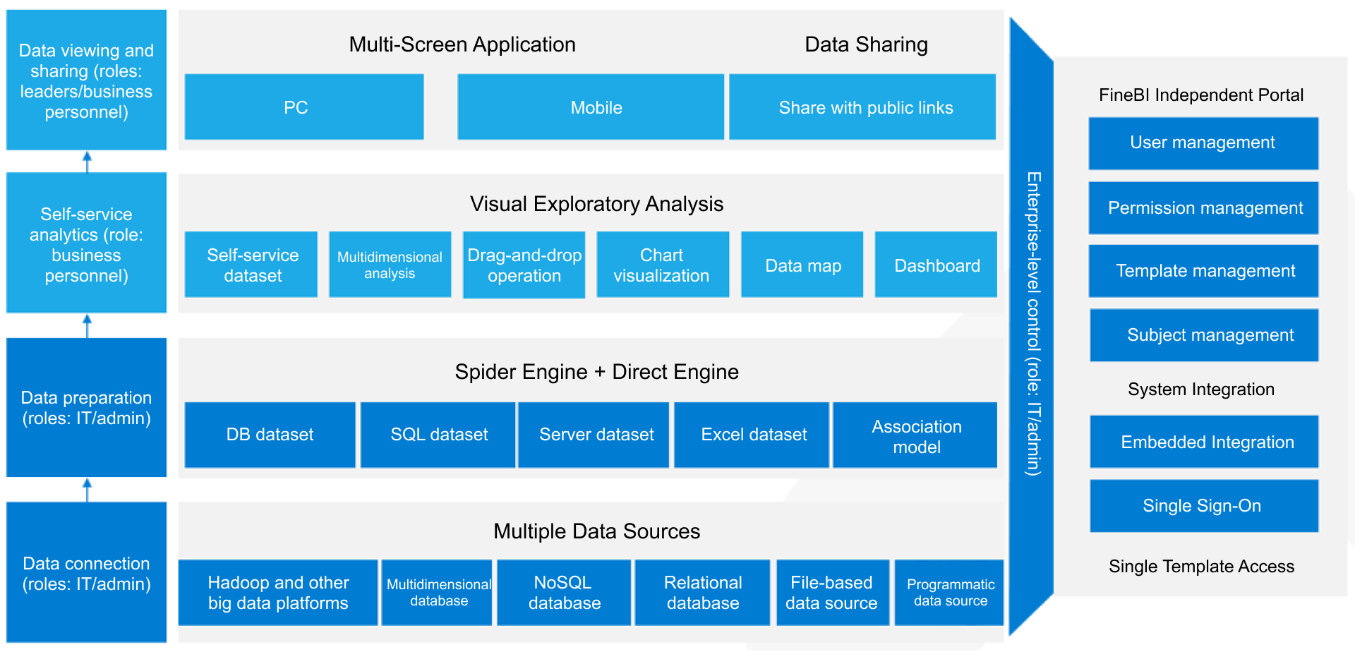
FineBI is well suited here because it supports interactive drill-downs, cross-functional views, and executive-friendly summaries without forcing teams into static reporting.
A practical structure is to build the dashboard in four layers:
Executive summary
Channel and content performance
Pipeline contribution
Revenue outcomes
This structure keeps the top view concise while allowing analysts and managers to dig deeper.
Recommended filters include:
Date range
Campaign
Content type
Topic cluster
Region
Sales segment
Product line
Opportunity stage
Choose visualizations that make trends obvious
The right chart type shortens meetings and reduces confusion. Keep visual choices aligned to the question being answered.
Use:
Scorecards for headline KPIs such as influenced pipeline and won revenue
Trend lines for weekly and monthly performance movement
Funnels for lifecycle and stage conversion
Tables for content asset-level comparisons
Bar charts for channel and topic cluster rankings
Heatmaps for content-path or segment analysis
Pair leading indicators with lagging indicators. For example, show engaged sessions and demo requests next to influenced pipeline and closed-won revenue. That gives teams both early signals and business outcomes.
Add practical drill-downs for content teams
A dashboard becomes operationally useful when users can move from summary metrics to root cause quickly.
Enable drill-downs from:
Revenue influence to campaign
Campaign to content type
Content type to specific asset
Asset to author, topic, and landing page
Opportunity metric to account or sales segment
Useful drill-down views include:
Underperforming content with high traffic but low conversion
High-converting content paths
Sales-assisted opportunities tied to content engagement
Topic clusters with strong pipeline impact but low publication volume
Launch, Validate, and Improve Your Top Sales Analytics Dashboard for Content Teams Over Time
A dashboard launch is not the finish line. It is the start of a governance and optimization cycle. The best-performing teams continuously validate the numbers and improve the model as the business changes.
Test the dashboard before rollout
Before broad release, compare the dashboard against known records and native-source totals. This helps catch join logic issues, field mapping errors, and stale refresh logic.
Validation should include:
GA4 conversion totals versus dashboard conversion totals
CRM opportunity counts versus dashboard opportunity counts
Revenue amounts versus finance-approved benchmarks
Known campaign records for spot checks
Date-range consistency across sources
Also run stakeholder review sessions with content, sales, and operations teams. Ask one question repeatedly: does this dashboard help you make a real decision?
Create a recurring optimization process
Strong dashboard programs operate on a fixed review cadence. That usually includes monthly logic reviews and quarterly redesign decisions.
Focus your optimization process on:
Metric quality
Dashboard usage patterns
Stakeholder feedback
New campaign or content dimensions
Attribution model refinement
Retirement of visuals that are not used
Turn insights into decisions
The real value of a top sales analytics dashboard for content teams is not visibility. It is action. Every dashboard review should drive a clear business choice.
Use the dashboard to decide:
Which content to refresh, repurpose, or retire
Which campaigns deserve more investment
Which sales enablement assets support deal progression
Which topic clusters warrant expansion
Which channels generate low-quality or high-value demand
Best Practices for Implementing This Dashboard Successfully
If I were advising an enterprise team building this for the first time, I would recommend these five steps.
1. Start with revenue questions, not reporting features
Define the executive questions first. Examples:
Which content influences the most pipeline?
Which channels create the highest win-rate opportunities?
Which assets shorten the sales cycle?
Only after those questions are clear should you design metrics and visuals.
2. Standardize naming conventions before launch
Fix campaign names, UTM rules, content taxonomy, and funnel-stage labels before users see the dashboard. Retrofitting naming chaos later is expensive and frustrating.
3. Build version one with a narrow KPI set
Do not launch with 40 metrics. Start with a compact operating layer:
Influenced pipeline
Won revenue
Qualified leads
Conversion rate
Win rate
Sales cycle length
Then expand once trust is established.
4. Design for drill-down, not just presentation
Executives need summary views, but managers need diagnostic views. A useful BI dashboard lets both audiences work from the same system without creating separate reports for every meeting.
5. Assign metric ownership
Every KPI should have an owner:
Marketing operations for tracking integrity
Sales operations for CRM quality
Content leadership for taxonomy consistency
Revenue leadership for business interpretation
This prevents endless disputes about whose number is “correct.”
Why FineBI Works Well for Content-to-Sales Analytics
For teams trying to unify GA4, CRM, and revenue reporting, FineBI offers a practical path from disconnected metrics to decision-ready dashboards. It is especially useful when teams need to serve both executives and operational users from one environment.
A top sales analytics dashboard for content teams should do one thing exceptionally well: connect content activity to pipeline and revenue in a way that stakeholders trust and act on. That requires disciplined GA4 setup, clean CRM definitions, sensible join logic, and a BI design built around decisions instead of vanity metrics.
If you build the dashboard around business questions, align on KPI definitions, and create a recurring optimization process, your content team will stop reporting activity and start proving revenue contribution.
It should combine content engagement, conversions, qualified leads, influenced pipeline, and revenue outcomes in one view. The goal is to show which assets and channels contribute to opportunity creation and closed-won deals.
GA4 tracks traffic sources, on-site engagement, and conversion events, while the CRM connects those interactions to leads, opportunities, and revenue. Together they let teams measure content impact beyond website activity.
The most important KPIs usually include conversion rate, qualified leads, MQL to SQL rate, influenced opportunities, pipeline value influenced, closed-won revenue influenced, and sales cycle length. These metrics help teams connect content performance to business results.
Consistent UTM naming prevents channel and campaign data from being split into misleading categories. That makes attribution cleaner and improves trust in dashboard insights.