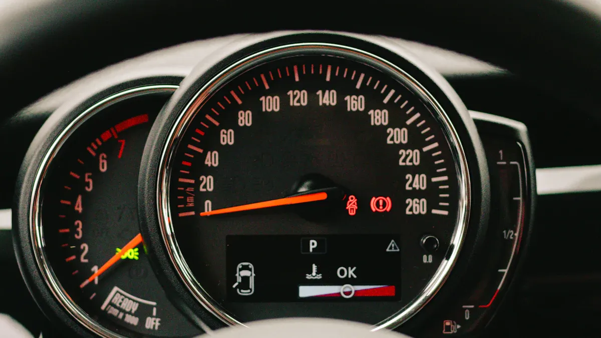
A gauge chart in data visualization shows a single value within a range, making it easy for you to see performance at a glance. You often see a gauge chart that looks like a speedometer or a dial, which helps you quickly understand how close you are to a target.
You can use a gauge chart to track key performance indicators or measure progress toward business goals. FineBIlets you create clear and interactive gauge charts and dashboards to support your decision-making.
Gauge Chart Basics
Visual Structure
When you look at a gauge chart, you see a design that resembles a speedometer or dial. This familiar shape helps you quickly understand the information it presents. The main components of a gauge chart work together to make data interpretation simple and effective.
The base structure forms a dial or arc, which serves as the foundation of the chart.
A value indicator, often a needle or pointer, shows the current measurement.
Scale markings appear along the arc, giving you clear reference points for interpreting values.
The value display presents the exact number, usually in a prominent position.
Color zones divide the scale into different ranges, such as green for good performance, yellow for caution, and red for warning.
Labels and units provide context, so you know what the measurement means.
Each part of the gauge chart plays a role in making the data easy to read. The arrangement of these elements affects how you interpret the information. The table below explains how key components influence your understanding:
Component
Effect on Interpretation
Pointer Position
Indicates the current value within the defined range.
Scale Range
Provides context for understanding the value relative to a total or target.
Color Thresholds
Enhances readability and allows for quick assessments of performance against goals.
How It Works
A gauge chartdisplays a single numeric value within a defined range. You can use it to track metrics like sales performance, production output, or system health. The chart visualizes the value by placing the needle or pointer at the correct spot on the dial. The color zones and scale markings help you see at a glance whether the value meets your expectations.
Gauge charts visualize numeric data by showing a specific value, such as the latest result in a time series or a summary like a sum or average. The chart divides the scale into intervals, with each interval representing a certain value. The needle moves to the position that matches the current measurement. Color zones highlight different performance levels, making it easy for you to spot trends or issues.
You can connect a gauge chart to live data sources. When you do this, the chart updates in real time. This feature is essential for continuous monitoring. You can see changes as they happen, which helps you respond quickly to new information. Unlike static charts, dynamic gauge charts offer an interactive way to assess performance against your goals. You get instant feedback, so you always know where you stand.
Gauge charts are especially useful for tracking critical metrics and progress toward goals. They give you immediate insights into performance levels. You can use them for both real-time monitoring and static reporting, depending on your needs.
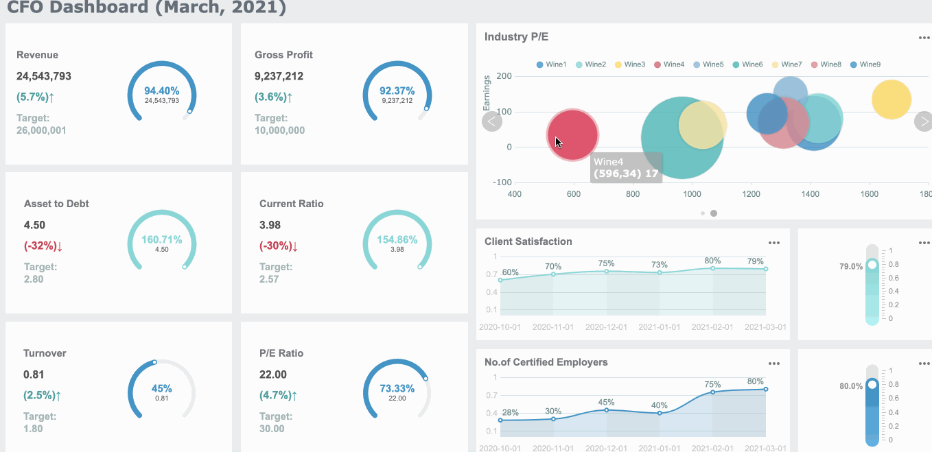
A single value gauge chart focuses on one key metric. You use this type of chart when you want to highlight a single performance indicator, such as sales achievement or system uptime. The chart displays just one value, making it easy for you to see progress toward a specific goal. You often see a single value gauge chart in dashboards that track daily targets or critical KPIs.
A single value gauge chart links to a form with only one cell value.
You get a quick visual snapshot of your progress toward a goal.
This chart type works best when you want to avoid clutter and keep your dashboard simple.
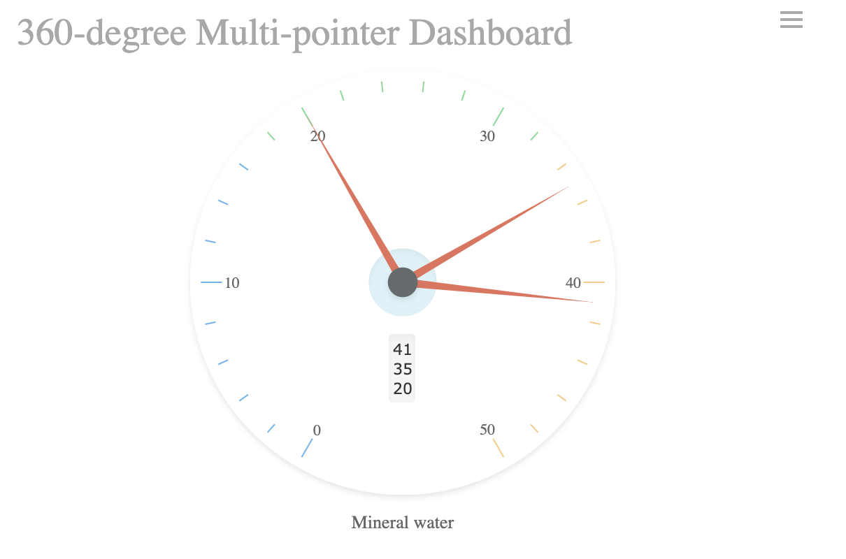
Multi Value
A multi value gauge chart lets you monitor several metrics at once. You can compare different KPIs side by side, which helps you spot trends or issues across multiple areas. This approach is useful for managers who need to track several departments or product lines.
Multi value gauge charts display multiple gauges, each showing a different metric.
You can compare performance across different values in one view.
These charts provide instant insights and real-time updates, so you see changes as they happen.
Clear color zones help you identify safe, warning, or critical statuses quickly.
The format makes it easy for non-technical users to understand performance at a glance.
Tip: When you design a multi value gauge chart, keep the layout clean. Too many gauges can overwhelm the viewer and reduce clarity.
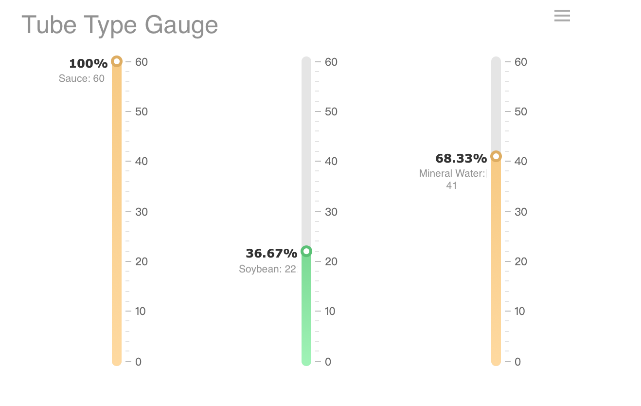
Radial vs. Linear
You can choose between radial and linear gauge charts based on your data and goals. Each style offers unique visual and functional benefits.
Gauge Type
Visual Characteristics
Functional Characteristics
Radial
Circular, like a speedometer
Best for showing a single metric at a glance
Linear
Straight line, like a thermometer
Ideal for tracking progress over time
Radial gauge charts give you a quick, familiar way to see a single value. Linear gauge charts work well when you want to show progress along a straight path, such as a timeline or a process.
You often use a gauge chart to track key performance indicators(KPIs) in business. This type of chart transforms important metrics into visual indicators, making it easy for you to see how close you are to your targets. When you look at a gauge chart, you get instant feedback on your progress. Executives and managers rely on these charts in dashboards because they provide a clear, immediate understanding of goal achievement. You can quickly spot if your performance is on track or if you need to take action.
Gauge charts work well for many industries. The table below shows common use cases:
Industry
Use Case Description
Manufacturing
Displaying production volume by top machine and reflecting downtime.
High Tech Organizations
Tracking progress of key processes like overall progress rate and average loading time.
Energy and Utility
Monitoring contribution of renewable energy by various sectors.
Public Sector
Showing average absenteeism rate or progress towards fundraising goals.
Consumer Products
Determining customer satisfaction, retention rates, and other key metrics.
You can use gauge charts to measure changes in values over time or compare different entities against a common parameter.
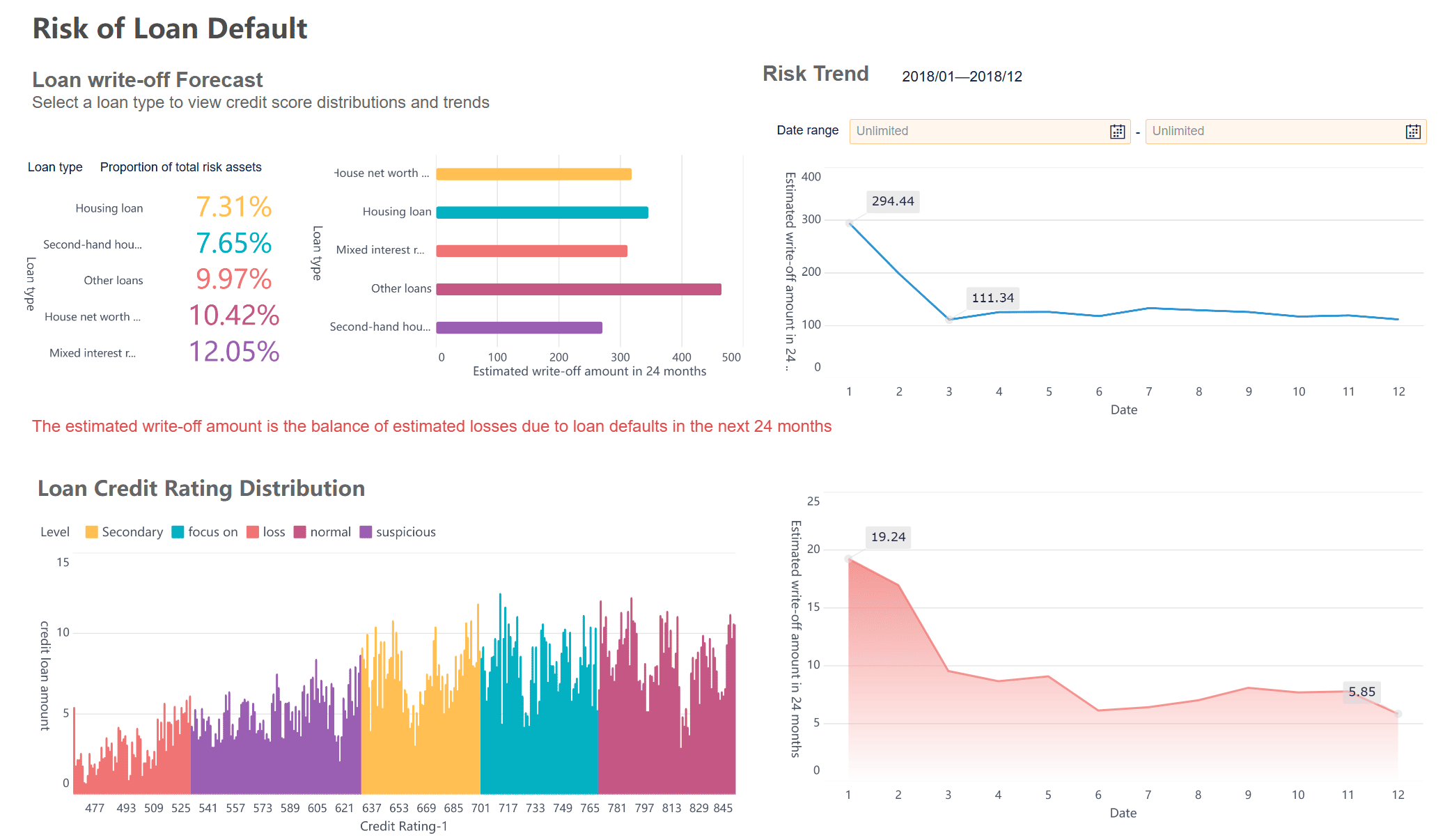
Quality Control in Manufacturing
In manufacturing, a gauge chart helps you monitor quality and efficiency. You can track metrics like defect rate, first pass yield, and scrap rate. These charts let you see if your production process meets quality standards. You also use them to monitor machine downtime and overall equipment effectiveness.
Key Metric
Description
Defect Rate
Measures the percentage of products with defects out of the total produced.
First Pass Yield (FPY)
Tracks the percentage of products that meet quality standards without needing rework.
Scrap Rate
Monitors the percentage of raw materials wasted during production.
Overall Equipment Effectiveness
Combines availability, performance, and quality to assess the efficiency of manufacturing equipment.
Downtime Tracking
Measures how often machines are idle, impacting production quality and timeliness.
You can use these charts to identify trends, monitor variations, and ensure your products stay within quality limits.
FineBI in Real-World Scenarios
FineBI supports you in building dashboards that use gauge charts for real-time monitoring and analysis. You can choose from different chart types, such as multi-pointer gauges, percentage gauges, and test tube gauges. FineBI lets you customize colors, pointer values, and scale settings to match your needs. You can also hide or adjust the scale and modify the maximum value for better clarity.
For example, BOE Technology Group used FineBIto create unified KPI dashboards. These dashboards helped them reduce inventory costs and improve operational efficiency. FineBI’s flexible dashboard features allow you to track performance across departments, monitor manufacturing quality, and support data-driven decisions in your organization.
When you use a gauge chart, you gain several practical benefits for data visualization and KPI tracking. The design makes it easy for you to create and understand, even if you have limited experience with charts. You see your data clearly, which helps you spot trends and patterns quickly. Gauge charts let you set goals and monitor progress, so you always know how close you are to your targets. You can embed a gauge chart into websites or applications, making real-time data display simple. The intuitive layout means anyone in your team can interpret the results without confusion.
Tip: Gauge charts work best when you want to highlight a single metric or show progress toward a specific goal.
Drawbacks
While a gauge chart offers many advantages, you should consider its limitations before choosing it for your dashboard. Gauge charts only display one data point at a time, which makes comparing multiple variables difficult. You cannot use a gauge chart to show trends over time, so it may not provide actionable insights for changing metrics. The chart takes up significant space on your dashboard, which can be inefficient if you have limited room. For comparing values or tracking changes, other chart types may serve you better.
Gauge charts show only one value, limiting comparisons.
You cannot track trends or changes over time with a gauge chart.
The chart occupies a large area, which may reduce dashboard efficiency.
Bar charts or radar charts are better for comparing multiple metrics.
Note: Use a gauge chart when you need a quick snapshot, not when you need detailed analysis or comparisons.
Comparison
You may wonder how a gauge chart compares to other visualization types for KPI tracking. The table below highlights the strengths and weaknesses of gauge charts, bar charts, and line charts:
Chart Type
Effectiveness for KPI Tracking
Gauge Charts
Shows a single metric against a target. Effective for quick assessments. Limited in showing progress over time.
Bar Charts
Summarizes data by categories. Allows for comparisons and tracking multiple KPIs. Good for visualizing differences.
Line Charts
Displays continuous data over time. Ideal for tracking trends and changes in KPIs.
Gauge charts give you instant feedback on one metric. Bar charts help you compare several values. Line charts let you see how metrics change over time. Choose the chart that matches your data and your goals.
Create Gauge Chart with FineBI
Step-by-Step Guide
You can create a gauge chart in FineBIwith a straightforward process. FineBI’s dashboard interface makes it easy for you to visualize your data and track key metrics. Follow these steps to build your own gauge chart:
Connect Your Data Start by connecting FineBI to your data source. FineBI supports a wide range of data sources, including relational databases, big data platforms, and Excel files. This flexibility ensures you can bring all your important metrics into one place.
Prepare and Process Data Upload your data and create an analysis subject. Use FineBI’s self-service tools to clean, edit, and organize your data. You can join tables, add calculated fields, and apply filters to focus on the information you need.
Add a Gauge Chart Component In the dashboard editor, select the option to add a new visual component. Choose "Gauge" as your chart type. FineBI offers several gauge chart subtypes, so you can pick the one that best fits your needs.
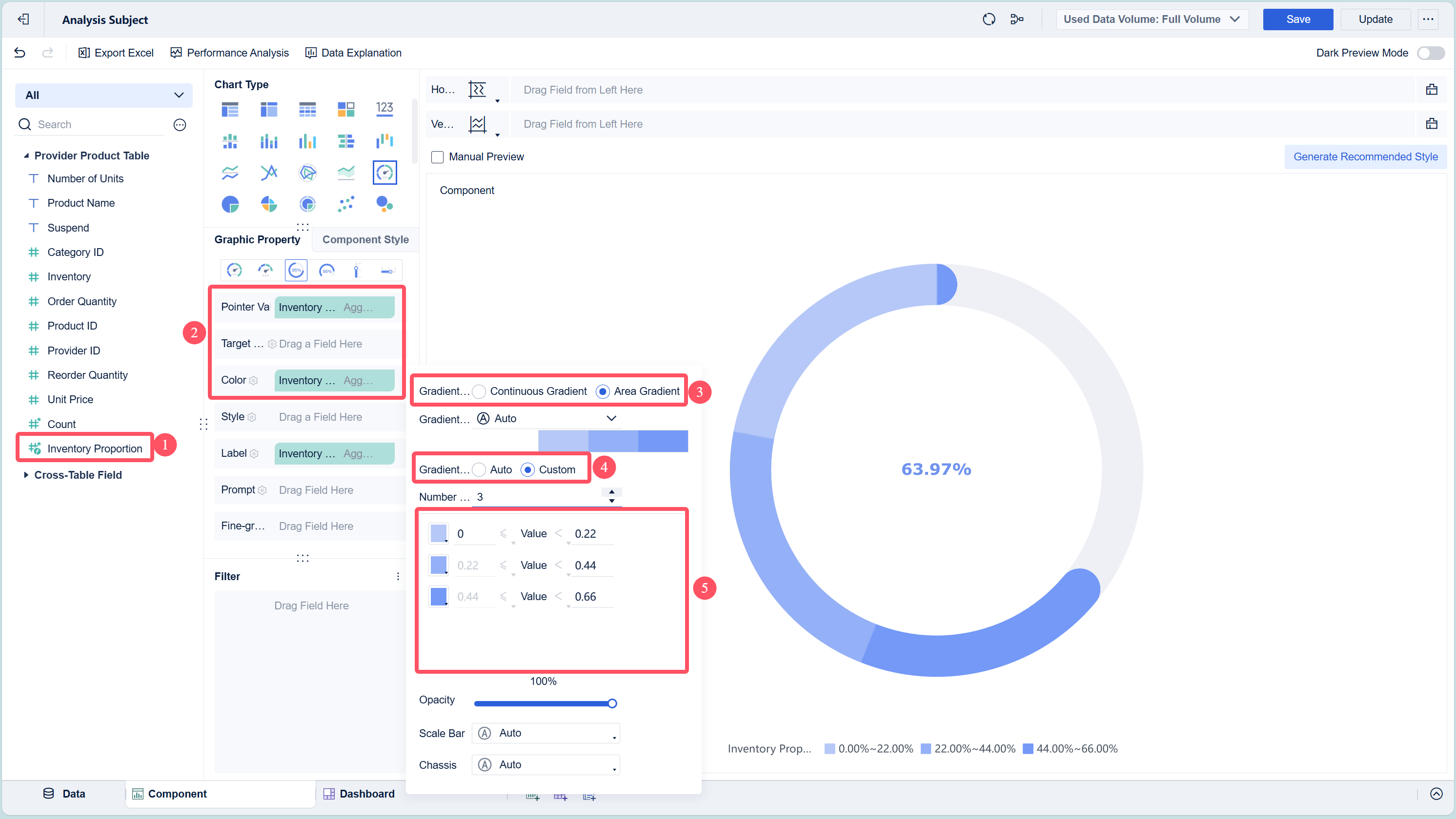
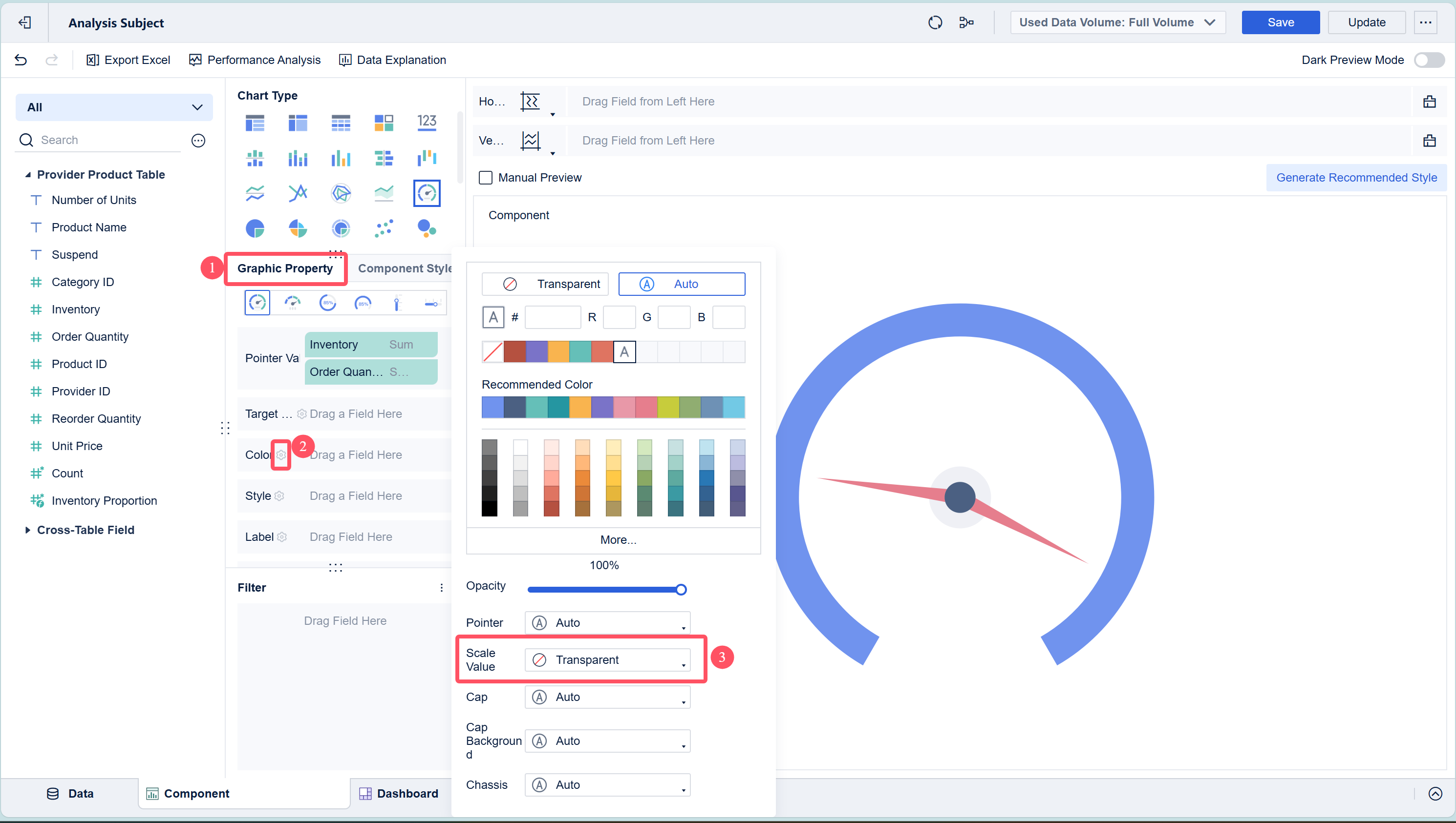
Configure the Gauge Chart Drag the metric you want to track, such as "Inventory Percentage," into the appropriate area of the chart properties. Set your target value by clicking the settings icon next to "Target Value." You can also format your metric as a percentage or other unit.
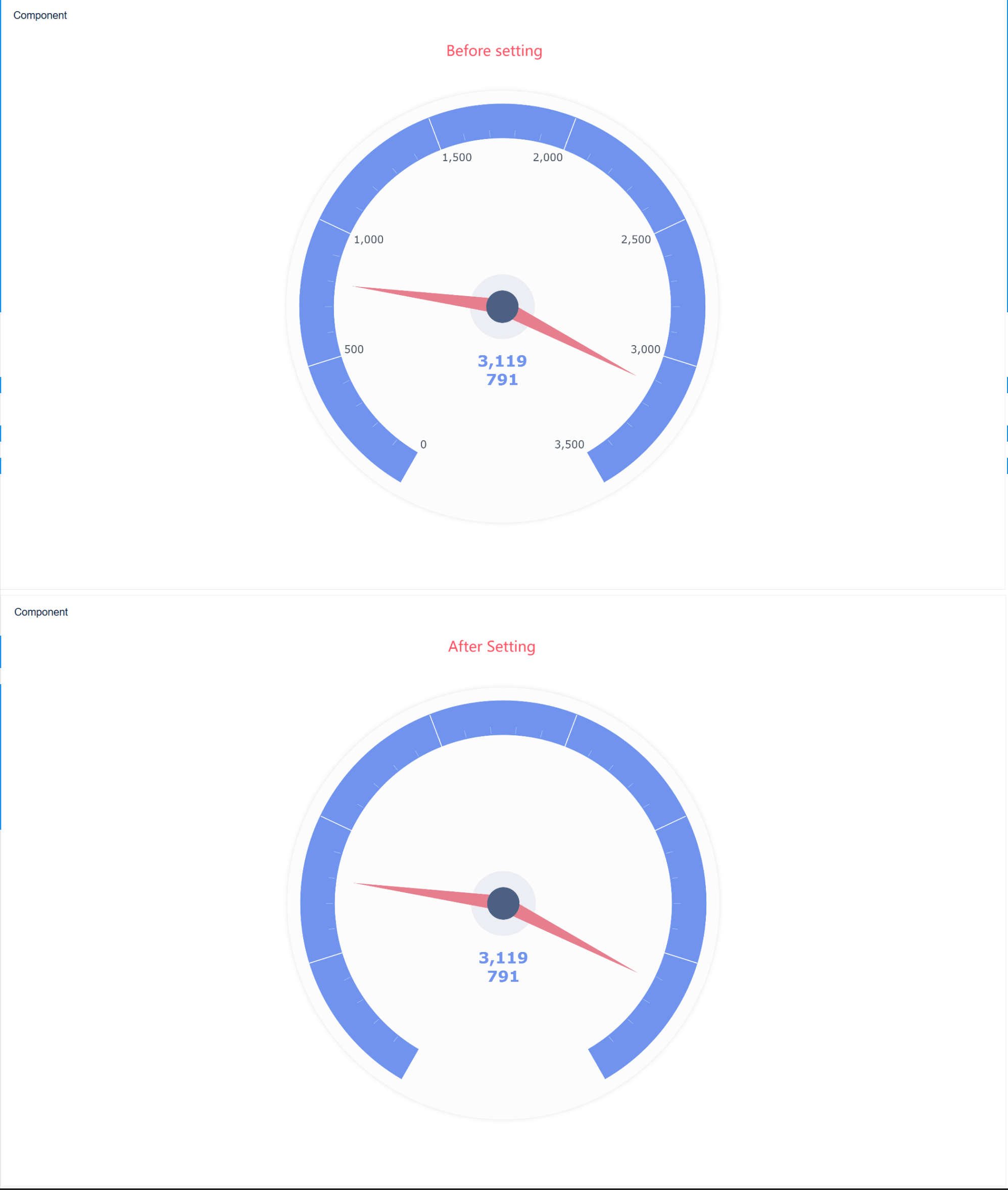
Customize the Display Adjust the color zones to highlight performance thresholds, such as green for good, yellow for caution, and red for warning. Add labels and units to provide context for your viewers.
Create and Arrange the Dashboard Click the "Add Dashboard" button to create a new dashboard. Drag your gauge chart component into the dashboard layout. FineBI’s drag-and-drop interface lets you arrange components for the best visual impact.
Preview and Publish Preview your dashboard to ensure everything looks correct. Once satisfied, publish the dashboard so others in your organization can access real-time insights.
FineBI'sworkflow covers every step, from data connection and processing to visualization and publishing. You can build dashboards that update automatically as your data changes, giving you a live view of your key metrics.
Best Practices for Gauge Chart Creation in FineBI
To get the most value from your gauge chart, follow these best practices:
Choose the Right Metric Select a metric that represents a clear goal or threshold. Gauge charts work best for single values, such as completion rates or performance percentages.
Set Meaningful Ranges Define color zones that align with your business objectives. For example, set green for values above 90%, yellow for 70-90%, and red for below 70%. This helps viewers interpret results quickly.
Keep the Design Simple Avoid clutter by limiting the number of gauge charts on a single dashboard. Too many gauges can overwhelm users and reduce clarity.
Use Real-Time Data Take advantage of FineBI’s real-time analysis features. Connect your gauge chart to live data sources so you always see the most current information.
Label Clearly Add descriptive labels and units to your gauge chart. Clear labeling ensures everyone understands what the chart measures.
Test Across Devices FineBIdashboards are responsive. Preview your gauge chart on different devices to make sure it displays correctly for all users.
Tip: Use gauge charts for high-impact metrics that require immediate attention. This ensures your dashboard remains focused and actionable.
Common Mistakes When Creating Gauge Charts in FineBI
You can avoid common pitfalls by keeping these points in mind:
Tracking Too Many Metrics Placing multiple gauge charts on one dashboard can cause confusion. Focus on the most important indicators.
Ignoring Data Preparation Skipping the data cleaning and processing steps may lead to inaccurate or misleading results. Always ensure your data is accurate before visualization.
Setting Unclear Targets Without clear target values and color thresholds, your gauge chart loses its effectiveness. Define these settings based on your business goals.
Overcomplicating the Design Adding unnecessary elements or complex formatting can distract from the main message. Keep your gauge chart simple and direct.
Neglecting Real-Time Updates Using outdated data reduces the value of your dashboard. FineBI’s real-time capabilities help you maintain up-to-date visualizations.
Forgetting Accessibility Make sure your color choices are accessible to all users, including those with color vision deficiencies.
FineBI’s features support you at every stage, from integrating diverse data sources to building interactive, real-time dashboards. The platform’s drag-and-drop interface, dynamic chart display, and responsive design make it easy for you to create effective gauge charts that drive better decision-making.
Feature
Description
Direct Connection to Big Data
Enables high performance and real-time access to massive data from various big data platforms.
SQL Data Set Processing
Provides an interface for users to write SQL queries, enhancing data retrieval capabilities.
Dynamic Chart Display
Supports dynamic visualizations with interactive elements, improving user engagement and analysis.
Responsive Design
Ensures dashboards look great on desktops, tablets, and smartphones.
You can rely on FineBIto deliver clear, actionable insights through well-designed gauge charts, helping your team stay focused on what matters most.
A gauge chart gives you a clear view of your progress and helps you track KPIs with ease. When you use gauge charts, you improve the quality, speed, and implementation of your decisions, which can boost financial performance:
Decision-Making Element
Correlation with Financial Performance
Quality
High
Speed
High
Implementation
High
Overall Improvement
Multiplier Effect
FineBI lets you build interactive gauge chart dashboards that update in real time. You can explore data, drill down for deeper insights, and create user-friendly reports with a simple drag-and-drop interface. Use FineBIto turn your data into actionable insights and make better business decisions.
Access a wealth of case studies, industry insights, and solution guides to accelerate digital transformation.
FAQ
What is the main purpose of a gauge chart?
A gauge chart helps you see how a single value compares to a target or range. You can quickly check if you meet your goal or need to take action.
When should you avoid using a gauge chart?
You should avoid gauge charts when you need to compare many values or show trends over time. Bar charts or line charts work better for those tasks.
Can you use gauge charts for real-time data?
Yes, you can. FineBI supports real-time data integration. Your gauge chart updates instantly when your data changes, so you always see the latest results.